Many global cities are investing in cycle infrastructure to help create more sustainable and healthy communities. Currently cycling levels and infrastructure quality are highly varied across European cities, and planners and researchers need methods to track progress towards achieving high-quality, safe cycle networks. This blog post describes research on ENHANCE, a Driving Urban Transitions project, quantifying cycle network quality using the examples of Amsterdam, a leading cycling city, and London, a city seeking to improve its cycling infrastructure.
Classifying Cycle Infrastructure Quality Two frameworks are used here to classify cycle infrastructure quality. The first analyses the geography of cycle lanes, with protected lanes physically separated from traffic being the desired standard to enable all residents to use the cycle network, including more vulnerable cyclists such as children and elderly residents. The second approach is a modified version of Level of Traffic Stress framework which measures wider road conditions in addition to cycle lanes, such as speed limits, road type and road width (the full methodology is described here). The data used is OpenStreetMap which includes comprehensive data on cycle lanes and streets as well as being a global dataset, enabling international comparisons.
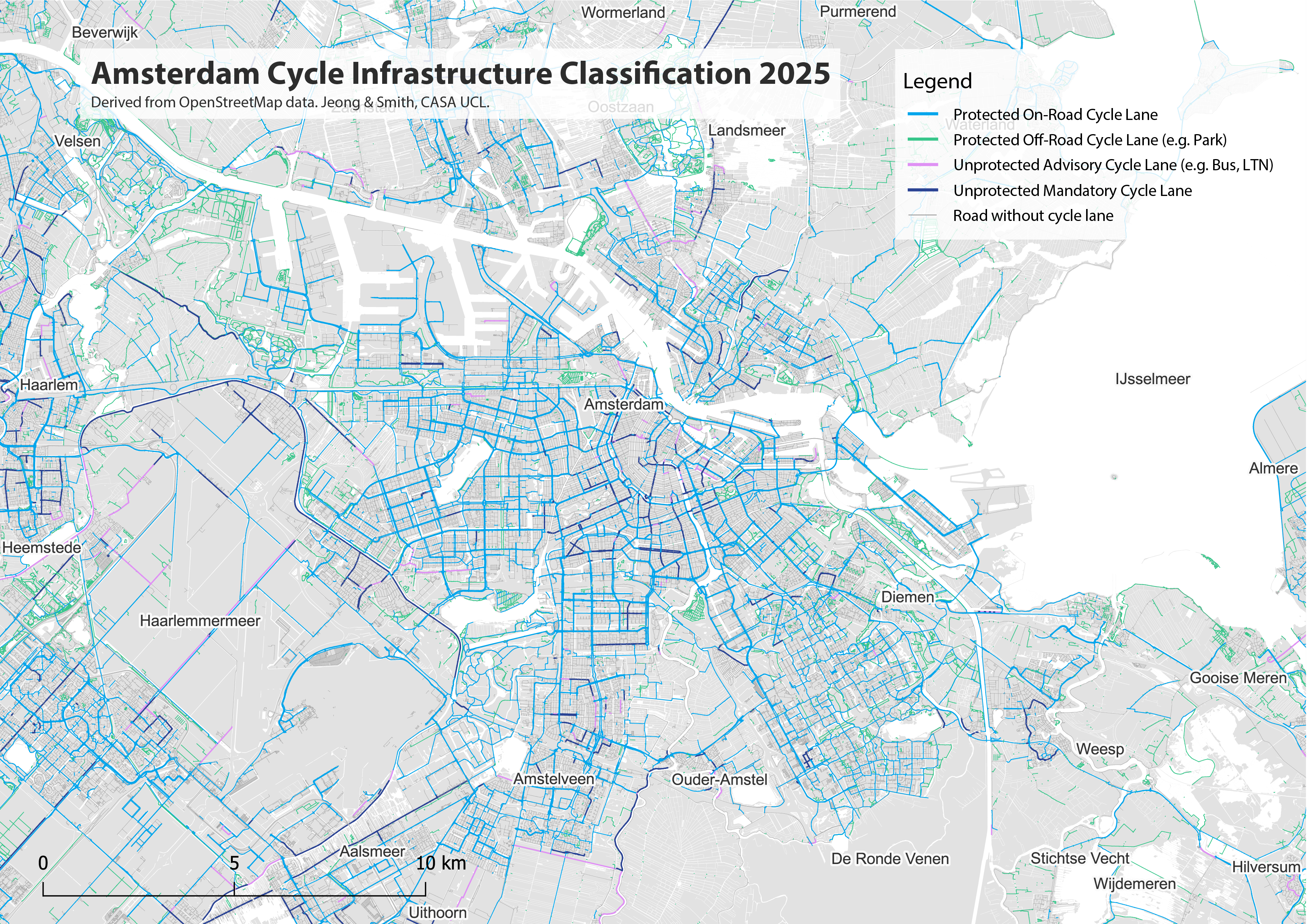
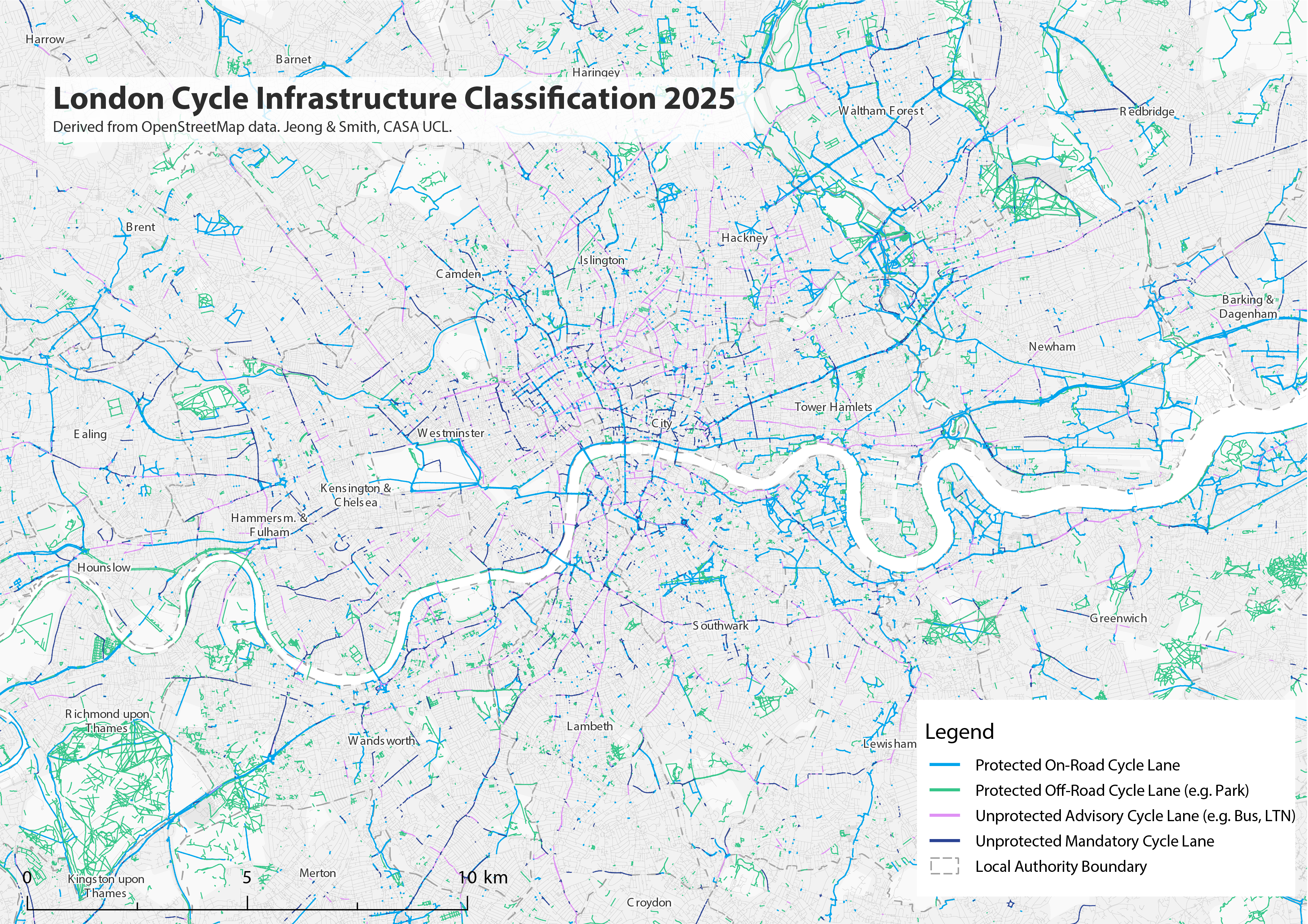
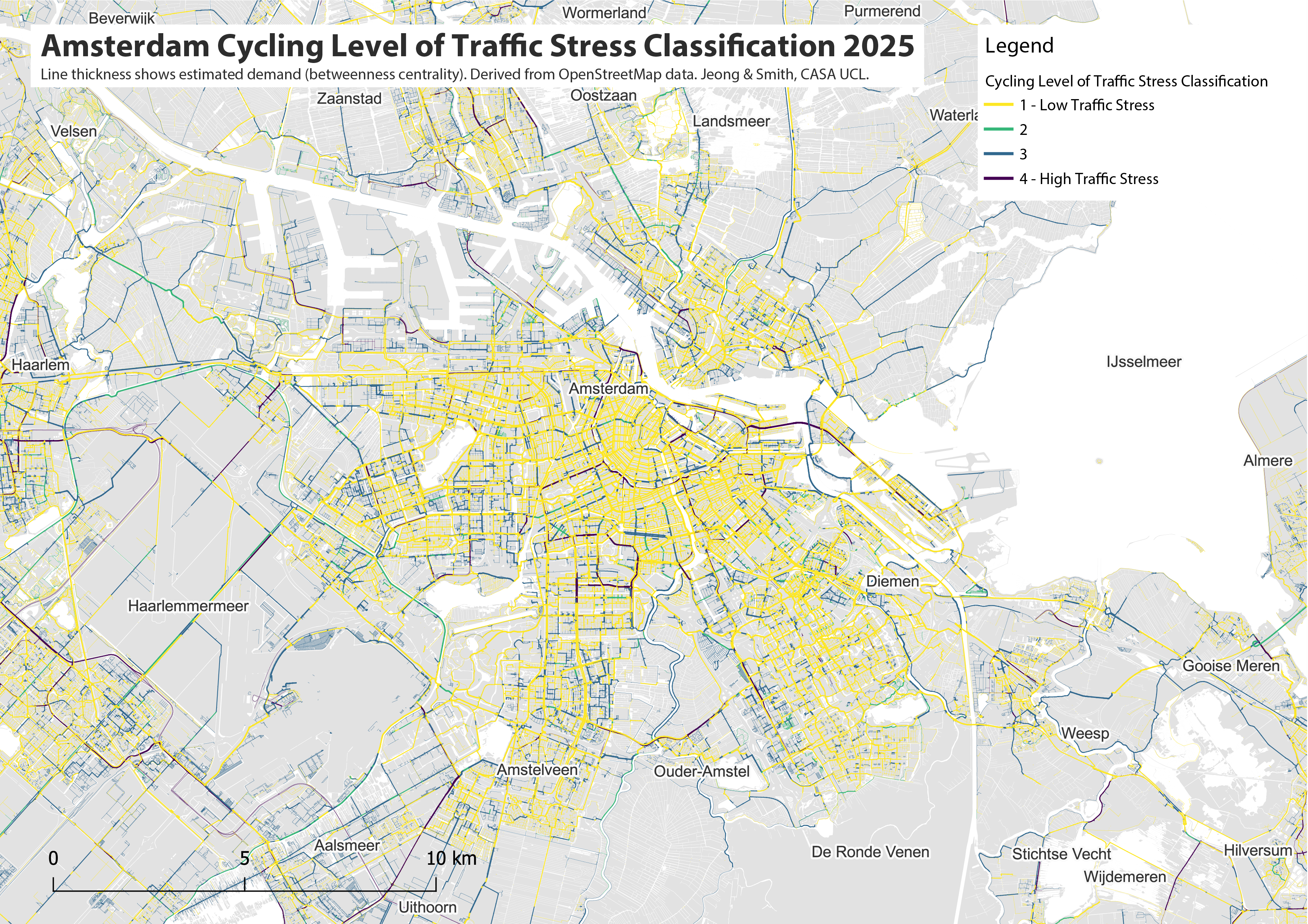
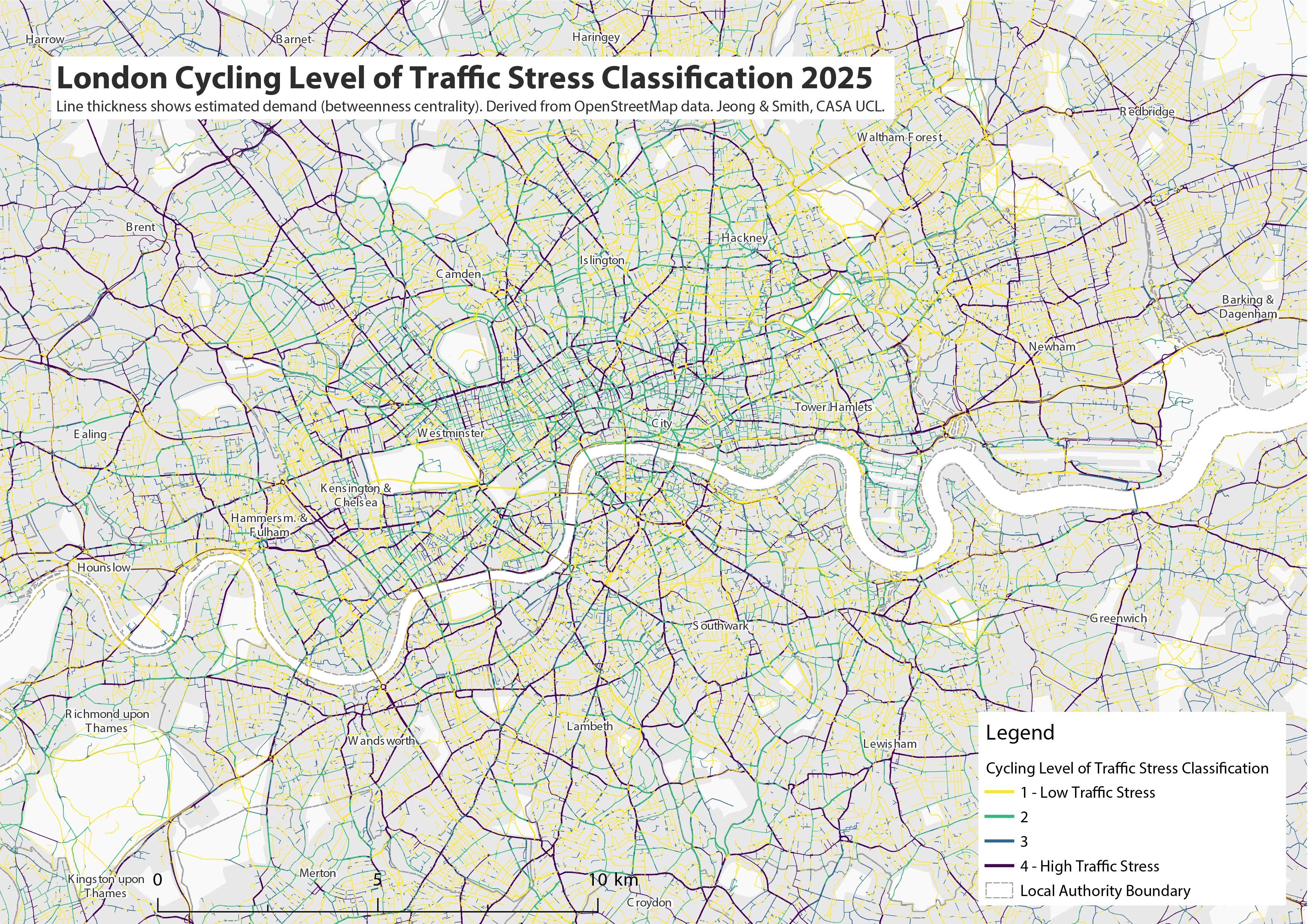
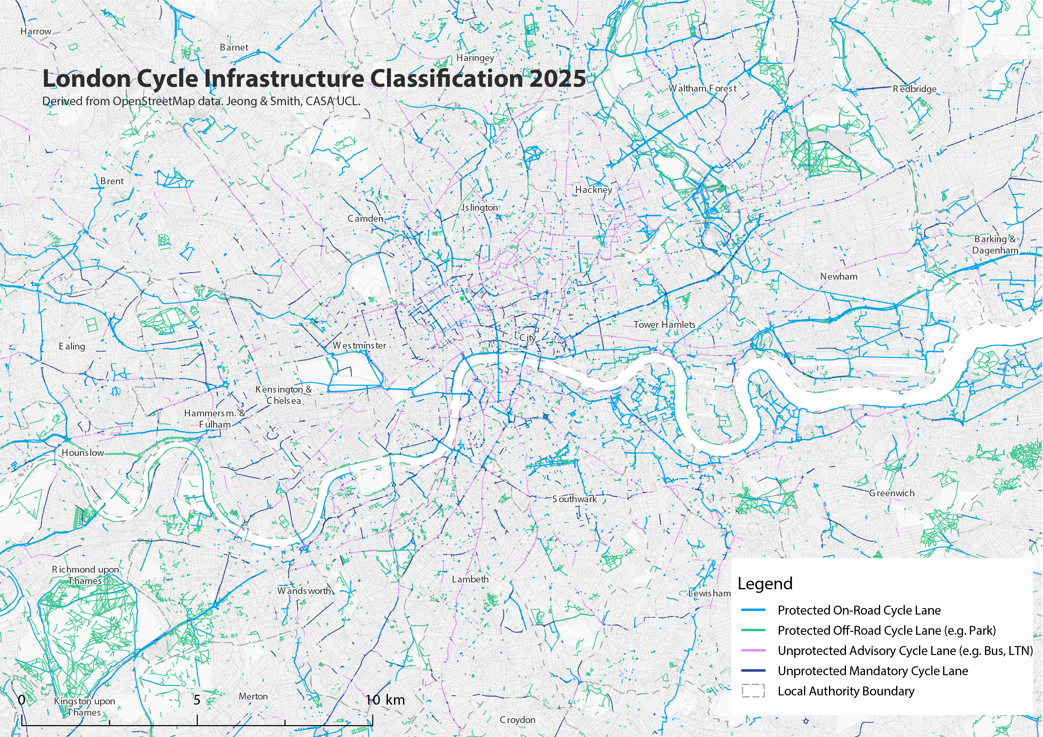
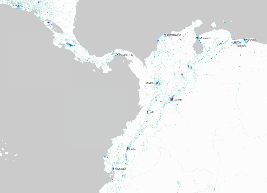
The maps below show the classification of cycle infrastructure for the Amsterdam region and for Greater London. The bright blue and bright green routes indicate high-quality protected cycle infrastructure separated from traffic. Amsterdam has a very comprehensive cycling network, covering all main roads, and linking urban settlements across the wider region. Green colours represent off-road cycle lanes in parks and rural areas. London’s network is in comparison patchy and incomplete, with large areas of the city lacking cycle infrastructure. The purple and dark blue lines indicate unprotected cycle infrastructure, such as Low Traffic Neighbourhoods where cyclists mix with low speed traffic (purple), or on-road cycle lanes without a physical barrier with road traffic (dark blue). These unprotected cycle lanes are rare in Amsterdam and relatively common in London. Roads without any cycle lane infrastructure are shown in grey (note this can also reflect data missing in the OpenStreetMap database).
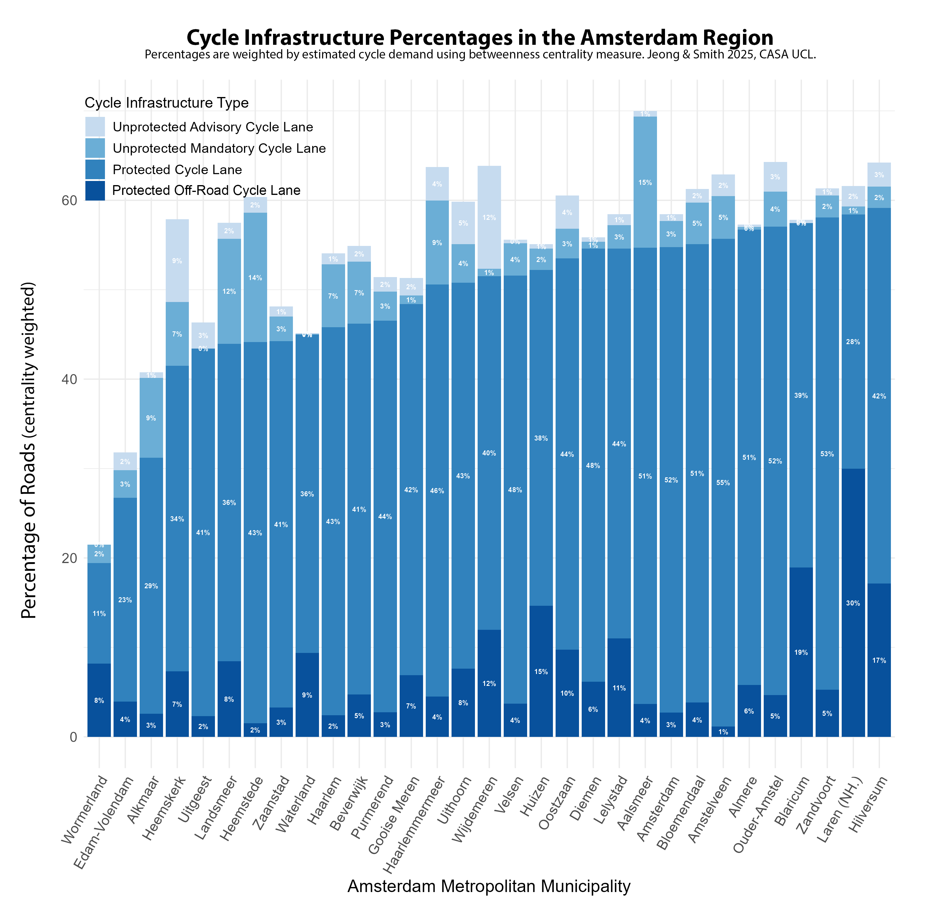
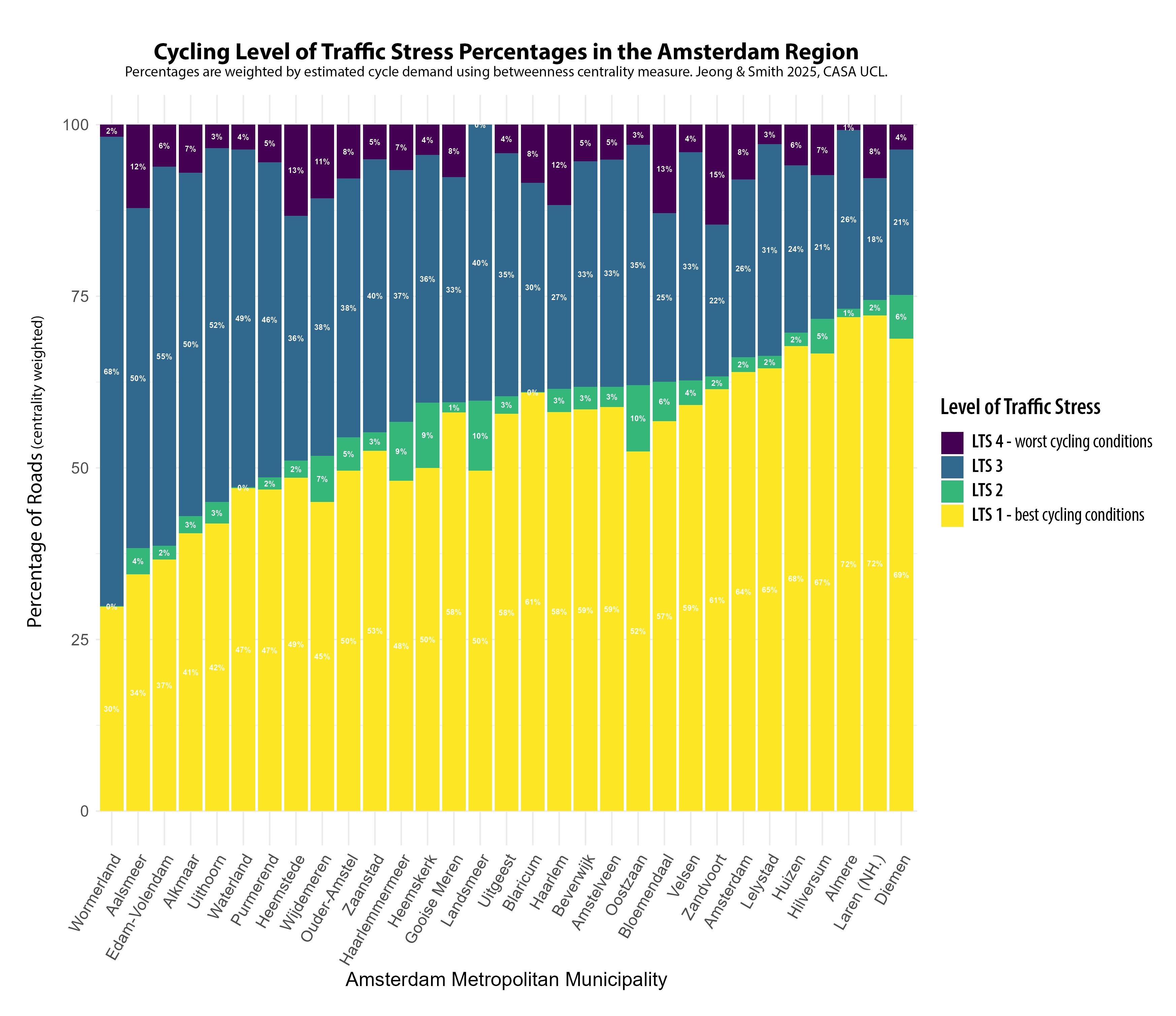
As well as mapping cycle infrastructure quality, the classification measure can also be used for statistical summaries. The chart below shows the percentage of roads with different types of cycle infrastructure, summed for each local authority in the Amsterdam region. This measure takes into account cycle route demand, based on network analysis to the most common destinations. This means that popular major cycle routes are weighted highly compared to sparse rural routes (the results are then normalised for each authority). In the Amsterdam region, most authorities have over half of all roads with protected cycle lanes. For the City of Amsterdam, the figure is 55% and there are eight authorities that score even more highly than Amsterdam with this measure, led by Hilversum and Laren. The comprehensive protected network is consistent across the metropolitan region, with only Wormerland, Edam-Volendam and Alkmaar falling below 40%. These authorities are all in the more rural Noord-Holland peninsula.
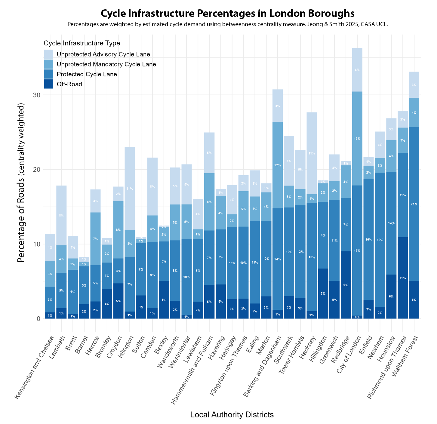
In London, the equivalent percentage of protected cycle lanes is around a third of the levels in Amsterdam, generally falling between 10-20% for most London boroughs. There is a wider variation between authorities, and a much higher percentage of lower quality unprotected cycle lanes as well. This outcome is the result of both a general lack of investment in cycling over decades, and the lack of a city-wide cycling strategy (London’s earliest was in 2013), leading to boroughs pursuing independent policies. There is evidently a huge gap with Amsterdam. Only two London boroughs, Waltham Forest and Richmond, can come close to the worse performing authorities in the Amsterdam region.
Level of Traffic Stress The experience of cycling can also be affected by other factors in addition to cycle lanes, such as traffic speed, road type and number of carriageways. This is the approach taken in the Level of Traffic Stress (LTS) framework, which has been adapted here to reflect conditions in European cities (see the methodology paper for more details). LTS produces a classification from 1-4, with LTS 1 being low stress conditions suitable for all cyclists, and LTS 4 being stressful conditions mixing with higher speed traffic, suitable only for experienced cyclists. In the maps below, we can see again the massive contrast between Amsterdam and London, with Amsterdam dominated by the yellow colour of the least stressful cycling conditions. There are more mixed conditions in some settlements in the wider Amsterdam region. Note also we are not considering cycle lane capacity in this measure, and the very high volume of cyclists in central Amsterdam (and more recently in parts of central London) can itself increase journey stress. In London, the inner city falls mainly into LTS 2 (due to widely implemented 30km/h speed limits) but major roads outside of Inner London are overwhelmingly in the most stressful LTS 4 classification, increasing levels of danger for cyclists and discouraging less experienced cyclists to switch modes.
The Level of Traffic Stress framework can also be used to create a statistical summary for authorities. LTS 1 is the dominant classification in the Amsterdam region, comprising more than half of the centrality weighted roads for most authorities, and 64% of roads in the City of Amsterdam. Comprehensive cycle lanes ensure that the most stressful traffic classification of LTS 4 is minimised across the metropolitan region, averaging around 7%. There is however a moderately high percentage of LTS 3, which likely reflects protected cycle lanes being next to higher-speed main roads and that 30 km/h speed limits could be further extended.
London has widely implemented 30km/h speed limits, which despite the lack of protected cycle lanes, increases the volume of roads falling into the LTS 2 category, particularly in Inner London boroughs. But a major problem, and contrast with the Amsterdam results, is just how prevalent LTS 4 roads are throughout London, averaging around 20% of all roads. These represent roads where cyclists are forced to mix with higher speed traffic, and are currently a major obstacle to providing safe and inclusive cycling conditions for many London residents.
Conclusions This post has shown how the analysis of cycle network data can be used to create indicators of cycle network quality, tracking progress towards sustainable and inclusive cities, and producing comparative city indicators. In this case the gap between the leading city of Amsterdam and London is huge in terms of the comprehensiveness and quality of cycle networks, and the experience of cycling in terms of Level of Traffic Stress. The only limitations in the Amsterdam metropolitan region were found to be in some of the more rural authorities, particularly in Noord-Holland, and potentially the need to expand 30 km/h speed limits. For London, major expansion in protected cycle lanes is needed in many parts of the city to try and achieve a more comprehensive and inclusive network, as currently there are major limitations in London’s cycle infrastructure network.
The ENHANCE Project and Next Steps You can read the full working paper of this research here, by Philyoung Jeong and Duncan Smith at CASA UCL. For future work we intend to expand this measure to other European cities, as it is based on open international data. Future improvements could also include considering cycle lane capacity and further improvements to the network analysis of cycle route demand. This research is part of the ENHANCE Project, a Driving Urban Transitions project funded by the European Union and ESRC.
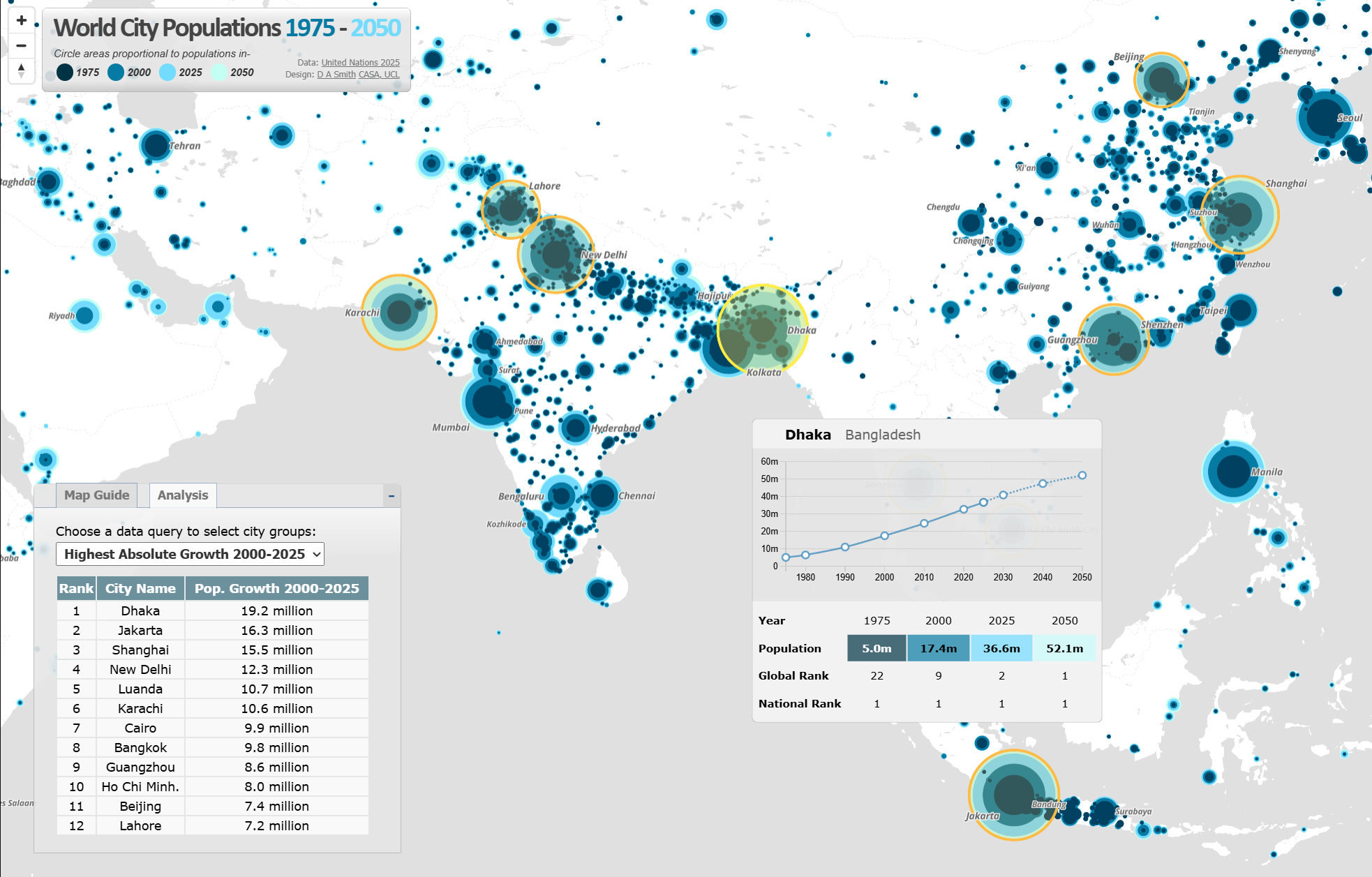
The interactive map of world city populations – https://luminocity3d.org/WorldCity/ – has been updated with the newest release of the UN World Urbanization Prospects (WUP), the leading dataset for understanding global urban dynamics. The new UN WUP 2025 release supersedes the 2018 version. It’s a major revision with updated demographic data a new harmonised methodology for calculating urban agglomeration populations based on urban land analysis (using the Global Human Settlement Layer data) compared to previous use of national administrative boundaries. The dataset also covers an updated time frame of 1975-2050. The dataset shows some dramatic changes in the ranking of the world’s largest urban agglomerations and predictions for urban growth in the next 25 years.
The online interactive World City map allows you to explore the overall trends in urban populations and the detailed dynamics of particular cities of interest. I have also created a non-interactive high-res publication version of the map below-
Jakarta and Dhaka Measured as the World’s Largest Urban Agglomerations The UN WUP 2025 uses an updated harmonised global methodology for defining urban agglomerations as contiguous areas of high density urban land (above 1,500 persons per km2) with a minimum population of at least fifty thousand. This new methodology results in several changes to the ranking of the world’s largest city-regions. Tokyo, with a population of 33.4 million is 2025, is often measured as the world’s most populous city, but with this methodology Jakarta, current population a gigantic 41.9 million, replaced Tokyo in 2010. This change in Jakarta’s population appears to be due to updated demographic data, and a misalignment between Jakarta’s administrative boundary and its metropolitan region that caused previous underestimations (I got similar results for Jakarta with my own analysis of the Global Human Settlement Layer data). The projection is for Dhaka and Jakarta to become the first urban agglomerations to exceed 50 million people in 2050.
Stabilisation of Urban Populations in China and India Global urban growth in recent decades has been dominated by China and India. The next 25 years however project a more stable urban picture in the world’s most populous countries, with China starting to follow Japan and South Korea with an ageing and more static population. For example, Shanghai gained a massive 15.5 million people between 2000 and 2025, but this growth is predicted to slow to 5.5 million between 2025-2050. Some cities in West China such as Chongqing, Wuhan and Chengdu are predicted to lose population between 2025-2050, though there are larger population falls predicted in Japan and South Korea.
Population change in India’s largest urban agglomerations follows a broadly similar stabilisation pattern. New Delhi gained 12.3 million residents between 2000-2025 to reach 30.2 million people, but the population growth prediction for the next 25 years is lower at 3.7 million. A similar levelling off can also be seen in the Indian megacities of Mumbai and Kolkata. Urban growth is higher however in India’s South Asian neighbours. Dhaka in Bangladesh continues with very high rates of growth. Dhaka is currently the world’s second largest urban agglomeration at 36.6 million in 2025, and may become the world’s largest urban agglomeration in 2050. Pakistan shows a similar picture, with Karachi predicted to gain 11.5 million people between 2025-2050 to become the world’s fifth largest urban agglomeration.
Highest Growth Rates in Africa, Though Also Lower than Previous Predictions African countries are generally much earlier in their urban transition and so have proportionally higher predicted rates of growth. Luanda is set to gain 8.9 million people between 2025-2050. Dar es Salaam and Addis Ababa are predicted to both become megacities of over 10 million in the next 25 years. Even In African cities however, this release of World Urbanization Prospects shows lower predicted growth for coming decades than previous predictions. Cities such as Lagos and Kinshasa have reduced populations with this methodology.
About the World City Population Visualisation The interactive map has been built using Mapbox JS. The technique of overlaying proportional circles to show urban population change over time was first developed in a static map at LSE Cities Urban Age by Guido Robazza.
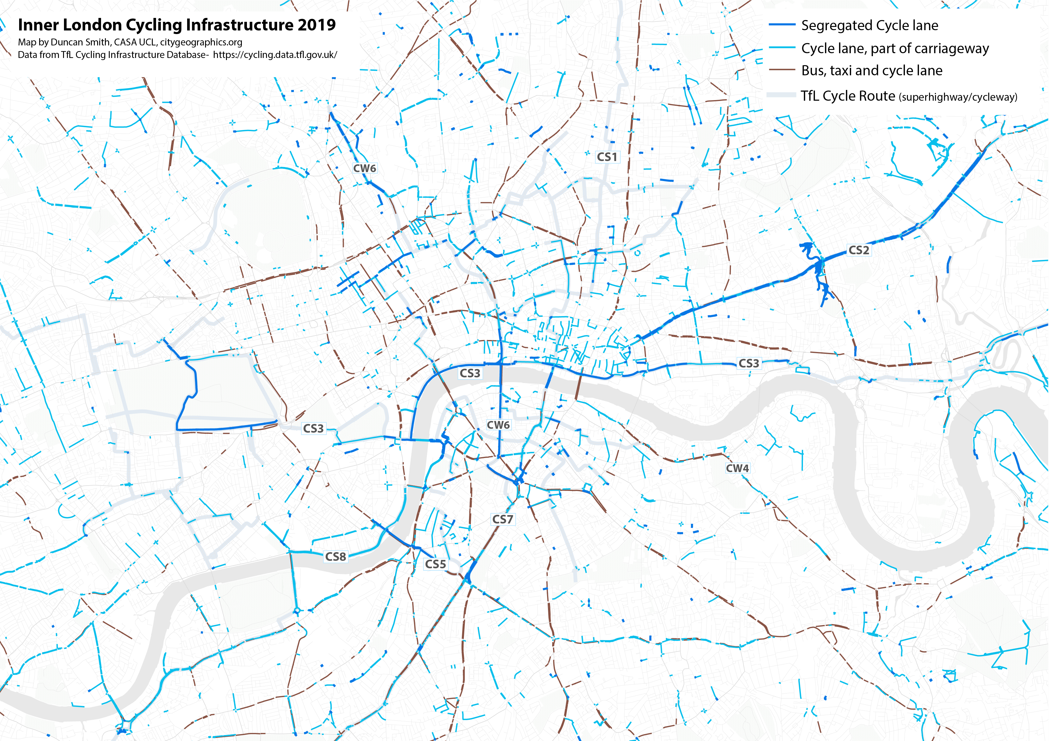
Increasing levels of cycling is a key part of the transport strategies of many global cities with the potential for significant health and sustainability benefits. Many urban cycle networks are however fragmented and poor-quality which can significantly limit participation. London is currently expanding its cycling infrastructure to catch up with leading European cities in active travel. How can we track recent progress towards developing comprehensive, safe and inclusive cycle networks?
Cycle Infrastructure and Level of Traffic Stress This research uses two main perspectives to review cycling networks. The first is based on cycle infrastructure, where we map the geography and quality of cycle lanes. From this view, protected cycle lanes that are physically separated from traffic are higher quality than cycle lanes that are merely paint on the side of the road, or that are shared with other vehicles, such as a bus lane. Cycle infrastructure is mapped for London below, derived from OpenStreetMap data-
The Mayor and Transport for London have been developing a city-wide network of Cycleways – protected cycle lanes – that appear in bright blue on the map, mostly running east-west through Inner London. Cycle lane provision in north-west and south-west London is generally weaker, with more car-dependent and suburban boroughs, as well as hillier topography. London’s most cycle-friendly boroughs are generally in Inner London. You can see in the map that pro-cycling boroughs such as Hackney and Islington have many advisory cycle lanes (in purple on the map), which include Low Traffic Neighbourhoods, Quietways and shared bus lanes.
Our second perspective on cycle network quality is the popular Level of Traffic Stress framework, which takes a wider perspective on road conditions affecting cyclists, including road width, speed limits and the type of road (e.g. residential road, high street, arterial road etc.). The Level of Traffic Stress framework is a categorical scale from LTS 1 – the safest conditions suitable for more vulnerable cyclists – to LTS 4 – the most stressful conditions mixing with higher speed road traffic, only suitable for experienced cyclists. The Level of Traffic Stress framework for all of London’s roads is mapped below, again using OpenStreetMap data-
The Level of Traffic Stress framework produces a much larger contrast between Inner and Outer London, with Inner London generally having lower speeds and lower stress cycling conditions. In Outer London, cycle-friendly residential neighbourhoods are typically bounded by high-speed unsafe main roads, reducing cycle accessibility. There are some Outer London boroughs that break this trend as we discuss below.
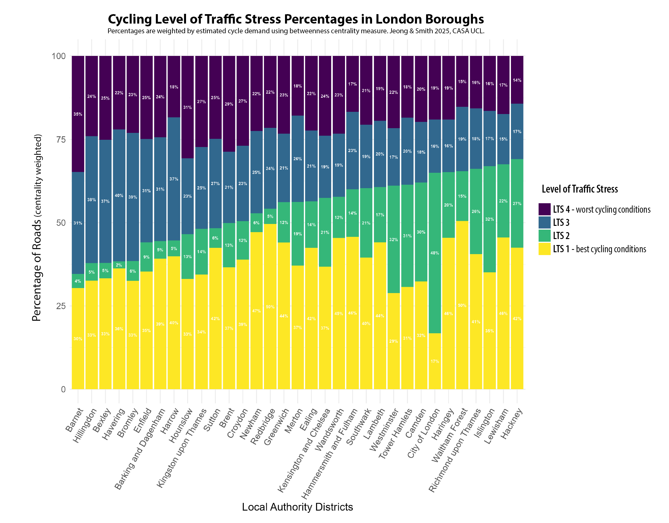
Developing Borough-Level Indicators of Cycle Network Quality In this research we wanted to transform the cycle infrastructure and Level of Traffic Stress data into indicators that accurately summarise the quality of cycle networks at the borough level. A key step here is that the most in-demand cycle routes need to be weighted higher than infrequently used routes, to give a representative picture of cycle network quality based on the routes cyclists actually need to use. This step has been achieved by calculating betweenness centrality to typical Point of Interest destinations, validated against TfL cycle count data (see the working paper for details).
The infrastructure summary indicator is below, ordered by the weighted percentage of protected cycle lanes. Outer London boroughs score better than expected with this indicator, led by Waltham Forest, Richmond and Hounslow. These boroughs have invested in fully segregated cycle networks, such as the mini-Holland funding scheme used to improve cycle networks in Waltham Forest. Cycle routes through parks and along rivers/canals also play an important role, with Richmond and Redbridge having the highest proportions of off-road cycle routes. Inner London boroughs such as Hackney and the City of London have a higher proportion of unprotected cycle lanes (such as bus lanes and Low Traffic Neighbourhoods) and do not score as well in terms of fully protected infrastructure.
The second Level of Traffic Stress (LTS) indicator measures a wider set of road conditions – such as speed limits, width and type – and includes all roads in Greater London (except where cycling is illegal such as motorways). A similar centrality-weighted chart by borough is shown below. There is a much clearer split between Inner and Outer London boroughs using LTS, with seven of the top ten boroughs being in Inner London – led by Hackney, Lewisham and Islington – and the bottom 13 boroughs all being in Outer London. This reflects lower speed cycle-friendly conditions in Inner London. Outer London boroughs feature higher proportions of LTS 3 and LTS 4 roads, due to the presence of more stressful, higher speed main roads, outside of the relatively sparse segregated cycle network. Richmond and Waltham Forest remain the exceptions, achieving good cycling conditions in Outer London and featuring in the top ten boroughs. Inner London boroughs that have pursued Low Traffic Neighbourhood and Quietway approaches, such as Hackney and Islington, score very well in the LTS classification as this measure favours lower speed cycling conditions.
To summarise these indicators, we have produced a borough ranking of the Cycle Infrastructure and the Level of Traffic Stress indicators, and an overall Cycle Accessibility Score, combining infrastructure and LTS, as shown in Table 1 below. Hackney, Islington and Hammersmith & Fulham are the best ranked Inner London boroughs overall, and Waltham Forest, Richmond and Haringey are the best ranked Outer London boroughs. Waltham Forest scores particularly well, coming in first overall for Greater London. In terms of the weakest London boroughs for cycling, these are car-dependent Outer London boroughs such as Barnet, Bexley and Brent. These boroughs currently fall outside of the TfL Cycleway network and have not managed to develop their own cycle networks in more car-dependent conditions. The weakest Inner London borough is Kensington & Chelsea, which has historically resisted developing its cycle network and came last in the cycle infrastructure ranking, despite being a high density Inner London borough that is adjacent to Hammersmith & Fulham which is at the opposite end of the results
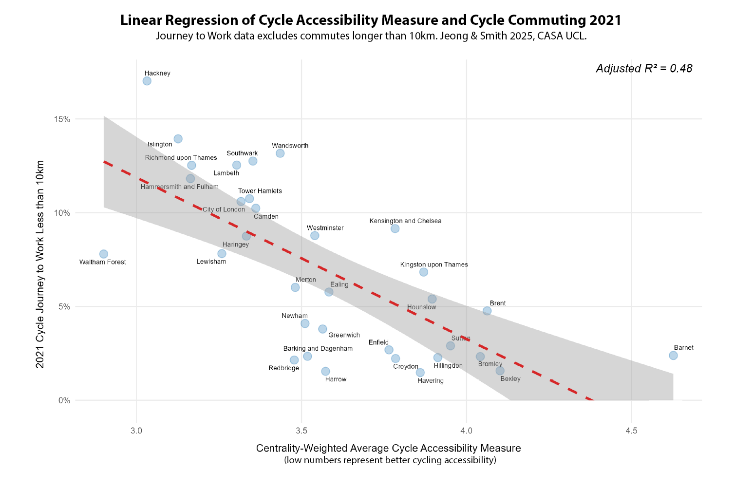
Comparing the Cycle Accessibility Measure to Travel Behaviour We can also compare the cycle accessibility score to recorded levels of cycling in travel survey data. A linear regression between the cycle accessibility measure (lower is better with this indicator) and recorded levels of cycle commuting in 2021 is shown below. Some boroughs with strong cycle networks, such as Hackney and Islington, have rates of cycle commuting even higher than expected, coming above the regression line. Waltham Forest has lower than expected levels of cycle commuting, though this may reflect being located further from job opportunities, as is the case for many Outer London boroughs. Some boroughs with weaker cycling infrastructure still show reasonable cycle commuting levels, such as Kensington & Chelsea, reflecting that some cyclists are willing to endure more stressful conditions. This approach is unlikely however to expand cycling participation beyond more experienced cyclists. Actual cycling rates reflect additional factors to cycling networks, such as demographics and public transport accessibility.
The ENHANCE Project and Where to Find Out More You can read the full working paper of this research here, by Philyoung Jeong and Duncan Smith at CASA UCL. This research is part of the ENHANCE Project, a Driving Urban Transitions project funded by ESRC. Future work will be expanding these indicators across the UK, and making comparing accessibility in the UK with partner cities in the Netherlands and Portugal.
Each year CASA master’s students demonstrate their spatial data visualisation skills with a group project. The theme this year was ‘Urban Futures’, and students have produced some very impressive and diverse work, experimenting with a range of visualisation tools and techniques. Click on the images below to visit the project websites.
Urban Resilience Projects Two groups explored at urban resilience and climate change. Some excellent interactive mapping work was created analysing Urban Heat Island effects in the Greater Bay Area of China (one of the world’s largest and fastest growing city regions) and at the potential impacts of sea level rise in New York City.
Transport Sustainability Projects Transport sustainability was another popular topic in urban futures. This included investigating 15 Minute City Accessibility in London (mapping the recent UBDC data), exploring the sustainability of the freight and logistics industry in the USA, and mapping the growth and sustainability of Los Angeles.
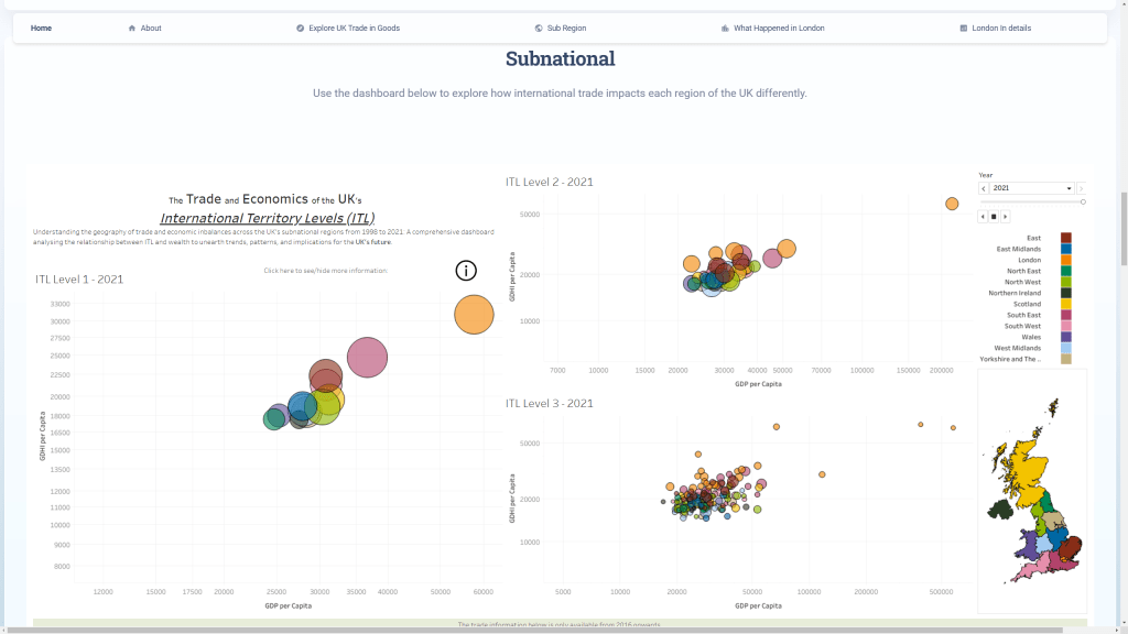
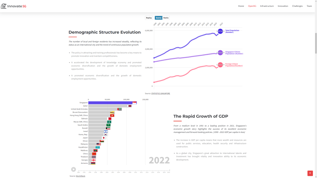
Economic Change and Innovation Projects Several groups explored different aspects of economic futures. This included analysing the UK’s international trade and sub-regional performance using interactive dashboards; and charting innovation policy in Singapore and its international competitiveness with animated charts and mapping.
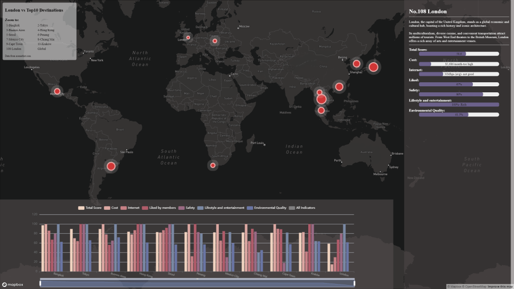
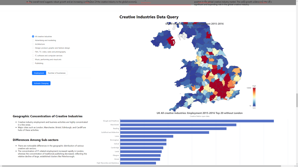
The phenomenon of mobile knowledge economy workers or Digital Nomads was explored in terms of analysing London compared to other global cities. Finally the importance of the Creative Industries to the UK economy was visualised using interactive maps and charts.
Social Change and Ageing Societies Projects Another increasingly important aspect of urban futures is planning for ageing societies. Two groups explored this topic, the first looking more particularly at ageing societies and facilities globally and with the case study of Bournemouth, and the second group exploring ageing societies both globally and in Manchester.
Although Greater London has an extensive transit network, this is not the case for many UK cities where underinvestment and privatisation has seen bus, metro and rail networks stagnate in recent decades, falling well behind European peers. Improving public transport is an important aspect of addressing the UK’s regional inequalities and poor productivity, and is a prominent issue for the 2024 general election.
Accessibility measures are an ideal tool to gauge the comprehensiveness and efficiency of public transport networks – they describe the ease with which populations can reach key services by different travel modes. The leading UK urban thinktank, the Centre for Cities (see their new Cities Outlook report 2024), has been doing some accessibility analysis of English cities compared to continental European cities, and this was recently republished in the Financial Times in an article on productivity challenges-
It’s great to see accessibility analysis feature in the media. The measure used above however has some serious problems leading to nonsensical results (e.g. does Manchester really have half the accessibility of Liverpool and Newcastle?). The Centre for Cities measure uses a single time threshold (30 minutes) when we know that accessibility varies considerably at different time thresholds. It is based on a single destination point, when cities can have multiple employment centres. And it describes accessibility as a percentage of all city jobs, which means that the smaller the urban settlement is, the higher the accessibility result will be using this measure. In reality, larger city-regions have better jobs accessibility.
Creating Robust Public Transport Accessibility Measures – R5R and PTAI-2022 We can create much better and more reliable accessibility measures for UK cities. There have been significant recent advances. The open source R5R software has solved many of the computational challenges for accurately calculating public transport accessibility, allowing the calculation of full travel matrices for all possible trips and handling accessibility variation over time. In the UK, Rafael Verduzco and David McArthur at the Urban Big Data Centre have taken this one step further and pre-calculated accessibility indicators for all of Great Britain at a range of time thresholds in their Public Transport Accessibility Indicators dataset. This dataset is calculated using R5R, and is based on the median travel time across a three hour travel time window, 7am to 10am on a typical weekday (Tuesday 22nd November 2021), and uses the latest public transport service datasets such as the Bus Open Data Service. The results are at LSOA scale for GB only (no Northern Ireland), based on census 2011 zones (so I have used 2020 population data in the below analysis).
Origin and Destination Accessibility Measures This article focuses on jobs accessibility, and this can be analysed from either the perspective of trip origins (residential-based accessibility to jobs) or from the perspective of trip destinations (workplace-based accessibility by residents). Both perspectives are complementary, and are developed below. For residential measures, if we take the average accessibility for all residents in a city then we get a good overview of how extensive and efficient the public transport network is. This requires city boundaries to define all the residents in each city. The analysis below uses the Primary Urban Area geography.
Public Transport Jobs Accessibility Trip Origin Results The table and chart below show average accessibility to jobs for residents in all major GB cities by three travel time thresholds- 30 minutes, 45 minutes and 60 minutes. London’s accessibility results are inevitably much higher than any other GB city, being around 3 to 4 times higher at all three travel times, and emphasising just how big the gap is between the capital and all other GB cities. The 30 minute threshold describes shorter trips, and identifies higher density compact cities where residents are on average closer to employment centres. Small compact cities such as Cambridge and Oxford score well at 30mins (though note this is not the case at 45 or 60mins). Edinburgh and Glasgow have the highest residential average accessibility outside of London at both 30 and 45 minutes. This is due to Scottish cities historically following a higher density European urban model, and maintaining better public transport networks by avoiding some of the worst effects of privatisation.
The 60 minute accessibility measure picks up longer distance commuting on regional rail and metro networks. This is where the strengths of larger city regions such as Greater Manchester and the West Midlands are highlighted, with Manchester second and Birmingham forth in the ranking (Glasgow is third and also has a large regional rail network). Given their large populations, Manchester and Birmingham should however be scoring higher in absolute terms and closing the gap on London. Both have poor accessibility for the shorter 30 minute accessibility measure, reflecting the need for further inner-city densification (as the Centre for Cities have argued). For longer commutes, Manchester and Birmingham metro networks should also continue to be extended regionally. Leeds scores relatively well at 30 minutes due to its medium-density urban core, but it lacks a metro and is behind Birmingham, Glasgow and Manchester for the longer commuting times.
Peak Public Transport Accessibility by Trip Destination We can also analyse accessibility by trip destination, which produces similar results to the trip origin residential measure but is more from the perspective of employment centres. The table below shows the peak accessibility by workplace within each Primary Urban Area, which is a measure of labour market size and agglomeration potential for the UK’s largest city centres. London retains its huge advantage with this measure, at 3 to 4 times higher than the next best cities. City-regions with larger rail and metro networks score better with the peak destination measure, with Birmingham and Manchester ranked second and third respectively, exceeding 2 million people at 60 minutes. Cities with strong rail connections to London, such as Reading and Crawley, also score highly at 60 minutes, but have much lower accessibility at 45 and 30 minutes. Smaller compact cities such as Edinburgh and Cambridge rank much lower by the destination measure compared to the residential analysis.
Both the trip origin residential average accessibility measure and the trip destination peak accessibility measure provide useful perspectives. The residential average measure is a good summary of the coverage and extent of public transport across a city, and how likely residents are to use public transport modes. The trip destination peak accessibility measures employment centre labour market size, and summarises the total number of people that can reach city centres by rail and metro. This is a better measure of agglomeration potential and is more closely correlated with city-region size.
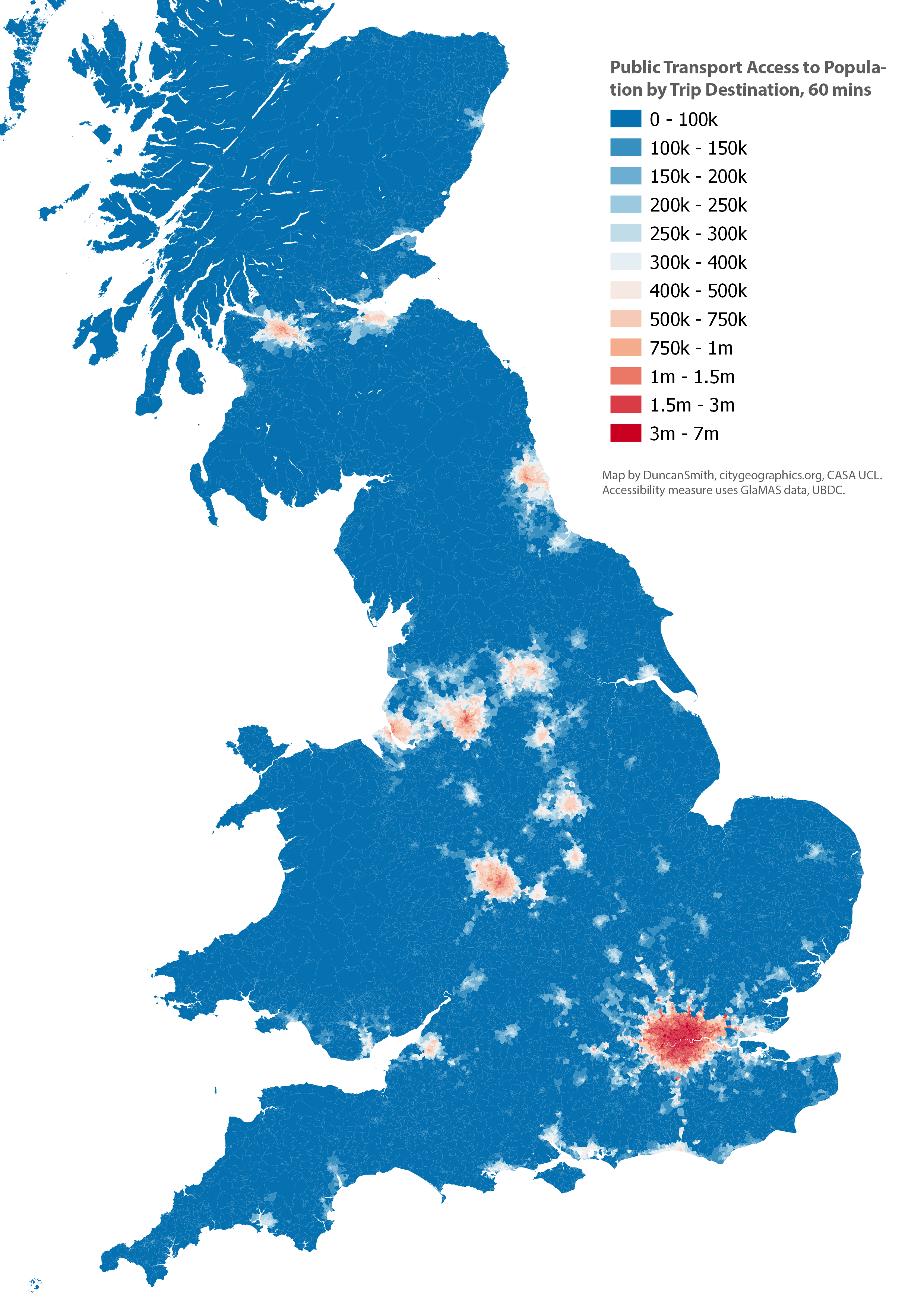
Mapping the Accessibility Results We can also map the results to view the geography of accessibility to jobs. Firstly the trip origin accessibility to jobs measure. This emphasises how large the area of high accessibility is across Greater London, with parts of Outer London and the South East having higher accessibility to jobs than residents in the city centres of the next largest cities, Manchester and Birmingham. The Primary Urban Area geography is also shown, which is the basis of the residential average accessibility chart and table shown above.
Next we map the trip destination accessibility to population measure. This has a very similar geography, but with more of an emphasis on city centres, as we are measuring average accessibility on a weekday 7am-10am when there will be more commuting services going to, rather than from, central areas. Again London has a huge advantage, peaking at 7 million people. We can also see the centres of Birmingham and Manchester reaching accessibility levels above 2 million people, while Glasgow, Leeds, Newcastle and Liverpool exceed 1 million.
Conclusion- Open Data and Software is Available to Create High Quality Accessibility Measures With software such as R5R (see this workshop for an intro) and the exemplary and easy to use PTAI-2022 dataset from the UBDC, it is easier than ever to produce accurate public transport accessibility measures. The comparative accessibility analysis of GB cities shown here has highlighted the huge accessibility gap between London and all other UK cities. It has also shown the generally better accessibility performance of Glasgow and Edinburgh, and the high regional accessibility of Birmingham and Manchester which contrasts with their weaker accessibility in these regions for shorter travel times, which supports inner-city densification. There is no single perfect accessibility measure that answers all questions we are interested in – this analysis has confirmed that variation at different travel times reveals contrasting patterns in local and regional accessibility; that average and peak accessibility in cities emphasise different aspects of transit networks; and that trip origin and trip destination measures provide complementary perspectives. We therefore need to test a range of measures to understand accessibility patterns.
Future Improvements This has been a relatively quick demonstration of the PTAI-2022 data and there are several areas for further improvements-
Including European cities for comparison would be very interesting, as the Centre for Cities explored in their original analysis. A recent major paper in Nature has shown how accurate international accessibility comparisons can be done- https://www.nature.com/articles/s42949-021-00020-2.
The PTAI-2022 dataset is a really good tool that makes GB accessibility analysis much more straightforward for researchers. Currently it uses the 2011 census boundaries, and the next update should use the 2021 boundaries allowing the latest census data to be used. Additionally, the current PTAI-2022 release uses 2021 public transport data, and updating this with the latest rail and bus data would also be a useful update. A related issue is that reliability on UK public transport networks can be poor, and that timetables can overestimate transit accessibility. This topic has been analysed by Tom Forth in this blog post.
This analysis has used the Primary Urban Area geography, which is a useful description of GB city-regions, but there are some issues with PUAs due to the underlying local authority geography. A few PUAs for medium-sized cities have quite large hinterlands (e.g. Sheffield) and this lowers the average accessibility measured in these PUAs due to lower accessibility outside of the urban core. A more thorough analysis of accessibility would need to test multiple urban geographies and gauge the extent of Modifiable Areal Unit Problem variation.
The housing crisis in London has become increasingly severe in the last decade with much higher prices, rents, and largely static incomes, while housing development volumes have remained consistently below targets. Green Belt reform is often cited as a solution to boost development, though this has been off the agenda during the last 13 years of Conservative government. Recent announcements by the Labour leadership, supporting Green Belt reform and setting ambitious targets for housing development, could change this state of affairs with the general election coming in 2024.
This article analyses housing development in the London region from 2011-2022 (full CASA Working Paper here), using the Energy Performance Certificate Data. There is strong evidence that the Green Belt is a major barrier to development and is in need of reform. On the other hand, there are very substantial challenges around the quality and sustainability of new build housing in the South East. The analysis shows that, outside of Greater London, new build housing typically has poor travel sustainability and energy efficiency outcomes. Any release of Green Belt land needs to be dependent on travel sustainability criteria and improved energy efficiency for new housing. Sustainable housing outcomes are much more likely to be achieved through prioritising development in existing towns and cities and in Outer London.
London’s Housing Affordability Crisis House prices in London doubled between 2009 and 2016, pricing out households on moderate and low incomes from home ownership, and translating into rent increases, longer social housing waiting lists, increased overcrowding and homelessness (see Edwards, 2016; LHDG, 2021). Price rises are linked to on the one hand to the financialization of housing (exacerbated by record low interest rates and Help to Buy loans in the 2010s) and on the other a long period of low housing supply, stretching back to the 1980s and the erosion of public housing.
The impact is record levels of unaffordability, with Inner London average house prices reaching £580k and Outer London £420k in 2016 (see chart below). The median house price to income ratio for Inner London soared from 9.9 in 2008 to 15.1 in 2016; for Outer London the ratio increased from 8.2 in 2008 to 11.8. In addition to high prices, first-time buyers have also been hit with record mortgage deposit requirements, with average deposits reaching £148,000 for Greater London, compared to around £10,000 in the late 1990s (Greater London Authority, 2022). Owner occupation is now effectively impossible in Inner, and much of Outer, London for low and moderate income buyers.
There have also been substantial increases in prices across the London region. The map below shows prices per square metre in the South East showing four radial corridors of high prices extending beyond Greater London into the Green Belt. East London is increasingly mirroring West London with two radial corridors of higher prices extending north-east and south-east from Inner East London. These are the primary areas of gentrification in London in the last decade (discussed in previous blog post), squeezing out what was the largest area of affordable market housing. There is also a distinct spatial alignment between London’s Green Belt boundary and higher prices, which is evidence of regional housing market integration, and that Green Belt restrictions are pushing up prices.
New Build Housing Delivery in the London Region Greater London has struggled to meet its housing targets in the last decade. The current London Plan target is for 52k annual completions, which, as can be seen in the graph below, London is significantly short of. The 52k annual target has been criticised as being too low, with other estimates of housing need calculating that 66k or even 90k houses per year are needed (LHDG, 2021). Given the extremely high prices, affordable housing tenures are needed more than ever, yet affordable housing delivery has fallen in the 2010s (although note there has been progress in affordable housing starts in the last two years). Finally, the recent impacts of the pandemic and high interest rates have hit market housing activity, meaning that London will very likely continue to miss its overall housing targets for the next 2-3 years.
We can look in more detail at the geography of housing delivery at local authority level in the scatterplot below. There is high development in most of Inner London, and some Outer London boroughs. These boroughs contain Opportunity Areas (major development sites in the London Plan): Canary Wharf in Tower Hamlets; the Olympic Park in Newham; Battersea Power Station in Wandsworth; Hendon-Colindale in Barnet; Wembley in Brent; Old Oak Common-Park Royal in Ealing; and Croydon town centre. Given that there are only a few Opportunity Areas in Outer London, this leads to relatively low delivery in most Outer London boroughs, and points to the need for a wider strategy for Outer London development.
Meanwhile, there is low development activity in nearly all Green Belt local authorities, much lower than London boroughs and also below the average for the rest of the South East. Green Belt restrictions affect both local authorities in the commuter belt and also Outer London boroughs as well (e.g. Enfield, Bromley) with 27% of Outer London consisting of Green Belt land. We can confirm how rigidly Green Belt restrictions are being applied using the official statistics, which calculate that the London region Green Belt land area was 5,160km2 in 2011 and 5,085km2 in 2022 (DLUHC, 2023). Therefore, only 74km2 or 1.4% of Green Belt land was released over the decade (this figure is for all development uses, not only housing), which is strong evidence of minimal change.
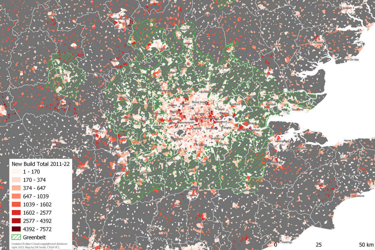
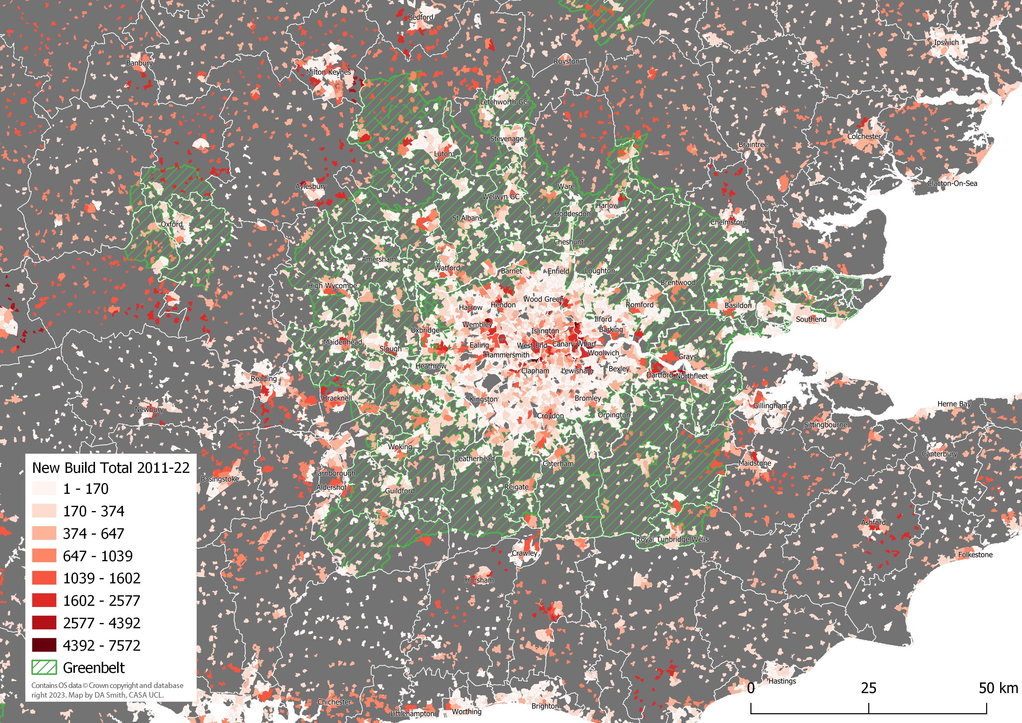
One final impact of the Green Belt can be seen by mapping development in the last decade as shown below. In addition to the patterns of high development in Opportunity Area sites, and generally low development in the Green Belt, there is a ring of high development activity just beyond the Green Belt boundary. This ring includes dispersed car-dependent development in semi-rural areas, and the expansion of medium-sized towns and cities such as Milton Keynes and Reading. This pattern looks very much like Green Belt restrictions are pushing development beyond the Green Belt boundary, creating sprawl-type patterns in several authorities. One important caveat is that several South East cities have strong economies in their own right, particularly technology industries in the Oxford-Milton Keynes-Cambridge arc, creating local development demands in addition to London-linked demand.
Potential for Green Belt Reform With Greater London consistently falling short of housing targets, reform of the Green Belt has been cited as a promising solution (see for example Mace, 2017; Cheshire and Buyuklieva, 2019). The release of Green Belt land could greatly boost development and ease prices. Green Belt reform could also be a substantial source of revenue for austerity-hit local authorities, if authorities are given the powers to purchase Green Belt land at current use value and benefit from the land value uplift (this is part of the Labour proposals).
Traditional objections to Green Belt development focus on rural land preservation. Yet the Green Belt is massive in scale – 12.5% of all the land in England is Green Belt. London’s Green Belt is 5,085km2, or three times bigger than Greater London. Medium density housing development would take up a small proportion of this land. For example, building 100k dwellings at a gross density of 40 dwellings per hectare would add up to 25km2, or less than 0.5% of the London region’s Green Belt. Appropriate Green Belt reform could simultaneously allow for a moderate increase in development and improve environmental aspects of the Green Belt – the current environmental record of the Green Belt is mediocre on key measures such as biodiversity – through green infrastructure funding and principles of Net Biodiversity Gain. The land preservation arguments against Green Belt development do appear to be solvable. There are however further sustainability impacts from housing development to consider, including transportation and housing energy impacts, as discussed below.
Sustainability Impacts- Travel Transport is the largest source of GHG emissions in the UK – 26% of all emissions in the latest 2021 data (DBEIS, 2023). The route to Net Zero requires both the electrification of transport systems and a significant mode shift from private cars to public transport, walking and cycling (HM Government, 2021). Greater London is a UK leader in sustainable travel, but this is not the case for the wider London region, much of which is car dependent. The analysis here uses car ownership and commuting mode choice data from the 2021 census to create a Travel Sustainability Index, as shown in the table below, which classifies Greater South East residents into 6 travel classes of around 4 million people. The South East covers a very wide range of travel behaviours, from an average of 20% commuting by car and 62% zero car households in the most sustainable class 1; to as high as 87% car commuting and 6% zero car households in the most car-dependent class 6.
Travel Sustainability Classes Average Statistics (2021 Census data)
Travel Sustainability Class
Travel Sustain. Index
Car Commute %
Public Transport Commute %
Walk & Cycle Commute %
Car Owning Households %
Residential Net Density (pp/km2)
Total Pop. in South East
1
45-82
20.3
48.5
26.4
38.3
51.5k
3.56m
2
30-45
41.6
33.2
20.9
61.5
32.1k
4.03m
3
21-30
60.6
18.1
17.6
74.7
25.0k
4.03m
4
15-21
71.6
10.9
14.2
83.3
20.2k
4.16m
5
10-15
80.0
6.5
10.9
89.4
16.4k
4.34m
6
1-10
87.3
3.6
6.7
94.1
11.1k
4.29m
Mapping the travel sustainability classes highlights the stark travel behaviour differences between Greater London and the wider region. The Inner London population-weighted average travel sustainability score is 51.6 (class 1), and Outer London is 32.1 (class 2). The Green Belt is overwhelmingly in car dependent classes 4 and 5, with an overall population-weighted average of 16.4 (class 4). The Rest of the South East has a population-weighted average score nearly identical to the Green Belt at 16.5, emphasising the disappointing levels of car dependence in the Green Belt despite its rail infrastructure and proximity to London.
The patterns shown in the above map clearly present a challenge for Green Belt development, as new housing in the wider region risks extending patterns of car dependence. Car dependent areas include some locations next to rail stations (proximity to rail stations has been advocated as a criteria for prioritising Green Belt land for housing). We can directly measure the travel sustainability of housing development from the last ten years by matching the output areas locations of new housing to the Travel Sustainability Index scores. This is shown in the scatterplot below, where Inner London boroughs score highly with this measure, followed by Outer London. Much of the housing development in the wider region scores poorly in terms of travel sustainability, including in areas with high housing development such as Bedfordshire and Milton Keynes.
Although travel sustainability is generally low in the wider region, there are trends identifiable in the above results that can be used as basis for guiding more sustainable development. Several towns and cities show moderately sustainable travel outcomes, including the Green Belt towns Luton, Watford, Guildford and Southend, and wider South East towns and cities Brighton, Reading, Oxford, Cambridge, Portsmouth, Norwich and Southampton. Generally, development in existing towns and cities is likely to be more sustainable than developing smaller settlements and more dispersed rural areas. There are also noticeably better results in active travel-oriented cities such as Brighton and Cambridge. Overall, if we want Green Belt housing development to minimise travel sustainability impacts, then it would be most realistic to achieve this by extending existing towns and cities, both within the Green Belt and in the wider South East. Promoting development in Outer London boroughs also looks to be an efficient strategy given generally good travel sustainability levels in Outer London, and that Outer London is 27% Green Belt land.
Sustainability Impacts- Energy Another important sustainability impact of new build is energy use and carbon emissions resulting from space and water heating, which we can estimate from the Energy Performance Certificate data as shown below. CO2 emissions per dwelling are considerably lower in Inner and Outer London, with overall London emissions per dwelling around two thirds of the value for the Green Belt and Rest of the South East. This is only partly due to smaller dwelling sizes, as CO2 emissions per square metre in London are significantly lower as well. The lower emissions in London housing can be explained by the much higher proportion of flats and also the use of community/district heating, with three quarters of all new build in Inner London and 47% of new build in Outer London connected to community heating networks. The community heating approach is only efficient for high density developments. For medium and lower density developments, air and ground source heat pump technologies are a key technology for improving energy efficiency and replacing gas boilers. The statistics from 2011-22 are very disappointing on this front, at 4% of new build with heat pumps in the Green Belt and 6% in the Wider South East.
New Build Annual Average CO2 Emissions and Energy Summary 2011-2022 (Data: EPC 2023)
Subregion
CO2 per Dwelling (tonnes)
CO2 per m2 (kg)
Energy Consumption (kWh/m2)
Community Heating %
Heat Pump % (air + ground)
Inner London
0.93
12.9
72.9
75.2
2.7
Outer London
1.04
15.3
87.2
46.9
2.8
Green Belt
1.60
18.7
106.9
7.9
3.5
Rest of South East
1.53
17.2
97.7
5.7
5.9
All Subregions
1.34
16.3
92.5
27.0
4.3
The average annual CO2 emissions by dwelling are summarised at the local authority level in Figure 19 (note y axis starts at 0.5). Similar to the travel sustainability results, London boroughs have considerably more sustainable results. Town centres in the South East again are the best performing outside of London, including Cambridge, Southampton, Eastleigh, Reading, Luton, Watford, Woking and Dartford. As the chart shows average CO2 per dwelling, there is a connection between affluence and dwelling size, with higher income boroughs such as Richmond Upon Thames and particularly Kensington and Chelsea, having high emissions. Overall however, energy efficiency is much better in London boroughs and this is a further challenge for the sustainability of Green Belt development. Similar to the travel sustainability analysis, the results point to the extension of existing towns and cities, and Outer London development, as the most sustainable development strategies.
Summary There is a widespread consensus that London needs to build more housing to meet demand and try to reduce record levels of unaffordability. Yet London has been consistently short of meeting housing targets for the last decade, despite substantial growth in Inner London. Green Belt restrictions do appear to have played a major role in constraining development, with low levels of new build in Green Belt local authorities, and in Outer London boroughs with extensive Green Belt land. There is also a significant price premium in Green Belt areas compared to the wider South East.
This analysis agrees with research advocating Green Belt reform. Travel sustainability conditions are needed to avoid this reform producing highly car dependent housing, such as has been occurring in Central Bedfordshire and Milton Keynes (where the East-West should have been built much earlier). Pedestrian access to rail stations is a sensible starting point for prioritising Green Belt land for housing, but it is not sufficient to produce sustainable travel outcomes in the Green Belt. The aim should be for new housing to have local access to a range of services (e.g. retail, schools), providing sustainable travel options for multiple trip types. Another related issue is the need for more sustainable energy efficiency measures in medium density new build housing. There is little evidence in the EPC data for adoption of key housing technologies such as heat-pumps and solar PV. Widespread adoption of these technologies is needed for sustainable development at scale in the Green Belt. Other studies have also identified poor design and planning in new build housing in the UK (see Carmona et al., 2020), and this needs to change as part of any plan to increase the volume of new housing.
Green Belt reform would have to come from national government, changing the very restrictive current National Planning Policy Framework to allow authorities with housing shortages to develop Green Belt land of low environmental quality near services, and to use land value uplift to fund services and affordable housing. It would be logical to give powers to the GLA (and other combined authorities) for the strategic coordination of this development within their boundaries, given the GLA’s strong track record on sustainable housing delivery. It is difficult however to envisage large scale change happening in the South East without national government also organising improved regional coordination and planning. This analysis identifies better travel sustainability outcomes for new build in larger towns and cities in the South East, and supports the urban extension model for development in the Green Belt. There are many candidate towns in London’s Green Belt for urban extensions, including Luton, Guildford, Watford, Maidenhead, Hemel Hempstead, Chelmsford, Basildon, Reigate and Harlow. This larger scale solution is politically more challenging, and would again require leadership and coordination from national government.
The European Commission JRC recently released a new 2023 update of the Global Human Settlement Layer (GHSL) data. This update has greatly improved the GHSL data, with a 10 metre scale built-up area dataset of the entire globe which has been used to create a 100 metre scale global population density layer. The level of detail for cities and rural areas is impressive, and it overcomes the limitations of previous releases of the GHSL. I have updated the World Population Density Map website to include this new 2023 data, with both the cartography and statistical analysis now based on the new data.
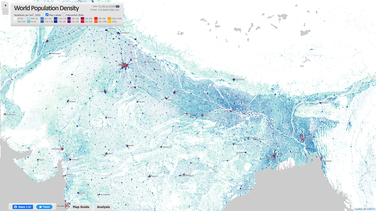
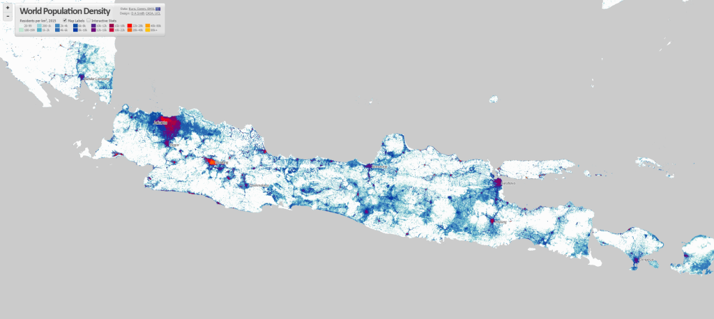
Improved Level of Detail for Cities and Rural Landscapes The new GHSL 2023 data has produced a much more detailed 10 metre dataset of built-up area (using recent European Space Agency Sentinel data), and this is the basis for creating the updated population layer. The results are much improved, particularly for complex rural and peri-urban landscapes in the Global South, such as for India shown below. The tens of thousands of small villages are identified and used to more accurately distribute India’s huge population. This is also the case for other key regions such as Sub-Saharan Africa, and China.
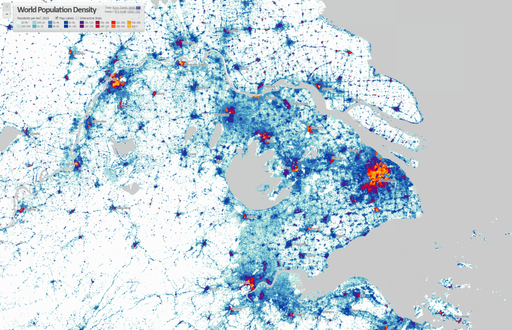
The added level of detail also improves the representation of cities, with more accurate density analysis, and improved techniques to differentiate residential from industrial and commercial urban land uses. Previous releases of the GHSL were underestimating urban densities for cities where census data was weaker, but this appears to no longer be the case. The dataset can now be used for more accurate comparisons of population and density for cities across the globe. Example images for Shanghai and New York City are shown below.
Country Density Profiles – the Diversity of Human Settlement The statistical analysis on the World Population Density Map website has also been updated using the 2023 GHSL data, so you can view the density profiles for all countries around the globe. Some highlights are shown below.
To complement the graph of the population in each density category, this updated version of the World Population Density Map includes Population Weighted Density statistics for each country and city. Population Weighted Density is a measure of the typical density experienced by residents in the country/city, in this case using the 1km2 scale GHSL data. The PWD is calculated by weighting each 1km2 cell according to the population, summing all the cells for the city/region, and then dividing the sum by the total population of the country/city (i.e. the arithmetic mean). This is a more representative measure than standard population density, which is affected by low density suburban/peri-urban and rural land, even where the population in these areas is relatively low.
China and India have very high density cities, but their large rural populations translate into moderate Population Weighted Density statistics overall. India is 9.9k pp/km2 and China is 8.9k pp/km2. The table below shows the top 20 countries by Population Weighted Density using the 2020 data-
Rank (by PWD 2020)
Country Name
Population Weighted Density 2020 (pp/km2)
1
Singapore
30.9k
2
Republic of Congo
25.2k
3
Somalia
24.1k
4
Egypt
21.8k
5
Comoros
17.4k
6
Djibouti
17.2k
7
Iran
16.8k
8
Yemen
16.7k
9
Jordan
15.8k
10
North Korea
14.8k
11
Democratic Republic of the Congo
14.2k
12
Bahrain
13.9k
13
Colombia
13.5k
14
Equatorial Guinea
13.5k
15
Turkey
13.5k
16
Morocco
13.4k
17
Bangladesh
13.3k
18
Taiwan
12.9k
19
South Korea
12.7k
20
Western Sahara
12.6k
For comparison, the equivalent Population Weighted Density figure for the UK is 4.1k, France is 3.7k and Germany is considerably lower at 2.7k. The USA is renowned for its low density living and suburban sprawl, and the Population Weighted Density measure for 2020 is 2.2k. This is the lowest figure for any large developed country in the world. Smaller developed countries have similar figures to the USA, including New Zealand, Norway and the Republic of Ireland.
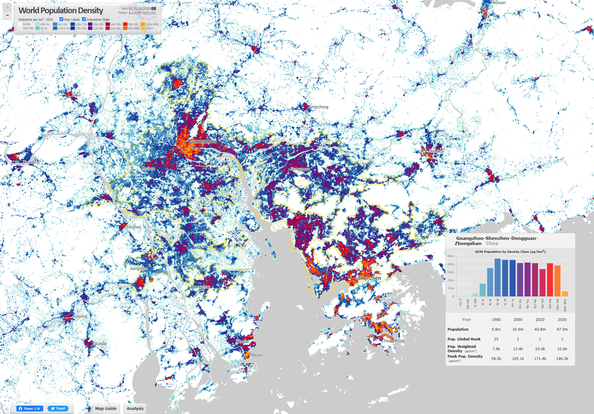
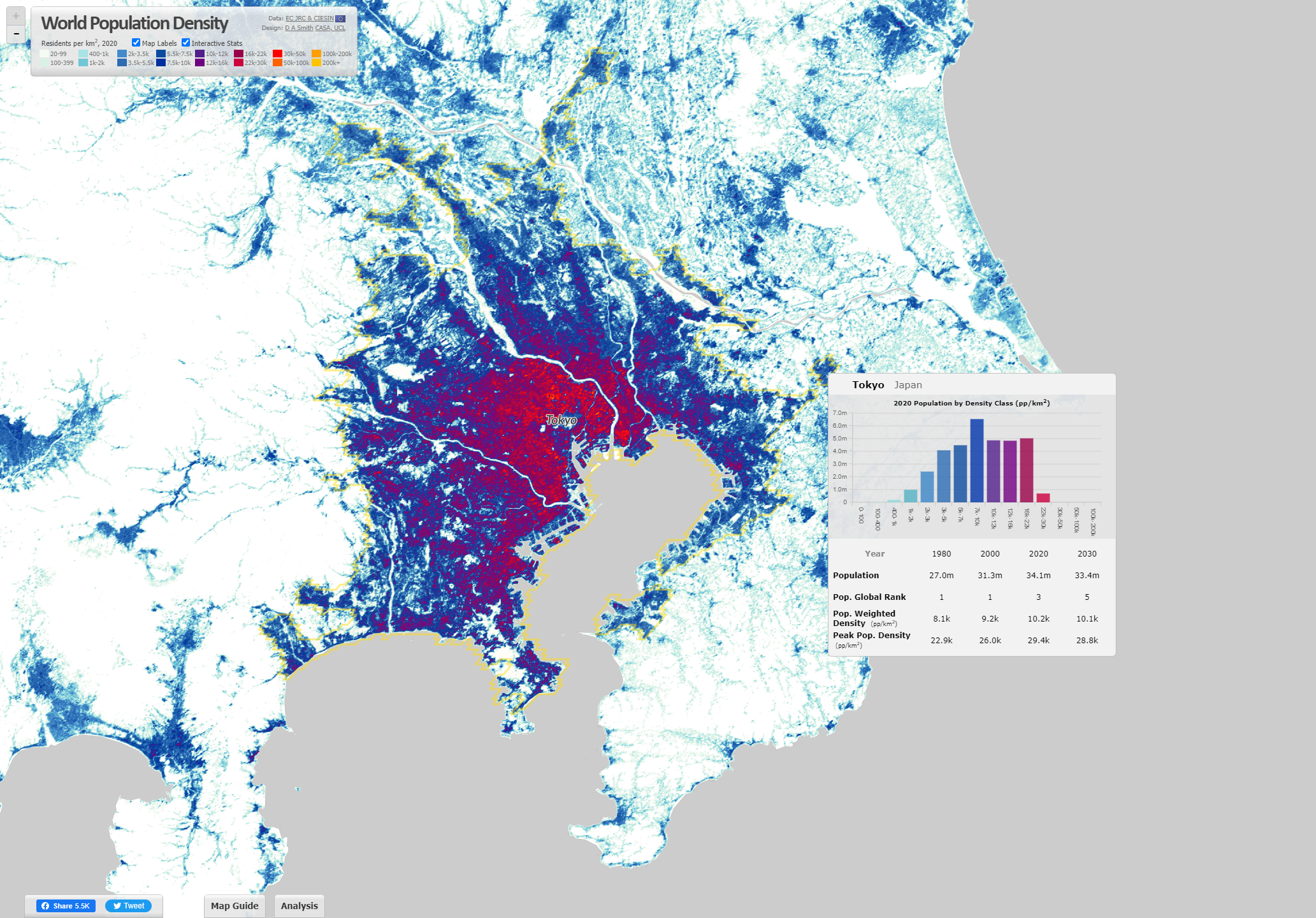
Analysing the World’s Largest City-Regions Using the GHSL The Built-Up Area and Population layers in the GHSL are used to define a settlement model (GHSL-SMOD) layer, which classifies land into urban and rural typologies. We can use this layer to define the boundaries of city-regions across the globe. This has been done using continuous areas of the highest urban category (urban centres) for the 2020 data. When you hover over cities on the World Population Density website, these city boundaries are highlighted-
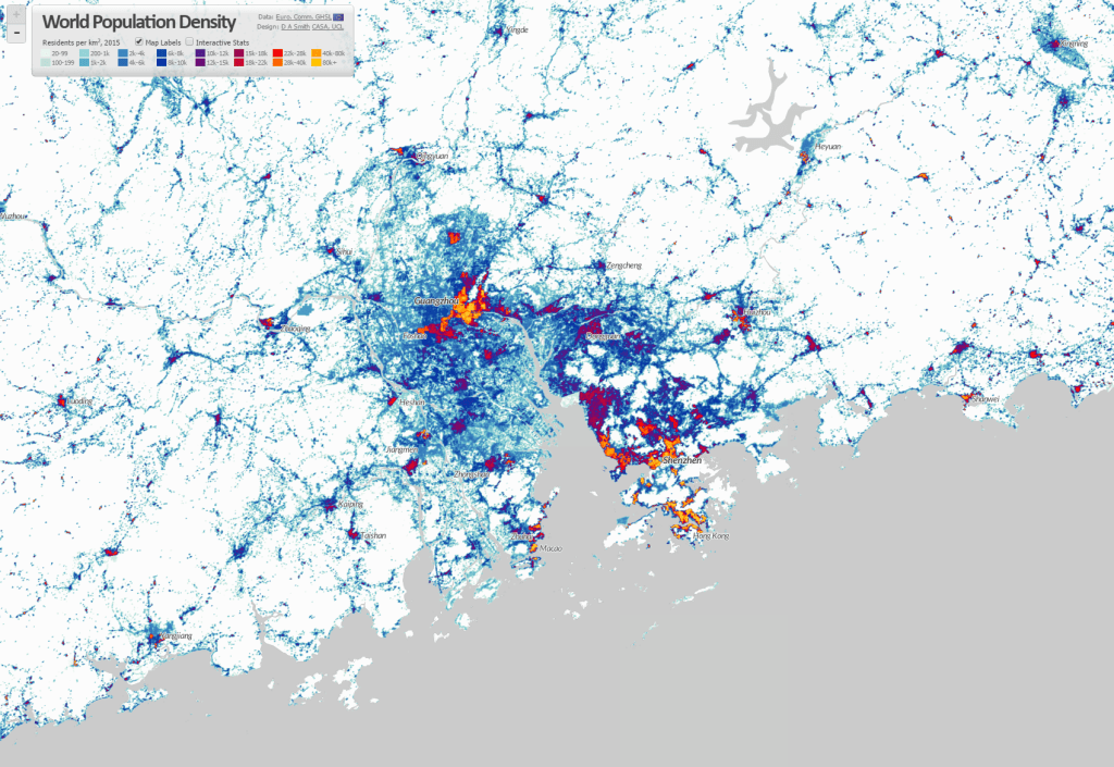
This land use based method of defining city-regions produces different estimates of city populations to analyses based on administrative boundaries. The GHSL method generally emphasises large continuous urban regions, such as the megacity region of the ‘Greater Bay Area’ in China shown above, which has formed from the fusion of Guangzhou, Shenzhen, Dongguan and Jiangmen. This is the largest city-region in the world by this measure, with a population of 43.8m in 2020 (rapidly developing from a base of 5.8m in 1980). The top twenty city-regions in the world are shown below-
Rank (by Pop. 2020)
City-Region Name
Population 1980
Population 2000
Population 2020
Pop. Weighted Density 2020 (pp/km2)
1
Guangzhou-Shenzhen-Dongguan-Jiangmen
5.8m
30.9m
43.8m
20k
2
Jakarta
16.1m
26.3m
38.7m
13.4k
3
Tokyo
27m
31.3m
34.1m
10.2k
4
Delhi
8.3m
19.1m
30.3m
29k
5
Shanghai
6.7m
15.1m
27.8m
27.9k
6
Dhaka
6.2m
14.8m
26.8m
47.9k
7
Kolkata
16.3m
22.9m
26.7m
36.4k
8
Manila
11.3m
18.3m
24.8m
27.1k
9
Cairo
9.8m
16.6m
24.5m
44.9k
10
Mumbai
11.3m
18.4m
22.9m
52.4k
11
Seoul
13.3m
19.7m
22.7m
19.8k
12
São Paulo
13.7m
17.4m
19.7m
14.5k
13
Beijing
7.2m
11.6m
19m
20.2k
14
Karachi
5.8m
10.9m
18.7m
48.8k
15
Mexico City
13.8m
17.9m
17.8m
13.2k
16
Bangkok
5.4m
9.2m
17.4m
11.6k
17
Osaka
17.2m
16.8m
15.6m
8.1k
18
Moscow
9.9m
11.9m
14.9m
16.7k
19
Los Angeles
10m
13.1m
14.5m
4.6k
20
Istanbul
6.1m
10.4m
14.3m
25.2k
One of the most impressive aspects of the GHSL is that it is a timeseries dataset going back to 1975. Therefore we can create historical indicators such as the population change data shown in the table above. Many cities have more than doubled, or even tripled in population size since 1980, including Delhi, Shanghai, Dhaka and Karachi. Rates of growth in the USA, Japan and Europe are inevitably much lower, as seen in Tokyo and Los Angeles in the table above. Tokyo is often measured as the world’s largest city (for example in the UN World Urbanization Prospects), though with the GHSL method Tokyo the third largest at 34.1m in 2020. Tokyo is also distinctive in terms of its Population Weighted Density at 10.2k pp/km2. While this figure is more than double the density of Los Angeles, Tokyo’s medium density is much lower than cities in China and South Asia. Incredibly, Mumbai’s density figure is five times higher than Tokyo at 52.4k pp/km2, and Karachi is not far behind at 48.8k.
The Office for National Statistics have started to publish the more detailed tables from the new 2021 census. Of particular interest for my research are the variables related to gentrification. In this post I look at the occupational class data (Standard Occupational Class) to identify areas of London and Manchester with the biggest social changes.
The Changing Geography of London Given that gentrification has been transforming Inner London for over half a century, some researchers had speculated these processes will start to slow with fewer and fewer working class districts left in Inner London that have not already been transformed. The 2021 census data shows however that gentrification has continued at pace between 2011-2021, with substantial changes in the geography of occupational classes, particularly in East and South-East London.
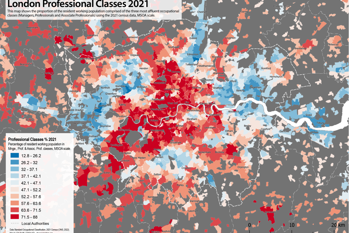
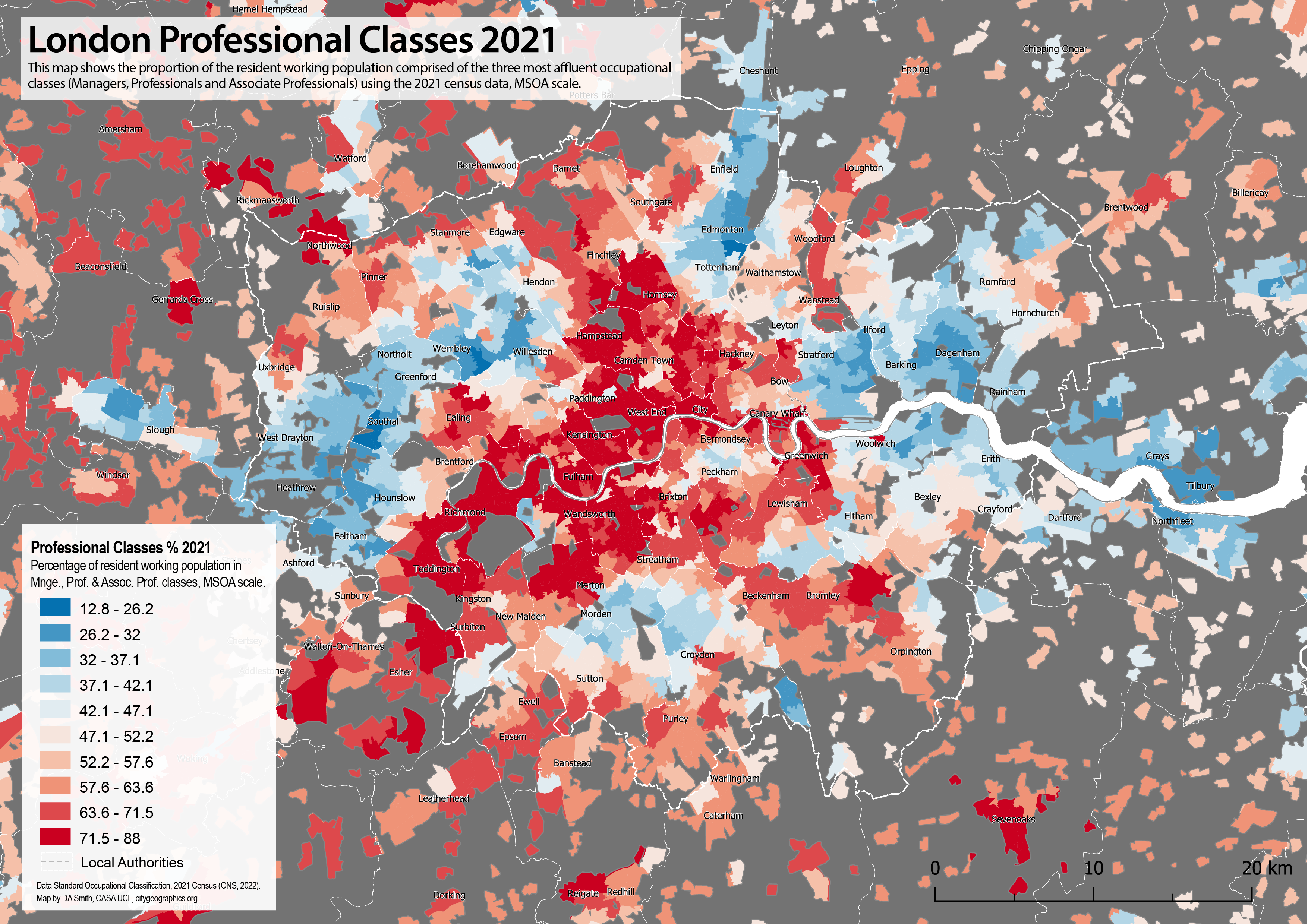
The map below shows the proportion of residents in the three most affluent occupational classes: Managers, Professionals and Associate Professionals in 2021. This is a useful overall indicator of gentrification (though note there are differences between these classes, and deprived populations can also be present in gentrifying areas). The map shows the long established structure of affluent Londoners clustered in Inner and West London, with radial corridors extending South West and North West through historic wealthy areas such as Richmond and Hampstead. The most dramatic changes with the 2021 data are in East London, and South East London, in areas such as Stratford, Walthamstow, Deptford and Greenwich, fitting with widely discussed social trends of these areas in the last ten years. The changes in East London are so substantial that we can identify new radial corridors of relative affluence forming in North East and South East London, mirroring the radial sectors in West London and forming a big red ‘X’ shape on the map. The traditional divisions between East and West are eroding over time with gentrification processes and the substantial transport and planning interventions in East London in recent decades. On the other hand, many of these areas in East and South East London still include high levels of deprivation alongside these gentrification processes, leading to a complex picture.
Below the 2011 and 2021 data are shown side by side with a slider. Gentrification is almost always a spatially clustered process, with newly gentrifying neighbourhoods forming next to existing affluent areas. You can see this very clearly in the maps below as the red areas follow a pattern of organic growth as they expand and strengthen from historic clusters-
We can also map change directly, as shown below. This highlights just how concentrated gentrification is in East and South East London. Some major development sites are picked out, such as the Olympic Park at Stratford, and the developments at North Greenwich. New build gentrification is clearly playing a significant role. But many of the changes are spread across districts such as Walthamstow, Leyton, Bow, Peckham and Deptford, and these changes will be through turnover in the historic housing stock alongside new build housing.
An important difference in 2021 compared the 1990s and early 2000s appears to be more social change in Outer London, at the urban fringe and extending into the more rural Home Counties. This is particularly noticeable in South East London (Bromley, Orpington, Bexley), as well as other parts of Outer London (Barnet, Ruislip, Romford, Coulsdon). This will likely be linked to the extreme unaffordability of Inner London, but the 2021 census may also be picking up some of the demand for larger houses with gardens in 2020 and early 2021 following the pandemic.
On the topic of whether gentrification processes are displacing lower income populations in London, it is not possible to answer with this data. A useful overall perspective comes from looking at the profile of all occupational classes for Greater London in 2011 and 2021. We can clearly observe in the graph below a very large increase in the Professional class, and a big increase in the Management class (Associate Professional is static- this is on average the youngest class, and is probably a sign that this group has been more affected by the price/rent increases). The remaining classes do not however show a decline, they are largely static (except for Administrative, on average the oldest class). This implies that the overall process of increased professionalisation in the last decade has been more about new populations moving to London rather than lower income classes being further displaced, but this conclusion is speculative and migration data would be needed to investigate this. Note also that the professionalisation pattern is clearly visible in the occupational class profile of England and Wales, showing that the growth in knowledge jobs is affecting the entire economy, not just big cities like London.
The Wider Picture Across England The scale and economic dynamism of London typically makes the capital an outlier compared to other UK cities in terms of processes of urban change. However, devolved governments in city regions such as Greater Manchester and the West Midlands have brought substantial new investment and developments in their cities over the last decade, and we would anticipate some similar processes of social change to be happening. If we look at percentage point change in professional classes for England and Wales (the same measure as the change map above, but this time at local authority scale), we can see the top ranked local authorities are mainly in East and South East London. A crucial difference however is the prominence of Greater Manchester boroughs, including Trafford and Salford. This indicates that major social change is occurring in Manchester. Additionally the West Midlands is also picked up within the top 25 local authorities. Note the national average change in Professional classes is +5.4 percentage points between 2011-2021, so the change towards professional and service jobs is occurring across the economy as a whole.
Local Authorities Ranked by Percentage Point Change in Profess. Classes 2011-2021-
Rank
Local Authority
Region
Prof. % 2011
Prof. % 2021
Percentage Point Change 11-21
1
Waltham Forest
London (East)
39.2
50.5
11.3
2
Trafford
Grt. Manchester
48.1
58.4
10.3
3
Newham
London (East)
32.0
41.5
9.5
4
Salford
Grt. Manchester
36.1
45.5
9.4
5
Dartford
London (OMA)
37.3
46.6
9.3
6
Bromley
London (SE)
50.6
59.8
9.1
7
Bexley
London (SE)
36.7
45.8
9.1
8
Greenwich
London (SE)
44.2
53.1
8.9
9
Lewisham
London (SE)
48.8
57.4
8.5
10
S. Cambridgeshire
East of England
52.3
60.8
8.5
11
Stockport
Grt. Manchester
44.3
52.6
8.4
12
Havering
London (East)
36.9
45.3
8.3
13
Warwick
West Midlands
51.9
60.1
8.2
14
North Tyneside
Tyne & Wear
38.3
46.3
8.0
15
Southwark
London (Inner)
53.8
61.8
8.0
16
Broxbourne
London (OMA)
35.2
43.2
8.0
17
Epsom and Ewell
London (OMA)
51.4
59.2
7.9
18
Sutton
London (SW)
43.9
51.7
7.8
19
Hackney
London (Inner)
56.5
64.2
7.8
20
Mid Sussex
South East
48.0
55.7
7.7
21
Tonbrg. & Malling
South East
44.1
51.7
7.7
22
Exeter
South West
39.2
46.8
7.6
23
Bromsgrove
West Midlands
48.2
55.7
7.5
24
Solihull
West Midlands
45.4
52.9
7.4
25
N. Hertfordshire
London (OMA)
49.6
57.0
7.4
26
Sevenoaks
London (OMA)
48.1
55.4
7.3
27
Epping Forest
London (OMA)
45.8
53.1
7.3
28
Bristol, City of
West of England
44.9
52.1
7.2
29
Ribble Valley
North West
45.2
52.4
7.2
30
Cambridge
East of England
57.9
65.1
7.2
Occupational Class Change in Greater Manchester It is clear from the table above that alongside London, there are considerable changes in the occupational class geography of Greater Manchester ongoing. The borough of Trafford ranks second in the above table, while Salford is at four and Stockport at eleven. Repeating the mapping exercise below, we can see that occupational class changes are widespread across Greater Manchester, particularly to the west and south of the city centre. In economic terms this is a positive sign that Manchester’s knowledge economy is growing and attracting skilled workers, an important trend given generally low productivity for many UK cities beyond London. On the flip side however, Manchester residents will be less impressed if house prices and levels of inequality start to resemble the extreme situation in the capital.
We can repeat the change map again for Greater Manchester. Some big development sites appear to be picked up in Salford, Ancoats and Sale (the prominent development site of Salford Quays appears to have already gentrified before the 2011 census). But the growth in more affluent occupational classes is not confined to these development sites, it is occurring across most of Greater Manchester and, similar to London, includes many suburban areas. It is only really in Bolton, Rochdale and Oldham where there are few signs of change identifiable.
Summary The occupational class data from the 2021 census shows that evolution towards knowledge economy and service jobs continues at pace, with Professional and Management classes showing by far the highest growth levels across England and Wales. London has continued to experience significant gentrification levels, with the spatial focus in the last decade concentrated in East and South East London. London centres such as Walthamstow, Stratford, Deptford and Lewisham have changed dramatically, so much so that we can see two new radial corridors of more affluent populations forming in North East and South East London, mirroring the long established structure of West London.
Gentrification is by no means confined to London, and indeed Greater Manchester has several of fastest gentrifying local authorities in England and Wales, particularly the boroughs of Salford and Trafford. This is largely reinforcing the structure of wealthier populations being concentrated to the south and west of Greater Manchester, and in the city centre.
This analysis has looked only at the new occupational class data, which does provide some interesting insights. To look into these issues more deeply however we would need to add analysis on housing markets, tenure, deprivation, age and migration data.
The pandemic and subsequent lockdowns have seen the largest and most sustained disruptions to travel behaviour in most of our lifetimes. Stay-at-home policies have fuelled a dramatic increase in remote working, and wider online substitution of other activities such as shopping and socialising. In sustainability terms, the pandemic has severely hit public transport and incentivised car travel, but has also likely reduced travel distances overall as well as encouraging new patterns in active travel. The big question is to what extent pandemic related changes are turning into longer term shifts in travel behaviour patterns.
This post looks at timeseries travel data across the last three years, and then summarises results from the recently published National Travel Survey data 2021 for England, with a particular focus on trip purpose and differences between London and England as a whole.
Transport Use Timeseries Data from DfT The Department for Transport have continually updated a very useful timeseries on how busy different transport modes have been in England throughout the pandemic. This index integrates many different datasets and is intended as a broad summary of trends (see methodology here). The graph below summarises this data, which is indexed to February 2020. The overall picture is of huge disruption in 2020, continued disruption with a transition towards recovery in 2021, and then what looks like settling into a new normal in 2022.
The chart paints a mixed picture in sustainability terms. Car travel has been the fastest transport mode to recover after each of the national lockdowns, and was back to near normal levels as early as summer 2021. While this is a challenge going forward, it could potentially have been worse. The pandemic could have resulted in substantial increases in car travel. Instead, there is a minor reduction to about 96% car use in the DfT data, sustained into 2022 (in per-capita terms this reduction will be more substantial given population increases). Note the motorised vehicle index that includes freight reaches 100% of pre-pandemic levels in 2022, possibly due to more online delivery traffic.
Public transport has been much slower to recover, falling to less than 50% of passenger numbers in 2020, increasing substantially throughout 2021 and then settling around 70-85% of pre-pandemic passenger numbers in 2022. Rail and tube travel were hardest hit in 2020 due to the widespread fall in commuting and these modes have taken longer to recover than bus travel. It is difficult to gauge whether public transport levels have now levelled off around the 75% level, or will continue to recover further in 2023 (the rail and tube strikes in summer 2022 may have curtailed further increases).
A positive sustainability story comes from the cycling data from the DfT. This is a less reliable metric, but nonetheless indicates growth in active travel, albeit from a low base in 2019. The annual variation in cycling in the DfT data between 2020 and 2022 is interesting. The initial 2020 increase in cycling makes sense, as there was a big growth in active travel for households locked down in their local area. This falls to 2019 levels in 2021, and then rebounds in 2022. Perhaps the fall off in new cyclists has given way to more practical longer term adoption of cycling in 2022.
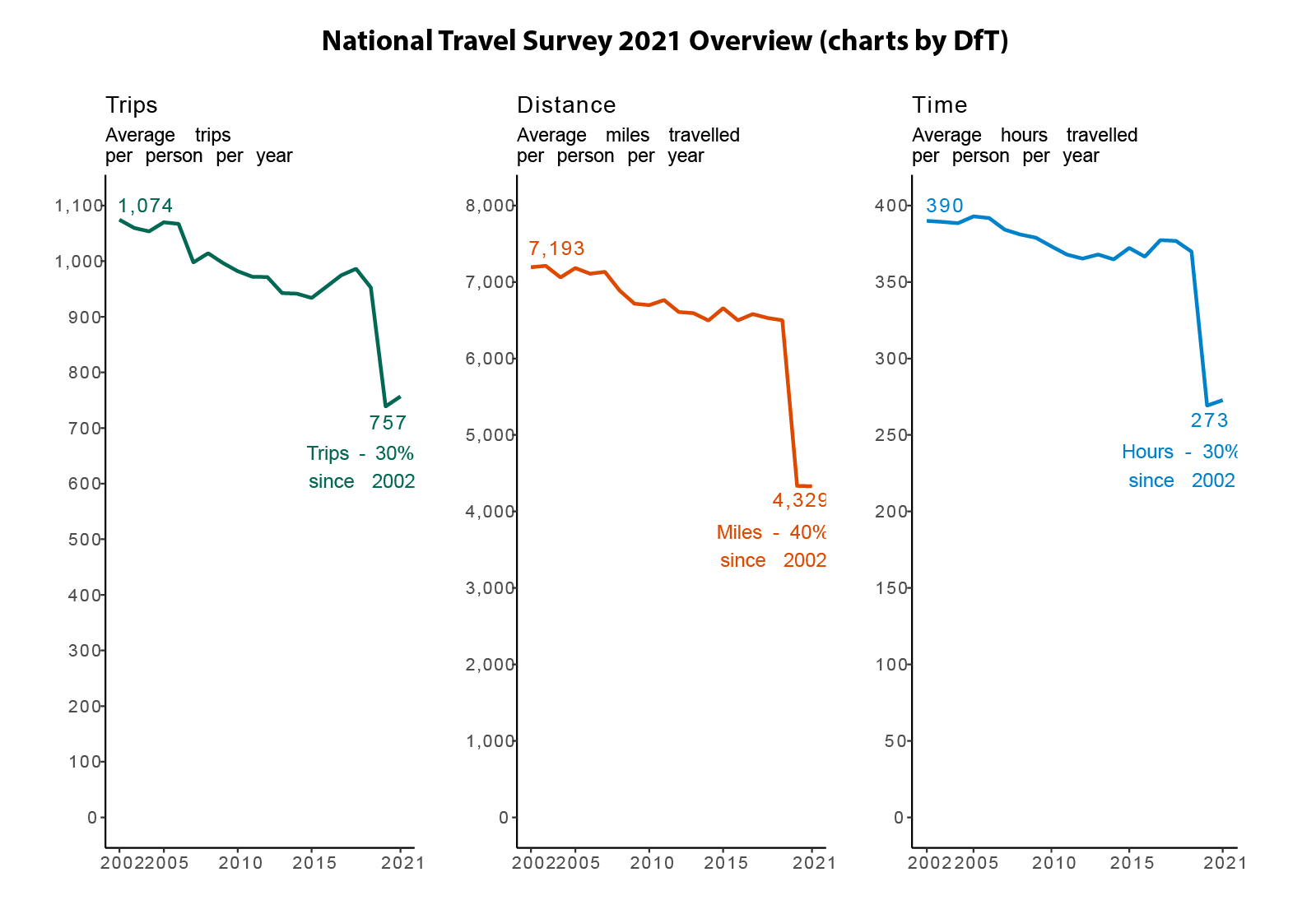
National Travel Survey Data 2021 The results for the National Travel Survey 2021 data were released at the end of August 2022. This long running survey records full travel diaries of thousands of residents in England, allowing analysis of topics such as trip purposes, walking trips and demographic analysis. There have been some data gathering challenges during the pandemic (see data quality report). The overall picture from the DfT chart below is that the 2021 NTS data is very similar to the 2020 data in terms of per person trips and annual distance recorded. This suggests that the NTS 2021 is not picking up much of the 2021 travel recovery that is shown in the DfT timeseries data we discussed above.
We can break down the annual trip distance per person by transport mode. The chart below compares the years 2019, 2020 and 2021. The results backs up the conclusion that, at the national level, the 2021 data is very similar to 2020. There is big reduction in car miles of 30%, while public transport levels are at around half the levels of 2019. There is a small increase in walking and cycling distances, though this falls back to 2019 levels in 2021.
Interestingly, the equivalent chart for London shows a very different picture in terms of travel behaviour responses. Car use increased marginally in 2020 (probably substituting for public transport trips) then falls in 2021, though this reduction is lower than the national picture. Bear in mind London mileages are around a third of the national average, so there may be fewer optional trips to cut. Meanwhile, public transport records a significant recovery in 2021 for rail and underground, much closer to the DfT time series analysis shown above (note the bus recovery is lower than expected). Walking and cycling follows the national picture by increasing in 2020 and then falling in 2021, though note that the 2021 cycling level is substantially up on the 2019 figure.
Overall the broad 2021 National Travel Survey results are fairly close to the 2020 results at the national level. In comparison to the DfT Transport use timeseries, it appears to be closer to the 2020 picture rather than the 2022 trend of a substantial recovery in transportation use. So we may have to wait for the National Travel Survey 2022 to confirm which changes are really sticking in terms of longer term behaviour. The London data is interesting, as it much more clearly shows a recovery in public transport travel in 2021, and a different picture for changes in car mileage, as well as a substantial increase in cycling.
Trip Purpose Analysis An important question is the type of trips most affected by the pandemic, and whether these changes are becoming longer term trends. The charts below show the trips per person per year and total distance per year between 2019 and 2021. As expected commuting is taking the biggest hit in terms of trips and distance, falling by 36% in distance terms and with only small signs of recovery in the 2021 NTS data. Drops in business travel are even larger, more than halving. Interestingly shopping trips have taken nearly as big a hit as commuting, with distances falling 26%. There has been a widespread trend towards online supermarket deliveries and online shopping more generally post-pandemic and it looks like this behaviour has continued into 2021. The 2021 NTS even shows shopping trips and distances falling again in 2021 from the 2020 level. Alongside commuting changes, shopping travel behaviour looks to be the major trip type that has been cut, possibly for the longer term.
Outside of commuting and shopping, other trip types with big reductions include holidays, business, and entertainment. In contrast day trips increased and walking trips nearly doubled (though both fell back marginally in 2021 from the 2020 peak). Visiting friends at their home also continued during the pandemic, with a more minor reduction in trips and distances.
Finally we repeat the distance trip purpose chart for London. Commuting takes an even bigger hit in London, falling by 48% in 2020, then moderately picking up in 2021. Business trips fell by a huge 67% and there is little sign of recovery. In contrast some trip types that declined in 2020 are nearly back at 2019 levels, such as education and education/other escort trips. The trips with the biggest increases in 2020, visiting friends at private homes and day trips, have also returned to their 2019 levels in the 2021 data. Walking trips have however remained considerably above their 2019 level, indicating that the active travel increase is looking more stable for London.
Summary
The DfT timeseries data shows travel patterns settling into a ‘new normal’ after more than two years of disruption. Car travel is only marginally down on pre-pandemic levels, while public transport is around 70-85% of the passenger numbers from 2019. There are some encouraging signs for active travel after increases in leisure walking and cycling trips, though the situation is dynamic.
The National Travel Survey 2021 data records a similar picture overall to 2020 in terms of major disruption- distances and trips down substantially. Car miles are down 30%, though the DfT timeseries data suggests this will not be the case in the 2022 data. Public transport remains around half of 2019 levels.
The trip types with the biggest reductions are commuting and business as expected, but also shopping (and the related travel type of personal business). Shopping trips fell again in 2021, and this looks, like commuting, to be a case of significant online substitution, possibly long term.
The London NTS data is very interesting, with some significant differences. Car use appears to have marginally increased in London in 2020, before falling in 2021 below 2019 levels. Public transport has staged a major comeback in London in the 2021 data, and there is also a sustained increase in cycling. The NTS data is also disaggregated into urban/rural categories and it would be interesting to test whether these trends are London specific or shared with other major English cities.
The Census is the most comprehensive demographic survey in the UK, providing detailed data for government and researchers in many fields, from health and education, to planning and transport. The 2021 Census has a unique context, as the 2021 census day (21st March 2021) occurred when the UK was still in the 3rd national lockdown which began on the 6th of January 2021. The lockdown will likely have various impacts on the census results, particularly on groups who may have changed their residence during lockdown, such as students (many of whom were studying remotely) and employees in the hardest hit sectors, such as retail, arts and hospitality.
The issue is not that the census will be inaccurate per se (indeed the Census has a very thorough survey methodology) but rather that the period in time captured of March 2021 will have aspects unique to the pandemic. These aspects are likely to be temporary as society returns to something more like normality in 2022 and beyond. While Scotland chose to delay its 2021 census for a year (which may prove to be a sensible decision), researchers in England and Wales will need to be make the most of the 2021 results and be made aware of any unusual aspects.
At present only the early population results have been released for the 2021 Census, so more detailed breakdowns of population groups will have to wait for further releases later this year. The following analysis compares the Census 2021 local authority totals to the ONS mid-year population estimates for 2020 to check how the census population results compare to the next most recent population estimate.
The differences between the 2020 data and 2021 Census are likely to reflect several factors-
The higher accuracy of the census methodology. The ONS mid-year estimates can have some errors due to limited data on some groups, such as international migrants, which are better represented in the census. Potentially Brexit could have increased the degree of error in the mid-year estimates, given changes in international migration.
Temporary pandemic changes to places of residence. These could include for example students working remotely from home during term time (including international students not coming to the UK), younger populations returning to live with parents as jobs furloughed/ended/changed to remote working, and wealthier residents choosing to live in second homes.
Longer term pandemic changes to residential preferences. This could reflect changing residential preferences towards larger houses with more space/gardens following a dramatic rise in remote working during the pandemic.
Right now the extent of these different factors is not known, and it is very difficult to separate them without more analysis and data. So the following discussion is speculative in nature.
Comparing the Census 2021 Populations to the 2020 ONS Mid-Year Estimates The map below shows the percentage differences between the 2020 mid-year population estimates, and the 2021 Census. Blue areas show where the census 2021 population is lower than the 2020 estimates, and red areas where the census 2021 population is higher than the 2020 estimates. The differences are substantial. In South East England there is a strong geographical pattern with Inner London populations down dramatically (Camden and Westminster both have 24% lower populations in the census results). London as a whole has a population of 8.8 million in the 2021 census, which is 200k lower than the estimated 2020 total. In contrast, commuter towns and the home counties surrounding London have distinctly higher populations of around 5-10%. This pattern very much looks like a pandemic geography of Inner London residents leaving during the lockdown. Analysis by the GLA using PAYE income data confirms this general conclusion, and also points to this population drop being concentrated in young adults (note also the GLA analysis shows this population largely returning to Inner London by 2022). It is possible however that other factors such as post-Brexit emigration and very high rents are also reducing Inner London populations, and could have produced errors in the 2020 mid-year estimate data.
It is not just in the South East where there are differences between the 2020 and 2021 data. The South West and the Midlands are also areas where generally 2021 Census populations are higher than the 2020 data. The higher populations are mainly in more rural authorities, as well as some urban areas including Leicester, Lincoln, Derby, Worcester and Swindon, while Coventry and Nottingham have lower 2021 populations (university related?). There is no simple pattern here, and there are likely some 2020 mid-year population errors here in addition to any pandemic related changes. There also appear to be higher populations in areas within 1-2 hour journey times to London, possibly linked to changing residential preferences following the rise in flexible working.
North-West England has a mixed pattern with higher census populations in Cheshire to the South and in Burnley, but not in central Manchester or Liverpool. In Yorkshire and Humberside, Leeds and Hull have higher populations in the 2021 Census, while Sheffield is lower. The North East and Wales generally have a much closer alignment between the 2020 and 2021 data. The higher than expected populations in many rural and smaller town authorities fits with pandemic related patterns, but the mixed picture for many cities implies that the situation is complex, and may include both pandemic changes and errors in the 2020 data.
London and the South East As mentioned above, the 2021 Census data for London and the South East does look to have been significantly influenced by the pandemic, with much lower than expected populations in Inner London, and higher populations in towns surrounding Greater London, and those with longer distance rail connections, such as Peterborough, Milton Keynes and Reading. We can look in more detail at some of these patterns.
As well as higher populations in commuter towns surrounding London, there are also higher population results recorded in the Outer West London boroughs of Ealing and Hounslow. This is quite an outlier compared to the rest of Greater London, and it is not clear why pandemic or mid-year population error factors would affect these boroughs in particular. In relation to the student population argument, it is interesting that both Oxford and Cambridge have higher than expected 2021 Census populations, likely because Oxbridge colleges insisted on students being on campus in 2021, and likely because the 2020 data has underpredicted wider population increases.
The big question on the geography of the South East is to what extent these pandemic related changes are a temporary lockdown phenomena, or may relate to longer term trends in residential preferences. The analysis by the GLA using PAYE data pointed to the population decreases in Inner London being a short term trend for younger adults, which in turn could have pushed up populations in the wider South East in 2021. However, an argument can also be made that some of the patterns observed fit trends of households looking for more spacious residences, and adapting to flexible working patterns that do not require daily attendance at the office. Areas beyond 1 hour travel to London with more affordable housing become much more attractive in this context (and have seen big house price increases). The map above shows a ring of local authorities surrounding London with higher than expected populations in 2021 that stretches beyond the South East into the Midlands and South West. We will need to wait for more data to see whether this is a trend beyond the immediate residential changes during the pandemic.
Age Profile Comparison, 2011 and 2021 In the comparison above, it is very difficult to separate out errors in the mid-year estimates from genuine population changes. Another approach is to look at the age profiles in 2011 and 2021 for those areas with significant population differences in the 2021 census. Firstly for Inner London boroughs with lower than expected populations, you can see very clearly in the charts for Westminster and Camden that the lower populations are focussed on younger adults, 20-40. This fits with the temporary pandemic residential changes argument. There are however other factors aside from the pandemic, such as increased rents and post-Brexit visa issues, that could also lower the population of younger adults.
For London as a whole, there is a modest drop in the population in their 20s, and increase in nearly all other age groups, with the average age increasing overall. The comparison between the 2020 population data with the 2021 census above did not pick up unexpectedly lower populations in other large English cities apart from London. Looking at other English cities in terms of age profiles, generally there does not appear to be this fall in the proportion of younger adults. Leeds is a fairly typical example shown below. Manchester on the other hand has a pattern a bit more like London, and perhaps this signals more pandemic related changes here, or maybe more similarity to London in terms of international migration.
Turning to those cities with higher than expected population increases in the 2021 census, we can also look at their age profiles. The examples below of Peterborough and Milton Keynes show really big increases in populations in their 30s and to a lesser extent 40s. Many of these households will have kids, and so there are similar jumps in the population of young children (though this does not appear in the age 0-4 group). This pattern looks very much like these towns are attracting families looking for more affordable housing, and the 2020 data has underestimated this trend. It is possible the pandemic has further encouraged this, but it looks overall like a longer term trend. Note that other towns growing rapidly in the South East such as Reading and Bedford has similar age profile charts (as does Ealing in London). The big outlier is Cambridge, where the population increase is geared more towards adults in their 20s.
Summary This analysis has found some significant differences between the new 2021 census data, and mid-year population estimate data from 2020. It is very difficult to know whether this is due to errors in the 2020 data, or alternatively pandemic factors affecting the population in March 2021. Some of the biggest differences are in London, and it does appear that London experienced a drop in the younger adult population during the pandemic, particularly in Inner London. Manchester also has signs of a similar trend. GLA analysis indicates this drop was temporary in London, though there are longer term factors such as high rents which could also be playing a role.
Another big difference between the 2020 and 2021 data is much faster growth in many towns and small cities in the South East. Places like Milton Keynes and Bedford have growth of around 17% between 2011 and 2021. The age profile data shows this is driven mainly by adults in their 30s and 40s, often with children. The population differences look more like errors in the 2020 data here, though it is possible that the pandemic has accelerated families moving to more affordable towns to purchase larger housing.
Overall is not straightforward to separate out errors in the ONS mid-year estimates from pandemic changes, or to separate temporary pandemic changes from any longer term trends that are emerging. When the full data is released it will likely be possible to filter out certain demographics (e.g. students, younger populations) more affected by the pandemic. But it does look like the census 2021 data is going to be less certain than usual, particularly for London, and maybe for other large cities. Given that the census is traditionally used as a basis for investment in public services, more caution will be needed when using the 2021 census results (indeed London Councils have already responded that the 2021 census is underpredicting London’s population).
Table of Local Authorities with Greatest Increases Between 2020 ONS and 2021 Census Populations
Name
2011 Census Population
2020 Mid-year Population
2021 Census Population
Population Change 2011-2020
Population Change 2011-2021
Difference Between 2020 ONS and 2021 Census
Cambridge
123867
125063
145700
1.9
17.6
16.5
Reading
155698
160337
174200
3.2
11.9
8.6
Ealing
338449
340341
367100
0.3
8.5
7.9
Oxford
151906
151584
162100
0.9
6.7
6.9
Harlow
81944
87280
93300
6.2
13.9
6.9
Peterborough
183631
202626
215700
9.8
17.5
6.5
Milton Keynes
248821
270203
287000
8.1
15.3
6.2
Bedford
157479
174687
185300
10.7
17.7
6.1
Hounslow
253957
271767
288200
6.6
13.5
6.0
Cherwell
141868
151846
161000
6.7
13.5
6.0
Burnley
87059
89344
94700
2.7
8.8
6.0
Slough
140205
149577
158500
6.3
13.0
6.0
Watford
90301
96623
102300
6.6
13.3
5.9
Rushmoor
93807
94387
99800
0.0
6.4
5.7
Luton
203201
213528
225300
4.9
10.9
5.5
Crawley
106597
112474
118500
5.1
11.2
5.4
Swindon
209156
222881
233400
6.3
11.6
4.7
West Northampton.
375101
406733
425700
8.2
13.5
4.7
Merton
199693
206453
215200
2.9
7.8
4.2
Basingstoke and Deane
167799
177760
185200
5.5
10.4
4.2
Leicester
329839
354036
368600
7.4
11.8
4.1
Pendle
89452
92145
95800
2.9
7.1
4.0
Table of Local Authorities with Greatest Decreases Between 2020 ONS and 2021 Census Populations
Have you ever wondered how London began? Or how London grew to become such an influential world city for business, politics and culture? You can find out how in Gilded City, a new book recently published (available on Amazon), shortlisted on the Architectural Books of the Year 2023. Gilded City tells the story of London by touring its most fascinating historic districts and buildings, and describing how the emergence of social groups during the medieval and early modern periods – such as the livery companies, religious orders, scholars and writers – helped shape both London and modern society more generally.
Gilded City tells London’s history visually, with extensive colour photography and mapping. Readers can see how the different ages of London have left their mark in the built-environment, and you can follow nine walking tours to explore these sites, including both famous historic landmarks and more secluded historic locations away from the main tourist trail.
Each chapter follows an influential social class in London’s history. Chapter 4 above covers the religious orders and shows St John’s Gate in Clerkenwell.
Given my background in cartography, lots of new maps have been created for this book. Each of the nine tours is mapped in detail with the architectural form of historic buildings illustrated. The maps are intended to show the important buildings that are still standing today, as well as the site of the many historic buildings lost over time in the Great Fire and other destructive events. These help to show the geography of London during different historical periods, and how the character of different parts of London – such as the financial quarter, Inns of Court and Whitehall – were first established.
Each tour is mapped in detail showing the historic buildings and sites of important features no longer present
Each year MSc students at CASA demonstrate their spatial data visualisation skills with a group project. The theme this year was ‘Global to Local’, and the class of 2022 has produced some particularly excellent work, experimenting with a range of visualisation tools and techniques.
Energy and the Cost of Living Returning to the sustainability theme, several groups zoomed in on energy and affordability challenges that the world is currently experiencing. One group used some advanced D3 charting to tell the story of the UK’s varying energy imports and wider global affordability challenges (see image below). A different take was to chart the energy generation mix in major economies around the world. Another topical affordability challenge relates to housing in major cities, and one group mapped relative affordability of housing in major cities across the globe.
Global Digital Divides Finally, another interesting take was to think about online communities as interactions between global and local, including the changing geography of internet access and the division of the world into different online platforms by language and political and economic divides.
Global internet connections and the digital divide by Group 12 (Ruijie Chang, Maidi Xu, Zhiheng Jiang)
Here is the full list of project groups and websites-
The Continuing Gentrification of Inner London
The gentrification of Inner London was first recorded by Ruth Glass back in the 1960s, with middle class residents moving into largely working class neighbourhoods as London’s economy began its long evolution from manufacturing towards service jobs. This process has continued for decades, ultimately transforming most of Inner London. In the 21st century, some researchers have argued that gentrification has stalled (perhaps because there are few neighbourhoods left to gentrify) or has entered a different phase (e.g. processes such as super-gentrification and new-build gentrification as discussed by Davidson and Lees).
This research uses the Standard Occupational Class data as the basis of measuring social class. This classification was found to correspond to differences in income, as well as to a distinct residential geography. In particular, the three most affluent groups (Management, Professional and Associate Professional) cluster together, resulting in the social geography we can see in the map below using the 2011 Census data. There is a clear clustering of professional classes in Inner-West London, with two prominent radial corridors extending northwards through Camden, Islington and Hampstead; and south-westwards through Kensington, Wandsworth and Richmond. Concentrations of non-professional groups are mainly in Outer London to the east, north-east and west, with only smaller pockets remaining in Inner London. This analysis largely matches the description of Inner London now being dominated by professional classes, with lower income groups increasingly in Outer London (with some exceptions remaining in Inner East and South-East London).
Professional Classes (Manag., Prof. & Assoc. Prof.) Residential Percentage 2011. Data: Census 2011 (Office for National Statistics, 2016).
As well as mapping the 2011 geography of occupational class, we looked at more recent changes to see if gentrification is continuing or has slowed, using the ONS Annual Population Survey. Analysing changes between 2006 and 2016, we found had substantial gentrification had continued in Inner London, as shown in the table below. The Management, Professional and Associate Professional groups all grew as a proportion of the Inner London population, while all other occupational classes fell proportionally (green cells are above the average for the metro region, and orange cells are below the average). Interestingly, the biggest growth was in the Management and Professional classes, rather than the younger Associate Professional class, arguably more in line with super-gentrification processes. In contrast, there are proportional increases in several lower income classes in Outer London.
Sub-Regional Occupational Class Percentage Point Change by Residence 2006–2016 (final 2016 sub-regional percentages in brackets)
We can also explore these changes at the more detailed level of local authorities, and show that even more dramatic changes are occurring at the local level. In the chart below, each Local Authority is shown as a trajectory connecting its position in 2006 to its position in 2016 in relation to the percentage of professional classes and the total working population. Generally, Inner Greater London Authority (GLA) boroughs experience high working population growth combined with large increases in the proportion of professional classes. Boroughs with a long history of gentrification, such as Camden and Islington, are higher up in the chart reaching 70% professional classes, while more recent gentrifiers, such as Lewisham and Southwark, are rapidly gentrifying from a lower base. Outer GLA boroughs also show substantial population growth but with lower levels of change in professional classes, and decline in some cases. The exceptions are mainly in South and South-West London, with Croydon, Sutton and Richmond all gentrifying. Outer Metropolitan Area (OMA) local authorities have a mixed picture, with some increases in professional occupational classes with minimal working population growth; while some lower income towns such as Luton and Harlow are not gentrifying.
Local Authority Trajectories for Combined Percentage of Professional Occupational Classes and Total Working Population for 2006 and 2016. Data Source: Annual Population Survey 2005–2017.
What Impacts Does Inner London Gentrification have on Accessibility to Jobs?
We would expect that the dominance of more affluent classes in Inner London translates into accessibility advantages for these classes, as Inner London has substantially better accessibility opportunities by public transport, walking and cycling. We were particularly interested in accessibility by more affordable travel modes in this research. Bus travel is in general considerably cheaper than other public transport options in London. This is reflected in higher rates of more affordable bus and walking trips by lower income classes in the 2011 Census data. We can see in the table below that the three lowest income classes (6, 7 & 9) have around three times higher rates of bus travel and two times higher rates of walking than the most affluent three classes (1, 2 & 3)-
We used network analysis to analyse accessibility differences (see working paper on accessibility model). The analysis was carried out using the 2011 census data. The box plot below shows the cumulative accessibility to jobs for 60 minutes travel by Car, Public Transport (all modes) and Bus Only for the occupational classes. We can see differences between classes, particularly for public transport and bus trips, though there is also much variation within each class.
GLA 60mins Cumulative Accessibility to Employment by SOC Groups: Absolute Results
The accessibility differences between occupational classes can be more clearly seen by plotting differences between how the average accessibility for each group varies from the average accessibility for the entire working population, as shown below. Note in this chart the accessibility differences are normalised by travel mode, so the differences between travel modes in the chart above are normalised in the chart below. We can see clear consistent accessibility advantages for the top three occupational classes, particularly for more affordable slower modes- walking and cycling. The remaining occupational classes have below average accessibility to jobs, particularly for the more car oriented Skilled Trades and Process groups.
Greater London Authority 60mins Cumulative Accessibility to Employment by SOC Groups: Relative Differences in Occupational Class Mode Means and Mode Means for Total Population
The results for bus and walking modes is a particular accessibility challenge. Accessibility by these more affordable modes is generally low in absolute terms outside of Inner London. For the bus mode, less than half the number of jobs are reachable at typical commute times compared to the full public transport network. Given that lower income groups are the most frequent bus and walking commuters, and that these classes are increasingly being priced out of Inner London, these limitations are a significant accessibility challenge going forward.
What Policies Can Planner follow to Mitigate this? In terms of transport policy, this research supports efforts to improve the affordability and connectivity of public transport for lower income populations. This is indeed a priority of the current London Mayor Sadiq Khan, who has committed to freezing public transport fares, and has reformed ticketing to allow multiple bus journeys on a single fare. These measures help offset travel costs for lower income residents in Outer London.
The main policy conclusion is the importance of housing policy in influencing accessibility outcomes in the study area. Low and moderate income groups are being priced out of public transport accessible areas. Without a step-change in the delivery of genuinely affordable housing in accessible locations, the increasing dominance of Inner London by professional classes will continue, resulting in greater accessibility inequalities, and likely increased travel costs for lower income classes.
Note on Covid-19 and Travel Inequalities This research was completed in 2019, before the recent COVID-19 pandemic. The pandemic has in the short term shut down public transport networks, and greatly disadvantaged millions of city residents around the world. Longer term it is possible that the pandemic will reduce the attraction of inner city areas such as Inner London, due to perceived risk of future pandemics as well as the acceleration of telecommuting and home-working trends. The overall effect could be to slow gentrification processes, although this is difficult to predict. The alternative view is that London will recover and adapt as it has done following many crises in the past. East Asian metropolises offer a good model of how to built resilience following their response to the earlier SARS and MERS outbreaks.
The wider economic impacts are clearly also important. Certainly we are in line for a very large recession, hitting important sectors such as tourism and hospitality. More specifically in London, the recession may hit development viability for affordable housing, and is a real headache for public transport operators. Transport for London was in financial trouble before the crisis, and is currently dependent on government bailouts to keep running. This will likely curtail the ability of the Mayor to maintain lower public transport fares, and so impact the kind of transport accessibility inequalities this paper discusses.
Overview
London and the UK as a whole have been severely affected by the Covid-19 pandemic, creating multiple health, social and economic crises. Social distancing requirements have drastically reduced the safe capacity of public transport services. The London Mayor and Transport for London (TfL) have quickly responded with a radical plan for transforming Inner London into a walking and cycling city, with major streetspace reallocation and restrictions on car use. Where should this new active travel infrastructure be prioritised? Will it substantially change travel behaviour for the better? This article looks at plans for new cycling infrastructure in Inner London, and includes recent UCL research by Nicolas Palominos.
The Green Active Travel Response to the Covid-19 Pandemic
The concentration of people, activity and global connections in cities is normally their greatest asset, yet now is the source of acute risk and vulnerability during the coronavirus pandemic. Rail, metro and bus systems enable millions of daily trips to be made efficiently and sustainably, but their crowded nature is incompatible with social distancing. Recent estimates of how many passengers can safely use buses, trains and metro systems in London while enforcing a 2 metre social distancing rule are around 15% of full capacity. This restriction is devastating for transit cities to function, preventing people getting to work, school and basic services; as well as crippling the fares revenue for public transport providers. Although there are plausible scenarios where the 15% limit could be moderately relaxed (such as through mandatory mask-wearing and temperature screening, or an adjustment of the UK social distancing rules to 1.5m/1m) we are effectively looking at months (in the worst case years) with public transport operating at a severely reduced capacity.
With public transport now hampered for the short-to-medium term, there is a real danger that there will be a big increase in car use as lockdown restrictions are eased, undoing much of the recent progress towards sustainable cities and tackling urban problems of congestion, poor air quality, carbon emissions and obesity. The alternative is to dramatically increase walking and cycling through a major reallocation of street space to these active travel modes. Measures for new cycle and pedestrian lanes have recently been proposed by many cities including Milan, Paris, Brussels and Bogota, and are being widely discussed in many more. The aim is to provide safe and healthy travel alternatives to increased car use, and to enable cities to continue to function with public transport restrictions. London Mayor Sadiq Khan has joined these progressive cities by advocating an active travel transformation for London with the Streetspace for London plan.
London’s Fragmented Cycle Routes
Cities that have achieved very high rates of cycling, such as Amsterdam and Copenhagen, have done so with comprehensive networks of segregated cycle lanes, allowing all residents to cycle safely, not just experienced cyclists. London has been struggling to catch up with these cities, and still has a fragmented and incomplete network of cycle lanes. The map below shows Inner London cycle lane data in 2019. The dark blue lines are physically segregated cycle lanes (i.e. a physical barrier between the cycle lane and the road). These are mainly found on CS2 (Cycle Superhighway 2) in East London, CS3 (the only complete East-West route through Central London), and parts of CW6 (Cycleway 6) which is the main north-south link across Blackfriars Bridge that has some sections in Central London that are still under construction.
Outside of these segregated routes there is a scattered patchwork of cycle lanes that are based on road markings without a physical barrier with the carriageway, shown in light blue on the map. There are also bus lanes on many major roads (dark red on the map) which offer some protection for cyclists, but are a long way from the safety of fully segregated lanes. Overall Inner London’s cycle network has many gaps that need filled, particularly in Central, West, North-West, North-East and South-East London. This infrastructure gap sits in sharp contrast to the aim of drastically increasing cycling during the post-lockdown period. The lack of segregated routes increases the risk of cycle collisions with cars, and will discourage public transport users from making the switch to cycling.
The Proposals from the Mayor and TfL
In the Streetspace for London plan, the Mayor has proposed developing a network of new walking and cycling routes to allow Londoners to walk and cycle while social distancing, and to redirect public transport trips to active travel rather than driving. Cycling will be critical for public transport substitution, as most tube and bus journeys are 4-10km, considerably longer than typical walking distances (discussed more below). Given the fragmented nature of current cycle routes, major changes and interventions are required to achieve these aims.
The highly ambitious nature of the proposals were made clear last week with a major plan for new Car Free routes to be introduced in the City of London (below). This plan would transform many of London’s busiest roads into bus, cycling and walking corridors, radically improving cycle access across Central London, particularly to major rail stations. It includes:
Completing Cycleway 6 with a car free Farringdon Road leading to Kings Cross Station;
A car free Waterloo Bridge, leading to a whole new car free north-south route via Kingsway and Southampton Row to Euston Station;
A car free London Bridge, leading to two segregated routes, the first via Bank to Moorgate, and and the second via Bisohopsgate to Liverpool Street station;
Upgraded east-west routes, with a car free Theobalds Road to Old Street; and improved cycle provision on High Holborn and Cheapside (could this be extended west to Oxford Street, and east to meet Cycleway 2 at Aldgate?);
These proposals show a comprehensive commitment to the active travel plan, and include major restrictions on driving to make this happen. In addition to the Car Free routes, the Congestion Charge and low emission zones have been reinstated, and the cost of the Congestion Charge will rise to £15, and hours of operation extended to 7am-10pm 7 days a week.
The Central London plan also shows that the City of London (the borough authority that controls London’s financial district) share the Mayor’s vision, as this proposal can only happen with their close cooperation. Indeed the City of London had already developed a longer term plan for removing cars from most of the City, and this proposal fits closely with their vision.
While Central London is vital for the Mayor’s active travel plans, the vast majority of journeys begin outside the City. Clearly a much wider vision for all of London is needed. TfL have stated they will create 30km of new permanent cycle lanes this summer. They have released a London-wide map of proposed new ‘Streetspace Routes’ on their website (below). While this map is very much in development (it does not yet have the City of London routes above added), there are several very significant proposals, including-
Segregated cycle lanes on Euston Road- a vital busy highway connecting major rail stations (Paddington, Euston, Kings Cross), as well as linking to the north-south routes in the above Central London map. The Euston Road proposal extends all the way west to Acton;
adding a further set of new routes in West London, including Cycleway 9 from Hounslow to Brentford and Kensington Olympia;
speeding up the completion of CW4 from London Bridge to Greenwich and Woolwich in South East London;
improving CS7 to Brixton and Clapham in South West London;
completing a North-West link from Regents Park to Golders Green;
adding a new link from Hackney to Canary Wharf;
Predicting Where Cycling Demand is Likely to be Highest While there are lots of excellent proposals in the TfL map above, it does not yet form a complete network (it also does not differentiate between the quality of existing cycle routes which are highly variable). We can use network analysis to consider where cycling demand is likely to be highest, and where new infrastructure should be prioritised. The analysis below by Nicolas Palominos at CASA is based on shortest paths between underground and rail stations, and is indicative of where active travel trips are most likely to be made if passengers are prevented from taking the tube/bus/train (see full working paper here). The map highlights the core network of Inner London’s most prominent links, including its oldest Roman Roads- Edgware Road, Kingsway, Oxford Street. Promisingly, there is considerable overlap between these critical shortest path routes and the cycle network proposals by TfL. We can see the importance of the new north-south Waterloo Bridge-Southampton Row link for example; Euston Road’s importance is clearly shown; as is Theobald’s Road to Old Street. TfL have completed similar analysis in their Strategic Cycling Analysis from 2017, and we can assume this is guiding their plans.
There are however some important links missing highlighted through the network analysis. The most significant missing link is London’s most important east-west route that runs along Hyde Park through Oxford Street all the way to Cheapside and the City (following the route of the Central Line). The City of London proposals cover the eastern section of this vital route, from High Holborn to Bank. There needs to be similar cycling upgrades for the western section: Oxford Street, Bayswater Road and Holland Park Avenue. This intervention requires the Mayor to cooperate closely with the City of Westminster authority. Politically this is difficult, as Westminster has been blocking high profile proposals from the mayor in recent years, most notably the pedestrianisation of Oxford Street. Coming to some agreement will be essential for the western expansion of the cycle network to be joined together effectively.
Other key routes that are not yet part of the proposals include Edgware Road; Peckham Road; Essex Road; Old Kent Road; City Road; Commercial Street; Kingsland Road; and Seven Sisters Road amongst others. These are discussed further in the working paper. Edgware Road is currently the main north-south driving route that avoids the Congestion Charge, and giving space to cycling would be difficult to implement here (although Park Lane is included in TfL’s plans, and indeed the Park Lane cycle lane is already installed on the western carriageway adjacent to Hyde park). The Swiss Cottage to Golders Green link looks like the proposed north-west alternative to Edgware Road, and would benefit from completion through Regents Park to the Euston Road link. The network analysis strongly agrees with the Euston Road cycle provision, though in this analysis this critical link continues further to Pentonville Road, City Road and Commercial Street encircling the City.
Overall, the TfL Streetspace proposals look very promising, and need to be further linked together and expanded as discussions with more boroughs continue. This will also need much more emphasis on Outer London centres and local shopping and school routes, important topics which are not covered in this article.
Estimating the Number of Cycling and Walking Trips Post-Lockdown What might the the number of trips by different travel modes in London look like in the coming months? This is highly uncertain. Some modelling figures from Transport for London quoted in press releases are anticipating radical changes in behaviour, up to a ten times increase in cycling trips, and up to a five times increase in walking trips. Are these figures realistic?
The chart below shows the distribution of trips pre-lockdown (from TfL Travel in London Report 12), and a series of post-lockdown guesstimate scenarios to discuss where we might be heading. Normally in London we are looking at around 27 million trips per day, with 9.5m by transit, 10m by car, 7m by walking and 0.7m by cycling. The lock-down figures in the chart below are based on TfL’s statement that underground passengers have been at 5% of normal levels, and car traffic has been radically reduced (though is picking up more recently). We don’t know overall walking and cycling levels during lock-down, but given workplaces, schools and most shops are closed, they have likely fallen.
What happens next is massively uncertain. During the lockdown, everyone except for key workers have been staying at home. This will change as the lockdown lifts, depending on the percentage of people who continue to stay at home. There are various reasons for continuing to stay at home: working from home; looking after children at home (particularly if schools remain closed or are only partially opened); and people who are furloughed or become unemployed. Two scenarios are shown above, with 50% of people continuing to stay at home and 20% of people continuing to stay at home. The 50% figure is likely to be closer to reality for at the least the next few months, with infection rates still significant and most schools and workplaces still closed.
Using the 15% social distancing capacity limit estimated by TfL, we can see that 8 million daily public transport trips (or 4 million return trips) can no longer be made. The question then is what happens to these trips. The Active Travel scenarios shown above are based on a big increase in cycling and walking trips remaining constant or increasing. The Car Travel scenarios in contrast estimate what will happen if these trips do not switch to active travel, and significantly more driving occurs. This results in more car trips than pre-lockdown and consequent problems of increased congestion and air pollution.
How realistic is it to assume that public transport trips could switch to active travel modes? One basic way to consider this is using average trip distances by travel mode, as shown below. It is clear that National Rail trips are often long distance, and substitution with active travel is likely going to be unrealistic for most of these trips. This seems to be the assumption in the TfL plans, as the Car Free Streespace corridors prioritise linking up the biggest mainline railway stations. The idea is that mainline rail trips will change the next leg of their journey to cycling and walking, rather than tube or bus. There will likely be significantly more demand for cycle parking/hire facilities at stations and for taking bikes on trains.
The most popular public transport mode in London is the bus, and bus trip lengths are very close to average cycling trip lengths, so prospects for active travel substitution are much better for these trips. Average Underground distances of just under 10km are potentially workable as cycling trips of around 30-40 minutes (or quicker with electric modes), so some substitution is possible for these trips. The network analysis in the working paper found average trip lengths for shortest path between stations in Inner London to be just over 10km. The extent to which public transport trips can be substituted with walking trips is highly questionable for distances above 5km, as this will take most pedestrians an hour or more. The average walking trip in London is less than 1km. This likely makes cycling the key active travel mode for most public transport substitution, as well as there being significant opportunities for expanding recent micromobility options such as e-bikes and e-scooters.
Summary The Mayor and Transport for London have proposed a radical Streetspace for London plan to redirect trips to walking and cycling as we move out of lockdown, and try to avoid a huge increase in car trips due to social-distancing capacity limits placed on public transport services. The Mayor and his team are essentially using this crisis to rapidly speed up active travel plans for London that were on the drawing board for the next decade. These plans are not empty words, they are backed up with a comprehensive transformation of many Central London routes to car free routes, as well as further restrictions on car use through the Congestion Charge. These measures are already being implemented.
At present, the proposed cycle network has lots of excellent proposals, yet remains incomplete, missing key links such as Oxford Street, as well as lacking proposals for linking Outer London centres. The proposals require support from London’s borough councils to be developed, and so far have support from key boroughs such as the City of London (with other pro-cycling boroughs such as Hackney and Camden also likely to be supportive). Hopefully more agreements will be reached with boroughs such as Wesminster, otherwise the new streetspace links will miss key parts of Inner London.
Earlier this year I worked on some charts and maps for a Greenpeace report authored by sustainable transport academic Robin Hickman, exploring the impacts of automobile dependence and the prospects for a post-car world. The report is online here.
The much debated phenomenon of ‘peak-car’ can be observed in many countries in the global north, in terms of a levelling off of private car use and increases in public transport, as shown in the graphs below. Many theories have been put forward to explain this trend, from the growth and densification of cities, to economic crises, fuel tax changes, to declining car use by younger demographics, and behavioural changes related to the internet. Given the many negative impacts of automobile dependence, from substantial GHG emissions, to air pollution, millions of road deaths annually, and contributions to the global obesity epidemic, clearly this behavioural trend is a great opportunity to develop more sustainable city forms much more widely across the globe.
This process is also observable at the level of individual cities, using data compiled by Newman and Kenworthy. Unfortunately this data is only available up to the year 2000.
The picture is of course different for newly industrialised countries, many of which are experiencing substantial growth in car ownership. I mapped data on vehicle sales, highlighting rapid growth in China and in Asia more generally, compared to static and declining markets in Europe and North America-
Thus the global sustainability challenge is to accelerate peak-car trends in the global north, and to try to curb the mistakes of automobile dependence being repeated in the developing world. Note that while the chart above suggests that the global south is increasingly responsible for GHG emissions, the picture from per-capita emissions is quite different as shown below, with the highest per-capita emissions in North America, the Middle East and Australia-
Geographers have long grappled with the complex and ever changing configurations of global urbanism. Many terms have been coined to describe new 20th and 21st century urban forms: conurbations (Geddes, 1915), multi-nuclei cities (Harris & Ultman, 1945), megalopolis (Gottman, 1961), world cities (Hall, 1966), desakota (McGee, 1991), fractal cities (Batty & Longley, 1994), network cities (Batten, 1995), postmetropolis (Soja, 2000), splintering urbanism (Graham & Marvin, 2001), polycentric mega-city regions (Hall & Pain, 2006)…
These concepts are diverse, coming from different perspectives with different methods and archetypal case studies. But there are shared themes: a focus on more diffuse and polycentric urban forms; recognition of city connections across multiple scales; and the rise of ever larger urban regions embedded in thicker global networks.
Representing and exploring the diversity of contemporary global urban forms is a challenge for cartographers. We often focus on mapping the amazing richness and diversity of dominant global cities like London and New York. Yet this is clearly a very biased lens from which to frame the vast majority of the globe, as researchers have noted. Postcolonial critiques like Robinson’s ordinary cities (2006) argue for a much more representative and cosmopolitan comparative urbanism. From a different angle, provocative research like Brenner’s (2014) ‘planetary urbanism‘ has critiqued the contentions of a universal urban age, arguing that urban/rural distinctions are no longer meaningful where capitalist networks reach to every corner of the globe.
I recently released an interactive map of the new Global Human Settlement Layer (GHSL) produced by the European Commission JRC and CIESIN Columbia University. This dataset makes several advances towards an improved cartography of the diversity of global urbanism. Firstly it is truly global, representing all the world’s landmass and settlements at a higher level of detail, down to 250m. Secondly the population density and built-up layers are continuous: there are no inherent city boundaries or urban/rural definitions (the GHSL includes an additional layer with urban centres defined, but the user can ignore these and create their own boundaries from the underlying layers). Thirdly the dataset is a time-series, including 1975, 1990, 2000 and 2015. Finally the data layers and the methods used to create them are fully open.
Diversity and Structure of Global Urban Constellations
The complexity and scale of the GHSL data is both beautiful and beguiling. In China and India there are continuous landscapes of connected urban settlements with hundreds of millions of people, scattered across many thousands of square kilometres. The cartographic appearance of these regions is like constellations of stars coalescing in vast nebulae of diffuse population. Densities of South and South-East Asian towns and small settlements in semi-rural regions exceed many major cities in Europe and North America. These are complex evolving landscapes at a scale and extent unprecedented in the history of urbanism.
Similarly there are unique trends in other major regions of urbanisation such as Latin America. Here major centres are very high density, but the extent of diffuse rural populations is far less prevalent. As a result countries like Colombia and Brazil have some of the highest urban population densities in the world.
The recognition of this global diversity does not mean abandoning global theories of urbanism. Even amongst such complexity and diversity, we can still observe shared spatial patterns and connections. Clearly we are observing landscapes heavily influenced by our current era of intense globalisation, as well as retaining inherited patterns from previous eras. Spatial logics of globalisation are apparent across the globe, though differentiated between regions, economies and societies.
The pull of coastal areas for global trade is an obvious spatial pattern. The importance of port cities is also applicable to historic periods of ancient civilisations, and indeed to globalisation in the 18th and 19th centuries. But the difference in the 20th and 21st centuries appears to be the more intensive links between major ports and global megaregions of production and manufacturing. We can observe this in the huge megaregions of China: the Pearl River Delta and Yangtze Delta (both with around 50m population depending on where the boundary is drawn), which are China’s leading manufacturing centres.
It also applies to Europe, with the higher density spine of the ‘blue banana’ linking low country ports to manufacturing centres in western Germany and north-eastern France, and more loosely to south-east England and northern Italy. As well as the manufacturing roles, it is clear that most major global financial centres are closely linked to megaregions, either at their core (e.g. Shanghai, New York, Tokyo) or within a couple of hours travel (e.g. Hong Kong, London, Paris). These centres provide the capital and business services that embed megaregions in global networks.
The importance of ports is also evident in South Asia. Port cities in South Asia are amongst the fastest growing in the world, such as Dhaka, Mumbai, Karachi, Kolkata and Chennai. But megaregions here appear as yet to be less extensive and well connected. Latin American cities are even more spatially separated and precisely defined in density terms, though there are signs of increasing connections between for example the two great Brazilian metropolises, Sao Paulo and Rio de Janeiro, and in the north between Venezuelan and Colombian port cities.
Another fascinating pattern relates to large previously rural areas of population in developing countries that are urbanising in more diffuse and bottom-up patterns. McGee used the term desakota (village-city) to describe patterns of disperse rural development in Java Indonesia. There appear to be similar patterns emerging across regions of China and India, including many areas of the vast Ganges plain, and along the great rivers of China. One of most striking features in China is the concentration of semi-rural and urban populations radiating south-west from Beijing towards Shijiazhuang and then south towards Zhengzhou (this follows one of China’s oldest rail routes, built 1903 and is nearly 600km long).
There are several areas of sub-Saharan Africa where desakota-like patterns seem to be apparent. The west coast around Nigeria and Ghana is one such area. Another is the many developments around Lake Victoria in Uganda, Kenya and Tanzania. Clearly the cultural and geographical diversity is very high in these regions, and my own knowledge of these countries is very limited. But the similar density patterns is still of interest.
Population and Density Statistics The World Population Density map includes density statistics at national and city scales, with population totals classified into density groups (turn on the Interactive Statistics button at the top left). These help to identify differences in patterns of settlement, and how city densities relate to national distributions.
If we view the world’s highest density cities, we can see the clear links to the above discussion of urbanisation in South Asia and East Asia, and major global port cities. Note however there are many issues with defining and measuring density, which need to be borne in mind when interpreting such statistics. These are measures of residential density, and results will likely be affected by the scale and accuracy of the underlying census data. It would also be better statistically to measure peaks as the 95th or 99th percentile to prevent a single square km cell skewing the results, as there are some outliers in the results.
Highest peak density cities GHSL 2015 1km scale-
City Name
Country
Peak Density (000s pp/km2)
Mean Density (000s pp/km2)
Population (millions)
Xiamen-Longhai
China
330.5
6.3
4.75
Peshawar
Pakistan
228.9
3.3
7.54
Dhaka
Bangladesh
197.8
9.1
24.83
Daegu
South Korea
189.4
8.5
2.58
Maunath Bhanjan
India
177
38.4
0.77
Cairo
Egypt
175.5
5.1
37.84
Kolkata
India
173.5
5.8
26.87
Baharampur
India
166.1
38
1.25
Bahawalpur
Pakistan
136.9
29.6
1.06
Xi’an
China
135.4
7.1
6.04
Kabul
Afghanistan
132.7
18
4.36
Nanjing
China
130.1
6.7
6.6
Guangzhou-Shenzhen
China
128.3
5.6
46.04
Hangzhou-Shaoxing
China
127.6
4.4
7.81
Manila
Philippines
127
9.9
22.45
We can also consider the highest population city-regions based on the GHSL urban centre boundaries. These are defined as continuous built-up areas, with polycentric regions linked into single cities. This leads to quite different results for world’s largest cities, with the Pearl River Delta measured as the world’s biggest urban agglomeration at 46 million (and that’s not including Hong Kong or Macao). It is interesting to compare this to results from the UN World Urbanisation Prospects data, which keeps these regions as separate cities and identifies Tokyo as the world’s largest city-region.
Highest population urban centres GHSL 2015 1km scale-
City Name
Country
Peak Density (000s pp/km2)
Mean Density (000s pp/km2)
Population (millions)
Guangzhou-Shenzhen
China
128.3
5.6
46.04
Cairo
Egypt
175.5
5.1
37.84
Jakarta
Indonesia
20.4
6.1
36.4
Tokyo
Japan
23
6.2
33.74
Delhi
India
68
11.1
27.63
Kolkata
India
173.5
5.8
26.87
Dhaka
Bangladesh
197.8
9.1
24.83
Shanghai
China
104.4
7.5
24.67
Mumbai
India
49.5
13.9
23.41
Manila
Philippines
127
9.9
22.45
Seoul
South Korea
103.1
8.8
22.13
Mexico City
Mexico
42
8.2
20.09
São Paulo
Brazil
38.7
8.9
20.02
Beijing
China
84.8
6.6
19.9
Osaka
Japan
13.4
5
16.53
Future Cartography of Global Urbanism
Population density is clearly a very useful base from which to understand urbanisation and patterns of settlement. But we can also see its limitations too in the World Density Map if urbanisation is viewed only in terms of density. Many US city-regions are very low density, much lower than semi-rural parts of Asia and Africa, but these US cities are amongst the most affluent and highly urbanised areas of the globe.
Clearly a more comprehensive cartography of global urbanism would combine population density with measurements of development and economic activity, and the flows of people, goods, energy and information that describe the dynamics of how cities and networks function. The development of open global datasets like the GHSL will greatly help in these endeavours.
Another important issue is improving the sophistication of spatial statistics to include multiple urban boundaries and limit Modifiable Areal Unit effects. This would be possible with the GHSL dataset, and I have tried including national and city statistics, but clearly MAUP effects remain when using fixed city boundaries. Something along the lines of my colleagues’ research testing statistics for multiple boundaries simultaneously and showing their influence would be a good avenue to explore.
A brilliant new dataset produced by the European Commission JRC and CIESIN Columbia University was recently released- the Global Human Settlement Layer (GHSL). This is the first time that detailed and comprehensive population density and built-up area for the world has been available as open data. As usual, my first thought was to make an interactive map, now online at- https://luminocity3d.org/WorldPopDen/
The World Population Density map is exploratory, as the dataset is very rich and new, and I am also testing out new methods for navigating statistics at both national and city scales on this site. There are clearly many applications of this data in understanding urban geographies at different scales, urban development, sustainability and change over time. A few highlights are included here and I will post in more detail later when I have explored the dataset more fully.
The GHSL is great for exploring megaregions. Above is the northeastern seaboard of the USA, with urban settlements stretching from Washington to Boston, famously discussed by Gottman in the 1960s as a meglopolis.
Europe’s version of a megaregion is looser, but you can clearly see the corridor of higher population density stretching through the industrial heartland of the low countries and Rhine-Ruhr towards Switzerland and northern Italy, sometimes called the ‘blue banana’.
The megaregions of China are spectacularly highlighted, above the Pearl River Delta including Guangzhou, Shenzhen and Hong Kong amongst many other large cities, giving a total population of around 50 million.
The Yangtze Delta is also home to another gigantic polycentric megaregion, with Shanghai as the focus. Population estimates range from 50-70 million depending on where you draw the boundary.
The form of Beijing’s wider region is quite different, with a huge lower density corridor to the South West of mixed industry and agriculture which looks like the Chinese version of desakota (“village-city”) forms. This emerging megaregion, including Tianjin, is sometimes termed Jingjinji.
The term desakota was originally coined by McGee in relation to Java in Indonesia, which has an incredible density of settlement as shown above. There are around 147 million people living on Java.
The intense settlement of Cairo and the Nile Delta is in complete contrast to the arid and empty Sahara.
Huge rural populations surround the delta lands of West Bengal and Bangladesh, focused around the megacities of Kolkata and Dhaka.
There is a massive concentration of population along the coast in South India. This reflects rich agriculture and prospering cities, but like many urban regions is vulnerable to sea level changes.
The comprehensive nature of the GHSL data means it can be analysed and applied in many ways, including as a time series as data is available for 1975, 1990, 2000 and 2015. So far I have only visualised 2015, but have calculated statistics for all the years (turn the interactive statistics on at the top left of the website- I’ll post more about these statistics later). Change over time animations would definitely be an interesting approach to explore in the future. Also see some nice work by Alasdair Rae who has produced some excellent 3D visualisations using GHSL.