Global Urban Constellations

Geographers have long grappled with the complex and ever changing configurations of global urbanism. Many terms have been coined to describe new 20th and 21st century urban forms: conurbations (Geddes, 1915), multi-nuclei cities (Harris & Ultman, 1945), megalopolis (Gottman, 1961), world cities (Hall, 1966), desakota (McGee, 1991),  fractal cities (Batty & Longley, 1994), network cities (Batten, 1995), postmetropolis (Soja, 2000), splintering urbanism (Graham & Marvin, 2001), polycentric mega-city regions (Hall & Pain, 2006)…

These concepts are diverse, coming from different perspectives with different methods and archetypal case studies. But there are shared themes: a focus on more diffuse and polycentric urban forms; recognition of city connections across multiple scales; and the rise of ever larger urban regions embedded in thicker global networks.

Representing and exploring the diversity of contemporary global urban forms is a challenge for cartographers. We often focus on mapping the amazing richness and diversity of dominant global cities like London and New York. Yet this is clearly a very biased lens from which to frame the vast majority of the globe, as researchers have noted. Postcolonial critiques like Robinson’s ordinary cities (2006) argue for a much more representative and cosmopolitan comparative urbanism. From a different angle, provocative research like Brenner’s (2014) ‘planetary urbanism‘ has critiqued the contentions of a universal urban age, arguing that urban/rural distinctions are no longer meaningful where capitalist networks reach to every corner of the globe.

I recently released an interactive map of the new Global Human Settlement Layer (GHSL) produced by the European Commission JRC and CIESIN Columbia University. This dataset makes several advances towards an improved cartography of the diversity of global urbanism. Firstly it is truly global, representing all the world’s landmass  and settlements at a higher level of detail, down to 250m. Secondly the population density and built-up layers are continuous: there are no inherent city boundaries or urban/rural definitions (the GHSL includes an additional layer with urban centres defined, but the user can ignore these and create their own boundaries from the underlying layers). Thirdly the dataset is a time-series, including 1975, 1990, 2000 and 2015. Finally the data layers and the methods used to create them are fully open.

Diversity and Structure of Global Urban Constellations
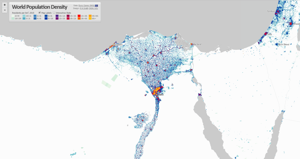
The complexity and scale of the GHSL data is both beautiful and beguiling. In China and India there are continuous landscapes of connected urban settlements with hundreds of millions of people, scattered across many thousands of square kilometres. The cartographic appearance of these regions is like constellations of stars coalescing in vast nebulae of diffuse population. Densities of South and South-East Asian towns and small settlements in semi-rural regions exceed many major cities in Europe and North America. These are complex evolving landscapes at a scale and extent unprecedented in the history of urbanism.

china2

india

Similarly there are unique trends in other major regions of urbanisation such as Latin America. Here major centres are very high density, but the extent of diffuse rural populations is far less prevalent. As a result countries like Colombia and Brazil have some of the highest urban population densities in the world.

colombiavenezuala

The recognition of this global diversity does not mean abandoning global theories of urbanism. Even amongst such complexity and diversity, we can still observe shared spatial patterns and connections. Clearly we are observing landscapes heavily influenced by our current era of intense globalisation, as well as retaining inherited patterns from previous eras. Spatial logics of globalisation are apparent across the globe, though differentiated between regions, economies and societies.

The pull of coastal areas for global trade is an obvious spatial pattern. The importance of port cities is also applicable to historic periods of ancient civilisations, and indeed to globalisation in the 18th and 19th centuries. But the difference in the 20th and 21st centuries appears to be the more intensive links between major ports and global megaregions of production and manufacturing. We can observe this in the huge megaregions of China: the Pearl River Delta and Yangtze Delta (both with around 50m population depending on where the boundary is drawn), which are China’s leading manufacturing centres.

shanghai

It also applies to Europe, with the higher density spine of the ‘blue banana’ linking low country ports to manufacturing centres in western Germany and north-eastern France, and more loosely to south-east England and northern Italy. As well as the manufacturing roles, it is clear that most major global financial centres are closely linked to megaregions, either at their core (e.g. Shanghai, New York, Tokyo) or within a couple of hours travel (e.g. Hong Kong, London, Paris). These centres provide the capital and business services that embed megaregions in global networks.

europe

The importance of ports is also evident in South Asia. Port cities in South Asia are amongst the fastest growing in the world, such as Dhaka, Mumbai, Karachi, Kolkata and Chennai. But megaregions here appear as yet to be less extensive and well connected. Latin American cities are even more spatially separated and precisely defined in density terms, though there are signs of increasing connections between for example the two great Brazilian metropolises, Sao Paulo and Rio de Janeiro, and in the north between Venezuelan and Colombian port cities.

saopauloriodejaneiro

Another fascinating pattern relates to large previously rural areas of population in developing countries that are urbanising in more diffuse and bottom-up patterns. McGee used the term desakota (village-city) to describe patterns of disperse rural development in Java Indonesia. There appear to be similar patterns emerging across regions of China and India, including many areas of the vast Ganges plain, and along the great rivers of China. One of most striking features in China is the concentration of semi-rural and urban populations radiating south-west from Beijing towards Shijiazhuang and then south towards Zhengzhou (this follows one of China’s oldest rail routes, built 1903 and is nearly 600km long).

beijing

There are several areas of sub-Saharan Africa where desakota-like patterns seem to be apparent. The west coast around Nigeria and Ghana is one such area. Another is the many developments around Lake Victoria in Uganda, Kenya and Tanzania. Clearly the cultural and geographical diversity is very high in these regions, and my own knowledge of these countries is very limited. But the similar density patterns is still of interest.

westafrica

Population and Density Statistics
The World Population Density map includes density statistics at national and city scales, with population totals classified into density groups (turn on the Interactive Statistics button at the top left). These help to identify differences in patterns of settlement, and how city densities relate to national distributions.

If we view the world’s highest density cities, we can see the clear links to the above discussion of urbanisation in South Asia and East Asia, and major global port cities. Note however there are many issues with defining and measuring density, which need to be borne in mind when interpreting such statistics. These are measures of residential density, and results will likely be affected by the scale and accuracy of the underlying census data. It would also be better statistically to measure peaks as the 95th or 99th percentile to prevent a single square km cell skewing the results, as there are some outliers in the results.

Highest peak density cities GHSL 2015 1km scale-

City Name Country Peak Density (000s pp/km2) Mean Density (000s pp/km2) Population (millions)
Xiamen-Longhai China 330.5 6.3 4.75
Peshawar Pakistan 228.9 3.3 7.54
Dhaka Bangladesh 197.8 9.1 24.83
Daegu South Korea 189.4 8.5 2.58
Maunath Bhanjan India 177 38.4 0.77
Cairo Egypt 175.5 5.1 37.84
Kolkata India 173.5 5.8 26.87
Baharampur India 166.1 38 1.25
Bahawalpur Pakistan 136.9 29.6 1.06
Xi’an China 135.4 7.1 6.04
Kabul Afghanistan 132.7 18 4.36
Nanjing China 130.1 6.7 6.6
Guangzhou-Shenzhen China 128.3 5.6 46.04
Hangzhou-Shaoxing China 127.6 4.4 7.81
Manila Philippines 127 9.9 22.45

We can also consider the highest population city-regions based on the GHSL urban centre boundaries. These are defined as continuous built-up areas, with polycentric regions linked into single cities. This leads to quite different results for world’s largest cities, with the Pearl River Delta measured as the world’s biggest urban agglomeration at 46 million (and that’s not including Hong Kong or Macao). It is interesting to compare this to results from the UN World Urbanisation Prospects data, which keeps these regions as separate cities and identifies Tokyo as the world’s largest city-region.

Highest population urban centres GHSL 2015 1km scale-

City Name Country Peak Density (000s pp/km2) Mean Density (000s pp/km2) Population (millions)
Guangzhou-Shenzhen China 128.3 5.6 46.04
Cairo Egypt 175.5 5.1 37.84
Jakarta Indonesia 20.4 6.1 36.4
Tokyo Japan 23 6.2 33.74
Delhi India 68 11.1 27.63
Kolkata India 173.5 5.8 26.87
Dhaka Bangladesh 197.8 9.1 24.83
Shanghai China 104.4 7.5 24.67
Mumbai India 49.5 13.9 23.41
Manila Philippines 127 9.9 22.45
Seoul South Korea 103.1 8.8 22.13
Mexico City Mexico 42 8.2 20.09
São Paulo Brazil 38.7 8.9 20.02
Beijing China 84.8 6.6 19.9
Osaka Japan 13.4 5 16.53


Future Cartography of Global Urbanism
Population density is clearly a very useful base from which to understand urbanisation and patterns of settlement. But we can also see its limitations too in the World Density Map if urbanisation is viewed only in terms of density. Many US city-regions are very low density, much lower than semi-rural parts of Asia and Africa, but these US cities are amongst the most affluent and highly urbanised areas of the globe.

Clearly a more comprehensive cartography of global urbanism would combine population density with measurements of development and economic activity, and the flows of people, goods, energy and information that describe the dynamics of how cities and networks function. The development of open global datasets like the GHSL will greatly help in these endeavours.

Another important issue is improving the sophistication of spatial statistics to include multiple urban boundaries and limit Modifiable Areal Unit effects. This would be possible with the GHSL dataset, and I have tried including national and city statistics, but clearly MAUP effects remain when using fixed city boundaries. Something along the lines of my colleagues’ research testing statistics for multiple boundaries simultaneously and showing their influence would be a good avenue to explore.


World Population Density Interactive Map

A brilliant new dataset produced by the European Commission JRC and CIESIN Columbia University was recently released- the Global Human Settlement Layer (GHSL). This is the first time that detailed and comprehensive population density and built-up area for the world has been available as open data. As usual, my first thought was to make an interactive map, now online at- https://luminocity3d.org/WorldPopDen/

The World Population Density map is exploratory, as the dataset is very rich and new, and I am also testing out new methods for navigating statistics at both national and city scales on this site. There are clearly many applications of this data in understanding urban geographies at different scales, urban development, sustainability and change over time. A few highlights are included here and I will post in more detail later when I have explored the dataset more fully.

neusa

The GHSL is great for exploring megaregions. Above is the northeastern seaboard of the USA, with urban settlements stretching from Washington to Boston, famously discussed by Gottman in the 1960s as a meglopolis.

europe

Europe’s version of a megaregion is looser, but you can clearly see the corridor of higher population density stretching through the industrial heartland of the low countries and Rhine-Ruhr towards Switzerland and northern Italy, sometimes called the ‘blue banana’.

pearlriverdelta

The megaregions of China are spectacularly highlighted, above the Pearl River Delta including Guangzhou, Shenzhen and Hong Kong amongst many other large cities, giving a total population of around 50 million.

shanghai

The Yangtze Delta is also home to another gigantic polycentric megaregion, with Shanghai as the focus. Population estimates range from 50-70 million depending on where you draw the boundary.

beijing

The form of Beijing’s wider region is quite different, with a huge lower density corridor to the South West of mixed industry and agriculture which looks like the Chinese version of desakota (“village-city”) forms. This emerging megaregion, including Tianjin, is sometimes termed Jingjinji.

javamalaysia

The term desakota was originally coined by McGee in relation to Java in Indonesia, which has an incredible density of settlement as shown above. There are around 147 million people living on Java.

cairo

The intense settlement of Cairo and the Nile Delta is in complete contrast to the arid and empty Sahara.

kolkatabangladesh

Huge rural populations surround the delta lands of West Bengal and Bangladesh, focused around the megacities of Kolkata and Dhaka.

southindia

There is a massive concentration of population along the coast in South India. This reflects rich agriculture and prospering cities, but like many urban regions is vulnerable to sea level changes.

The comprehensive nature of the GHSL data means it can be analysed and applied in many ways, including as a time series as data is available for 1975, 1990, 2000 and 2015. So far I have only visualised 2015, but have calculated statistics for all the years (turn the interactive statistics on at the top left of the website- I’ll post more about these statistics later). Change over time animations would definitely be an interesting approach to explore in the future. Also see some nice work by Alasdair Rae who has produced some excellent 3D visualisations using GHSL.


New Paper- Online Interactive Mapping: Applications and Techniques for Socio-Economic Research

I have a new paper published in Computers Environment and Urban Systems- Online interactive thematic mapping: applications and techniques for socio-economic research. The paper reviews workflows for creating online thematic maps, and describes how several leading interactive mapping sites were created. The paper is open access so you can download the pdf for free.

Figure_04
Global Metro Monitor by Brookings- http://www.brookings.edu/research/reports2/2015/01/22-global-metro-monitor

The paper features web mapping sites by Oliver O’Brien (http://www.datashine.org.uk), Kiln (http://www.carbonmap.org) and Alec Friedoff at Brookings (http://www.brookings.edu/research/reports2/2015/01/22-global-metro-monitor). Many thanks to these cartographers for agreeing for their work to be included in the paper, particularly Ollie O’Brien who also kindly provided comments on the paper draft. Also many thanks to Steven Gray at CASA who set up the hosting for the LuminoCity3D site.

Here’s the paper abstract-

Recent advances in public sector open data and online mapping software are opening up new possibilities for interactive mapping in research applications. Increasingly there are opportunities to develop advanced interactive platforms with exploratory and analytical functionality. This paper reviews tools and workflows for the production of online research mapping platforms, alongside a classification of the interactive functionality that can be achieved. A series of mapping case studies from government, academia and research institutes are reviewed.

The conclusions are that online cartography’s technical hurdles are falling due to open data releases, open source software and cloud services innovations. The data exploration functionality of these new tools is powerful and complements the emerging fields of big data and open GIS. International data perspectives are also increasingly feasible. Analytical functionality for web mapping is currently less developed, but promising examples can be seen in areas such as urban analytics. For more presentational research communication applications, there has been progress in story-driven mapping drawing on data journalism approaches that are capable of connecting with very large audiences.

And here are some example images from the mapping sites reviewed in the paper-

Datashine
Datashine by Oliver O’Brien and James Cheshire- http://www.datashine.org.uk
Luminocity
LuminoCity3D by Duncan Smith- http://luminocity3d.org
Figure_06
The Carbon Map by Kiln- http://www.carbonmap.org

Mapping the Global Urban Transformation

One of the best datasets for understanding the explosive growth of cities across the world in the last 65 years in the UN World Urbanisation Prospects research, which records individual city populations from 1950 to 2014, and includes predicted populations up to 2030. I have been meaning to create an interactive map of this fascinating data for a while, and have now completed this at- luminocity3d.org/WorldCity/

UNWCP_global

The map uses proportional circles representing city populations in the years 1950, 1990, 2015 and 2030, highlighting the regions in the globe with the most spectacular urban growth, and the time period when this growth occurred. This technique of overlaying proportional circles to show population change over time was first developed in a static map at LSE Cities Urban Age by Guido Robazza. Naturally China, India, Africa and Latin America jump out in the map, while Europe is largely static (except for Turkey). You can also explore time-series graphs and statistics for individual cities by moving your cursor over each city.

UNWCP_shanghai

The site also includes queries of the city statistics, for example highlighting the world’s largest cities in different years. It’s amazing to see the dramatic changes between 1950 and 2015. London was the 3rd largest city in the world in 1950, and is now the 36th. In 1950 there were no African cities and only one Indian city in the world’s top 12, but by 2030 this list is dominated by South Asian, East Asian and African cities.

UNWCP_largest2030

Mapping Tools Used
This map is the first time I’ve tried out CartoDB for interactive mapping, and I’m impressed with this tool. The main advantage of CartoDB for thematic mapping is the ability to perform SQL queries on the client-side, allowing map features to be highlighted interactively (this is used for the map queries on the World City site). There is also the ability to comprehensively restyle map symbology from the client using CartoCSS (this feature requires a full map refresh). Certainly sophisticated interactive mapping functionality is possible using CartoDB. It’s also Leaflet.js based, which is what I’m used to from the previous LuminoCity3D project.

Cities and Mega-City Regions
Measurements of city populations inevitably depend on where regional boundaries are defined, and the UN database is by no means perfect. The job of trying to integrate the hundreds of different city definitions used by each individual nation-state is no easy task. The UN tries to apply the concept of metropolitan agglomerations across the globe, but data is not always available and some cities are measured using administrative boundaries, which leads to population underestimation (full details on the UN methodology).

One of the interesting definitional issues that arises is around how very large polycentric regions have emerged in parts of the globe and beginning to look more like a single giant city. One of the most famous is the Pearl River Delta Megacity Region-

UNWCP_shenzhen

There are so many giant cities in close proximity that the map symbology struggles. Hong Kong, Guangzhou, Shenzhen, Foshan and Dongguan are all huge cities. Shenzhen in particular has experienced the most rapid growth of any city in history, growing from small town in 1980 to 10.7 million people in 2015. The combined population of these cities would make the Pearl River Delta the largest city in the world if a wider regional definition was employed.

Exploring the Users of Interactive Mapping Platforms

Datashine

CASA and UCL Geography have substantial experience in developing online interactive mapping sites for research outreach. The purpose of these tools is to take spatial analysis and visualisation outputs from the research lab and make them accessible and useful for many users from a wide variety of sectors and backgrounds, including: wider academia, central and local government, built-environment professionals, business, technology, community groups and the general public. Interactive mapping tools are part of the movement to make science and research more accessible, supported by the main UK research funding bodies as well as specific campaign movements like Open Data and Open Science.

The positive media coverage of recent projects and our communications with users has indicated that interactive mapping sites do reach a wide audience, including various expert users as well as the general public. These mapping projects are however a relatively new set of tools, and there is a lack of detailed information and evidence on who is using interactive mapping sites and the degree of research impact that they can deliver. In this post I explore two recent interactive mapping projects, DataShine.org.uk & LuminoCity3D.org, and analyse who has shared these sites using data from Twitter. This method is not without its flaws as described below, but is an early attempt to gather evidence and understand the user base.

‘Engaged’ Users and Social Media Sharers
A well designed interactive mapping site can generate a lot of hits, particularly if it gets picked up by national media sites. DataShine generated a huge 99,000 unique users in its first three months after launch in June last year, while LuminoCity had a reasonably large 24,000 unique users in its first three months from September 2014.

How many of these hits are truly engaged users? We can approach this question in terms of web statistics. On the LuminoCity site during the first three months, 16% of users made at least one return visit; 18% of users stayed for at least three minutes; and 26% of users explored at least four different maps during their session. So we can estimate that around 20% of the total users are exploring the site in some depth. That’s not a bad return where there is a high number of total users, e.g. this would equate to 19,800 people for the first three months of DataShine, and 4,800 people for the LuminoCity site.

We do not know however who these users are. Are they mainly interested members of the general public? Are they expert professional users? This is harder to gauge.

Classifying Twitter Users
We do have further information about the most engaged group of users- the social media sharers. These are the people who actively promoted the site to their network of followers/friends. The two major social media sites are Facebook and Twitter, with 4% of visitors of both DataShine and LuminoCity either sharing/liking the site on Facebook or posting the link on Twitter in the first three months. This is a high proportion of social media sharers, and reflects the novel and accessible nature of the sites which helped to generate enthusiastic users.

In this analysis I have classified Twitter users who shared site links to Datashine and LuminoCity according to their profession. Naturally there are some problems with this approach- this selection reflects only the most enthusiastic users of the mappings sites; Twitter users are a biased sample (generally towards affluent professionals, tech and media users); many users have multiple professions (I tried to pick the main one); and professional and personal opinions on Twitter overlap significantly. However this is an early effort to explore types of users of interactive mapping sites, and hopefully this can be built on in the future.

The DataShine Census Site
Below is the classification of 350 Twitter sharers from the DataShine site. It is clear that a wide variety of users are covered, including both professional and community groups (a more detailed table is at the end of the post)-

DataShineSectors

Geographers were not surprisingly the main group of academic users, but DataShine also attracted many users from across the natural sciences, social sciences and the humanities. Health researchers were particularly well represented, as the site provides many useful health related maps from the 2011 census. This result also chimes with a high number of business users in the public policy sector, mainly with a health and planning focus.

The innovative visualisation technology behind the DataShine site appeals to IT users, and there were many sharers from IT, cartography, data journalism and data science backgrounds.

One of the biggest successes with the DataShine site was in reaching beyond academic and professional experts to local communities. The site provides high quality maps of census data at the neighbourhood level, and this successfully appealed to local community groups, campaigners (e.g. cycling campaigns, local environment campaigns) and to local government users. Several councillors tweeted the site, as well as users from DCLG and local government planners. Media coverage also helped to generate many interested users from the general public.

The LuminoCity Site
The data from the LuminoCity site is based on a smaller sample of 140 Twitter shares. This covers a similarly wide variety of users, with more of a focus on built-environment professionals, and less on local government and the general public.

LuminoCitySectors

The LuminoCity site provides a range of maps and statistics for the comparative analysis of UK cities. This functionality appealed strongly to planners and transport consultants, as well as some business users in economic development and real estate. Academic users also had a more urban focus for the LuminoCity site. The site did not chime so strongly with local government and community users who generally want a more local scale of analysis. There were some users from Central Government who used the site for measuring economic performance in northern cities.

The more abstract minimalist aesthetic used on the LuminoCity site attracted quite a few architects and designers to the platform. These users are enthusiastic about visualisation while being less familiar with the range of open data available at city and national scales.

The ‘Other Education’ sector, which was popular for both sites, includes high schools, geography departments, museums and the wider education sector beyond universities. This was an unexpected outreach success for both of the websites, and shows how the open approach can help to create new connections.

Summary
This analysis of twitter shares from interactive mapping platforms shows how these tools can successfully appeal to a wide range of users, both professional and the general public. Academics are well respresented, but also business users, government, local communities and the wider education sector.

Twitter users are inevitably a biased sample and it would be useful in the future to look at methods that can capture a larger proportion of engaged users and assess to what extent the most engaged social media users represent the wider engaged audience for the sites.

Full Tables of Twitter Sharers

DataShine Twitter Sharers Classification

Sector Sector Percentage Group Group Percentage
Academic 18.4 Geographer / Urban Academic 3.8
Other academic 11.4
Social Science Org 0.9
Student 2.3
Other Education 5.8 Geography Education 1.8
Other Education / Museum 4.1
Built Environment Professional 7.0 Transport Consultant/Planner 2.0
Architect 1.2
City Planning/Housing Org. 3.8
Business 9.6 Economic development 0.0
General Business / Marketing 6.1
Public Policy 3.2
Real Estate 0.3
Design & Journalism 8.2 Design- graphic, interactive 2.3
Data Journalism Specialist 1.8
Journalist General 4.1
IT 16.7 Cartography & GIS exp. 4.7
IT / Tech General 9.1
Data Scientist 2.9
Government 7.3 Central Gov 1.8
Local Gov 3.8
Open Data 1.8
Local Community & Charity 8.8 Community / Place Activist / Charity 8.8
General Public 18.1 General Public 18.1


LuminoCity Twitter Sharers Classification

Sector Sector Percentage Group Group Percentage
Academic 19.4 Geographer / Urban Academic 8.1
Other academic 7.3
Social Science Org 1.6
Student 2.4
Other Education 7.3 Geography Education 4.8
Other Education / Museum 2.4
Built Environment Professional 16.9 Transport Consultant/Planner 4.8
Architect 4.0
City Planning/Housing Org. 8.1
Business 10.5 Economic development 3.2
General Business / Marketing 6.5
Public Policy 0.0
Real Estate 0.8
Design & Journalism 12.1 Design- graphic, interactive 7.3
Data Journalism Specialist 2.4
Journalist General 2.4
IT 18.5 Cartography & GIS exp. 5.6
IT / Tech General 8.1
Data Scientist 4.8
Government 3.2 Central Gov 1.6
Local Gov 0.8
Open Data 0.8
Local Community & Charity 3.2 Community / Place Activist / Charity 3.2
General Public 8.9 General Public 8.9