Household energy use is a key indicator for understanding urban sustainability and fuel poverty, and is a timely topic now that winter has arrived. The LuminoCity3D site maps domestic energy use in England and Wales at 1km2 scale using data from DECC. This map has also just been published as a featured graphic in Regional Studies Regional Science. The household energy use distribution is really fascinating, with large scale regional variation and fine scale intra-urban patterns identifiable-
Average domestic energy use 2012, click to view interactive map
The lowest energy use per-household is found in cities and towns in the South-West region such as Plymouth and Exeter, and also along the South coast. While the highest energy use per-household is found in commuter belt towns around London. The variation within city-regions is very high, with for example London and Manchester averages varying by up to a factor of 5, from a mere 8kWh to over 40kWh per year.
The main drivers of energy use are generally housing type (more exposed walls=more energy use; larger house=more energy use), household size, wealth and climate. Often these factors are correlated at household and neighbourhood levels- so for example wealthier households in England and Wales are more likely to live in large detached houses, and these households tend to be clustered together. These trends produce the high energy use pattern seen in London’s commuter belt, as well as in the wealthier suburbs of other large cities like Birmingham, Manchester and Leeds. South West England on the other hand benefits from the mildest climate in the UK, has a relatively high proportions of flats and generally lower average household sizes, thus resulting in the lowest energy use.
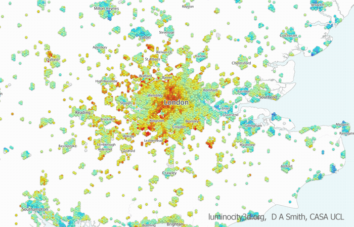
We can see how these factors play out for London in the map below. The height of the hexagons shows density, with higher density areas clearly using less energy. City centre households have considerably lower energy use, with a strong bias towards Inner East London where incomes are lower.
London average domestic energy use 2012, click to view interactive map
Energy use areas correlate strongly with the most prevalent housing type map (also on the LuminoCity3D site), with flats and terraced housing the lowest energy users, and detached and semi-detached areas the highest.
London most prevalent housing type 2011, click to view interactive map
The relationship with household size is less clear cut, but it can be seen that average household sizes are smaller in the city centre. On the other hand, areas with high average household sizes such as Stratford and Wembley, do not have particularly high average energy use.
London average household size 2011, click to view interactive map
Overall domestic energy use patterns tend to mirror transport sustainability, in that higher density city centre areas perform more efficiently compared to low density suburbs. On the other hand the link to city size (which tends to be strong in transport sustainability relationships, with bigger cities reducing car use) is much weaker, and the most efficient locations are often small and medium sized towns and cities. It is not clear in this analysis whether more recent green policies (such as improved insulation or CHP schemes) are having much effect, but several cities with green reputations like Brighton and Bristol are amongst the best performing cities.
Urban policy is currently riding high on the UK political agenda. A combination of the desire to rebalance the UK economy away from financial services; debates over massive high-speed rail investment; the worsening housing crisis in the South-East; and city devolution demands following the Scottish referendum, all point to major reform. As we move towards the 2015 general election, addressing city concerns is going to be a key, perhaps even decisive, election debate.
It is therefore a good time to take stock of recent urban growth and change in Great Britain, assess policy successes and failures, and consider how better outcomes might be achieved in the coming decades. This post draws on map visualisations from the LuminoCity3D.org website.
London and the South-East: Global Boom Region to Elite Island?
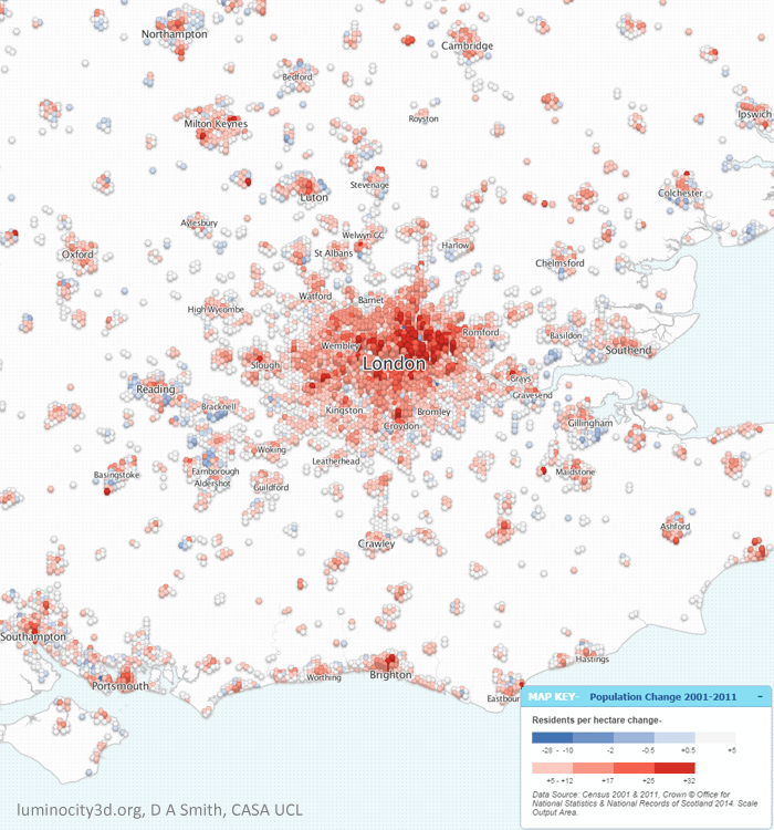
London’s recent growth has been phenomenal, gaining over a million residents (+13%) between 2001 and 2011. As we can see in the figure below, population growth has occurred across all of Greater London (except Kensington & Chelsea), with the strongest concentrations in Inner London and East London, reflecting the priorities of successive London Plans. This spectacular growth has not been confined to Greater London either, but is found across the South East region. The fastest growing UK towns and cities are nearly all in London’s orbit, including Milton Keynes with 20% growth, Ipswich with 15% growth, Cambridge with 16% growth and Ashford with 21% growth. This shared growth clearly illustrates that the South East is a closely integrated region, as further demonstrated by extensive commuting flows.
Population Change 2001-2011 in the South East region.
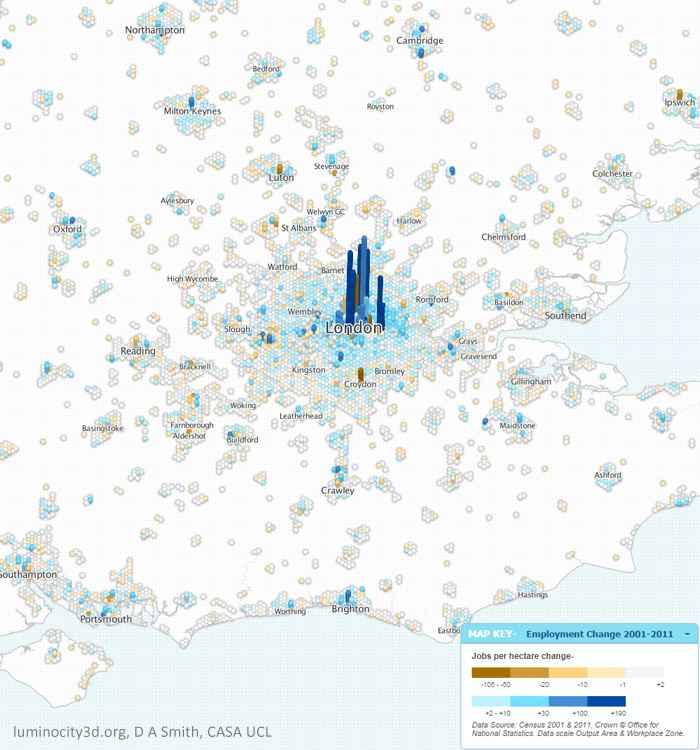
Inevitably it is strong economic growth that underpins this rise in population. London gained 650,000 jobs (+15%) between 2001-2011, strongly focussed in Inner London and Canary Wharf. Employment growth is much more unevenly spread across the South East, and arguably booming Inner London is taking jobs away from other centres, or pressuring some into becoming dormitory suburbs through soaring demand for housing. This is most clearly seen in Outer London in centres such as Croydon and Bromley where employment has fallen, while resident population has risen.
Employment density change 2001-2011 in the South East region.
Inner London is dominant for many employment sectors, not just financial and business services, but also creative industries, research, tourism, and increasingly for information technology, helping London to bounce back successfully from the great recession. The IT industry is an important growth sector, and has traditionally been concentrated in Reading, Bracknell and surrounding towns, an area dubbed the Western Sector by Sir Peter Hall in the 1980s. The Western Sector still retains the highest percentage of IT jobs in GB, but recent growth here has been sluggish. The current stars of the IT industry are now online and social media businesses, and these are attracted to the creative pull of Inner London. Meanwhile the most significant South East growth story outside the M25 has switched north, with Oxford (12% jobs growth), Milton Keynes (14% jobs growth) and Cambridge (22% jobs growth) forming a new northern arc of science and engineering based growth.
So with so many success stories, you be forgiven for thinking everything looking rosy for London and the South East. Unfortunately this is not the case. Soaring population growth has in no way been matched by new housing construction. What was previously a housing affordability problem in the South East is now an outright crisis that threatens to put the brakes on the entire region. Mean house prices just passed the incredible figure of £500,000 in July of this year, and a recent survey placed London as the most expensive city in the world to live and work. This is a looming disaster for future growth prospects. The crisis is not limited to London either, as shown below, with median prices above £300k for much of the South East, and the most popular cities experiencing similar extremes to London.
House prices 2013 in the South East region.
Soaring prices may seem like great news for property owners, but ultimately cities rely on their ability to attract talent and new businesses. And as London’s competitiveness falls, growth will go elsewhere. What has traditionally been a region of opportunity risks becoming a closed-shop for the wealthy.
And the situation is in danger of getting worse before it gets better. The current UK government did not create the housing shortage, but have overseen a period of historically low house building, with 2014 rumoured to hit rock-bottom. Mapping new-built housing sales leaves a sea of white, largely because there have been so few new houses constructed to sell. The recession presented an ideal opportunity for investing in housing and addressing unemployment, but this opportunity was missed. Trumpeted planning reforms have achieved very little, while right-to-buy policies have simply further increased prices.
Solving the housing crisis requires reform on a number of fronts. More power for local authorities to borrow money and make compulsory land purchases would certainly help. Linked to this is a desperate need for property tax reform to encourage housing to be used efficiently. Currently a £300k house pays the same council tax as a £10 million house, while empty housing is not discouraged, leaving many houses in Inner London as empty or underused investment vehicles. Similar arguments are made in favour of a land value tax to encourage land to be used efficiently and stop land banking.
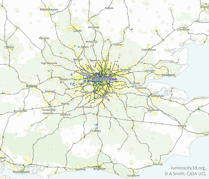
Perhaps the most controversial issue is whether the green-belt can be retained in its current form. Calls from the eminent Richard Rogers that all new development can still be on brownfield frankly look out of touch with the reality in the South East. The debate really needs to switch towards how a controlled release of green belt land can be managed to avoid car-based sprawl and develop sustainable urban areas. Mapping rail infrastructure and urban density in the South East as shown below indicates that there are many potential locations with rail stations and room for growth. This approach would only however create more commuter towns, and ultimately there needs to be stronger planning for the entire South East region, likely with big urban extensions for successful cities such as Milton Keynes, Cambridge and Brighton. It is interesting that recent entries for the Wolfson prize were focussed on this approach.
Rail infrastructure, the green belt and urban density in the South East region
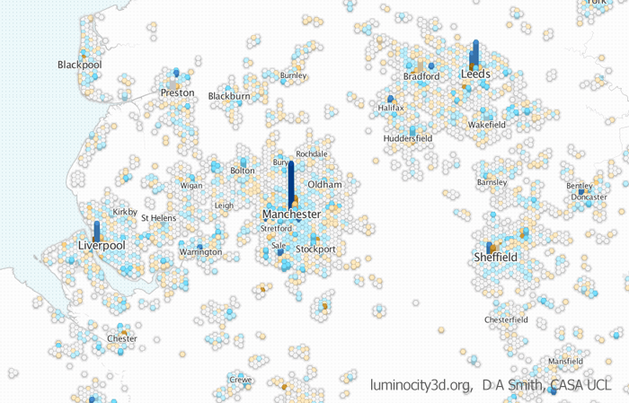
Northern Evolution: an Emerging Hierarchy of Urban Centres? While the South East is in danger of overheating, the majority of the UK’s city-regions have been focussed on post-industrial regeneration and stimulating growth. And in the last decade there has been significant change for many northern cities. Starting in the North West and Yorkshire we can see rising populations in all the major city centres. Greater Manchester in particular has experienced high levels of growth, gaining 200,000 residents (+8%) and 100,000 jobs (+10%) between 2001 and 2011. By the regional definitions used in LuminoCity3D.org, Greater Manchester has overtaken the West Midlands to become the second largest city-region in the country with 2.6 million residents. Manchester city centre has also experienced high rates of employment growth and is the primary centre in the North West, with positive signs in the business services and science & engineering sectors.
The Leeds and West Yorkshire region is also growing quickly, gaining 120,000 residents (+8%) and 50,000 jobs (+6.6%). Population growth is greatest in Leeds city centre, but is evident across the region, particularly in Bradford and Huddersfield. Similar to Manchester, employment growth is focussed strongly on the largest centre, Leeds, with a concentration in financial and business services. Despite West Yorkshire and Greater Manchester being two of the most dynamic northern regions, there is very little travel interactions between them due to poor transport links, and this surely needs to be a policy priority.
Sheffield also displays significant city centre led growth, gaining 45,000 (+6.3%) residents and 21,000 jobs (+6.7%), as does Liverpool although there has been some population decline in the suburbs. Liverpool’s figures are a gain of 21,000 residents (1.8%) and a more impressive 44,000 jobs (10%).
Population change 2001-2011 in the North West and West Yorkshire regions.Employment density change 2001-2011 in the North West and West Yorkshire regions.
The house prices map for the north-west and Yorkshire makes a very interesting comparison to London. The dramatic gentrification that has transformed Inner London towards increasing affluence and polarisation has not (yet?) occurred. The wealthy areas are mainly suburban in the north-west, often where large cities merge with national parks such as the Peak District and the Yorkshire Dales. There are some signs that wealthier South Manchester is beginning to move towards the city-centre, but this is still in earlier stages of city-centre transformation.
House prices 2013 in the North West and Yorkshire regions.
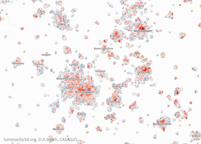
Moving on to the Midlands, again we can see population growth across all major city centres. Birmingham and the West Midlands gained 162,000 residents (7.3%) and 47,000 jobs (+4.8%) between 2001 and 2011, with similar city centre employment density levels to Manchester. The most dynamic cities in the Midlands seem to be medium sized cites, with Leicester growing 12.8%, Nottingham by 8.1% and Derby by 11.8%, although jobs growth is more mixed. There is a significant concentration of business service jobs in Birmingham city centre, but by far the most distinctive sector in the Midlands economy is hi-tech manufacturing and R&D jobs linked to the automotive industry. Clusters around major factories can be seen in Solihull Birmingham, Coventry, Derby, Telford, Warwick and Crewe, with manufactures including Jaguar Land Rover and Toyota. The distributed nature of employment contributes to considerable travel flows between neighbouring cities.
Population change 2001-2011 in the Midlands regionEmployment density change 2001-2011 in the Midlands region.
Similar to the North West and Yorkshire, city centre housing markets are relatively inexpensive in the Midlands, with wealthier areas in the suburbs, particularly between Birmingham, Coventry and Warwick/Leamington Spa. There are signs that wealthier groups to the south of Birmingham are moving further into the city centre.
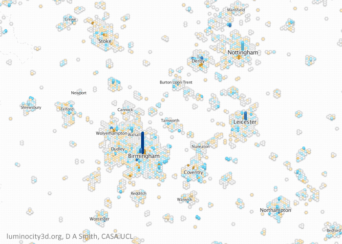
House prices 2013 in the Midlands region.
Will Growth Transfer from the South East to the North? With the South East struggling to accommodate growth and northern regions trying to attract more growth, the answer seems obvious- transfer growth to the north. Unfortunately urban economics is seldom that straightforward. London is a global leader in a range of service sectors, and it does not automatically follow that existing firms and new firms would choose northern cities over the South East. There are however many encouraging signs in cities such as Manchester, Leeds and Birmingham with growth in a range of knowledge-economy sectors. The gap with the South East still remains extensive, and this essentially is the crux of the debates about city devolution and infrastructure investment: whether or not these policies can enable northern cities to bridge this gap. London currently has great advantages in terms of public money invested in infrastructure like public transport, and also in terms of political power to plan and manage growth through the Mayor and Greater London Authority. The argument in favour of empowering northern cities looks increasingly convincing, and we shall see in the coming months whether politicians are brave enough to instigate this process.
Recent urban growth in the UK has further emphasised the role of cities in influencing economic prosperity, quality of life and sustainability. If we are to meet 21st century social and economic challenges then we need to plan and run our cities better. Data analysis can play a useful role in this task by helping understand current patterns and trends, and identifying successful cities for sharing best practice.
LuminoCity3D.org is a mapping platform designed to explore the performance and dynamics of cities in Great Britain. The site brings together a wide range of key city indicators, including population, growth, housing, travel behaviour, employment, business location and energy use. These indicators are mapped using a new 3D grid-based approach that allows consistent comparisons between urban areas to be made, and relationships between urban form and city performance to be identified (technical details are provided here). Press coverage of LuminoCity3D has included Londonist, Wired.co.uk, Independent Online and Guardian Cities.
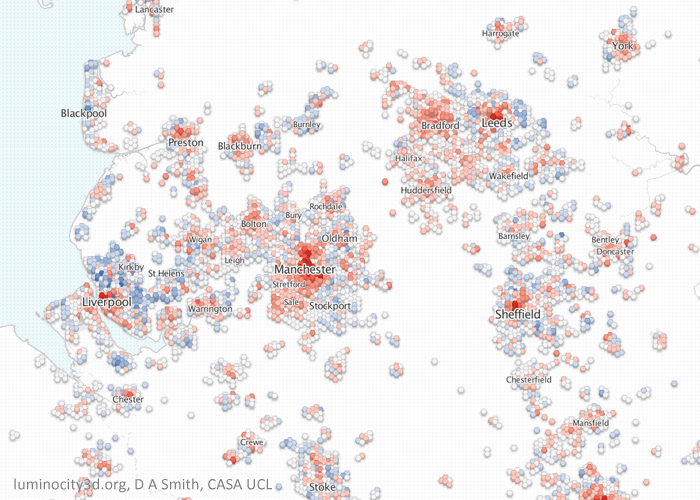
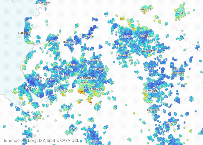
Taking for example employment density change in northern English cities as shown below. Current growth is mainly in ‘knowledge-economy’ services that generally favour being clustered together in city centres, generally reinforcing a select few larger centres rather than many smaller centres. There is clear growth in Manchester, Leeds and Liverpool city centres, particularly Manchester which displays the biggest increase in employment density of any location in GB. But around these success stories there is a much more mixed picture of growth and decline for many other centres that are finding it more difficult to compete for firms and jobs.
Employment density change in the north of England (blue is an increase and orange decline). Manchester and Leeds city centres have established themselves as the largest centres, with the biggest increase in Manchester.
Interactive City Statistics
City statistics are available to make more precise comparisons between urban areas. Statistics can be viewed on LuminoCity3D.org by moving your mouse pointer over a city of interest, or by hovering/clicking on the GB Overview Chart at the bottom left of the screen. The graphs and statistics change depending on the map indicator selected, so that the LuminoCity maps and statistics are interactively integrated.
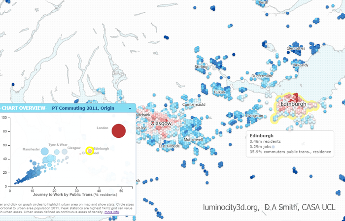
The example below shows public transport travel, a key sustainability indicator that also has important economic and equity implications. Greater London is by far the public transport centre of the UK with nearly 50% of commuting by public transport. Without the investment and historic advantages of London, city-regions like Manchester and Birmingham do not even manage 20% PT commuting. But we can see that it is not essential to be as gigantic as London to achieve more sustainable travel. Edinburgh, with a compact form and extensive publicly owned bus network, achieves 36% PT commuting.
Public transport commuting in central Scotland. Hovering over urban areas highlights indicator statistics and highlights the city’s position on the GB Chart.
All the datasets used are government open data. Websites such as LuminoCity would not be possible without recent open data initiatives and the release of considerable government data into the public domain. Links to the specific datasets used in each map are provided to the bottom right of the page under “Source Data”.