World Population Density Interactive Map

A brilliant new dataset produced by the European Commission JRC and CIESIN Columbia University was recently released- the Global Human Settlement Layer (GHSL). This is the first time that detailed and comprehensive population density and built-up area for the world has been available as open data. As usual, my first thought was to make an interactive map, now online at- https://luminocity3d.org/WorldPopDen/

The World Population Density map is exploratory, as the dataset is very rich and new, and I am also testing out new methods for navigating statistics at both national and city scales on this site. There are clearly many applications of this data in understanding urban geographies at different scales, urban development, sustainability and change over time. A few highlights are included here and I will post in more detail later when I have explored the dataset more fully.

neusa

The GHSL is great for exploring megaregions. Above is the northeastern seaboard of the USA, with urban settlements stretching from Washington to Boston, famously discussed by Gottman in the 1960s as a meglopolis.

europe

Europe’s version of a megaregion is looser, but you can clearly see the corridor of higher population density stretching through the industrial heartland of the low countries and Rhine-Ruhr towards Switzerland and northern Italy, sometimes called the ‘blue banana’.

pearlriverdelta

The megaregions of China are spectacularly highlighted, above the Pearl River Delta including Guangzhou, Shenzhen and Hong Kong amongst many other large cities, giving a total population of around 50 million.

shanghai

The Yangtze Delta is also home to another gigantic polycentric megaregion, with Shanghai as the focus. Population estimates range from 50-70 million depending on where you draw the boundary.

beijing

The form of Beijing’s wider region is quite different, with a huge lower density corridor to the South West of mixed industry and agriculture which looks like the Chinese version of desakota (“village-city”) forms. This emerging megaregion, including Tianjin, is sometimes termed Jingjinji.

javamalaysia

The term desakota was originally coined by McGee in relation to Java in Indonesia, which has an incredible density of settlement as shown above. There are around 147 million people living on Java.

cairo

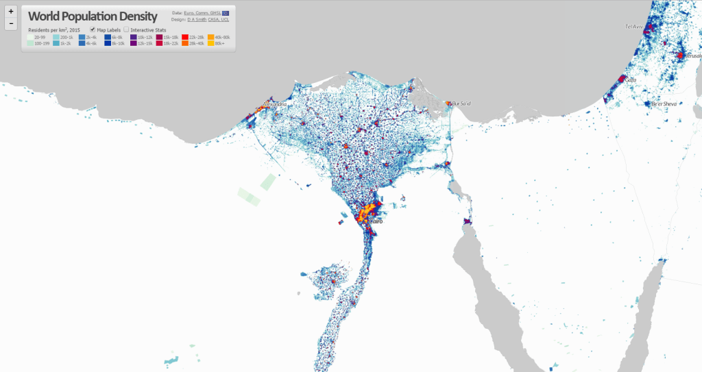
The intense settlement of Cairo and the Nile Delta is in complete contrast to the arid and empty Sahara.

kolkatabangladesh

Huge rural populations surround the delta lands of West Bengal and Bangladesh, focused around the megacities of Kolkata and Dhaka.

southindia

There is a massive concentration of population along the coast in South India. This reflects rich agriculture and prospering cities, but like many urban regions is vulnerable to sea level changes.

The comprehensive nature of the GHSL data means it can be analysed and applied in many ways, including as a time series as data is available for 1975, 1990, 2000 and 2015. So far I have only visualised 2015, but have calculated statistics for all the years (turn the interactive statistics on at the top left of the website- I’ll post more about these statistics later). Change over time animations would definitely be an interesting approach to explore in the future. Also see some nice work by Alasdair Rae who has produced some excellent 3D visualisations using GHSL.


Animating Global Innovation Diffusion- Public Transport

UndergroundWorldMap

We know that knowledge networks and intensive competition within cities boosts innovation. There are also further scales to this dynamic. The networks and competition between cities at regional and global scales promotes the adoption of new ideas- as cities buy, borrow and adapt ideas from their competitors. It’s this latter global dynamic that we’re exploring in this post, investigating the spread of new ideas in a sector that’s intrinsically urban in nature- public transport. After widespread decline in the second half of the 20th century, transit has recently undergone an impressive renaissance linked to the dramatic growth of urban populations, high density forms and sustainability policies.

The spread of new ideas between cities is clustered in space and in time, as cities are strongly influenced by nearby competitors, as well as economic investment cycles. Therefore a natural way to visualise these spatial and temporal patterns is through animated cartography. This is the technique used here with the help of Processing and the MapThing library by Jon Reades (allows GIS data to be imported into Processing).

So first up we’re going to head back in time to the invention and dispersion of the underground/subway metro (data from metrobits.org; best viewed HD fullscreen)-

London celebrated 150 years of the Underground this year, and it was three decades after 1863 before other cities in Europe and North America had their own high-frequency high-capacity city centre networks. This delay can be linked to varied levels of industrialisation between countries, as well as the time taken to improve the metro concept with electrical power (the original Underground amazingly used steam locomotives). It’s interesting that the youthful American metropolises of Chicago and Boston were quicker off the mark to build metro systems than many European capitals.

Buenos Aires in 1913 and Tokyo in 1927 (now the world’s largest metro) were early exceptions to the European and North American monopoly on metro systems. Yet it took until the 1980’s onwards with the rise of Newly Industrialised Countries like Brazil, Russia, India, Mexico and Turkey for metro systems to become truly global. China is now in a league of its own with gigantic metros in Shanghai, Guangzhou, Beijing and Hong Kong.

Underground metros may seem like the best answer to cities’ transit demands, but they are highly expensive and disruptive to build, and are pricey to maintain also. These difficulties underlie another key innovation in the global rise of public transport- bus rapid transit. The use of segregated roads, specially designed stations and articulated buses enables BRT to have similar capacity and speed advantages of subways at a much lower cost. We can see from the animation that BRT begins as a Brazilian innovation (data from brtdata.org)-

Initially BRT adoption is highly clustered in Brazil’s major cities, with a few early adopters including Santiago de Chile, Quito, Pittsburgh and Essen in Germany. Then in the late 1990’s the dynamic changes with a burst of new systems in Central America, Canada, Australia, and mainly second-tier cities in Europe. Taipei has spearheaded the adoption of BRT into China, with many new large systems emerging. Sizeable BRTs also recently opened in Istanbul, Tehran and interestingly in Lagos where hopefully further investment in African cities will follow.

In our highly connected globalised world, new city innovations are likely to spread more quickly, and that seems to be the case with BRT. Indeed this acceleration effect is even more marked in the last innovation we’re going to investigate- the bike sharing phenomenon. Now bike share schemes are of course small investments compared to city-wide metro systems, yet they are still an interesting recent advance with similar global dispersion dynamics (data from Bike Sharing World Map and O’Brien Bike Share Map)-

The original pioneer of bike sharing is not as clean cut as the BRT and Underground examples as there have been several generations of innovation (see pdf article). In 1995 Copenhagen successfully created a reasonably sized (1,000 bikes) coin operated system with specially designed bicycles that tried to reduce theft. A small number of cities in Germany and France followed suit. The next generation began in Lyon in 2005 with a larger (4,000 bikes) system using smart card technology that greatly reduced theft. Subsequently bike sharing has exploded globally across Europe, North America, China and South Korea.

Paris has by far the largest system in Europe with 20,000 bikes. But even Paris’s Vélib’ is small compared to two huge Chinese systems in Wuhan (90,000 bikes) and Hangzhou (70,000 bikes). China’s strong cycling tradition has recently been in decline with rising car ownership, and hopefully the Bike Share boom will reverse this trend.

So to conclude, we are experiencing an age of truly global transit adoption with innovations spreading more rapidly through global city networks. While innovation has traditionally arisen in Western European and North American contexts, by far the greatest urban growth is in Newly Industrialised Countries, increasing demand for innovations like BRT. The rapid rise of bike share systems shows that relatively modest innovations can have a global impact when the innovation is popular and effectively implemented.


————————————————————————————

Notes-

The ridership and scheme size data relates to current passenger levels rather than the size of the system at the time of construction. Would be great to do this visualisation with time-series ridership data, but this is not to my knowledge currently available.

The definition of metro and BRT systems used here comes from the database providers, and there is some ambiguity, e.g. in defining when a regional urban rail system can be classed as a metro (see metrobits.org).


Carbonchart: Why are Global CO2 Emissions Soaring?

As the costs of recent droughts spiral from USA to Australia, West Africa to India, we’re getting a taste of what a significantly warmer climate would be like. Critically as the scientific evidence mounts up that climate change is occurring, global carbon dioxide emissions are soaring. Why is this?

I’ve designed a new website Carbon Chart visualising current data to answer this question.

There’s no single ideal metric to determine the contribution of different countries towards global warming, and a range of different perspectives need to be considered, as well as related issues of economic development and poverty reduction. The design of Carbon Chart is intended to allow the comparison of several perspectives.

So where are the maps? I’ve gone for a graph approach to focus on change over time. See Kiln’s excellent Carbon Map website for a cartogram-based approach to understanding global warming.

Current emissions data do not make happy reading. CO2 output is increasing in the developed world in consumption terms, and is rocketing in the developing world, especially China. We’re replicating our carbon intensive economic model on an incredible scale.

Maybe the climate models are wrong, or maybe an international climate agreement with substance is just around the corner. But right now it’s difficult to see how the more extreme scenarios of 4°C+ warming are going to be avoided.


Visualising Flows 2: the Global CO2 Emissions Supply Chain

GlobalCarbonFlows_web

Every so often you come across a dataset that really amazes you in its richness and ability to change perspectives on understanding the world. One such dataset has been produced by academics at Stanford and Oslo tracing the global supply chain of CO2 emissions.

Traditionally emissions are attributed to countries depending on where fuels are burned- the point of production. This approach puts big industrial polluters like China at the top of the emissions pile. Yet globalisation means that we are linked into an increasingly complex web of trade that challenges a production-based understanding of emissions. A quarter of fossil fuel CO2 emissions can be considered as being embedded in manufactured goods that are consumed away from the point of production.

To address this issue Davis, Peters & Caldeira have created a database charting the global supply chain of CO2 emissions from extraction to production and finally to consumption. The database covers coal, oil, gas and secondary fuels traded by 58 industrial sectors in 112 countries for the year 2004. Even better, the entire database is available online.

Maps of the major carbon transfers included in the paper highlight firstly the massive flows from the energy rich Middle East and Russia, and secondly how production emissions from industrial countries such as China are ultimately driven by consumption in the affluent core of USA, Europe and Japan.

Davisetal_FlowMap

Being a mapping type, I feel that the flow maps in the paper miss out much of the amazing detail in the dataset, such as extraction to consumption flows within countries (half of all emissions). So I decided to put my visualisation skills to the test…

First up I produced a proportional bubble map of extraction and production, giving a good sense of the relative scale between countries. Economies with high levels of both extraction and consumption (e.g. USA and China) exploit their own energy resources and have large emission flows within their national boundaries. Other large consuming nations that lack energy resources (e.g. the EU,  Japan and South Korea) must import them.

GlobalCarbonBubble_web

Next I mapped the transfers of CO2 embedded in trade flows, using the same black-red colour scheme to indicate flow direction. While the visualisation is not as straightforward as the simpler flow map above, it gives a strong sense of the amazing complexity in global trade relationships and highlights clear patterns and structures.

GlobalCarbonFlows_web

Black lines emanate from the major energy exporters of the Middle East and Russia. Indeed the degree to which all of Europe is dependent on Russian energy is highly alarming. Major industrial countries act as intermediaries, both importing and exporting emissions. For instance China and Japan import energy and materials from the Middle East, Indonesia and Australia, then export manufactured products to the USA and Europe. The USA is top predator in the emissions food chain, spectacularly drawing in goods and resources from every corner of the globe and racking up over 25% of global emissions by consumption.

The data is for 2004, so some current trends like the strong growth of South America, continued growth of China and the strengthening relationships between China and Africa are not fully captured. Hopefully an update will come in the not too distant future.

On the cartography side, I went for the Azimuthal Equidistant projection to emphasise the close North America-Europe-Asia links. This projection is recognisable as the basis of the United Nations logo. Here however it is global capitalism and environmental exploitation drawing the world together like some kind of tightening noose. After another empty environmental conference at Rio+20, burning billions of tonnes of fossil fuels is set to remain a defining characteristic of our age.