World Population Density Map Update with GHSL 2023

The European Commission JRC recently released a new 2023 update of the Global Human Settlement Layer (GHSL) data. This update has greatly improved the GHSL data, with a 10 metre scale built-up area dataset of the entire globe which has been used to create a 100 metre scale global population density layer. The level of detail for cities and rural areas is impressive, and it overcomes the limitations of previous releases of the GHSL. I have updated the World Population Density Map website to include this new 2023 data, with both the cartography and statistical analysis now based on the new data.

Improved Level of Detail for Cities and Rural Landscapes
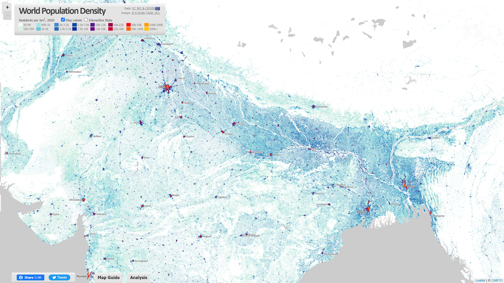
The new GHSL 2023 data has produced a much more detailed 10 metre dataset of built-up area (using recent European Space Agency Sentinel data), and this is the basis for creating the updated population layer. The results are much improved, particularly for complex rural and peri-urban landscapes in the Global South, such as for India shown below. The tens of thousands of small villages are identified and used to more accurately distribute India’s huge population. This is also the case for other key regions such as Sub-Saharan Africa, and China.

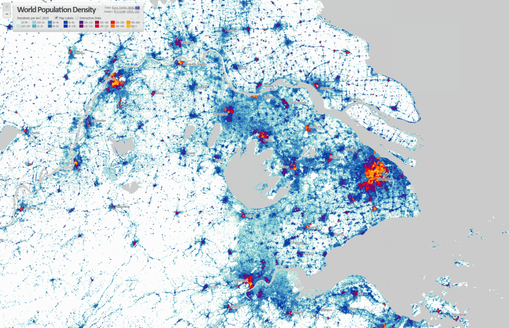
The added level of detail also improves the representation of cities, with more accurate density analysis, and improved techniques to differentiate residential from industrial and commercial urban land uses. Previous releases of the GHSL were underestimating urban densities for cities where census data was weaker, but this appears to no longer be the case. The dataset can now be used for more accurate comparisons of population and density for cities across the globe. Example images for Shanghai and New York City are shown below.

Country Density Profiles – the Diversity of Human Settlement
The statistical analysis on the World Population Density Map website has also been updated using the 2023 GHSL data, so you can view the density profiles for all countries around the globe. Some highlights are shown below.

To complement the graph of the population in each density category, this updated version of the World Population Density Map includes Population Weighted Density statistics for each country and city. Population Weighted Density is a measure of the typical density experienced by residents in the country/city, in this case using the 1km2 scale GHSL data. The PWD is calculated by weighting each 1km2 cell according to the population, summing all the cells for the city/region, and then dividing the sum by the total population of the country/city (i.e. the arithmetic mean). This is a more representative measure than standard population density, which is affected by low density suburban/peri-urban and rural land, even where the population in these areas is relatively low.

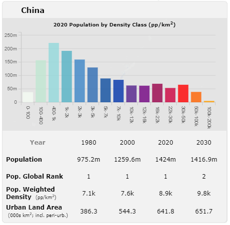
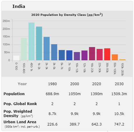
China and India have very high density cities, but their large rural populations translate into moderate Population Weighted Density statistics overall. India is 9.9k pp/km2 and China is 8.9k pp/km2. The table below shows the top 20 countries by Population Weighted Density using the 2020 data-

Rank (by PWD 2020)Country NamePopulation Weighted Density 2020 (pp/km2)
1Singapore30.9k
2Republic of Congo25.2k
3Somalia24.1k
4Egypt21.8k
5Comoros17.4k
6Djibouti17.2k
7Iran16.8k
8Yemen16.7k
9Jordan15.8k
10North Korea14.8k
11Democratic Republic of the Congo14.2k
12Bahrain13.9k
13Colombia13.5k
14Equatorial Guinea13.5k
15Turkey13.5k
16Morocco13.4k
17Bangladesh13.3k
18Taiwan12.9k
19South Korea12.7k
20Western Sahara12.6k

For comparison, the equivalent Population Weighted Density figure for the UK is 4.1k, France is 3.7k and Germany is considerably lower at 2.7k. The USA is renowned for its low density living and suburban sprawl, and the Population Weighted Density measure for 2020 is 2.2k. This is the lowest figure for any large developed country in the world. Smaller developed countries have similar figures to the USA, including New Zealand, Norway and the Republic of Ireland.

Analysing the World’s Largest City-Regions Using the GHSL
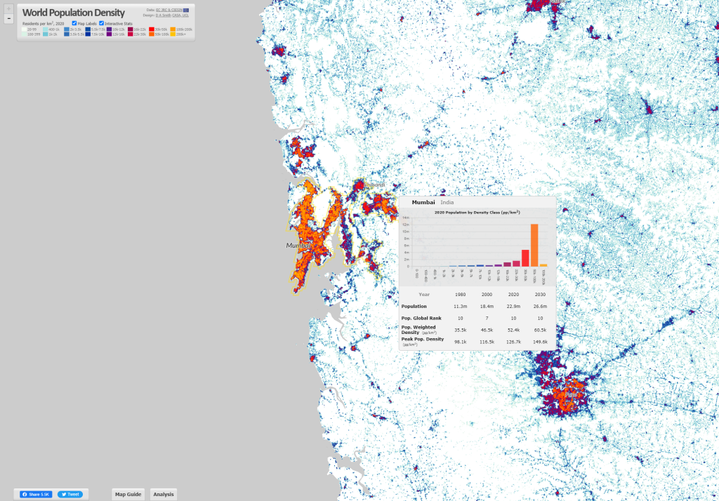
The Built-Up Area and Population layers in the GHSL are used to define a settlement model (GHSL-SMOD) layer, which classifies land into urban and rural typologies. We can use this layer to define the boundaries of city-regions across the globe. This has been done using continuous areas of the highest urban category (urban centres) for the 2020 data. When you hover over cities on the World Population Density website, these city boundaries are highlighted-

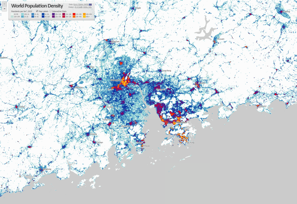
This land use based method of defining city-regions produces different estimates of city populations to analyses based on administrative boundaries. The GHSL method generally emphasises large continuous urban regions, such as the megacity region of the ‘Greater Bay Area’ in China shown above, which has formed from the fusion of Guangzhou, Shenzhen, Dongguan and Jiangmen. This is the largest city-region in the world by this measure, with a population of 43.8m in 2020 (rapidly developing from a base of 5.8m in 1980). The top twenty city-regions in the world are shown below-

Rank (by Pop. 2020)City-Region NamePopulation 1980Population 2000Population 2020Pop. Weighted Density 2020 (pp/km2)
1Guangzhou-Shenzhen-Dongguan-Jiangmen5.8m30.9m43.8m20k
2Jakarta16.1m26.3m38.7m13.4k
3Tokyo27m31.3m34.1m10.2k
4Delhi8.3m19.1m30.3m29k
5Shanghai6.7m15.1m27.8m27.9k
6Dhaka6.2m14.8m26.8m47.9k
7Kolkata16.3m22.9m26.7m36.4k
8Manila11.3m18.3m24.8m27.1k
9Cairo9.8m16.6m24.5m44.9k
10Mumbai11.3m18.4m22.9m52.4k
11Seoul13.3m19.7m22.7m19.8k
12São Paulo13.7m17.4m19.7m14.5k
13Beijing7.2m11.6m19m20.2k
14Karachi5.8m10.9m18.7m48.8k
15Mexico City13.8m17.9m17.8m13.2k
16Bangkok5.4m9.2m17.4m11.6k
17Osaka17.2m16.8m15.6m8.1k
18Moscow9.9m11.9m14.9m16.7k
19Los Angeles10m13.1m14.5m4.6k
20Istanbul6.1m10.4m14.3m25.2k

One of the most impressive aspects of the GHSL is that it is a timeseries dataset going back to 1975. Therefore we can create historical indicators such as the population change data shown in the table above. Many cities have more than doubled, or even tripled in population size since 1980, including Delhi, Shanghai, Dhaka and Karachi. Rates of growth in the USA, Japan and Europe are inevitably much lower, as seen in Tokyo and Los Angeles in the table above. Tokyo is often measured as the world’s largest city (for example in the UN World Urbanization Prospects), though with the GHSL method Tokyo the third largest at 34.1m in 2020. Tokyo is also distinctive in terms of its Population Weighted Density at 10.2k pp/km2. While this figure is more than double the density of Los Angeles, Tokyo’s medium density is much lower than cities in China and South Asia. Incredibly, Mumbai’s density figure is five times higher than Tokyo at 52.4k pp/km2, and Karachi is not far behind at 48.8k.

Credits and Links
The Global Human Settlement Layer is published by the European Commission Joint Research Centre. All the GHSL layers are available as open data and can be downloaded on their website. The GHSL population data uses as an input the Gridded Population of the World data by CIESEN at Columbia University.

The World Population Density Map website has been created by Duncan A. Smith at CASA UCL. The mapping data is hosted on a tileserver at CASA UCL kindly set up by Steven Gray. The interactive mapping layers are hosted on Carto.

Global Data Visualisations by CASA MSc students

Each year MSc students at CASA demonstrate their spatial data visualisation skills with a group project. The theme this year was ‘Global to Local’, and the class of 2022 has produced some particularly excellent work, experimenting with a range of visualisation tools and techniques.

Sustainability and Climate Change
Several groups interpreted the main theme in terms of global sustainability and climate change. These projects included investigating flood events, both locally and in terms of impacts on the UK; global heating in the Arctic and sea-level rise; and the effects of global temperature changes on the wine industry, with both positive and negative changes. Some interesting visualisation trends here included the use of high quality spatially detailed global datasets; using non-Mercator web projections (a recently added feature to Mapbox); experiments with animated data; and also use of 3D globes.

Global Flooding Events Map by Group 1 (Nina Fabsikova, Sangbin Lee, Murray Chapman, Xinyi Huang, Henry Song)
Global Temperature Change and the Wine Industry by Group 5 (Andras Gelanyi, Ruby Johnson, Haofu Wang, Shuyi Zheng, Kameliya Staneva)
Arctic Sea Ice and Climate Change by Group 3 (Nayomi Kasthuri Arachchi, Haisu Chen, Daphne Badounas, Tianyi Li)

Global Cultural Interactions
Taking a very different tack, several groups looked at Global to Local interactions in terms of cultural and culinary exchanges. One group used story-mapping techniques to show Chinese cultural diffusion, including the history of the Silk Road and Zheng He’s early voyages of discovery. Another approach was to look at global interactions through food, including creating a virtual kitchen as an interface to global food journeys, and mapping major food importers to the UK.

The Silk Road and Chinese global cultural diffusion by Group 4 (Rongrong Xue, Yuning Jiang, Zhonghao Li, Ce Hou)
The World to your Kitchen, global food study by Group 7 (Zicheng Fan, Jingran Ma, Hangjin Cai, Haotian Meng, Liyuan Dong)
Global food imports to the UK by Group 10 (Shengwei Deng, Zhenlei Gu, Jing Liu, Yujie Hu, Xinwei Kang)

Energy and the Cost of Living
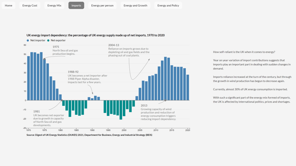
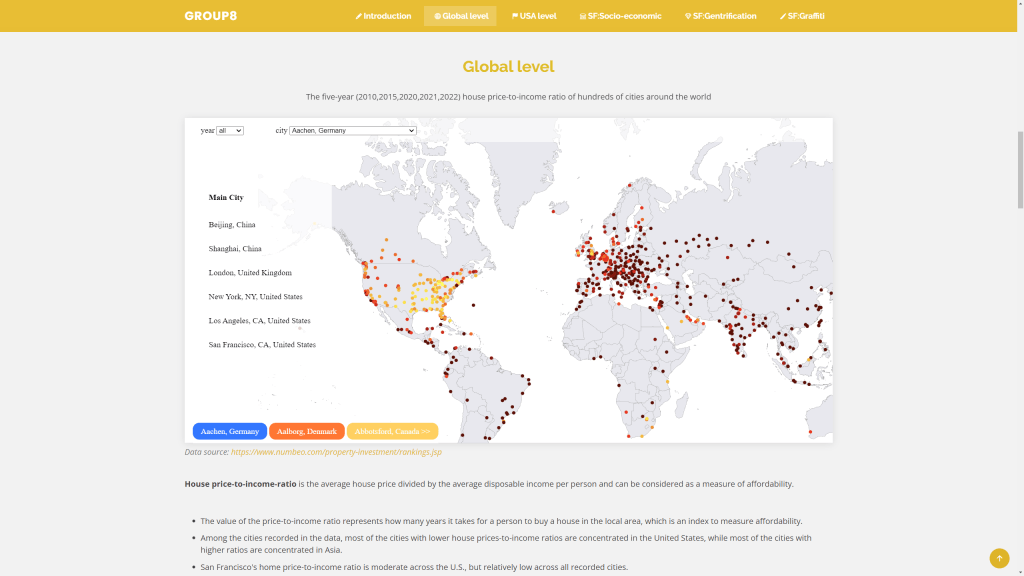
Returning to the sustainability theme, several groups zoomed in on energy and affordability challenges that the world is currently experiencing. One group used some advanced D3 charting to tell the story of the UK’s varying energy imports and wider global affordability challenges (see image below). A different take was to chart the energy generation mix in major economies around the world. Another topical affordability challenge relates to housing in major cities, and one group mapped relative affordability of housing in major cities across the globe.

UK energy import dependency over time by Group 6 (Sunny Zhao, Elika Sinha, Val Ismaili, Ankur Shanker, Bolin You)

Global energy consumption by type by Group 2 (Jiani Gong, Jeonghwa Kang, Linhan Cao, Seren Shi)
House price affordability comparison in global cities by Group 8 (Mengjiao Luo, Jieqi Tan, Wei Wang, Siyi Cai, Yanpu Huang)

Covid-19 Visualisations
The aftermath of the pandemic is still with us, and tracking Covid-19 was another interpretation of the Global to Local theme. One group experimented with animation to track the spread of the virus. Another used graphs and interactive mapping to investigate how effective lockdown policies were in a series of case studies.

Global Spread of Covid-19 by Group 9 (Ian Liu, Peizhao Wang, Shirao Zhang,  Miaomiao Pan, Lin Sheng)
Global Covid-19 infections by Group 11 (Jikai Song, Lucia Zhang, Jianqiang Li)

Global Digital Divides
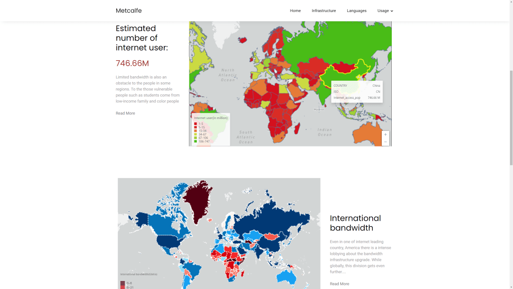
Finally, another interesting take was to think about online communities as interactions between global and local, including the changing geography of internet access and the division of the world into different online platforms by language and political and economic divides.

Global internet connections and the digital divide by Group 12 (Ruijie Chang, Maidi Xu, Zhiheng Jiang)

Here is the full list of project groups and websites-

  1. Delugeo Global Flooding-
    Sangbin Lee, Murray Chapman, Xinyi Huang, Nina Fabsikova, Henry Song
    https://nfabsikova.github.io/delugeo/
  2. Clean Energy Now-
    Jiani Gong, Jeonghwa Kang, Linhan Cao, Seren Shi
    https://linhanccc.github.io/CASA0003-GROUP2/website.html
  3. 30 Degrees Rising-
    Nayomi Kasthuri Arachchi, Haisu Chen, Daphne Badounas, Tianyi Li
    https://eloquent-crepe-6cc40a.netlify.app/
  4. Chinese Cultural Diffusion-
    Rongrong Xue, Yuning Jiang, Zhonghao Li, Ce Hou
    https://casa-chinese-cultural-diffusion.github.io/digital-viz-Chinese-Cultural-Diffusion/html/main.html
  5. A Change in Climate, a Change in Taste-
    Ruby Johnson, Haofu Wang, Andras Gelanyi, Shuyi Zheng, Kameliya Staneva
    https://agelanyi.github.io/climate-and-uk-wine/website-frontend/index.html#firstSection
  6. Why are energy prices rising?-
    Sunny Zhao, Elika Sinha, Val Ismaili, Ankur Shanker, Bolin You
  7. The World in your Kitchen-
    Zicheng Fan, Jingran Ma, Hangjin Cai, Haotian Meng, Liyuan Dong
    https://world2kitchen.github.io/The_World_in_your_Kitchen/P0_Panoramic_and_Fullpage/fullpage.html
  8. San Francisco: Global to Local-
    Mengjiao Luo, Jieqi Tan, Wei Wang, Siyi Cai, Yanpu Huang
    https://casa0003group8.github.io/HousepriceSF/index/housepriceSF
  9. How does Covid-19 influence the world?-
    Ian Liu, Peizhao Wang, Shirao Zhang,  Miaomiao Pan, Lin Sheng
    https://peizhaowang.wixsite.com/casag9covidimpact
  10. From the Global to your Table-
    Shengwei Deng, Zhenlei Gu, Jing Liu, Yujie Hu, Xinwei Kang
    https://zhenleigu.github.io/CASA0003_Group10/
  11. Did Lockdown really Stop the Virus?-
    Jikai Song, Lucia Zhang, Jianqiang Li
    https://jikaisong1997.github.io/
  12. Worldwide Digital Divides-
    Ruijie Chang, Maidi Xu, Zhiheng Jiang

Global Urban Constellations

Geographers have long grappled with the complex and ever changing configurations of global urbanism. Many terms have been coined to describe new 20th and 21st century urban forms: conurbations (Geddes, 1915), multi-nuclei cities (Harris & Ultman, 1945), megalopolis (Gottman, 1961), world cities (Hall, 1966), desakota (McGee, 1991),  fractal cities (Batty & Longley, 1994), network cities (Batten, 1995), postmetropolis (Soja, 2000), splintering urbanism (Graham & Marvin, 2001), polycentric mega-city regions (Hall & Pain, 2006)…

These concepts are diverse, coming from different perspectives with different methods and archetypal case studies. But there are shared themes: a focus on more diffuse and polycentric urban forms; recognition of city connections across multiple scales; and the rise of ever larger urban regions embedded in thicker global networks.

Representing and exploring the diversity of contemporary global urban forms is a challenge for cartographers. We often focus on mapping the amazing richness and diversity of dominant global cities like London and New York. Yet this is clearly a very biased lens from which to frame the vast majority of the globe, as researchers have noted. Postcolonial critiques like Robinson’s ordinary cities (2006) argue for a much more representative and cosmopolitan comparative urbanism. From a different angle, provocative research like Brenner’s (2014) ‘planetary urbanism‘ has critiqued the contentions of a universal urban age, arguing that urban/rural distinctions are no longer meaningful where capitalist networks reach to every corner of the globe.

I recently released an interactive map of the new Global Human Settlement Layer (GHSL) produced by the European Commission JRC and CIESIN Columbia University. This dataset makes several advances towards an improved cartography of the diversity of global urbanism. Firstly it is truly global, representing all the world’s landmass  and settlements at a higher level of detail, down to 250m. Secondly the population density and built-up layers are continuous: there are no inherent city boundaries or urban/rural definitions (the GHSL includes an additional layer with urban centres defined, but the user can ignore these and create their own boundaries from the underlying layers). Thirdly the dataset is a time-series, including 1975, 1990, 2000 and 2015. Finally the data layers and the methods used to create them are fully open.

Diversity and Structure of Global Urban Constellations
The complexity and scale of the GHSL data is both beautiful and beguiling. In China and India there are continuous landscapes of connected urban settlements with hundreds of millions of people, scattered across many thousands of square kilometres. The cartographic appearance of these regions is like constellations of stars coalescing in vast nebulae of diffuse population. Densities of South and South-East Asian towns and small settlements in semi-rural regions exceed many major cities in Europe and North America. These are complex evolving landscapes at a scale and extent unprecedented in the history of urbanism.

china2

india

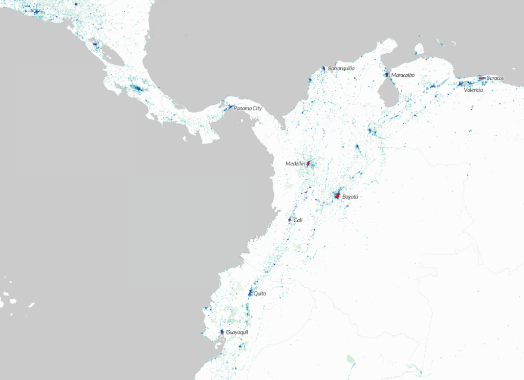
Similarly there are unique trends in other major regions of urbanisation such as Latin America. Here major centres are very high density, but the extent of diffuse rural populations is far less prevalent. As a result countries like Colombia and Brazil have some of the highest urban population densities in the world.

colombiavenezuala

The recognition of this global diversity does not mean abandoning global theories of urbanism. Even amongst such complexity and diversity, we can still observe shared spatial patterns and connections. Clearly we are observing landscapes heavily influenced by our current era of intense globalisation, as well as retaining inherited patterns from previous eras. Spatial logics of globalisation are apparent across the globe, though differentiated between regions, economies and societies.

The pull of coastal areas for global trade is an obvious spatial pattern. The importance of port cities is also applicable to historic periods of ancient civilisations, and indeed to globalisation in the 18th and 19th centuries. But the difference in the 20th and 21st centuries appears to be the more intensive links between major ports and global megaregions of production and manufacturing. We can observe this in the huge megaregions of China: the Pearl River Delta and Yangtze Delta (both with around 50m population depending on where the boundary is drawn), which are China’s leading manufacturing centres.

shanghai

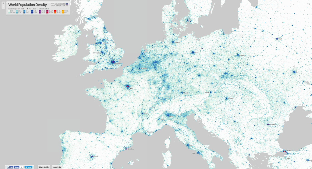
It also applies to Europe, with the higher density spine of the ‘blue banana’ linking low country ports to manufacturing centres in western Germany and north-eastern France, and more loosely to south-east England and northern Italy. As well as the manufacturing roles, it is clear that most major global financial centres are closely linked to megaregions, either at their core (e.g. Shanghai, New York, Tokyo) or within a couple of hours travel (e.g. Hong Kong, London, Paris). These centres provide the capital and business services that embed megaregions in global networks.

europe

The importance of ports is also evident in South Asia. Port cities in South Asia are amongst the fastest growing in the world, such as Dhaka, Mumbai, Karachi, Kolkata and Chennai. But megaregions here appear as yet to be less extensive and well connected. Latin American cities are even more spatially separated and precisely defined in density terms, though there are signs of increasing connections between for example the two great Brazilian metropolises, Sao Paulo and Rio de Janeiro, and in the north between Venezuelan and Colombian port cities.

saopauloriodejaneiro

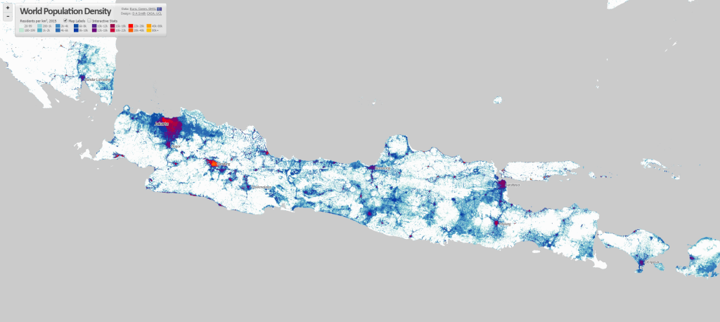
Another fascinating pattern relates to large previously rural areas of population in developing countries that are urbanising in more diffuse and bottom-up patterns. McGee used the term desakota (village-city) to describe patterns of disperse rural development in Java Indonesia. There appear to be similar patterns emerging across regions of China and India, including many areas of the vast Ganges plain, and along the great rivers of China. One of most striking features in China is the concentration of semi-rural and urban populations radiating south-west from Beijing towards Shijiazhuang and then south towards Zhengzhou (this follows one of China’s oldest rail routes, built 1903 and is nearly 600km long).

beijing

There are several areas of sub-Saharan Africa where desakota-like patterns seem to be apparent. The west coast around Nigeria and Ghana is one such area. Another is the many developments around Lake Victoria in Uganda, Kenya and Tanzania. Clearly the cultural and geographical diversity is very high in these regions, and my own knowledge of these countries is very limited. But the similar density patterns is still of interest.

westafrica

Population and Density Statistics
The World Population Density map includes density statistics at national and city scales, with population totals classified into density groups (turn on the Interactive Statistics button at the top left). These help to identify differences in patterns of settlement, and how city densities relate to national distributions.

If we view the world’s highest density cities, we can see the clear links to the above discussion of urbanisation in South Asia and East Asia, and major global port cities. Note however there are many issues with defining and measuring density, which need to be borne in mind when interpreting such statistics. These are measures of residential density, and results will likely be affected by the scale and accuracy of the underlying census data. It would also be better statistically to measure peaks as the 95th or 99th percentile to prevent a single square km cell skewing the results, as there are some outliers in the results.

Highest peak density cities GHSL 2015 1km scale-

City Name Country Peak Density (000s pp/km2) Mean Density (000s pp/km2) Population (millions)
Xiamen-Longhai China 330.5 6.3 4.75
Peshawar Pakistan 228.9 3.3 7.54
Dhaka Bangladesh 197.8 9.1 24.83
Daegu South Korea 189.4 8.5 2.58
Maunath Bhanjan India 177 38.4 0.77
Cairo Egypt 175.5 5.1 37.84
Kolkata India 173.5 5.8 26.87
Baharampur India 166.1 38 1.25
Bahawalpur Pakistan 136.9 29.6 1.06
Xi’an China 135.4 7.1 6.04
Kabul Afghanistan 132.7 18 4.36
Nanjing China 130.1 6.7 6.6
Guangzhou-Shenzhen China 128.3 5.6 46.04
Hangzhou-Shaoxing China 127.6 4.4 7.81
Manila Philippines 127 9.9 22.45

We can also consider the highest population city-regions based on the GHSL urban centre boundaries. These are defined as continuous built-up areas, with polycentric regions linked into single cities. This leads to quite different results for world’s largest cities, with the Pearl River Delta measured as the world’s biggest urban agglomeration at 46 million (and that’s not including Hong Kong or Macao). It is interesting to compare this to results from the UN World Urbanisation Prospects data, which keeps these regions as separate cities and identifies Tokyo as the world’s largest city-region.

Highest population urban centres GHSL 2015 1km scale-

City Name Country Peak Density (000s pp/km2) Mean Density (000s pp/km2) Population (millions)
Guangzhou-Shenzhen China 128.3 5.6 46.04
Cairo Egypt 175.5 5.1 37.84
Jakarta Indonesia 20.4 6.1 36.4
Tokyo Japan 23 6.2 33.74
Delhi India 68 11.1 27.63
Kolkata India 173.5 5.8 26.87
Dhaka Bangladesh 197.8 9.1 24.83
Shanghai China 104.4 7.5 24.67
Mumbai India 49.5 13.9 23.41
Manila Philippines 127 9.9 22.45
Seoul South Korea 103.1 8.8 22.13
Mexico City Mexico 42 8.2 20.09
São Paulo Brazil 38.7 8.9 20.02
Beijing China 84.8 6.6 19.9
Osaka Japan 13.4 5 16.53


Future Cartography of Global Urbanism
Population density is clearly a very useful base from which to understand urbanisation and patterns of settlement. But we can also see its limitations too in the World Density Map if urbanisation is viewed only in terms of density. Many US city-regions are very low density, much lower than semi-rural parts of Asia and Africa, but these US cities are amongst the most affluent and highly urbanised areas of the globe.

Clearly a more comprehensive cartography of global urbanism would combine population density with measurements of development and economic activity, and the flows of people, goods, energy and information that describe the dynamics of how cities and networks function. The development of open global datasets like the GHSL will greatly help in these endeavours.

Another important issue is improving the sophistication of spatial statistics to include multiple urban boundaries and limit Modifiable Areal Unit effects. This would be possible with the GHSL dataset, and I have tried including national and city statistics, but clearly MAUP effects remain when using fixed city boundaries. Something along the lines of my colleagues’ research testing statistics for multiple boundaries simultaneously and showing their influence would be a good avenue to explore.


World Population Density Interactive Map

A brilliant new dataset produced by the European Commission JRC and CIESIN Columbia University was recently released- the Global Human Settlement Layer (GHSL). This is the first time that detailed and comprehensive population density and built-up area for the world has been available as open data. As usual, my first thought was to make an interactive map, now online at- https://luminocity3d.org/WorldPopDen/

The World Population Density map is exploratory, as the dataset is very rich and new, and I am also testing out new methods for navigating statistics at both national and city scales on this site. There are clearly many applications of this data in understanding urban geographies at different scales, urban development, sustainability and change over time. A few highlights are included here and I will post in more detail later when I have explored the dataset more fully.

neusa

The GHSL is great for exploring megaregions. Above is the northeastern seaboard of the USA, with urban settlements stretching from Washington to Boston, famously discussed by Gottman in the 1960s as a meglopolis.

europe

Europe’s version of a megaregion is looser, but you can clearly see the corridor of higher population density stretching through the industrial heartland of the low countries and Rhine-Ruhr towards Switzerland and northern Italy, sometimes called the ‘blue banana’.

pearlriverdelta

The megaregions of China are spectacularly highlighted, above the Pearl River Delta including Guangzhou, Shenzhen and Hong Kong amongst many other large cities, giving a total population of around 50 million.

shanghai

The Yangtze Delta is also home to another gigantic polycentric megaregion, with Shanghai as the focus. Population estimates range from 50-70 million depending on where you draw the boundary.

beijing

The form of Beijing’s wider region is quite different, with a huge lower density corridor to the South West of mixed industry and agriculture which looks like the Chinese version of desakota (“village-city”) forms. This emerging megaregion, including Tianjin, is sometimes termed Jingjinji.

javamalaysia

The term desakota was originally coined by McGee in relation to Java in Indonesia, which has an incredible density of settlement as shown above. There are around 147 million people living on Java.

cairo

The intense settlement of Cairo and the Nile Delta is in complete contrast to the arid and empty Sahara.

kolkatabangladesh

Huge rural populations surround the delta lands of West Bengal and Bangladesh, focused around the megacities of Kolkata and Dhaka.

southindia

There is a massive concentration of population along the coast in South India. This reflects rich agriculture and prospering cities, but like many urban regions is vulnerable to sea level changes.

The comprehensive nature of the GHSL data means it can be analysed and applied in many ways, including as a time series as data is available for 1975, 1990, 2000 and 2015. So far I have only visualised 2015, but have calculated statistics for all the years (turn the interactive statistics on at the top left of the website- I’ll post more about these statistics later). Change over time animations would definitely be an interesting approach to explore in the future. Also see some nice work by Alasdair Rae who has produced some excellent 3D visualisations using GHSL.


Open Source Public Transport Accessibility Modelling

The RGS-IBG annual conference has been on this week, and I presented as part of a series of geocomputation sessions arranged in advance of the 21st anniversary Geocomputation conference in Leeds next year. The topic was current CASA research from the RESOLUTION project, looking at developing fast and consistent methods of measuring public transport accessibility between different cities.

For this task I have been testing the OpenTripPlanner software with encouraging results. PDF of the slides are here.

The data used for the London analysis comes from the Traveline public transport timetable data. The image below shows an example accessibility measure of jobs accessible within 1 hour’s travel time leaving at 8am.

LondonResolution_PT_Accessibility

Environment & Planning Featured Graphic: World City Populations Time-Series Map

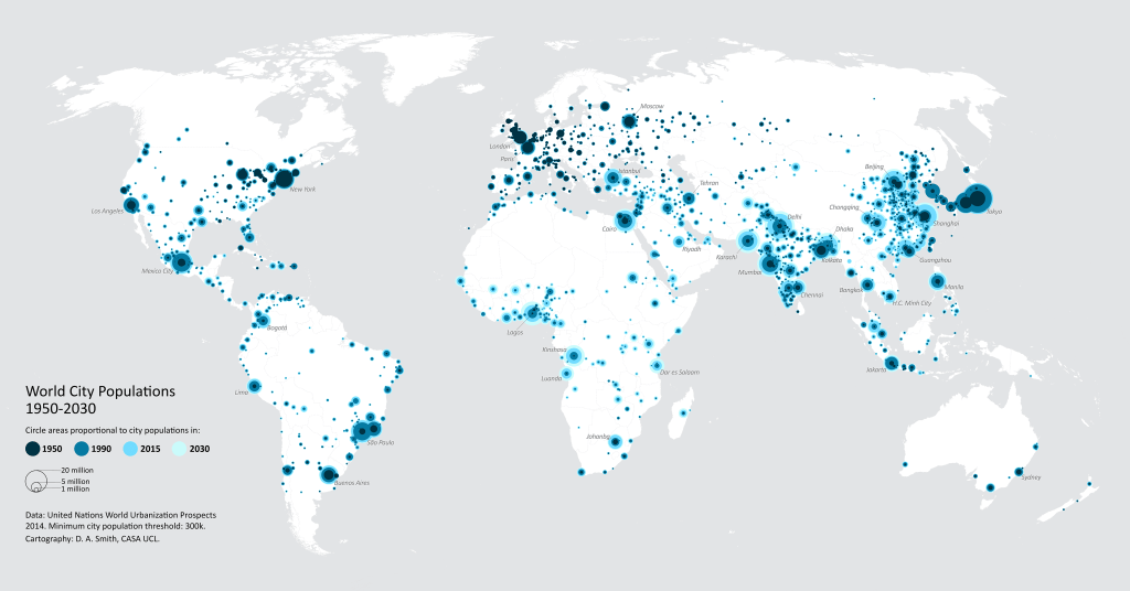
The World City Populations Interactive Map is now available as a static map, and has been published as a Featured Graphic in Environment and Planning A. The EPA article includes details on the UN World Urbanization Prospects data, and the methods used to create the map.

For a high resolution version of the static map, click below-

UNWUP_WorldPopMap2014_DSmith

Mapping the Global Urban Transformation

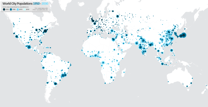
One of the best datasets for understanding the explosive growth of cities across the world in the last 65 years in the UN World Urbanisation Prospects research, which records individual city populations from 1950 to 2014, and includes predicted populations up to 2030. I have been meaning to create an interactive map of this fascinating data for a while, and have now completed this at- luminocity3d.org/WorldCity/

UNWCP_global

The map uses proportional circles representing city populations in the years 1950, 1990, 2015 and 2030, highlighting the regions in the globe with the most spectacular urban growth, and the time period when this growth occurred. This technique of overlaying proportional circles to show population change over time was first developed in a static map at LSE Cities Urban Age by Guido Robazza. Naturally China, India, Africa and Latin America jump out in the map, while Europe is largely static (except for Turkey). You can also explore time-series graphs and statistics for individual cities by moving your cursor over each city.

UNWCP_shanghai

The site also includes queries of the city statistics, for example highlighting the world’s largest cities in different years. It’s amazing to see the dramatic changes between 1950 and 2015. London was the 3rd largest city in the world in 1950, and is now the 36th. In 1950 there were no African cities and only one Indian city in the world’s top 12, but by 2030 this list is dominated by South Asian, East Asian and African cities.

UNWCP_largest2030

Mapping Tools Used
This map is the first time I’ve tried out CartoDB for interactive mapping, and I’m impressed with this tool. The main advantage of CartoDB for thematic mapping is the ability to perform SQL queries on the client-side, allowing map features to be highlighted interactively (this is used for the map queries on the World City site). There is also the ability to comprehensively restyle map symbology from the client using CartoCSS (this feature requires a full map refresh). Certainly sophisticated interactive mapping functionality is possible using CartoDB. It’s also Leaflet.js based, which is what I’m used to from the previous LuminoCity3D project.

Cities and Mega-City Regions
Measurements of city populations inevitably depend on where regional boundaries are defined, and the UN database is by no means perfect. The job of trying to integrate the hundreds of different city definitions used by each individual nation-state is no easy task. The UN tries to apply the concept of metropolitan agglomerations across the globe, but data is not always available and some cities are measured using administrative boundaries, which leads to population underestimation (full details on the UN methodology).

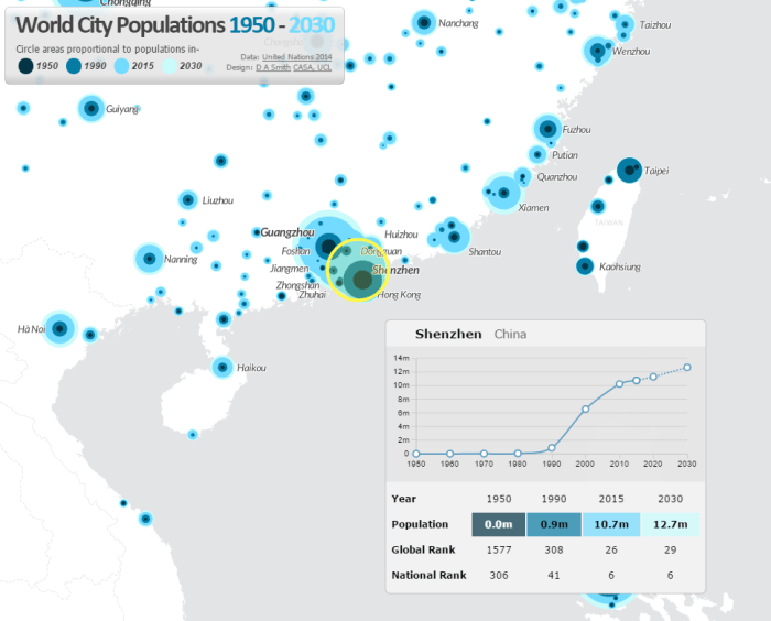
One of the interesting definitional issues that arises is around how very large polycentric regions have emerged in parts of the globe and beginning to look more like a single giant city. One of the most famous is the Pearl River Delta Megacity Region-

UNWCP_shenzhen

There are so many giant cities in close proximity that the map symbology struggles. Hong Kong, Guangzhou, Shenzhen, Foshan and Dongguan are all huge cities. Shenzhen in particular has experienced the most rapid growth of any city in history, growing from small town in 1980 to 10.7 million people in 2015. The combined population of these cities would make the Pearl River Delta the largest city in the world if a wider regional definition was employed.

ESRI Urban Observatory- the right model for city crowdsourcing?

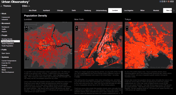
This month ESRI made an interesting move into the field of global city data with the launch of Urban Observatory (TM). The site has some great interactive visualisation ideas with simultaneous mapping of three interchangeable cities, linked navigation and indicator selection. It provides an intuitive interface to explore the diverse forms of world cities-

UrbanObservatory

Furthermore this ambitious project is intended to be an extensible platform. Jack Dangermond (billionaire founder of ESRI) and Richard Saul Wurman (founder of TED with a long-standing interest in city cartography) discuss in the introductory video how they want many more cities to join in, to crowdsource city data from around the world, using the ArcGIS online platform.

So is this project going to be the answer for all our global urban and smart city data needs? Well I think despite the great interface, as a city crowdsourcing model ESRI’s urban observatory is not going to work. But it’s interesting to explore why, particularly in relation to the bigger questions of whether the open city data revolution is going to be truly global and inspire a new era of urban analysis and comparative urban research.

ESRI’s site states that “information about urbanization does not exist in comparative form”. In reality comparative urban analysis is a growing trend across many sectors, from international organisations like OECD, EU and UN (including the original UN Habitat Urban Observatory); to environmental organisations like ICLEI and C40; to economically focussed organisations like the World Bank and Brookings; to global remote sensing providers like the USGS; to major commercial data producers in transport and telecoms; to the many urban academic research centres around the world (including the two London based centres I’ve worked for, CASA and LSE Cities).

Global cities data example- GaWC Network at Loughborough

CASA- deprivation in UK cities example.

Brookings MetroMonitor- comparison of US cities' economic performance
Brookings MetroMonitor- comparison of US cities’ economic performance


LSE Cities- over a decade exploring comparative urbanism

There’s a rich and growing field of data providers and analysis techniques to draw on for comparative urban analysis. Indeed the ability to gather and analyse urban data is absolutely central to the whole Smart City agenda. But there are clearly many challenges. What do cities gain by opening up their data? Who then owns the data and controls how it is presented? Who selects what data is included and excluded?

I believe the natural platform for civic data (and subsequently for the international comparison of urban data) will be an open platform with wiki features to encourage civic engagement. This provides the answers to the above questions- citizens gain from better access to data and institutional transparency; citizens own the data and have a say in what is included and how it’s presented. This is the model for current successful open data sites like the London Datastore, where anyone can access the data, and Londoners can request new datasets (backed by freedom of information legislation). Unfortunately the governance situation is of course much more complicated for the international comparison of cities, and this has limited progress.

As the world’s leading provider of GIS software, ESRI are in a strong position to integrate global datasets, and have clear commercial interests in amassing urban data for their clients. But it’s much harder to answer questions about who owns and controls data in their urban observatory project. Arguably this will limit the number of cities volunteering to take part, and limits the project’s ability to respond to the diverse demands of global cities and their citizens.

A further huge challenge in comparative urbanism is in developing the right analytical techniques and indicators to answer key urban questions. This will inevitably require more sophisticated analysis tools than a set of thematic maps, and needs to draw on the many research strands developing the most relevant analytical tools.

Overall there will be some exciting competition in the coming months and years in the expanding market of international urban data integration and visualisation, with different models from commercial, government and academic contexts. ESRI’s urban observatory is an innovative project, and should stimulate further advances.

World City Living and Working Densities: Poles Apart?

One of the most recognisable visualisation techniques used by LSE Cities in the Urban Age publications is the 3D density map- an intuitive and engaging way to represent built form, and enable comparison of very different city environments across the globe. I’ve been producing 3D density maps in my own research for around five years now, and so it was a nice challenge to produce the 3D density maps for this year’s Urban Age conference, the Electric City in London. In this post I focus on the contrasting densities in three leading world cities- London, New York and Hong Kong- with the added twist that both residential and employment densities are mapped for comparison.

Higher urban densities can facilitate more sustainable travel patterns, improve service delivery efficiency, reduce building energy use and promote urban vitality. These advantages depend of course on good urban planning to minimise congestion and pollution problems. High density mixed-use development is central to the compact city planning movement, and remains a foundation of sustainable planning policy today. Here we map the number of residents in each square kilometre of a 100 by 100 kilometre region for London, New York and Hong Kong. Lower urban densities apply to suburban-like neighbourhoods, while high densities generally represent medium or high rise buildings clustered on a tight urban grid.

The city that stands out in the mapping is Hong Kong, with its extremely high residential densities exceeding 110,000 people per km2. Here planners have responded to scarce land availability with very tall (over 30 storeys) high-density development. Scarce land has also influenced the development of New York City, where Manhattan densities peak at 59,000 people per km2. London in comparison is much lower density. The heritage of suburban housing and generous greenspace has created a residential culture at half the density of New York and a quarter the density of Hong Kong. Despite current intensification in London, residential densities remain a world away from other global cities.

Where people live is not however the only perspective needed to understand urban density. We can also examine employment densities for an important point of comparison (both residential and employment maps are at the same scale). Taller spikes in the employment maps represent higher numbers of jobs concentrated in business centres. London, New York and Hong Kong feature very intensive central employment clusters. The highest peak of over 150,000 jobs per km2 is in Midtown Manhattan. London is surprisingly close behind at over 140,000 jobs per km2, concentrated in the City of London and the West End. Hong Kong peaks at 120,000 jobs per km2 in Central (note the Hong Kong survey data is less comprehensive and may underestimate peak densities). These intense spikes represent very strong agglomeration economies, where financial and business services and creative industries cluster together to access labour markets, share fast-changing information and engage in face-to-face interaction with clients, customers and partners. Despite living in an age of instant telecommunication, proximity is still critical for many world city business activities.

The extreme employment density peaks are indicative of economic success in these world cities. Demand for office space is so stong that developers get sufficient returns to build high and businesses use their space more intensively. Central employment clustering also means these cities are dominated by public transport rather than car travel (particularly Hong Kong). On the other hand the divergence of living and working densities can signify a lack of integration between living and working locations. London is very polarised between its low density living and high density working environments. This contributes to the long distance and long duration commuting travel for many Londoners (recent surveys find an average one-way commute times for Londoners of 38 minutes). New York has a better integration of living and working locations (average commutes are around 31 minutes). Hong Kong appears to have the closest integration of living and working spaces, though unfortunately commuting time survey data is not available to test this.

The analysis here supports the medium-rise inner-city residential intensification that the London Plan prescribes to improve the balance of urban functions, and increase accessibility for residents and businesses. The gap in residential densities between London and many world cities is so large that modest intensification can be achieved while keeping London’s distinct character, providing development is on the much remaining brownfield land rather than London’s treasured greenspaces.

Another interesting thought is whether the highly concentrated office clusters we see in London and New York will continue to be the way most businesses operate in the future. Greg Lindsay gave a good talk last week on how businesses are changing the way they use work space towards more shared and flexible environments that will likely be less space demanding.

To see more detailed analysis of sustainability trends in many more world cities from the Urban Age conference see the Electric City conference newspaper.

Urban Age Electric City Conference

ElectricCity

I recently began a new job at LSE Cities and have been working for the last month on materials for the Electric City conference in London, taking place on the 6th and 7th December this week. The conference will be exploring smart cities and disruptive urban tech from a sociological slant, and includes talks from famous urbanists such as Ed Glaeser, Saskia Sassen and Deyan Sudjic. You can get a flavour of the debate from Richard Sennett’s provocative article on “Stupefying Smart Cities”.

The whole event will be live streamed on the conference website.

My role, alongside the LSE Cities Research Team, has been in producing comparative urban visualisations and analysis around the theme of sustainable urbanism. These visuals and articles are now online in the conference newspaper.

Copenhagen and Hong Kong: Mapping Global Leaders in Green Transport

Cities that achieve social and economic success without high car use generally have three things in common: high densities, good urban design, and successful planning frameworks that integrate land-use with public transport, walking and cycling networks. I’ve been working on an LSE Cities project that investigated two leading global cities in green transport- Copenhagen and Hong Kong- to better understand how their leading positions were reached. You can read the final Going Green report here.

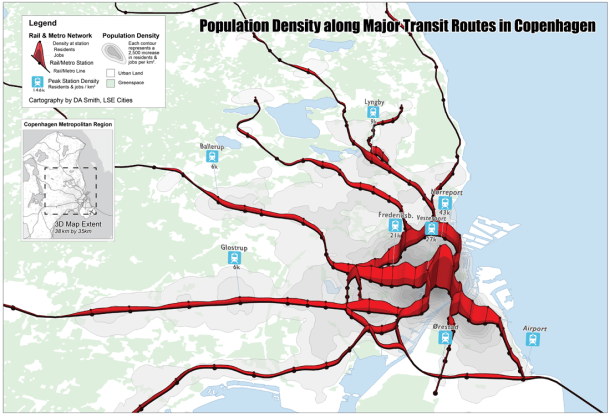
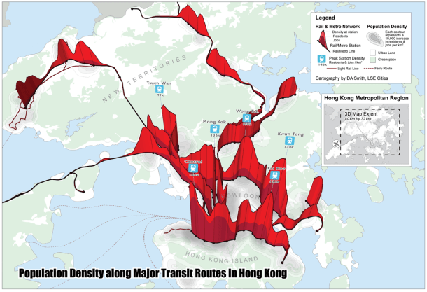
The project required visualising the level of integration between public transport and urban density in these cities. We developed a technique where the rail network is shown as a transect through a 3D population density surface. This shows how the density of jobs and residents in these cities is clustered around major public transport nodes.

CopenhagenMap_small

Copenhagen has a classic radial pattern, based on the famous ‘Finger Plan‘ developed over 60 years ago, where linear urban features are separated by thin green wedges. This is quite distinct to the UK greenbelt approach. Current expansion is focussed to the south of the city centre along the Orestad corridor served by the more recently developed metro links. This area sites the airport and transport links to Sweden, continuing the cross-border integration between Copenhagen and Malmö.

Hong Kong makes a very interesting comparison. It is on average 8 times(!) higher density than Copenhagen, and peak densities are around four times higher at nearly 150,000 jobs & residents per square kilometre. This is due firstly to the natural boundaries and country park designations that prevent suburban development, and secondly to the unique ‘Rail plus Property’ planning model run by the government and MTR, where extremely high development densities are pursued at rail station sites, and land value gains captured to fund public transport. The result is a polycentric pattern of jagged nodal development.

HongKongMap_small

Another way to consider this relationship is to measure typical distances to rail & metro stations for these cities. As can be seen below, Copenhagen and Hong Kong compare favourably to other leading global cities like London and New York.

It would be interesting to pursue this analysis further for London. You can see that London scores relatively lower for the population within 500 metres of stations. Intensification policies at public transport nodes are a recent policy change for London. Accessibility figures are likely to change over time with several major intensification projects under way at rail stations in Inner London.

(Above figure based on metropolitan regions. Defined as Outer Met Area for London and 100 km by 100 km square centred on Manhattan for NYC).

Arrival City by Doug Saunders

First published in 2010, I have only recently got round to reading Doug Saunders‘ excellent review of cities as the great engines of migration and, where successful, the route for the rural poor to achieve a better life and join the ranks of the middle classes. The ‘Arrival Cities’ are the urban districts (often termed slums) with concentrations of rural immigrants, with Saunders drawing on a wide set of case studies such as Tower Hamlets, Shenzen, Mumbai and Sao Paolo. In each case he tracks the lives of individuals making the leap of faith from villages, and how the relationship between city and village evolves.

Success for an arrival city, in terms of achieving social mobility, Saunders argues relates to the strength of local communities in arrival cities, and the ability for immigrants to start new small businesses, get jobs, and eventually gain citizenship. Saunders is critical of several examples from Western Europe where local jobs and ultimately citizenship are unobtainable as a result of policy and local circumstances. Policy is widely different between countries, with the most extreme example in China where millions of migrant workers are denied basic services and ability to own property outside of their local area. The physical form of districts can also be significant, where design prevents local shopping and business centres emerging, such as characterise the Paris banlieues. There’s a strong element of Jane Jacobs in Saunder’s argument, with his support for more organic urban districts and local businesses.

The urbanisation of billions of rural dwellers is surely the great urban story of the 21st century. This book provides an engaging overview of lessons learned from past and current arrival cities for how this great change in global geography can be facilitated.