The interactive map of world city populations – https://luminocity3d.org/WorldCity/ – has been updated with the newest release of the UN World Urbanization Prospects (WUP), the leading dataset for understanding global urban dynamics. The new UN WUP 2025 release supersedes the 2018 version. It’s a major revision with updated demographic data a new harmonised methodology for calculating urban agglomeration populations based on urban land analysis (using the Global Human Settlement Layer data) compared to previous use of national administrative boundaries. The dataset also covers an updated time frame of 1975-2050. The dataset shows some dramatic changes in the ranking of the world’s largest urban agglomerations and predictions for urban growth in the next 25 years.
The online interactive World City map allows you to explore the overall trends in urban populations and the detailed dynamics of particular cities of interest. I have also created a non-interactive high-res publication version of the map below-
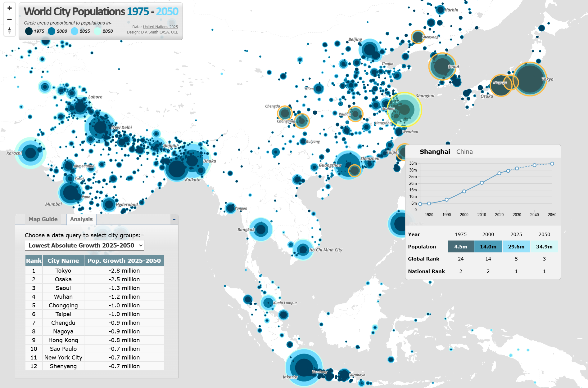
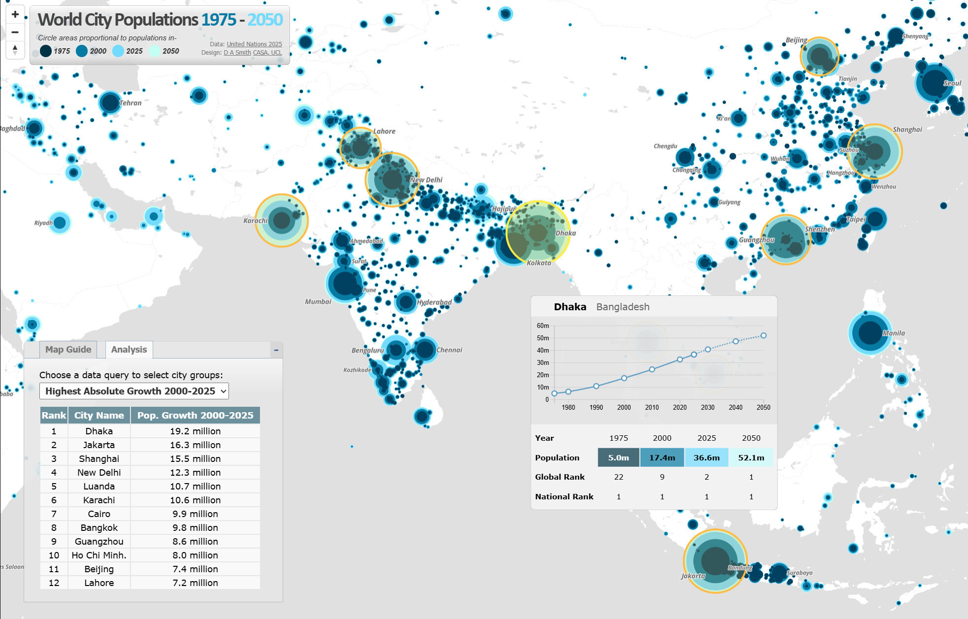
Jakarta and Dhaka Measured as the World’s Largest Urban Agglomerations The UN WUP 2025 uses an updated harmonised global methodology for defining urban agglomerations as contiguous areas of high density urban land (above 1,500 persons per km2) with a minimum population of at least fifty thousand. This new methodology results in several changes to the ranking of the world’s largest city-regions. Tokyo, with a population of 33.4 million is 2025, is often measured as the world’s most populous city, but with this methodology Jakarta, current population a gigantic 41.9 million, replaced Tokyo in 2010. This change in Jakarta’s population appears to be due to updated demographic data, and a misalignment between Jakarta’s administrative boundary and its metropolitan region that caused previous underestimations (I got similar results for Jakarta with my own analysis of the Global Human Settlement Layer data). The projection is for Dhaka and Jakarta to become the first urban agglomerations to exceed 50 million people in 2050.
Stabilisation of Urban Populations in China and India Global urban growth in recent decades has been dominated by China and India. The next 25 years however project a more stable urban picture in the world’s most populous countries, with China starting to follow Japan and South Korea with an ageing and more static population. For example, Shanghai gained a massive 15.5 million people between 2000 and 2025, but this growth is predicted to slow to 5.5 million between 2025-2050. Some cities in West China such as Chongqing, Wuhan and Chengdu are predicted to lose population between 2025-2050, though there are larger population falls predicted in Japan and South Korea.
Population change in India’s largest urban agglomerations follows a broadly similar stabilisation pattern. New Delhi gained 12.3 million residents between 2000-2025 to reach 30.2 million people, but the population growth prediction for the next 25 years is lower at 3.7 million. A similar levelling off can also be seen in the Indian megacities of Mumbai and Kolkata. Urban growth is higher however in India’s South Asian neighbours. Dhaka in Bangladesh continues with very high rates of growth. Dhaka is currently the world’s second largest urban agglomeration at 36.6 million in 2025, and may become the world’s largest urban agglomeration in 2050. Pakistan shows a similar picture, with Karachi predicted to gain 11.5 million people between 2025-2050 to become the world’s fifth largest urban agglomeration.
Highest Growth Rates in Africa, Though Also Lower than Previous Predictions African countries are generally much earlier in their urban transition and so have proportionally higher predicted rates of growth. Luanda is set to gain 8.9 million people between 2025-2050. Dar es Salaam and Addis Ababa are predicted to both become megacities of over 10 million in the next 25 years. Even In African cities however, this release of World Urbanization Prospects shows lower predicted growth for coming decades than previous predictions. Cities such as Lagos and Kinshasa have reduced populations with this methodology.
About the World City Population Visualisation The interactive map has been built using Mapbox JS. The technique of overlaying proportional circles to show urban population change over time was first developed in a static map at LSE Cities Urban Age by Guido Robazza.
Each year CASA master’s students demonstrate their spatial data visualisation skills with a group project. The theme this year was ‘Urban Futures’, and students have produced some very impressive and diverse work, experimenting with a range of visualisation tools and techniques. Click on the images below to visit the project websites.
Urban Resilience Projects Two groups explored at urban resilience and climate change. Some excellent interactive mapping work was created analysing Urban Heat Island effects in the Greater Bay Area of China (one of the world’s largest and fastest growing city regions) and at the potential impacts of sea level rise in New York City.
Transport Sustainability Projects Transport sustainability was another popular topic in urban futures. This included investigating 15 Minute City Accessibility in London (mapping the recent UBDC data), exploring the sustainability of the freight and logistics industry in the USA, and mapping the growth and sustainability of Los Angeles.
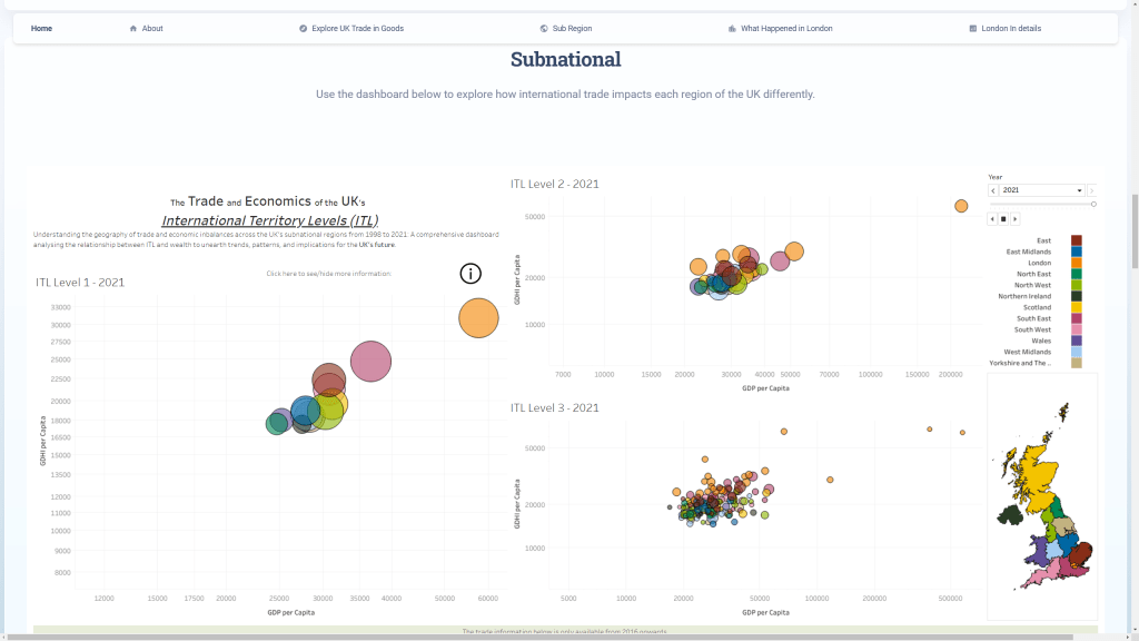
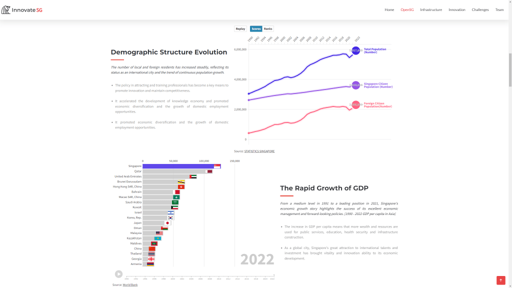
Economic Change and Innovation Projects Several groups explored different aspects of economic futures. This included analysing the UK’s international trade and sub-regional performance using interactive dashboards; and charting innovation policy in Singapore and its international competitiveness with animated charts and mapping.
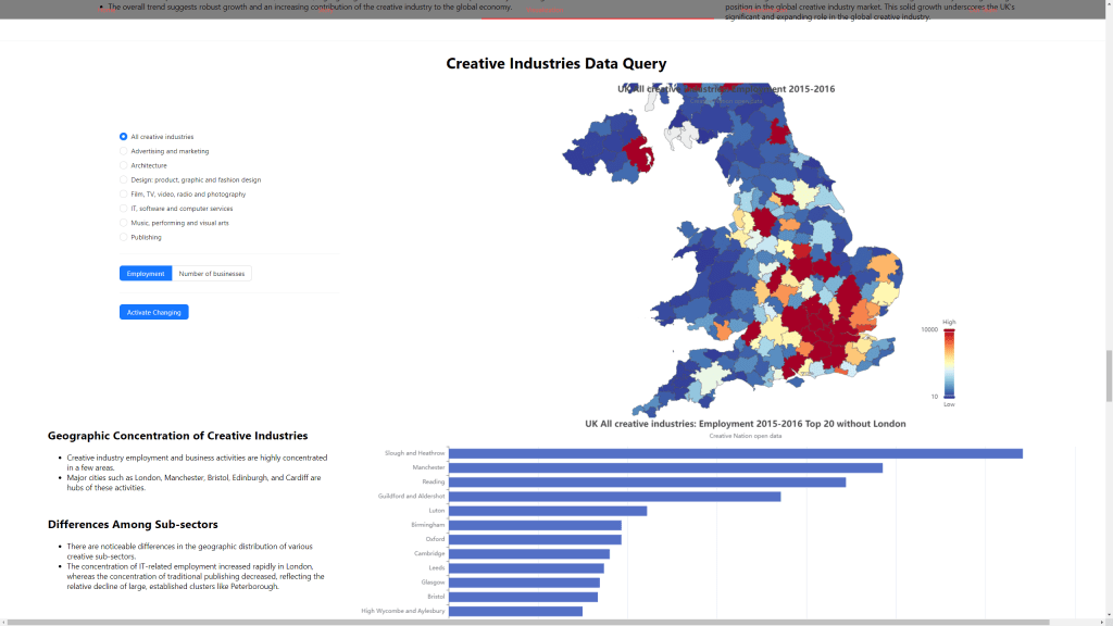
The phenomenon of mobile knowledge economy workers or Digital Nomads was explored in terms of analysing London compared to other global cities. Finally the importance of the Creative Industries to the UK economy was visualised using interactive maps and charts.
Social Change and Ageing Societies Projects Another increasingly important aspect of urban futures is planning for ageing societies. Two groups explored this topic, the first looking more particularly at ageing societies and facilities globally and with the case study of Bournemouth, and the second group exploring ageing societies both globally and in Manchester.
The European Commission JRC recently released a new 2023 update of the Global Human Settlement Layer (GHSL) data. This update has greatly improved the GHSL data, with a 10 metre scale built-up area dataset of the entire globe which has been used to create a 100 metre scale global population density layer. The level of detail for cities and rural areas is impressive, and it overcomes the limitations of previous releases of the GHSL. I have updated the World Population Density Map website to include this new 2023 data, with both the cartography and statistical analysis now based on the new data.
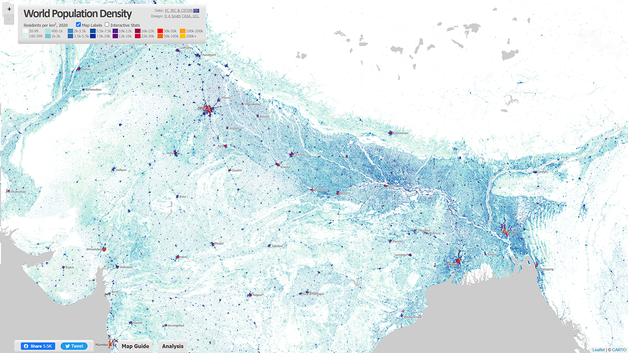
Improved Level of Detail for Cities and Rural Landscapes The new GHSL 2023 data has produced a much more detailed 10 metre dataset of built-up area (using recent European Space Agency Sentinel data), and this is the basis for creating the updated population layer. The results are much improved, particularly for complex rural and peri-urban landscapes in the Global South, such as for India shown below. The tens of thousands of small villages are identified and used to more accurately distribute India’s huge population. This is also the case for other key regions such as Sub-Saharan Africa, and China.
The added level of detail also improves the representation of cities, with more accurate density analysis, and improved techniques to differentiate residential from industrial and commercial urban land uses. Previous releases of the GHSL were underestimating urban densities for cities where census data was weaker, but this appears to no longer be the case. The dataset can now be used for more accurate comparisons of population and density for cities across the globe. Example images for Shanghai and New York City are shown below.
Country Density Profiles – the Diversity of Human Settlement The statistical analysis on the World Population Density Map website has also been updated using the 2023 GHSL data, so you can view the density profiles for all countries around the globe. Some highlights are shown below.
To complement the graph of the population in each density category, this updated version of the World Population Density Map includes Population Weighted Density statistics for each country and city. Population Weighted Density is a measure of the typical density experienced by residents in the country/city, in this case using the 1km2 scale GHSL data. The PWD is calculated by weighting each 1km2 cell according to the population, summing all the cells for the city/region, and then dividing the sum by the total population of the country/city (i.e. the arithmetic mean). This is a more representative measure than standard population density, which is affected by low density suburban/peri-urban and rural land, even where the population in these areas is relatively low.
China and India have very high density cities, but their large rural populations translate into moderate Population Weighted Density statistics overall. India is 9.9k pp/km2 and China is 8.9k pp/km2. The table below shows the top 20 countries by Population Weighted Density using the 2020 data-
Rank (by PWD 2020)
Country Name
Population Weighted Density 2020 (pp/km2)
1
Singapore
30.9k
2
Republic of Congo
25.2k
3
Somalia
24.1k
4
Egypt
21.8k
5
Comoros
17.4k
6
Djibouti
17.2k
7
Iran
16.8k
8
Yemen
16.7k
9
Jordan
15.8k
10
North Korea
14.8k
11
Democratic Republic of the Congo
14.2k
12
Bahrain
13.9k
13
Colombia
13.5k
14
Equatorial Guinea
13.5k
15
Turkey
13.5k
16
Morocco
13.4k
17
Bangladesh
13.3k
18
Taiwan
12.9k
19
South Korea
12.7k
20
Western Sahara
12.6k
For comparison, the equivalent Population Weighted Density figure for the UK is 4.1k, France is 3.7k and Germany is considerably lower at 2.7k. The USA is renowned for its low density living and suburban sprawl, and the Population Weighted Density measure for 2020 is 2.2k. This is the lowest figure for any large developed country in the world. Smaller developed countries have similar figures to the USA, including New Zealand, Norway and the Republic of Ireland.
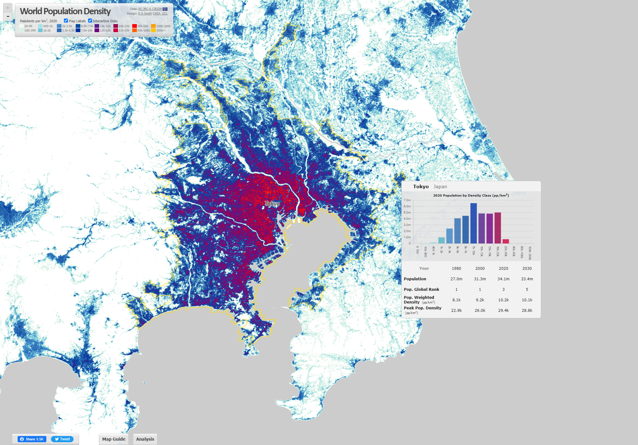
Analysing the World’s Largest City-Regions Using the GHSL The Built-Up Area and Population layers in the GHSL are used to define a settlement model (GHSL-SMOD) layer, which classifies land into urban and rural typologies. We can use this layer to define the boundaries of city-regions across the globe. This has been done using continuous areas of the highest urban category (urban centres) for the 2020 data. When you hover over cities on the World Population Density website, these city boundaries are highlighted-
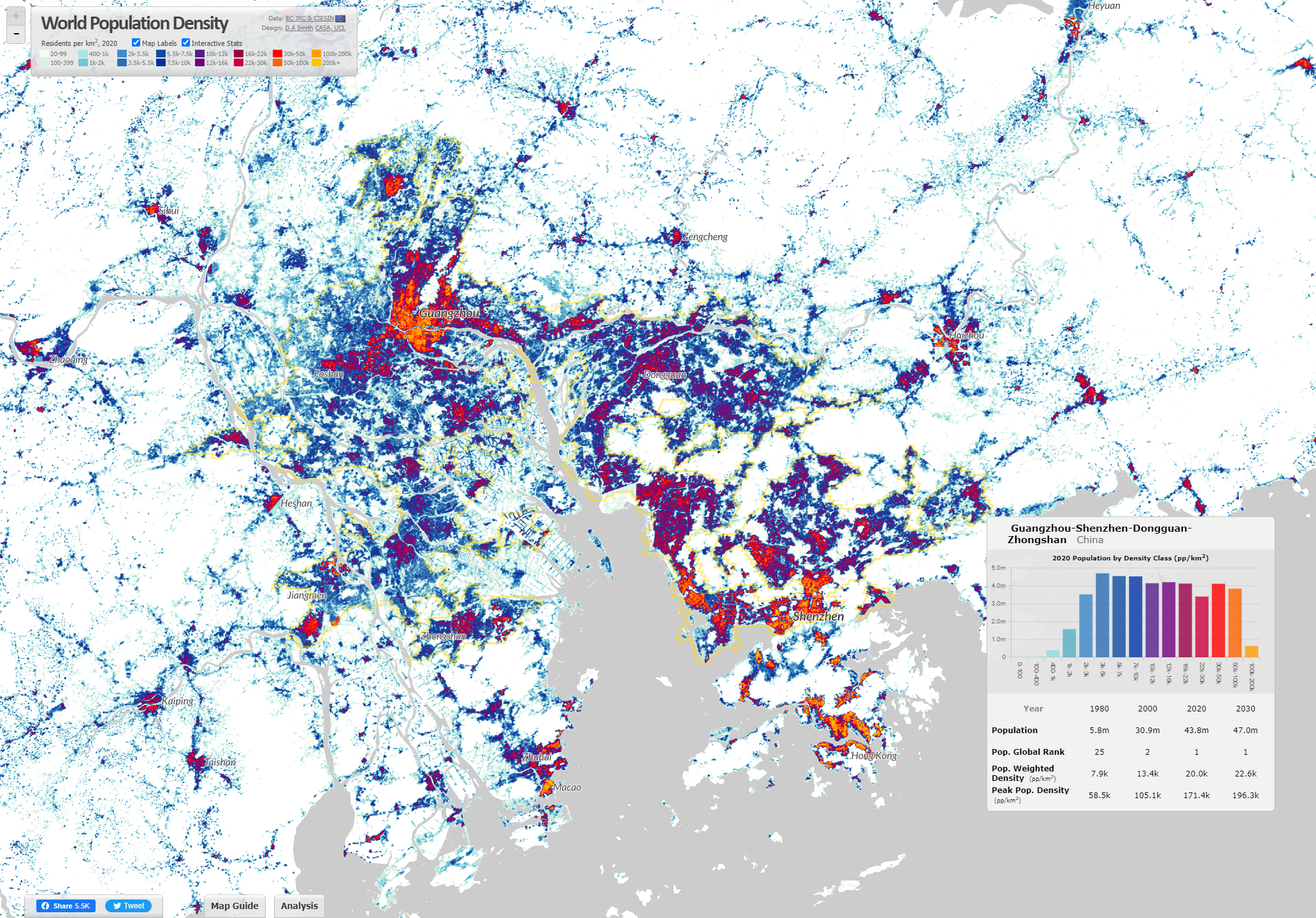
This land use based method of defining city-regions produces different estimates of city populations to analyses based on administrative boundaries. The GHSL method generally emphasises large continuous urban regions, such as the megacity region of the ‘Greater Bay Area’ in China shown above, which has formed from the fusion of Guangzhou, Shenzhen, Dongguan and Jiangmen. This is the largest city-region in the world by this measure, with a population of 43.8m in 2020 (rapidly developing from a base of 5.8m in 1980). The top twenty city-regions in the world are shown below-
Rank (by Pop. 2020)
City-Region Name
Population 1980
Population 2000
Population 2020
Pop. Weighted Density 2020 (pp/km2)
1
Guangzhou-Shenzhen-Dongguan-Jiangmen
5.8m
30.9m
43.8m
20k
2
Jakarta
16.1m
26.3m
38.7m
13.4k
3
Tokyo
27m
31.3m
34.1m
10.2k
4
Delhi
8.3m
19.1m
30.3m
29k
5
Shanghai
6.7m
15.1m
27.8m
27.9k
6
Dhaka
6.2m
14.8m
26.8m
47.9k
7
Kolkata
16.3m
22.9m
26.7m
36.4k
8
Manila
11.3m
18.3m
24.8m
27.1k
9
Cairo
9.8m
16.6m
24.5m
44.9k
10
Mumbai
11.3m
18.4m
22.9m
52.4k
11
Seoul
13.3m
19.7m
22.7m
19.8k
12
São Paulo
13.7m
17.4m
19.7m
14.5k
13
Beijing
7.2m
11.6m
19m
20.2k
14
Karachi
5.8m
10.9m
18.7m
48.8k
15
Mexico City
13.8m
17.9m
17.8m
13.2k
16
Bangkok
5.4m
9.2m
17.4m
11.6k
17
Osaka
17.2m
16.8m
15.6m
8.1k
18
Moscow
9.9m
11.9m
14.9m
16.7k
19
Los Angeles
10m
13.1m
14.5m
4.6k
20
Istanbul
6.1m
10.4m
14.3m
25.2k
One of the most impressive aspects of the GHSL is that it is a timeseries dataset going back to 1975. Therefore we can create historical indicators such as the population change data shown in the table above. Many cities have more than doubled, or even tripled in population size since 1980, including Delhi, Shanghai, Dhaka and Karachi. Rates of growth in the USA, Japan and Europe are inevitably much lower, as seen in Tokyo and Los Angeles in the table above. Tokyo is often measured as the world’s largest city (for example in the UN World Urbanization Prospects), though with the GHSL method Tokyo the third largest at 34.1m in 2020. Tokyo is also distinctive in terms of its Population Weighted Density at 10.2k pp/km2. While this figure is more than double the density of Los Angeles, Tokyo’s medium density is much lower than cities in China and South Asia. Incredibly, Mumbai’s density figure is five times higher than Tokyo at 52.4k pp/km2, and Karachi is not far behind at 48.8k.
Each year MSc students at CASA demonstrate their spatial data visualisation skills with a group project. The theme this year was ‘Global to Local’, and the class of 2022 has produced some particularly excellent work, experimenting with a range of visualisation tools and techniques.
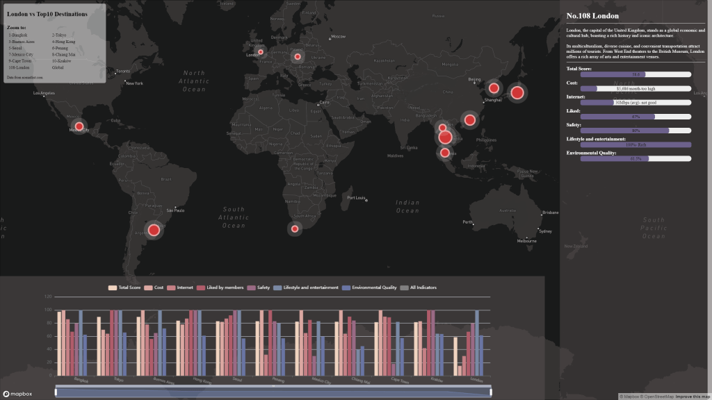
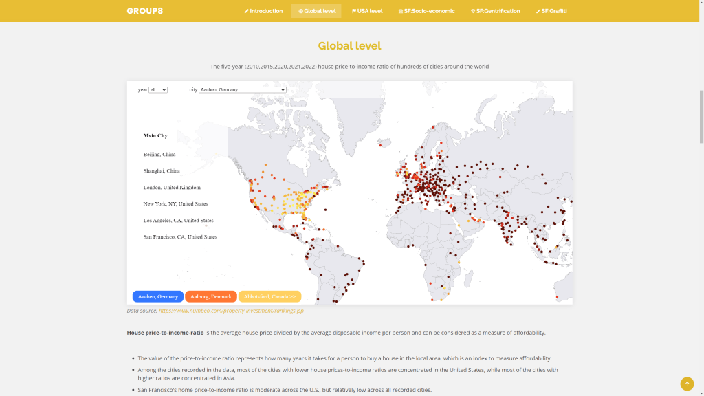
Energy and the Cost of Living Returning to the sustainability theme, several groups zoomed in on energy and affordability challenges that the world is currently experiencing. One group used some advanced D3 charting to tell the story of the UK’s varying energy imports and wider global affordability challenges (see image below). A different take was to chart the energy generation mix in major economies around the world. Another topical affordability challenge relates to housing in major cities, and one group mapped relative affordability of housing in major cities across the globe.
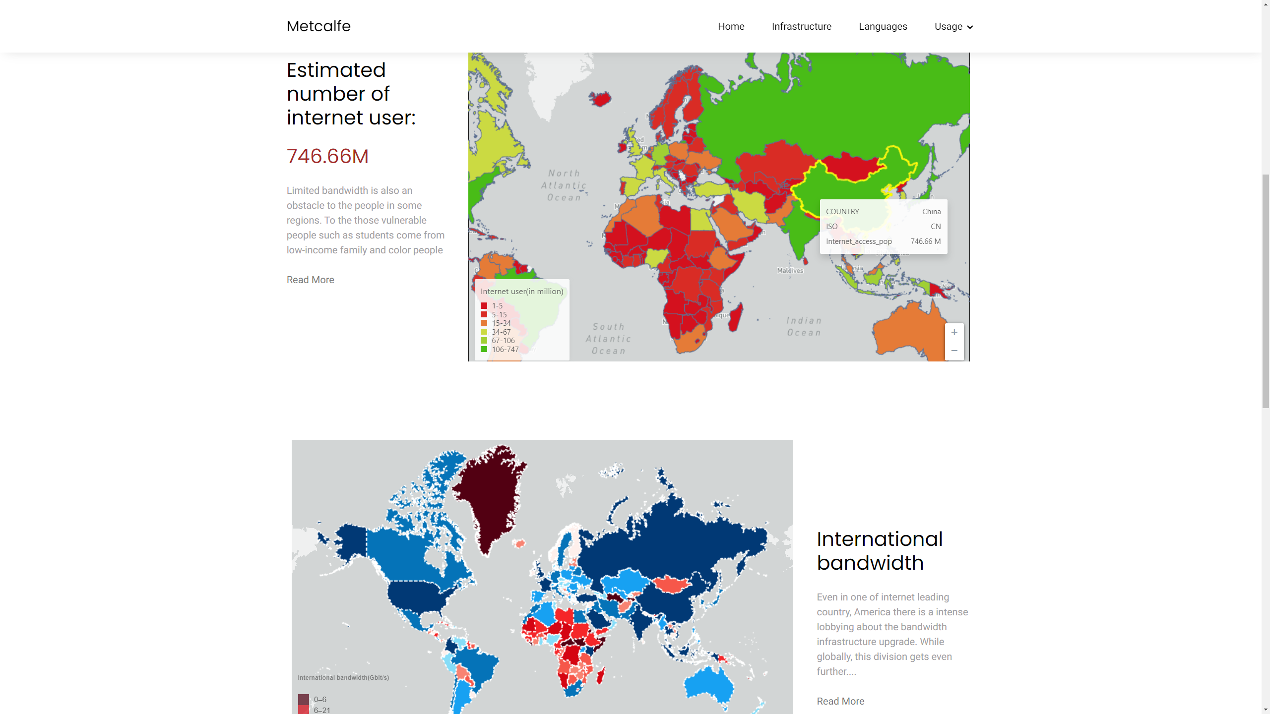
Global Digital Divides Finally, another interesting take was to think about online communities as interactions between global and local, including the changing geography of internet access and the division of the world into different online platforms by language and political and economic divides.
Global internet connections and the digital divide by Group 12 (Ruijie Chang, Maidi Xu, Zhiheng Jiang)
Here is the full list of project groups and websites-
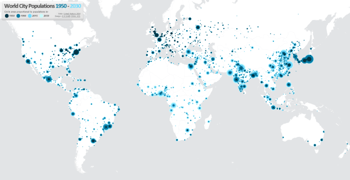
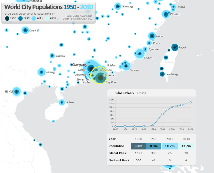
One of the best datasets for understanding the explosive growth of cities across the world in the last 65 years in the UN World Urbanisation Prospects research, which records individual city populations from 1950 to 2014, and includes predicted populations up to 2030. I have been meaning to create an interactive map of this fascinating data for a while, and have now completed this at- luminocity3d.org/WorldCity/
The map uses proportional circles representing city populations in the years 1950, 1990, 2015 and 2030, highlighting the regions in the globe with the most spectacular urban growth, and the time period when this growth occurred. This technique of overlaying proportional circles to show population change over time was first developed in a static map at LSE Cities Urban Age by Guido Robazza. Naturally China, India, Africa and Latin America jump out in the map, while Europe is largely static (except for Turkey). You can also explore time-series graphs and statistics for individual cities by moving your cursor over each city.
The site also includes queries of the city statistics, for example highlighting the world’s largest cities in different years. It’s amazing to see the dramatic changes between 1950 and 2015. London was the 3rd largest city in the world in 1950, and is now the 36th. In 1950 there were no African cities and only one Indian city in the world’s top 12, but by 2030 this list is dominated by South Asian, East Asian and African cities.
Mapping Tools Used
This map is the first time I’ve tried out CartoDB for interactive mapping, and I’m impressed with this tool. The main advantage of CartoDB for thematic mapping is the ability to perform SQL queries on the client-side, allowing map features to be highlighted interactively (this is used for the map queries on the World City site). There is also the ability to comprehensively restyle map symbology from the client using CartoCSS (this feature requires a full map refresh). Certainly sophisticated interactive mapping functionality is possible using CartoDB. It’s also Leaflet.js based, which is what I’m used to from the previous LuminoCity3D project.
Cities and Mega-City Regions
Measurements of city populations inevitably depend on where regional boundaries are defined, and the UN database is by no means perfect. The job of trying to integrate the hundreds of different city definitions used by each individual nation-state is no easy task. The UN tries to apply the concept of metropolitan agglomerations across the globe, but data is not always available and some cities are measured using administrative boundaries, which leads to population underestimation (full details on the UN methodology).
One of the interesting definitional issues that arises is around how very large polycentric regions have emerged in parts of the globe and beginning to look more like a single giant city. One of the most famous is the Pearl River Delta Megacity Region-
There are so many giant cities in close proximity that the map symbology struggles. Hong Kong, Guangzhou, Shenzhen, Foshan and Dongguan are all huge cities. Shenzhen in particular has experienced the most rapid growth of any city in history, growing from small town in 1980 to 10.7 million people in 2015. The combined population of these cities would make the Pearl River Delta the largest city in the world if a wider regional definition was employed.
CASA and UCL Geography have substantial experience in developing online interactive mapping sites for research outreach. The purpose of these tools is to take spatial analysis and visualisation outputs from the research lab and make them accessible and useful for many users from a wide variety of sectors and backgrounds, including: wider academia, central and local government, built-environment professionals, business, technology, community groups and the general public. Interactive mapping tools are part of the movement to make science and research more accessible, supported by the main UK research funding bodies as well as specific campaign movements like Open Data and Open Science.
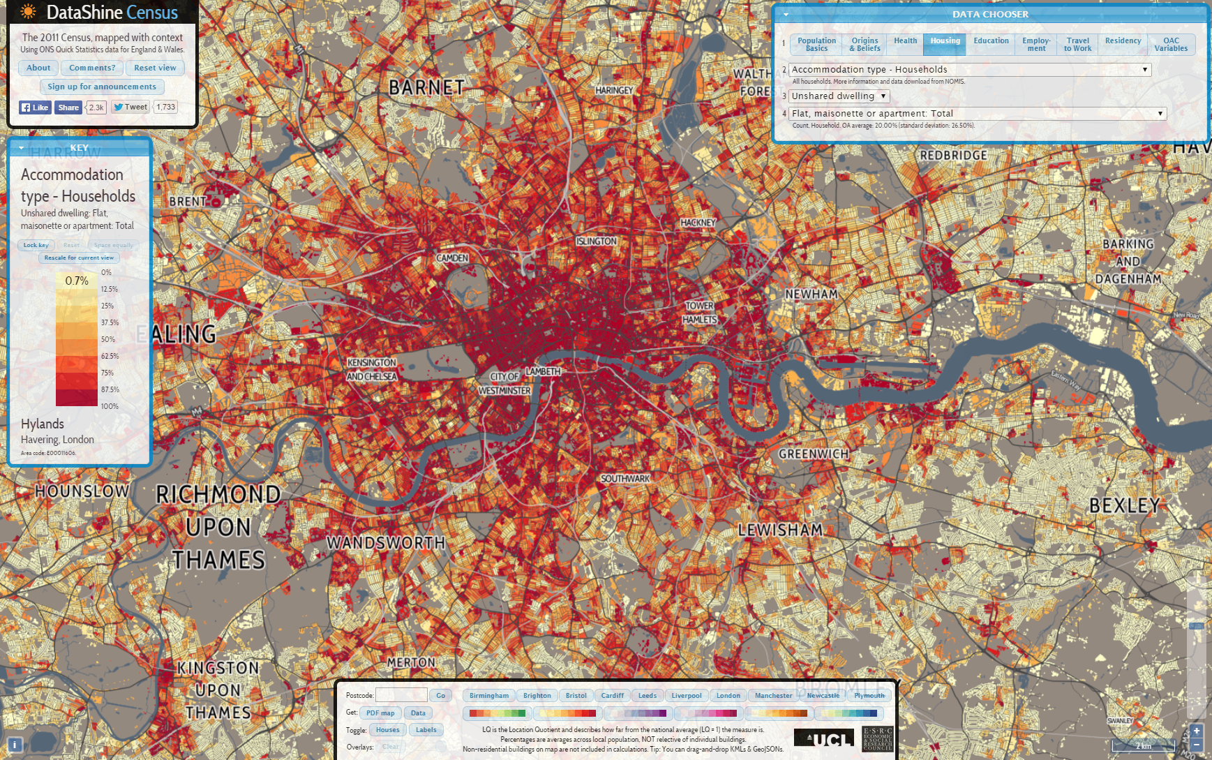
The positive media coverage of recent projects and our communications with users has indicated that interactive mapping sites do reach a wide audience, including various expert users as well as the general public. These mapping projects are however a relatively new set of tools, and there is a lack of detailed information and evidence on who is using interactive mapping sites and the degree of research impact that they can deliver. In this post I explore two recent interactive mapping projects, DataShine.org.uk & LuminoCity3D.org, and analyse who has shared these sites using data from Twitter. This method is not without its flaws as described below, but is an early attempt to gather evidence and understand the user base.
‘Engaged’ Users and Social Media Sharers
A well designed interactive mapping site can generate a lot of hits, particularly if it gets picked up by national media sites. DataShine generated a huge 99,000 unique users in its first three months after launch in June last year, while LuminoCity had a reasonably large 24,000 unique users in its first three months from September 2014.
How many of these hits are truly engaged users? We can approach this question in terms of web statistics. On the LuminoCity site during the first three months, 16% of users made at least one return visit; 18% of users stayed for at least three minutes; and 26% of users explored at least four different maps during their session. So we can estimate that around 20% of the total users are exploring the site in some depth. That’s not a bad return where there is a high number of total users, e.g. this would equate to 19,800 people for the first three months of DataShine, and 4,800 people for the LuminoCity site.
We do not know however who these users are. Are they mainly interested members of the general public? Are they expert professional users? This is harder to gauge.
Classifying Twitter Users
We do have further information about the most engaged group of users- the social media sharers. These are the people who actively promoted the site to their network of followers/friends. The two major social media sites are Facebook and Twitter, with 4% of visitors of both DataShine and LuminoCity either sharing/liking the site on Facebook or posting the link on Twitter in the first three months. This is a high proportion of social media sharers, and reflects the novel and accessible nature of the sites which helped to generate enthusiastic users.
In this analysis I have classified Twitter users who shared site links to Datashine and LuminoCity according to their profession. Naturally there are some problems with this approach- this selection reflects only the most enthusiastic users of the mappings sites; Twitter users are a biased sample (generally towards affluent professionals, tech and media users); many users have multiple professions (I tried to pick the main one); and professional and personal opinions on Twitter overlap significantly. However this is an early effort to explore types of users of interactive mapping sites, and hopefully this can be built on in the future.
The DataShine Census Site
Below is the classification of 350 Twitter sharers from the DataShine site. It is clear that a wide variety of users are covered, including both professional and community groups (a more detailed table is at the end of the post)-
Geographers were not surprisingly the main group of academic users, but DataShine also attracted many users from across the natural sciences, social sciences and the humanities. Health researchers were particularly well represented, as the site provides many useful health related maps from the 2011 census. This result also chimes with a high number of business users in the public policy sector, mainly with a health and planning focus.
The innovative visualisation technology behind the DataShine site appeals to IT users, and there were many sharers from IT, cartography, data journalism and data science backgrounds.
One of the biggest successes with the DataShine site was in reaching beyond academic and professional experts to local communities. The site provides high quality maps of census data at the neighbourhood level, and this successfully appealed to local community groups, campaigners (e.g. cycling campaigns, local environment campaigns) and to local government users. Several councillors tweeted the site, as well as users from DCLG and local government planners. Media coverage also helped to generate many interested users from the general public.
The LuminoCity Site
The data from the LuminoCity site is based on a smaller sample of 140 Twitter shares. This covers a similarly wide variety of users, with more of a focus on built-environment professionals, and less on local government and the general public.
The LuminoCity site provides a range of maps and statistics for the comparative analysis of UK cities. This functionality appealed strongly to planners and transport consultants, as well as some business users in economic development and real estate. Academic users also had a more urban focus for the LuminoCity site. The site did not chime so strongly with local government and community users who generally want a more local scale of analysis. There were some users from Central Government who used the site for measuring economic performance in northern cities.
The more abstract minimalist aesthetic used on the LuminoCity site attracted quite a few architects and designers to the platform. These users are enthusiastic about visualisation while being less familiar with the range of open data available at city and national scales.
The ‘Other Education’ sector, which was popular for both sites, includes high schools, geography departments, museums and the wider education sector beyond universities. This was an unexpected outreach success for both of the websites, and shows how the open approach can help to create new connections.
Summary
This analysis of twitter shares from interactive mapping platforms shows how these tools can successfully appeal to a wide range of users, both professional and the general public. Academics are well respresented, but also business users, government, local communities and the wider education sector.
Twitter users are inevitably a biased sample and it would be useful in the future to look at methods that can capture a larger proportion of engaged users and assess to what extent the most engaged social media users represent the wider engaged audience for the sites.
Urban policy is currently riding high on the UK political agenda. A combination of the desire to rebalance the UK economy away from financial services; debates over massive high-speed rail investment; the worsening housing crisis in the South-East; and city devolution demands following the Scottish referendum, all point to major reform. As we move towards the 2015 general election, addressing city concerns is going to be a key, perhaps even decisive, election debate.
It is therefore a good time to take stock of recent urban growth and change in Great Britain, assess policy successes and failures, and consider how better outcomes might be achieved in the coming decades. This post draws on map visualisations from the LuminoCity3D.org website.
London and the South-East: Global Boom Region to Elite Island?
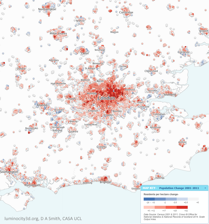
London’s recent growth has been phenomenal, gaining over a million residents (+13%) between 2001 and 2011. As we can see in the figure below, population growth has occurred across all of Greater London (except Kensington & Chelsea), with the strongest concentrations in Inner London and East London, reflecting the priorities of successive London Plans. This spectacular growth has not been confined to Greater London either, but is found across the South East region. The fastest growing UK towns and cities are nearly all in London’s orbit, including Milton Keynes with 20% growth, Ipswich with 15% growth, Cambridge with 16% growth and Ashford with 21% growth. This shared growth clearly illustrates that the South East is a closely integrated region, as further demonstrated by extensive commuting flows.
Population Change 2001-2011 in the South East region.
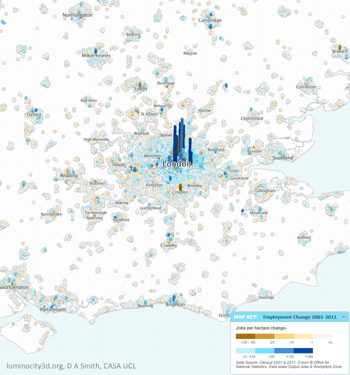
Inevitably it is strong economic growth that underpins this rise in population. London gained 650,000 jobs (+15%) between 2001-2011, strongly focussed in Inner London and Canary Wharf. Employment growth is much more unevenly spread across the South East, and arguably booming Inner London is taking jobs away from other centres, or pressuring some into becoming dormitory suburbs through soaring demand for housing. This is most clearly seen in Outer London in centres such as Croydon and Bromley where employment has fallen, while resident population has risen.
Employment density change 2001-2011 in the South East region.
Inner London is dominant for many employment sectors, not just financial and business services, but also creative industries, research, tourism, and increasingly for information technology, helping London to bounce back successfully from the great recession. The IT industry is an important growth sector, and has traditionally been concentrated in Reading, Bracknell and surrounding towns, an area dubbed the Western Sector by Sir Peter Hall in the 1980s. The Western Sector still retains the highest percentage of IT jobs in GB, but recent growth here has been sluggish. The current stars of the IT industry are now online and social media businesses, and these are attracted to the creative pull of Inner London. Meanwhile the most significant South East growth story outside the M25 has switched north, with Oxford (12% jobs growth), Milton Keynes (14% jobs growth) and Cambridge (22% jobs growth) forming a new northern arc of science and engineering based growth.
So with so many success stories, you be forgiven for thinking everything looking rosy for London and the South East. Unfortunately this is not the case. Soaring population growth has in no way been matched by new housing construction. What was previously a housing affordability problem in the South East is now an outright crisis that threatens to put the brakes on the entire region. Mean house prices just passed the incredible figure of £500,000 in July of this year, and a recent survey placed London as the most expensive city in the world to live and work. This is a looming disaster for future growth prospects. The crisis is not limited to London either, as shown below, with median prices above £300k for much of the South East, and the most popular cities experiencing similar extremes to London.
House prices 2013 in the South East region.
Soaring prices may seem like great news for property owners, but ultimately cities rely on their ability to attract talent and new businesses. And as London’s competitiveness falls, growth will go elsewhere. What has traditionally been a region of opportunity risks becoming a closed-shop for the wealthy.
And the situation is in danger of getting worse before it gets better. The current UK government did not create the housing shortage, but have overseen a period of historically low house building, with 2014 rumoured to hit rock-bottom. Mapping new-built housing sales leaves a sea of white, largely because there have been so few new houses constructed to sell. The recession presented an ideal opportunity for investing in housing and addressing unemployment, but this opportunity was missed. Trumpeted planning reforms have achieved very little, while right-to-buy policies have simply further increased prices.
Solving the housing crisis requires reform on a number of fronts. More power for local authorities to borrow money and make compulsory land purchases would certainly help. Linked to this is a desperate need for property tax reform to encourage housing to be used efficiently. Currently a £300k house pays the same council tax as a £10 million house, while empty housing is not discouraged, leaving many houses in Inner London as empty or underused investment vehicles. Similar arguments are made in favour of a land value tax to encourage land to be used efficiently and stop land banking.
Perhaps the most controversial issue is whether the green-belt can be retained in its current form. Calls from the eminent Richard Rogers that all new development can still be on brownfield frankly look out of touch with the reality in the South East. The debate really needs to switch towards how a controlled release of green belt land can be managed to avoid car-based sprawl and develop sustainable urban areas. Mapping rail infrastructure and urban density in the South East as shown below indicates that there are many potential locations with rail stations and room for growth. This approach would only however create more commuter towns, and ultimately there needs to be stronger planning for the entire South East region, likely with big urban extensions for successful cities such as Milton Keynes, Cambridge and Brighton. It is interesting that recent entries for the Wolfson prize were focussed on this approach.
Rail infrastructure, the green belt and urban density in the South East region
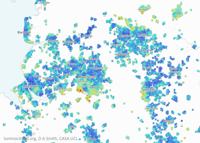
Northern Evolution: an Emerging Hierarchy of Urban Centres? While the South East is in danger of overheating, the majority of the UK’s city-regions have been focussed on post-industrial regeneration and stimulating growth. And in the last decade there has been significant change for many northern cities. Starting in the North West and Yorkshire we can see rising populations in all the major city centres. Greater Manchester in particular has experienced high levels of growth, gaining 200,000 residents (+8%) and 100,000 jobs (+10%) between 2001 and 2011. By the regional definitions used in LuminoCity3D.org, Greater Manchester has overtaken the West Midlands to become the second largest city-region in the country with 2.6 million residents. Manchester city centre has also experienced high rates of employment growth and is the primary centre in the North West, with positive signs in the business services and science & engineering sectors.
The Leeds and West Yorkshire region is also growing quickly, gaining 120,000 residents (+8%) and 50,000 jobs (+6.6%). Population growth is greatest in Leeds city centre, but is evident across the region, particularly in Bradford and Huddersfield. Similar to Manchester, employment growth is focussed strongly on the largest centre, Leeds, with a concentration in financial and business services. Despite West Yorkshire and Greater Manchester being two of the most dynamic northern regions, there is very little travel interactions between them due to poor transport links, and this surely needs to be a policy priority.
Sheffield also displays significant city centre led growth, gaining 45,000 (+6.3%) residents and 21,000 jobs (+6.7%), as does Liverpool although there has been some population decline in the suburbs. Liverpool’s figures are a gain of 21,000 residents (1.8%) and a more impressive 44,000 jobs (10%).
Population change 2001-2011 in the North West and West Yorkshire regions.
Employment density change 2001-2011 in the North West and West Yorkshire regions.
The house prices map for the north-west and Yorkshire makes a very interesting comparison to London. The dramatic gentrification that has transformed Inner London towards increasing affluence and polarisation has not (yet?) occurred. The wealthy areas are mainly suburban in the north-west, often where large cities merge with national parks such as the Peak District and the Yorkshire Dales. There are some signs that wealthier South Manchester is beginning to move towards the city-centre, but this is still in earlier stages of city-centre transformation.
House prices 2013 in the North West and Yorkshire regions.
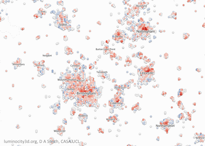
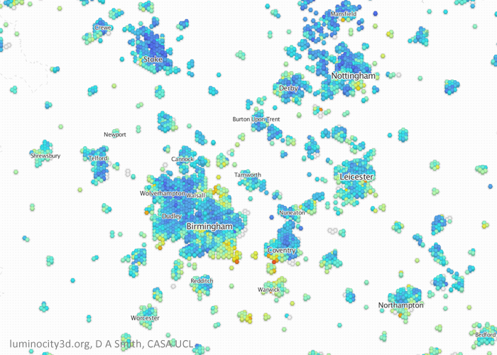
Moving on to the Midlands, again we can see population growth across all major city centres. Birmingham and the West Midlands gained 162,000 residents (7.3%) and 47,000 jobs (+4.8%) between 2001 and 2011, with similar city centre employment density levels to Manchester. The most dynamic cities in the Midlands seem to be medium sized cites, with Leicester growing 12.8%, Nottingham by 8.1% and Derby by 11.8%, although jobs growth is more mixed. There is a significant concentration of business service jobs in Birmingham city centre, but by far the most distinctive sector in the Midlands economy is hi-tech manufacturing and R&D jobs linked to the automotive industry. Clusters around major factories can be seen in Solihull Birmingham, Coventry, Derby, Telford, Warwick and Crewe, with manufactures including Jaguar Land Rover and Toyota. The distributed nature of employment contributes to considerable travel flows between neighbouring cities.
Population change 2001-2011 in the Midlands region
Employment density change 2001-2011 in the Midlands region.
Similar to the North West and Yorkshire, city centre housing markets are relatively inexpensive in the Midlands, with wealthier areas in the suburbs, particularly between Birmingham, Coventry and Warwick/Leamington Spa. There are signs that wealthier groups to the south of Birmingham are moving further into the city centre.
House prices 2013 in the Midlands region.
Will Growth Transfer from the South East to the North? With the South East struggling to accommodate growth and northern regions trying to attract more growth, the answer seems obvious- transfer growth to the north. Unfortunately urban economics is seldom that straightforward. London is a global leader in a range of service sectors, and it does not automatically follow that existing firms and new firms would choose northern cities over the South East. There are however many encouraging signs in cities such as Manchester, Leeds and Birmingham with growth in a range of knowledge-economy sectors. The gap with the South East still remains extensive, and this essentially is the crux of the debates about city devolution and infrastructure investment: whether or not these policies can enable northern cities to bridge this gap. London currently has great advantages in terms of public money invested in infrastructure like public transport, and also in terms of political power to plan and manage growth through the Mayor and Greater London Authority. The argument in favour of empowering northern cities looks increasingly convincing, and we shall see in the coming months whether politicians are brave enough to instigate this process.
Recent urban growth in the UK has further emphasised the role of cities in influencing economic prosperity, quality of life and sustainability. If we are to meet 21st century social and economic challenges then we need to plan and run our cities better. Data analysis can play a useful role in this task by helping understand current patterns and trends, and identifying successful cities for sharing best practice.
LuminoCity3D.org is a mapping platform designed to explore the performance and dynamics of cities in Great Britain. The site brings together a wide range of key city indicators, including population, growth, housing, travel behaviour, employment, business location and energy use. These indicators are mapped using a new 3D grid-based approach that allows consistent comparisons between urban areas to be made, and relationships between urban form and city performance to be identified (technical details are provided here). Press coverage of LuminoCity3D has included Londonist, Wired.co.uk, Independent Online and Guardian Cities.
Taking for example employment density change in northern English cities as shown below. Current growth is mainly in ‘knowledge-economy’ services that generally favour being clustered together in city centres, generally reinforcing a select few larger centres rather than many smaller centres. There is clear growth in Manchester, Leeds and Liverpool city centres, particularly Manchester which displays the biggest increase in employment density of any location in GB. But around these success stories there is a much more mixed picture of growth and decline for many other centres that are finding it more difficult to compete for firms and jobs.
Employment density change in the north of England (blue is an increase and orange decline). Manchester and Leeds city centres have established themselves as the largest centres, with the biggest increase in Manchester.
Interactive City Statistics
City statistics are available to make more precise comparisons between urban areas. Statistics can be viewed on LuminoCity3D.org by moving your mouse pointer over a city of interest, or by hovering/clicking on the GB Overview Chart at the bottom left of the screen. The graphs and statistics change depending on the map indicator selected, so that the LuminoCity maps and statistics are interactively integrated.
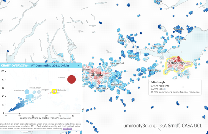
The example below shows public transport travel, a key sustainability indicator that also has important economic and equity implications. Greater London is by far the public transport centre of the UK with nearly 50% of commuting by public transport. Without the investment and historic advantages of London, city-regions like Manchester and Birmingham do not even manage 20% PT commuting. But we can see that it is not essential to be as gigantic as London to achieve more sustainable travel. Edinburgh, with a compact form and extensive publicly owned bus network, achieves 36% PT commuting.
Public transport commuting in central Scotland. Hovering over urban areas highlights indicator statistics and highlights the city’s position on the GB Chart.
All the datasets used are government open data. Websites such as LuminoCity would not be possible without recent open data initiatives and the release of considerable government data into the public domain. Links to the specific datasets used in each map are provided to the bottom right of the page under “Source Data”.