Many global cities are investing in cycle infrastructure to help create more sustainable and healthy communities. Currently cycling levels and infrastructure quality are highly varied across European cities, and planners and researchers need methods to track progress towards achieving high-quality, safe cycle networks. This blog post describes research on ENHANCE, a Driving Urban Transitions project, quantifying cycle network quality using the examples of Amsterdam, a leading cycling city, and London, a city seeking to improve its cycling infrastructure.
Classifying Cycle Infrastructure Quality
Two frameworks are used here to classify cycle infrastructure quality. The first analyses the geography of cycle lanes, with protected lanes physically separated from traffic being the desired standard to enable all residents to use the cycle network, including more vulnerable cyclists such as children and elderly residents. The second approach is a modified version of Level of Traffic Stress framework which measures wider road conditions in addition to cycle lanes, such as speed limits, road type and road width (the full methodology is described here). The data used is OpenStreetMap which includes comprehensive data on cycle lanes and streets as well as being a global dataset, enabling international comparisons.
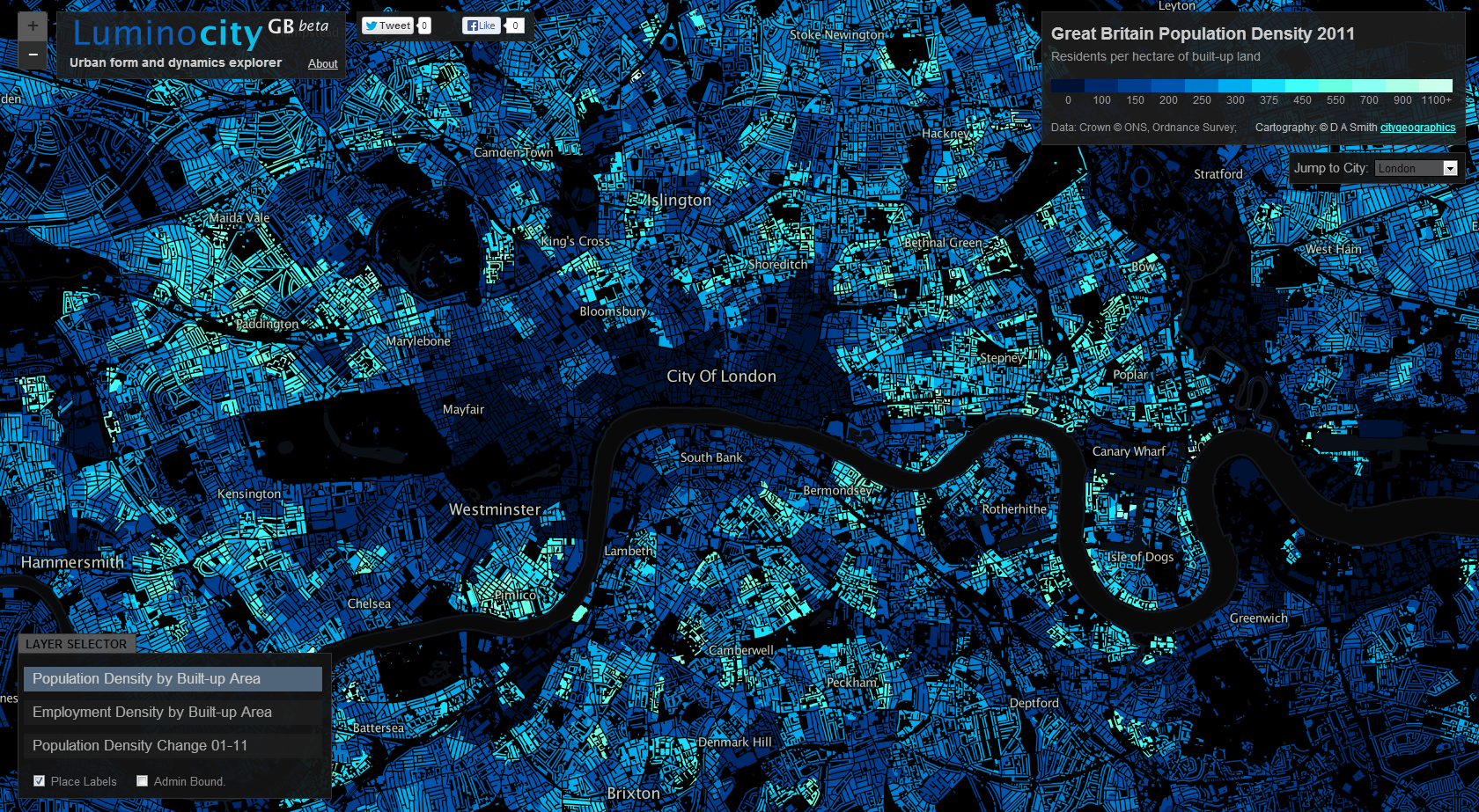
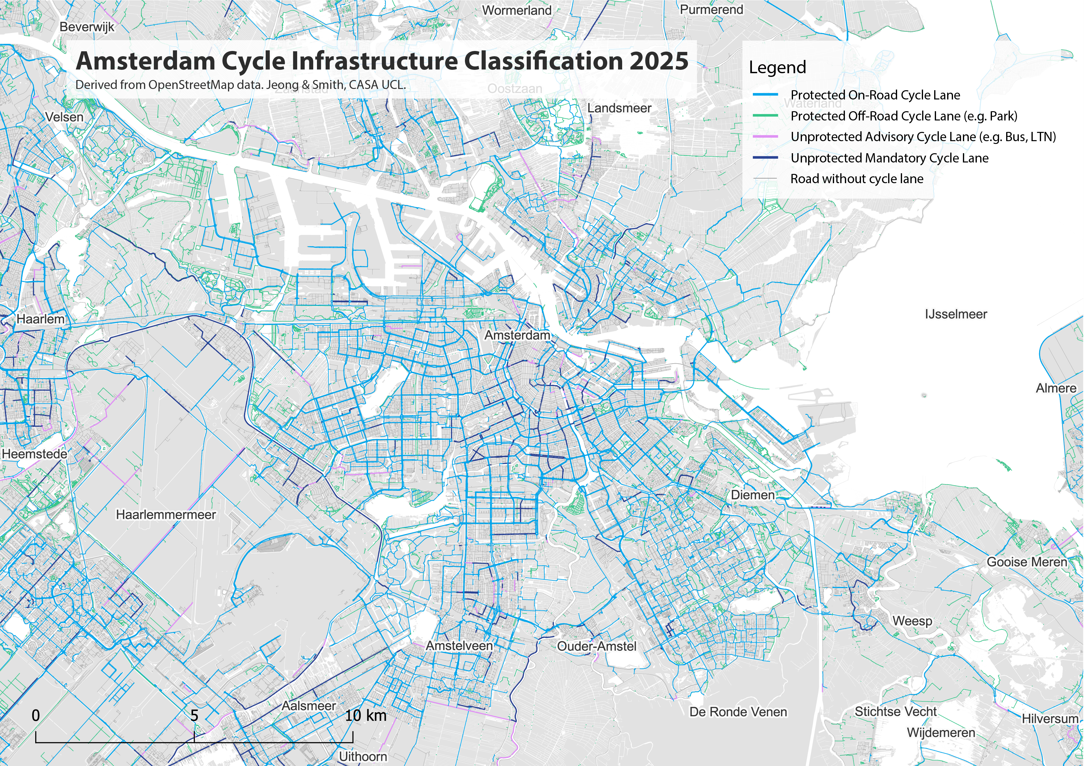
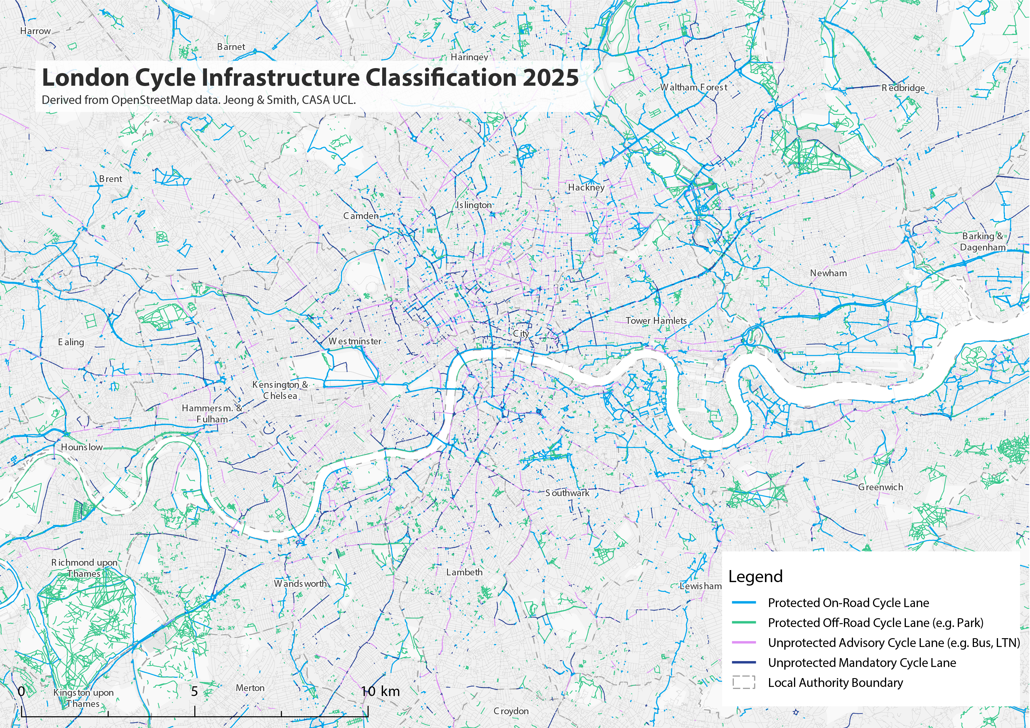
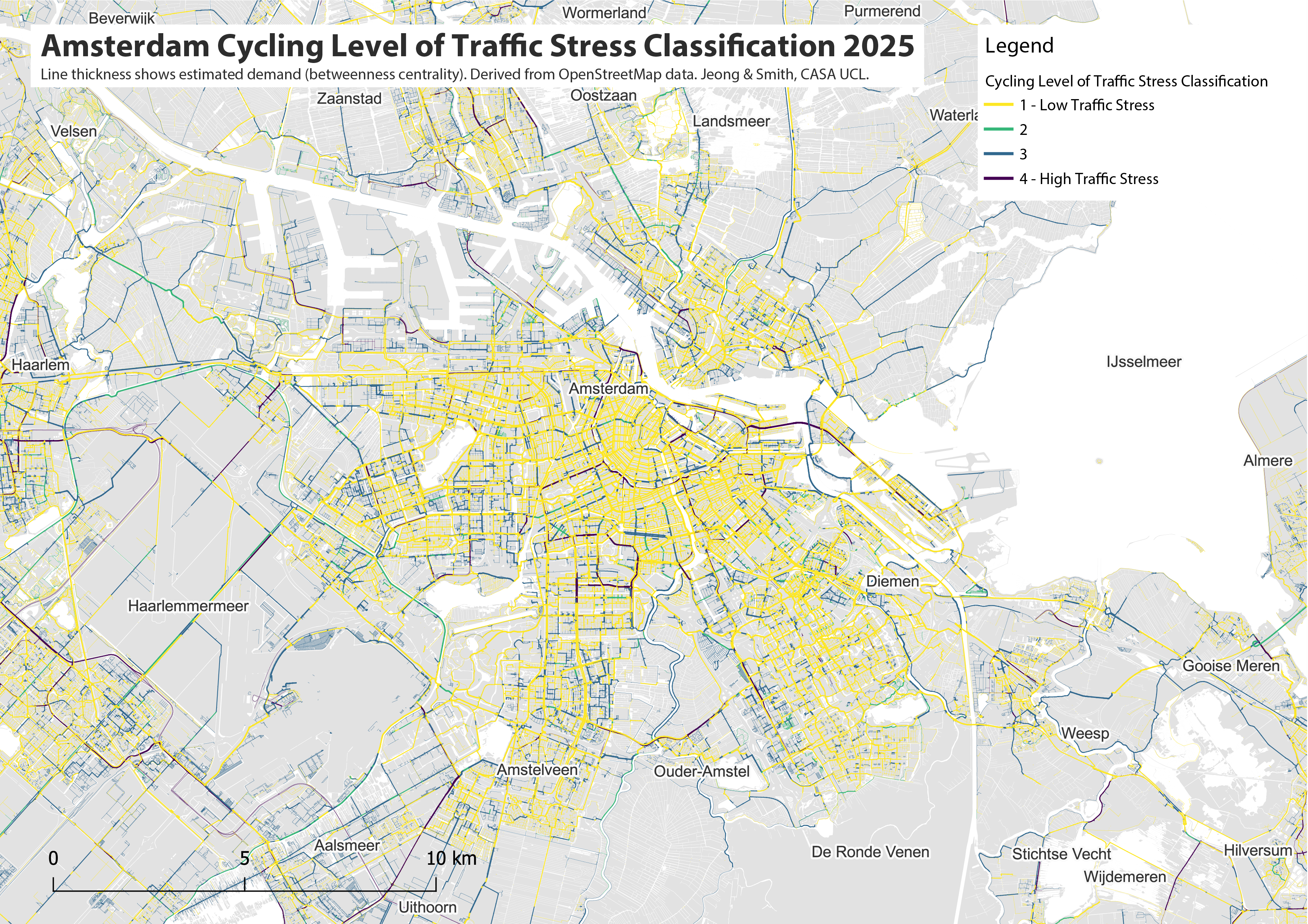
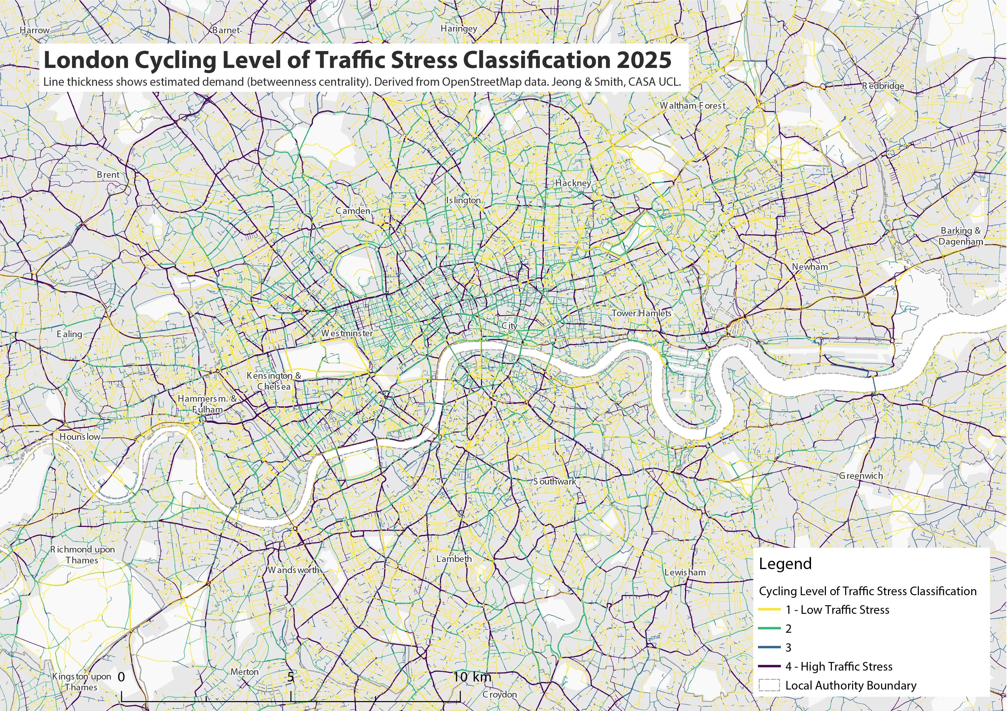
The maps below show the classification of cycle infrastructure for the Amsterdam region and for Greater London. The bright blue and bright green routes indicate high-quality protected cycle infrastructure separated from traffic. Amsterdam has a very comprehensive cycling network, covering all main roads, and linking urban settlements across the wider region. Green colours represent off-road cycle lanes in parks and rural areas. London’s network is in comparison patchy and incomplete, with large areas of the city lacking cycle infrastructure. The purple and dark blue lines indicate unprotected cycle infrastructure, such as Low Traffic Neighbourhoods where cyclists mix with low speed traffic (purple), or on-road cycle lanes without a physical barrier with road traffic (dark blue). These unprotected cycle lanes are rare in Amsterdam and relatively common in London. Roads without any cycle lane infrastructure are shown in grey (note this can also reflect data missing in the OpenStreetMap database).
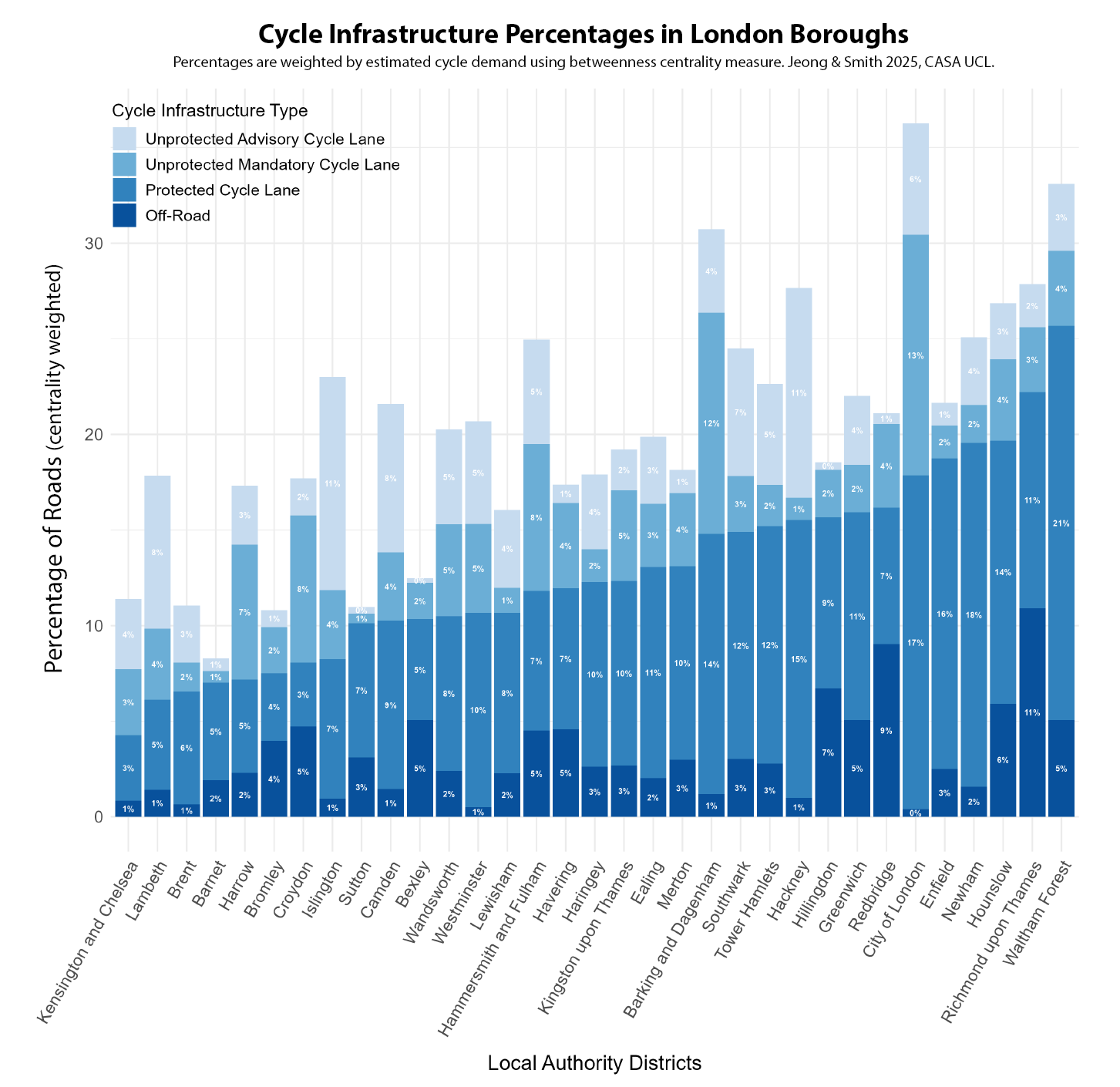
As well as mapping cycle infrastructure quality, the classification measure can also be used for statistical summaries. The chart below shows the percentage of roads with different types of cycle infrastructure, summed for each local authority in the Amsterdam region. This measure takes into account cycle route demand, based on network analysis to the most common destinations. This means that popular major cycle routes are weighted highly compared to sparse rural routes (the results are then normalised for each authority). In the Amsterdam region, most authorities have over half of all roads with protected cycle lanes. For the City of Amsterdam, the figure is 55% and there are eight authorities that score even more highly than Amsterdam with this measure, led by Hilversum and Laren. The comprehensive protected network is consistent across the metropolitan region, with only Wormerland, Edam-Volendam and Alkmaar falling below 40%. These authorities are all in the more rural Noord-Holland peninsula.
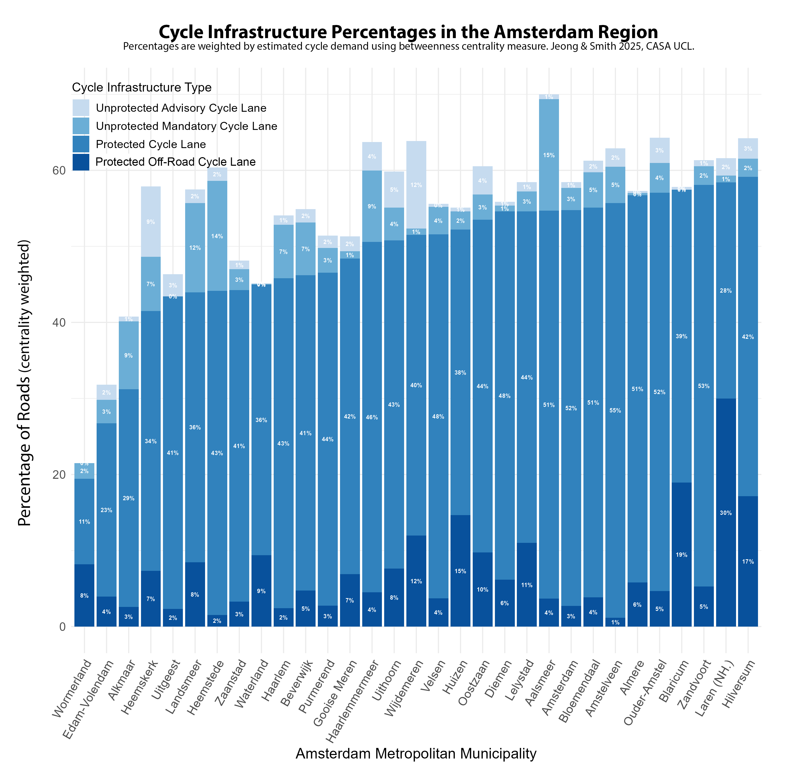
In London, the equivalent percentage of protected cycle lanes is around a third of the levels in Amsterdam, generally falling between 10-20% for most London boroughs. There is a wider variation between authorities, and a much higher percentage of lower quality unprotected cycle lanes as well. This outcome is the result of both a general lack of investment in cycling over decades, and the lack of a city-wide cycling strategy (London’s earliest was in 2013), leading to boroughs pursuing independent policies. There is evidently a huge gap with Amsterdam. Only two London boroughs, Waltham Forest and Richmond, can come close to the worse performing authorities in the Amsterdam region.
Level of Traffic Stress
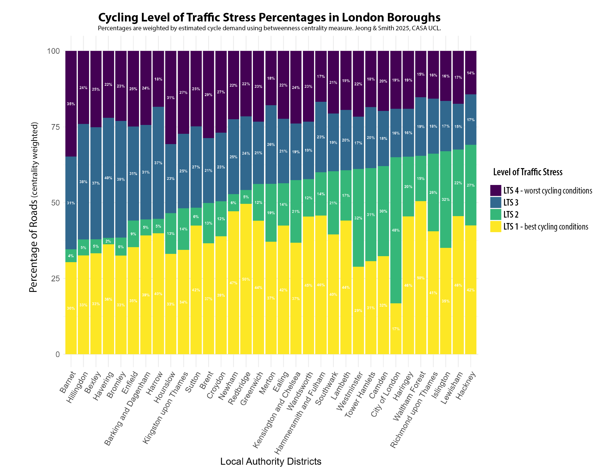
The experience of cycling can also be affected by other factors in addition to cycle lanes, such as traffic speed, road type and number of carriageways. This is the approach taken in the Level of Traffic Stress (LTS) framework, which has been adapted here to reflect conditions in European cities (see the methodology paper for more details). LTS produces a classification from 1-4, with LTS 1 being low stress conditions suitable for all cyclists, and LTS 4 being stressful conditions mixing with higher speed traffic, suitable only for experienced cyclists. In the maps below, we can see again the massive contrast between Amsterdam and London, with Amsterdam dominated by the yellow colour of the least stressful cycling conditions. There are more mixed conditions in some settlements in the wider Amsterdam region. Note also we are not considering cycle lane capacity in this measure, and the very high volume of cyclists in central Amsterdam (and more recently in parts of central London) can itself increase journey stress. In London, the inner city falls mainly into LTS 2 (due to widely implemented 30km/h speed limits) but major roads outside of Inner London are overwhelmingly in the most stressful LTS 4 classification, increasing levels of danger for cyclists and discouraging less experienced cyclists to switch modes.
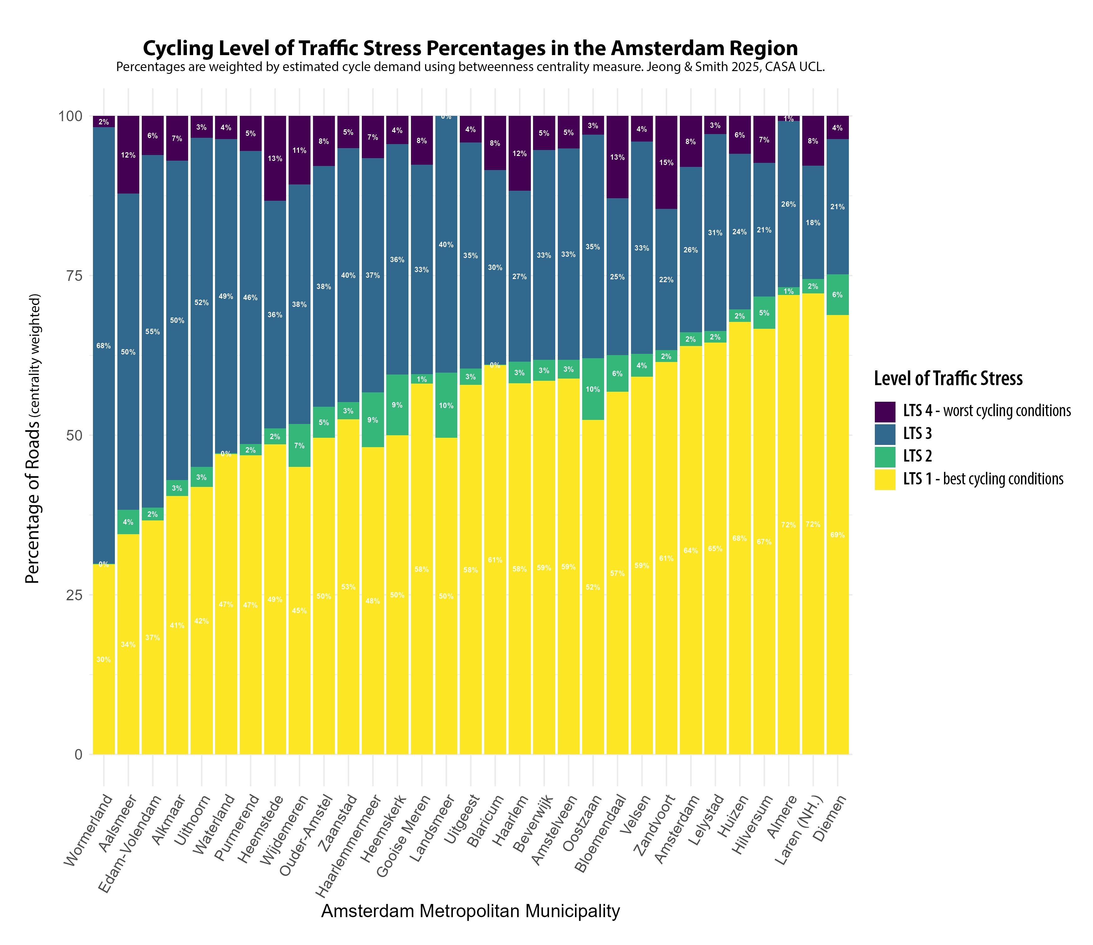
The Level of Traffic Stress framework can also be used to create a statistical summary for authorities. LTS 1 is the dominant classification in the Amsterdam region, comprising more than half of the centrality weighted roads for most authorities, and 64% of roads in the City of Amsterdam. Comprehensive cycle lanes ensure that the most stressful traffic classification of LTS 4 is minimised across the metropolitan region, averaging around 7%. There is however a moderately high percentage of LTS 3, which likely reflects protected cycle lanes being next to higher-speed main roads and that 30 km/h speed limits could be further extended.
London has widely implemented 30km/h speed limits, which despite the lack of protected cycle lanes, increases the volume of roads falling into the LTS 2 category, particularly in Inner London boroughs. But a major problem, and contrast with the Amsterdam results, is just how prevalent LTS 4 roads are throughout London, averaging around 20% of all roads. These represent roads where cyclists are forced to mix with higher speed traffic, and are currently a major obstacle to providing safe and inclusive cycling conditions for many London residents.
Conclusions
This post has shown how the analysis of cycle network data can be used to create indicators of cycle network quality, tracking progress towards sustainable and inclusive cities, and producing comparative city indicators. In this case the gap between the leading city of Amsterdam and London is huge in terms of the comprehensiveness and quality of cycle networks, and the experience of cycling in terms of Level of Traffic Stress. The only limitations in the Amsterdam metropolitan region were found to be in some of the more rural authorities, particularly in Noord-Holland, and potentially the need to expand 30 km/h speed limits. For London, major expansion in protected cycle lanes is needed in many parts of the city to try and achieve a more comprehensive and inclusive network, as currently there are major limitations in London’s cycle infrastructure network.
The ENHANCE Project and Next Steps
You can read the full working paper of this research here, by Philyoung Jeong and Duncan Smith at CASA UCL. For future work we intend to expand this measure to other European cities, as it is based on open international data. Future improvements could also include considering cycle lane capacity and further improvements to the network analysis of cycle route demand. This research is part of the ENHANCE Project, a Driving Urban Transitions project funded by the European Union and ESRC.