I have a new paper published in Computers Environment and Urban Systems- Online interactive thematic mapping: applications and techniques for socio-economic research. The paper reviews workflows for creating online thematic maps, and describes how several leading interactive mapping sites were created. The paper is open access so you can download the pdf for free.

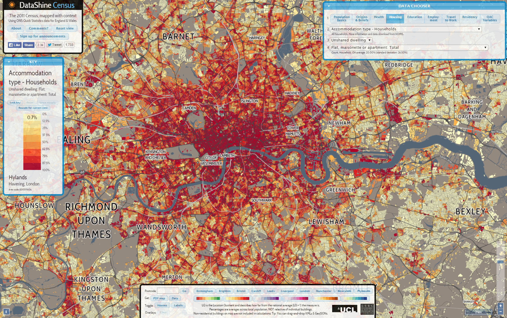
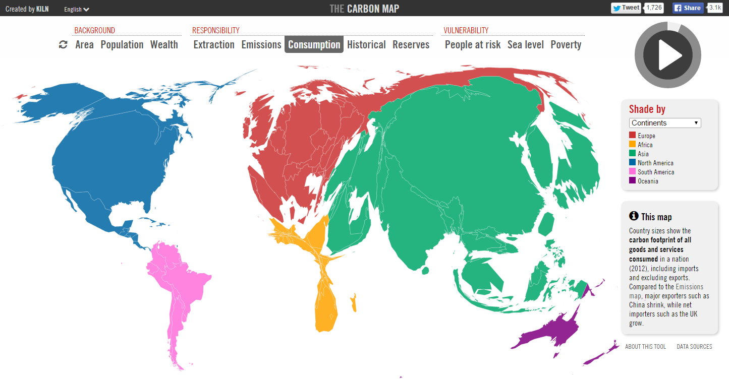
The paper features web mapping sites by Oliver O’Brien (http://www.datashine.org.uk), Kiln (http://www.carbonmap.org) and Alec Friedoff at Brookings (http://www.brookings.edu/research/reports2/2015/01/22-global-metro-monitor). Many thanks to these cartographers for agreeing for their work to be included in the paper, particularly Ollie O’Brien who also kindly provided comments on the paper draft. Also many thanks to Steven Gray at CASA who set up the hosting for the LuminoCity3D site.
Here’s the paper abstract-
Recent advances in public sector open data and online mapping software are opening up new possibilities for interactive mapping in research applications. Increasingly there are opportunities to develop advanced interactive platforms with exploratory and analytical functionality. This paper reviews tools and workflows for the production of online research mapping platforms, alongside a classification of the interactive functionality that can be achieved. A series of mapping case studies from government, academia and research institutes are reviewed.
The conclusions are that online cartography’s technical hurdles are falling due to open data releases, open source software and cloud services innovations. The data exploration functionality of these new tools is powerful and complements the emerging fields of big data and open GIS. International data perspectives are also increasingly feasible. Analytical functionality for web mapping is currently less developed, but promising examples can be seen in areas such as urban analytics. For more presentational research communication applications, there has been progress in story-driven mapping drawing on data journalism approaches that are capable of connecting with very large audiences.
And here are some example images from the mapping sites reviewed in the paper-