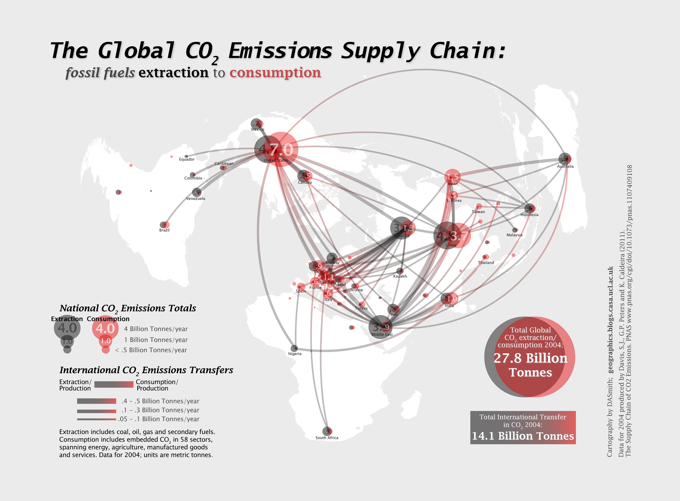
There has been much discussion in recent years about the UK ‘productivity puzzle’: the shortfall in productivity between the UK and comparable EU states like Germany and France, with this gap widening in the last decade. One important perspective for understanding productivity relates to skills and education, and how well graduate skills are integrated with businesses and are helping to expand knowledge economy industries. This is where the UK has a distinct advantage due to the high number of world leading universities across the country. Yet this strong higher education base is not currently translating into sufficient numbers of productive graduate jobs in the UK.
The Foresight Government Office for Science has been investigating this topic, and recently published the Future of Cities: Graduate Mobility and Productivity report. I contributed to the report with data analysis on graduate flows from higher education institutions to workplaces using HESA data from 2013/2014.
There are several interesting aspects of the Foresight report. Firstly there is a strong city focus, which is vital when you see that productivity is highly city dependent, and has close links with regional patterns such as the north-south divide in the UK.
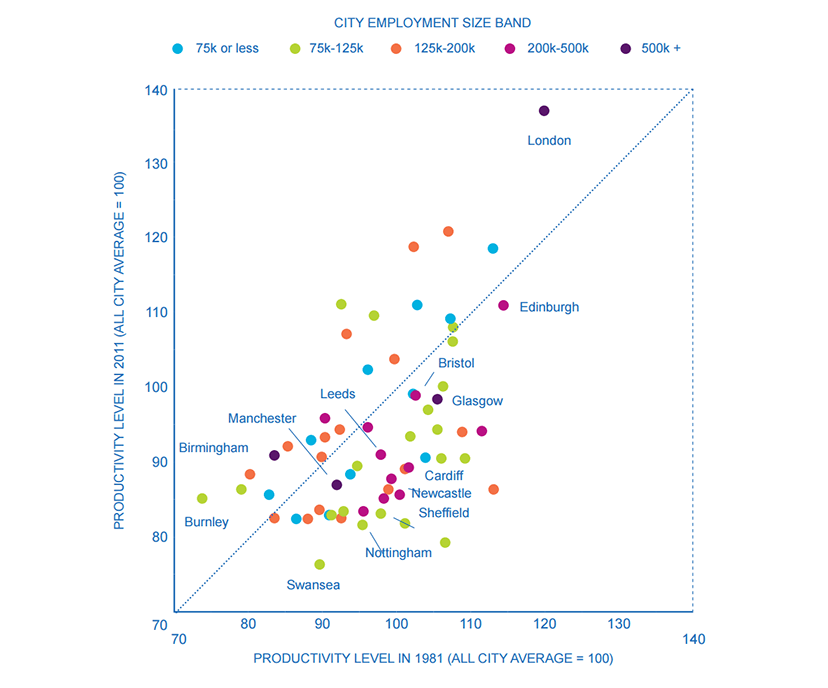
cities, 1981 and 2011 (Source Martin, Gardiner and Tyler 2014)
The productivity gap at the city level is further linked to graduate flows. London dominates the UK as a graduate employer, both in absolute terms and in proportional flows from higher education institutions to workplaces. The scale of the labour market and graduate recruitment programs in London, as well as its reputation as an ‘escalator region’, all add to this huge reach.


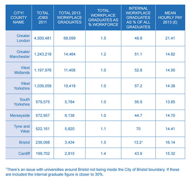
That is not to say however that other large city-regions do not also have significant national graduate flows. Birmingham, Leeds and Manchester all draw significant numbers of graduates, with respective strengths in industries such as advanced manufacturing, creative industries and financial services (note HESA data is at county level, with Birmingham part of West Midlands and Leeds part of West Yorkshire). This is the foundation on which future growth will build.


A second interesting aspect of the Foresight report is that it has been produced in collaboration with regional and local government agencies in Birmingham, Manchester, Leeds, Liverpool, Bristol and Cardiff. There are a number of initiatives in development to address key aspects of graduate employment, including:
• The Skills Engine being developed in Birmingham brings together a network of key players from the local area in order to improve the matching of demand for and supply of talent in the local economy.
• FASTTRACK is an initiative being tested by Leeds University to attract and assist graduate integration into small and medium-sized businesses in the region through placements and specially designed induction and training programmes.
• The Graduate Business Lounge builds on Bristol’s existing engagement in student enterprise to integrate existing graduate enterprise service providers and platforms to foster greater student entrepreneurship.
• New Economy Hubs in Birmingham, Liverpool and Manchester will take a multi-sector approach to understanding key economic growth areas at the city regional level.
• The GRAData Project, working with Leeds City Council and Leeds Institute for Data Analytics, aims to improve university and council use of national graduate data. The hope is that this will improve local careers support for students, and illuminate graduate mobility to enable the development of regional talent strategies.
These cities are well aware of the challenges in graduate skills and recruitment, and recent devolution processes are providing opportunities for improving graduate employment offers and addressing regional economy issues more generally. Data analysis and policy support are important is this role, with organisations set up such as New Economy Manchester and the University of Birmingham City REDI institute expanding.
For more details on the Foresight research, read the report here, and it is also worthwhile exploring the wider Foresight Future of Cities page.