Although Greater London has an extensive transit network, this is not the case for many UK cities where underinvestment and privatisation has seen bus, metro and rail networks stagnate in recent decades, falling well behind European peers. Improving public transport is an important aspect of addressing the UK’s regional inequalities and poor productivity, and is a prominent issue for the 2024 general election.
Accessibility measures are an ideal tool to gauge the comprehensiveness and efficiency of public transport networks – they describe the ease with which populations can reach key services by different travel modes. The leading UK urban thinktank, the Centre for Cities (see their new Cities Outlook report 2024), has been doing some accessibility analysis of English cities compared to continental European cities, and this was recently republished in the Financial Times in an article on productivity challenges-


It’s great to see accessibility analysis feature in the media. The measure used above however has some serious problems leading to nonsensical results (e.g. does Manchester really have half the accessibility of Liverpool and Newcastle?). The Centre for Cities measure uses a single time threshold (30 minutes) when we know that accessibility varies considerably at different time thresholds. It is based on a single destination point, when cities can have multiple employment centres. And it describes accessibility as a percentage of all city jobs, which means that the smaller the urban settlement is, the higher the accessibility result will be using this measure. In reality, larger city-regions have better jobs accessibility.
Creating Robust Public Transport Accessibility Measures – R5R and PTAI-2022
We can create much better and more reliable accessibility measures for UK cities. There have been significant recent advances. The open source R5R software has solved many of the computational challenges for accurately calculating public transport accessibility, allowing the calculation of full travel matrices for all possible trips and handling accessibility variation over time. In the UK, Rafael Verduzco and David McArthur at the Urban Big Data Centre have taken this one step further and pre-calculated accessibility indicators for all of Great Britain at a range of time thresholds in their Public Transport Accessibility Indicators dataset. This dataset is calculated using R5R, and is based on the median travel time across a three hour travel time window, 7am to 10am on a typical weekday (Tuesday 22nd November 2021), and uses the latest public transport service datasets such as the Bus Open Data Service. The results are at LSOA scale for GB only (no Northern Ireland), based on census 2011 zones (so I have used 2020 population data in the below analysis).
Origin and Destination Accessibility Measures
This article focuses on jobs accessibility, and this can be analysed from either the perspective of trip origins (residential-based accessibility to jobs) or from the perspective of trip destinations (workplace-based accessibility by residents). Both perspectives are complementary, and are developed below. For residential measures, if we take the average accessibility for all residents in a city then we get a good overview of how extensive and efficient the public transport network is. This requires city boundaries to define all the residents in each city. The analysis below uses the Primary Urban Area geography.
Public Transport Jobs Accessibility Trip Origin Results
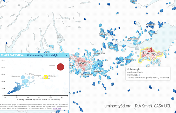
The table and chart below show average accessibility to jobs for residents in all major GB cities by three travel time thresholds- 30 minutes, 45 minutes and 60 minutes. London’s accessibility results are inevitably much higher than any other GB city, being around 3 to 4 times higher at all three travel times, and emphasising just how big the gap is between the capital and all other GB cities. The 30 minute threshold describes shorter trips, and identifies higher density compact cities where residents are on average closer to employment centres. Small compact cities such as Cambridge and Oxford score well at 30mins (though note this is not the case at 45 or 60mins). Edinburgh and Glasgow have the highest residential average accessibility outside of London at both 30 and 45 minutes. This is due to Scottish cities historically following a higher density European urban model, and maintaining better public transport networks by avoiding some of the worst effects of privatisation.


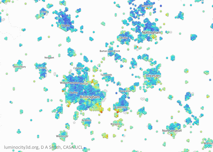
The 60 minute accessibility measure picks up longer distance commuting on regional rail and metro networks. This is where the strengths of larger city regions such as Greater Manchester and the West Midlands are highlighted, with Manchester second and Birmingham forth in the ranking (Glasgow is third and also has a large regional rail network). Given their large populations, Manchester and Birmingham should however be scoring higher in absolute terms and closing the gap on London. Both have poor accessibility for the shorter 30 minute accessibility measure, reflecting the need for further inner-city densification (as the Centre for Cities have argued). For longer commutes, Manchester and Birmingham metro networks should also continue to be extended regionally. Leeds scores relatively well at 30 minutes due to its medium-density urban core, but it lacks a metro and is behind Birmingham, Glasgow and Manchester for the longer commuting times.
Peak Public Transport Accessibility by Trip Destination
We can also analyse accessibility by trip destination, which produces similar results to the trip origin residential measure but is more from the perspective of employment centres. The table below shows the peak accessibility by workplace within each Primary Urban Area, which is a measure of labour market size and agglomeration potential for the UK’s largest city centres. London retains its huge advantage with this measure, at 3 to 4 times higher than the next best cities. City-regions with larger rail and metro networks score better with the peak destination measure, with Birmingham and Manchester ranked second and third respectively, exceeding 2 million people at 60 minutes. Cities with strong rail connections to London, such as Reading and Crawley, also score highly at 60 minutes, but have much lower accessibility at 45 and 30 minutes. Smaller compact cities such as Edinburgh and Cambridge rank much lower by the destination measure compared to the residential analysis.

Both the trip origin residential average accessibility measure and the trip destination peak accessibility measure provide useful perspectives. The residential average measure is a good summary of the coverage and extent of public transport across a city, and how likely residents are to use public transport modes. The trip destination peak accessibility measures employment centre labour market size, and summarises the total number of people that can reach city centres by rail and metro. This is a better measure of agglomeration potential and is more closely correlated with city-region size.
Mapping the Accessibility Results
We can also map the results to view the geography of accessibility to jobs. Firstly the trip origin accessibility to jobs measure. This emphasises how large the area of high accessibility is across Greater London, with parts of Outer London and the South East having higher accessibility to jobs than residents in the city centres of the next largest cities, Manchester and Birmingham. The Primary Urban Area geography is also shown, which is the basis of the residential average accessibility chart and table shown above.

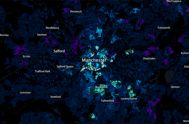
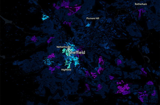
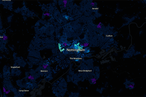
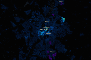
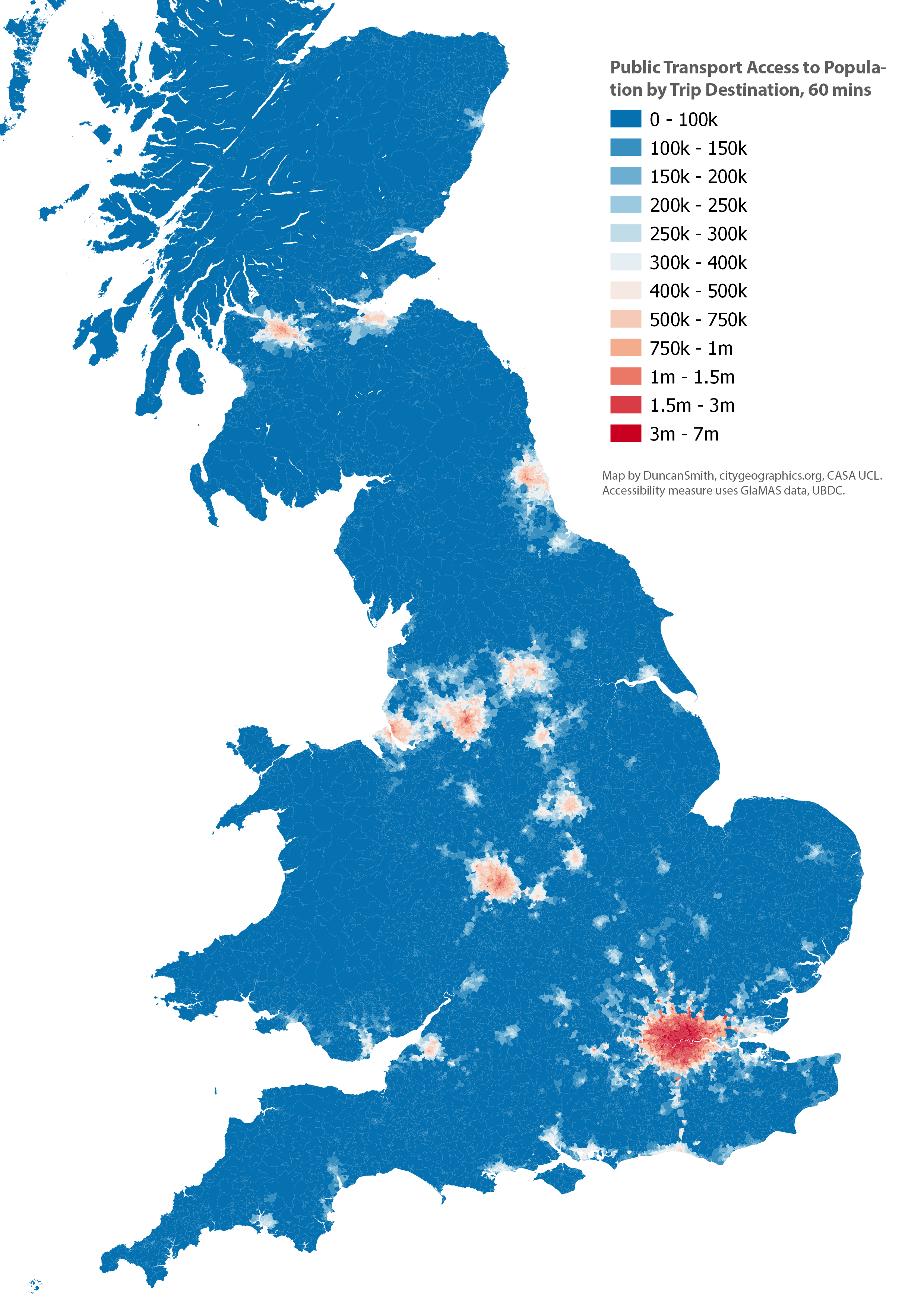
Next we map the trip destination accessibility to population measure. This has a very similar geography, but with more of an emphasis on city centres, as we are measuring average accessibility on a weekday 7am-10am when there will be more commuting services going to, rather than from, central areas. Again London has a huge advantage, peaking at 7 million people. We can also see the centres of Birmingham and Manchester reaching accessibility levels above 2 million people, while Glasgow, Leeds, Newcastle and Liverpool exceed 1 million.
Conclusion- Open Data and Software is Available to Create High Quality Accessibility Measures
With software such as R5R (see this workshop for an intro) and the exemplary and easy to use PTAI-2022 dataset from the UBDC, it is easier than ever to produce accurate public transport accessibility measures. The comparative accessibility analysis of GB cities shown here has highlighted the huge accessibility gap between London and all other UK cities. It has also shown the generally better accessibility performance of Glasgow and Edinburgh, and the high regional accessibility of Birmingham and Manchester which contrasts with their weaker accessibility in these regions for shorter travel times, which supports inner-city densification. There is no single perfect accessibility measure that answers all questions we are interested in – this analysis has confirmed that variation at different travel times reveals contrasting patterns in local and regional accessibility; that average and peak accessibility in cities emphasise different aspects of transit networks; and that trip origin and trip destination measures provide complementary perspectives. We therefore need to test a range of measures to understand accessibility patterns.
Future Improvements
This has been a relatively quick demonstration of the PTAI-2022 data and there are several areas for further improvements-
Including European cities for comparison would be very interesting, as the Centre for Cities explored in their original analysis. A recent major paper in Nature has shown how accurate international accessibility comparisons can be done- https://www.nature.com/articles/s42949-021-00020-2.
The PTAI-2022 dataset is a really good tool that makes GB accessibility analysis much more straightforward for researchers. Currently it uses the 2011 census boundaries, and the next update should use the 2021 boundaries allowing the latest census data to be used. Additionally, the current PTAI-2022 release uses 2021 public transport data, and updating this with the latest rail and bus data would also be a useful update. A related issue is that reliability on UK public transport networks can be poor, and that timetables can overestimate transit accessibility. This topic has been analysed by Tom Forth in this blog post.
This analysis has used the Primary Urban Area geography, which is a useful description of GB city-regions, but there are some issues with PUAs due to the underlying local authority geography. A few PUAs for medium-sized cities have quite large hinterlands (e.g. Sheffield) and this lowers the average accessibility measured in these PUAs due to lower accessibility outside of the urban core. A more thorough analysis of accessibility would need to test multiple urban geographies and gauge the extent of Modifiable Areal Unit Problem variation.