ENHANCE Cities: A New Mapping Tool for Urban Planning & Sustainable Transport Indicators in England & Wales

With advances in Digital Planning and Urban Analytics, new indicators are being produced to help understand cities and urban change. These indicators include for example new measures of transport accessibility, urban sustainability and improved ways to track development. Visualising these datasets together through interactive mapping and charts allows cities to be compared, and provides an overview of urban patterns and trends.

That’s the concept behind ENHANCE Cities, a new mapping tool that we are launching at CASA UCL. ENHANCE Cities maps a series of planning and transport sustainability indicators for England and Wales, from national to neighbourhood scales. The indicators include Connectivity Metrics from the DfT, housing development using Energy Performance Certificate data, and brownfield site data from MHCLG. Additionally, we have created a Travel Sustainability Index to measure travel behaviour; and a Local Accessibility Measure that summarises access to local amenities by sustainable modes. We have also included previous CASA work on House Prices per Square Metre. You can access the ENHANCE Cities site here- https://enhancecities.org

Using the ENHANCE Cities Tool to Understand Accessibility and Travel Behaviour
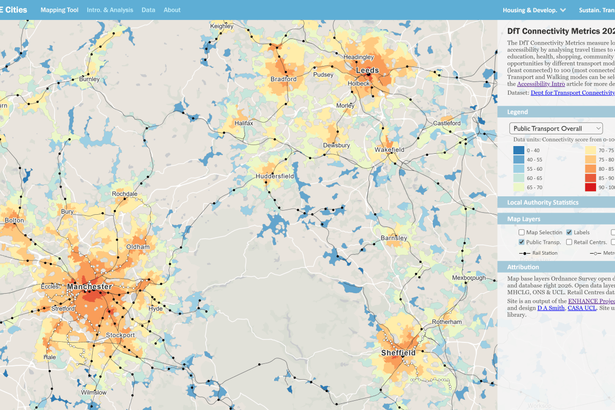
Achieving a mode shift to public transport and active travel is an important policy goal for health and sustainability, and improving access to jobs and services is also beneficial for urban economies. Accessibility indicators measure opportunities to key destinations (shops, schools, jobs…) by different modes of transport, and the Department for Transport have recently created sophisticated Connectivity Metrics for England and Wales, describing mode-specific accessibility to different destination types, which are mapped on the ENHANCE Cities site–
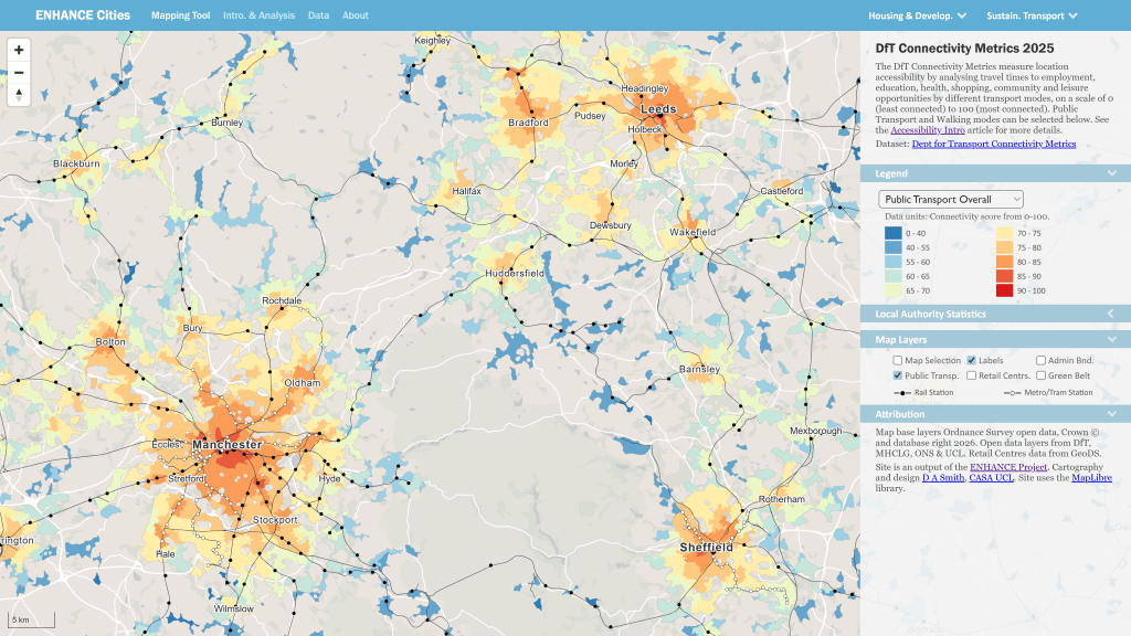
ENHANCE Cities Mapping Tool showing map of public transport accessibility in Northern cities

An important question is how accessibility relates to actual travel behaviour. The ENHANCE site allows you to compare accessibility measures with travel behaviour using the Travel Sustainability Index, which is derived from census data on car ownership and journey to work. These indicators can be be compared using interactive maps for cities and authorities in England and Wales, and we have also have graphed this relationship, showing how accessibility by sustainable modes underpins sustainable travel outcomes (more discussion here)-
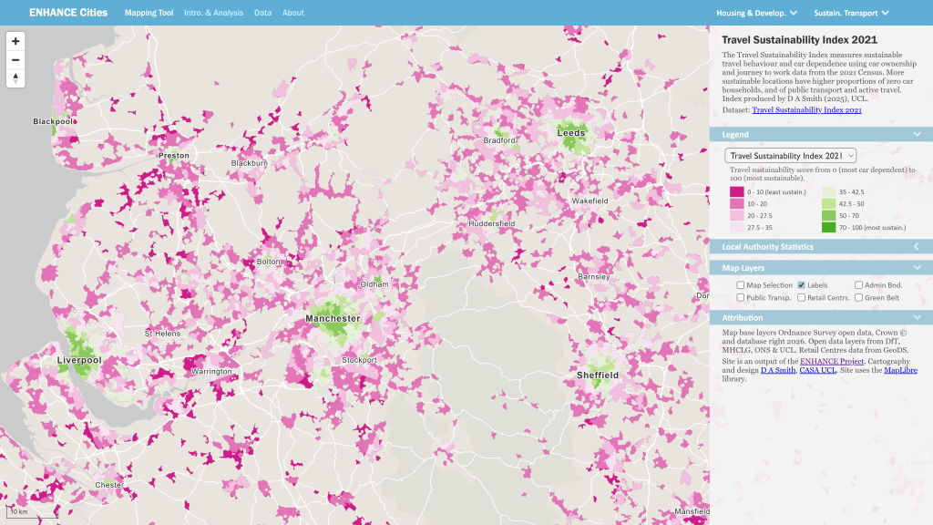
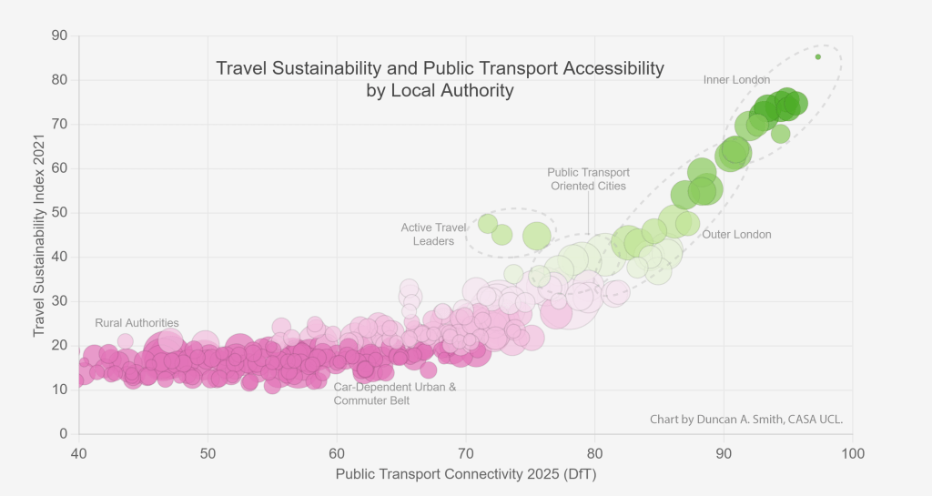
ENHANCE Cities Mapping Tool showing map of travel sustainability northern English cities

Mapping Transit Oriented Development and Brownfield Sites
Another important aspect of sustainable planning is the integration of new development with public transport infrastructure. Using the Energy Performance Certificate data, we have mapped all new housing development from the last 15 years in relation to rail and metro systems. You can see good examples of integration between public transport and housing development in cities such as Manchester-
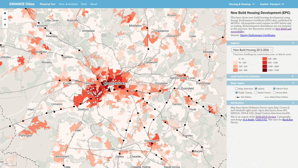
ENHANCE Cities Mapping Tool showing map of integration between new housing and public transport stations in Manchester

The EPC data shows a broad mix of development across England and Wales in the last 15 years, both sustainable outcomes in urban areas and more car-dependent development in commuter belt and more rural areas. Brownfield development is a key route to achieving sustainable development in urban areas, and using the MHCLG data, we can map brownfield sites across England. By joining the Brownfield data with the DfT Public Transport Connectivity Metric, we can demonstrate that brownfield sites are strongly concentrated in accessible urban locations (more discussion here)-
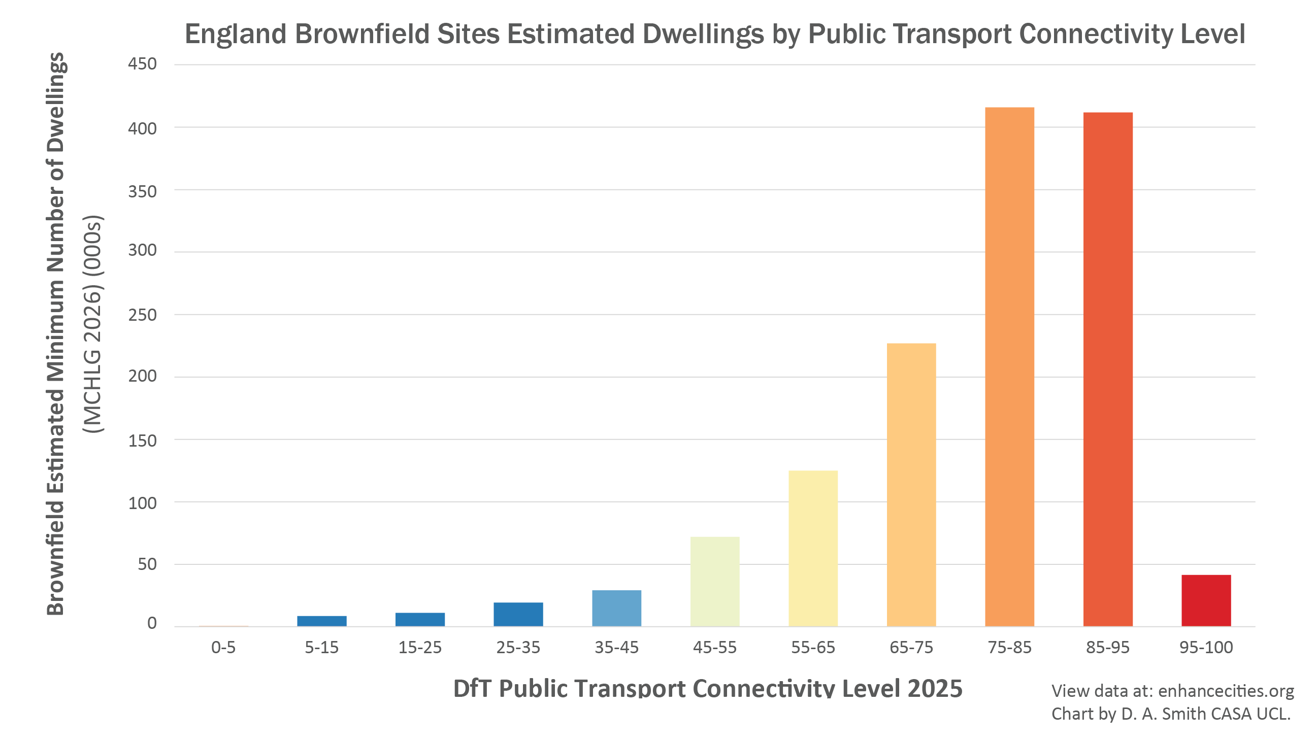
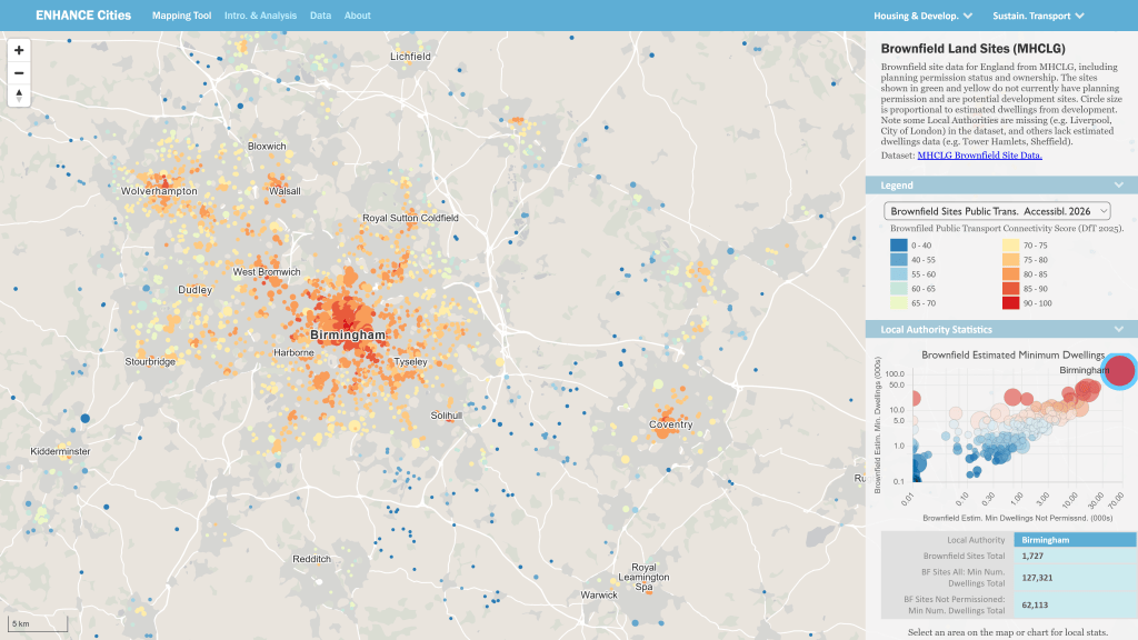
Estimated potential number of dwellings on Brownfield sites in England by Public Transport Connectivity
Map of Brownfield sites in Birmingham and the West Midlands

Local Accessibility and the 15 Minute City
There has been a major international movement towards proximity planning and active travel through the concept of the 15 Minute City. We have created a Local Accessibility Measure that analyses travel time to the nearest opportunities for 40 different types of services and amenities, using walking and public transport modes. You can explore travel times to individual destination types, and overall scores for Local Accessibility-
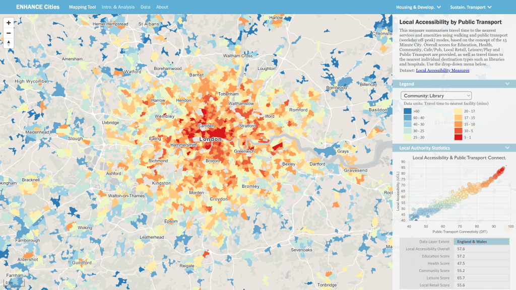
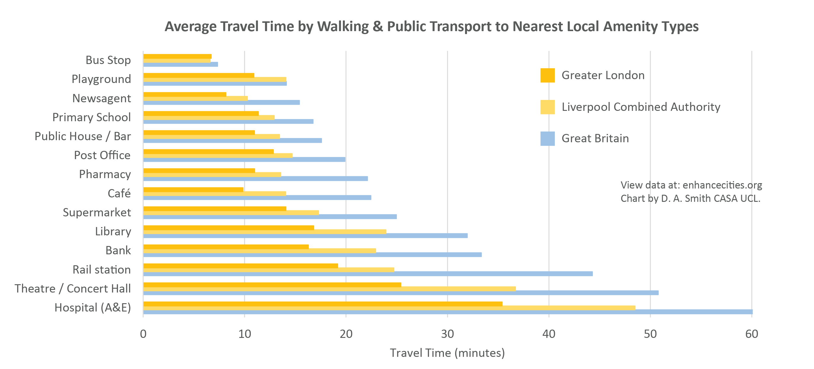
The Local Accessibility Measure provides a more nuanced understanding of the 15 Minute City. Large urban areas in Britain overwhelmingly provide 15 minute accessibility for ubiquitous destination types such as local retail, schools and cafes. The chart below shows average travel times to a selection of nearest facilities in Greater London, the Liverpool Combined Authority area, and the overall average for Great Britain. You can see average travel times around 10-15 minutes for ubiquitous destination types such as newsagents and pubs, while travel times start to increase for amenities such as libraries, banks and rail stations. For highly specialised destination types such as A&E Hospitals, average travel times are above 30 minutes in major cities and over an hour for Britain as a whole (more discussion here)-
Feedback on the ENHANCE Mapping Tool
We welcome feedback from city authorities, planners and researchers on this new tool. We are particularly interested in additional datasets or indicators that would be useful to in relation to urban planning and sustainable development. Please email info@enhancecities.org, or you can get in touch with Duncan Smith at UCL. Note, we have endeavoured to make the new indicators as accurate as possible, but these are not official statistics and may have errors. More information on the indicator methodologies can be found here- https://enhancecities.org/data.html

About the ENHANCE Project
The ENHANCE Project is investigating how accessibility indicators and travel behaviour analysis can be used to provide evidence of sustainable planning in regional towns and cities. The project is funded by the Economic and Social Research Council and is part of the Driving Urban Transitions European network. More info here.
New Paper- Online Interactive Mapping: Applications and Techniques for Socio-Economic Research

I have a new paper published in Computers Environment and Urban Systems- Online interactive thematic mapping: applications and techniques for socio-economic research. The paper reviews workflows for creating online thematic maps, and describes how several leading interactive mapping sites were created. The paper is open access so you can download the pdf for free.

Figure_04
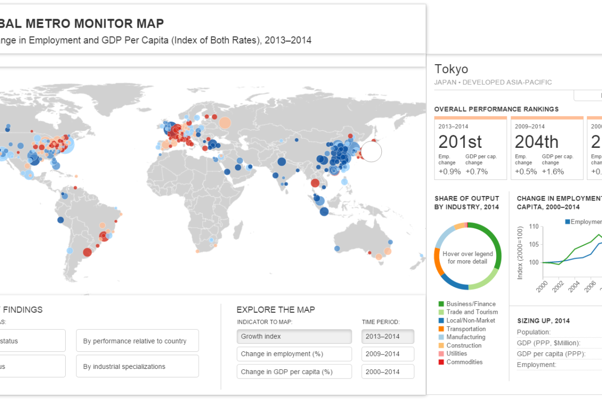
Global Metro Monitor by Brookings- http://www.brookings.edu/research/reports2/2015/01/22-global-metro-monitor

The paper features web mapping sites by Oliver O’Brien (http://www.datashine.org.uk), Kiln (http://www.carbonmap.org) and Alec Friedoff at Brookings (http://www.brookings.edu/research/reports2/2015/01/22-global-metro-monitor). Many thanks to these cartographers for agreeing for their work to be included in the paper, particularly Ollie O’Brien who also kindly provided comments on the paper draft. Also many thanks to Steven Gray at CASA who set up the hosting for the LuminoCity3D site.

Here’s the paper abstract-

Recent advances in public sector open data and online mapping software are opening up new possibilities for interactive mapping in research applications. Increasingly there are opportunities to develop advanced interactive platforms with exploratory and analytical functionality. This paper reviews tools and workflows for the production of online research mapping platforms, alongside a classification of the interactive functionality that can be achieved. A series of mapping case studies from government, academia and research institutes are reviewed.

The conclusions are that online cartography’s technical hurdles are falling due to open data releases, open source software and cloud services innovations. The data exploration functionality of these new tools is powerful and complements the emerging fields of big data and open GIS. International data perspectives are also increasingly feasible. Analytical functionality for web mapping is currently less developed, but promising examples can be seen in areas such as urban analytics. For more presentational research communication applications, there has been progress in story-driven mapping drawing on data journalism approaches that are capable of connecting with very large audiences.

And here are some example images from the mapping sites reviewed in the paper-

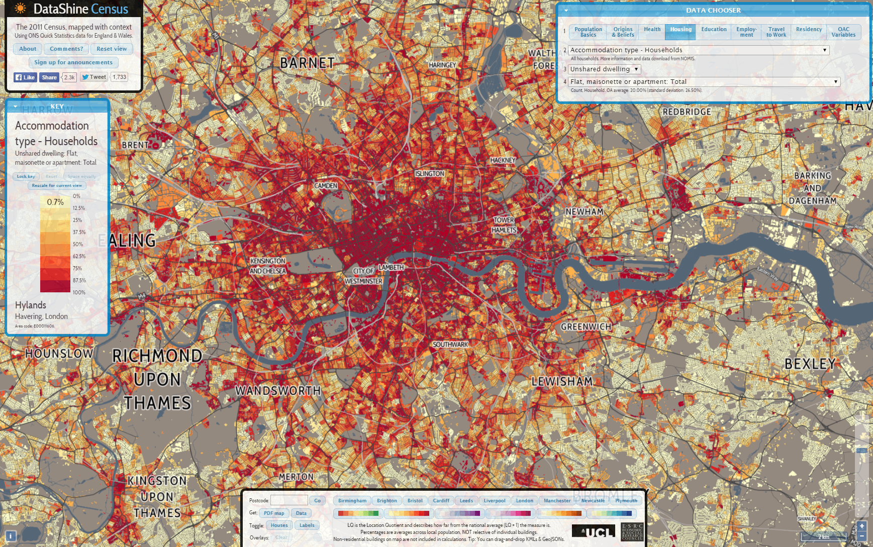
Datashine
Datashine by Oliver O’Brien and James Cheshire- http://www.datashine.org.uk

Luminocity
LuminoCity3D by Duncan Smith- http://luminocity3d.org

Figure_06
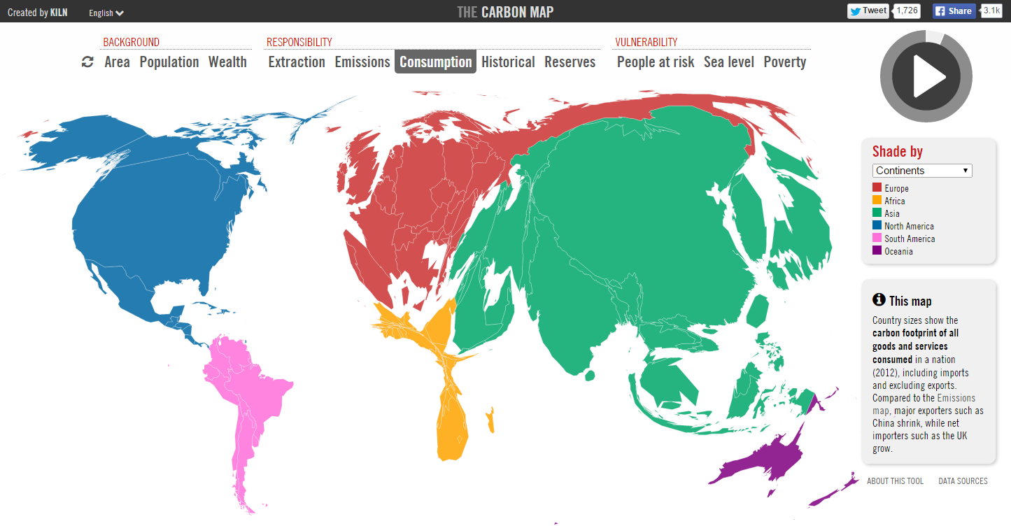
The Carbon Map by Kiln- http://www.carbonmap.org

Mapping the Global Urban Transformation

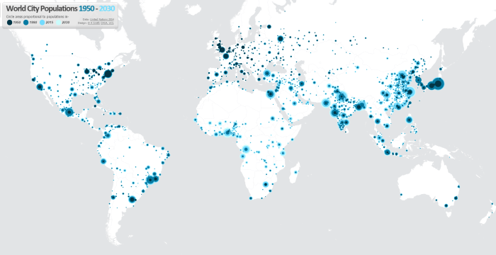
One of the best datasets for understanding the explosive growth of cities across the world in the last 65 years in the UN World Urbanisation Prospects research, which records individual city populations from 1950 to 2014, and includes predicted populations up to 2030. I have been meaning to create an interactive map of this fascinating data for a while, and have now completed this at- luminocity3d.org/WorldCity/

UNWCP_global

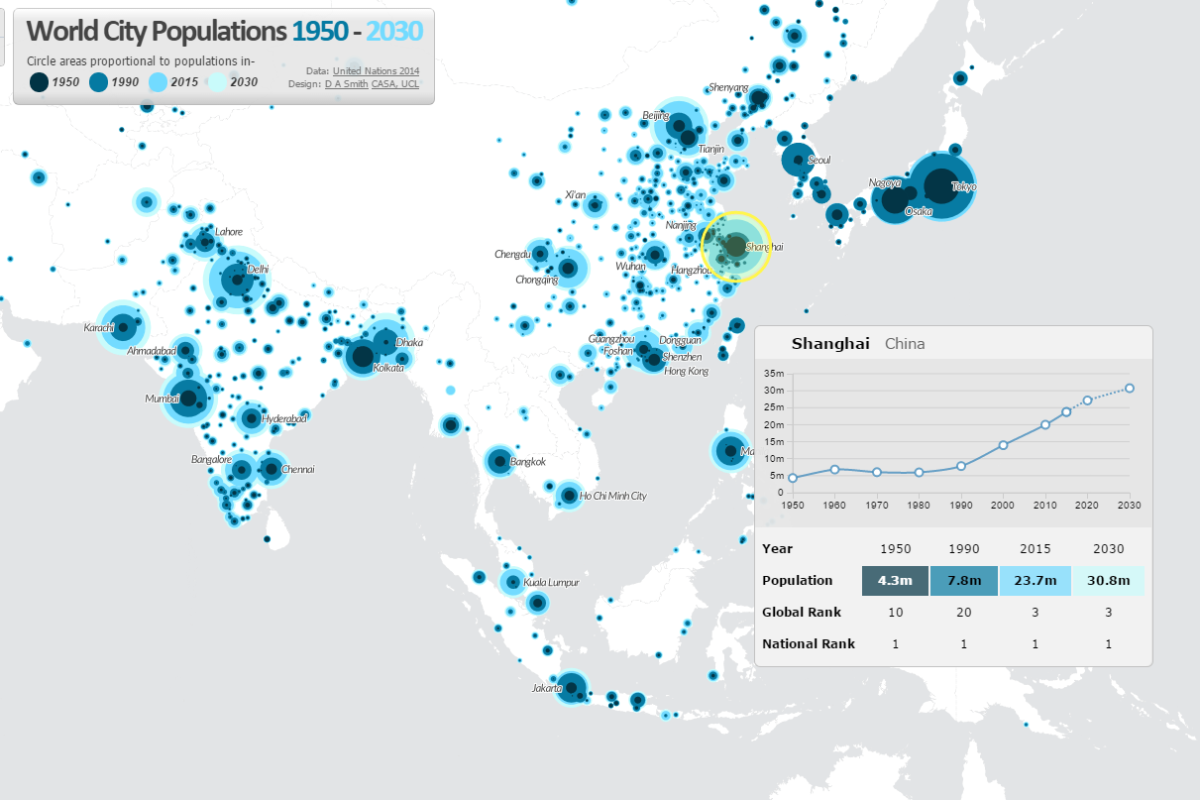
The map uses proportional circles representing city populations in the years 1950, 1990, 2015 and 2030, highlighting the regions in the globe with the most spectacular urban growth, and the time period when this growth occurred. This technique of overlaying proportional circles to show population change over time was first developed in a static map at LSE Cities Urban Age by Guido Robazza. Naturally China, India, Africa and Latin America jump out in the map, while Europe is largely static (except for Turkey). You can also explore time-series graphs and statistics for individual cities by moving your cursor over each city.

UNWCP_shanghai

The site also includes queries of the city statistics, for example highlighting the world’s largest cities in different years. It’s amazing to see the dramatic changes between 1950 and 2015. London was the 3rd largest city in the world in 1950, and is now the 36th. In 1950 there were no African cities and only one Indian city in the world’s top 12, but by 2030 this list is dominated by South Asian, East Asian and African cities.

UNWCP_largest2030

Mapping Tools Used
This map is the first time I’ve tried out CartoDB for interactive mapping, and I’m impressed with this tool. The main advantage of CartoDB for thematic mapping is the ability to perform SQL queries on the client-side, allowing map features to be highlighted interactively (this is used for the map queries on the World City site). There is also the ability to comprehensively restyle map symbology from the client using CartoCSS (this feature requires a full map refresh). Certainly sophisticated interactive mapping functionality is possible using CartoDB. It’s also Leaflet.js based, which is what I’m used to from the previous LuminoCity3D project.

Cities and Mega-City Regions
Measurements of city populations inevitably depend on where regional boundaries are defined, and the UN database is by no means perfect. The job of trying to integrate the hundreds of different city definitions used by each individual nation-state is no easy task. The UN tries to apply the concept of metropolitan agglomerations across the globe, but data is not always available and some cities are measured using administrative boundaries, which leads to population underestimation (full details on the UN methodology).

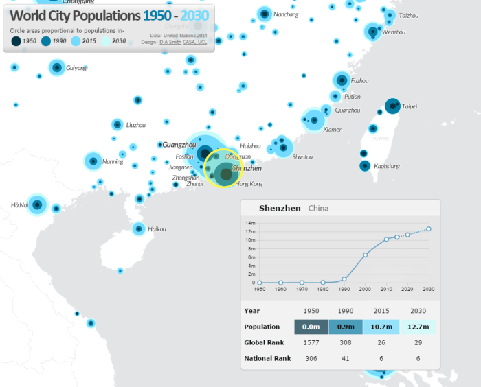
One of the interesting definitional issues that arises is around how very large polycentric regions have emerged in parts of the globe and beginning to look more like a single giant city. One of the most famous is the Pearl River Delta Megacity Region-

UNWCP_shenzhen

There are so many giant cities in close proximity that the map symbology struggles. Hong Kong, Guangzhou, Shenzhen, Foshan and Dongguan are all huge cities. Shenzhen in particular has experienced the most rapid growth of any city in history, growing from small town in 1980 to 10.7 million people in 2015. The combined population of these cities would make the Pearl River Delta the largest city in the world if a wider regional definition was employed.

ESRI Urban Observatory- the right model for city crowdsourcing?

This month ESRI made an interesting move into the field of global city data with the launch of Urban Observatory (TM). The site has some great interactive visualisation ideas with simultaneous mapping of three interchangeable cities, linked navigation and indicator selection. It provides an intuitive interface to explore the diverse forms of world cities-

UrbanObservatory

Furthermore this ambitious project is intended to be an extensible platform. Jack Dangermond (billionaire founder of ESRI) and Richard Saul Wurman (founder of TED with a long-standing interest in city cartography) discuss in the introductory video how they want many more cities to join in, to crowdsource city data from around the world, using the ArcGIS online platform.

So is this project going to be the answer for all our global urban and smart city data needs? Well I think despite the great interface, as a city crowdsourcing model ESRI’s urban observatory is not going to work. But it’s interesting to explore why, particularly in relation to the bigger questions of whether the open city data revolution is going to be truly global and inspire a new era of urban analysis and comparative urban research.

ESRI’s site states that “information about urbanization does not exist in comparative form”. In reality comparative urban analysis is a growing trend across many sectors, from international organisations like OECD, EU and UN (including the original UN Habitat Urban Observatory); to environmental organisations like ICLEI and C40; to economically focussed organisations like the World Bank and Brookings; to global remote sensing providers like the USGS; to major commercial data producers in transport and telecoms; to the many urban academic research centres around the world (including the two London based centres I’ve worked for, CASA and LSE Cities).

Global cities data example- GaWC Network at Loughborough

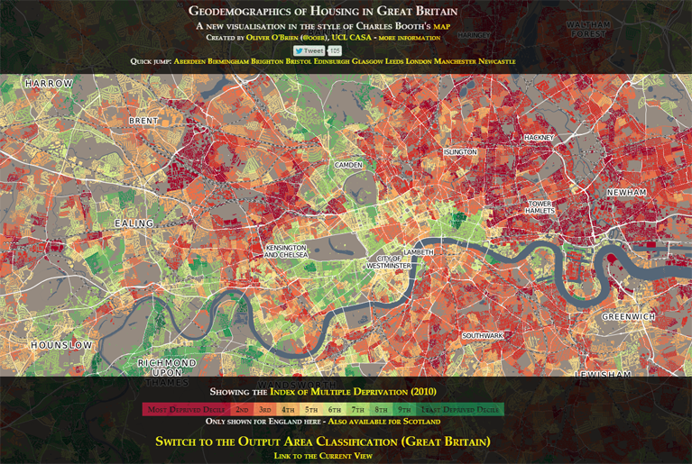
CASA- deprivation in UK cities example.

Brookings MetroMonitor- comparison of US cities' economic performance
Brookings MetroMonitor- comparison of US cities’ economic performance


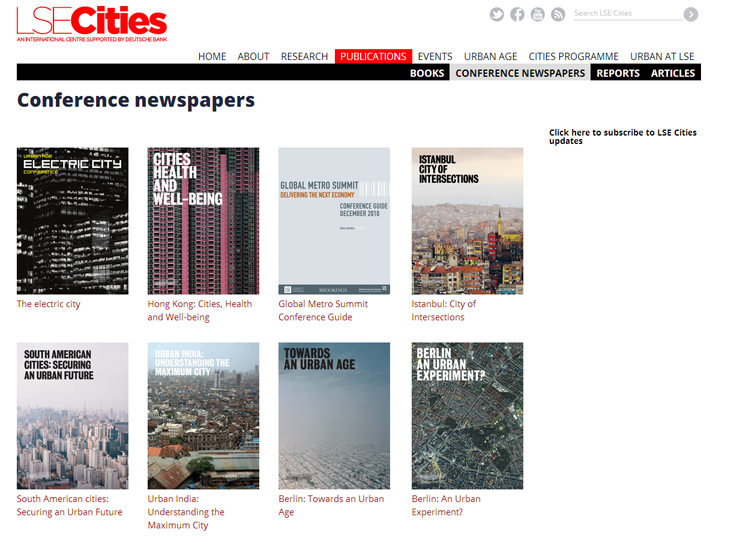
LSE Cities- over a decade exploring comparative urbanism

There’s a rich and growing field of data providers and analysis techniques to draw on for comparative urban analysis. Indeed the ability to gather and analyse urban data is absolutely central to the whole Smart City agenda. But there are clearly many challenges. What do cities gain by opening up their data? Who then owns the data and controls how it is presented? Who selects what data is included and excluded?

I believe the natural platform for civic data (and subsequently for the international comparison of urban data) will be an open platform with wiki features to encourage civic engagement. This provides the answers to the above questions- citizens gain from better access to data and institutional transparency; citizens own the data and have a say in what is included and how it’s presented. This is the model for current successful open data sites like the London Datastore, where anyone can access the data, and Londoners can request new datasets (backed by freedom of information legislation). Unfortunately the governance situation is of course much more complicated for the international comparison of cities, and this has limited progress.

As the world’s leading provider of GIS software, ESRI are in a strong position to integrate global datasets, and have clear commercial interests in amassing urban data for their clients. But it’s much harder to answer questions about who owns and controls data in their urban observatory project. Arguably this will limit the number of cities volunteering to take part, and limits the project’s ability to respond to the diverse demands of global cities and their citizens.

A further huge challenge in comparative urbanism is in developing the right analytical techniques and indicators to answer key urban questions. This will inevitably require more sophisticated analysis tools than a set of thematic maps, and needs to draw on the many research strands developing the most relevant analytical tools.

Overall there will be some exciting competition in the coming months and years in the expanding market of international urban data integration and visualisation, with different models from commercial, government and academic contexts. ESRI’s urban observatory is an innovative project, and should stimulate further advances.