
CASA and UCL Geography have substantial experience in developing online interactive mapping sites for research outreach. The purpose of these tools is to take spatial analysis and visualisation outputs from the research lab and make them accessible and useful for many users from a wide variety of sectors and backgrounds, including: wider academia, central and local government, built-environment professionals, business, technology, community groups and the general public. Interactive mapping tools are part of the movement to make science and research more accessible, supported by the main UK research funding bodies as well as specific campaign movements like Open Data and Open Science.
The positive media coverage of recent projects and our communications with users has indicated that interactive mapping sites do reach a wide audience, including various expert users as well as the general public. These mapping projects are however a relatively new set of tools, and there is a lack of detailed information and evidence on who is using interactive mapping sites and the degree of research impact that they can deliver. In this post I explore two recent interactive mapping projects, DataShine.org.uk & LuminoCity3D.org, and analyse who has shared these sites using data from Twitter. This method is not without its flaws as described below, but is an early attempt to gather evidence and understand the user base.
‘Engaged’ Users and Social Media Sharers
A well designed interactive mapping site can generate a lot of hits, particularly if it gets picked up by national media sites. DataShine generated a huge 99,000 unique users in its first three months after launch in June last year, while LuminoCity had a reasonably large 24,000 unique users in its first three months from September 2014.
How many of these hits are truly engaged users? We can approach this question in terms of web statistics. On the LuminoCity site during the first three months, 16% of users made at least one return visit; 18% of users stayed for at least three minutes; and 26% of users explored at least four different maps during their session. So we can estimate that around 20% of the total users are exploring the site in some depth. That’s not a bad return where there is a high number of total users, e.g. this would equate to 19,800 people for the first three months of DataShine, and 4,800 people for the LuminoCity site.
We do not know however who these users are. Are they mainly interested members of the general public? Are they expert professional users? This is harder to gauge.
Classifying Twitter Users
We do have further information about the most engaged group of users- the social media sharers. These are the people who actively promoted the site to their network of followers/friends. The two major social media sites are Facebook and Twitter, with 4% of visitors of both DataShine and LuminoCity either sharing/liking the site on Facebook or posting the link on Twitter in the first three months. This is a high proportion of social media sharers, and reflects the novel and accessible nature of the sites which helped to generate enthusiastic users.
In this analysis I have classified Twitter users who shared site links to Datashine and LuminoCity according to their profession. Naturally there are some problems with this approach- this selection reflects only the most enthusiastic users of the mappings sites; Twitter users are a biased sample (generally towards affluent professionals, tech and media users); many users have multiple professions (I tried to pick the main one); and professional and personal opinions on Twitter overlap significantly. However this is an early effort to explore types of users of interactive mapping sites, and hopefully this can be built on in the future.
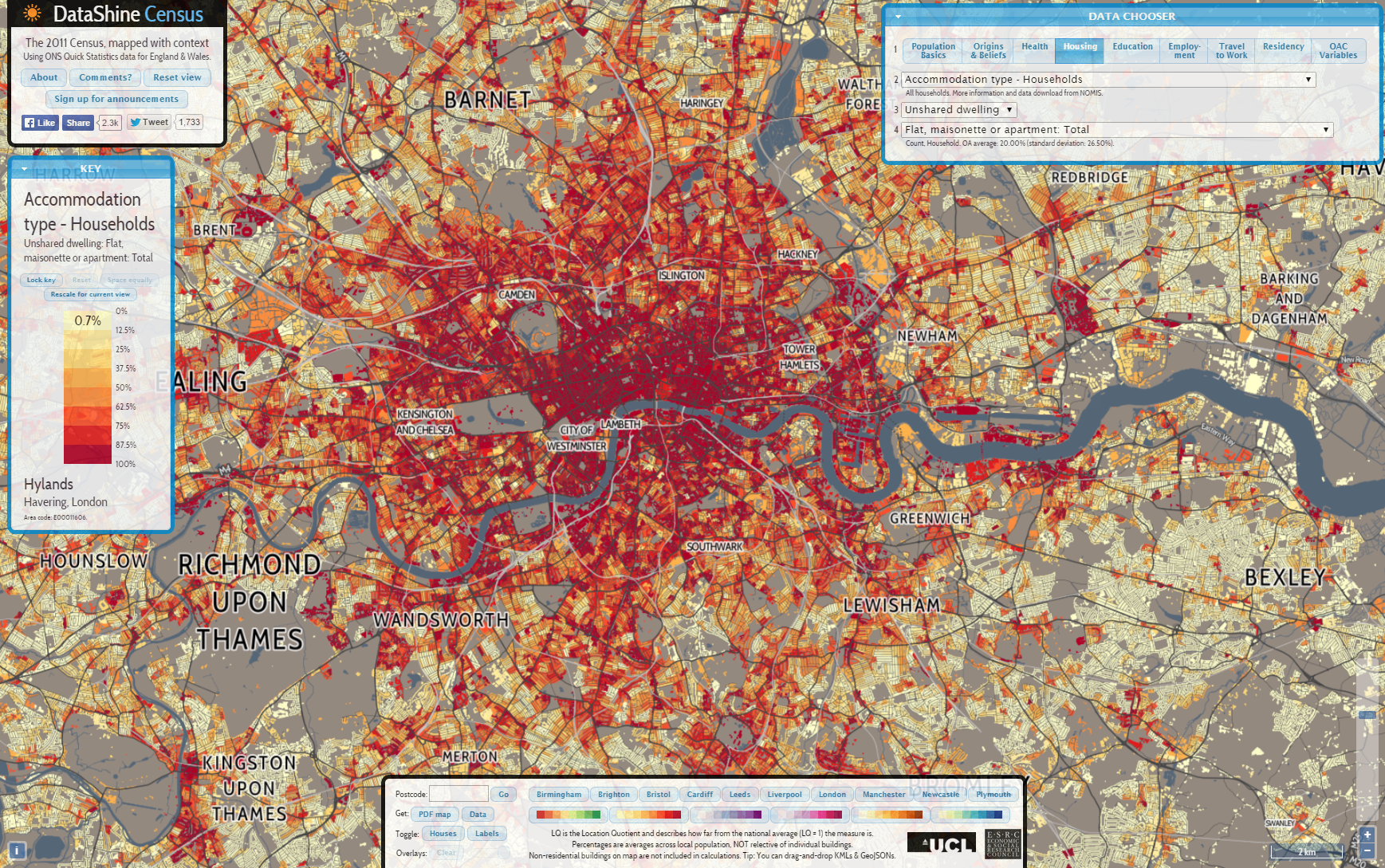
The DataShine Census Site
Below is the classification of 350 Twitter sharers from the DataShine site. It is clear that a wide variety of users are covered, including both professional and community groups (a more detailed table is at the end of the post)-

Geographers were not surprisingly the main group of academic users, but DataShine also attracted many users from across the natural sciences, social sciences and the humanities. Health researchers were particularly well represented, as the site provides many useful health related maps from the 2011 census. This result also chimes with a high number of business users in the public policy sector, mainly with a health and planning focus.
The innovative visualisation technology behind the DataShine site appeals to IT users, and there were many sharers from IT, cartography, data journalism and data science backgrounds.
One of the biggest successes with the DataShine site was in reaching beyond academic and professional experts to local communities. The site provides high quality maps of census data at the neighbourhood level, and this successfully appealed to local community groups, campaigners (e.g. cycling campaigns, local environment campaigns) and to local government users. Several councillors tweeted the site, as well as users from DCLG and local government planners. Media coverage also helped to generate many interested users from the general public.
The LuminoCity Site
The data from the LuminoCity site is based on a smaller sample of 140 Twitter shares. This covers a similarly wide variety of users, with more of a focus on built-environment professionals, and less on local government and the general public.

The LuminoCity site provides a range of maps and statistics for the comparative analysis of UK cities. This functionality appealed strongly to planners and transport consultants, as well as some business users in economic development and real estate. Academic users also had a more urban focus for the LuminoCity site. The site did not chime so strongly with local government and community users who generally want a more local scale of analysis. There were some users from Central Government who used the site for measuring economic performance in northern cities.
The more abstract minimalist aesthetic used on the LuminoCity site attracted quite a few architects and designers to the platform. These users are enthusiastic about visualisation while being less familiar with the range of open data available at city and national scales.
The ‘Other Education’ sector, which was popular for both sites, includes high schools, geography departments, museums and the wider education sector beyond universities. This was an unexpected outreach success for both of the websites, and shows how the open approach can help to create new connections.
Summary
This analysis of twitter shares from interactive mapping platforms shows how these tools can successfully appeal to a wide range of users, both professional and the general public. Academics are well respresented, but also business users, government, local communities and the wider education sector.
Twitter users are inevitably a biased sample and it would be useful in the future to look at methods that can capture a larger proportion of engaged users and assess to what extent the most engaged social media users represent the wider engaged audience for the sites.
Full Tables of Twitter Sharers
DataShine Twitter Sharers Classification
| Sector | Sector Percentage | Group | Group Percentage |
| Academic | 18.4 | Geographer / Urban Academic | 3.8 |
| Other academic | 11.4 | ||
| Social Science Org | 0.9 | ||
| Student | 2.3 | ||
| Other Education | 5.8 | Geography Education | 1.8 |
| Other Education / Museum | 4.1 | ||
| Built Environment Professional | 7.0 | Transport Consultant/Planner | 2.0 |
| Architect | 1.2 | ||
| City Planning/Housing Org. | 3.8 | ||
| Business | 9.6 | Economic development | 0.0 |
| General Business / Marketing | 6.1 | ||
| Public Policy | 3.2 | ||
| Real Estate | 0.3 | ||
| Design & Journalism | 8.2 | Design- graphic, interactive | 2.3 |
| Data Journalism Specialist | 1.8 | ||
| Journalist General | 4.1 | ||
| IT | 16.7 | Cartography & GIS exp. | 4.7 |
| IT / Tech General | 9.1 | ||
| Data Scientist | 2.9 | ||
| Government | 7.3 | Central Gov | 1.8 |
| Local Gov | 3.8 | ||
| Open Data | 1.8 | ||
| Local Community & Charity | 8.8 | Community / Place Activist / Charity | 8.8 |
| General Public | 18.1 | General Public | 18.1 |
LuminoCity Twitter Sharers Classification
| Sector | Sector Percentage | Group | Group Percentage |
| Academic | 19.4 | Geographer / Urban Academic | 8.1 |
| Other academic | 7.3 | ||
| Social Science Org | 1.6 | ||
| Student | 2.4 | ||
| Other Education | 7.3 | Geography Education | 4.8 |
| Other Education / Museum | 2.4 | ||
| Built Environment Professional | 16.9 | Transport Consultant/Planner | 4.8 |
| Architect | 4.0 | ||
| City Planning/Housing Org. | 8.1 | ||
| Business | 10.5 | Economic development | 3.2 |
| General Business / Marketing | 6.5 | ||
| Public Policy | 0.0 | ||
| Real Estate | 0.8 | ||
| Design & Journalism | 12.1 | Design- graphic, interactive | 7.3 |
| Data Journalism Specialist | 2.4 | ||
| Journalist General | 2.4 | ||
| IT | 18.5 | Cartography & GIS exp. | 5.6 |
| IT / Tech General | 8.1 | ||
| Data Scientist | 4.8 | ||
| Government | 3.2 | Central Gov | 1.6 |
| Local Gov | 0.8 | ||
| Open Data | 0.8 | ||
| Local Community & Charity | 3.2 | Community / Place Activist / Charity | 3.2 |
| General Public | 8.9 | General Public | 8.9 |
