ENHANCE Cities: A New Mapping Tool for Urban Planning & Sustainable Transport Indicators in England & Wales

With advances in Digital Planning and Urban Analytics, new indicators are being produced to help understand cities and urban change. These indicators include for example new measures of transport accessibility, urban sustainability and improved ways to track development. Visualising these datasets together through interactive mapping and charts allows cities to be compared, and provides an overview of urban patterns and trends.

That’s the concept behind ENHANCE Cities, a new mapping tool that we are launching at CASA UCL. ENHANCE Cities maps a series of planning and transport sustainability indicators for England and Wales, from national to neighbourhood scales. The indicators include Connectivity Metrics from the DfT, housing development using Energy Performance Certificate data, and brownfield site data from MHCLG. Additionally, we have created a Travel Sustainability Index to measure travel behaviour; and a Local Accessibility Measure that summarises access to local amenities by sustainable modes. We have also included previous CASA work on House Prices per Square Metre. You can access the ENHANCE Cities site here- https://enhancecities.org

Using the ENHANCE Cities Tool to Understand Accessibility and Travel Behaviour
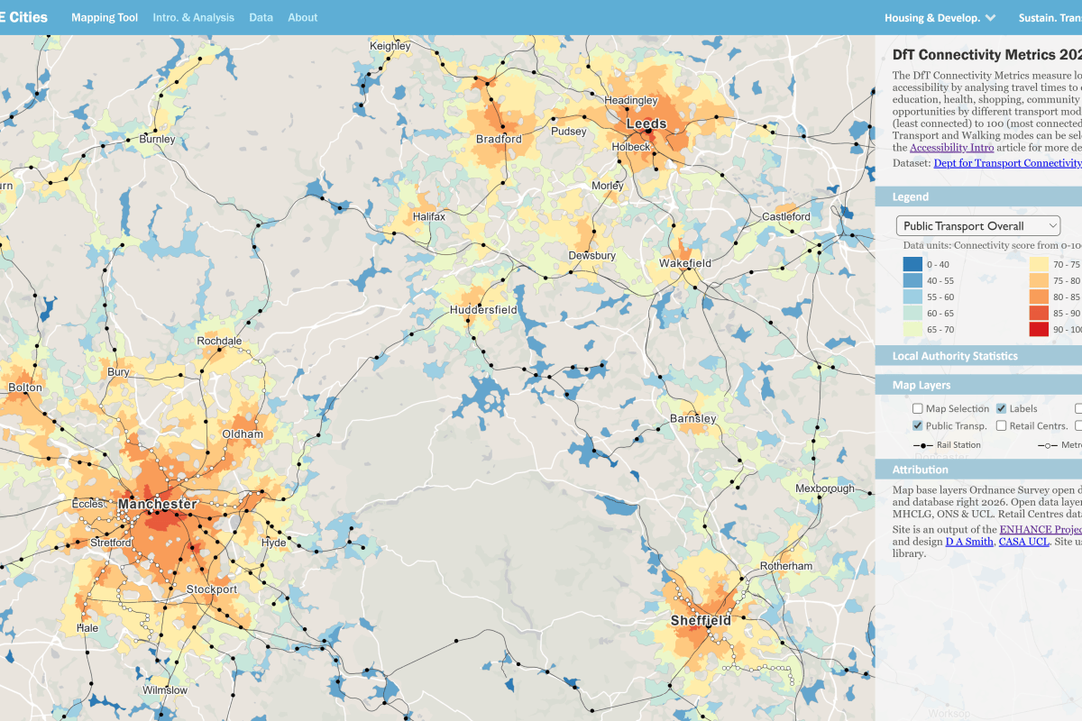
Achieving a mode shift to public transport and active travel is an important policy goal for health and sustainability, and improving access to jobs and services is also beneficial for urban economies. Accessibility indicators measure opportunities to key destinations (shops, schools, jobs…) by different modes of transport, and the Department for Transport have recently created sophisticated Connectivity Metrics for England and Wales, describing mode-specific accessibility to different destination types, which are mapped on the ENHANCE Cities site–
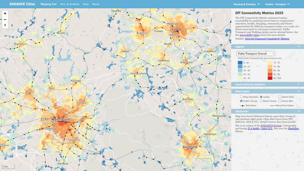
ENHANCE Cities Mapping Tool showing map of public transport accessibility in Northern cities

An important question is how accessibility relates to actual travel behaviour. The ENHANCE site allows you to compare accessibility measures with travel behaviour using the Travel Sustainability Index, which is derived from census data on car ownership and journey to work. These indicators can be be compared using interactive maps for cities and authorities in England and Wales, and we have also have graphed this relationship, showing how accessibility by sustainable modes underpins sustainable travel outcomes (more discussion here)-
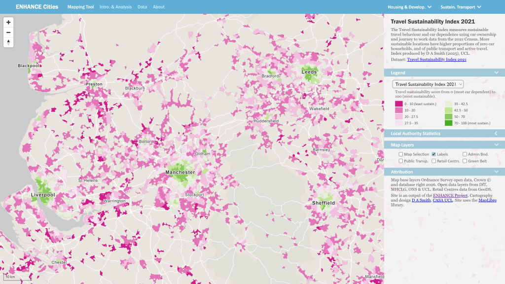
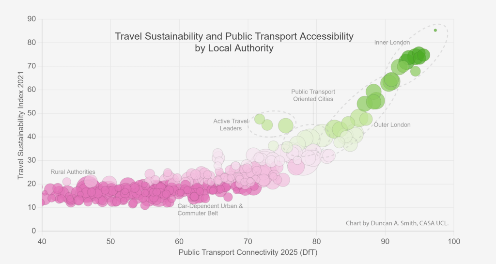
ENHANCE Cities Mapping Tool showing map of travel sustainability northern English cities

Mapping Transit Oriented Development and Brownfield Sites
Another important aspect of sustainable planning is the integration of new development with public transport infrastructure. Using the Energy Performance Certificate data, we have mapped all new housing development from the last 15 years in relation to rail and metro systems. You can see good examples of integration between public transport and housing development in cities such as Manchester-
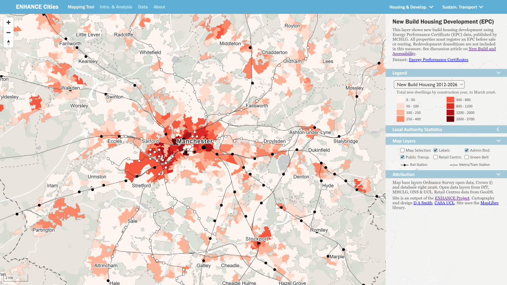
ENHANCE Cities Mapping Tool showing map of integration between new housing and public transport stations in Manchester

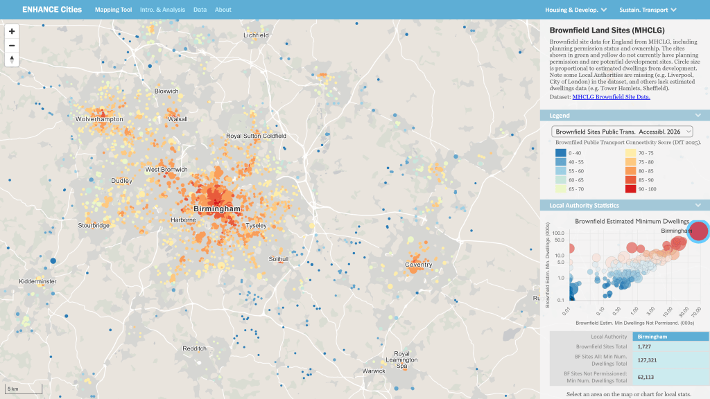
The EPC data shows a broad mix of development across England and Wales in the last 15 years, both sustainable outcomes in urban areas and more car-dependent development in commuter belt and more rural areas. Brownfield development is a key route to achieving sustainable development in urban areas, and using the MHCLG data, we can map brownfield sites across England. By joining the Brownfield data with the DfT Public Transport Connectivity Metric, we can demonstrate that brownfield sites are strongly concentrated in accessible urban locations (more discussion here)-
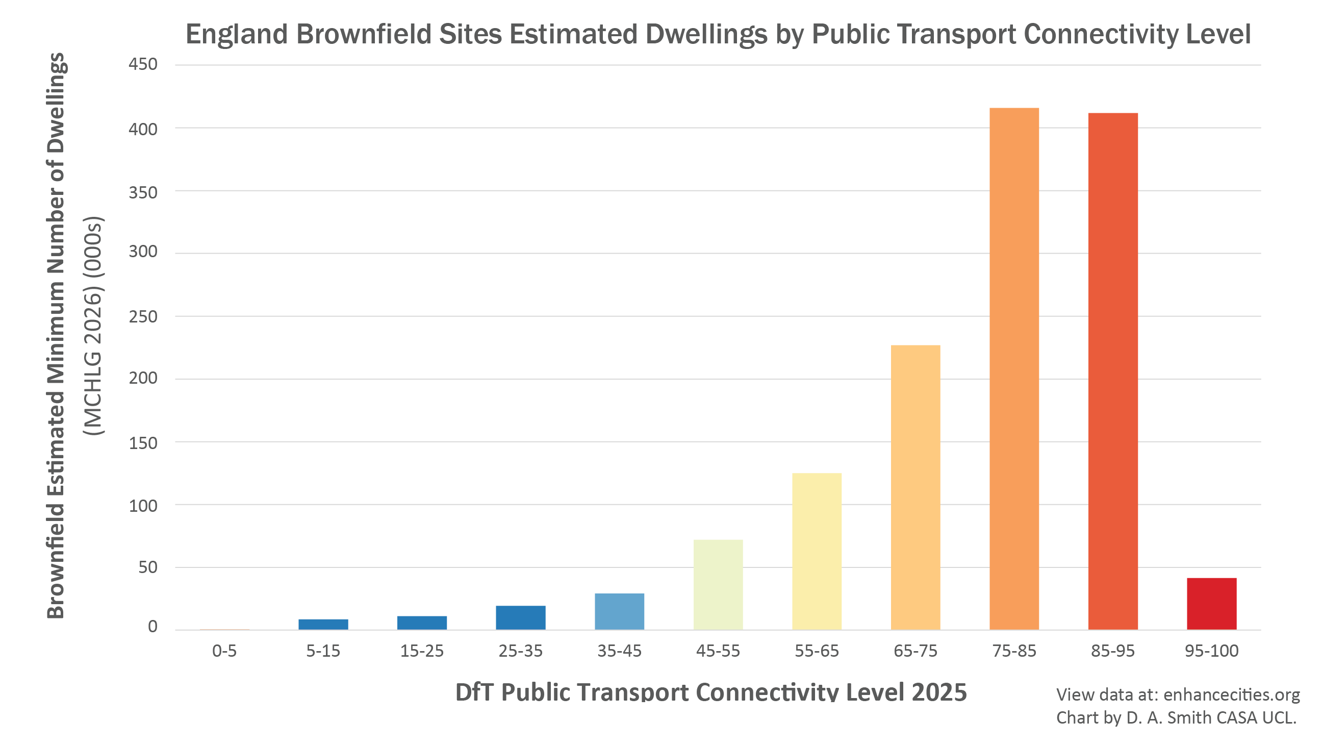
Estimated potential number of dwellings on Brownfield sites in England by Public Transport Connectivity
Map of Brownfield sites in Birmingham and the West Midlands

Local Accessibility and the 15 Minute City
There has been a major international movement towards proximity planning and active travel through the concept of the 15 Minute City. We have created a Local Accessibility Measure that analyses travel time to the nearest opportunities for 40 different types of services and amenities, using walking and public transport modes. You can explore travel times to individual destination types, and overall scores for Local Accessibility-
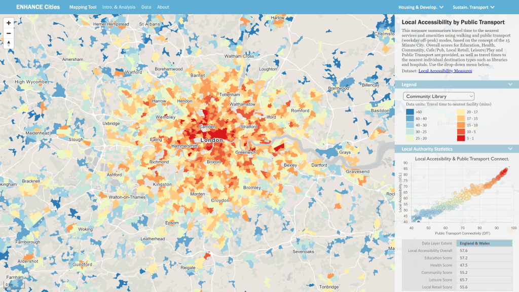
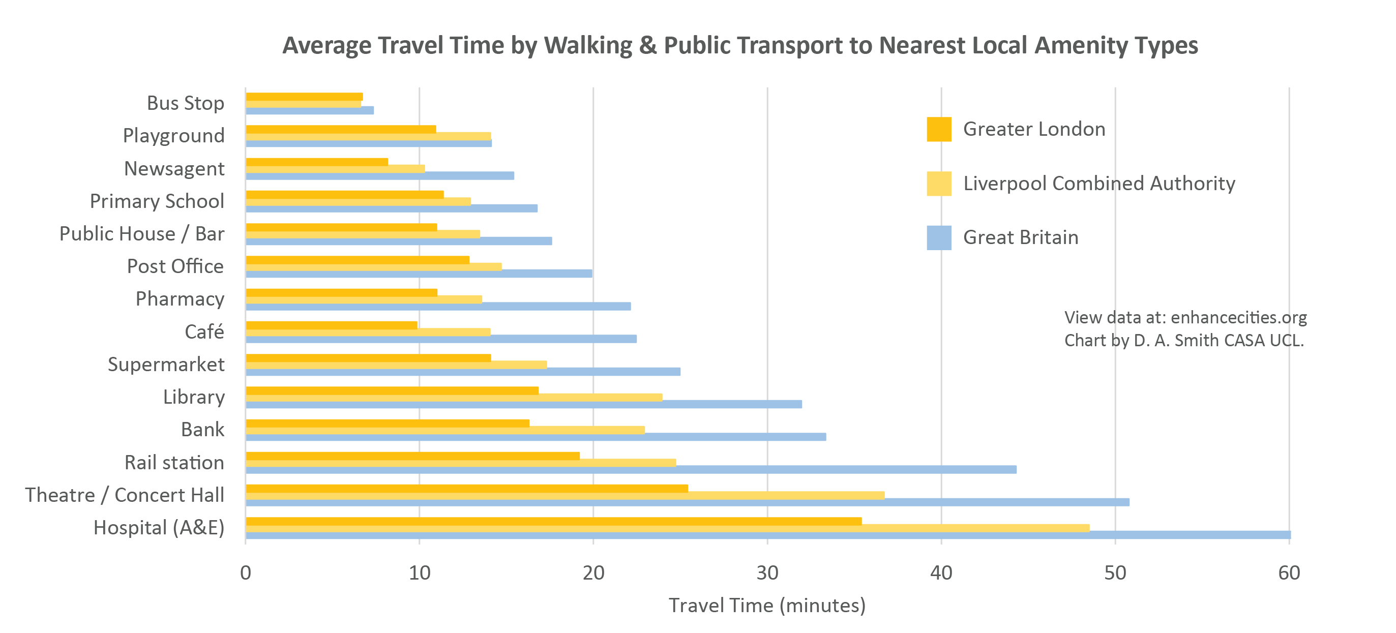
The Local Accessibility Measure provides a more nuanced understanding of the 15 Minute City. Large urban areas in Britain overwhelmingly provide 15 minute accessibility for ubiquitous destination types such as local retail, schools and cafes. The chart below shows average travel times to a selection of nearest facilities in Greater London, the Liverpool Combined Authority area, and the overall average for Great Britain. You can see average travel times around 10-15 minutes for ubiquitous destination types such as newsagents and pubs, while travel times start to increase for amenities such as libraries, banks and rail stations. For highly specialised destination types such as A&E Hospitals, average travel times are above 30 minutes in major cities and over an hour for Britain as a whole (more discussion here)-
Feedback on the ENHANCE Mapping Tool
We welcome feedback from city authorities, planners and researchers on this new tool. We are particularly interested in additional datasets or indicators that would be useful to in relation to urban planning and sustainable development. Please email info@enhancecities.org, or you can get in touch with Duncan Smith at UCL. Note, we have endeavoured to make the new indicators as accurate as possible, but these are not official statistics and may have errors. More information on the indicator methodologies can be found here- https://enhancecities.org/data.html

About the ENHANCE Project
The ENHANCE Project is investigating how accessibility indicators and travel behaviour analysis can be used to provide evidence of sustainable planning in regional towns and cities. The project is funded by the Economic and Social Research Council and is part of the Driving Urban Transitions European network. More info here.
Improving Indicators of Urban Cycle Network Quality: a Case Study of London Boroughs

Increasing levels of cycling is a key part of the transport strategies of many global cities with the potential for significant health and sustainability benefits. Many urban cycle networks are however fragmented and poor-quality which can significantly limit participation. London is currently expanding its cycling infrastructure to catch up with leading European cities in active travel. How can we track recent progress towards developing comprehensive, safe and inclusive cycle networks?

Cycle Infrastructure and Level of Traffic Stress
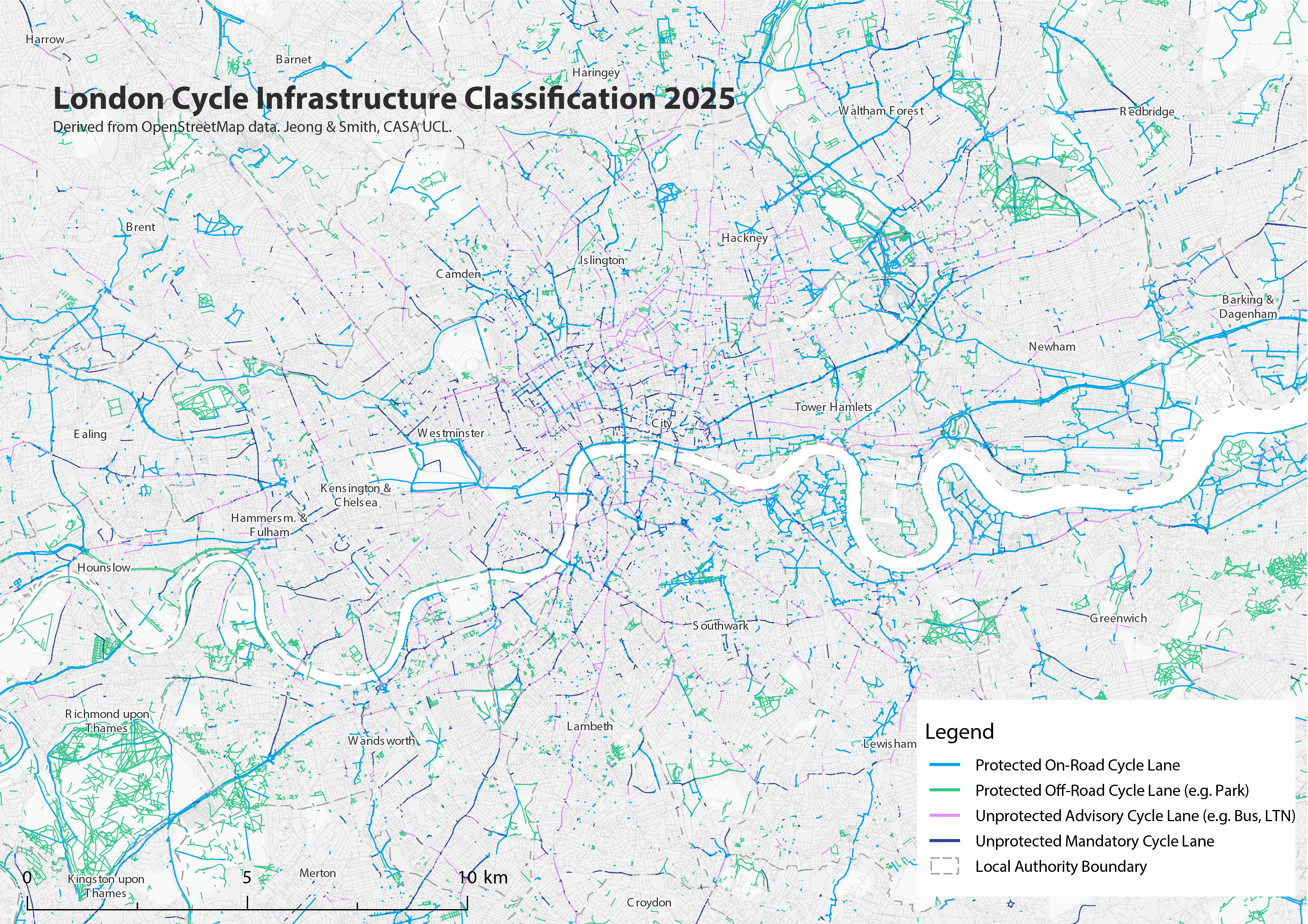
This research uses two main perspectives to review cycling networks. The first is based on cycle infrastructure, where we map the geography and quality of cycle lanes. From this view, protected cycle lanes that are physically separated from traffic are higher quality than cycle lanes that are merely paint on the side of the road, or that are shared with other vehicles, such as a bus lane. Cycle infrastructure is mapped for London below, derived from OpenStreetMap data-

The Mayor and Transport for London have been developing a city-wide network of Cycleways – protected cycle lanes – that appear in bright blue on the map, mostly running east-west through Inner London. Cycle lane provision in north-west and south-west London is generally weaker, with more car-dependent and suburban boroughs, as well as hillier topography. London’s most cycle-friendly boroughs are generally in Inner London. You can see in the map that pro-cycling boroughs such as Hackney and Islington have many advisory cycle lanes (in purple on the map), which include Low Traffic Neighbourhoods, Quietways and shared bus lanes.

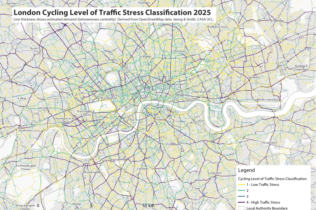
Our second perspective on cycle network quality is the popular Level of Traffic Stress framework, which takes a wider perspective on road conditions affecting cyclists, including road width, speed limits and the type of road (e.g. residential road, high street, arterial road etc.). The Level of Traffic Stress framework is a categorical scale from LTS 1 – the safest conditions suitable for more vulnerable cyclists – to LTS 4 – the most stressful conditions mixing with higher speed road traffic, only suitable for experienced cyclists. The Level of Traffic Stress framework for all of London’s roads is mapped below, again using OpenStreetMap data-

The Level of Traffic Stress framework produces a much larger contrast between Inner and Outer London, with Inner London generally having lower speeds and lower stress cycling conditions. In Outer London, cycle-friendly residential neighbourhoods are typically bounded by high-speed unsafe main roads, reducing cycle accessibility. There are some Outer London boroughs that break this trend as we discuss below.

Developing Borough-Level Indicators of Cycle Network Quality
In this research we wanted to transform the cycle infrastructure and Level of Traffic Stress data into indicators that accurately summarise the quality of cycle networks at the borough level. A key step here is that the most in-demand cycle routes need to be weighted higher than infrequently used routes, to give a representative picture of cycle network quality based on the routes cyclists actually need to use. This step has been achieved by calculating betweenness centrality to typical Point of Interest destinations, validated against TfL cycle count data (see the working paper for details).

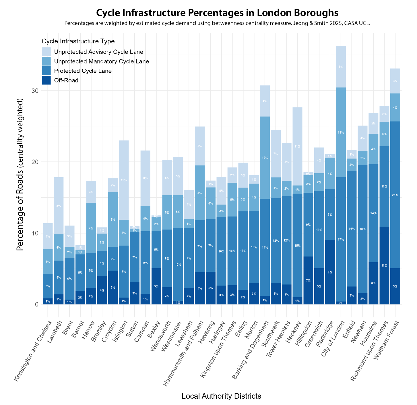
The infrastructure summary indicator is below, ordered by the weighted percentage of protected cycle lanes. Outer London boroughs score better than expected with this indicator, led by Waltham Forest, Richmond and Hounslow. These boroughs have invested in fully segregated cycle networks, such as the mini-Holland funding scheme used to improve cycle networks in Waltham Forest. Cycle routes through parks and along rivers/canals also play an important role, with Richmond and Redbridge having the highest proportions of off-road cycle routes. Inner London boroughs such as Hackney and the City of London have a higher proportion of unprotected cycle lanes (such as bus lanes and Low Traffic Neighbourhoods) and do not score as well in terms of fully protected infrastructure.

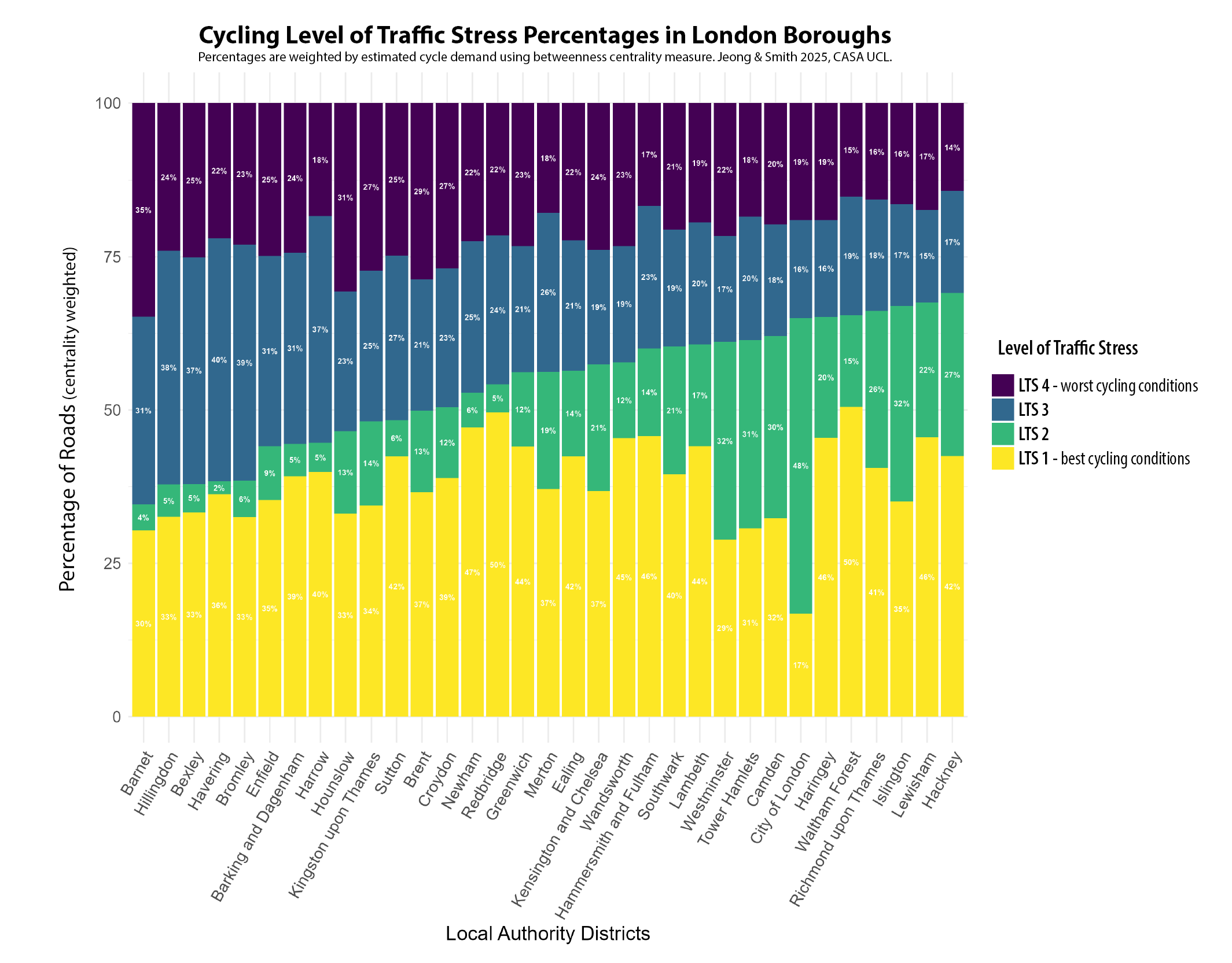
The second Level of Traffic Stress (LTS) indicator measures a wider set of road conditions – such as speed limits, width and type – and includes all roads in Greater London (except where cycling is illegal such as motorways). A similar centrality-weighted chart by borough is shown below. There is a much clearer split between Inner and Outer London boroughs using LTS, with seven of the top ten boroughs being in Inner London – led by Hackney, Lewisham and Islington – and the bottom 13 boroughs all being in Outer London. This reflects lower speed cycle-friendly conditions in Inner London. Outer London boroughs feature higher proportions of LTS 3 and LTS 4 roads, due to the presence of more stressful, higher speed main roads, outside of the relatively sparse segregated cycle network. Richmond and Waltham Forest remain the exceptions, achieving good cycling conditions in Outer London and featuring in the top ten boroughs. Inner London boroughs that have pursued Low Traffic Neighbourhood and Quietway approaches, such as Hackney and Islington, score very well in the LTS classification as this measure favours lower speed cycling conditions.

To summarise these indicators, we have produced a borough ranking of the Cycle Infrastructure and the Level of Traffic Stress indicators, and an overall Cycle Accessibility Score, combining infrastructure and LTS, as shown in Table 1 below. Hackney, Islington and Hammersmith & Fulham are the best ranked Inner London boroughs overall, and Waltham Forest, Richmond and Haringey are the best ranked Outer London boroughs. Waltham Forest scores particularly well, coming in first overall for Greater London. In terms of the weakest London boroughs for cycling, these are car-dependent Outer London boroughs such as Barnet, Bexley and Brent. These boroughs currently fall outside of the TfL Cycleway network and have not managed to develop their own cycle networks in more car-dependent conditions. The weakest Inner London borough is Kensington & Chelsea, which has historically resisted developing its cycle network and came last in the cycle infrastructure ranking, despite being a high density Inner London borough that is adjacent to Hammersmith & Fulham which is at the opposite end of the results

Comparing the Cycle Accessibility Measure to Travel Behaviour
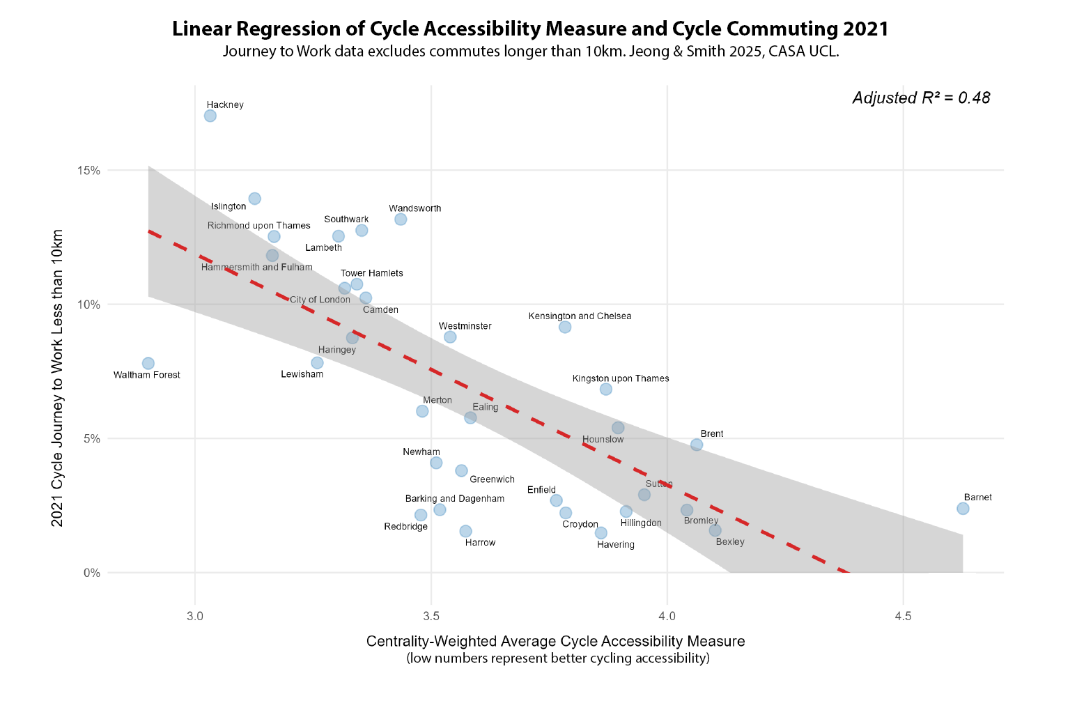
We can also compare the cycle accessibility score to recorded levels of cycling in travel survey data. A linear regression between the cycle accessibility measure (lower is better with this indicator) and recorded levels of cycle commuting in 2021 is shown below. Some boroughs with strong cycle networks, such as Hackney and Islington, have rates of cycle commuting even higher than expected, coming above the regression line. Waltham Forest has lower than expected levels of cycle commuting, though this may reflect being located further from job opportunities, as is the case for many Outer London boroughs. Some boroughs with weaker cycling infrastructure still show reasonable cycle commuting levels, such as Kensington & Chelsea, reflecting that some cyclists are willing to endure more stressful conditions. This approach is unlikely however to expand cycling participation beyond more experienced cyclists. Actual cycling rates reflect additional factors to cycling networks, such as demographics and public transport accessibility.

The ENHANCE Project and Where to Find Out More
You can read the full working paper of this research here, by Philyoung Jeong and Duncan Smith at CASA UCL. This research is part of the ENHANCE Project, a Driving Urban Transitions project funded by ESRC. Future work will be expanding these indicators across the UK, and making comparing accessibility in the UK with partner cities in the Netherlands and Portugal.