The RGS-IBG annual conference has been on this week, and I presented as part of a series of geocomputation sessions arranged in advance of the 21st anniversary Geocomputation conference in Leeds next year. The topic was current CASA research from the RESOLUTION project, looking at developing fast and consistent methods of measuring public transport accessibility between different cities.
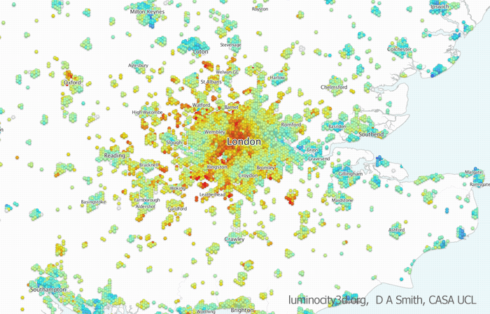
The data used for the London analysis comes from the Traveline public transport timetable data. The image below shows an example accessibility measure of jobs accessible within 1 hour’s travel time leaving at 8am.
High rise developments are often exclusive private spaces, as attested by the current glut of luxury flats, hotels and offices rising across Inner London. Even recent developments advertising their public space credentials have come up short, with for example the Shard’s fantastic views costing £25 entry fee, or the Walkie-Talkie’s ‘skygarden’ amounting to an expensive restaurant and some pot plants.
It’s wonderfully refreshing therefore that London’s newest tower is dedicated to public space. Tate Modern’s Switch House extension includes free galleries, spaces for contemplation and discussion, and one of the most spectacular 360 degree viewing locations in London. It all adds up to a big improvement to what was already a very successful gallery.
The Switch House exterior sits right next to brightly coloured flats and office developments. Architects Herzog and de Meuron have opted for a bold angular form that holds its own in this contested space, while still complementing the original Bankside power station through the use of a brickwork lattice.
The gallery floors are spacious, with the exhibits focusing less on blockbuster artists, and more on international voices, sculpture and performance. For example the Living Cities gallery features works from the Middle East and Africa. The winding nature of the tower staircases also creates many intimate and relaxing spaces, which contrasts nicely with the busier open galleries next to the turbine hall.
The viewing gallery presents a superb panorama over the City, St Paul’s, East and South London. It’s an amazing perspective, and quite unique compared to other skyline views, particularly with Bankside tower looming just in front, and no glass barriers present. Thew view westwards is more obscured from developments around Blackfriars, but is still fascinating.
Here’s how the the new tower links with the existing galleries in the internal plan. There’s even a bridge across the turbine hall. High-res versions of these photos are on flickr.
Last year’s 2015 general election revealed a Britain that was increasingly fractured between nations, between the north and south of England, and between more prosperous metropolitan and deprived areas. But GE2015 has now proved to be only a staging post in the UK’s splintering. The momentous vote for Brexit in last week’s EU referendum threatens economic and political turmoil, and it may effectively split the United Kingdom.
The results show stark geographical divisions. Outside of London and its affluent hinterland, as well as inner cities such as Manchester, Liverpool and Bristol, England has voted for Brexit with a majority of 1.9 million (53% to 47%) voting to leave. Wales also voted for leaving the EU (despite being by far the highest UK beneficiary of EU funding) by 52.5% to 47.5%. Northern Ireland voted to remain by 56% to 44%, but is split between unionist and nationalist areas. Meanwhile Scotland has a strong majority to remain overall (62% to 48%), and a local majority to remain in every single local authority. The case for Scottish independence to prevent its undemocratic removal from the EU is inescapable, unless some kind of ‘reverse Greenland‘ compromise can be reached.
Data from Electoral Commission. Shapefile comiled by Robin Edwards (@geotheory) and Alan McConchie (@mappingmashups).
Underlying the geographical divisions are a host of socioeconomic factors, including education levels, income, unemployment and deprivation: in other words populations that have been cut off from the unequal benefits of globalisation have overwhelmingly voted out. The demographics of this outcome have been reviewed in detail in the Financial Times, or try the excellent John Harris reporting the UK’s inequalities. One of the saddest divisions in the referendum is age, with 75% of votes under 25 and 58% of voters aged 25-34 voting to stay in the EU. Young Brits are now set to have the opportunities of freely living, working, studying and cheaply travelling in the EU made much more difficult due to older generations.
The referendum came about as a Conservative manifesto commitment to address deep internal party divisions and appeal to right wing voters. This gamble has spectacularly backfired, forcing the prime minister to resign. However another critical factor in the result has been the Labour leadership’s mixed attitudes to remaining in the EU. Traditional Labour areas in England, including the North East (58% leave), Yorkshire and the Humber (58% leave) and West Midlands (59% leave) voted decisively to leave the EU. Labour’s uncharismatic leader Jeremy Corbyn has failed to make an impact during months of civil war by the Tory government, and ran a lacklustre campaign for remaining in the EU, despite the economic impacts of Brexit (currency devaluation, inflation, higher prices, more austerity…) set to hit poorest families hardest.
Another way to look at this is if we select local authorities that coincide with Labour won seats in the 2015 general election. We can see that there are a majority of Labour heartland areas that voted to leave the EU (51% of voters in the map below). Indeed if we discount London, the majority for leaving is 55%. This highlights the degree of disconnect between the remain campaign and Labour heartlands.
While the short term economic and political impacts of Brexit are already underway, the full implications will not be known for years both within the UK and beyond. During the referendum, the negative predictions of a Brexit were dismissed as scaremongering. We will now find out if this is the case, with jobs, the union, and the future of the UK and the EU on the line.
There has been much discussion in recent years about the UK ‘productivity puzzle’: the shortfall in productivity between the UK and comparable EU states like Germany and France, with this gap widening in the last decade. One important perspective for understanding productivity relates to skills and education, and how well graduate skills are integrated with businesses and are helping to expand knowledge economy industries. This is where the UK has a distinct advantage due to the high number of world leading universities across the country. Yet this strong higher education base is not currently translating into sufficient numbers of productive graduate jobs in the UK.
The Foresight Government Office for Science has been investigating this topic, and recently published the Future of Cities: Graduate Mobility and Productivity report. I contributed to the report with data analysis on graduate flows from higher education institutions to workplaces using HESA data from 2013/2014.
There are several interesting aspects of the Foresight report. Firstly there is a strong city focus, which is vital when you see that productivity is highly city dependent, and has close links with regional patterns such as the north-south divide in the UK.
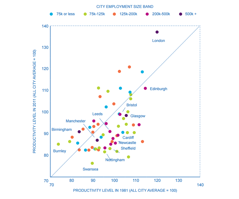
Productivity (Gross Value Added(GVA) per person employed) across British cities, 1981 and 2011 (Source Martin, Gardiner and Tyler 2014)
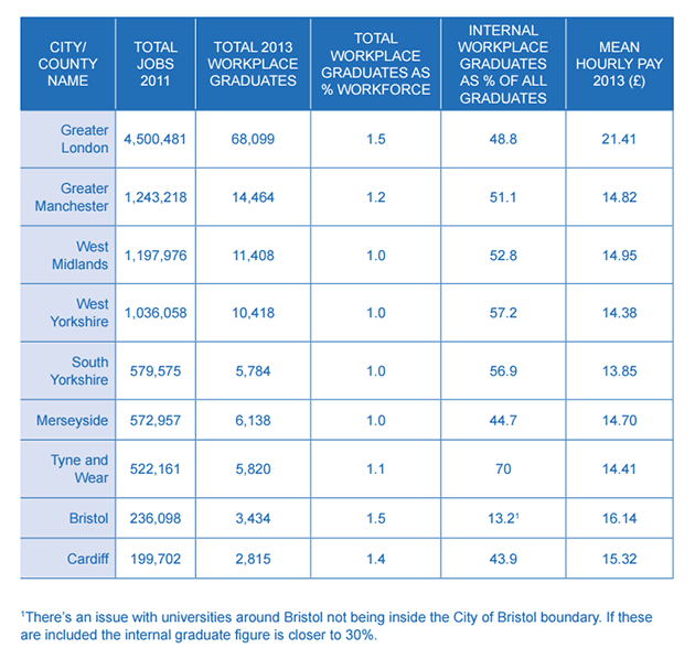
The productivity gap at the city level is further linked to graduate flows. London dominates the UK as a graduate employer, both in absolute terms and in proportional flows from higher education institutions to workplaces. The scale of the labour market and graduate recruitment programs in London, as well as its reputation as an ‘escalator region’, all add to this huge reach.
Data HESA Destination of Leavers Survey 2013/2014
That is not to say however that other large city-regions do not also have significant national graduate flows. Birmingham, Leeds and Manchester all draw significant numbers of graduates, with respective strengths in industries such as advanced manufacturing, creative industries and financial services (note HESA data is at county level, with Birmingham part of West Midlands and Leeds part of West Yorkshire). This is the foundation on which future growth will build.
Data HESA Destination of Leavers Survey 2013/2014Data HESA Destination of Leavers Survey 2013/2014Data HESA Destination of Leavers Survey 2013/2014
A second interesting aspect of the Foresight report is that it has been produced in collaboration with regional and local government agencies in Birmingham, Manchester, Leeds, Liverpool, Bristol and Cardiff. There are a number of initiatives in development to address key aspects of graduate employment, including:
• The Skills Engine being developed in Birmingham brings together a network of key players from the local area in order to improve the matching of demand for and supply of talent in the local economy.
• FASTTRACK is an initiative being tested by Leeds University to attract and assist graduate integration into small and medium-sized businesses in the region through placements and specially designed induction and training programmes.
• The Graduate Business Lounge builds on Bristol’s existing engagement in student enterprise to integrate existing graduate enterprise service providers and platforms to foster greater student entrepreneurship.
• New Economy Hubs in Birmingham, Liverpool and Manchester will take a multi-sector approach to understanding key economic growth areas at the city regional level.
• The GRAData Project, working with Leeds City Council and Leeds Institute for Data Analytics, aims to improve university and council use of national graduate data. The hope is that this will improve local careers support for students, and illuminate graduate mobility to enable the development of regional talent strategies.
These cities are well aware of the challenges in graduate skills and recruitment, and recent devolution processes are providing opportunities for improving graduate employment offers and addressing regional economy issues more generally. Data analysis and policy support are important is this role, with organisations set up such as New Economy Manchester and the University of Birmingham City REDI institute expanding.
Last week I attended the American Association of Geographers annual conference in San Francisco. This was my first AAG and first time visiting the Bay Area, so made for a fascinating trip.
The tech boom and economic resurgence of the Bay Area is a topic of much interest to geographers, and I really enjoyed the Author Meets the Critics session on Michael Storper et al.’s new book The Rise and Fall of Urban Economies. The book compares San Francisco to Los Angeles over the last 40 years, and how SF has more successfully developed new knowledge economy industries, including through government interventions like the Bay Area Rapid Transit (BART). It was great to see influential economic geographers like Michael Storper and Allen Scott debating city evolution and path dependence, as I’ve been following their work for a long time.
CASA and UCL were well represented at the conference. Martin Zaltz Austwick presented on how the Olympic regeneration in London is affecting artistic creativity in Hackney Wick. Continuing the artistic theme, Miki Beavis presented her PhD research into the dynamics of live music performances and venues in Camden. Agent-based modelling was a big conference theme, and Kostas Cheliotis presented his work modelling pedestrian behaviour in Hyde Park using the Unity game engine. I also enjoyed Kurtis Garbutt’s work using ABM for flood relief modelling in the UK.
Continuing the pedestrian theme, Panos Mavros presented his PhD work on measuring psychological responses to the built-environment using mobile EEG readers, based on pedestrian navigation experiments in Fitzrovia London. I had participated in the experiment that was presented six months previously, and it was interesting to see the academic analysis on the psychological experience of navigating through urban space. Quick takeaway was the high diversity of route choice and psychological response amongst participants, even within a controlled experimental context of a small area of London.
My own presentation reviewed methods for creating online thematic mapping platforms for researchers, based on a recent open access review paper. The session included Jesse Piburn from Oak Ridge lab, presenting innovative recent work integrating global spatio-temporal data (World STAMP project).
As well as the academic work, their was some leisure time for enjoying the city. Spring is well underway in California, with lots of wildlife and colour. I visited Muir Woods, one of the few last reserves of the giant coastal redwoods, named after the Scottish naturalist John Muir who had a key role in founding Yosemite National Park.
The city has many affluent picture postcard neighbourhoods famous from movies that are great to explore. But there are urban challenges too. One can’t help be struck by the extent of homelessness in downtown, where large city districts have hundreds of people sleeping rough. The story of low income households being left out of a huge real-estate boom is all too familiar. With homelessness on the rise in London, and government policy making things worse, we are heading for a similar situation.
Recent advances in public sector open data and online mapping software are opening up new possibilities for interactive mapping in research applications. Increasingly there are opportunities to develop advanced interactive platforms with exploratory and analytical functionality. This paper reviews tools and workflows for the production of online research mapping platforms, alongside a classification of the interactive functionality that can be achieved. A series of mapping case studies from government, academia and research institutes are reviewed.
The conclusions are that online cartography’s technical hurdles are falling due to open data releases, open source software and cloud services innovations. The data exploration functionality of these new tools is powerful and complements the emerging fields of big data and open GIS. International data perspectives are also increasingly feasible. Analytical functionality for web mapping is currently less developed, but promising examples can be seen in areas such as urban analytics. For more presentational research communication applications, there has been progress in story-driven mapping drawing on data journalism approaches that are capable of connecting with very large audiences.
And here are some example images from the mapping sites reviewed in the paper-
One of the best datasets for understanding the explosive growth of cities across the world in the last 65 years in the UN World Urbanisation Prospects research, which records individual city populations from 1950 to 2014, and includes predicted populations up to 2030. I have been meaning to create an interactive map of this fascinating data for a while, and have now completed this at- luminocity3d.org/WorldCity/
The map uses proportional circles representing city populations in the years 1950, 1990, 2015 and 2030, highlighting the regions in the globe with the most spectacular urban growth, and the time period when this growth occurred. This technique of overlaying proportional circles to show population change over time was first developed in a static map at LSE Cities Urban Age by Guido Robazza. Naturally China, India, Africa and Latin America jump out in the map, while Europe is largely static (except for Turkey). You can also explore time-series graphs and statistics for individual cities by moving your cursor over each city.
The site also includes queries of the city statistics, for example highlighting the world’s largest cities in different years. It’s amazing to see the dramatic changes between 1950 and 2015. London was the 3rd largest city in the world in 1950, and is now the 36th. In 1950 there were no African cities and only one Indian city in the world’s top 12, but by 2030 this list is dominated by South Asian, East Asian and African cities.
Mapping Tools Used
This map is the first time I’ve tried out CartoDB for interactive mapping, and I’m impressed with this tool. The main advantage of CartoDB for thematic mapping is the ability to perform SQL queries on the client-side, allowing map features to be highlighted interactively (this is used for the map queries on the World City site). There is also the ability to comprehensively restyle map symbology from the client using CartoCSS (this feature requires a full map refresh). Certainly sophisticated interactive mapping functionality is possible using CartoDB. It’s also Leaflet.js based, which is what I’m used to from the previous LuminoCity3D project.
Cities and Mega-City Regions
Measurements of city populations inevitably depend on where regional boundaries are defined, and the UN database is by no means perfect. The job of trying to integrate the hundreds of different city definitions used by each individual nation-state is no easy task. The UN tries to apply the concept of metropolitan agglomerations across the globe, but data is not always available and some cities are measured using administrative boundaries, which leads to population underestimation (full details on the UN methodology).
One of the interesting definitional issues that arises is around how very large polycentric regions have emerged in parts of the globe and beginning to look more like a single giant city. One of the most famous is the Pearl River Delta Megacity Region-
There are so many giant cities in close proximity that the map symbology struggles. Hong Kong, Guangzhou, Shenzhen, Foshan and Dongguan are all huge cities. Shenzhen in particular has experienced the most rapid growth of any city in history, growing from small town in 1980 to 10.7 million people in 2015. The combined population of these cities would make the Pearl River Delta the largest city in the world if a wider regional definition was employed.
CASA and UCL Geography have substantial experience in developing online interactive mapping sites for research outreach. The purpose of these tools is to take spatial analysis and visualisation outputs from the research lab and make them accessible and useful for many users from a wide variety of sectors and backgrounds, including: wider academia, central and local government, built-environment professionals, business, technology, community groups and the general public. Interactive mapping tools are part of the movement to make science and research more accessible, supported by the main UK research funding bodies as well as specific campaign movements like Open Data and Open Science.
The positive media coverage of recent projects and our communications with users has indicated that interactive mapping sites do reach a wide audience, including various expert users as well as the general public. These mapping projects are however a relatively new set of tools, and there is a lack of detailed information and evidence on who is using interactive mapping sites and the degree of research impact that they can deliver. In this post I explore two recent interactive mapping projects, DataShine.org.uk & LuminoCity3D.org, and analyse who has shared these sites using data from Twitter. This method is not without its flaws as described below, but is an early attempt to gather evidence and understand the user base.
‘Engaged’ Users and Social Media Sharers
A well designed interactive mapping site can generate a lot of hits, particularly if it gets picked up by national media sites. DataShine generated a huge 99,000 unique users in its first three months after launch in June last year, while LuminoCity had a reasonably large 24,000 unique users in its first three months from September 2014.
How many of these hits are truly engaged users? We can approach this question in terms of web statistics. On the LuminoCity site during the first three months, 16% of users made at least one return visit; 18% of users stayed for at least three minutes; and 26% of users explored at least four different maps during their session. So we can estimate that around 20% of the total users are exploring the site in some depth. That’s not a bad return where there is a high number of total users, e.g. this would equate to 19,800 people for the first three months of DataShine, and 4,800 people for the LuminoCity site.
We do not know however who these users are. Are they mainly interested members of the general public? Are they expert professional users? This is harder to gauge.
Classifying Twitter Users
We do have further information about the most engaged group of users- the social media sharers. These are the people who actively promoted the site to their network of followers/friends. The two major social media sites are Facebook and Twitter, with 4% of visitors of both DataShine and LuminoCity either sharing/liking the site on Facebook or posting the link on Twitter in the first three months. This is a high proportion of social media sharers, and reflects the novel and accessible nature of the sites which helped to generate enthusiastic users.
In this analysis I have classified Twitter users who shared site links to Datashine and LuminoCity according to their profession. Naturally there are some problems with this approach- this selection reflects only the most enthusiastic users of the mappings sites; Twitter users are a biased sample (generally towards affluent professionals, tech and media users); many users have multiple professions (I tried to pick the main one); and professional and personal opinions on Twitter overlap significantly. However this is an early effort to explore types of users of interactive mapping sites, and hopefully this can be built on in the future.
The DataShine Census Site
Below is the classification of 350 Twitter sharers from the DataShine site. It is clear that a wide variety of users are covered, including both professional and community groups (a more detailed table is at the end of the post)-
Geographers were not surprisingly the main group of academic users, but DataShine also attracted many users from across the natural sciences, social sciences and the humanities. Health researchers were particularly well represented, as the site provides many useful health related maps from the 2011 census. This result also chimes with a high number of business users in the public policy sector, mainly with a health and planning focus.
The innovative visualisation technology behind the DataShine site appeals to IT users, and there were many sharers from IT, cartography, data journalism and data science backgrounds.
One of the biggest successes with the DataShine site was in reaching beyond academic and professional experts to local communities. The site provides high quality maps of census data at the neighbourhood level, and this successfully appealed to local community groups, campaigners (e.g. cycling campaigns, local environment campaigns) and to local government users. Several councillors tweeted the site, as well as users from DCLG and local government planners. Media coverage also helped to generate many interested users from the general public.
The LuminoCity Site
The data from the LuminoCity site is based on a smaller sample of 140 Twitter shares. This covers a similarly wide variety of users, with more of a focus on built-environment professionals, and less on local government and the general public.
The LuminoCity site provides a range of maps and statistics for the comparative analysis of UK cities. This functionality appealed strongly to planners and transport consultants, as well as some business users in economic development and real estate. Academic users also had a more urban focus for the LuminoCity site. The site did not chime so strongly with local government and community users who generally want a more local scale of analysis. There were some users from Central Government who used the site for measuring economic performance in northern cities.
The more abstract minimalist aesthetic used on the LuminoCity site attracted quite a few architects and designers to the platform. These users are enthusiastic about visualisation while being less familiar with the range of open data available at city and national scales.
The ‘Other Education’ sector, which was popular for both sites, includes high schools, geography departments, museums and the wider education sector beyond universities. This was an unexpected outreach success for both of the websites, and shows how the open approach can help to create new connections.
Summary
This analysis of twitter shares from interactive mapping platforms shows how these tools can successfully appeal to a wide range of users, both professional and the general public. Academics are well respresented, but also business users, government, local communities and the wider education sector.
Twitter users are inevitably a biased sample and it would be useful in the future to look at methods that can capture a larger proportion of engaged users and assess to what extent the most engaged social media users represent the wider engaged audience for the sites.
If news emerged that a virus was killing thousands of vulnerable Londoners every year then there would justifiably be public alarm, followed by swift political action. Yet the impacts of this imaginary scenario are similar to what air pollution has been inflicting on Londoners for many years, while the political response has been slow. According to the most up-to-date and comprehensive research, air pollution reduces Londoners’ life expectancy equivalent to the death of 9,400 people of average age every year (5,900 due to NO2 and 3,500 due to PM2.5) as well as exacerbating respiratory diseases in vulnerable populations. Despite the severity of these impacts, it has become standard practice over the last decade for national government and the London Mayor to gloss-over the problem, downplay continued breaches of European law, and for politicians to delay taking any significant responses.
The current London mayor, Boris Johnson, has been slow to face up to the challenge. His tenure began by removing the western extension to the Congestion Charging Zone, thus increasing vehicle numbers in Inner West London, and opting out of using the Congestion Charge to tax the most polluting vehicles. This would have boosted the adoption of hybrid and electric vehicles (still only a meagre 1% of new cars) and reduced heavy emitters in Central London. Furthermore Johnson has not succeeded in comprehensively upgrading London’s bus and taxi fleet to hybrid and electric vehicles, instead embarking on an expensive new Routemaster project which still produces substantial emissions and currently makes up a minority of the overwhelmingly diesel bus fleet.
NO2 Annual concentration in London 2010, modelled by the London Atmospheric Emissions Inventory. All of Inner London and many major roads in Outer London greatly exceed the EU limit.
Looking to the future, London must now tackle the air pollution problem with a new mayor in the upcoming 2016 elections. The scope for change looks positive, as the main candidates on both the left and right have been openly discussing the need for change. What then could a new mayor do to address air quality and improve the health of Londoners?
Pricing Out Polluting Vehicles with the Ultra Low Emission Zone
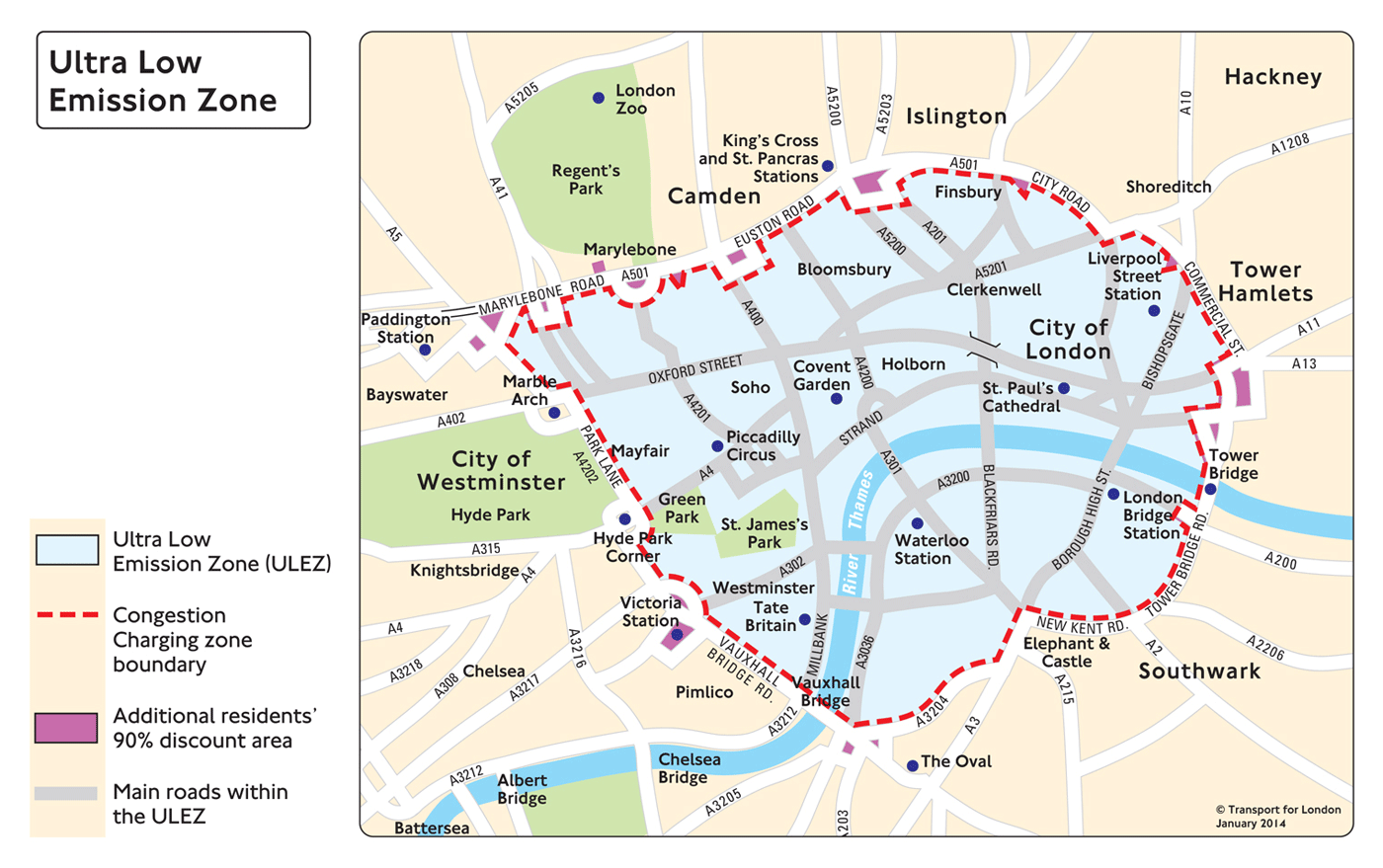
To be fair to Boris Johnson, he did finally respond to pressure and announce a significant air pollution policy in 2013, dubbed the ‘Ultra-Low Emissions Zone‘. The ULEZ is set to come into effect in 2020 and essentially uses the Congestion Charging infrastructure to tackle the most polluting vehicles (similar to what Livingstone proposed way back in 2006). The question is whether the ULEZ goes far enough. It’s based on Euro emission standards, which measure NO2 and PM10/2.5 as well as CO2 emissions. It correctly targets diesel vehicles, requiring them to meet the Euro 6 standard, which only came into force in September 2015, so almost all current diesels on the road would have to change or pay the charge. This means that the main source of NO2 emissions will be appropriately targeted.
The current Congestion Charge boundary will be the basis of the Ultra Low Emissions Zone (map by TfL).
There are limitations however. The charge is only going to be £11.50 (except for large buses and HGVs), so it likely many diesel users will continue to drive into Central London and pay the charge. Furthermore the ULEZ will only affect Central London; the rules on diesel taxis and private hire vehicles have not been decided; and ULEZ zone residents get an overly generous exemption until 2023.
The next mayor will have a number of options that could be pursued if they want to be bolder than Johnson’s ULEZ proposal. These include increasing the ULEZ charge and/or Congestion Charge, bringing the ULEZ implementation forward to an earlier date, and potentially reintroducing the Congestion Charge Western Extension. All of these would make significant improvements to air quality, but would be controversial with drivers, many of whom were mis-sold diesel vehicles in the past as a supposedly environmentally benign option. The mayor may also want to re-examine the wider Low Emission Zone (LEZ) that tackles very polluting vehicles entering the whole of Greater London, as this affects the entire city and has not changed since 2012.
Euston Road, one of London’s busiest and most polluted routes with NO2 annual concentrations typically twice the EU limit (photo by D Smith).
Banning Diesel? A more radical approach currently being proposed for Paris is to ban diesel cars all together. This would certainly make a huge improvement to air quality. The problem for London would be that the city’s bus and taxi fleet would fail this restriction, and there would likely be a backlash from thousands of car and van drivers. This would be a very confrontational approach for a new mayor.
The more pragmatic solution for London would be to work with the ULEZ framework, considering stricter measures and higher charges, and implementing the policy earlier. One very important issue for the new mayor is emerging from the current Volkswagen emissions scandal. It looks like the latest Euro 6 diesels produce significantly higher NO2 emissions in real world driving conditions compared to the misleading testing conditions. If this is the case then the proposed ULEZ will be much less effective in improving air quality (as Euro 6 diesels will be exempt from the charge). The ULEZ may have to charge all diesel vehicles, regardless of their Euro rating. This decision would need to made very early, so that there is sufficient time for car users to adjust behaviours accordingly.
Pedestrianising Streets and Upgrading the Bus Fleet Oxford Street is London’s busiest pedestrian street and has some of the worst NO2 pollution in Europe. A response that is gaining popularity is to pedestrianise the whole street. Certainly this would be an iconic change to both the image of London, and to the experience of the city for thousands of Londoners and tourists. The challenge for this measure is avoiding creating bus jams at either end of Oxford Street, and handling the extra demand levels that would be placed on the already congested Central Line. These challenges are not necessarily permanent however, as the arrival of Crossrail in 2018 (which follows the west to east Central Line route through Inner London) has been described as a ‘game changer’ that makes pedestrianising Oxford Street a realistic option. The new mayor should certainly pursue this possibility.
The wider challenge for the mayor is not to just think about Oxford Street, but to accelerate the upgrading of the entire bus and taxi fleet towards zero emission vehicles and develop wider pedestrianisation policies. This would improve air quality for all of London’s high streets. London is still at the trial stage of pure electric double-decker buses, which represents disappointingly slow progress considering how long we have known about air pollution problems. There’s been better progress on electric/hydrogen single-deckers. Considerable investment will be needed to upgrade the bus fleet, with decision-making based on real evidence and value-for-money. Johnson’s Routemaster project has failed both these criteria, and better leadership is now required.
Heathrow Third Runway All the main candidates for the London Mayor oppose the expansion of Heathrow, with air pollution alongside noise pollution amongst the most important factors. You can see how Heathrow already dramatically increases emissions in West London in the NO2 annual concentration map at the top of this article using the London Atmospheric Emissions Inventory data. This is due both to emissions for aircraft engines, and the thousands of cars driving to and from Heathrow everyday. The challenge will be how effectively the new mayor can challenge the UK government to reject the Heathrow expansion option.
Overall, the issue of air pollution has gained unprecedented prominence as we approach the 2016 mayoral elections. The main candidates need to respond accordingly in their manifesto commitments, with London having a lot of catching up to do after eight years of little change. It will be interesting to see which candidates are prepared to be bolder.
The imminent UK General Election is fascinating for a host of reasons, not least because of the challenge to the long established dominance of the two main parties, Conservatives and Labour. Their share of the vote has been steadily in decline for over 50 years, from a high of 97% in 1951 to 65% in 2010-
Polls for 2015 indicate that the two main parties are tied at around 33-34%. But the difference in 2015 is that the rise of the smaller parties is going to translate into winning seats, most spectacularly in Scotland with the SNP set to wipe the floor and become the third biggest party in the UK with 50+ seats. There are also likely to be gains for the right wing party UKIP, and possibly for the Welsh nationalists Plaid Cymru and the left wing Green Party. The political map of Great Britain will look very different and increasingly fractured, with a coalition or minority government inevitable and essentially becoming the new normal-
2015 General Election predictions from May2015.com (left) and Guardian (right) in cartogram format.
How can we understand this changing political geography? There is a strong tendency towards spatial clustering of similar voting patterns, with votes for minor parties higher further away from the economic and political core of London. This relates to the nations of Scotland, Wales and Northern Ireland but also to regions like South West England and coastal towns where UKIP and the Greens could pick up seats. There is also a strong geographical element to the division between Labour and Conservative seats, with Labour strongly urban and northern while Conservatives are dominant in more rural areas and in the South East.
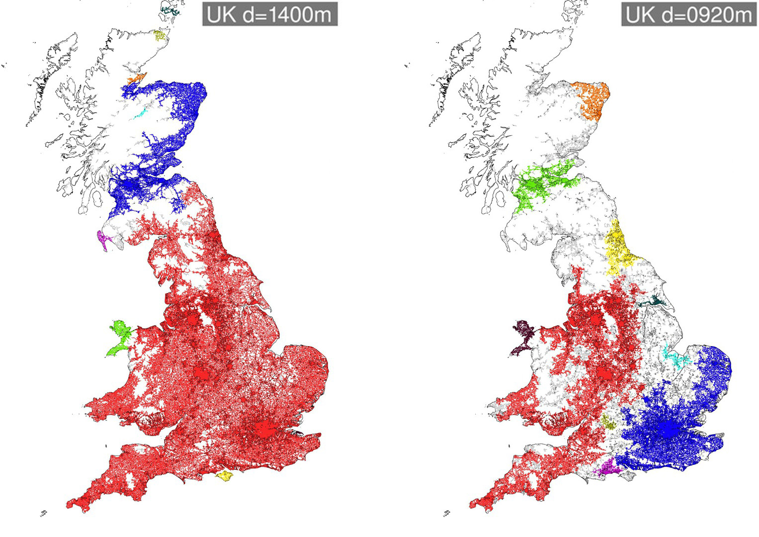
In research at CASA we have been using percolation as a method of exploring urban regions at multiple scales, and have a new paper applying percolation to understanding Britain’s political geography (paper by Carlos Molinero, Elsa Arcaute, Mike Batty and myself). The paper proposes that voting patterns are fracturing along long-standing historic national and regional divisions in Great Britain, and seeks to test this proposition using percolation analysis. The percolation method defines regions by building clusters of road junctions according to a threshold distance, with the road network used as a proxy of population settlement and connectivity. At a threshold distance of 5km Great Britain is one giant cluster-
We can then reduce this threshold distance to see how Great Britain fractures. At a threshold distance of 1.4km Scotland fractures from England & Wales (although interestingly some of the Scottish borders remain part of the England & Wales cluster). Then at a distance of 900m the North and South of England split, as does the North East of England and North East of Scotland-
By 800m South Wales splits off from England, and the South West and East Anglia become separate regions. Finally at a distance of 300m, we are left with the core of large cities-
These various levels of percolation clusters can be viewed as a tree (below).
Our question is then, do these regions generated through percolation analysis bear any relationship to voting patterns? We can test this by classifying parliamentary constituencies according to the composition of percolation clusters that fall within each constituency. Each of the parliamentary constituency groups is assigned an ‘average voting behaviour’ from the real voting behaviour in 2010, in terms of a vector of percentage votes for each of the parties. The average voting behaviour of each group can be compared to the real voting behaviour in terms of the percentage error. We can compared the percolation clustering outcomes against results using different datasets. Clusters created using the real voting data naturally produce the lowest error. It is interesting however that the percolation based results outperform clusters produced using common socio-economic data such as socio-economic class, age and education level.
Making Predictions for 2015 Finally the percolation clusters can also be used to try to make predictions about the forthcoming election using a universal swing method on the 2015 data (for full details see the paper). In the series of maps below we have (from left to right) the prediction using the real 2010 data and latest polls; the prediction using percolation clusters and occupational class data; the prediction using only percolation clusters; and the prediction using only socio-economic class data. The percolation based results appear relatively close to the prediction based directly on the real data. The percolation method is highly clustered spatially, leading to an exaggeration of regional divisions in the UK-
In terms of the total seats predicted, the results are not too far off current polling predictions. The percolation based method tends to exaggerate Labour’s predicted number of seats, as Labour benefit from a strong clustering of their vote in northern city-regions.
Overall the percolation method is very a promising approach for understanding regional divisions in the UK, and we continue this line of inquiry in further research. It remains to be seen whether the political geography of the UK will continue to fracture further along these regional lines. A key factor will be whether the rise of smaller parties raises the pressure for voting reform, as the First Past the Post System is becoming increasingly misrepresentative of the UK’s voting patterns and is failing to deliver the single party majority that is supposed to be the FPTP system’s main asset.
The financial crises and recession that began in 2008 were initially viewed as an opportunity for rebalancing the UK economy away from financial services towards a broader base, and addressing Britain’s long term north-south divide. In reality however the post-recession period has seen a strengthening of regional divisions with high rates of growth in London and much of the South East, compared to mixed or negative performance in the rest of Britain (see the map below). While the South East now needs to tackle the knock-on effects of growth in terms of the severe housing shortage, many regions in the UK have been struggling to achieve growth at all.
City devolution policies are aimed at boosting growth in northern cities and narrowing regional disparities. The 2015 general election is unique for the prominence of these policies, with devolution manifesto commitments from all the major parties. The Conservatives would continue their programme of devolving some powers and budgets to specific northern cities, while Labour and the Lib Dems would legislate for more comprehensive city devolution. Are these policies likely to work? There is currently much debate and uncertainty over this question. I argue here that urban research can help us understand current trends in cities and the directions urban futures are likely to take.
Firstly we need to understand the continuing structural changes in the economy. Economic growth is being led by professional and business service jobs, so-called ‘knowledge economy’ sectors (see graph below). Despite zero growth in financial services jobs over the last 15 years, professional and business services continue to grow substantially led by sectors such as ICT, management consultancy, creative industries, legal and real estate. Other service sectors are more mixed, with a decline in administrative jobs, and some growth in retail and public services. Meanwhile manufacturing continues to be in decline, though has levelled off in the last five years.
The economic picture illustrated above is one that significantly favours cities and city-regions. Knowledge economy firms benefit from clustering together, sharing labour markets, knowledge spill-overs and other externalities. These agglomeration economies are strongest in cities, and strongest of all in large cities, where the density of transport and communications infrastructure facilitates connections and reduces costs. An expanding academic literature describes how larger cities are on average more innovative, competitive, diverse and sustainable, backed up with empirical evidence mostly from the USA. This line of reasoning chimes with the strong economic performance of London in the UK, and explains how the capital has been able to bounce back from the recession through its diverse economic base.
Yet in research at the Centre for Advanced Spatial Analysis (CASA) we have found that the relationship between city size and economic performance does not hold for Great Britain (see paper). Several small cities are the fastest growing in the country and have become highly specialised in knowledge economy industries, principally cities/towns in the South East with universities such as Milton Keynes, Cambridge and Brighton. Meanwhile the major post-industrial cities, such as Birmingham, Manchester, Liverpool, Leeds and Newcastle are underperforming given their relatively large size.
Are these northern cities capable of faster growth and developing stronger knowledge economy clusters? Recent regeneration in cities such as Manchester would suggest yes, and indeed some green shoots can be seen in the North West and West Midlands in the map above (these two regions are the fastest growing from 2010-2014 after London). Such regeneration does however require significant investment, planning and political collaboration. Thus this is where devolution policies come in. The intention is to give cities more powers for strategic planning, housing, transport and local budgets. More comprehensive devolution proposals allow cities to retain money raised by local taxation. At present the city with by far the most devolved powers is London, with the creation of the mayor and Greater London Authority having positive impacts on development over the last 15 years and helping attract infrastructure spending towards the capital (indeed to an unfair extent- there is a huge UK public investment bias towards London). Would devolution allow other large cities to repeat London’s success, or would fiscal devolution favour existing affluent cities and exacerbate divisions?
Many of these issues around the future of UK cities are being discussed by the Foresight Future of Cities project which UCL is significantly involved in. You can read current Foresight working papers exploring this and many other current urban debates here. We also have a new CASA paper investigating the fracturing political geography of Great Britain.
Household energy use is a key indicator for understanding urban sustainability and fuel poverty, and is a timely topic now that winter has arrived. The LuminoCity3D site maps domestic energy use in England and Wales at 1km2 scale using data from DECC. This map has also just been published as a featured graphic in Regional Studies Regional Science. The household energy use distribution is really fascinating, with large scale regional variation and fine scale intra-urban patterns identifiable-
Average domestic energy use 2012, click to view interactive map
The lowest energy use per-household is found in cities and towns in the South-West region such as Plymouth and Exeter, and also along the South coast. While the highest energy use per-household is found in commuter belt towns around London. The variation within city-regions is very high, with for example London and Manchester averages varying by up to a factor of 5, from a mere 8kWh to over 40kWh per year.
The main drivers of energy use are generally housing type (more exposed walls=more energy use; larger house=more energy use), household size, wealth and climate. Often these factors are correlated at household and neighbourhood levels- so for example wealthier households in England and Wales are more likely to live in large detached houses, and these households tend to be clustered together. These trends produce the high energy use pattern seen in London’s commuter belt, as well as in the wealthier suburbs of other large cities like Birmingham, Manchester and Leeds. South West England on the other hand benefits from the mildest climate in the UK, has a relatively high proportions of flats and generally lower average household sizes, thus resulting in the lowest energy use.
We can see how these factors play out for London in the map below. The height of the hexagons shows density, with higher density areas clearly using less energy. City centre households have considerably lower energy use, with a strong bias towards Inner East London where incomes are lower.
London average domestic energy use 2012, click to view interactive map
Energy use areas correlate strongly with the most prevalent housing type map (also on the LuminoCity3D site), with flats and terraced housing the lowest energy users, and detached and semi-detached areas the highest.
London most prevalent housing type 2011, click to view interactive map
The relationship with household size is less clear cut, but it can be seen that average household sizes are smaller in the city centre. On the other hand, areas with high average household sizes such as Stratford and Wembley, do not have particularly high average energy use.
London average household size 2011, click to view interactive map
Overall domestic energy use patterns tend to mirror transport sustainability, in that higher density city centre areas perform more efficiently compared to low density suburbs. On the other hand the link to city size (which tends to be strong in transport sustainability relationships, with bigger cities reducing car use) is much weaker, and the most efficient locations are often small and medium sized towns and cities. It is not clear in this analysis whether more recent green policies (such as improved insulation or CHP schemes) are having much effect, but several cities with green reputations like Brighton and Bristol are amongst the best performing cities.
Following rapid growth and a chronic lack of new development, housing affordability has reached crisis levels in London. Median house prices are at £300k (8 times median household income) while average prices have passed half a million. London is now amongst the most expensive cities in the world, a situation with severe consequences for economic competitiveness and for inequality. Rents continue to increase faster than wages, ownership is being restricted to affluent populations and the social housing waiting list now stands at 345,000 households, nearly double the figure from 15 years ago.
Recent development figures have been very low. London needs at least 50,000 new homes per year to meet demand, yet only 21,000 were built last financial year, and this figure has been below 20,000 for all of the last five years. Nationally around 200,000 houses a year are needed, and we are building around 100,000. These figures amount to a comprehensive failure of national and mayoral policy.
Clearly substantial changes are needed. Last week the Centre for Cities outlined how this change could happen, launching their ‘Building Change: Delivering Homes Where we Need Them‘ report. It convincingly argues that we are failing to deliver homes where demand in greatest- in the vicinity of rapidly growing towns and cities- resulting in spiralling housing costs.
The report makes a range of positive recommendations for enhancing local authority capacity in relation to delivering new housing, including the streamlining and reform of compulsory purchase orders for faster development and allowing cities to benefit from uplift values in land; allowing local authorities to borrow more with longer term commitments from central government; and enabling greater cooperation between local authorities to tackle city-region challenges. Best practice examples are provided from local authorities that have successfully delivered new housing, such as Bristol and Milton Keynes. The report also provides a useful summary on brownfield capacity, with for example the potential for 350,000 homes on brownfield sites within the GLA.
Releasing Greenbelt Land for Development
By far the most politically controversial aspect of the report is the recommendation to reconsider greenbelt development restrictions. Prioritising brownfield land has been a central foundation of compact city planning over the last twenty years, directing development towards inner city regeneration and away from rural areas. Yet brownfield land can be expensive to develop, and in combination with greenbelt restrictions, land prices have soared. These spiralling land costs have significantly curtailed new housing.
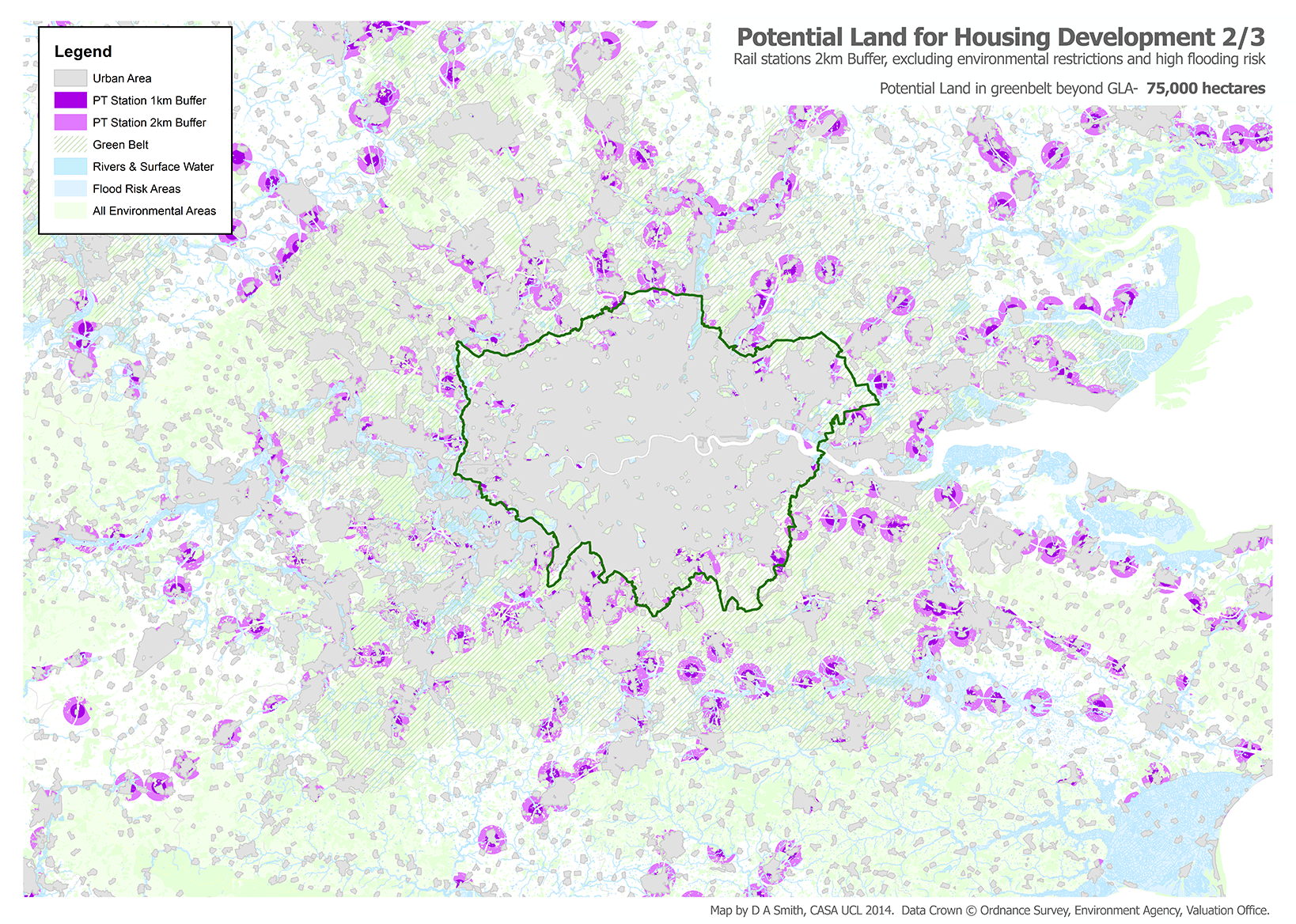
Opportunities for housing on ‘Usable Greenbelt Land’ around London are mapped in the report (figure below), based on locations within 2km of rail stations. The Centre for Cities estimate that there are opportunities for 430,000 housing units on greenbelt land within the GLA, and opportunities for a massive 3 million housing units on the London greenbelt beyond the GLA boundary. This huge housing capacity could effectively solve London and the South East’s housing crisis. So is developing on the greenbelt the answer?
Opportunities for new housing on London greenbelt land, Centre for Cities Delivering Change Report 2014.
Usable Land and the Value of the Greenbelt The gigantic housing development capacity figures quoted in the Centre for Cities report certainly demand attention. As housing development is such a central issue for planning in the South East, I have decided to repeat the Centre for Cities spatial analysis from a sustainable urbanism perspective and assess how realistic these recommendations are, and what the environmental consequences of the greenbelt development approach are likely to be.
First of all, some details on the Centre for Cities methodology. Their Usable Land definition is a 2km crow-flies buffer of rail and underground stations, excluding several environmental protection area types (SSSIs, AONB, SAC, SPA, Ancient Woodlands). The report does not argue that all this land should be developed, rather that it could be considered for development on a case by case basis. They take a ballpark figure that, given infrastructure, services and removing highly amenable land, 60% of the remaining land could be developed for housing at an overall average of 40 dwellings per hectare (thus each hectare of usable land effectively translates to 24 homes). I have repeated this method below and I get a very similar result of 120,000 hectares / 2.87 million homes on London greenbelt land beyond the GLA boundary. I get a lower (but still substantial) figure of 12,700 hectares / 306,000 homes on greenbelt land within the GLA.
There are two main spatial analysis issues with the Centre for Cities method of identifying usable land- firstly there are significant development restrictions missing, and secondly there are problems with using rail station buffers as a proxy for sustainable travel. Regarding the first problem, the most significant restrictions that should be included are flood risk areas, and additional environmental land and habitats (principally Priority Habitat Areas). The impact of these additional restrictions is shown in the map below. Surface water and flooding risk in particular covers large areas of land in the Thames Valley west of the GLA, and north in the Lee Valley, reflecting the role of the greenbelt in flood management. Assuming these areas would not be developed, this removes nearly 40% of the usable land from the analysis, leaving 75,000 hectares. With more data and time, further restrictions could be considered, for example local site access, road congestion, airport flight paths, heritage restrictions etc.
The second problem is how to consider public transport accessibility and sustainable travel. The basic principal used by Centre for Cities is sound- directing development to areas of public transport access. But locations within 2km of rail stations in the South East are often very small towns and villages, lacking local retail and services opportunities. Not surprisingly these small towns are generally highly car dependent, with around 80% of commuters driving to work, and similar patterns for other trip purposes. Building further low density housing in these locations would likely reproduce this pattern of car dependence.
Ideally the appropriate method here would be to do some accessibility modelling and network analysis (comparable to the PTAL approach used in the London Plan) to identify locations with access to local services and a range of public transport options. Unfortunately performing accessibility modelling for the whole of the South East is not trivial. The maps below shows a simpler alternative, identifying locations within an estimated local walk/bus trip of a retail and service centre (3km of a large centre, 2km of a medium centre or 1km of a small centre) based on 2010 Valuation Office data, in addition to the 2km buffer of rail stations. It is clear that a stricter definition of accessible locations greatly reduces the resulting volume of usable land, directing potential development to larger settlements with more facilities (and public transport services) like Southend, Maidstone and Hemel Hempstead. In this case it leaves 27,500 hectares of greenbelt land beyond the GLA, or 23% of the original figure. Note we also haven’t considered public transport capacity, which is a critical issue for commuters into London as many services are overcrowded.
This analysis points to the Centre for Cities figure of 3 million potential homes in the greenbelt being a big overestimate if sustainable planning guidance is going to be followed. Yet even with this stricter approach I still get a large figure of 27,500 hectares of potential development land in the greenbelt beyond the GLA, which would be about 650,000 homes at suburban densities or more at higher densities. This could go a long way to alleviating the housing crisis in the South East. The Centre for Cities report is convincing in its wider policy argument that land should be ‘evaluated on its merits’ rather than being fixed by blanket restrictions. Greenbelt development could play an important and perhaps even relatively sustainable role in addressing the housing crisis.
The question then is how any release of greenbelt land can be managed to prevent sprawl and retain the many environmental roles that the greenbelt embodies. There is also the problem of making the case to the public when the greenbelt has traditionally been a popular policy. And so we come back to the issue of local authorities cooperating to tackle regional challenges. A million commuters cross the GLA boundary every weekday, yet regional planning is almost non-existent. Any release of greenbelt land needs to be considered in its regional context and balanced against brownfield opportunities. The biggest housing opportunities are linked to new infrastructure (e.g. Crossrail both West and East of the GLA; the Varsity Line for Oxford-Milton Keynes-Cambridge), again at the regional scale. Its hard to see how the housing crisis can be tackled without much greater regional cooperation and some form of regional planning for the South East.
Urban policy is currently riding high on the UK political agenda. A combination of the desire to rebalance the UK economy away from financial services; debates over massive high-speed rail investment; the worsening housing crisis in the South-East; and city devolution demands following the Scottish referendum, all point to major reform. As we move towards the 2015 general election, addressing city concerns is going to be a key, perhaps even decisive, election debate.
It is therefore a good time to take stock of recent urban growth and change in Great Britain, assess policy successes and failures, and consider how better outcomes might be achieved in the coming decades. This post draws on map visualisations from the LuminoCity3D.org website.
London and the South-East: Global Boom Region to Elite Island?
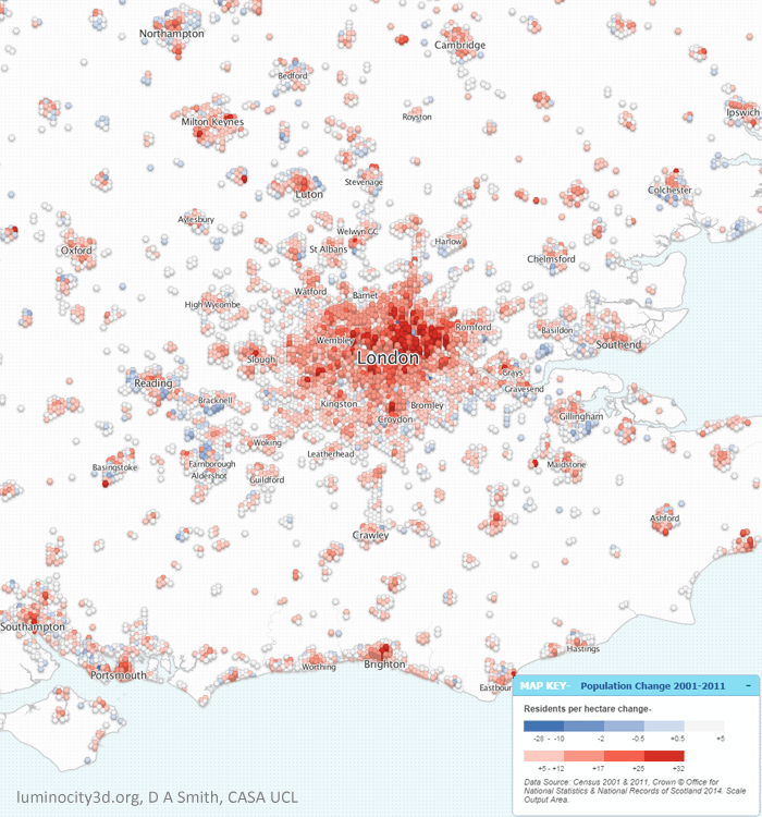
London’s recent growth has been phenomenal, gaining over a million residents (+13%) between 2001 and 2011. As we can see in the figure below, population growth has occurred across all of Greater London (except Kensington & Chelsea), with the strongest concentrations in Inner London and East London, reflecting the priorities of successive London Plans. This spectacular growth has not been confined to Greater London either, but is found across the South East region. The fastest growing UK towns and cities are nearly all in London’s orbit, including Milton Keynes with 20% growth, Ipswich with 15% growth, Cambridge with 16% growth and Ashford with 21% growth. This shared growth clearly illustrates that the South East is a closely integrated region, as further demonstrated by extensive commuting flows.
Population Change 2001-2011 in the South East region.
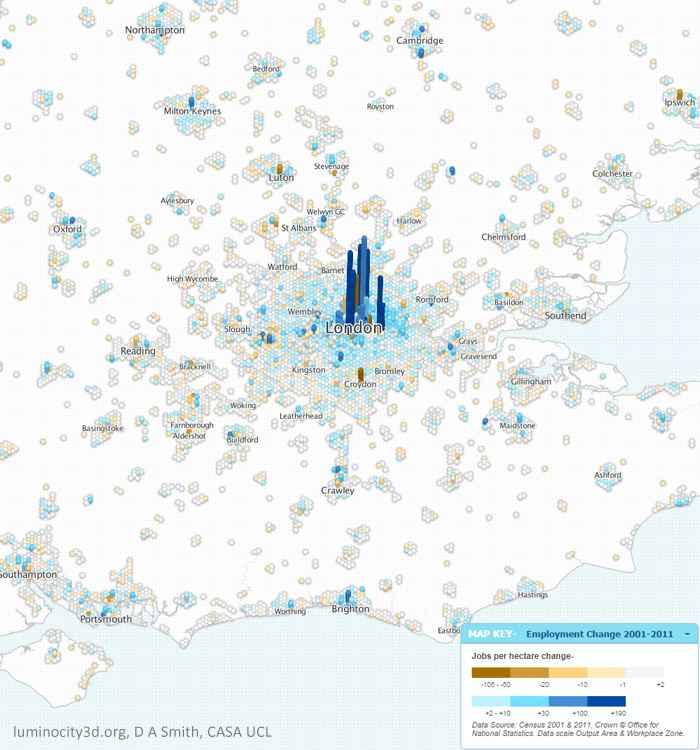
Inevitably it is strong economic growth that underpins this rise in population. London gained 650,000 jobs (+15%) between 2001-2011, strongly focussed in Inner London and Canary Wharf. Employment growth is much more unevenly spread across the South East, and arguably booming Inner London is taking jobs away from other centres, or pressuring some into becoming dormitory suburbs through soaring demand for housing. This is most clearly seen in Outer London in centres such as Croydon and Bromley where employment has fallen, while resident population has risen.
Employment density change 2001-2011 in the South East region.
Inner London is dominant for many employment sectors, not just financial and business services, but also creative industries, research, tourism, and increasingly for information technology, helping London to bounce back successfully from the great recession. The IT industry is an important growth sector, and has traditionally been concentrated in Reading, Bracknell and surrounding towns, an area dubbed the Western Sector by Sir Peter Hall in the 1980s. The Western Sector still retains the highest percentage of IT jobs in GB, but recent growth here has been sluggish. The current stars of the IT industry are now online and social media businesses, and these are attracted to the creative pull of Inner London. Meanwhile the most significant South East growth story outside the M25 has switched north, with Oxford (12% jobs growth), Milton Keynes (14% jobs growth) and Cambridge (22% jobs growth) forming a new northern arc of science and engineering based growth.
So with so many success stories, you be forgiven for thinking everything looking rosy for London and the South East. Unfortunately this is not the case. Soaring population growth has in no way been matched by new housing construction. What was previously a housing affordability problem in the South East is now an outright crisis that threatens to put the brakes on the entire region. Mean house prices just passed the incredible figure of £500,000 in July of this year, and a recent survey placed London as the most expensive city in the world to live and work. This is a looming disaster for future growth prospects. The crisis is not limited to London either, as shown below, with median prices above £300k for much of the South East, and the most popular cities experiencing similar extremes to London.
House prices 2013 in the South East region.
Soaring prices may seem like great news for property owners, but ultimately cities rely on their ability to attract talent and new businesses. And as London’s competitiveness falls, growth will go elsewhere. What has traditionally been a region of opportunity risks becoming a closed-shop for the wealthy.
And the situation is in danger of getting worse before it gets better. The current UK government did not create the housing shortage, but have overseen a period of historically low house building, with 2014 rumoured to hit rock-bottom. Mapping new-built housing sales leaves a sea of white, largely because there have been so few new houses constructed to sell. The recession presented an ideal opportunity for investing in housing and addressing unemployment, but this opportunity was missed. Trumpeted planning reforms have achieved very little, while right-to-buy policies have simply further increased prices.
Solving the housing crisis requires reform on a number of fronts. More power for local authorities to borrow money and make compulsory land purchases would certainly help. Linked to this is a desperate need for property tax reform to encourage housing to be used efficiently. Currently a £300k house pays the same council tax as a £10 million house, while empty housing is not discouraged, leaving many houses in Inner London as empty or underused investment vehicles. Similar arguments are made in favour of a land value tax to encourage land to be used efficiently and stop land banking.
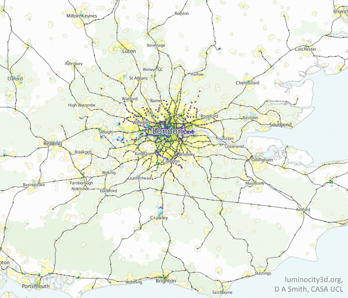
Perhaps the most controversial issue is whether the green-belt can be retained in its current form. Calls from the eminent Richard Rogers that all new development can still be on brownfield frankly look out of touch with the reality in the South East. The debate really needs to switch towards how a controlled release of green belt land can be managed to avoid car-based sprawl and develop sustainable urban areas. Mapping rail infrastructure and urban density in the South East as shown below indicates that there are many potential locations with rail stations and room for growth. This approach would only however create more commuter towns, and ultimately there needs to be stronger planning for the entire South East region, likely with big urban extensions for successful cities such as Milton Keynes, Cambridge and Brighton. It is interesting that recent entries for the Wolfson prize were focussed on this approach.
Rail infrastructure, the green belt and urban density in the South East region
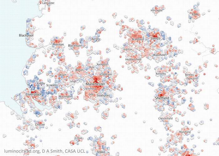
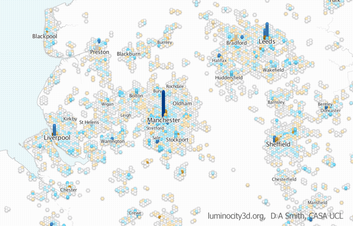
Northern Evolution: an Emerging Hierarchy of Urban Centres? While the South East is in danger of overheating, the majority of the UK’s city-regions have been focussed on post-industrial regeneration and stimulating growth. And in the last decade there has been significant change for many northern cities. Starting in the North West and Yorkshire we can see rising populations in all the major city centres. Greater Manchester in particular has experienced high levels of growth, gaining 200,000 residents (+8%) and 100,000 jobs (+10%) between 2001 and 2011. By the regional definitions used in LuminoCity3D.org, Greater Manchester has overtaken the West Midlands to become the second largest city-region in the country with 2.6 million residents. Manchester city centre has also experienced high rates of employment growth and is the primary centre in the North West, with positive signs in the business services and science & engineering sectors.
The Leeds and West Yorkshire region is also growing quickly, gaining 120,000 residents (+8%) and 50,000 jobs (+6.6%). Population growth is greatest in Leeds city centre, but is evident across the region, particularly in Bradford and Huddersfield. Similar to Manchester, employment growth is focussed strongly on the largest centre, Leeds, with a concentration in financial and business services. Despite West Yorkshire and Greater Manchester being two of the most dynamic northern regions, there is very little travel interactions between them due to poor transport links, and this surely needs to be a policy priority.
Sheffield also displays significant city centre led growth, gaining 45,000 (+6.3%) residents and 21,000 jobs (+6.7%), as does Liverpool although there has been some population decline in the suburbs. Liverpool’s figures are a gain of 21,000 residents (1.8%) and a more impressive 44,000 jobs (10%).
Population change 2001-2011 in the North West and West Yorkshire regions.Employment density change 2001-2011 in the North West and West Yorkshire regions.
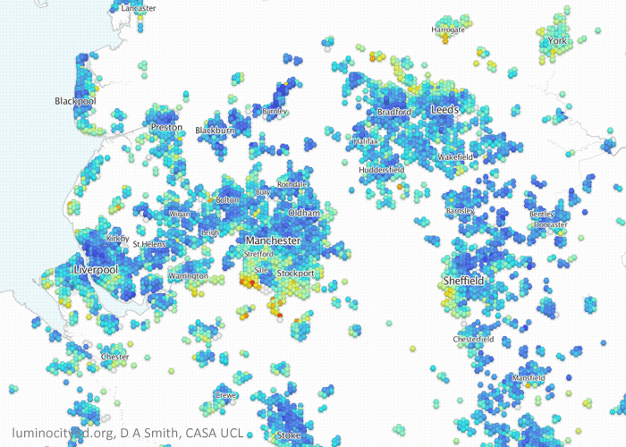
The house prices map for the north-west and Yorkshire makes a very interesting comparison to London. The dramatic gentrification that has transformed Inner London towards increasing affluence and polarisation has not (yet?) occurred. The wealthy areas are mainly suburban in the north-west, often where large cities merge with national parks such as the Peak District and the Yorkshire Dales. There are some signs that wealthier South Manchester is beginning to move towards the city-centre, but this is still in earlier stages of city-centre transformation.
House prices 2013 in the North West and Yorkshire regions.
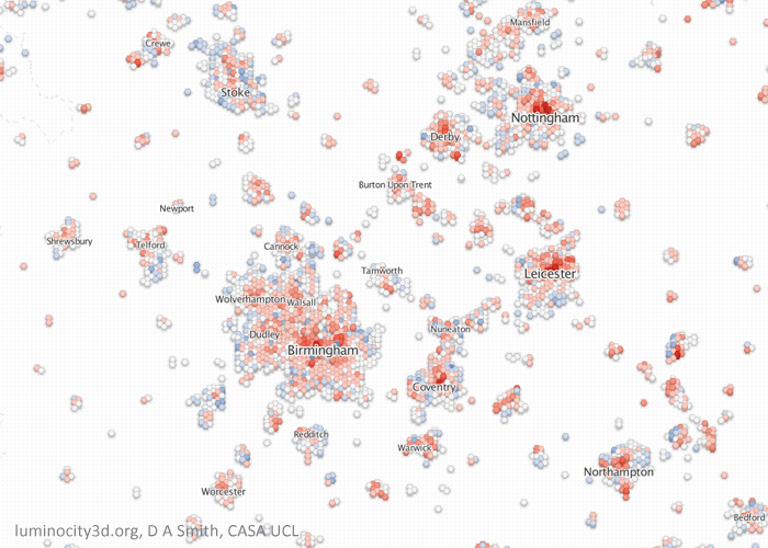
Moving on to the Midlands, again we can see population growth across all major city centres. Birmingham and the West Midlands gained 162,000 residents (7.3%) and 47,000 jobs (+4.8%) between 2001 and 2011, with similar city centre employment density levels to Manchester. The most dynamic cities in the Midlands seem to be medium sized cites, with Leicester growing 12.8%, Nottingham by 8.1% and Derby by 11.8%, although jobs growth is more mixed. There is a significant concentration of business service jobs in Birmingham city centre, but by far the most distinctive sector in the Midlands economy is hi-tech manufacturing and R&D jobs linked to the automotive industry. Clusters around major factories can be seen in Solihull Birmingham, Coventry, Derby, Telford, Warwick and Crewe, with manufactures including Jaguar Land Rover and Toyota. The distributed nature of employment contributes to considerable travel flows between neighbouring cities.
Population change 2001-2011 in the Midlands regionEmployment density change 2001-2011 in the Midlands region.
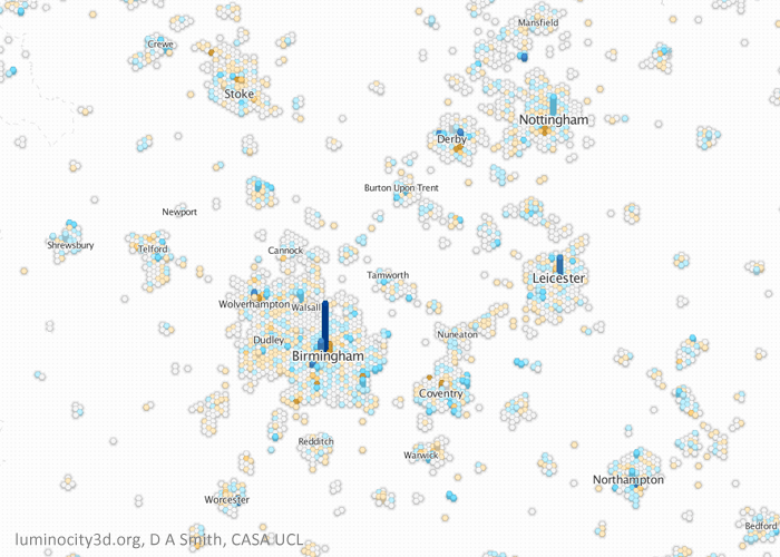
Similar to the North West and Yorkshire, city centre housing markets are relatively inexpensive in the Midlands, with wealthier areas in the suburbs, particularly between Birmingham, Coventry and Warwick/Leamington Spa. There are signs that wealthier groups to the south of Birmingham are moving further into the city centre.
House prices 2013 in the Midlands region.
Will Growth Transfer from the South East to the North? With the South East struggling to accommodate growth and northern regions trying to attract more growth, the answer seems obvious- transfer growth to the north. Unfortunately urban economics is seldom that straightforward. London is a global leader in a range of service sectors, and it does not automatically follow that existing firms and new firms would choose northern cities over the South East. There are however many encouraging signs in cities such as Manchester, Leeds and Birmingham with growth in a range of knowledge-economy sectors. The gap with the South East still remains extensive, and this essentially is the crux of the debates about city devolution and infrastructure investment: whether or not these policies can enable northern cities to bridge this gap. London currently has great advantages in terms of public money invested in infrastructure like public transport, and also in terms of political power to plan and manage growth through the Mayor and Greater London Authority. The argument in favour of empowering northern cities looks increasingly convincing, and we shall see in the coming months whether politicians are brave enough to instigate this process.
Recent urban growth in the UK has further emphasised the role of cities in influencing economic prosperity, quality of life and sustainability. If we are to meet 21st century social and economic challenges then we need to plan and run our cities better. Data analysis can play a useful role in this task by helping understand current patterns and trends, and identifying successful cities for sharing best practice.
LuminoCity3D.org is a mapping platform designed to explore the performance and dynamics of cities in Great Britain. The site brings together a wide range of key city indicators, including population, growth, housing, travel behaviour, employment, business location and energy use. These indicators are mapped using a new 3D grid-based approach that allows consistent comparisons between urban areas to be made, and relationships between urban form and city performance to be identified (technical details are provided here). Press coverage of LuminoCity3D has included Londonist, Wired.co.uk, Independent Online and Guardian Cities.
Taking for example employment density change in northern English cities as shown below. Current growth is mainly in ‘knowledge-economy’ services that generally favour being clustered together in city centres, generally reinforcing a select few larger centres rather than many smaller centres. There is clear growth in Manchester, Leeds and Liverpool city centres, particularly Manchester which displays the biggest increase in employment density of any location in GB. But around these success stories there is a much more mixed picture of growth and decline for many other centres that are finding it more difficult to compete for firms and jobs.
Employment density change in the north of England (blue is an increase and orange decline). Manchester and Leeds city centres have established themselves as the largest centres, with the biggest increase in Manchester.
Interactive City Statistics
City statistics are available to make more precise comparisons between urban areas. Statistics can be viewed on LuminoCity3D.org by moving your mouse pointer over a city of interest, or by hovering/clicking on the GB Overview Chart at the bottom left of the screen. The graphs and statistics change depending on the map indicator selected, so that the LuminoCity maps and statistics are interactively integrated.
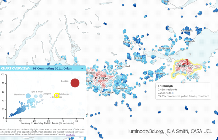
The example below shows public transport travel, a key sustainability indicator that also has important economic and equity implications. Greater London is by far the public transport centre of the UK with nearly 50% of commuting by public transport. Without the investment and historic advantages of London, city-regions like Manchester and Birmingham do not even manage 20% PT commuting. But we can see that it is not essential to be as gigantic as London to achieve more sustainable travel. Edinburgh, with a compact form and extensive publicly owned bus network, achieves 36% PT commuting.
Public transport commuting in central Scotland. Hovering over urban areas highlights indicator statistics and highlights the city’s position on the GB Chart.
All the datasets used are government open data. Websites such as LuminoCity would not be possible without recent open data initiatives and the release of considerable government data into the public domain. Links to the specific datasets used in each map are provided to the bottom right of the page under “Source Data”.
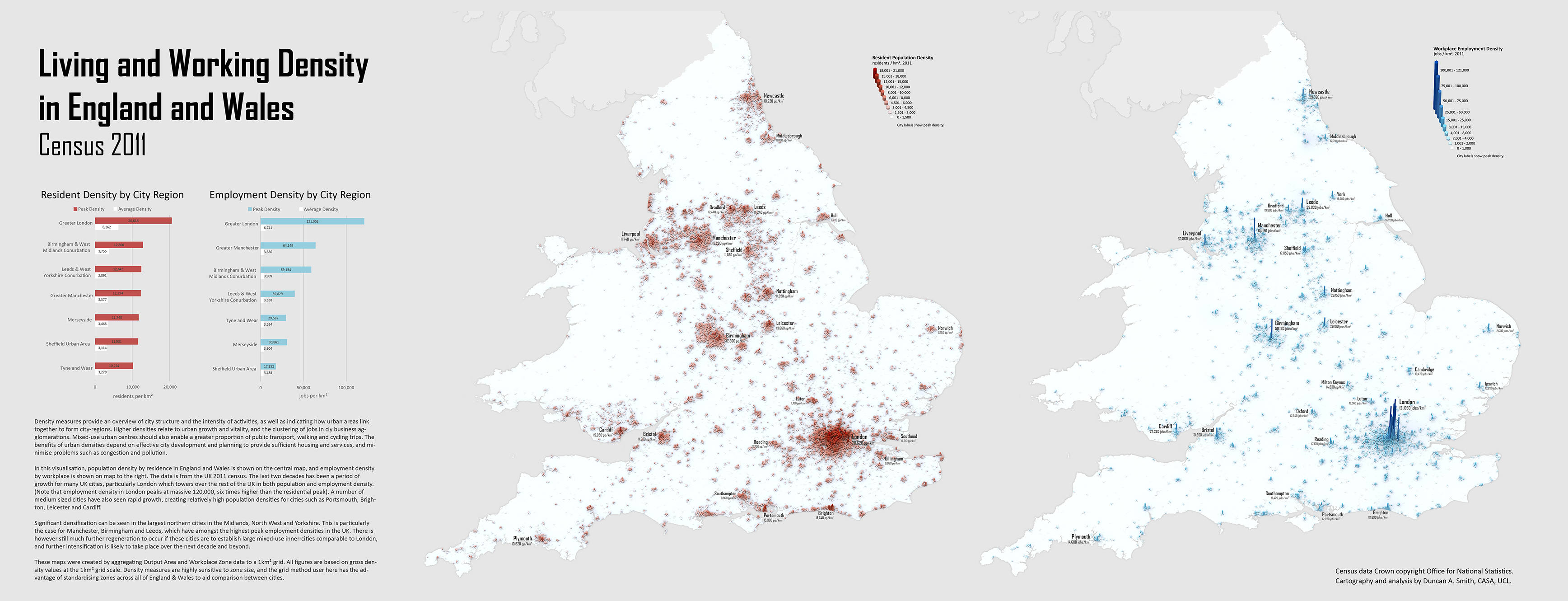
UK cities have been undergoing significant change over the last decade, and the 2011 census data provides a great basis for tracking current urban structure. I’ve mapped population and employment density for all of England and Wales in 2011, using a 1km2 grid scale approach-
The main themes that emerge are the dramatic intensification of London, high densities in some medium sized cities such as Leicester and Brighton, and the regeneration of the major northern conurbations, with Manchester and Birmingham as the largest employment hubs outside of London.
Mapping all of England and Wales together is a useful basis for considering city-regions and their connections (note Scotland has not yet published census 2011 employment data and is not mapped). Certainly this is a major theme in current policy debates grappling with the north-south divide and proposed high-speed rail links. I’ll be looking at densities in relation to network connections in future posts as this topic is part of ongoing research at CASA as part of the MECHANICITY project.
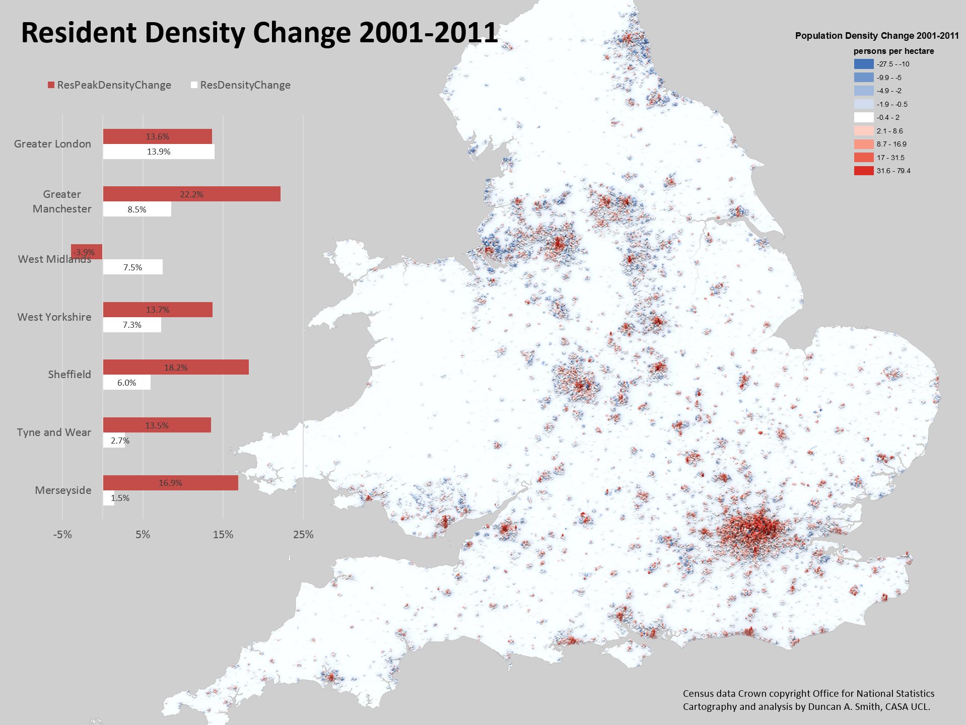
It is also possible to directly map changes in density between using the same visualisation approach (note the grid height describes density in 2011, while colour describes change in density between 2001-2011)-
The change map really highlights the pattern of city centre intensification combined with static or marginally declining suburbs in England and Wales. This trend was discussed in a previous post. The two statistics of peak and average densities reinforce the city centre versus suburbs divide, with peak density measurements growing much more than average densities. But the peak density statistic is somewhat unreliable (such as in the case of Birmingham/West Midlands) and we will be doing further work at CASA to define inner cities and produce more robust statistics of these trends.
Notes on the Analysis Method-
The density values were calculated from the smallest available units- Output Area population and Workplace Zone employment data from the 2011 census. This data was transformed to a 1km2 grid geography using a proportional spatial join approach, with the intention of standardising zone size to aid comparability of density measurements between cities. The transformation inevitably results in some MAUP errors. These are however minimised by the very fine scale resolution of the original data, which is much smaller than the grid geography in urban areas.
The workplace zone data is a very positive new addition by the Office for National Statistics for the 2011 census. There is a lot of new interesting information on workplace geography- have a look at my colleague Robin Edward’s blog, where he has been mapping this new data.
Defining city regions is another boundary issue for these statistics. I’ve used a simple approach of amalgamating local authorities, as shown below-