Many global cities are investing in cycle infrastructure to help create more sustainable and healthy communities. Currently cycling levels and infrastructure quality are highly varied across European cities, and planners and researchers need methods to track progress towards achieving high-quality, safe cycle networks. This blog post describes research on ENHANCE, a Driving Urban Transitions project, quantifying cycle network quality using the examples of Amsterdam, a leading cycling city, and London, a city seeking to improve its cycling infrastructure.
Classifying Cycle Infrastructure Quality Two frameworks are used here to classify cycle infrastructure quality. The first analyses the geography of cycle lanes, with protected lanes physically separated from traffic being the desired standard to enable all residents to use the cycle network, including more vulnerable cyclists such as children and elderly residents. The second approach is a modified version of Level of Traffic Stress framework which measures wider road conditions in addition to cycle lanes, such as speed limits, road type and road width (the full methodology is described here). The data used is OpenStreetMap which includes comprehensive data on cycle lanes and streets as well as being a global dataset, enabling international comparisons.
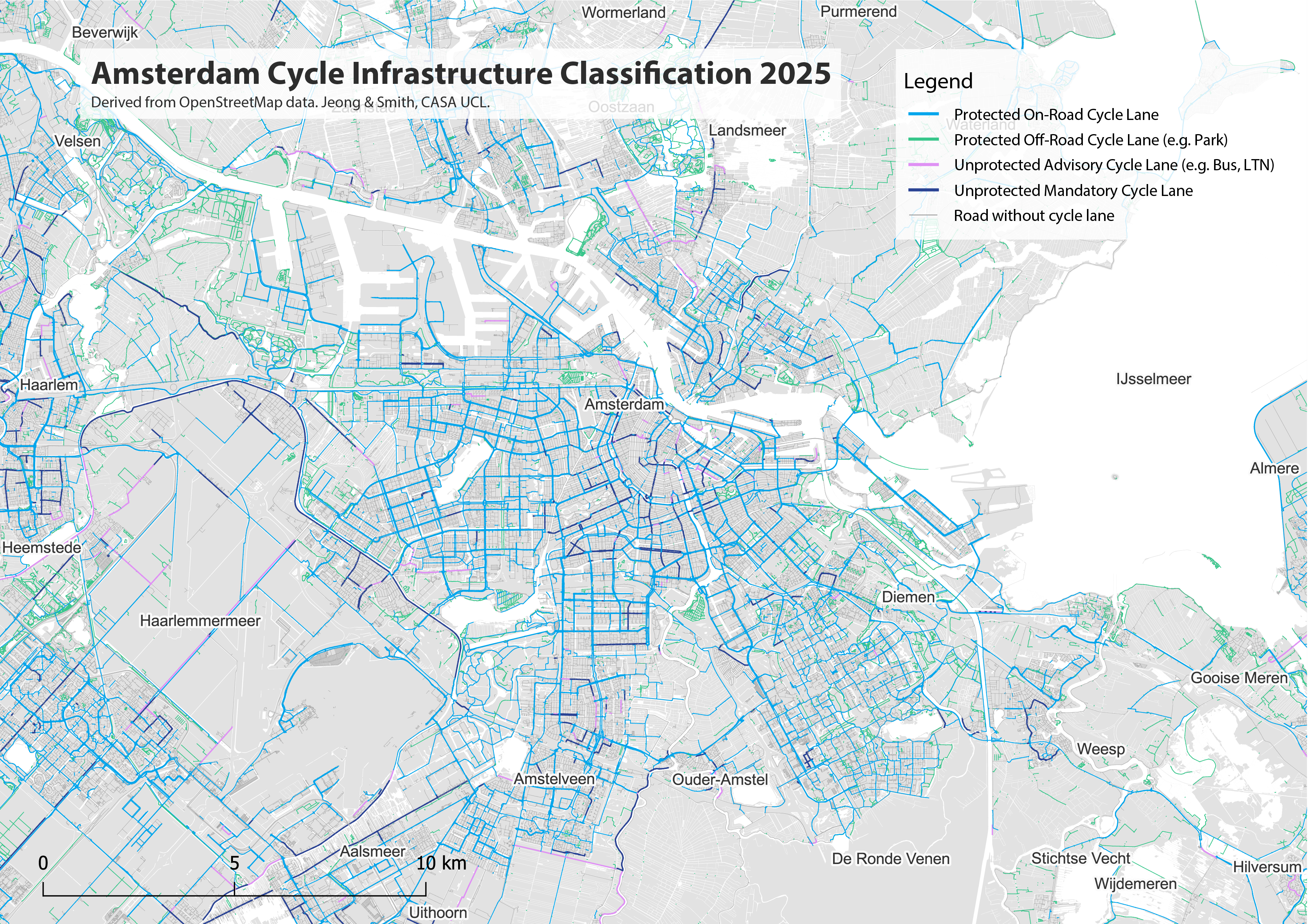
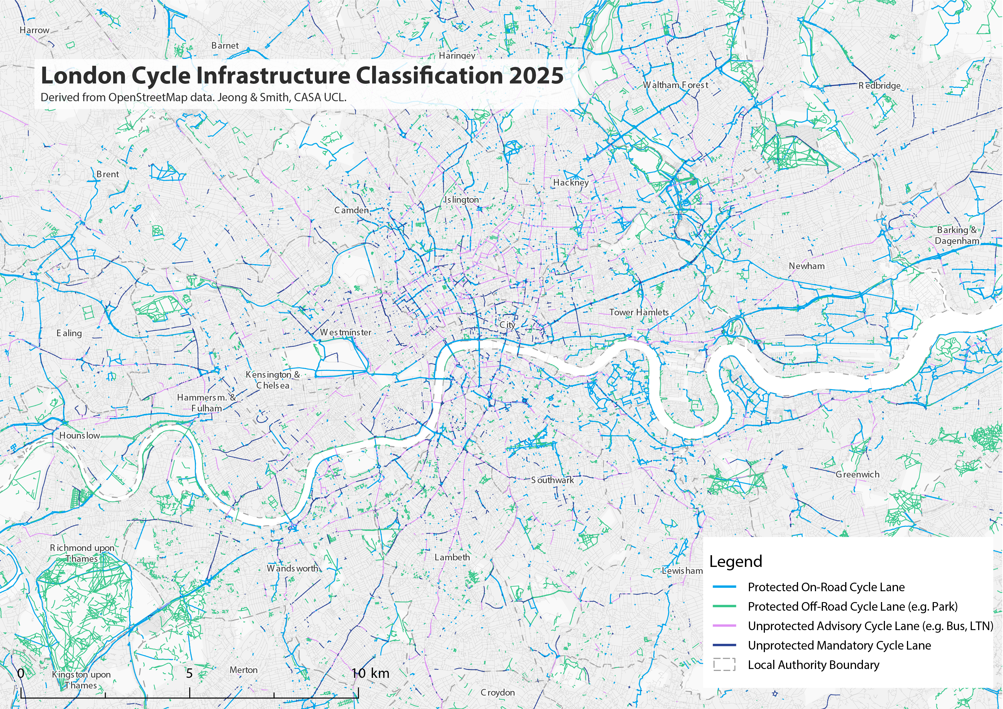
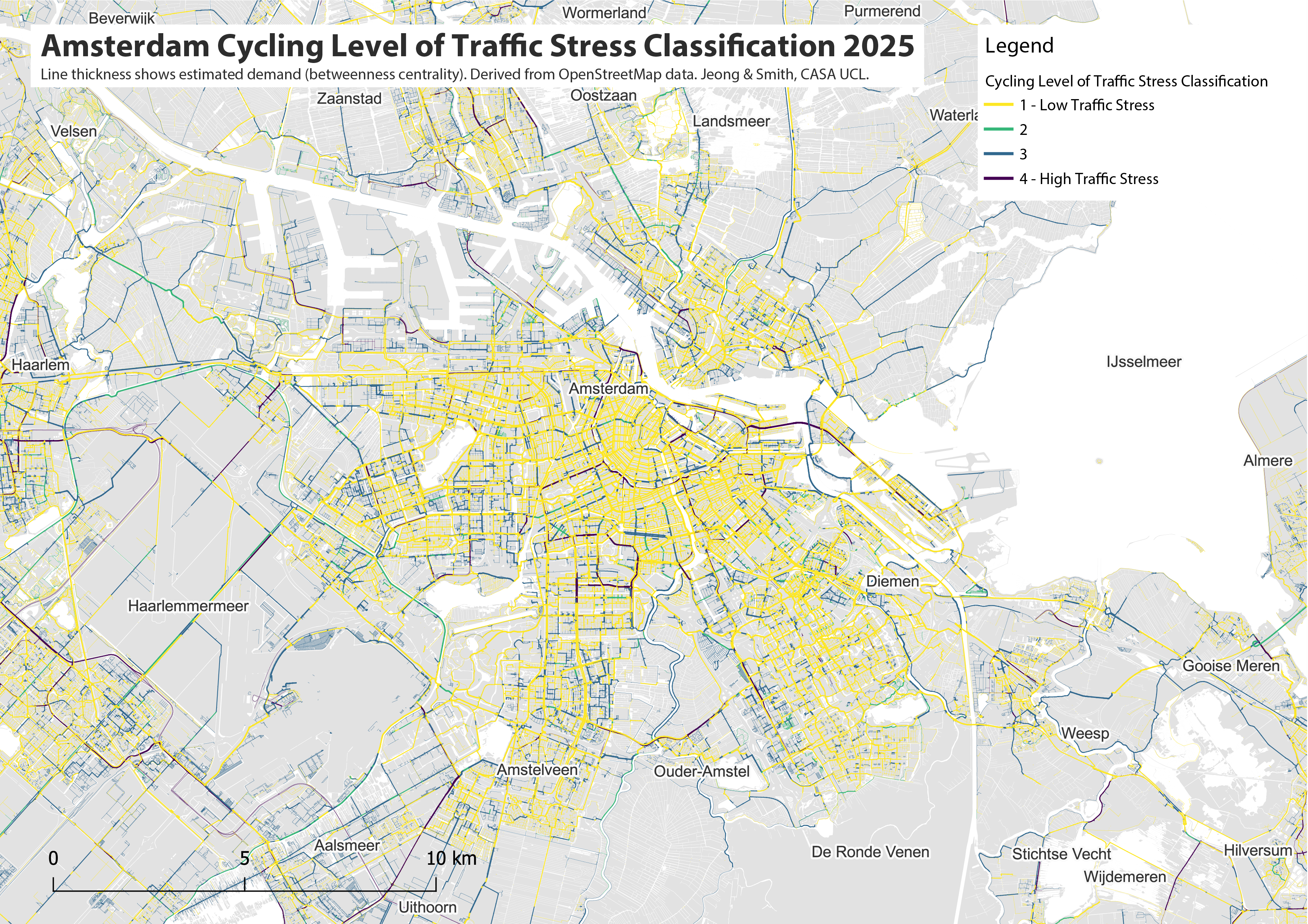
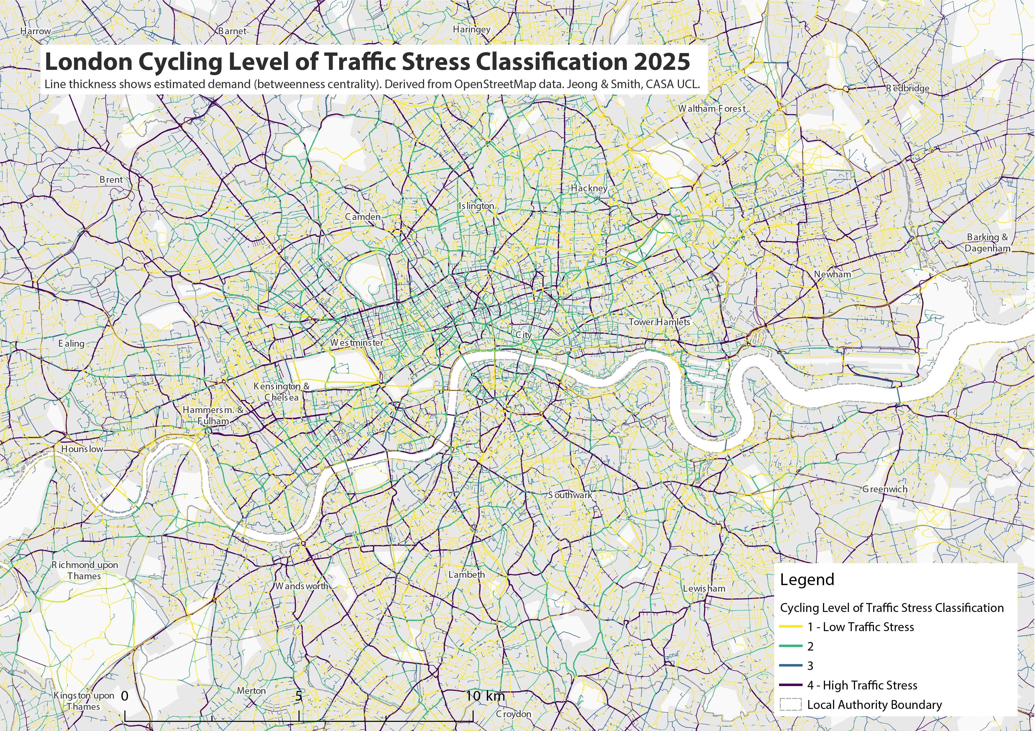
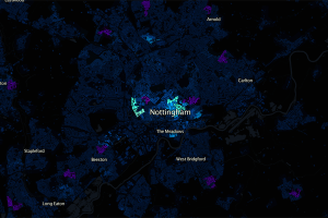
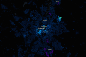
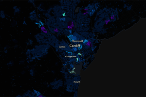
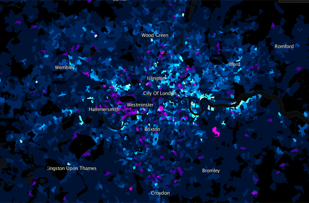
The maps below show the classification of cycle infrastructure for the Amsterdam region and for Greater London. The bright blue and bright green routes indicate high-quality protected cycle infrastructure separated from traffic. Amsterdam has a very comprehensive cycling network, covering all main roads, and linking urban settlements across the wider region. Green colours represent off-road cycle lanes in parks and rural areas. London’s network is in comparison patchy and incomplete, with large areas of the city lacking cycle infrastructure. The purple and dark blue lines indicate unprotected cycle infrastructure, such as Low Traffic Neighbourhoods where cyclists mix with low speed traffic (purple), or on-road cycle lanes without a physical barrier with road traffic (dark blue). These unprotected cycle lanes are rare in Amsterdam and relatively common in London. Roads without any cycle lane infrastructure are shown in grey (note this can also reflect data missing in the OpenStreetMap database).
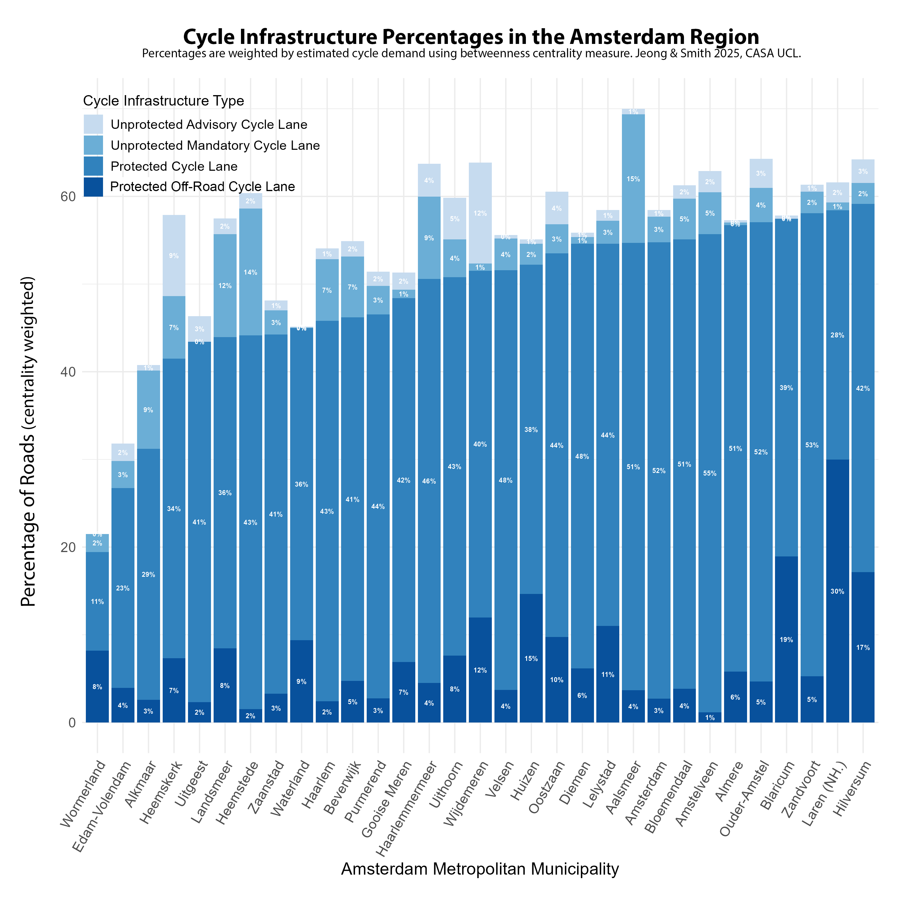
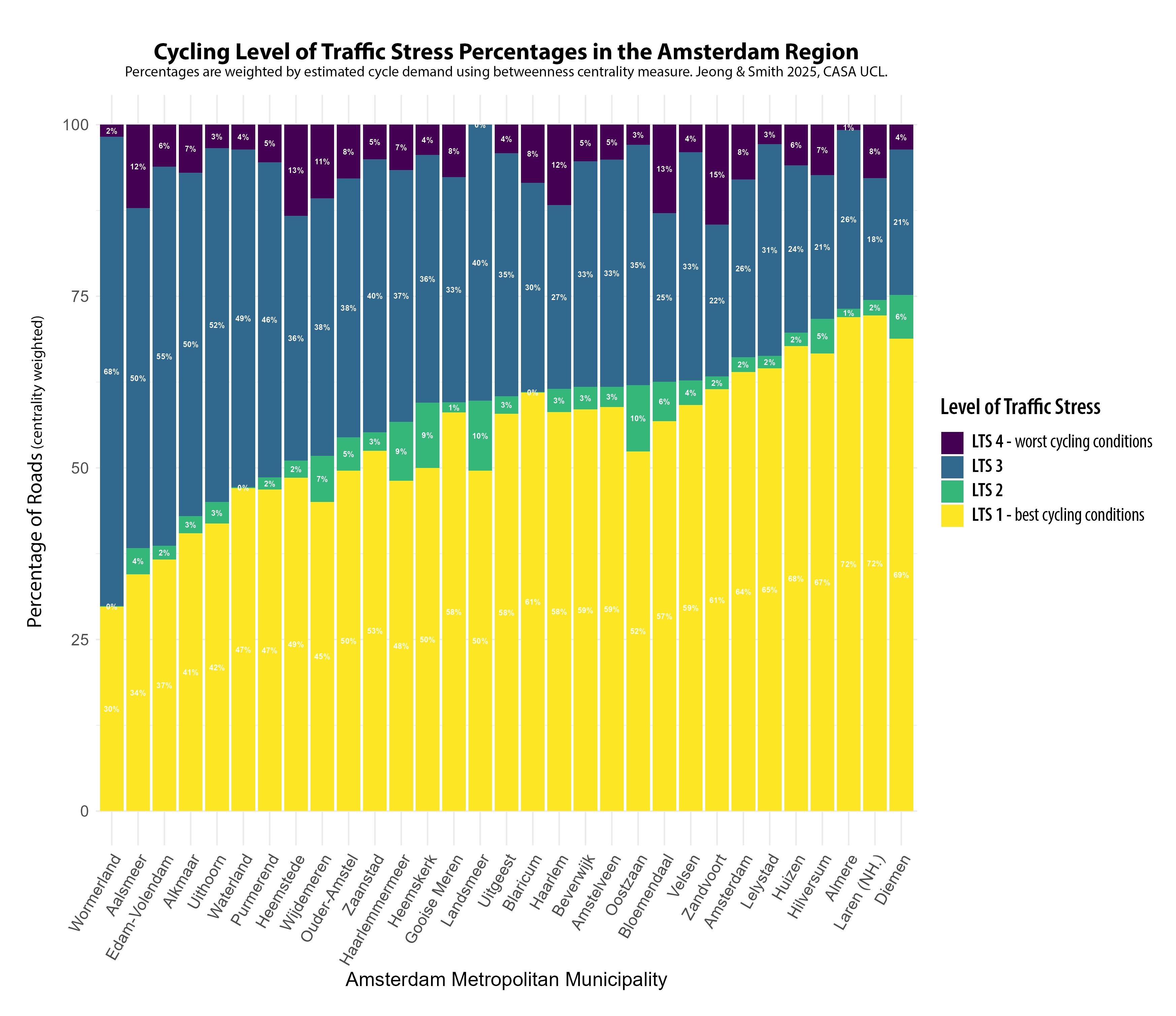
As well as mapping cycle infrastructure quality, the classification measure can also be used for statistical summaries. The chart below shows the percentage of roads with different types of cycle infrastructure, summed for each local authority in the Amsterdam region. This measure takes into account cycle route demand, based on network analysis to the most common destinations. This means that popular major cycle routes are weighted highly compared to sparse rural routes (the results are then normalised for each authority). In the Amsterdam region, most authorities have over half of all roads with protected cycle lanes. For the City of Amsterdam, the figure is 55% and there are eight authorities that score even more highly than Amsterdam with this measure, led by Hilversum and Laren. The comprehensive protected network is consistent across the metropolitan region, with only Wormerland, Edam-Volendam and Alkmaar falling below 40%. These authorities are all in the more rural Noord-Holland peninsula.
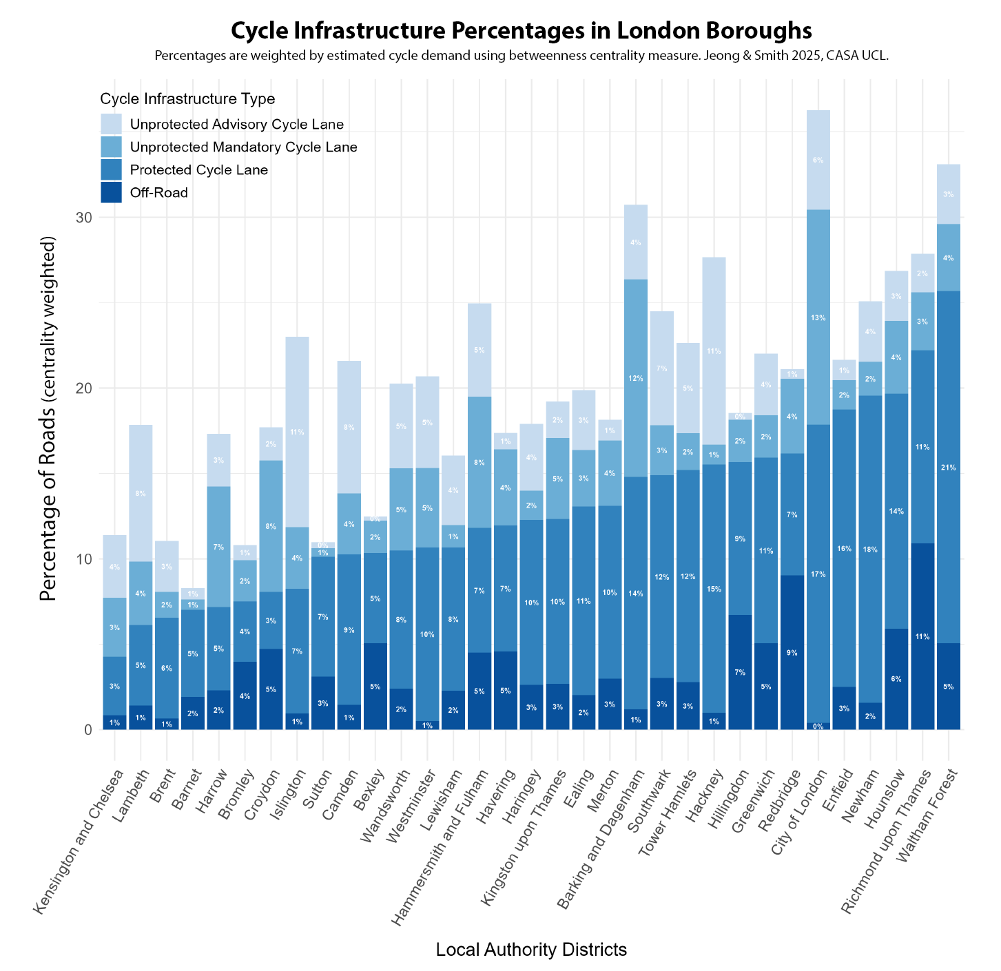
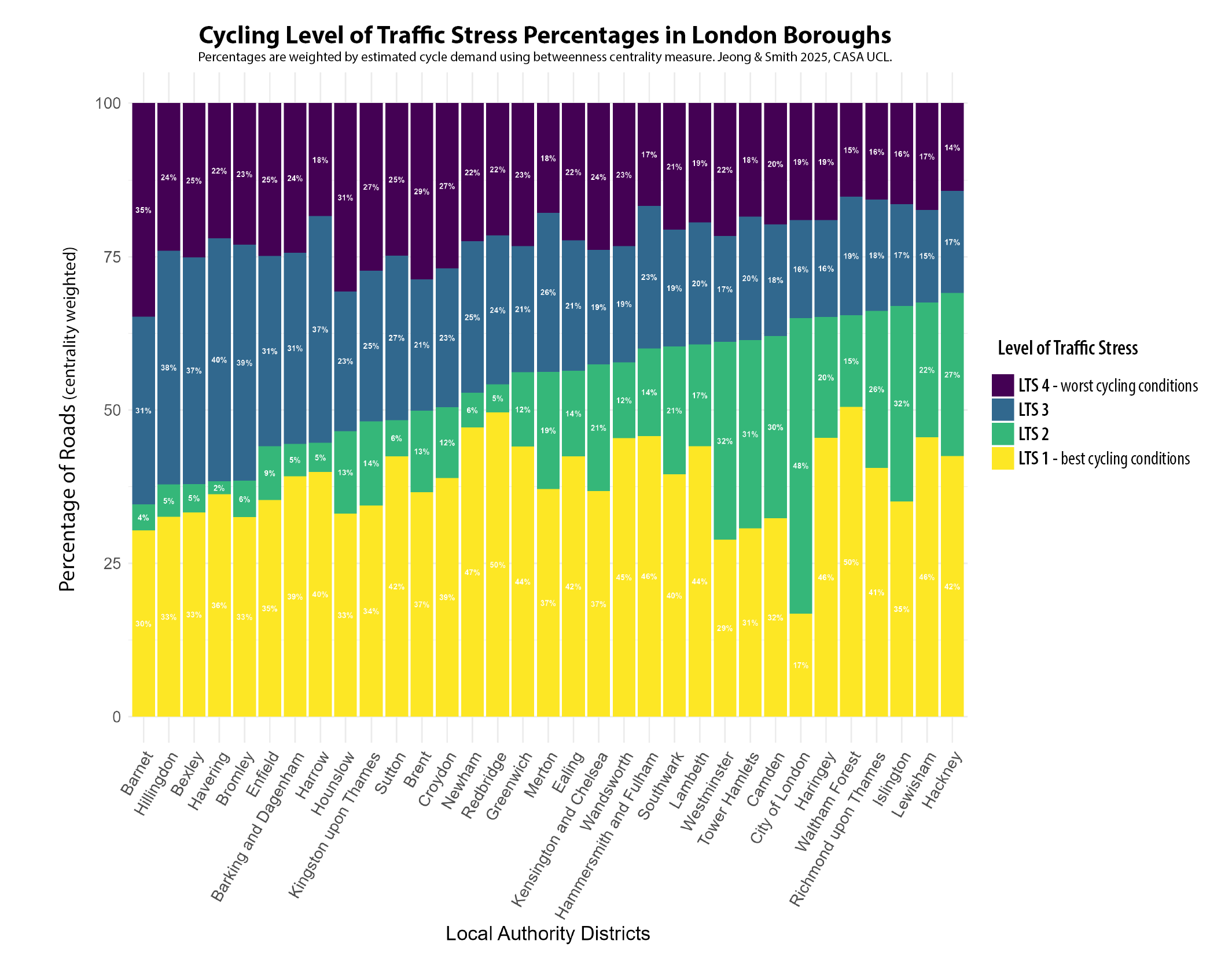
In London, the equivalent percentage of protected cycle lanes is around a third of the levels in Amsterdam, generally falling between 10-20% for most London boroughs. There is a wider variation between authorities, and a much higher percentage of lower quality unprotected cycle lanes as well. This outcome is the result of both a general lack of investment in cycling over decades, and the lack of a city-wide cycling strategy (London’s earliest was in 2013), leading to boroughs pursuing independent policies. There is evidently a huge gap with Amsterdam. Only two London boroughs, Waltham Forest and Richmond, can come close to the worse performing authorities in the Amsterdam region.
Level of Traffic Stress The experience of cycling can also be affected by other factors in addition to cycle lanes, such as traffic speed, road type and number of carriageways. This is the approach taken in the Level of Traffic Stress (LTS) framework, which has been adapted here to reflect conditions in European cities (see the methodology paper for more details). LTS produces a classification from 1-4, with LTS 1 being low stress conditions suitable for all cyclists, and LTS 4 being stressful conditions mixing with higher speed traffic, suitable only for experienced cyclists. In the maps below, we can see again the massive contrast between Amsterdam and London, with Amsterdam dominated by the yellow colour of the least stressful cycling conditions. There are more mixed conditions in some settlements in the wider Amsterdam region. Note also we are not considering cycle lane capacity in this measure, and the very high volume of cyclists in central Amsterdam (and more recently in parts of central London) can itself increase journey stress. In London, the inner city falls mainly into LTS 2 (due to widely implemented 30km/h speed limits) but major roads outside of Inner London are overwhelmingly in the most stressful LTS 4 classification, increasing levels of danger for cyclists and discouraging less experienced cyclists to switch modes.
The Level of Traffic Stress framework can also be used to create a statistical summary for authorities. LTS 1 is the dominant classification in the Amsterdam region, comprising more than half of the centrality weighted roads for most authorities, and 64% of roads in the City of Amsterdam. Comprehensive cycle lanes ensure that the most stressful traffic classification of LTS 4 is minimised across the metropolitan region, averaging around 7%. There is however a moderately high percentage of LTS 3, which likely reflects protected cycle lanes being next to higher-speed main roads and that 30 km/h speed limits could be further extended.
London has widely implemented 30km/h speed limits, which despite the lack of protected cycle lanes, increases the volume of roads falling into the LTS 2 category, particularly in Inner London boroughs. But a major problem, and contrast with the Amsterdam results, is just how prevalent LTS 4 roads are throughout London, averaging around 20% of all roads. These represent roads where cyclists are forced to mix with higher speed traffic, and are currently a major obstacle to providing safe and inclusive cycling conditions for many London residents.
Conclusions This post has shown how the analysis of cycle network data can be used to create indicators of cycle network quality, tracking progress towards sustainable and inclusive cities, and producing comparative city indicators. In this case the gap between the leading city of Amsterdam and London is huge in terms of the comprehensiveness and quality of cycle networks, and the experience of cycling in terms of Level of Traffic Stress. The only limitations in the Amsterdam metropolitan region were found to be in some of the more rural authorities, particularly in Noord-Holland, and potentially the need to expand 30 km/h speed limits. For London, major expansion in protected cycle lanes is needed in many parts of the city to try and achieve a more comprehensive and inclusive network, as currently there are major limitations in London’s cycle infrastructure network.
The ENHANCE Project and Next Steps You can read the full working paper of this research here, by Philyoung Jeong and Duncan Smith at CASA UCL. For future work we intend to expand this measure to other European cities, as it is based on open international data. Future improvements could also include considering cycle lane capacity and further improvements to the network analysis of cycle route demand. This research is part of the ENHANCE Project, a Driving Urban Transitions project funded by the European Union and ESRC.
Although Greater London has an extensive transit network, this is not the case for many UK cities where underinvestment and privatisation has seen bus, metro and rail networks stagnate in recent decades, falling well behind European peers. Improving public transport is an important aspect of addressing the UK’s regional inequalities and poor productivity, and is a prominent issue for the 2024 general election.
Accessibility measures are an ideal tool to gauge the comprehensiveness and efficiency of public transport networks – they describe the ease with which populations can reach key services by different travel modes. The leading UK urban thinktank, the Centre for Cities (see their new Cities Outlook report 2024), has been doing some accessibility analysis of English cities compared to continental European cities, and this was recently republished in the Financial Times in an article on productivity challenges-
It’s great to see accessibility analysis feature in the media. The measure used above however has some serious problems leading to nonsensical results (e.g. does Manchester really have half the accessibility of Liverpool and Newcastle?). The Centre for Cities measure uses a single time threshold (30 minutes) when we know that accessibility varies considerably at different time thresholds. It is based on a single destination point, when cities can have multiple employment centres. And it describes accessibility as a percentage of all city jobs, which means that the smaller the urban settlement is, the higher the accessibility result will be using this measure. In reality, larger city-regions have better jobs accessibility.
Creating Robust Public Transport Accessibility Measures – R5R and PTAI-2022 We can create much better and more reliable accessibility measures for UK cities. There have been significant recent advances. The open source R5R software has solved many of the computational challenges for accurately calculating public transport accessibility, allowing the calculation of full travel matrices for all possible trips and handling accessibility variation over time. In the UK, Rafael Verduzco and David McArthur at the Urban Big Data Centre have taken this one step further and pre-calculated accessibility indicators for all of Great Britain at a range of time thresholds in their Public Transport Accessibility Indicators dataset. This dataset is calculated using R5R, and is based on the median travel time across a three hour travel time window, 7am to 10am on a typical weekday (Tuesday 22nd November 2021), and uses the latest public transport service datasets such as the Bus Open Data Service. The results are at LSOA scale for GB only (no Northern Ireland), based on census 2011 zones (so I have used 2020 population data in the below analysis).
Origin and Destination Accessibility Measures This article focuses on jobs accessibility, and this can be analysed from either the perspective of trip origins (residential-based accessibility to jobs) or from the perspective of trip destinations (workplace-based accessibility by residents). Both perspectives are complementary, and are developed below. For residential measures, if we take the average accessibility for all residents in a city then we get a good overview of how extensive and efficient the public transport network is. This requires city boundaries to define all the residents in each city. The analysis below uses the Primary Urban Area geography.
Public Transport Jobs Accessibility Trip Origin Results The table and chart below show average accessibility to jobs for residents in all major GB cities by three travel time thresholds- 30 minutes, 45 minutes and 60 minutes. London’s accessibility results are inevitably much higher than any other GB city, being around 3 to 4 times higher at all three travel times, and emphasising just how big the gap is between the capital and all other GB cities. The 30 minute threshold describes shorter trips, and identifies higher density compact cities where residents are on average closer to employment centres. Small compact cities such as Cambridge and Oxford score well at 30mins (though note this is not the case at 45 or 60mins). Edinburgh and Glasgow have the highest residential average accessibility outside of London at both 30 and 45 minutes. This is due to Scottish cities historically following a higher density European urban model, and maintaining better public transport networks by avoiding some of the worst effects of privatisation.
The 60 minute accessibility measure picks up longer distance commuting on regional rail and metro networks. This is where the strengths of larger city regions such as Greater Manchester and the West Midlands are highlighted, with Manchester second and Birmingham forth in the ranking (Glasgow is third and also has a large regional rail network). Given their large populations, Manchester and Birmingham should however be scoring higher in absolute terms and closing the gap on London. Both have poor accessibility for the shorter 30 minute accessibility measure, reflecting the need for further inner-city densification (as the Centre for Cities have argued). For longer commutes, Manchester and Birmingham metro networks should also continue to be extended regionally. Leeds scores relatively well at 30 minutes due to its medium-density urban core, but it lacks a metro and is behind Birmingham, Glasgow and Manchester for the longer commuting times.
Peak Public Transport Accessibility by Trip Destination We can also analyse accessibility by trip destination, which produces similar results to the trip origin residential measure but is more from the perspective of employment centres. The table below shows the peak accessibility by workplace within each Primary Urban Area, which is a measure of labour market size and agglomeration potential for the UK’s largest city centres. London retains its huge advantage with this measure, at 3 to 4 times higher than the next best cities. City-regions with larger rail and metro networks score better with the peak destination measure, with Birmingham and Manchester ranked second and third respectively, exceeding 2 million people at 60 minutes. Cities with strong rail connections to London, such as Reading and Crawley, also score highly at 60 minutes, but have much lower accessibility at 45 and 30 minutes. Smaller compact cities such as Edinburgh and Cambridge rank much lower by the destination measure compared to the residential analysis.
Both the trip origin residential average accessibility measure and the trip destination peak accessibility measure provide useful perspectives. The residential average measure is a good summary of the coverage and extent of public transport across a city, and how likely residents are to use public transport modes. The trip destination peak accessibility measures employment centre labour market size, and summarises the total number of people that can reach city centres by rail and metro. This is a better measure of agglomeration potential and is more closely correlated with city-region size.
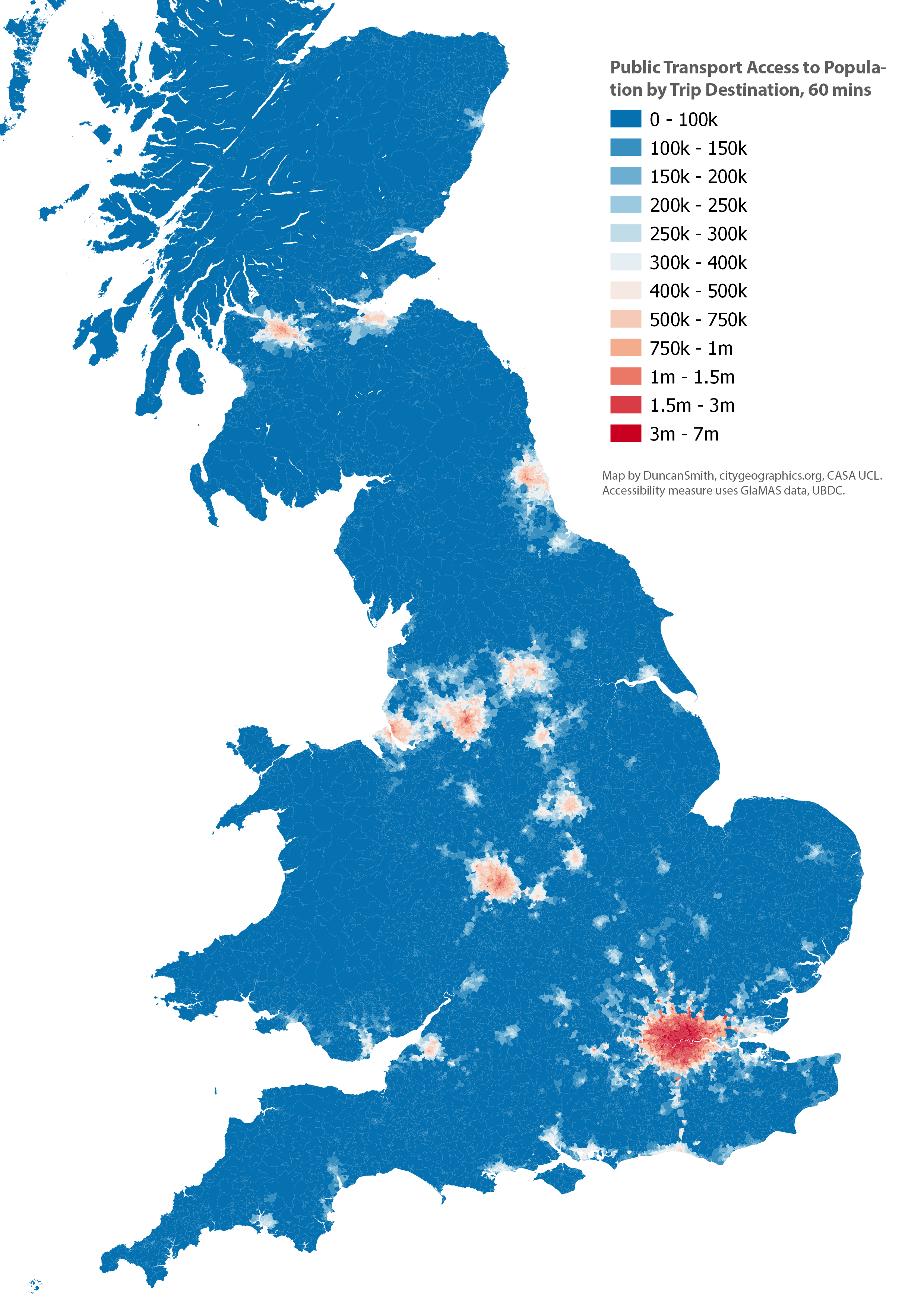
Mapping the Accessibility Results We can also map the results to view the geography of accessibility to jobs. Firstly the trip origin accessibility to jobs measure. This emphasises how large the area of high accessibility is across Greater London, with parts of Outer London and the South East having higher accessibility to jobs than residents in the city centres of the next largest cities, Manchester and Birmingham. The Primary Urban Area geography is also shown, which is the basis of the residential average accessibility chart and table shown above.
Next we map the trip destination accessibility to population measure. This has a very similar geography, but with more of an emphasis on city centres, as we are measuring average accessibility on a weekday 7am-10am when there will be more commuting services going to, rather than from, central areas. Again London has a huge advantage, peaking at 7 million people. We can also see the centres of Birmingham and Manchester reaching accessibility levels above 2 million people, while Glasgow, Leeds, Newcastle and Liverpool exceed 1 million.
Conclusion- Open Data and Software is Available to Create High Quality Accessibility Measures With software such as R5R (see this workshop for an intro) and the exemplary and easy to use PTAI-2022 dataset from the UBDC, it is easier than ever to produce accurate public transport accessibility measures. The comparative accessibility analysis of GB cities shown here has highlighted the huge accessibility gap between London and all other UK cities. It has also shown the generally better accessibility performance of Glasgow and Edinburgh, and the high regional accessibility of Birmingham and Manchester which contrasts with their weaker accessibility in these regions for shorter travel times, which supports inner-city densification. There is no single perfect accessibility measure that answers all questions we are interested in – this analysis has confirmed that variation at different travel times reveals contrasting patterns in local and regional accessibility; that average and peak accessibility in cities emphasise different aspects of transit networks; and that trip origin and trip destination measures provide complementary perspectives. We therefore need to test a range of measures to understand accessibility patterns.
Future Improvements This has been a relatively quick demonstration of the PTAI-2022 data and there are several areas for further improvements-
Including European cities for comparison would be very interesting, as the Centre for Cities explored in their original analysis. A recent major paper in Nature has shown how accurate international accessibility comparisons can be done- https://www.nature.com/articles/s42949-021-00020-2.
The PTAI-2022 dataset is a really good tool that makes GB accessibility analysis much more straightforward for researchers. Currently it uses the 2011 census boundaries, and the next update should use the 2021 boundaries allowing the latest census data to be used. Additionally, the current PTAI-2022 release uses 2021 public transport data, and updating this with the latest rail and bus data would also be a useful update. A related issue is that reliability on UK public transport networks can be poor, and that timetables can overestimate transit accessibility. This topic has been analysed by Tom Forth in this blog post.
This analysis has used the Primary Urban Area geography, which is a useful description of GB city-regions, but there are some issues with PUAs due to the underlying local authority geography. A few PUAs for medium-sized cities have quite large hinterlands (e.g. Sheffield) and this lowers the average accessibility measured in these PUAs due to lower accessibility outside of the urban core. A more thorough analysis of accessibility would need to test multiple urban geographies and gauge the extent of Modifiable Areal Unit Problem variation.
The housing crisis in London has become increasingly severe in the last decade with much higher prices, rents, and largely static incomes, while housing development volumes have remained consistently below targets. Green Belt reform is often cited as a solution to boost development, though this has been off the agenda during the last 13 years of Conservative government. Recent announcements by the Labour leadership, supporting Green Belt reform and setting ambitious targets for housing development, could change this state of affairs with the general election coming in 2024.
This article analyses housing development in the London region from 2011-2022 (full CASA Working Paper here), using the Energy Performance Certificate Data. There is strong evidence that the Green Belt is a major barrier to development and is in need of reform. On the other hand, there are very substantial challenges around the quality and sustainability of new build housing in the South East. The analysis shows that, outside of Greater London, new build housing typically has poor travel sustainability and energy efficiency outcomes. Any release of Green Belt land needs to be dependent on travel sustainability criteria and improved energy efficiency for new housing. Sustainable housing outcomes are much more likely to be achieved through prioritising development in existing towns and cities and in Outer London.
London’s Housing Affordability Crisis House prices in London doubled between 2009 and 2016, pricing out households on moderate and low incomes from home ownership, and translating into rent increases, longer social housing waiting lists, increased overcrowding and homelessness (see Edwards, 2016; LHDG, 2021). Price rises are linked to on the one hand to the financialization of housing (exacerbated by record low interest rates and Help to Buy loans in the 2010s) and on the other a long period of low housing supply, stretching back to the 1980s and the erosion of public housing.
The impact is record levels of unaffordability, with Inner London average house prices reaching £580k and Outer London £420k in 2016 (see chart below). The median house price to income ratio for Inner London soared from 9.9 in 2008 to 15.1 in 2016; for Outer London the ratio increased from 8.2 in 2008 to 11.8. In addition to high prices, first-time buyers have also been hit with record mortgage deposit requirements, with average deposits reaching £148,000 for Greater London, compared to around £10,000 in the late 1990s (Greater London Authority, 2022). Owner occupation is now effectively impossible in Inner, and much of Outer, London for low and moderate income buyers.
There have also been substantial increases in prices across the London region. The map below shows prices per square metre in the South East showing four radial corridors of high prices extending beyond Greater London into the Green Belt. East London is increasingly mirroring West London with two radial corridors of higher prices extending north-east and south-east from Inner East London. These are the primary areas of gentrification in London in the last decade (discussed in previous blog post), squeezing out what was the largest area of affordable market housing. There is also a distinct spatial alignment between London’s Green Belt boundary and higher prices, which is evidence of regional housing market integration, and that Green Belt restrictions are pushing up prices.
New Build Housing Delivery in the London Region Greater London has struggled to meet its housing targets in the last decade. The current London Plan target is for 52k annual completions, which, as can be seen in the graph below, London is significantly short of. The 52k annual target has been criticised as being too low, with other estimates of housing need calculating that 66k or even 90k houses per year are needed (LHDG, 2021). Given the extremely high prices, affordable housing tenures are needed more than ever, yet affordable housing delivery has fallen in the 2010s (although note there has been progress in affordable housing starts in the last two years). Finally, the recent impacts of the pandemic and high interest rates have hit market housing activity, meaning that London will very likely continue to miss its overall housing targets for the next 2-3 years.
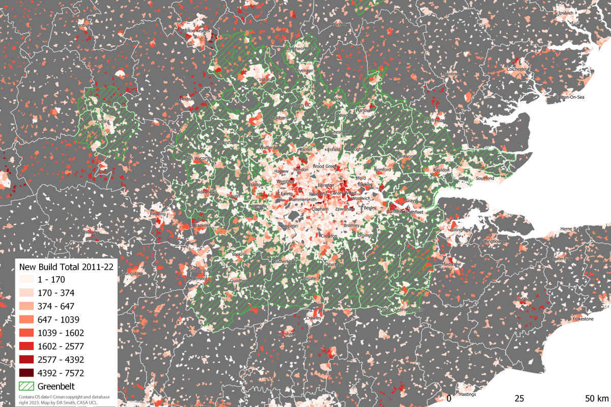
We can look in more detail at the geography of housing delivery at local authority level in the scatterplot below. There is high development in most of Inner London, and some Outer London boroughs. These boroughs contain Opportunity Areas (major development sites in the London Plan): Canary Wharf in Tower Hamlets; the Olympic Park in Newham; Battersea Power Station in Wandsworth; Hendon-Colindale in Barnet; Wembley in Brent; Old Oak Common-Park Royal in Ealing; and Croydon town centre. Given that there are only a few Opportunity Areas in Outer London, this leads to relatively low delivery in most Outer London boroughs, and points to the need for a wider strategy for Outer London development.
Meanwhile, there is low development activity in nearly all Green Belt local authorities, much lower than London boroughs and also below the average for the rest of the South East. Green Belt restrictions affect both local authorities in the commuter belt and also Outer London boroughs as well (e.g. Enfield, Bromley) with 27% of Outer London consisting of Green Belt land. We can confirm how rigidly Green Belt restrictions are being applied using the official statistics, which calculate that the London region Green Belt land area was 5,160km2 in 2011 and 5,085km2 in 2022 (DLUHC, 2023). Therefore, only 74km2 or 1.4% of Green Belt land was released over the decade (this figure is for all development uses, not only housing), which is strong evidence of minimal change.
One final impact of the Green Belt can be seen by mapping development in the last decade as shown below. In addition to the patterns of high development in Opportunity Area sites, and generally low development in the Green Belt, there is a ring of high development activity just beyond the Green Belt boundary. This ring includes dispersed car-dependent development in semi-rural areas, and the expansion of medium-sized towns and cities such as Milton Keynes and Reading. This pattern looks very much like Green Belt restrictions are pushing development beyond the Green Belt boundary, creating sprawl-type patterns in several authorities. One important caveat is that several South East cities have strong economies in their own right, particularly technology industries in the Oxford-Milton Keynes-Cambridge arc, creating local development demands in addition to London-linked demand.
Potential for Green Belt Reform With Greater London consistently falling short of housing targets, reform of the Green Belt has been cited as a promising solution (see for example Mace, 2017; Cheshire and Buyuklieva, 2019). The release of Green Belt land could greatly boost development and ease prices. Green Belt reform could also be a substantial source of revenue for austerity-hit local authorities, if authorities are given the powers to purchase Green Belt land at current use value and benefit from the land value uplift (this is part of the Labour proposals).
Traditional objections to Green Belt development focus on rural land preservation. Yet the Green Belt is massive in scale – 12.5% of all the land in England is Green Belt. London’s Green Belt is 5,085km2, or three times bigger than Greater London. Medium density housing development would take up a small proportion of this land. For example, building 100k dwellings at a gross density of 40 dwellings per hectare would add up to 25km2, or less than 0.5% of the London region’s Green Belt. Appropriate Green Belt reform could simultaneously allow for a moderate increase in development and improve environmental aspects of the Green Belt – the current environmental record of the Green Belt is mediocre on key measures such as biodiversity – through green infrastructure funding and principles of Net Biodiversity Gain. The land preservation arguments against Green Belt development do appear to be solvable. There are however further sustainability impacts from housing development to consider, including transportation and housing energy impacts, as discussed below.
Sustainability Impacts- Travel Transport is the largest source of GHG emissions in the UK – 26% of all emissions in the latest 2021 data (DBEIS, 2023). The route to Net Zero requires both the electrification of transport systems and a significant mode shift from private cars to public transport, walking and cycling (HM Government, 2021). Greater London is a UK leader in sustainable travel, but this is not the case for the wider London region, much of which is car dependent. The analysis here uses car ownership and commuting mode choice data from the 2021 census to create a Travel Sustainability Index, as shown in the table below, which classifies Greater South East residents into 6 travel classes of around 4 million people. The South East covers a very wide range of travel behaviours, from an average of 20% commuting by car and 62% zero car households in the most sustainable class 1; to as high as 87% car commuting and 6% zero car households in the most car-dependent class 6.
Travel Sustainability Classes Average Statistics (2021 Census data)
Travel Sustainability Class
Travel Sustain. Index
Car Commute %
Public Transport Commute %
Walk & Cycle Commute %
Car Owning Households %
Residential Net Density (pp/km2)
Total Pop. in South East
1
45-82
20.3
48.5
26.4
38.3
51.5k
3.56m
2
30-45
41.6
33.2
20.9
61.5
32.1k
4.03m
3
21-30
60.6
18.1
17.6
74.7
25.0k
4.03m
4
15-21
71.6
10.9
14.2
83.3
20.2k
4.16m
5
10-15
80.0
6.5
10.9
89.4
16.4k
4.34m
6
1-10
87.3
3.6
6.7
94.1
11.1k
4.29m
Mapping the travel sustainability classes highlights the stark travel behaviour differences between Greater London and the wider region. The Inner London population-weighted average travel sustainability score is 51.6 (class 1), and Outer London is 32.1 (class 2). The Green Belt is overwhelmingly in car dependent classes 4 and 5, with an overall population-weighted average of 16.4 (class 4). The Rest of the South East has a population-weighted average score nearly identical to the Green Belt at 16.5, emphasising the disappointing levels of car dependence in the Green Belt despite its rail infrastructure and proximity to London.
The patterns shown in the above map clearly present a challenge for Green Belt development, as new housing in the wider region risks extending patterns of car dependence. Car dependent areas include some locations next to rail stations (proximity to rail stations has been advocated as a criteria for prioritising Green Belt land for housing). We can directly measure the travel sustainability of housing development from the last ten years by matching the output areas locations of new housing to the Travel Sustainability Index scores. This is shown in the scatterplot below, where Inner London boroughs score highly with this measure, followed by Outer London. Much of the housing development in the wider region scores poorly in terms of travel sustainability, including in areas with high housing development such as Bedfordshire and Milton Keynes.
Although travel sustainability is generally low in the wider region, there are trends identifiable in the above results that can be used as basis for guiding more sustainable development. Several towns and cities show moderately sustainable travel outcomes, including the Green Belt towns Luton, Watford, Guildford and Southend, and wider South East towns and cities Brighton, Reading, Oxford, Cambridge, Portsmouth, Norwich and Southampton. Generally, development in existing towns and cities is likely to be more sustainable than developing smaller settlements and more dispersed rural areas. There are also noticeably better results in active travel-oriented cities such as Brighton and Cambridge. Overall, if we want Green Belt housing development to minimise travel sustainability impacts, then it would be most realistic to achieve this by extending existing towns and cities, both within the Green Belt and in the wider South East. Promoting development in Outer London boroughs also looks to be an efficient strategy given generally good travel sustainability levels in Outer London, and that Outer London is 27% Green Belt land.
Sustainability Impacts- Energy Another important sustainability impact of new build is energy use and carbon emissions resulting from space and water heating, which we can estimate from the Energy Performance Certificate data as shown below. CO2 emissions per dwelling are considerably lower in Inner and Outer London, with overall London emissions per dwelling around two thirds of the value for the Green Belt and Rest of the South East. This is only partly due to smaller dwelling sizes, as CO2 emissions per square metre in London are significantly lower as well. The lower emissions in London housing can be explained by the much higher proportion of flats and also the use of community/district heating, with three quarters of all new build in Inner London and 47% of new build in Outer London connected to community heating networks. The community heating approach is only efficient for high density developments. For medium and lower density developments, air and ground source heat pump technologies are a key technology for improving energy efficiency and replacing gas boilers. The statistics from 2011-22 are very disappointing on this front, at 4% of new build with heat pumps in the Green Belt and 6% in the Wider South East.
New Build Annual Average CO2 Emissions and Energy Summary 2011-2022 (Data: EPC 2023)
Subregion
CO2 per Dwelling (tonnes)
CO2 per m2 (kg)
Energy Consumption (kWh/m2)
Community Heating %
Heat Pump % (air + ground)
Inner London
0.93
12.9
72.9
75.2
2.7
Outer London
1.04
15.3
87.2
46.9
2.8
Green Belt
1.60
18.7
106.9
7.9
3.5
Rest of South East
1.53
17.2
97.7
5.7
5.9
All Subregions
1.34
16.3
92.5
27.0
4.3
The average annual CO2 emissions by dwelling are summarised at the local authority level in Figure 19 (note y axis starts at 0.5). Similar to the travel sustainability results, London boroughs have considerably more sustainable results. Town centres in the South East again are the best performing outside of London, including Cambridge, Southampton, Eastleigh, Reading, Luton, Watford, Woking and Dartford. As the chart shows average CO2 per dwelling, there is a connection between affluence and dwelling size, with higher income boroughs such as Richmond Upon Thames and particularly Kensington and Chelsea, having high emissions. Overall however, energy efficiency is much better in London boroughs and this is a further challenge for the sustainability of Green Belt development. Similar to the travel sustainability analysis, the results point to the extension of existing towns and cities, and Outer London development, as the most sustainable development strategies.
Summary There is a widespread consensus that London needs to build more housing to meet demand and try to reduce record levels of unaffordability. Yet London has been consistently short of meeting housing targets for the last decade, despite substantial growth in Inner London. Green Belt restrictions do appear to have played a major role in constraining development, with low levels of new build in Green Belt local authorities, and in Outer London boroughs with extensive Green Belt land. There is also a significant price premium in Green Belt areas compared to the wider South East.
This analysis agrees with research advocating Green Belt reform. Travel sustainability conditions are needed to avoid this reform producing highly car dependent housing, such as has been occurring in Central Bedfordshire and Milton Keynes (where the East-West should have been built much earlier). Pedestrian access to rail stations is a sensible starting point for prioritising Green Belt land for housing, but it is not sufficient to produce sustainable travel outcomes in the Green Belt. The aim should be for new housing to have local access to a range of services (e.g. retail, schools), providing sustainable travel options for multiple trip types. Another related issue is the need for more sustainable energy efficiency measures in medium density new build housing. There is little evidence in the EPC data for adoption of key housing technologies such as heat-pumps and solar PV. Widespread adoption of these technologies is needed for sustainable development at scale in the Green Belt. Other studies have also identified poor design and planning in new build housing in the UK (see Carmona et al., 2020), and this needs to change as part of any plan to increase the volume of new housing.
Green Belt reform would have to come from national government, changing the very restrictive current National Planning Policy Framework to allow authorities with housing shortages to develop Green Belt land of low environmental quality near services, and to use land value uplift to fund services and affordable housing. It would be logical to give powers to the GLA (and other combined authorities) for the strategic coordination of this development within their boundaries, given the GLA’s strong track record on sustainable housing delivery. It is difficult however to envisage large scale change happening in the South East without national government also organising improved regional coordination and planning. This analysis identifies better travel sustainability outcomes for new build in larger towns and cities in the South East, and supports the urban extension model for development in the Green Belt. There are many candidate towns in London’s Green Belt for urban extensions, including Luton, Guildford, Watford, Maidenhead, Hemel Hempstead, Chelmsford, Basildon, Reigate and Harlow. This larger scale solution is politically more challenging, and would again require leadership and coordination from national government.
Each year MSc students at CASA demonstrate their spatial data visualisation skills with a group project. The theme this year was ‘Global to Local’, and the class of 2022 has produced some particularly excellent work, experimenting with a range of visualisation tools and techniques.
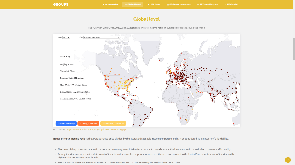
Energy and the Cost of Living Returning to the sustainability theme, several groups zoomed in on energy and affordability challenges that the world is currently experiencing. One group used some advanced D3 charting to tell the story of the UK’s varying energy imports and wider global affordability challenges (see image below). A different take was to chart the energy generation mix in major economies around the world. Another topical affordability challenge relates to housing in major cities, and one group mapped relative affordability of housing in major cities across the globe.
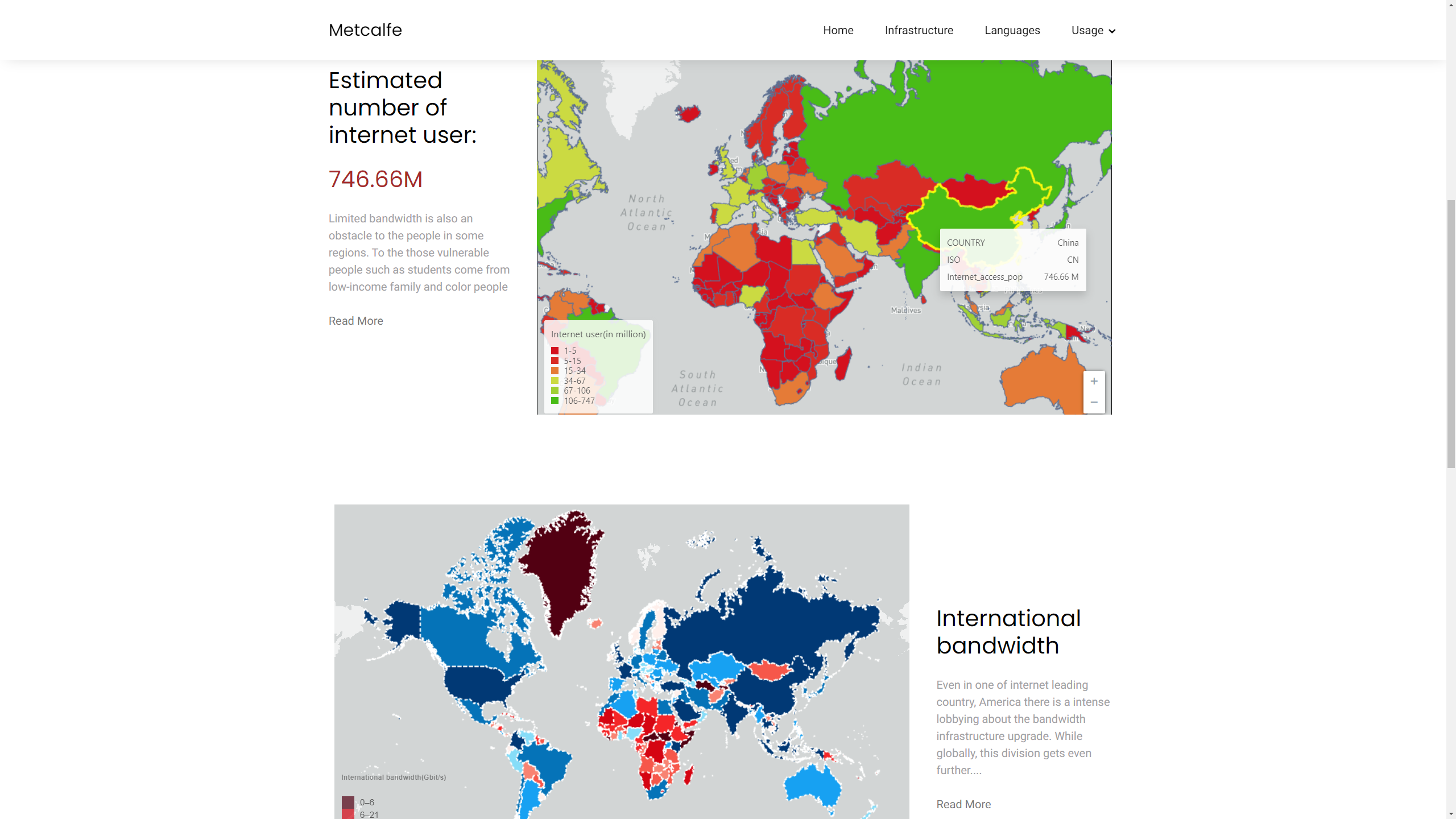
Global Digital Divides Finally, another interesting take was to think about online communities as interactions between global and local, including the changing geography of internet access and the division of the world into different online platforms by language and political and economic divides.
Global internet connections and the digital divide by Group 12 (Ruijie Chang, Maidi Xu, Zhiheng Jiang)
Here is the full list of project groups and websites-
Earlier this year I worked on some charts and maps for a Greenpeace report authored by sustainable transport academic Robin Hickman, exploring the impacts of automobile dependence and the prospects for a post-car world. The report is online here.
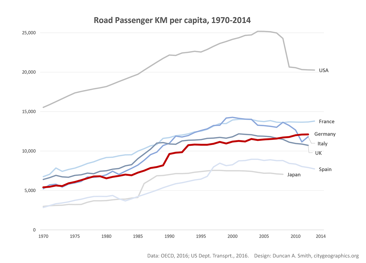
The much debated phenomenon of ‘peak-car’ can be observed in many countries in the global north, in terms of a levelling off of private car use and increases in public transport, as shown in the graphs below. Many theories have been put forward to explain this trend, from the growth and densification of cities, to economic crises, fuel tax changes, to declining car use by younger demographics, and behavioural changes related to the internet. Given the many negative impacts of automobile dependence, from substantial GHG emissions, to air pollution, millions of road deaths annually, and contributions to the global obesity epidemic, clearly this behavioural trend is a great opportunity to develop more sustainable city forms much more widely across the globe.
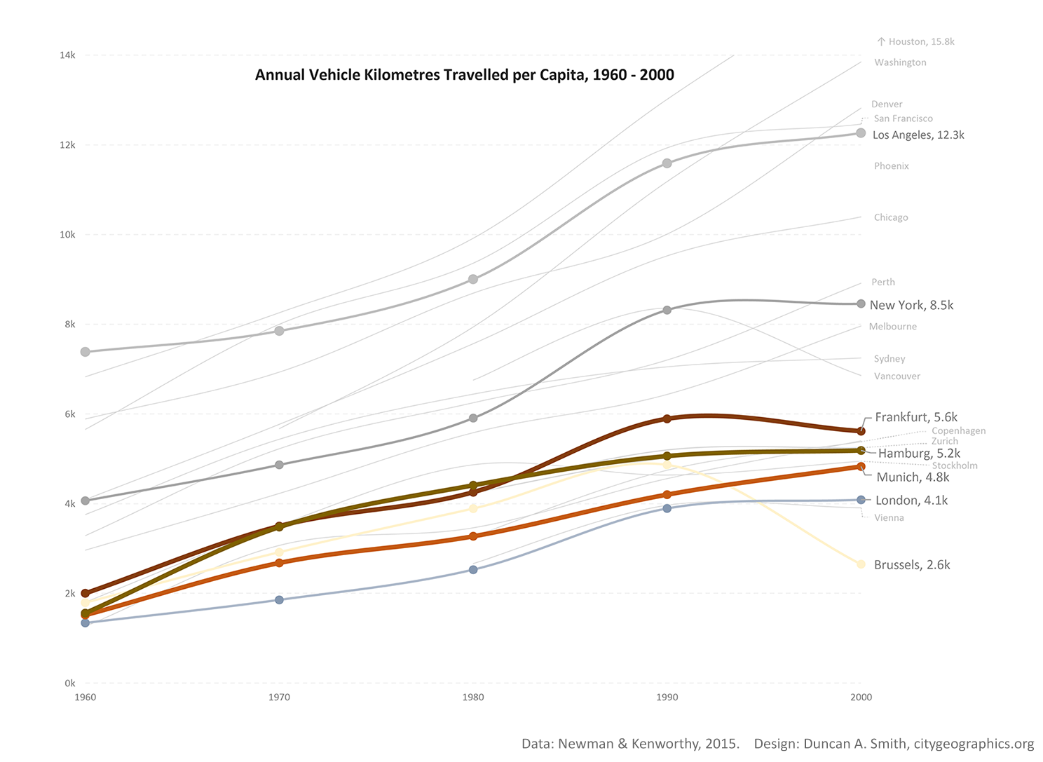
This process is also observable at the level of individual cities, using data compiled by Newman and Kenworthy. Unfortunately this data is only available up to the year 2000.
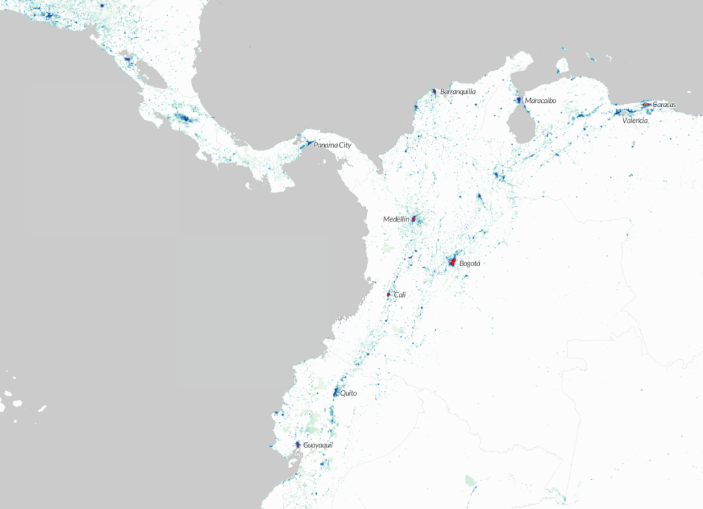
The picture is of course different for newly industrialised countries, many of which are experiencing substantial growth in car ownership. I mapped data on vehicle sales, highlighting rapid growth in China and in Asia more generally, compared to static and declining markets in Europe and North America-
Thus the global sustainability challenge is to accelerate peak-car trends in the global north, and to try to curb the mistakes of automobile dependence being repeated in the developing world. Note that while the chart above suggests that the global south is increasingly responsible for GHG emissions, the picture from per-capita emissions is quite different as shown below, with the highest per-capita emissions in North America, the Middle East and Australia-
Geographers have long grappled with the complex and ever changing configurations of global urbanism. Many terms have been coined to describe new 20th and 21st century urban forms: conurbations (Geddes, 1915), multi-nuclei cities (Harris & Ultman, 1945), megalopolis (Gottman, 1961), world cities (Hall, 1966), desakota (McGee, 1991), fractal cities (Batty & Longley, 1994), network cities (Batten, 1995), postmetropolis (Soja, 2000), splintering urbanism (Graham & Marvin, 2001), polycentric mega-city regions (Hall & Pain, 2006)…
These concepts are diverse, coming from different perspectives with different methods and archetypal case studies. But there are shared themes: a focus on more diffuse and polycentric urban forms; recognition of city connections across multiple scales; and the rise of ever larger urban regions embedded in thicker global networks.
Representing and exploring the diversity of contemporary global urban forms is a challenge for cartographers. We often focus on mapping the amazing richness and diversity of dominant global cities like London and New York. Yet this is clearly a very biased lens from which to frame the vast majority of the globe, as researchers have noted. Postcolonial critiques like Robinson’s ordinary cities (2006) argue for a much more representative and cosmopolitan comparative urbanism. From a different angle, provocative research like Brenner’s (2014) ‘planetary urbanism‘ has critiqued the contentions of a universal urban age, arguing that urban/rural distinctions are no longer meaningful where capitalist networks reach to every corner of the globe.
I recently released an interactive map of the new Global Human Settlement Layer (GHSL) produced by the European Commission JRC and CIESIN Columbia University. This dataset makes several advances towards an improved cartography of the diversity of global urbanism. Firstly it is truly global, representing all the world’s landmass and settlements at a higher level of detail, down to 250m. Secondly the population density and built-up layers are continuous: there are no inherent city boundaries or urban/rural definitions (the GHSL includes an additional layer with urban centres defined, but the user can ignore these and create their own boundaries from the underlying layers). Thirdly the dataset is a time-series, including 1975, 1990, 2000 and 2015. Finally the data layers and the methods used to create them are fully open.
Diversity and Structure of Global Urban Constellations
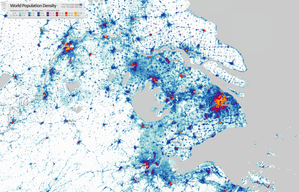
The complexity and scale of the GHSL data is both beautiful and beguiling. In China and India there are continuous landscapes of connected urban settlements with hundreds of millions of people, scattered across many thousands of square kilometres. The cartographic appearance of these regions is like constellations of stars coalescing in vast nebulae of diffuse population. Densities of South and South-East Asian towns and small settlements in semi-rural regions exceed many major cities in Europe and North America. These are complex evolving landscapes at a scale and extent unprecedented in the history of urbanism.
Similarly there are unique trends in other major regions of urbanisation such as Latin America. Here major centres are very high density, but the extent of diffuse rural populations is far less prevalent. As a result countries like Colombia and Brazil have some of the highest urban population densities in the world.
The recognition of this global diversity does not mean abandoning global theories of urbanism. Even amongst such complexity and diversity, we can still observe shared spatial patterns and connections. Clearly we are observing landscapes heavily influenced by our current era of intense globalisation, as well as retaining inherited patterns from previous eras. Spatial logics of globalisation are apparent across the globe, though differentiated between regions, economies and societies.
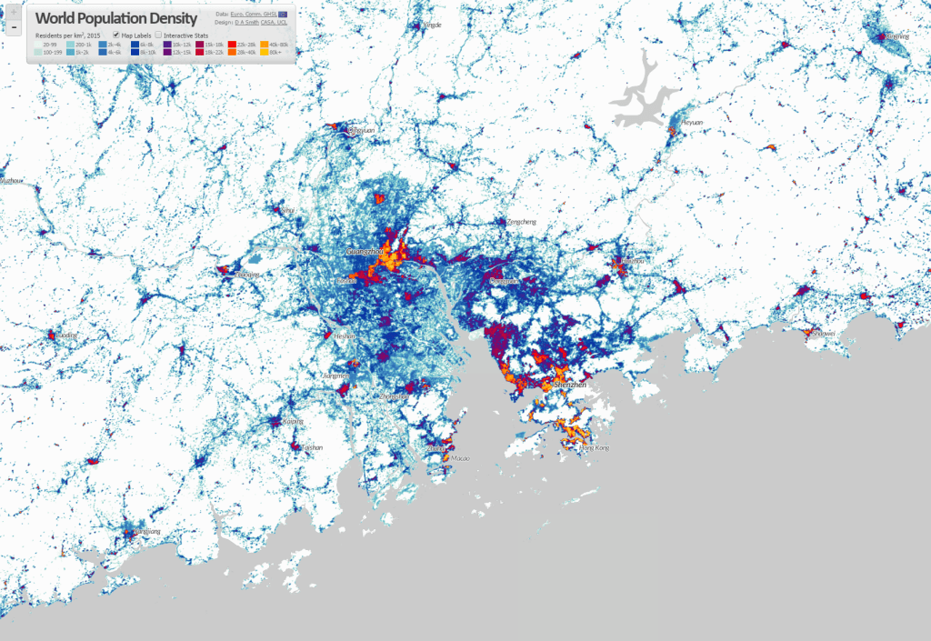
The pull of coastal areas for global trade is an obvious spatial pattern. The importance of port cities is also applicable to historic periods of ancient civilisations, and indeed to globalisation in the 18th and 19th centuries. But the difference in the 20th and 21st centuries appears to be the more intensive links between major ports and global megaregions of production and manufacturing. We can observe this in the huge megaregions of China: the Pearl River Delta and Yangtze Delta (both with around 50m population depending on where the boundary is drawn), which are China’s leading manufacturing centres.
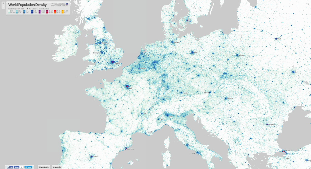
It also applies to Europe, with the higher density spine of the ‘blue banana’ linking low country ports to manufacturing centres in western Germany and north-eastern France, and more loosely to south-east England and northern Italy. As well as the manufacturing roles, it is clear that most major global financial centres are closely linked to megaregions, either at their core (e.g. Shanghai, New York, Tokyo) or within a couple of hours travel (e.g. Hong Kong, London, Paris). These centres provide the capital and business services that embed megaregions in global networks.
The importance of ports is also evident in South Asia. Port cities in South Asia are amongst the fastest growing in the world, such as Dhaka, Mumbai, Karachi, Kolkata and Chennai. But megaregions here appear as yet to be less extensive and well connected. Latin American cities are even more spatially separated and precisely defined in density terms, though there are signs of increasing connections between for example the two great Brazilian metropolises, Sao Paulo and Rio de Janeiro, and in the north between Venezuelan and Colombian port cities.
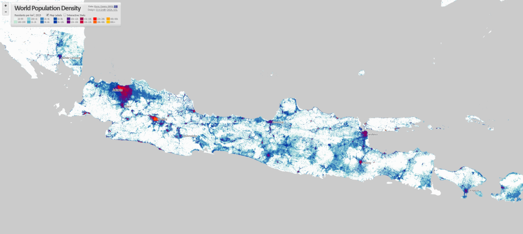
Another fascinating pattern relates to large previously rural areas of population in developing countries that are urbanising in more diffuse and bottom-up patterns. McGee used the term desakota (village-city) to describe patterns of disperse rural development in Java Indonesia. There appear to be similar patterns emerging across regions of China and India, including many areas of the vast Ganges plain, and along the great rivers of China. One of most striking features in China is the concentration of semi-rural and urban populations radiating south-west from Beijing towards Shijiazhuang and then south towards Zhengzhou (this follows one of China’s oldest rail routes, built 1903 and is nearly 600km long).
There are several areas of sub-Saharan Africa where desakota-like patterns seem to be apparent. The west coast around Nigeria and Ghana is one such area. Another is the many developments around Lake Victoria in Uganda, Kenya and Tanzania. Clearly the cultural and geographical diversity is very high in these regions, and my own knowledge of these countries is very limited. But the similar density patterns is still of interest.
Population and Density Statistics The World Population Density map includes density statistics at national and city scales, with population totals classified into density groups (turn on the Interactive Statistics button at the top left). These help to identify differences in patterns of settlement, and how city densities relate to national distributions.
If we view the world’s highest density cities, we can see the clear links to the above discussion of urbanisation in South Asia and East Asia, and major global port cities. Note however there are many issues with defining and measuring density, which need to be borne in mind when interpreting such statistics. These are measures of residential density, and results will likely be affected by the scale and accuracy of the underlying census data. It would also be better statistically to measure peaks as the 95th or 99th percentile to prevent a single square km cell skewing the results, as there are some outliers in the results.
Highest peak density cities GHSL 2015 1km scale-
City Name
Country
Peak Density (000s pp/km2)
Mean Density (000s pp/km2)
Population (millions)
Xiamen-Longhai
China
330.5
6.3
4.75
Peshawar
Pakistan
228.9
3.3
7.54
Dhaka
Bangladesh
197.8
9.1
24.83
Daegu
South Korea
189.4
8.5
2.58
Maunath Bhanjan
India
177
38.4
0.77
Cairo
Egypt
175.5
5.1
37.84
Kolkata
India
173.5
5.8
26.87
Baharampur
India
166.1
38
1.25
Bahawalpur
Pakistan
136.9
29.6
1.06
Xi’an
China
135.4
7.1
6.04
Kabul
Afghanistan
132.7
18
4.36
Nanjing
China
130.1
6.7
6.6
Guangzhou-Shenzhen
China
128.3
5.6
46.04
Hangzhou-Shaoxing
China
127.6
4.4
7.81
Manila
Philippines
127
9.9
22.45
We can also consider the highest population city-regions based on the GHSL urban centre boundaries. These are defined as continuous built-up areas, with polycentric regions linked into single cities. This leads to quite different results for world’s largest cities, with the Pearl River Delta measured as the world’s biggest urban agglomeration at 46 million (and that’s not including Hong Kong or Macao). It is interesting to compare this to results from the UN World Urbanisation Prospects data, which keeps these regions as separate cities and identifies Tokyo as the world’s largest city-region.
Highest population urban centres GHSL 2015 1km scale-
City Name
Country
Peak Density (000s pp/km2)
Mean Density (000s pp/km2)
Population (millions)
Guangzhou-Shenzhen
China
128.3
5.6
46.04
Cairo
Egypt
175.5
5.1
37.84
Jakarta
Indonesia
20.4
6.1
36.4
Tokyo
Japan
23
6.2
33.74
Delhi
India
68
11.1
27.63
Kolkata
India
173.5
5.8
26.87
Dhaka
Bangladesh
197.8
9.1
24.83
Shanghai
China
104.4
7.5
24.67
Mumbai
India
49.5
13.9
23.41
Manila
Philippines
127
9.9
22.45
Seoul
South Korea
103.1
8.8
22.13
Mexico City
Mexico
42
8.2
20.09
São Paulo
Brazil
38.7
8.9
20.02
Beijing
China
84.8
6.6
19.9
Osaka
Japan
13.4
5
16.53
Future Cartography of Global Urbanism
Population density is clearly a very useful base from which to understand urbanisation and patterns of settlement. But we can also see its limitations too in the World Density Map if urbanisation is viewed only in terms of density. Many US city-regions are very low density, much lower than semi-rural parts of Asia and Africa, but these US cities are amongst the most affluent and highly urbanised areas of the globe.
Clearly a more comprehensive cartography of global urbanism would combine population density with measurements of development and economic activity, and the flows of people, goods, energy and information that describe the dynamics of how cities and networks function. The development of open global datasets like the GHSL will greatly help in these endeavours.
Another important issue is improving the sophistication of spatial statistics to include multiple urban boundaries and limit Modifiable Areal Unit effects. This would be possible with the GHSL dataset, and I have tried including national and city statistics, but clearly MAUP effects remain when using fixed city boundaries. Something along the lines of my colleagues’ research testing statistics for multiple boundaries simultaneously and showing their influence would be a good avenue to explore.
A brilliant new dataset produced by the European Commission JRC and CIESIN Columbia University was recently released- the Global Human Settlement Layer (GHSL). This is the first time that detailed and comprehensive population density and built-up area for the world has been available as open data. As usual, my first thought was to make an interactive map, now online at- https://luminocity3d.org/WorldPopDen/
The World Population Density map is exploratory, as the dataset is very rich and new, and I am also testing out new methods for navigating statistics at both national and city scales on this site. There are clearly many applications of this data in understanding urban geographies at different scales, urban development, sustainability and change over time. A few highlights are included here and I will post in more detail later when I have explored the dataset more fully.
The GHSL is great for exploring megaregions. Above is the northeastern seaboard of the USA, with urban settlements stretching from Washington to Boston, famously discussed by Gottman in the 1960s as a meglopolis.
Europe’s version of a megaregion is looser, but you can clearly see the corridor of higher population density stretching through the industrial heartland of the low countries and Rhine-Ruhr towards Switzerland and northern Italy, sometimes called the ‘blue banana’.
The megaregions of China are spectacularly highlighted, above the Pearl River Delta including Guangzhou, Shenzhen and Hong Kong amongst many other large cities, giving a total population of around 50 million.
The Yangtze Delta is also home to another gigantic polycentric megaregion, with Shanghai as the focus. Population estimates range from 50-70 million depending on where you draw the boundary.
The form of Beijing’s wider region is quite different, with a huge lower density corridor to the South West of mixed industry and agriculture which looks like the Chinese version of desakota (“village-city”) forms. This emerging megaregion, including Tianjin, is sometimes termed Jingjinji.
The term desakota was originally coined by McGee in relation to Java in Indonesia, which has an incredible density of settlement as shown above. There are around 147 million people living on Java.
The intense settlement of Cairo and the Nile Delta is in complete contrast to the arid and empty Sahara.
Huge rural populations surround the delta lands of West Bengal and Bangladesh, focused around the megacities of Kolkata and Dhaka.
There is a massive concentration of population along the coast in South India. This reflects rich agriculture and prospering cities, but like many urban regions is vulnerable to sea level changes.
The comprehensive nature of the GHSL data means it can be analysed and applied in many ways, including as a time series as data is available for 1975, 1990, 2000 and 2015. So far I have only visualised 2015, but have calculated statistics for all the years (turn the interactive statistics on at the top left of the website- I’ll post more about these statistics later). Change over time animations would definitely be an interesting approach to explore in the future. Also see some nice work by Alasdair Rae who has produced some excellent 3D visualisations using GHSL.
The RGS-IBG annual conference has been on this week, and I presented as part of a series of geocomputation sessions arranged in advance of the 21st anniversary Geocomputation conference in Leeds next year. The topic was current CASA research from the RESOLUTION project, looking at developing fast and consistent methods of measuring public transport accessibility between different cities.
The data used for the London analysis comes from the Traveline public transport timetable data. The image below shows an example accessibility measure of jobs accessible within 1 hour’s travel time leaving at 8am.
High rise developments are often exclusive private spaces, as attested by the current glut of luxury flats, hotels and offices rising across Inner London. Even recent developments advertising their public space credentials have come up short, with for example the Shard’s fantastic views costing £25 entry fee, or the Walkie-Talkie’s ‘skygarden’ amounting to an expensive restaurant and some pot plants.
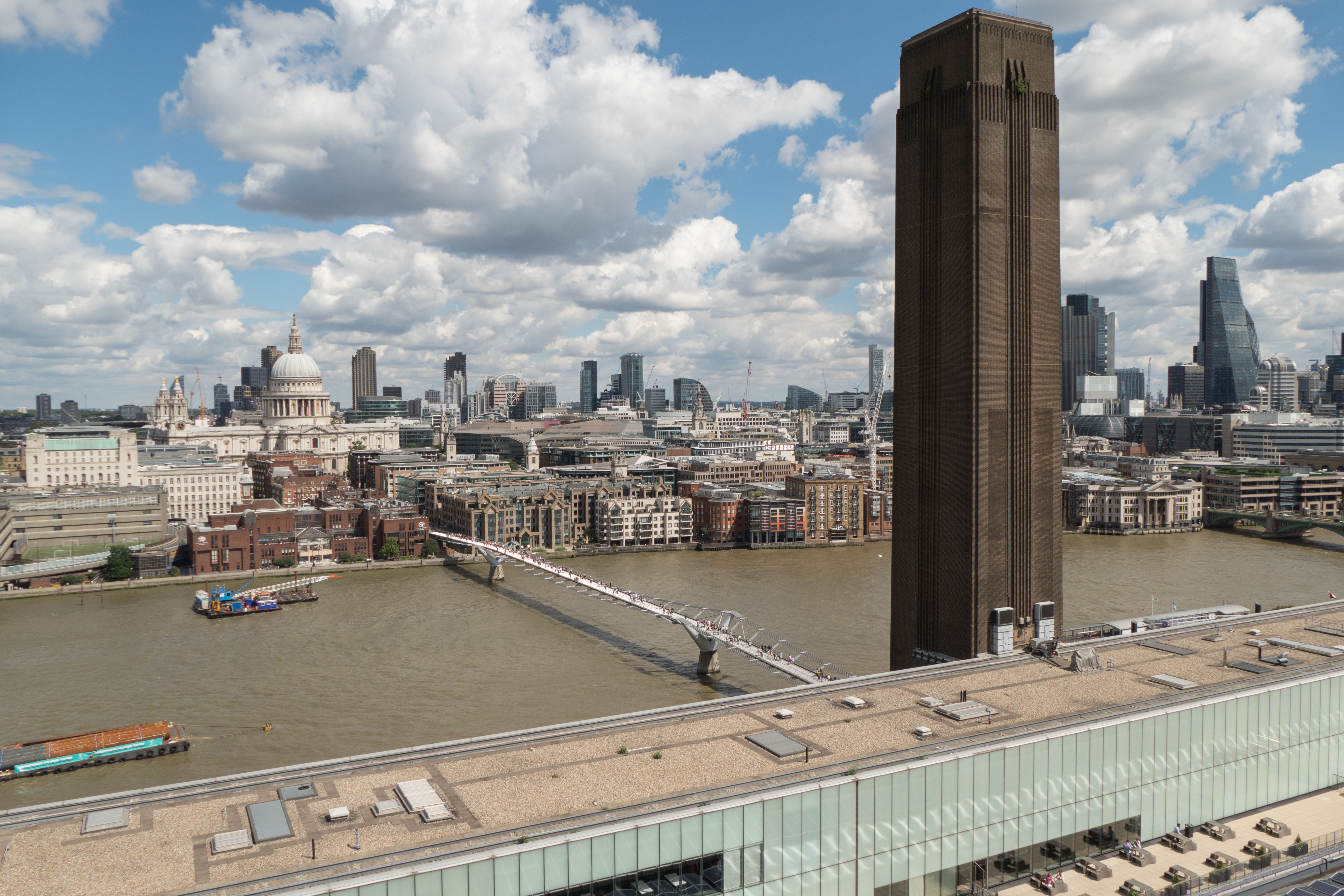
It’s wonderfully refreshing therefore that London’s newest tower is dedicated to public space. Tate Modern’s Switch House extension includes free galleries, spaces for contemplation and discussion, and one of the most spectacular 360 degree viewing locations in London. It all adds up to a big improvement to what was already a very successful gallery.
The Switch House exterior sits right next to brightly coloured flats and office developments. Architects Herzog and de Meuron have opted for a bold angular form that holds its own in this contested space, while still complementing the original Bankside power station through the use of a brickwork lattice.
The gallery floors are spacious, with the exhibits focusing less on blockbuster artists, and more on international voices, sculpture and performance. For example the Living Cities gallery features works from the Middle East and Africa. The winding nature of the tower staircases also creates many intimate and relaxing spaces, which contrasts nicely with the busier open galleries next to the turbine hall.
The viewing gallery presents a superb panorama over the City, St Paul’s, East and South London. It’s an amazing perspective, and quite unique compared to other skyline views, particularly with Bankside tower looming just in front, and no glass barriers present. Thew view westwards is more obscured from developments around Blackfriars, but is still fascinating.
Here’s how the the new tower links with the existing galleries in the internal plan. There’s even a bridge across the turbine hall. High-res versions of these photos are on flickr.
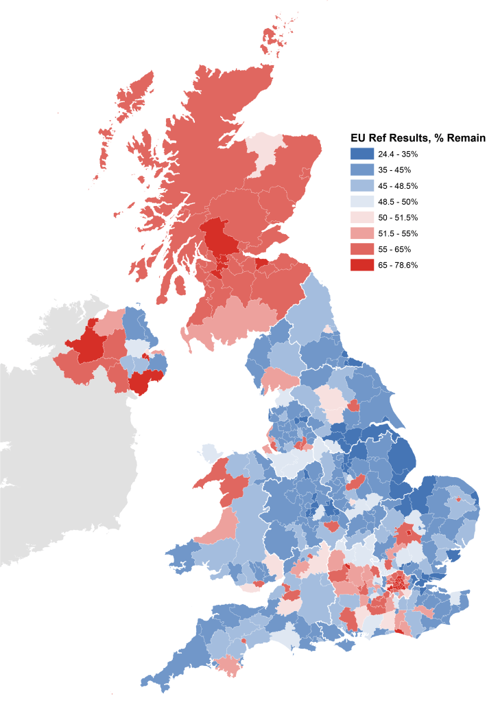
Last year’s 2015 general election revealed a Britain that was increasingly fractured between nations, between the north and south of England, and between more prosperous metropolitan and deprived areas. But GE2015 has now proved to be only a staging post in the UK’s splintering. The momentous vote for Brexit in last week’s EU referendum threatens economic and political turmoil, and it may effectively split the United Kingdom.
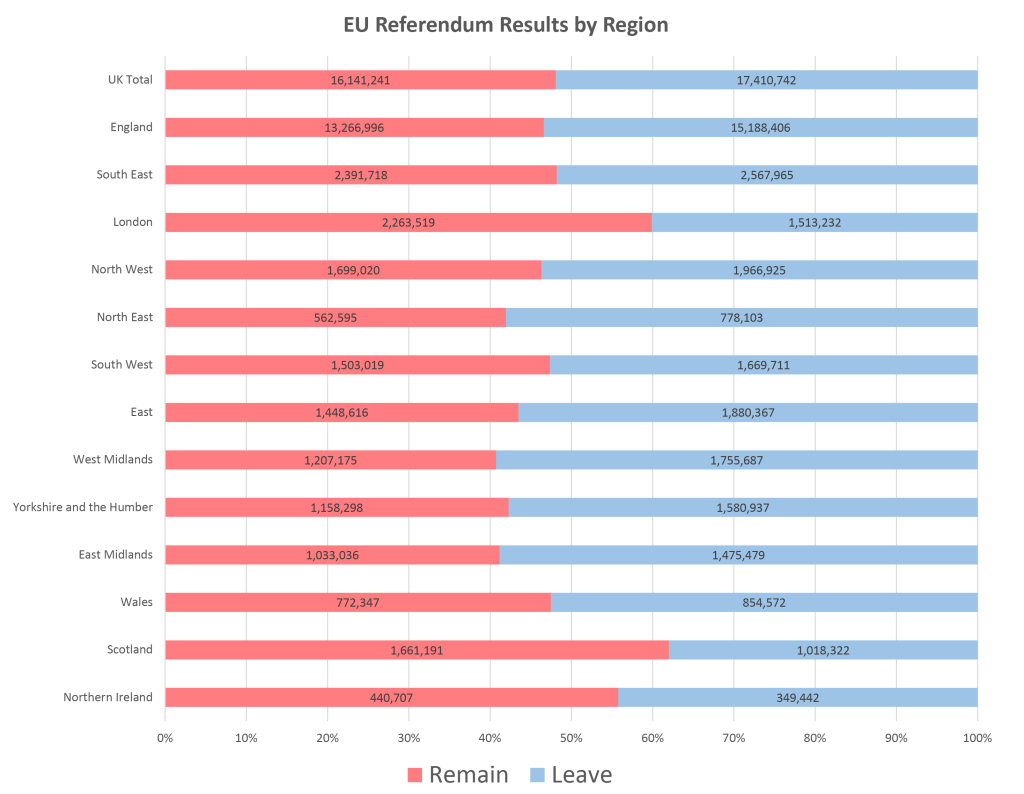
The results show stark geographical divisions. Outside of London and its affluent hinterland, as well as inner cities such as Manchester, Liverpool and Bristol, England has voted for Brexit with a majority of 1.9 million (53% to 47%) voting to leave. Wales also voted for leaving the EU (despite being by far the highest UK beneficiary of EU funding) by 52.5% to 47.5%. Northern Ireland voted to remain by 56% to 44%, but is split between unionist and nationalist areas. Meanwhile Scotland has a strong majority to remain overall (62% to 48%), and a local majority to remain in every single local authority. The case for Scottish independence to prevent its undemocratic removal from the EU is inescapable, unless some kind of ‘reverse Greenland‘ compromise can be reached.
Data from Electoral Commission. Shapefile comiled by Robin Edwards (@geotheory) and Alan McConchie (@mappingmashups).
Underlying the geographical divisions are a host of socioeconomic factors, including education levels, income, unemployment and deprivation: in other words populations that have been cut off from the unequal benefits of globalisation have overwhelmingly voted out. The demographics of this outcome have been reviewed in detail in the Financial Times, or try the excellent John Harris reporting the UK’s inequalities. One of the saddest divisions in the referendum is age, with 75% of votes under 25 and 58% of voters aged 25-34 voting to stay in the EU. Young Brits are now set to have the opportunities of freely living, working, studying and cheaply travelling in the EU made much more difficult due to older generations.
The referendum came about as a Conservative manifesto commitment to address deep internal party divisions and appeal to right wing voters. This gamble has spectacularly backfired, forcing the prime minister to resign. However another critical factor in the result has been the Labour leadership’s mixed attitudes to remaining in the EU. Traditional Labour areas in England, including the North East (58% leave), Yorkshire and the Humber (58% leave) and West Midlands (59% leave) voted decisively to leave the EU. Labour’s uncharismatic leader Jeremy Corbyn has failed to make an impact during months of civil war by the Tory government, and ran a lacklustre campaign for remaining in the EU, despite the economic impacts of Brexit (currency devaluation, inflation, higher prices, more austerity…) set to hit poorest families hardest.
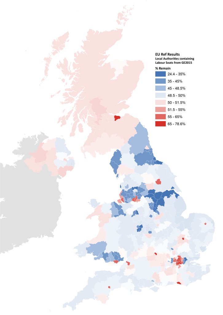
Another way to look at this is if we select local authorities that coincide with Labour won seats in the 2015 general election. We can see that there are a majority of Labour heartland areas that voted to leave the EU (51% of voters in the map below). Indeed if we discount London, the majority for leaving is 55%. This highlights the degree of disconnect between the remain campaign and Labour heartlands.
While the short term economic and political impacts of Brexit are already underway, the full implications will not be known for years both within the UK and beyond. During the referendum, the negative predictions of a Brexit were dismissed as scaremongering. We will now find out if this is the case, with jobs, the union, and the future of the UK and the EU on the line.
Last week I attended the American Association of Geographers annual conference in San Francisco. This was my first AAG and first time visiting the Bay Area, so made for a fascinating trip.
The tech boom and economic resurgence of the Bay Area is a topic of much interest to geographers, and I really enjoyed the Author Meets the Critics session on Michael Storper et al.’s new book The Rise and Fall of Urban Economies. The book compares San Francisco to Los Angeles over the last 40 years, and how SF has more successfully developed new knowledge economy industries, including through government interventions like the Bay Area Rapid Transit (BART). It was great to see influential economic geographers like Michael Storper and Allen Scott debating city evolution and path dependence, as I’ve been following their work for a long time.
CASA and UCL were well represented at the conference. Martin Zaltz Austwick presented on how the Olympic regeneration in London is affecting artistic creativity in Hackney Wick. Continuing the artistic theme, Miki Beavis presented her PhD research into the dynamics of live music performances and venues in Camden. Agent-based modelling was a big conference theme, and Kostas Cheliotis presented his work modelling pedestrian behaviour in Hyde Park using the Unity game engine. I also enjoyed Kurtis Garbutt’s work using ABM for flood relief modelling in the UK.
Continuing the pedestrian theme, Panos Mavros presented his PhD work on measuring psychological responses to the built-environment using mobile EEG readers, based on pedestrian navigation experiments in Fitzrovia London. I had participated in the experiment that was presented six months previously, and it was interesting to see the academic analysis on the psychological experience of navigating through urban space. Quick takeaway was the high diversity of route choice and psychological response amongst participants, even within a controlled experimental context of a small area of London.
My own presentation reviewed methods for creating online thematic mapping platforms for researchers, based on a recent open access review paper. The session included Jesse Piburn from Oak Ridge lab, presenting innovative recent work integrating global spatio-temporal data (World STAMP project).
As well as the academic work, their was some leisure time for enjoying the city. Spring is well underway in California, with lots of wildlife and colour. I visited Muir Woods, one of the few last reserves of the giant coastal redwoods, named after the Scottish naturalist John Muir who had a key role in founding Yosemite National Park.
The city has many affluent picture postcard neighbourhoods famous from movies that are great to explore. But there are urban challenges too. One can’t help be struck by the extent of homelessness in downtown, where large city districts have hundreds of people sleeping rough. The story of low income households being left out of a huge real-estate boom is all too familiar. With homelessness on the rise in London, and government policy making things worse, we are heading for a similar situation.
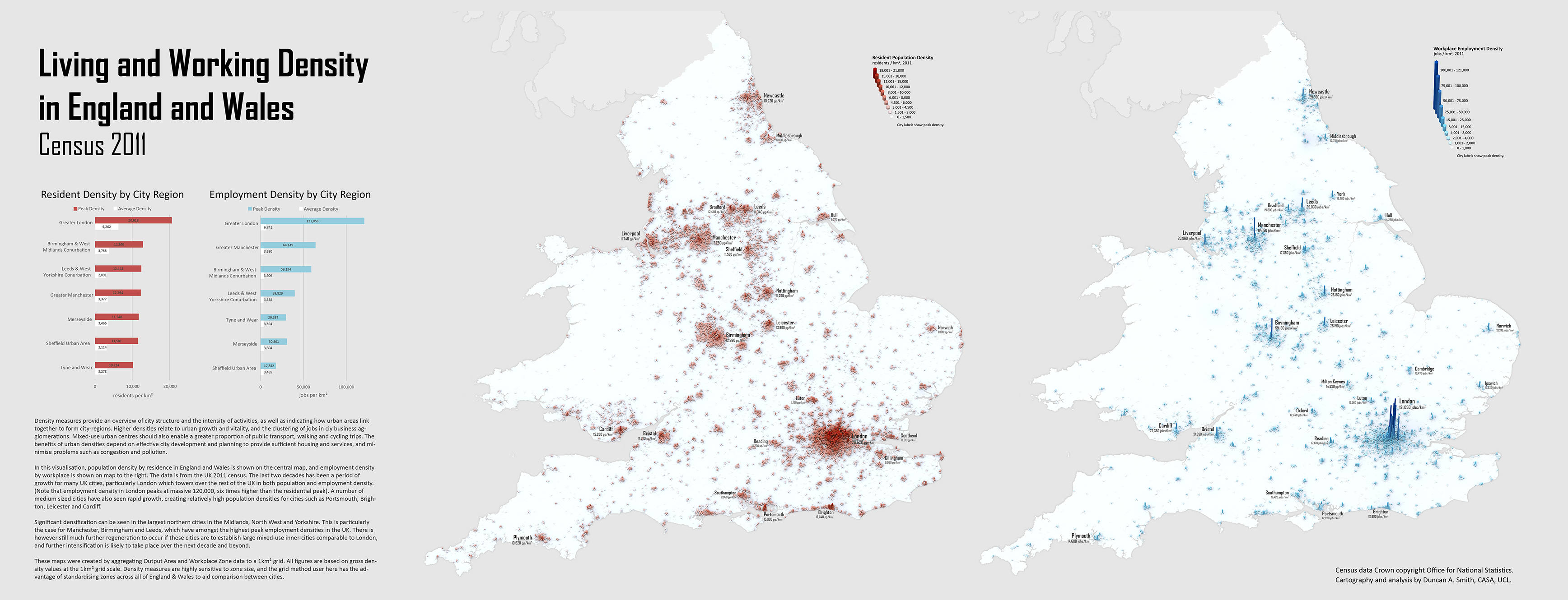
UK cities have been undergoing significant change over the last decade, and the 2011 census data provides a great basis for tracking current urban structure. I’ve mapped population and employment density for all of England and Wales in 2011, using a 1km2 grid scale approach-
The main themes that emerge are the dramatic intensification of London, high densities in some medium sized cities such as Leicester and Brighton, and the regeneration of the major northern conurbations, with Manchester and Birmingham as the largest employment hubs outside of London.
Mapping all of England and Wales together is a useful basis for considering city-regions and their connections (note Scotland has not yet published census 2011 employment data and is not mapped). Certainly this is a major theme in current policy debates grappling with the north-south divide and proposed high-speed rail links. I’ll be looking at densities in relation to network connections in future posts as this topic is part of ongoing research at CASA as part of the MECHANICITY project.
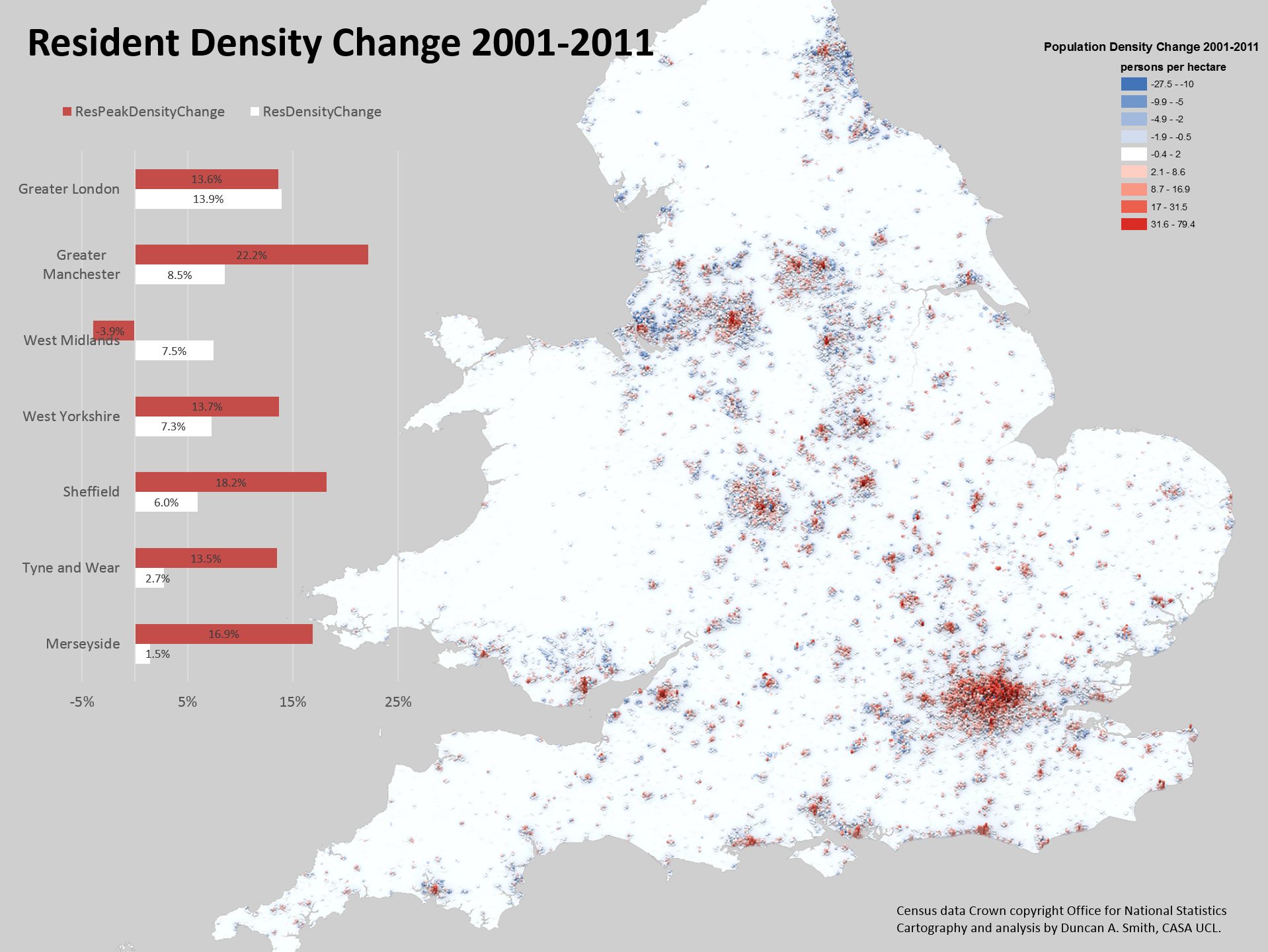
It is also possible to directly map changes in density between using the same visualisation approach (note the grid height describes density in 2011, while colour describes change in density between 2001-2011)-
The change map really highlights the pattern of city centre intensification combined with static or marginally declining suburbs in England and Wales. This trend was discussed in a previous post. The two statistics of peak and average densities reinforce the city centre versus suburbs divide, with peak density measurements growing much more than average densities. But the peak density statistic is somewhat unreliable (such as in the case of Birmingham/West Midlands) and we will be doing further work at CASA to define inner cities and produce more robust statistics of these trends.
Notes on the Analysis Method-
The density values were calculated from the smallest available units- Output Area population and Workplace Zone employment data from the 2011 census. This data was transformed to a 1km2 grid geography using a proportional spatial join approach, with the intention of standardising zone size to aid comparability of density measurements between cities. The transformation inevitably results in some MAUP errors. These are however minimised by the very fine scale resolution of the original data, which is much smaller than the grid geography in urban areas.
The workplace zone data is a very positive new addition by the Office for National Statistics for the 2011 census. There is a lot of new interesting information on workplace geography- have a look at my colleague Robin Edward’s blog, where he has been mapping this new data.
Defining city regions is another boundary issue for these statistics. I’ve used a simple approach of amalgamating local authorities, as shown below-
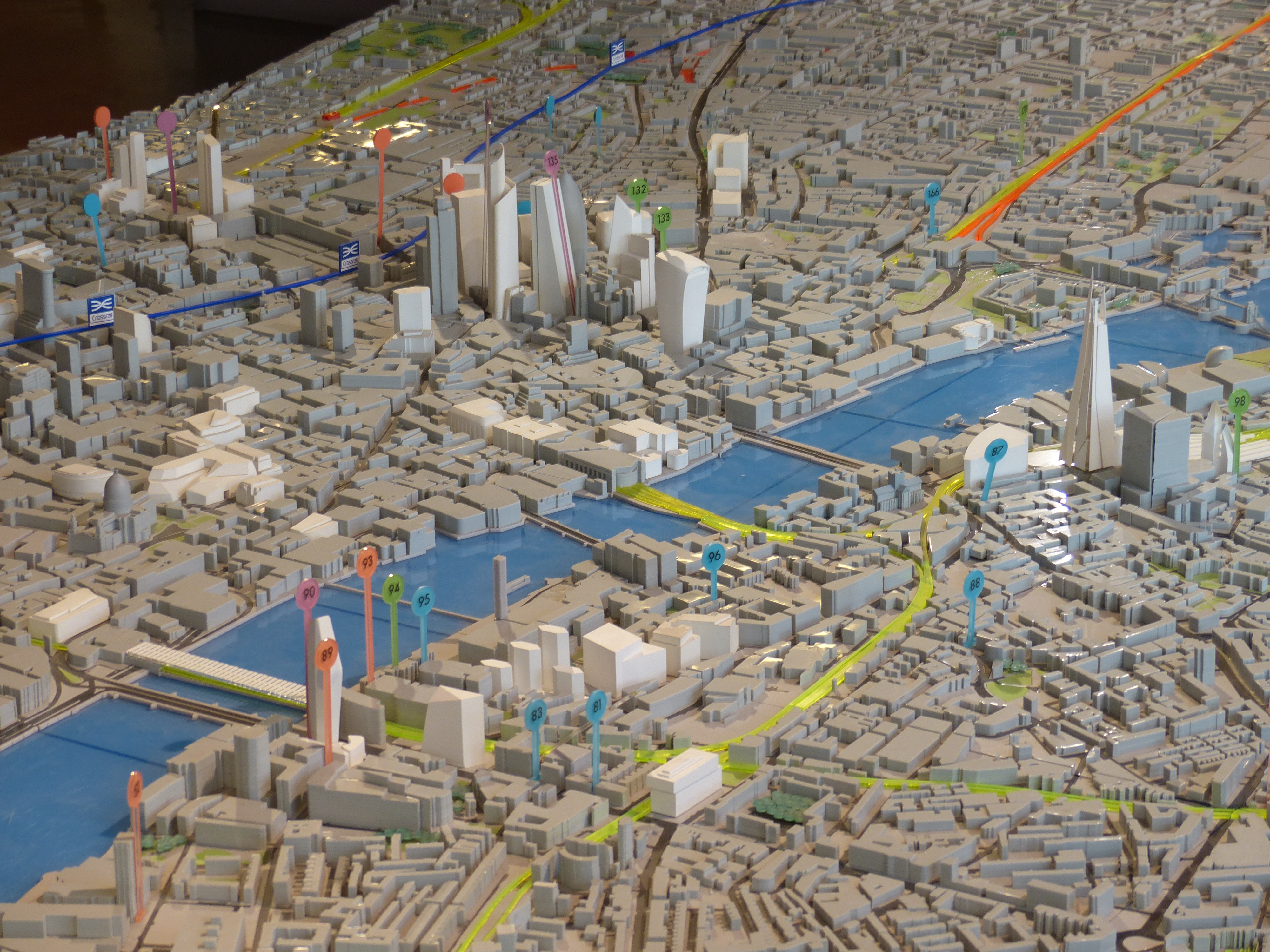
Last week New London Architecture, centre for built-environment debate and communication, launched a new exhibition on London high rises and high buildings policy. As well as including many spectacular models of present and future buildings, the exhibition presents results from NLA research into London’s current generation of high building proposals. The most eye-catching finding is that there are over 230 towers of 20 storeys or more proposed or under construction in London, potentially resulting in a dramatic change in London’s urban environment. A high profile campaign has been launched by the Guardian and Architects’ Journal calling for for more discussion and a ‘Skyline Commission’ to assess the impacts of these many developments. The NLA exhibition itself takes a more neutral tone in the debate, and highlights are summarised below.
NLA “London’s Growing Up” Exhibition, with Leadenhall Building Model
It’s clear from the NLA map below that the majority of proposals are strongly clustered spatially, with many adjacent to existing high rise districts of Canary Wharf and in the City around Bishopsgate and Liverpool Street. There are however many new clusters set to be created, principally Vauxhall-Nine Elms; Waterloo; Blackfriars Bridge; City Road (Islington); Aldgate; Stratford and North Greenwich. Demand for high rises is a result of acute pressures for more housing, and the prioritising of development at public transport nodes, such as Canary Wharf, Vauxhall and Blackfriars. In heritage terms a number of these clusters are controversial, particularly those along the South Bank that affect London’s river views, and those proposals in the vicinity of the world heritage sites of Westminster and the Tower of London.
NLA Insight Study map of current high building proposals
The main critique from campaigners is that there is a lack of vision from planners regarding high buildings policy, and that current developments are being driven by schemes for luxury residential flats along the river that maximise developer profits. The map above lends support to this view, particularly along the South Bank and at Vauxhall. There are already many medium rise luxury flat developments along the Thames of often limited design quality, and its debatable whether the current batch of taller developments will be any better. Policy restrictions in London are strongly geared towards protecting views of St Pauls Cathedral, effectively preventing new schemes in West Central London. Protection elsewhere is more limited and dependent on borough level interpretations of policy. Westminster has prioritised conservation and prevented new high rises (except at the Paddington Station development) while neighbouring boroughs of Lambeth and Southwark are more inclined to accept proposals, and use the much needed revenue for further housing development.
As well as covering the current planning debate, the exhibition includes many beautiful architectural models of existing and future high building proposals. There are some really unique designs, such as the fountain pen-shaped ‘Pinnacle’ that is back under development in the main City of London cluster.
Overall the exhibition is well worth a visit, and whether you are a fan or a critic of high buildings in London, there is clearly a need for greater awareness and discussion of current changes and what they will mean for the urban environment. There is also a need for more public access to open models and visualisations of how new buildings will appear and change London’s physical structure. Andy Hudson-Smith (@digitalurban) argued for this a few years back in CASA’s Virtual London project, and it appears that trends are currently moving in this direction.
The 2013 Urban Age conference took place in Rio de Janeiro on the 24th-25th October. The LSE Cities research team have spent recent months learning about Rio and the fascinating changes this city is undergoing. It’s a city right in the eye of the storm of current debates in urban studies, relating to poverty, urban regeneration, mega-events and informal housing. I summarise some of the conference research highlights in this post. For a more comprehensive picture you can download the conference newspaper here.
Rio is defined by it’s mountainous topography. Here we look east with Zona Central on the left overlooking Guanabara Bay, and wealthy Zona Sul on the Atlantic Ocean to the right. Photograph by Tuca Viera for LSE Cities.
Economic Boom and Poverty Reduction
Rio conjures up very contrasting images to the outsider. On the one hand there is the wonderful exuberant city of Copacabana beach, samba music and carnival. These inspiring images are juxtaposed with the ongoing challenges Rio faces in terms of poverty, gang violence and drugs, captured in popular culture through films like City of God. Much more recently, Brazil has been hitting the headlines because of widespread protests across the country, with citizens demanding better quality public services and the tackling of government corruption.
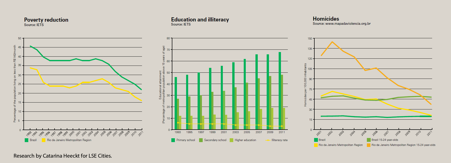
Brazil has in fact made admirable progress in social development in recent decades. Social welfare reforms, such as the Bolsa Familia pragramme introduced by former president Lula in 2003, have seen one of the world’s most dramatic reductions in poverty, with significant improvement in cities like Rio. Education rates have greatly increased, and the high number homicides that plagued Rio in the 1990’s has fallen significantly.
These social improvements have been aided both by progressive leadership, and by a booming economy. The State of Rio has received a huge financial injection from the extensive oil and gas fields discovered off the coast. It makes for an incongruous sight walking along Copacabana beach to see the far horizon dotted with oil platforms. Revenues from this windfall have boosted investment into the city, although supporters of the current protests would argue that it should be more fairly distributed.
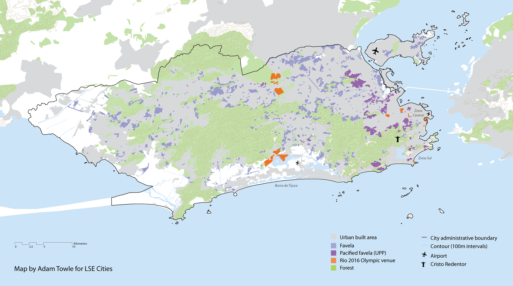
Rio and the Favelas
Rio has grown rapidly into a city of 6.4 million people and 12 million in the wider metropolitan region. It is both defined and constrained by its spectacular coastal topography of steep slopes, forests and lagoons. Much of the expansion in population in the 20th century was housed informally, and 20% of Rio’s population still live in the favelas. These were built on the less accessible steep forest slopes, leading to the common distinction between the ‘morro’ and ‘asphalto’, the informal and the formal city. This is often a fine-grained division, as favelas are spread across the entire city, visible from the richest to the poorest areas.
Rather than demolish the favalas, Rio has worked to upgrade them with sanitation and electricity. Yet many remain isolated from public services and employment. The favelas have also been at the centre of drugs trade, controlled by gangs and armed militias. A high profile ‘pacification’ programme has been implemented over the last five years by the Rio government to reclaim these territories for the city. While this programme generally has public support, it involves serious use of force, with the army moving into favelas and disarming local gangs. After this initial disarming process, a network of police stations is set up and further efforts are made to made to reintegrate communities into the wider city, socially and economically.
As seen in the above map, there is a distinct geography to the pacification programme, with favelas in the city centre and around the Olympic venues given priority. Rio will host both the World Cup in 2014 and Olympic Games in 2016, and these megaevents have greatly accelerated the pacification process. It remains to be seen whether pacification will eventually reach the entire city, or if peripheral favelas will remain beyond the control of city authorities.
Complexo do Alemao is one of Rio’s largest favelas. After the initial pacification phase, there have been investments in new housing, and a cable car transport system to aid accessibility. UPP police stations are located adjacent to cable car stops. Photograph by Tuca Viera for LSE Cities
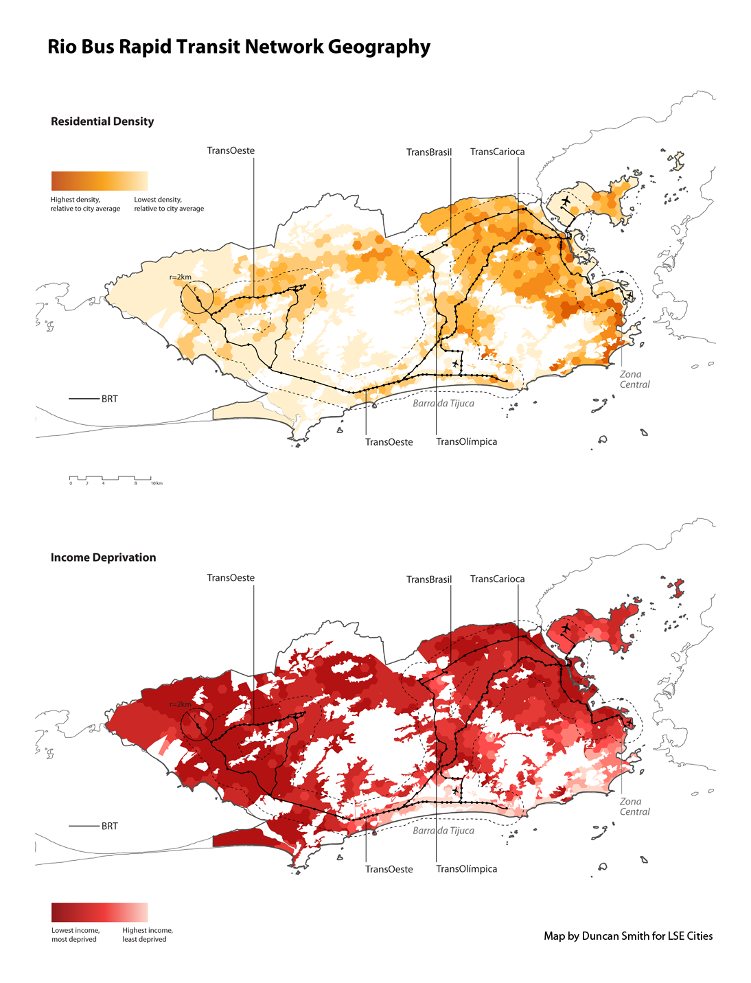
Urban Integration and Mobility
Rio’s topography and sharp social contrasts make for a largely fragmented city. Wealthy residents are concentrated in Zona Sul, the coastal area to the south that includes Copacabana and Ipanema. The magnificent beaches in Zona Sul are a central attraction for wealthier residents and tourists, and this area is expanding westwards along the coast to Barra da Tijuca, defined by high rises and gated communities that resemble Miami. The rest of the city is much poorer. Residents in the periphery and isolated favelas can take hours to access services and work locations. This is exacerbated by Rio’s very limited public transport system, and the underdevelopment of the old city centre and port area.
Concious of this fragmentation and the need for better connectivity, Rio’s authorities have begun a massive investment in public transport infrastructure. The centre-piece is a city-wide bus rapid transit system, with 160km of lines covering the entire width of the city area. The challenging topography of Rio requires serious infrastructure investment in tunnels and bridges to construct this new network.
As can be seen in the above maps, the BRT routes have several aims. One is to make Barra da Tijuca a new transport hub, with the three lines converging near the location of the new Olympic Park. Another is to provide much better connections for the previously isolated western suburbs of Rio. And finally the TransCarioca line will improve links to the city centre. Arguably this latter point of better connectivity to the city centre should be a higher priority if Rio is to successfully revive its inner city. Olympic developments and real-estate interests are playing a significant role in this major public transport investment.
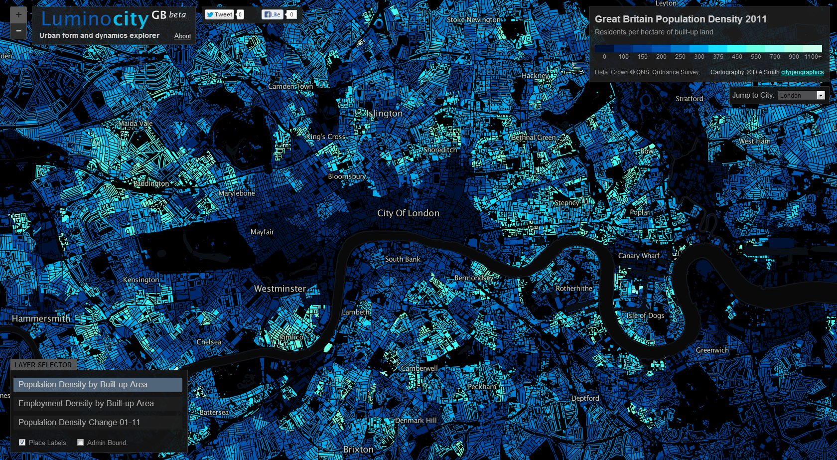
It’s been 14 years since the landmark Urban Task Force report, which set the agenda for inner-city densification and brownfield regeneration in the UK. Furthermore we’ve seen significant economic and demographic change in the last decade that’s greatly impacted urban areas. We can now use the 2011 census data, mapped here on the LuminoCity GB site, to investigate how these policies and socio-economic trends have transformed British cities in terms of population density change.
The stand-out result is that there’s a striking similarity across a wide range of cities, with overall growth achieved through high levels of inner-city densification (shown in lighter blue to cyan colours) in combination with a mix of slowly growing and moderately declining suburbs (dark purple to magenta colours).
We can see this pattern in the growing urban regions of Manchester, Birmingham, Leeds and Sheffield above. Manchester has the fastest population growth after London, with 8.1% growth in the city-region, and a massive 28% growth in the core local authority. Average densities in Manchester have gone up by 28% (+35 residents per hectare), but it’s not a uniform growth. There are new development sites at a very high 300 or 400 residents per hectare, contrasting with low density surrounds and the extensive remaining brownfield sites. There is a patchy nature to the current urban fabric of Manchester, indicating that much further development could still take place.
The West Midlands Conurbation is the third fastest growing city-region at 7.3%, with a higher 10% growth in the core city authority Birmingham. Density increases are more modest here (+13 residents per hectare) but the same general pattern remains. Similar patterns of high density inner-city growth are also clear in Leeds (5% growth) and Sheffield (8% growth).
The trend applies to medium size cities also. Those cities with the highest growth rates like Leicester (+18%), Nottingham (+14%), Cardiff (+13%) and Bristol (+12.5%) show fewer signs of suburban depopulation-
Scottish cities have a stronger tradition of high density inner-city living. With compact cores already in place, Edinburgh (+6.5%) and Aberdeen (+5%) have been expanding the inner city into Leith and Old Aberdeen-
Meanwhile the UK’s former industrial powerhouses of Glasgow, Liverpool and Newcastle display a more problematic variation on this pattern. City centre intensification is still much in evidence, with core city authority populations growing at 8% in Newcastle, 6% in Liverpool and 4% in Glasgow. But this growth is in combination with outright decline in some surrounding towns and suburban areas, particularly around Glasgow. These patterns are linked to major programmes to overhaul poor inner-city housing stock, but are also inevitably linked to weaker economic growth in Glasgow and Liverpool. The picture is better in Tyne & Wear, where there are more positive employment signs (8% growth in workforce jobs 2001-2011).
What is driving this urban dynamic?
In addition to planning policy shifts, a series of economic and demographic changes are contributing to the pattern of central growth and struggling suburbs, as commentators have variously been observing in the UK and US (e.g. gentrification researchers, Erenhalt, Kochan). Demographic aspects include more students, immigrants, singles and childless couples. Economic aspects include city-centre friendly service and knowledge economy jobs, as well as increased costs of petrol. For these trends to occur over a wide range of demographically and economically diverse cities in the UK and beyond, clearly there are multiple factors pulling urban populations and growth in similar directions.
London Extremes
We’ve avoided the gigantic outlier of London so far. It’s a city apart in many ways- much larger (8.1 million in the GLA area) and faster growing (+14% 2001-2011). It’s also massively higher density, with average residents per hectare 50% higher (nearly 200 residents per hectare) than the next most dense city-region in GB. The biggest changes have been in Inner East London. Tower Hamlets (where Canary Wharf has boomed) is 1st on every indicator- highest population change (+28.8%), highest employment change (+50%!!), highest population density (324 residents / hectare). The pressures for growth in London are so high that there is little surburban decline in population terms (although employment has been declining significantly in Outer London).
Yet the high rate of densification in London has come nowhere near meeting housing demand. London is the midst of a massive housing shortage and crisis, with some of the world’s highest property prices. The debate is currently raging about what needs to be done to accelerate construction, with advocates of transforming more land to community ownership (e.g. Planners Network UK), relaxing planning regulations such as the green belt (e.g. LSE SERC), and implementing an array of measures simultaneously (e.g. Shelter Report). We can see London’s challenges in the maps, such as the failure thus far of the flagship housing expansion programme, the Thames Gateway, to deliver. Some high profile development sites like Stratford and Kings Cross have only recently opened for residents and so do not show in the 2011 data.
The Thames Gateway- aside from Woolwich, little housing has been delivered.
Another more surprising result is the fall in the population of Inner West London, particularly Kensington and Chelsea. While this finding does need some context- K&C is still the forth most densely populated local authority in the country- it’s still an amazing trend given the extreme population pressures in London. It is in line with arguments that the most expensive properties in London have become investments for international capital rather than homes for living. Such trends push prices up, cut supply and bring questionable benefits to the city. Addressing this issue would require tax changes, and macro economic factors like the value of the pound and yields on alternative investments are also clearly influential.
Inner London- expansion in the East and decline in Kensington & Chelsea
Summary- an Ongoing Renaissance and Suburban Challenges
Well to state the obvious GB cities are, with only a few exceptions, growing significantly. That’s not to be sniffed at given the history of widespread urban decline throughout the second half of the 20th century. And secondly the pattern of growth in density terms is clear- densifying inner cities, and fairly static or declining suburbs. The scale of London and the severe housing crisis has it’s own unique dynamics, while Glasgow and Liverpool are still dealing with significant population loss in many areas of the city region. But on the whole, the pattern is surprisingly consistent across cities in Great Britain.
Clearly this review prompts a series of further questions analysing the economic, demographic, gentrification, deprivation and property market processes inherent in this urban change, and what future city centres and suburbs will be like. Hopefully this mapping exercise should is a useful context for the ongoing research.
Our cities have been changing dramatically in recent years, with the intensification of urban centres, redevelopment of old industrial spaces, new demographic trends, and the pressures of a volatile global economy. The aim of the LuminoCity website, which launches in beta today, is to visualise urban form and dynamics to better understand how these trends are transforming cities in Great Britain. Explore the site for yourself here- luminocitymap.org.
London Population Density by Built-up Area 2011
Glasgow Jobs Density by Built-up Area 2010
Manchester Population Density Change 2001-2011
The visual style developed for LuminoCity combines urban activity data with built-form. Density values are calculated by dividing fine-scale (LSOA) employment and population data by built-up area, and then mapping the results to the same building footprint data (Ordnance Survey VectorMap). The result is a novel city perspective on common demographic indicators like population and employment density, with links between density and the texture of the built-environment clearly highlighted. So for example in the London map above, we can see the patchwork pattern of recent high density developments in Docklands (along the river to the east), and high density clustering around major rail stations like Paddington.
There are three layers included in the beta version of LuminoCity-
Each layer provides a complementary angle on urban form, with Employment Density showing business agglomeration patterns, and Population Density Change highlighting where intensification is occurring and where population losses are found. Examples of these three layers for major cities are shown above. The Population Density Change is particularly interesting in light of clear patterns of city centre growth and static or declining suburbs in many British cities, such as Manchester above. There is also in London a distinct pattern of population loss in the western inner-city, likely due to international capital speculation leaving under-occupied housing (see image below). These trends will be discussed in a further post later this week.
London Population Density Change 2001-2011
Multi-Scale Interactive Statistics
As well as browsing the map you can also click on particular locations to get a set of core statistics and rankings of that area for the current map layer. The statistics are at three spatial levels- City Region, Local Authority and LSOA. This feature shows how typical a particular area is compared to the wider city-region and the country as a whole. It also helps to communicate the variation in density measurements according to scale.
Location Statistics for Manchester, one of Britain’s fastest growing cities
The site concept was partly inspired by Ollie O’Brien’s ‘New Booth’ Map of Deprivation for Great Britain.
Datasets Used
The population data comes from the UK 2001 and 2011 Census, published by Office for National Statistics and National Records of Scotland. The employment data is derived from the Business Register and Employment Survey 2009-2011, also published by Office for National Statistics. The building footprint and urban area data is from the Ordnance Survey Vector District and Meridian products. These datasets have been published by the OS as Open Data, which is a fantastic recent development enabling sites like this to happen.
Spatial Analysis Method Details and Errors
All socio-economic mapping contains a degree of error, and the building footprint density approach used here introduces some issues. The Lower Super Output Area zone geography at which the population and employment data is published is fine scale but is not at the individual block level. Each LSOA zone represents groups of adjacent city blocks. The density results are therefore an average of the adjacent blocks in each zone. The results are affected by a particular version of the Modifiable Areal Unit Problem, and represent the density of fine-scale city neighbourhoods rather than of particular buildings. You can view the specific geography of the LSOA zones by turning on the ‘Admin Boundary’ layer on the LuminoCity site to see how blocks are aggregated.
Additionally the analysis does not consider building use (there are several technical and copyright challenges with this) and so population and employment density measures include all buildings rather than distinguishing residential and commercial property densities.
Finally, the ONS has not yet published census 2001 and 2011 population counts at the same LSOA geography, and a proportional spatial join method by building area was used to convert the 2001 LSOA census data to 2011 LSOAs for the Population Density Change layer.
Feedback and Comments
If you like the site or have any feedback or comments then you can tweet me @citygeographics, or email duncan2001@gmail.com. The site is in beta at the moment, and I plan to add more layers and interactivity in future releases. I’ll be blogging here in more detail about what the visualisations reveal about the changing geography of British cities over the coming weeks.
This month ESRI made an interesting move into the field of global city data with the launch of Urban Observatory (TM). The site has some great interactive visualisation ideas with simultaneous mapping of three interchangeable cities, linked navigation and indicator selection. It provides an intuitive interface to explore the diverse forms of world cities-
Furthermore this ambitious project is intended to be an extensible platform. Jack Dangermond (billionaire founder of ESRI) and Richard Saul Wurman (founder of TED with a long-standing interest in city cartography) discuss in the introductory video how they want many more cities to join in, to crowdsource city data from around the world, using the ArcGIS online platform.
So is this project going to be the answer for all our global urban and smart city data needs? Well I think despite the great interface, as a city crowdsourcing model ESRI’s urban observatory is not going to work. But it’s interesting to explore why, particularly in relation to the bigger questions of whether the open city data revolution is going to be truly global and inspire a new era of urban analysis and comparative urban research.
ESRI’s site states that “information about urbanization does not exist in comparative form”. In reality comparative urban analysis is a growing trend across many sectors, from international organisations like OECD, EU and UN (including the original UN Habitat Urban Observatory); to environmental organisations like ICLEI and C40; to economically focussed organisations like the World Bank and Brookings; to global remote sensing providers like the USGS; to major commercial data producers in transport and telecoms; to the many urban academic research centres around the world (including the two London based centres I’ve worked for, CASA and LSE Cities).
Global cities data example- GaWC Network at Loughborough
CASA- deprivation in UK cities example.
Brookings MetroMonitor- comparison of US cities’ economic performance
LSE Cities- over a decade exploring comparative urbanism
There’s a rich and growing field of data providers and analysis techniques to draw on for comparative urban analysis. Indeed the ability to gather and analyse urban data is absolutely central to the whole Smart City agenda. But there are clearly many challenges. What do cities gain by opening up their data? Who then owns the data and controls how it is presented? Who selects what data is included and excluded?
I believe the natural platform for civic data (and subsequently for the international comparison of urban data) will be an open platform with wiki features to encourage civic engagement. This provides the answers to the above questions- citizens gain from better access to data and institutional transparency; citizens own the data and have a say in what is included and how it’s presented. This is the model for current successful open data sites like the London Datastore, where anyone can access the data, and Londoners can request new datasets (backed by freedom of information legislation). Unfortunately the governance situation is of course much more complicated for the international comparison of cities, and this has limited progress.
As the world’s leading provider of GIS software, ESRI are in a strong position to integrate global datasets, and have clear commercial interests in amassing urban data for their clients. But it’s much harder to answer questions about who owns and controls data in their urban observatory project. Arguably this will limit the number of cities volunteering to take part, and limits the project’s ability to respond to the diverse demands of global cities and their citizens.
A further huge challenge in comparative urbanism is in developing the right analytical techniques and indicators to answer key urban questions. This will inevitably require more sophisticated analysis tools than a set of thematic maps, and needs to draw on the many research strands developing the most relevant analytical tools.
Overall there will be some exciting competition in the coming months and years in the expanding market of international urban data integration and visualisation, with different models from commercial, government and academic contexts. ESRI’s urban observatory is an innovative project, and should stimulate further advances.