Earlier this year we ran a new updated version of the Urban Data Visualisation module at CASA UCL. MSc and MRes students produced some fantastic visualisation projects on a range of urban topics, including accessibility inequalities, global sustainability and transport innovations. These projects combined analytical insights with high quality design and cartography using the latest tools. Below are some project highlights. Note these projects were designed primarily for desktop/laptop viewing rather than mobile.
Urban Accessibility
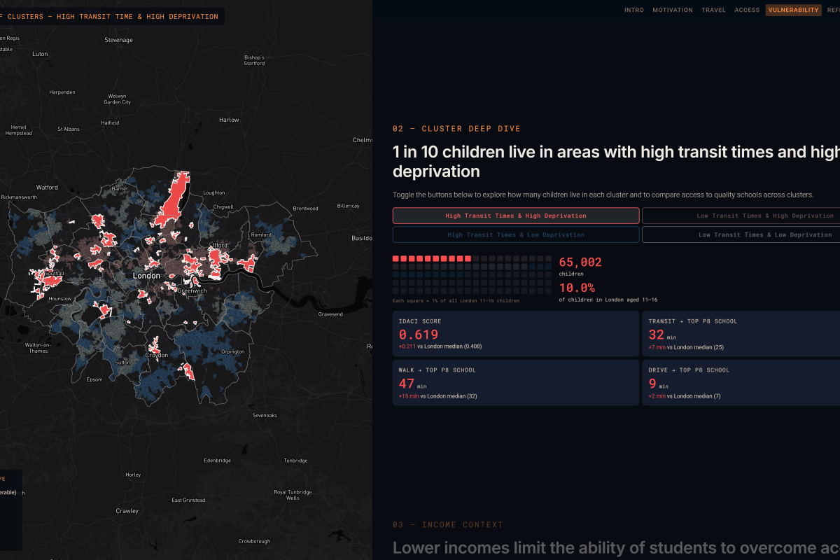
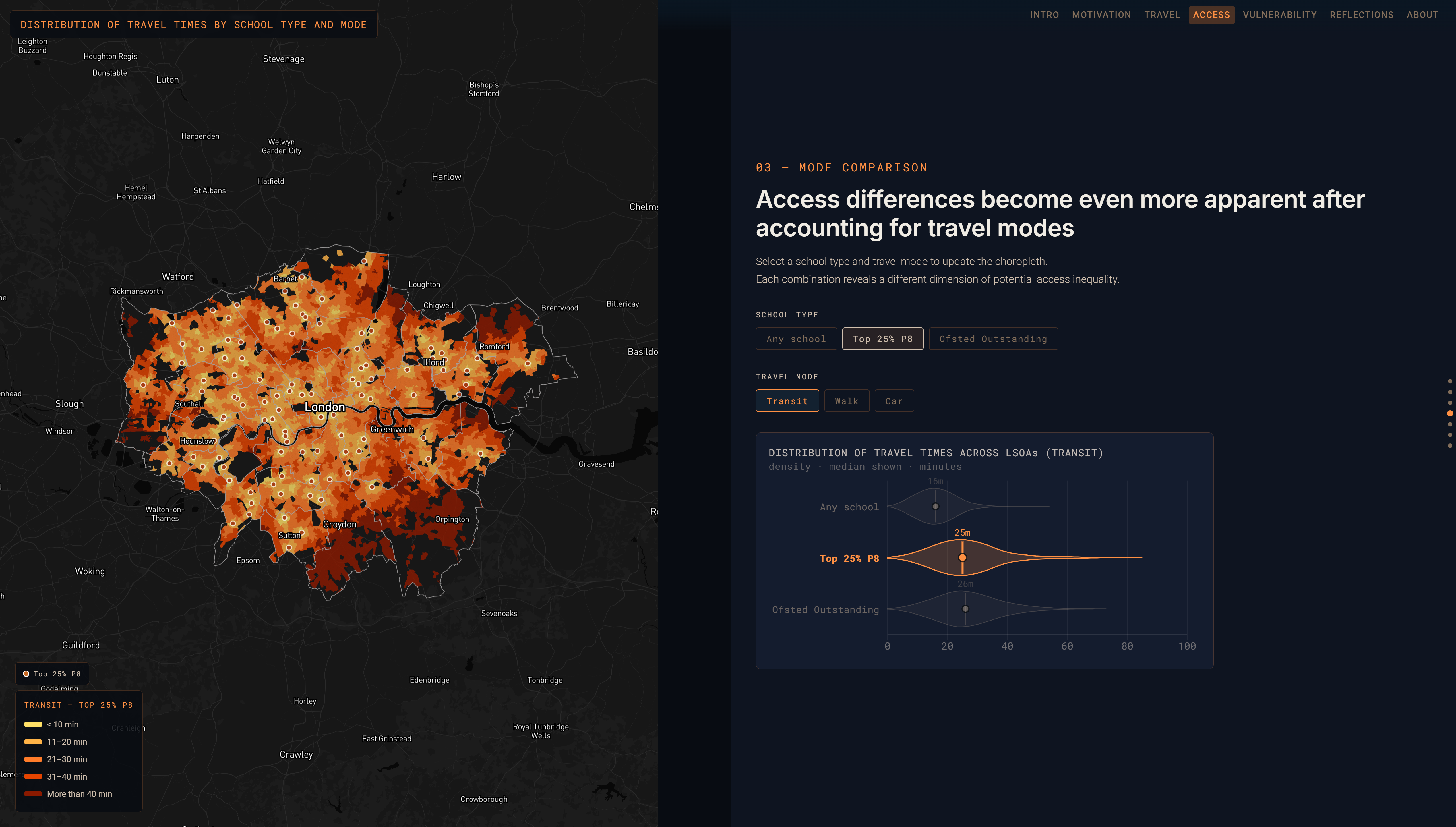
With advances in public transport data and network routing tools to analyse this data, it is possible to look in-depth at accessibility to key amenities such as schools and employment, and explore how these spatial patterns relate to urban inequalities. Benjamin Tee, Tabata Parades, Olivia Xing analysed accessibility to schools in London, in combination with school quality and deprivation- https://benjamintee.github.io/CASA_UDV_Final/pathways_to_progress.html
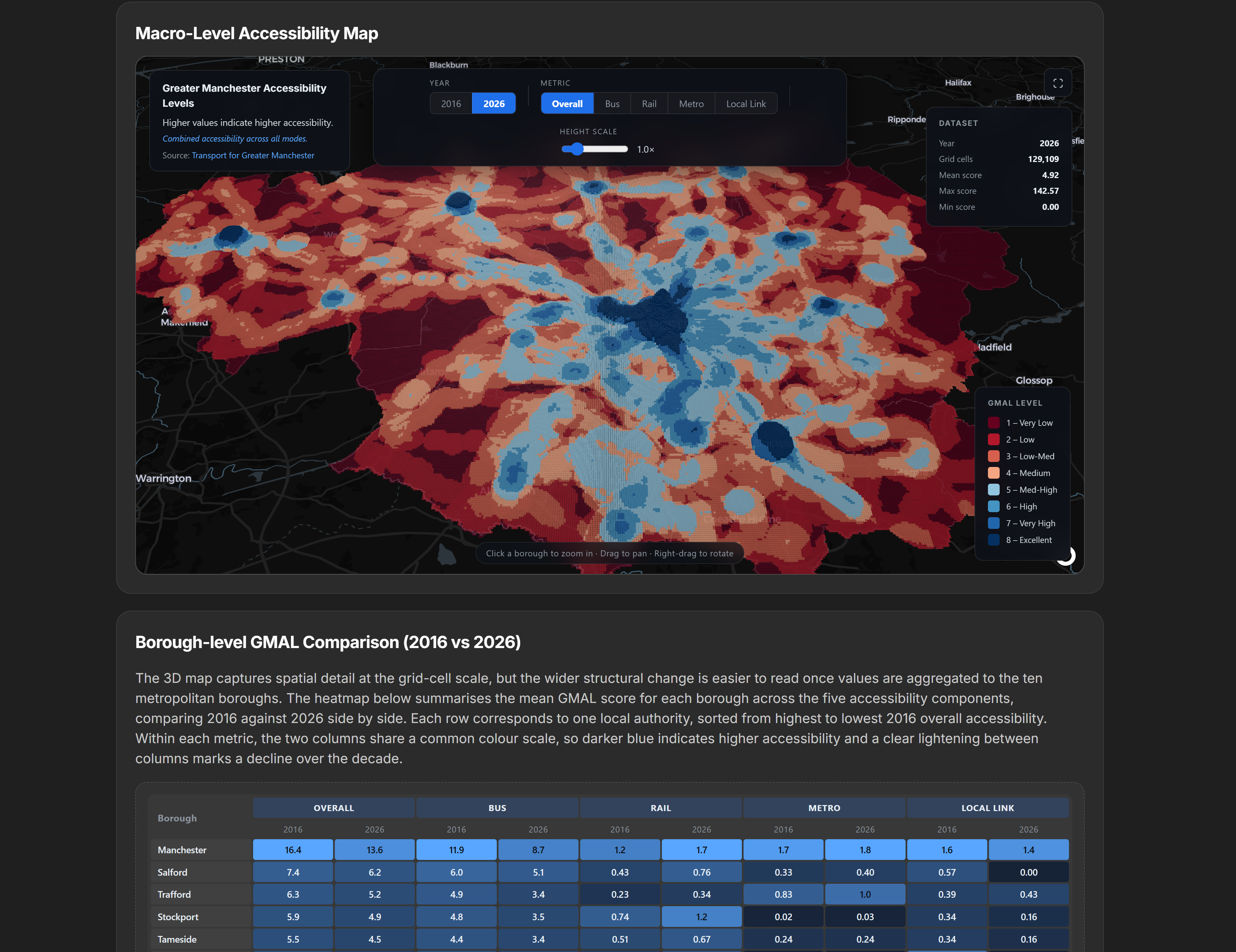
Greater Manchester has been integrating its public transport services and improving data availability. Kongtup Wanichjaroenporn, Piyapa Sotthiwat and Jacob Echele explored changes in accessibility and also public transport reliability in Greater Manchester – https://piyapa-uss.github.io/CASA0029-Group-18-Bus-Delay-in-Manchester
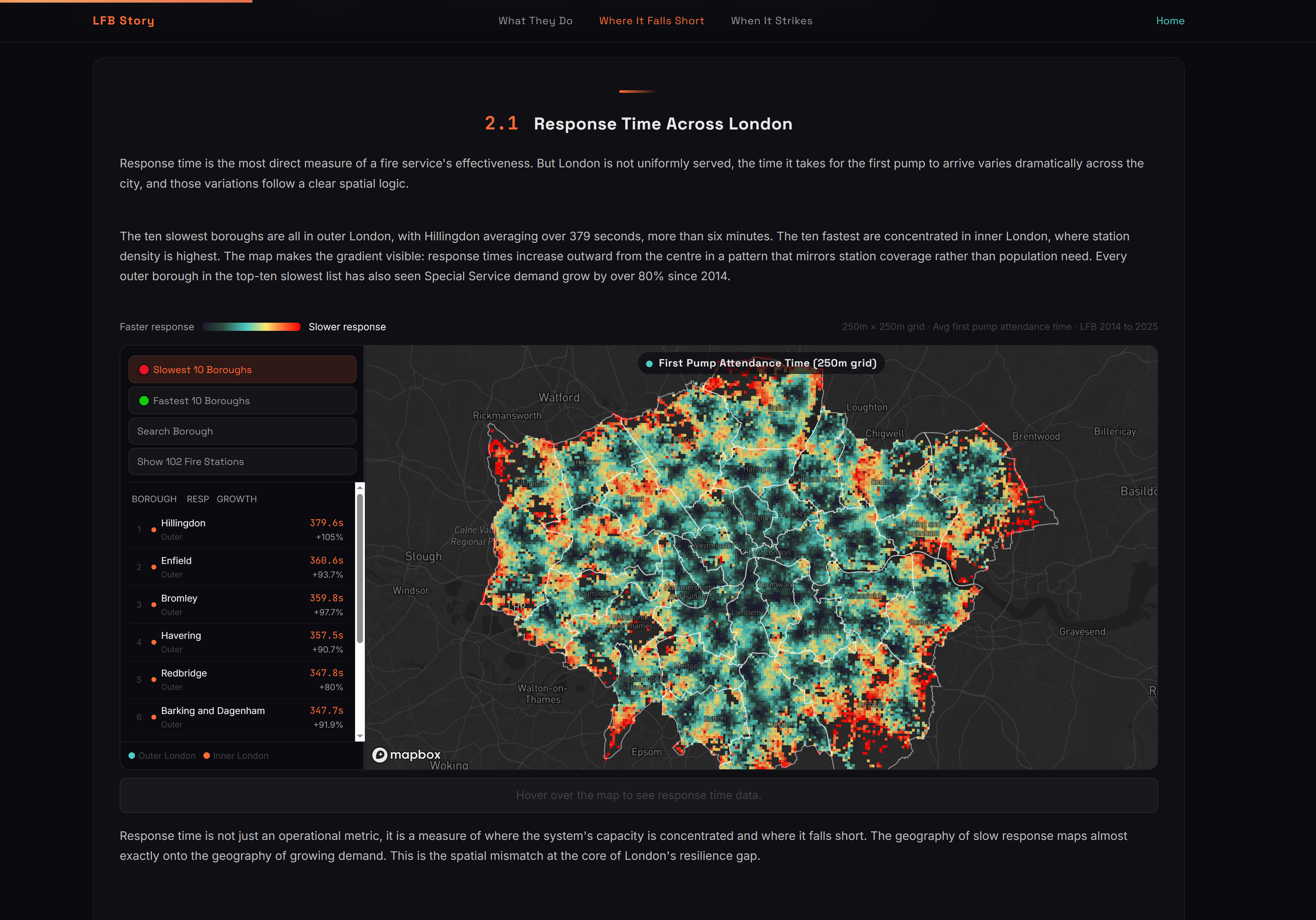
Accessibility analysis can also consider emergency response times. Yanxi Ren, Siyi Wu, Yifan Zhang analysed London Fire Brigade data, considering inequalities in coverage – https://220046.github.io/london_fire_story
Global Sustainability
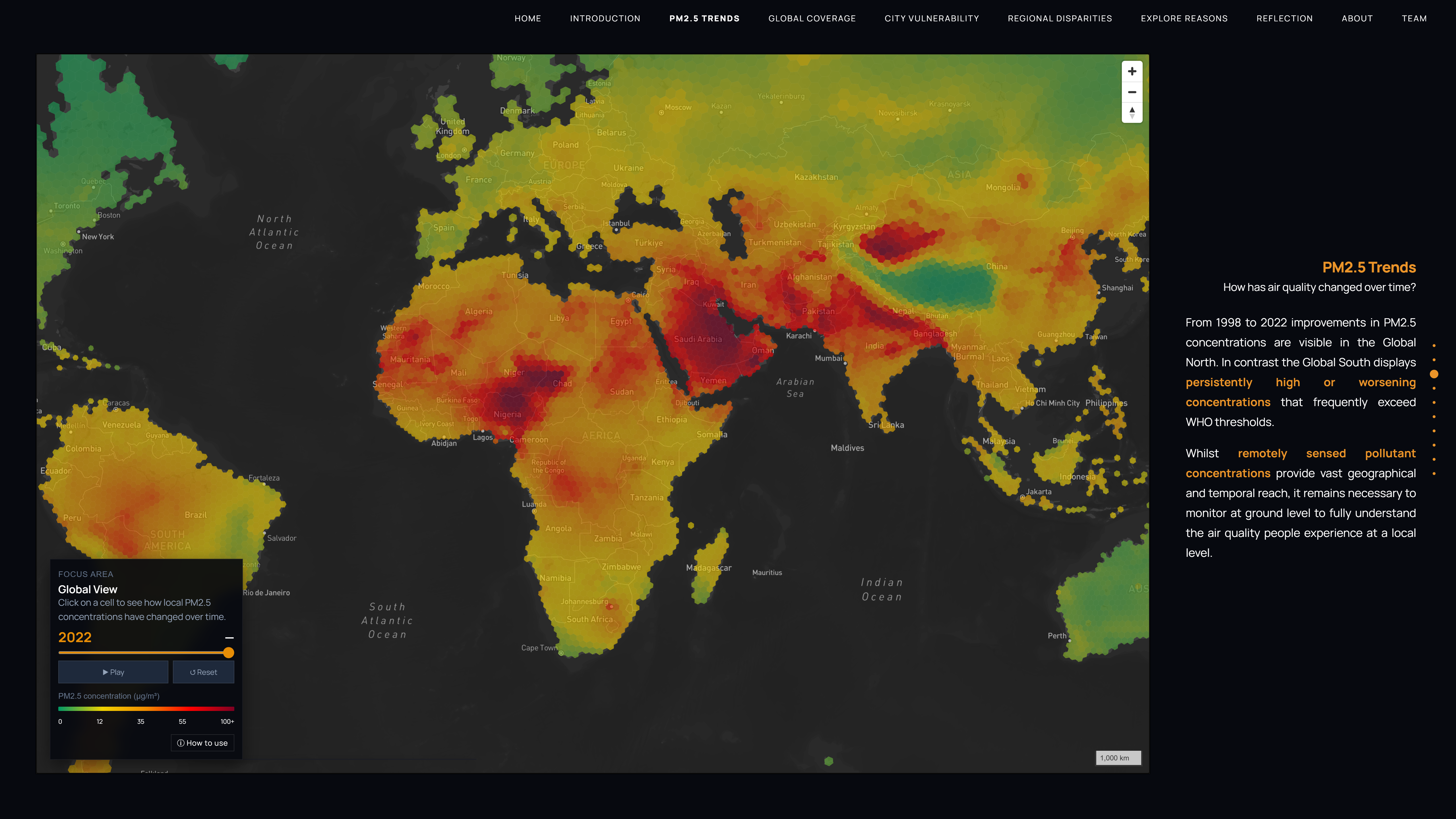
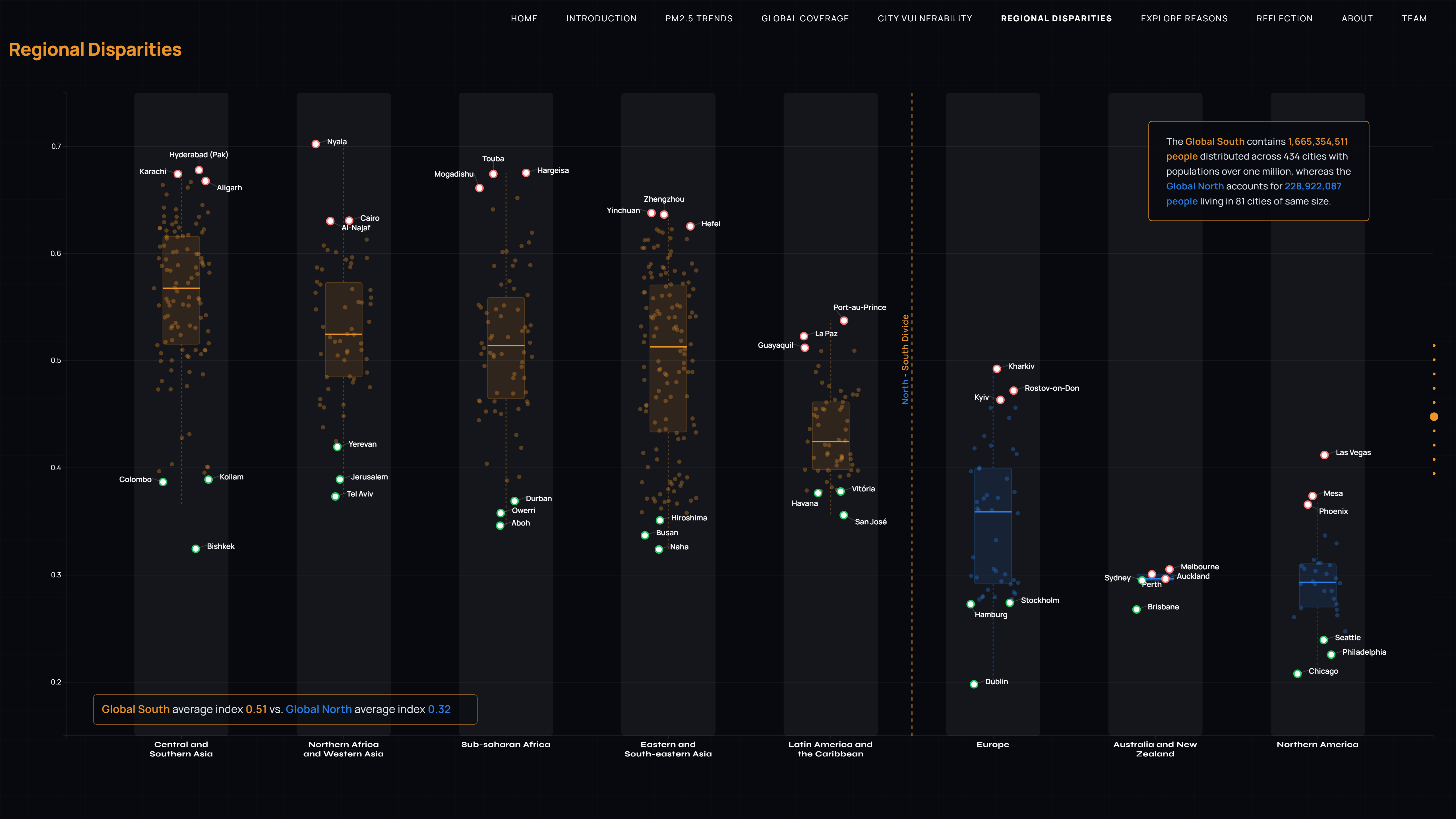
As well as visualising data at the city level, global data visualisations are also possible using remote sensing and global demographic datasets. Emily Dugmore, Santiago Soubie & Paul McNicholas analysed global air quality and considered how sensor coverage varies between cities in the Global North and South – https://ssoubie.github.io/data_viz_air_quality_project/
Transport Innovation
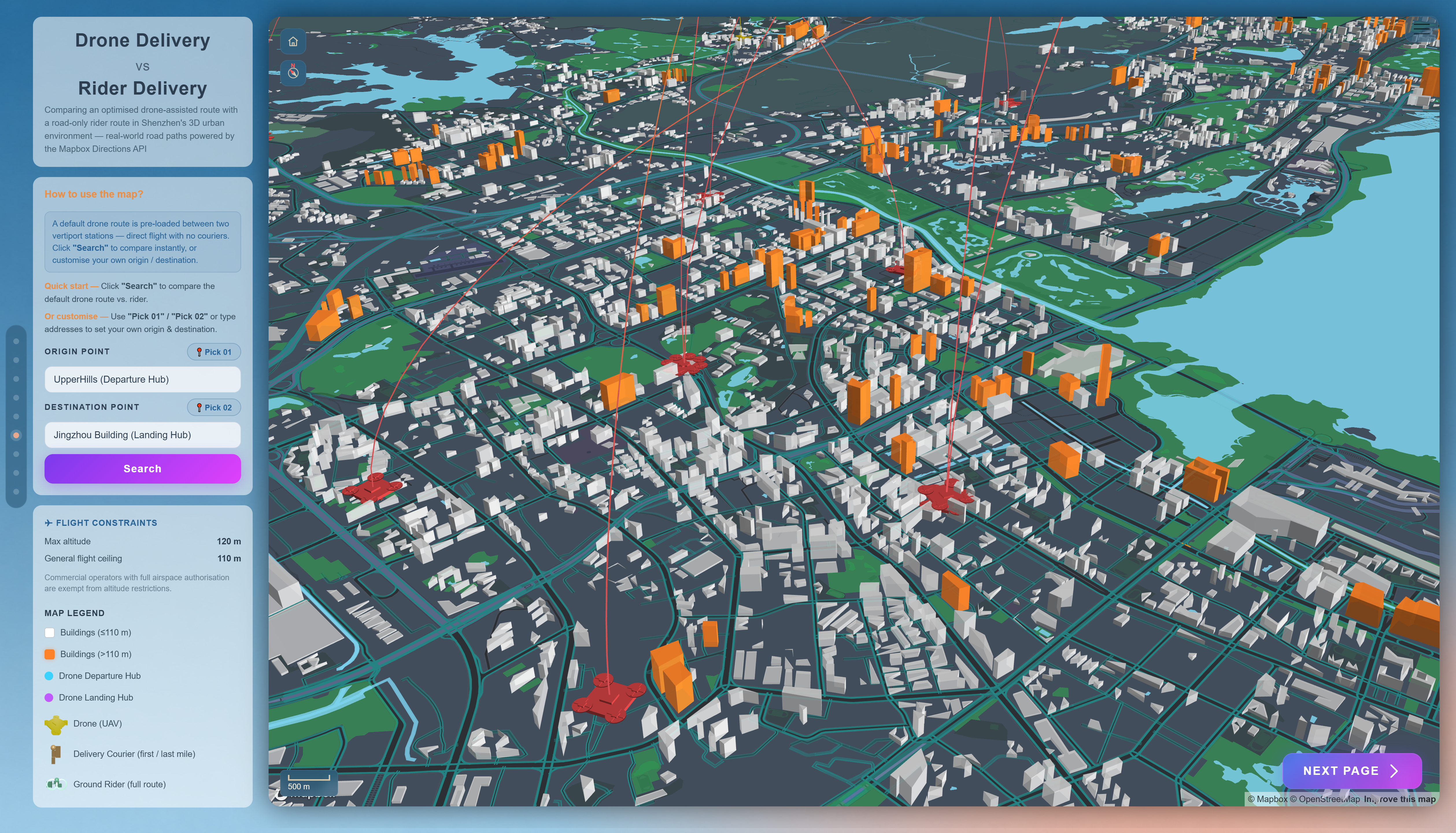
There are many ongoing innovations in urban transport networks, particularly around electrification and micro mobility. Several projects looked at these trends. Xinrui Qi, Zixuan Deng, Peiyao Zhang, Jiayi Jing considered drone delivery networks in the technologically advanced city of Shenzhen, and the competitiveness of drones against more traditional delivery modes. – https://xinruiqi.github.io/CASA0029-Data-Visualization-Group-Work/
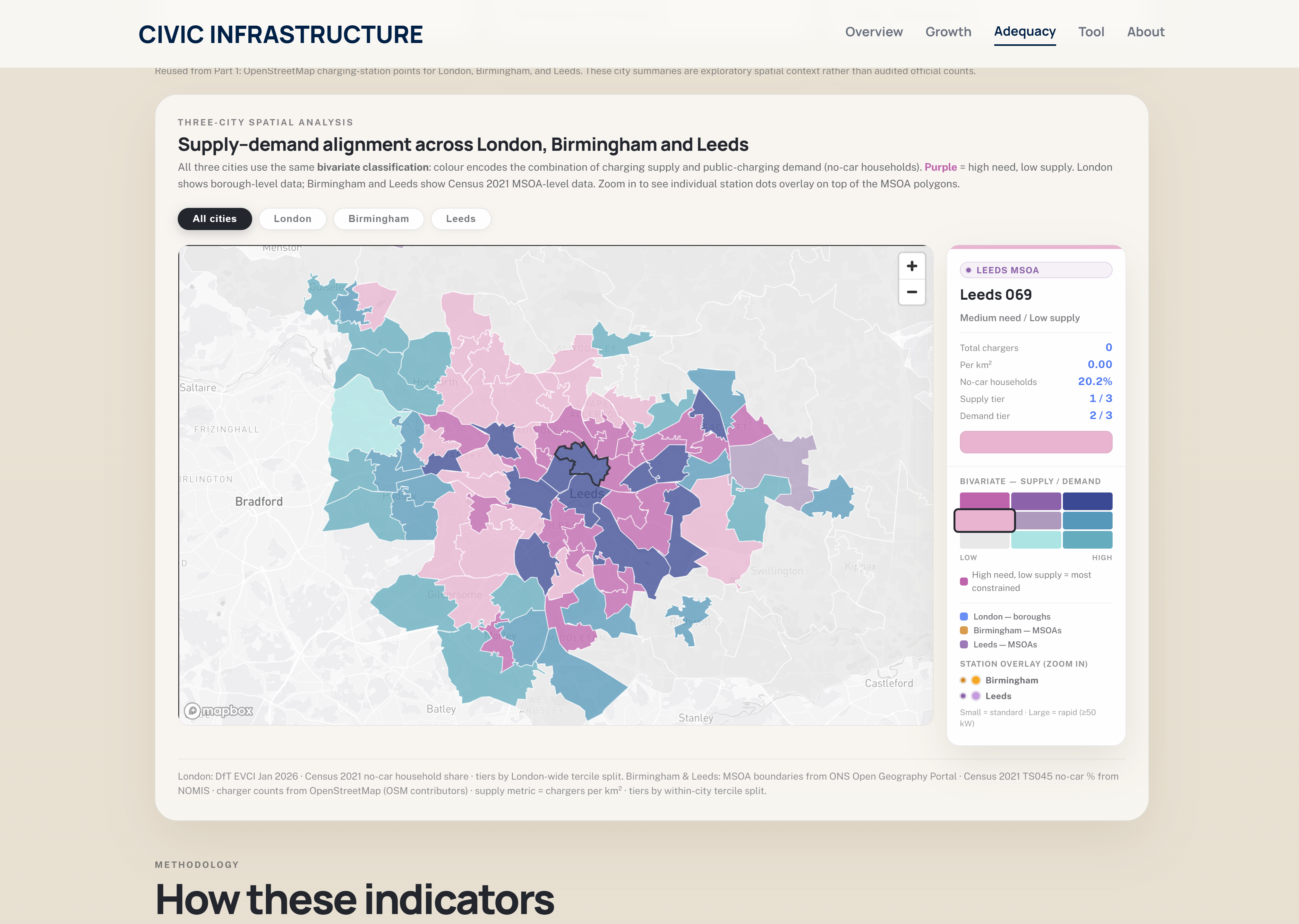
Penghe Gao, Xinlei Shi and Jiahui Li considered the growth of electric car charging networks in Leeds, Birmingham and London – https://helena-max-del.github.io/visualisation2026/
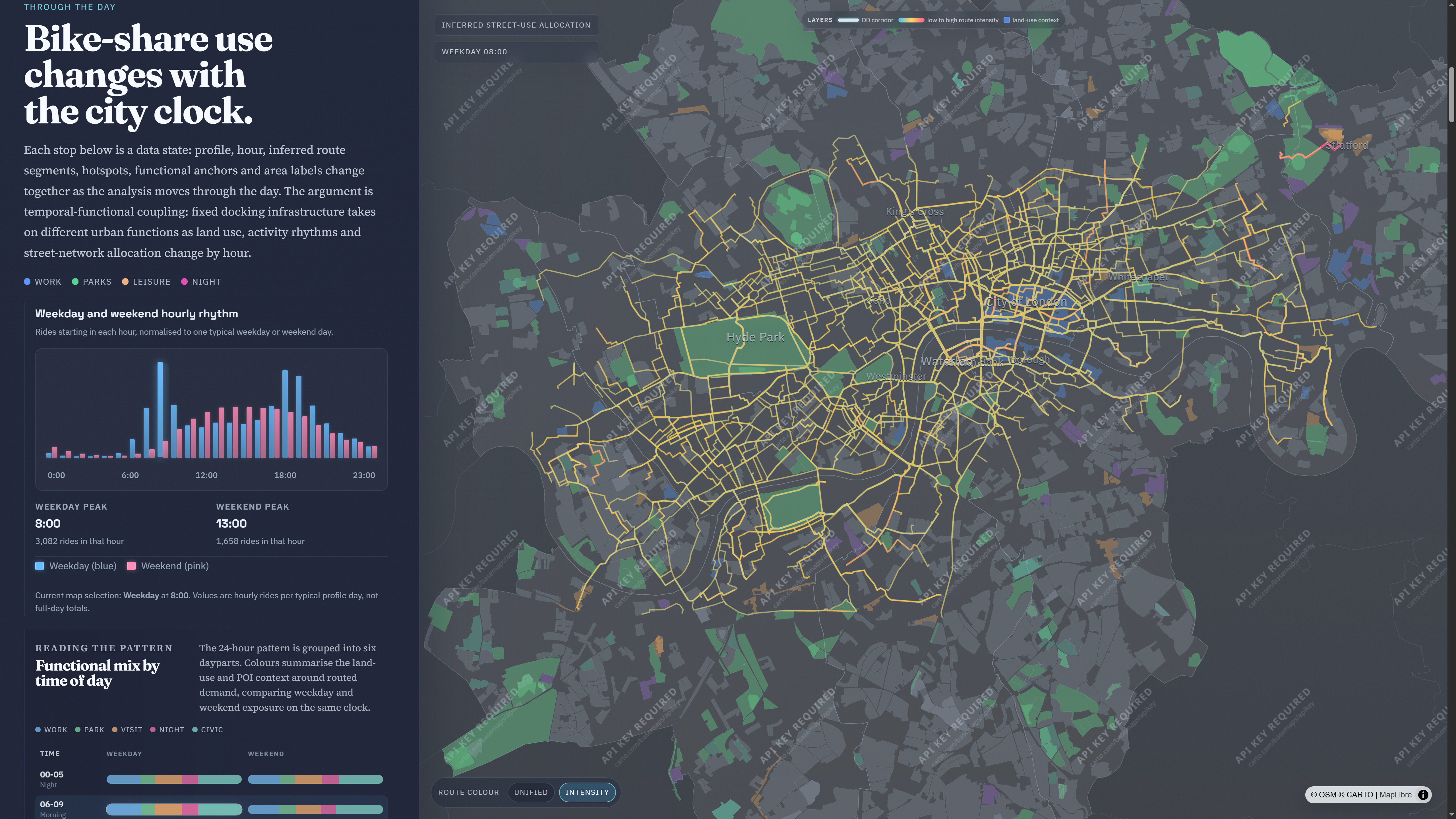
Bike sharing systems might have been around for several decades, but the spatio-temporal data they provide can be insightful for transport analysis. Rong Zhao, Zhuohang Duan and Dailing Wu looked at spatio-temporal patterns in London’s bike share usage – https://jameslemon2002.github.io/casa_viz_groupwork/
New York Data Visualisations
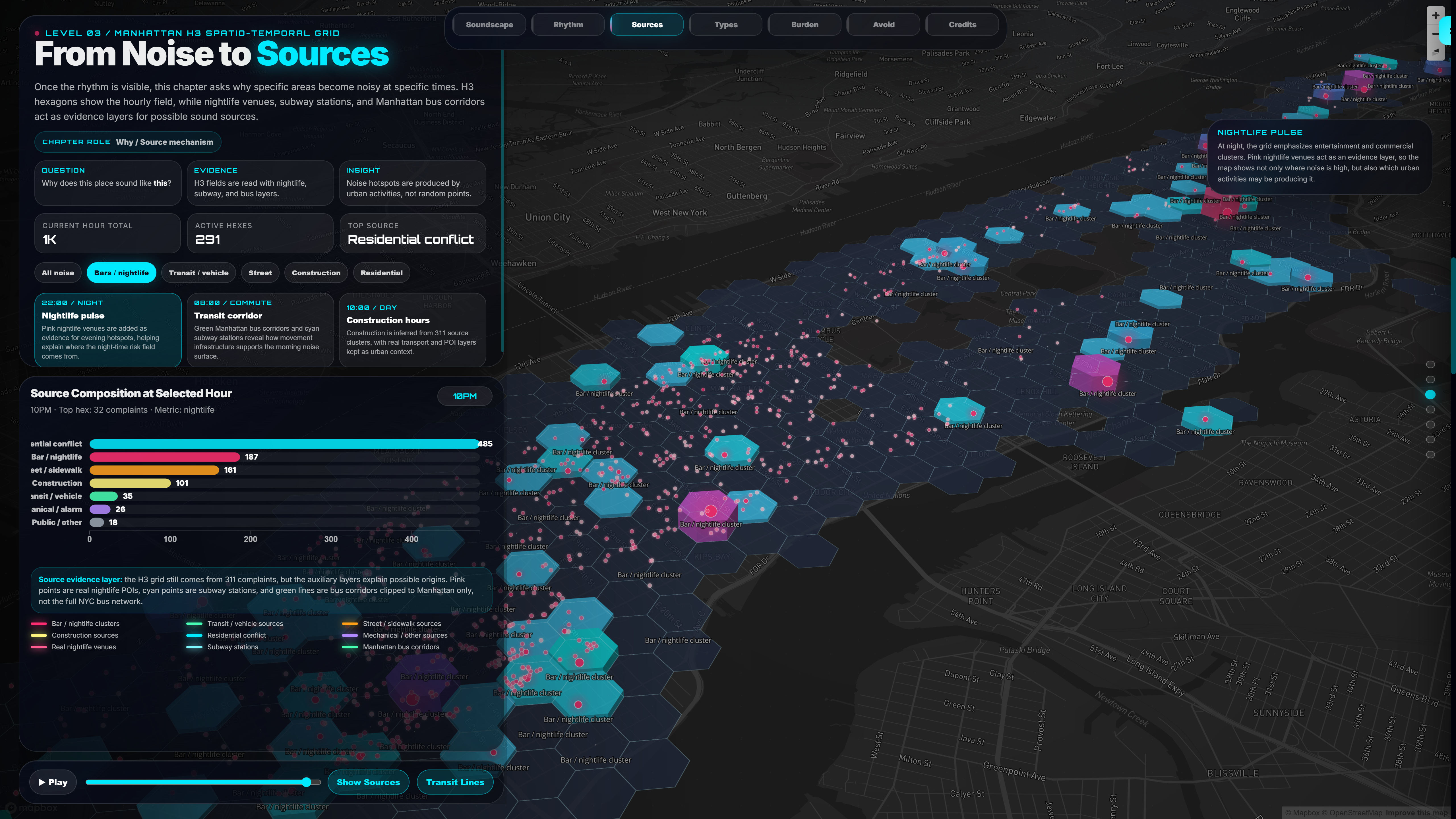
Good data availability is a key factor for the feasibility of data visualisation projects. Alongside London, NYC has some really interesting open datasets to explore. Tage Zhang and Chenwei Fang investigated noise pollution data and its sources with some stylishly designed hex-mapping – https://fakejunior.github.io/CASA0029-Group4/
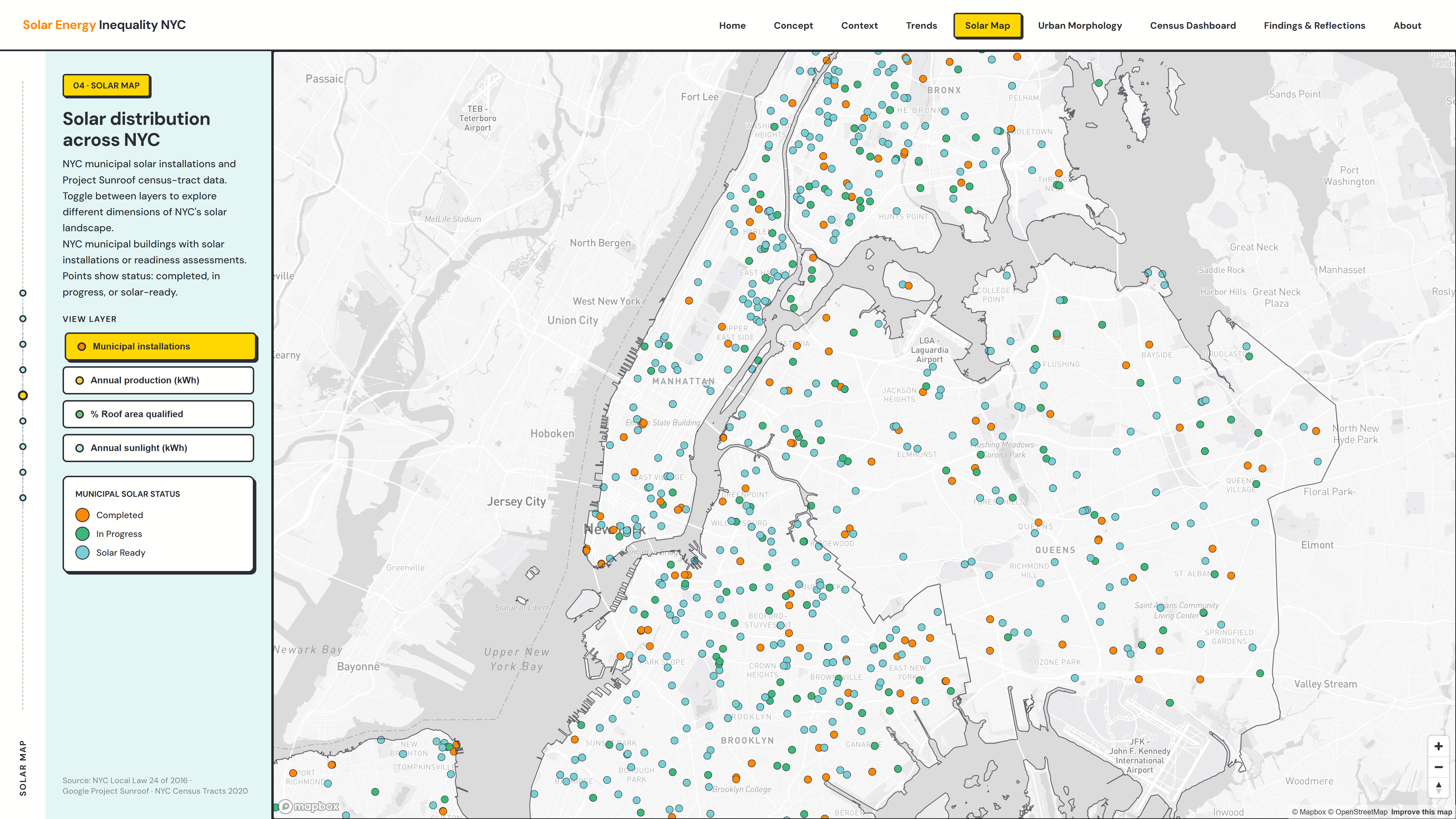
Renewables data is another interesting angle to explore. Jie Liu, Yutong Chen and Yifei Sun analysed the growth of solar networks in New York boroughs- https://yan02y.github.io/CASA0029-Groupwork/