Each year CASA master’s students demonstrate their spatial data visualisation skills with a group project. The theme this year was ‘Urban Futures’, and students have produced some very impressive and diverse work, experimenting with a range of visualisation tools and techniques. Click on the images below to visit the project websites.
Urban Resilience Projects Two groups explored at urban resilience and climate change. Some excellent interactive mapping work was created analysing Urban Heat Island effects in the Greater Bay Area of China (one of the world’s largest and fastest growing city regions) and at the potential impacts of sea level rise in New York City.
Transport Sustainability Projects Transport sustainability was another popular topic in urban futures. This included investigating 15 Minute City Accessibility in London (mapping the recent UBDC data), exploring the sustainability of the freight and logistics industry in the USA, and mapping the growth and sustainability of Los Angeles.
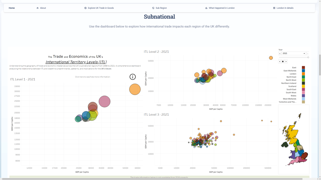
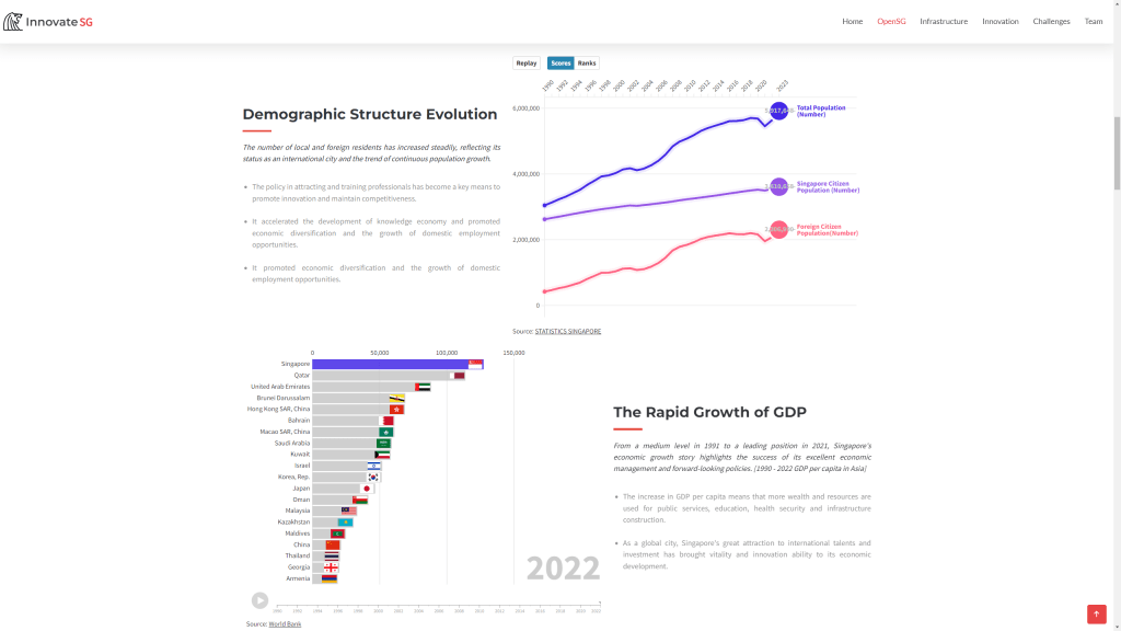
Economic Change and Innovation Projects Several groups explored different aspects of economic futures. This included analysing the UK’s international trade and sub-regional performance using interactive dashboards; and charting innovation policy in Singapore and its international competitiveness with animated charts and mapping.
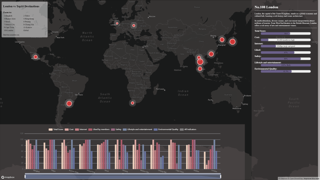
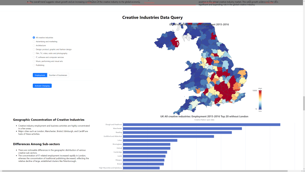
The phenomenon of mobile knowledge economy workers or Digital Nomads was explored in terms of analysing London compared to other global cities. Finally the importance of the Creative Industries to the UK economy was visualised using interactive maps and charts.
Social Change and Ageing Societies Projects Another increasingly important aspect of urban futures is planning for ageing societies. Two groups explored this topic, the first looking more particularly at ageing societies and facilities globally and with the case study of Bournemouth, and the second group exploring ageing societies both globally and in Manchester.
Each year MSc students at CASA demonstrate their spatial data visualisation skills with a group project. The theme this year was ‘Global to Local’, and the class of 2022 has produced some particularly excellent work, experimenting with a range of visualisation tools and techniques.
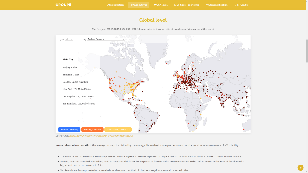
Energy and the Cost of Living Returning to the sustainability theme, several groups zoomed in on energy and affordability challenges that the world is currently experiencing. One group used some advanced D3 charting to tell the story of the UK’s varying energy imports and wider global affordability challenges (see image below). A different take was to chart the energy generation mix in major economies around the world. Another topical affordability challenge relates to housing in major cities, and one group mapped relative affordability of housing in major cities across the globe.
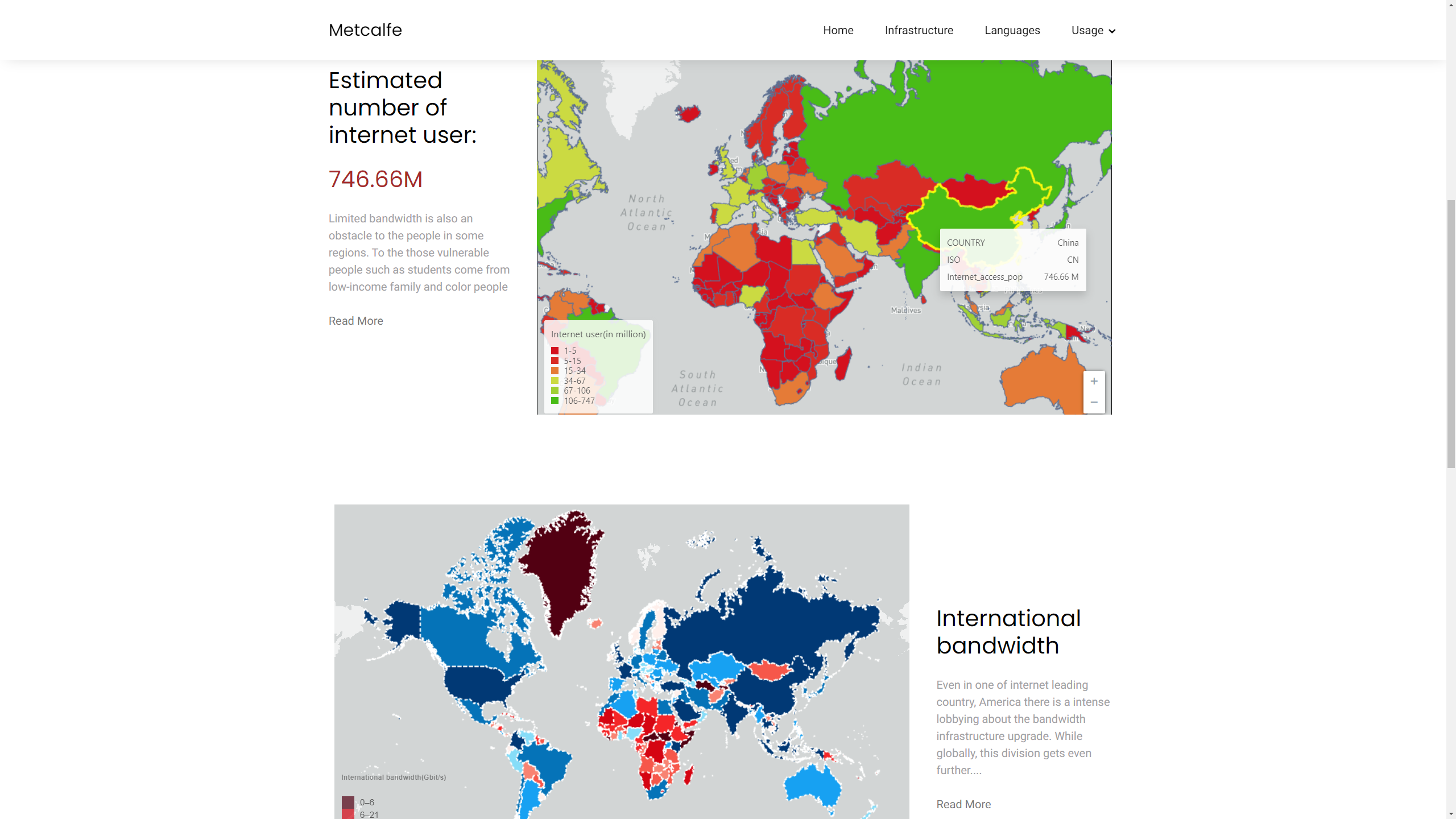
Global Digital Divides Finally, another interesting take was to think about online communities as interactions between global and local, including the changing geography of internet access and the division of the world into different online platforms by language and political and economic divides.
Global internet connections and the digital divide by Group 12 (Ruijie Chang, Maidi Xu, Zhiheng Jiang)
Here is the full list of project groups and websites-
Recent advances in public sector open data and online mapping software are opening up new possibilities for interactive mapping in research applications. Increasingly there are opportunities to develop advanced interactive platforms with exploratory and analytical functionality. This paper reviews tools and workflows for the production of online research mapping platforms, alongside a classification of the interactive functionality that can be achieved. A series of mapping case studies from government, academia and research institutes are reviewed.
The conclusions are that online cartography’s technical hurdles are falling due to open data releases, open source software and cloud services innovations. The data exploration functionality of these new tools is powerful and complements the emerging fields of big data and open GIS. International data perspectives are also increasingly feasible. Analytical functionality for web mapping is currently less developed, but promising examples can be seen in areas such as urban analytics. For more presentational research communication applications, there has been progress in story-driven mapping drawing on data journalism approaches that are capable of connecting with very large audiences.
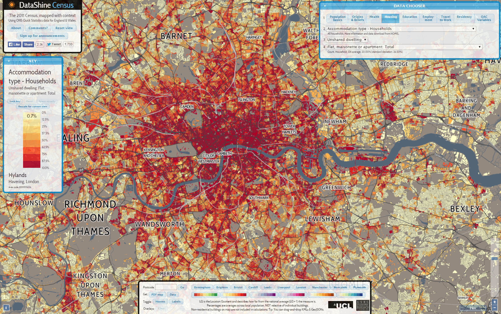
And here are some example images from the mapping sites reviewed in the paper-
The imminent UK General Election is fascinating for a host of reasons, not least because of the challenge to the long established dominance of the two main parties, Conservatives and Labour. Their share of the vote has been steadily in decline for over 50 years, from a high of 97% in 1951 to 65% in 2010-
Polls for 2015 indicate that the two main parties are tied at around 33-34%. But the difference in 2015 is that the rise of the smaller parties is going to translate into winning seats, most spectacularly in Scotland with the SNP set to wipe the floor and become the third biggest party in the UK with 50+ seats. There are also likely to be gains for the right wing party UKIP, and possibly for the Welsh nationalists Plaid Cymru and the left wing Green Party. The political map of Great Britain will look very different and increasingly fractured, with a coalition or minority government inevitable and essentially becoming the new normal-
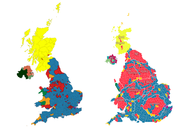
2015 General Election predictions from May2015.com (left) and Guardian (right) in cartogram format.
How can we understand this changing political geography? There is a strong tendency towards spatial clustering of similar voting patterns, with votes for minor parties higher further away from the economic and political core of London. This relates to the nations of Scotland, Wales and Northern Ireland but also to regions like South West England and coastal towns where UKIP and the Greens could pick up seats. There is also a strong geographical element to the division between Labour and Conservative seats, with Labour strongly urban and northern while Conservatives are dominant in more rural areas and in the South East.
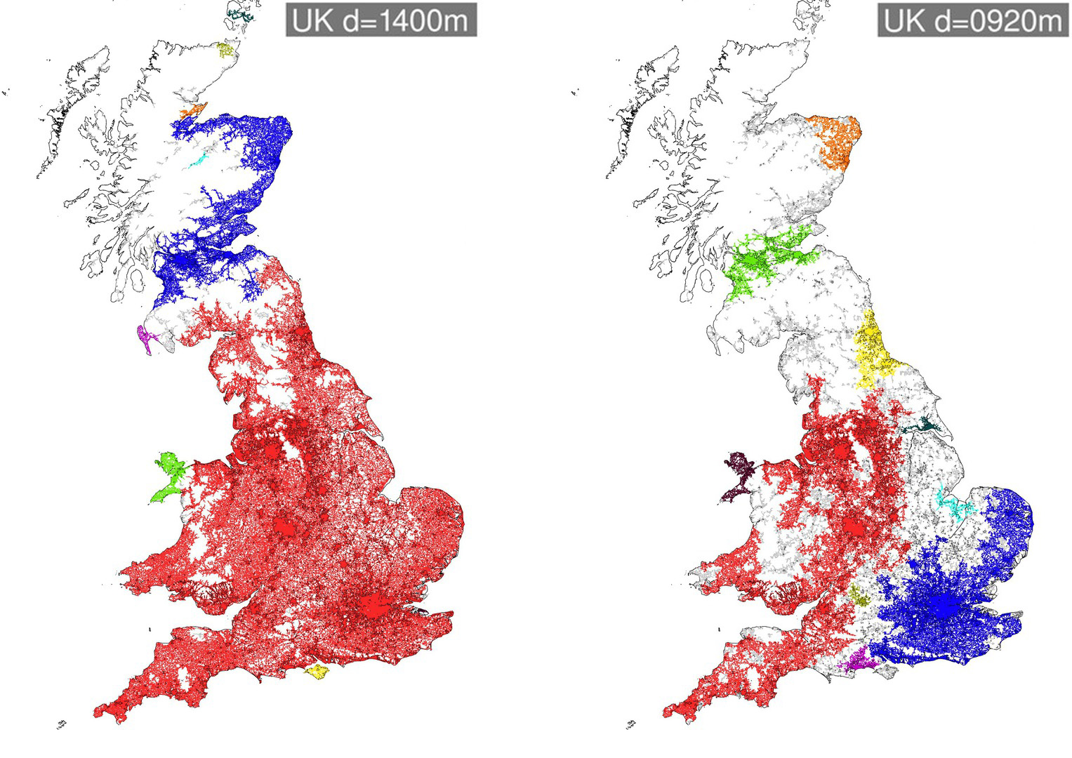
In research at CASA we have been using percolation as a method of exploring urban regions at multiple scales, and have a new paper applying percolation to understanding Britain’s political geography (paper by Carlos Molinero, Elsa Arcaute, Mike Batty and myself). The paper proposes that voting patterns are fracturing along long-standing historic national and regional divisions in Great Britain, and seeks to test this proposition using percolation analysis. The percolation method defines regions by building clusters of road junctions according to a threshold distance, with the road network used as a proxy of population settlement and connectivity. At a threshold distance of 5km Great Britain is one giant cluster-
We can then reduce this threshold distance to see how Great Britain fractures. At a threshold distance of 1.4km Scotland fractures from England & Wales (although interestingly some of the Scottish borders remain part of the England & Wales cluster). Then at a distance of 900m the North and South of England split, as does the North East of England and North East of Scotland-
By 800m South Wales splits off from England, and the South West and East Anglia become separate regions. Finally at a distance of 300m, we are left with the core of large cities-
These various levels of percolation clusters can be viewed as a tree (below).
Our question is then, do these regions generated through percolation analysis bear any relationship to voting patterns? We can test this by classifying parliamentary constituencies according to the composition of percolation clusters that fall within each constituency. Each of the parliamentary constituency groups is assigned an ‘average voting behaviour’ from the real voting behaviour in 2010, in terms of a vector of percentage votes for each of the parties. The average voting behaviour of each group can be compared to the real voting behaviour in terms of the percentage error. We can compared the percolation clustering outcomes against results using different datasets. Clusters created using the real voting data naturally produce the lowest error. It is interesting however that the percolation based results outperform clusters produced using common socio-economic data such as socio-economic class, age and education level.
Making Predictions for 2015 Finally the percolation clusters can also be used to try to make predictions about the forthcoming election using a universal swing method on the 2015 data (for full details see the paper). In the series of maps below we have (from left to right) the prediction using the real 2010 data and latest polls; the prediction using percolation clusters and occupational class data; the prediction using only percolation clusters; and the prediction using only socio-economic class data. The percolation based results appear relatively close to the prediction based directly on the real data. The percolation method is highly clustered spatially, leading to an exaggeration of regional divisions in the UK-
In terms of the total seats predicted, the results are not too far off current polling predictions. The percolation based method tends to exaggerate Labour’s predicted number of seats, as Labour benefit from a strong clustering of their vote in northern city-regions.
Overall the percolation method is very a promising approach for understanding regional divisions in the UK, and we continue this line of inquiry in further research. It remains to be seen whether the political geography of the UK will continue to fracture further along these regional lines. A key factor will be whether the rise of smaller parties raises the pressure for voting reform, as the First Past the Post System is becoming increasingly misrepresentative of the UK’s voting patterns and is failing to deliver the single party majority that is supposed to be the FPTP system’s main asset.
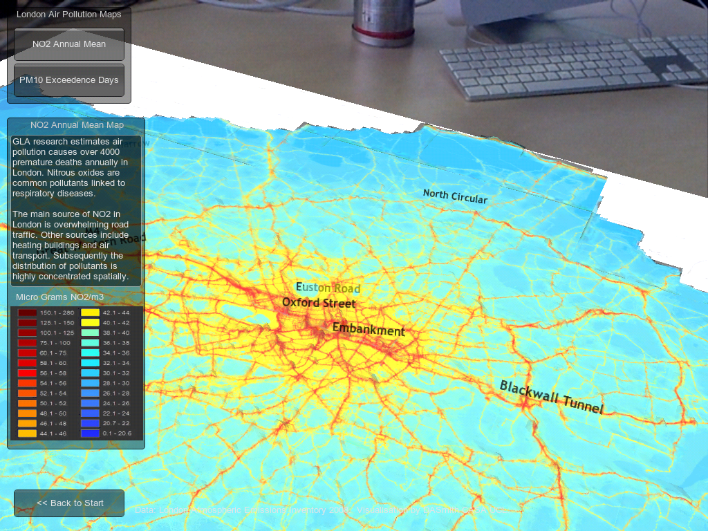
For my own exhibit I had a try at developing an augmented reality app to explore 3D urban data. The idea was to use iPads as the window into a 3D urban map of London, allowing the user to navigate around the virtual model to see different perspectives and focus on interesting parts of the data. Do we respond differently to data with a seemingly physical presence? Well this is one way to find out…
The app was developed in Unity using the Vuforia AR extension, and I was impressed with how accessible augmented reality technology has become using such tools. Firstly GIS data on urban form in London and air pollution was exported from ArcMap into Unity, and an interface to the data was developed. The core app without the AR capabilities can be viewed here (Unity web player required).
Next I followed the Vuforia iOS tutorials to add AR functionality. This approach uses a tracking image to position and scale the 3D model to the user’s viewpoint. Nice features of Vuforia include the ability to select your own tracking image, and that it can handle some occlusion of the image when the user moves to a particular part of the model, although a part of the tracking image must be in view of the camera at all times otherwise the model disappears from the user’s view. A large A0 poster was used as the tracking image, giving users greater flexibility in navigating the data.
The resulting app is very intuitive and delivered the desired ‘wow’ factor with many of the attendees at the conference. The AR aspect certainly encouraged users to explore the data, and identify patterns at different scales.
Adding more interactivity, animation and sorting out some issues with the target image (multiple smaller images would have worked better than one very large image) would all be nice for version 2. I’ll do a more detailed tutorial on the workflow developed later on if this is of interest.