Can the Green Belt be Developed Sustainably to Ease London’s Housing Crisis?

The housing crisis in London has become increasingly severe in the last decade with much higher prices, rents, and largely static incomes, while housing development volumes have remained consistently below targets. Green Belt reform is often cited as a solution to boost development, though this has been off the agenda during the last 13 years of Conservative government. Recent announcements by the Labour leadership, supporting Green Belt reform and setting ambitious targets for housing development, could change this state of affairs with the general election coming in 2024.

This article analyses housing development in the London region from 2011-2022 (full CASA Working Paper here), using the Energy Performance Certificate Data. There is strong evidence that the Green Belt is a major barrier to development and is in need of reform. On the other hand, there are very substantial challenges around the quality and sustainability of new build housing in the South East. The analysis shows that, outside of Greater London, new build housing typically has poor travel sustainability and energy efficiency outcomes. Any release of Green Belt land needs to be dependent on travel sustainability criteria and improved energy efficiency for new housing. Sustainable housing outcomes are much more likely to be achieved through prioritising development in existing towns and cities and in Outer London.

London’s Housing Affordability Crisis
House prices in London doubled between 2009 and 2016, pricing out households on moderate and low incomes from home ownership, and translating into rent increases, longer social housing waiting lists, increased overcrowding and homelessness (see Edwards, 2016; LHDG, 2021). Price rises are linked to on the one hand to the financialization of housing (exacerbated by record low interest rates and Help to Buy loans in the 2010s) and on the other a long period of low housing supply, stretching back to the 1980s and the erosion of public housing.

The impact is record levels of unaffordability, with Inner London average house prices reaching £580k and Outer London £420k in 2016 (see chart below). The median house price to income ratio for Inner London soared from 9.9 in 2008 to 15.1 in 2016; for Outer London the ratio increased from 8.2 in 2008 to 11.8. In addition to high prices, first-time buyers have also been hit with record mortgage deposit requirements, with average deposits reaching £148,000 for Greater London, compared to around £10,000 in the late 1990s (Greater London Authority, 2022). Owner occupation is now effectively impossible in Inner, and much of Outer, London for low and moderate income buyers.

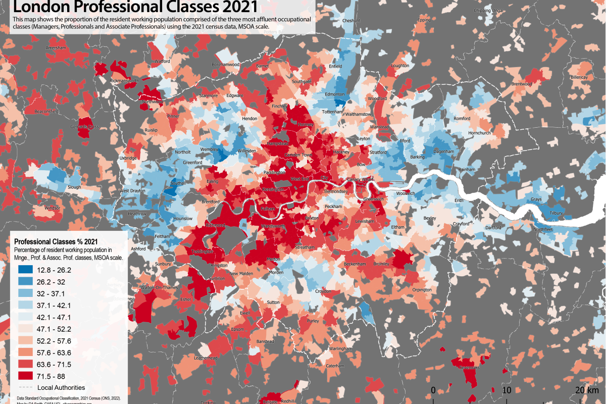
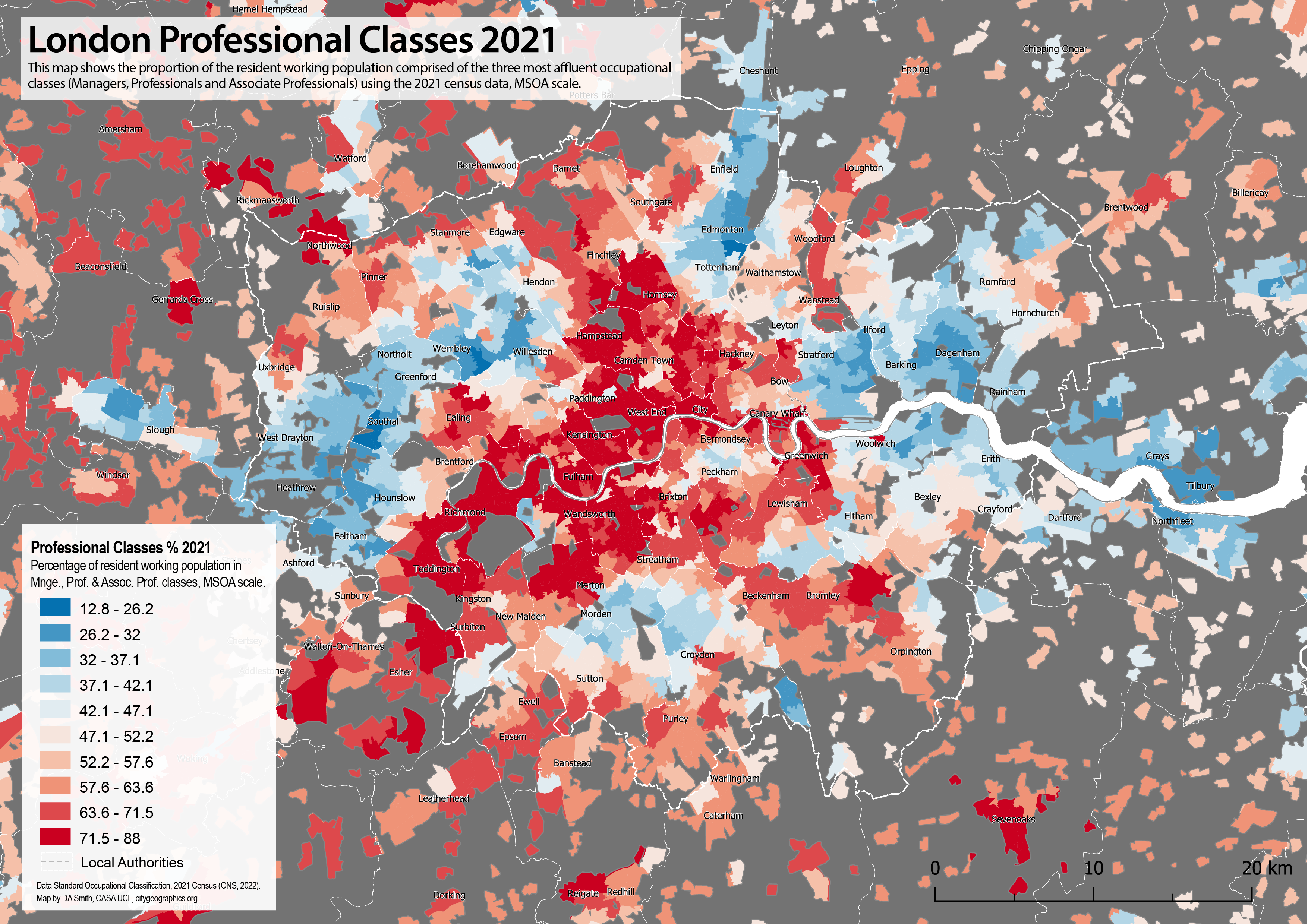
There have also been substantial increases in prices across the London region. The map below shows prices per square metre in the South East showing four radial corridors of high prices extending beyond Greater London into the Green Belt. East London is increasingly mirroring West London with two radial corridors of higher prices extending north-east and south-east from Inner East London. These are the primary areas of gentrification in London in the last decade (discussed in previous blog post), squeezing out what was the largest area of affordable market housing. There is also a distinct spatial alignment between London’s Green Belt boundary and higher prices, which is evidence of regional housing market integration, and that Green Belt restrictions are pushing up prices.

New Build Housing Delivery in the London Region
Greater London has struggled to meet its housing targets in the last decade. The current London Plan target is for 52k annual completions, which, as can be seen in the graph below, London is significantly short of. The 52k annual target has been criticised as being too low, with other estimates of housing need calculating that 66k or even 90k houses per year are needed (LHDG, 2021). Given the extremely high prices, affordable housing tenures are needed more than ever, yet affordable housing delivery has fallen in the 2010s (although note there has been progress in affordable housing starts in the last two years). Finally, the recent impacts of the pandemic and high interest rates have hit market housing activity, meaning that London will very likely continue to miss its overall housing targets for the next 2-3 years.

We can look in more detail at the geography of housing delivery at local authority level in the scatterplot below. There is high development in most of Inner London, and some Outer London boroughs. These boroughs contain Opportunity Areas (major development sites in the London Plan): Canary Wharf in Tower Hamlets; the Olympic Park in Newham; Battersea Power Station in Wandsworth; Hendon-Colindale in Barnet; Wembley in Brent; Old Oak Common-Park Royal in Ealing; and Croydon town centre. Given that there are only a few Opportunity Areas in Outer London, this leads to relatively low delivery in most Outer London boroughs, and points to the need for a wider strategy for Outer London development.

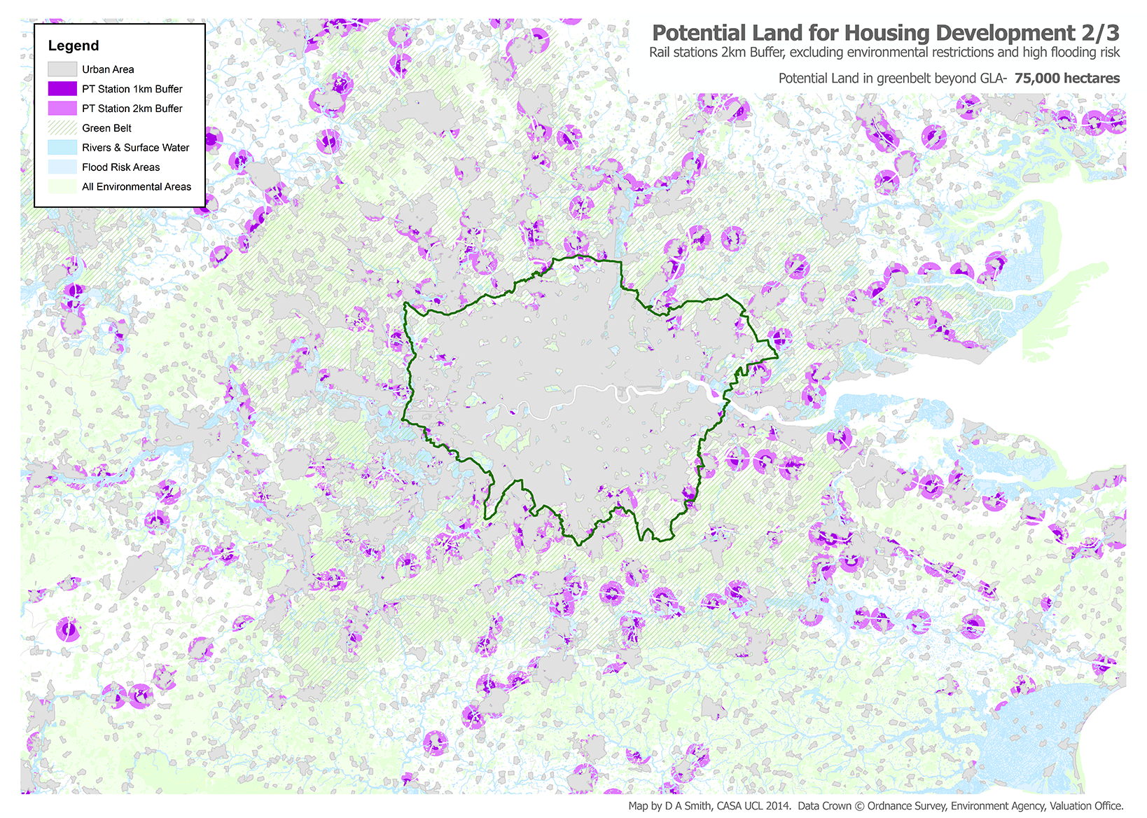
Meanwhile, there is low development activity in nearly all Green Belt local authorities, much lower than London boroughs and also below the average for the rest of the South East. Green Belt restrictions affect both local authorities in the commuter belt and also Outer London boroughs as well (e.g. Enfield, Bromley) with 27% of Outer London consisting of Green Belt land. We can confirm how rigidly Green Belt restrictions are being applied using the official statistics, which calculate that the London region Green Belt land area was 5,160km2 in 2011 and 5,085km2 in 2022 (DLUHC, 2023). Therefore, only 74km2 or 1.4% of Green Belt land was released over the decade (this figure is for all development uses, not only housing), which is strong evidence of minimal change.

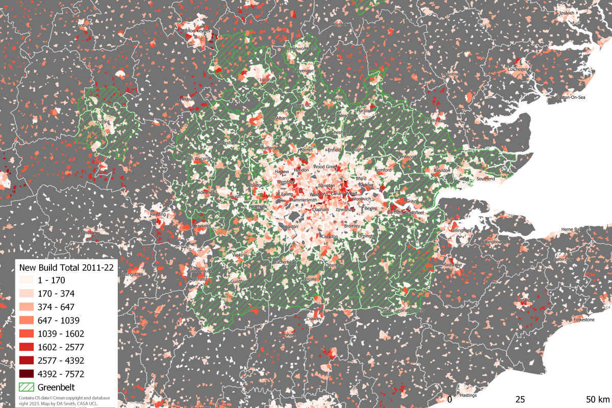
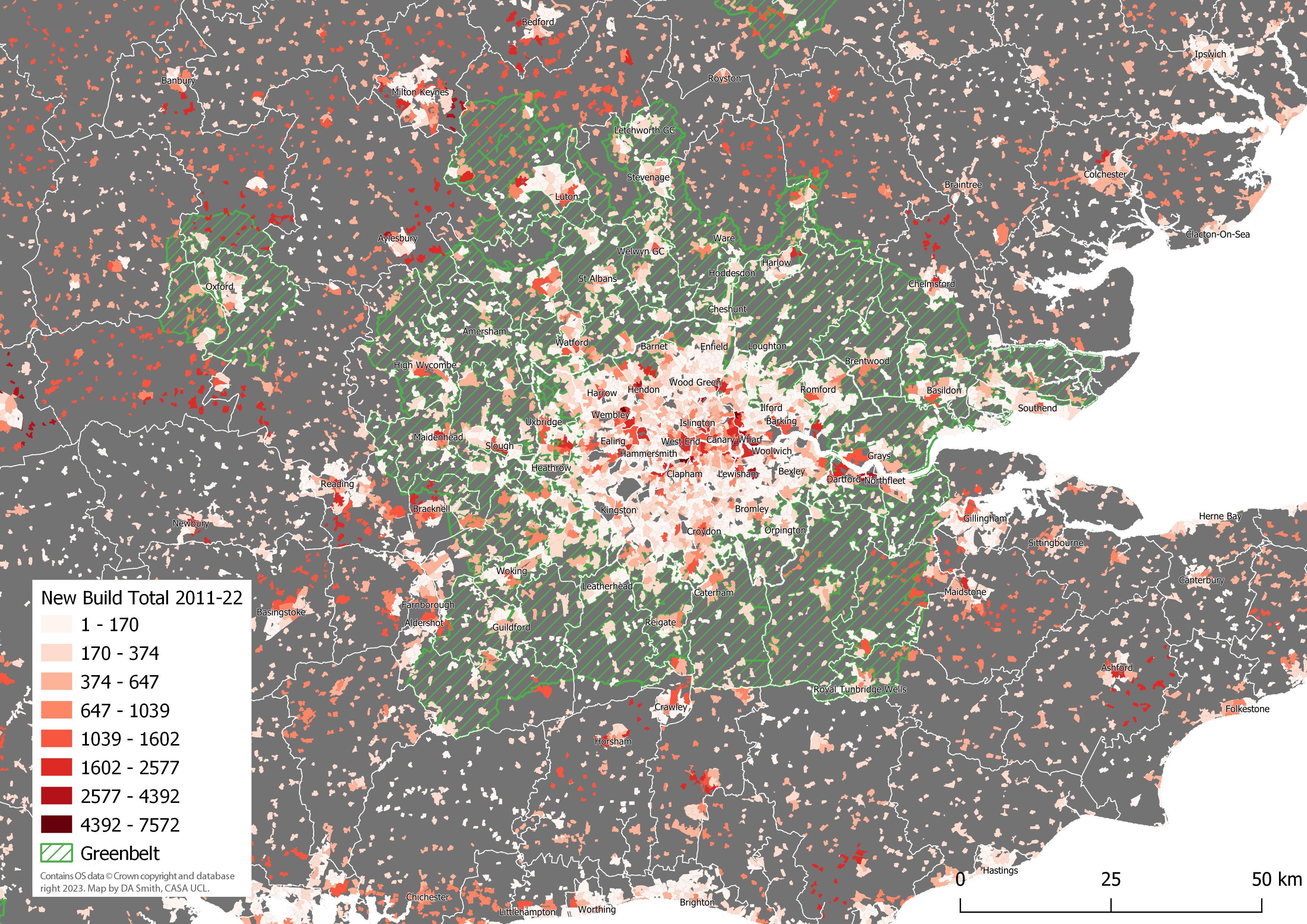
One final impact of the Green Belt can be seen by mapping development in the last decade as shown below. In addition to the patterns of high development in Opportunity Area sites, and generally low development in the Green Belt, there is a ring of high development activity just beyond the Green Belt boundary. This ring includes dispersed car-dependent development in semi-rural areas, and the expansion of medium-sized towns and cities such as Milton Keynes and Reading. This pattern looks very much like Green Belt restrictions are pushing development beyond the Green Belt boundary, creating sprawl-type patterns in several authorities. One important caveat is that several South East cities have strong economies in their own right, particularly technology industries in the Oxford-Milton Keynes-Cambridge arc, creating local development demands in addition to London-linked demand.

Potential for Green Belt Reform
With Greater London consistently falling short of housing targets, reform of the Green Belt has been cited as a promising solution (see for example Mace, 2017; Cheshire and Buyuklieva, 2019). The release of Green Belt land could greatly boost development and ease prices. Green Belt reform could also be a substantial source of revenue for austerity-hit local authorities, if authorities are given the powers to purchase Green Belt land at current use value and benefit from the land value uplift (this is part of the Labour proposals).

Traditional objections to Green Belt development focus on rural land preservation. Yet the Green Belt is massive in scale – 12.5% of all the land in England is Green Belt. London’s Green Belt is 5,085km2, or three times bigger than Greater London. Medium density housing development would take up a small proportion of this land. For example, building 100k dwellings at a gross density of 40 dwellings per hectare would add up to 25km2, or less than 0.5% of the London region’s Green Belt. Appropriate Green Belt reform could simultaneously allow for a moderate increase in development and improve environmental aspects of the Green Belt – the current environmental record of the Green Belt is mediocre on key measures such as biodiversity – through green infrastructure funding and principles of Net Biodiversity Gain. The land preservation arguments against Green Belt development do appear to be solvable. There are however further sustainability impacts from housing development to consider, including transportation and housing energy impacts, as discussed below.

Sustainability Impacts- Travel
Transport is the largest source of GHG emissions in the UK – 26% of all emissions in the latest 2021 data (DBEIS, 2023). The route to Net Zero requires both the electrification of transport systems and a significant mode shift from private cars to public transport, walking and cycling (HM Government, 2021). Greater London is a UK leader in sustainable travel, but this is not the case for the wider London region, much of which is car dependent. The analysis here uses car ownership and commuting mode choice data from the 2021 census to create a Travel Sustainability Index, as shown in the table below, which classifies Greater South East residents into 6 travel classes of around 4 million people. The South East covers a very wide range of travel behaviours, from an average of 20% commuting by car and 62% zero car households in the most sustainable class 1; to as high as 87% car commuting and 6% zero car households in the most car-dependent class 6.

Travel Sustainability Classes Average Statistics (2021 Census data)

Travel Sustainability ClassTravel Sustain. IndexCar
Commute %
Public Transport Commute %Walk & Cycle Commute %Car Owning Households %Residential Net Density (pp/km2)Total Pop. in South East
145-8220.348.526.438.351.5k3.56m
230-4541.633.220.961.532.1k4.03m
321-3060.618.117.674.725.0k4.03m
415-2171.610.914.283.320.2k4.16m
510-1580.06.510.989.416.4k4.34m
61-1087.33.66.794.111.1k4.29m

Mapping the travel sustainability classes highlights the stark travel behaviour differences between Greater London and the wider region. The Inner London population-weighted average travel sustainability score is 51.6 (class 1), and Outer London is 32.1 (class 2). The Green Belt is overwhelmingly in car dependent classes 4 and 5, with an overall population-weighted average of 16.4 (class 4). The Rest of the South East has a population-weighted average score nearly identical to the Green Belt at 16.5, emphasising the disappointing levels of car dependence in the Green Belt despite its rail infrastructure and proximity to London.

The patterns shown in the above map clearly present a challenge for Green Belt development, as new housing in the wider region risks extending patterns of car dependence. Car dependent areas include some locations next to rail stations (proximity to rail stations has been advocated as a criteria for prioritising Green Belt land for housing). We can directly measure the travel sustainability of housing development from the last ten years by matching the output areas locations of new housing to the Travel Sustainability Index scores. This is shown in the scatterplot below, where Inner London boroughs score highly with this measure, followed by Outer London. Much of the housing development in the wider region scores poorly in terms of travel sustainability, including in areas with high housing development such as Bedfordshire and Milton Keynes.

Although travel sustainability is generally low in the wider region, there are trends identifiable in the above results that can be used as basis for guiding more sustainable development. Several towns and cities show moderately sustainable travel outcomes, including the Green Belt towns Luton, Watford, Guildford and Southend, and wider South East towns and cities Brighton, Reading, Oxford, Cambridge, Portsmouth, Norwich and Southampton. Generally, development in existing towns and cities is likely to be more sustainable than developing smaller settlements and more dispersed rural areas. There are also noticeably better results in active travel-oriented cities such as Brighton and Cambridge. Overall, if we want Green Belt housing development to minimise travel sustainability impacts, then it would be most realistic to achieve this by extending existing towns and cities, both within the Green Belt and in the wider South East. Promoting development in Outer London boroughs also looks to be an efficient strategy given generally good travel sustainability levels in Outer London, and that Outer London is 27% Green Belt land.

Sustainability Impacts- Energy
Another important sustainability impact of new build is energy use and carbon emissions resulting from space and water heating, which we can estimate from the Energy Performance Certificate data as shown below. CO2 emissions per dwelling are considerably lower in Inner and Outer London, with overall London emissions per dwelling around two thirds of the value for the Green Belt and Rest of the South East. This is only partly due to smaller dwelling sizes, as CO2 emissions per square metre in London are significantly lower as well. The lower emissions in London housing can be explained by the much higher proportion of flats and also the use of community/district heating, with three quarters of all new build in Inner London and 47% of new build in Outer London connected to community heating networks. The community heating approach is only efficient for high density developments. For medium and lower density developments, air and ground source heat pump technologies are a key technology for improving energy efficiency and replacing gas boilers. The statistics from 2011-22 are very disappointing on this front, at 4% of new build with heat pumps in the Green Belt and 6% in the Wider South East.

New Build Annual Average CO2 Emissions and Energy Summary 2011-2022 (Data: EPC 2023)

SubregionCO2 per Dwelling
(tonnes)
CO2 per m2 (kg)Energy Consumption
(kWh/m2)
Community
Heating %
Heat Pump % (air + ground)
Inner London0.9312.972.975.22.7
Outer London1.0415.387.246.92.8
Green Belt1.6018.7106.97.93.5
Rest of South East1.5317.297.75.75.9
All Subregions1.3416.392.527.04.3

The average annual CO2 emissions by dwelling are summarised at the local authority level in Figure 19 (note y axis starts at 0.5). Similar to the travel sustainability results, London boroughs have considerably more sustainable results. Town centres in the South East again are the best performing outside of London, including Cambridge, Southampton, Eastleigh, Reading, Luton, Watford, Woking and Dartford. As the chart shows average CO2 per dwelling, there is a connection between affluence and dwelling size, with higher income boroughs such as Richmond Upon Thames and particularly Kensington and Chelsea, having high emissions. Overall however, energy efficiency is much better in London boroughs and this is a further challenge for the sustainability of Green Belt development. Similar to the travel sustainability analysis, the results point to the extension of existing towns and cities, and Outer London development, as the most sustainable development strategies.

Summary
There is a widespread consensus that London needs to build more housing to meet demand and try to reduce record levels of unaffordability. Yet London has been consistently short of meeting housing targets for the last decade, despite substantial growth in Inner London. Green Belt restrictions do appear to have played a major role in constraining development, with low levels of new build in Green Belt local authorities, and in Outer London boroughs with extensive Green Belt land. There is also a significant price premium in Green Belt areas compared to the wider South East.

This analysis agrees with research advocating Green Belt reform. Travel sustainability conditions are needed to avoid this reform producing highly car dependent housing, such as has been occurring in Central Bedfordshire and Milton Keynes (where the East-West should have been built much earlier). Pedestrian access to rail stations is a sensible starting point for prioritising Green Belt land for housing, but it is not sufficient to produce sustainable travel outcomes in the Green Belt. The aim should be for new housing to have local access to a range of services (e.g. retail, schools), providing sustainable travel options for multiple trip types. Another related issue is the need for more sustainable energy efficiency measures in medium density new build housing. There is little evidence in the EPC data for adoption of key housing technologies such as heat-pumps and solar PV. Widespread adoption of these technologies is needed for sustainable development at scale in the Green Belt. Other studies have also identified poor design and planning in new build housing in the UK (see Carmona et al., 2020), and this needs to change as part of any plan to increase the volume of new housing.

Green Belt reform would have to come from national government, changing the very restrictive current National Planning Policy Framework to allow authorities with housing shortages to develop Green Belt land of low environmental quality near services, and to use land value uplift to fund services and affordable housing. It would be logical to give powers to the GLA (and other combined authorities) for the strategic coordination of this development within their boundaries, given the GLA’s strong track record on sustainable housing delivery. It is difficult however to envisage large scale change happening in the South East without national government also organising improved regional coordination and planning. This analysis identifies better travel sustainability outcomes for new build in larger towns and cities in the South East, and supports the urban extension model for development in the Green Belt. There are many candidate towns in London’s Green Belt for urban extensions, including Luton, Guildford, Watford, Maidenhead, Hemel Hempstead, Chelmsford, Basildon, Reigate and Harlow. This larger scale solution is politically more challenging, and would again require leadership and coordination from national government.

—————————–

Read the full CASA Working Paper.

This research is part of the ESRC / JPI Europe SIMETRI Project.

Tracking Gentrification in London and Manchester Using the 2021 Census Occupational Class Data

The Office for National Statistics have started to publish the more detailed tables from the new 2021 census. Of particular interest for my research are the variables related to gentrification. In this post I look at the occupational class data (Standard Occupational Class) to identify areas of London and Manchester with the biggest social changes.

The Changing Geography of London
Given that gentrification has been transforming Inner London for over half a century, some researchers had speculated these processes will start to slow with fewer and fewer working class districts left in Inner London that have not already been transformed. The 2021 census data shows however that gentrification has continued at pace between 2011-2021, with substantial changes in the geography of occupational classes, particularly in East and South-East London.

The map below shows the proportion of residents in the three most affluent occupational classes: Managers, Professionals and Associate Professionals in 2021. This is a useful overall indicator of gentrification (though note there are differences between these classes, and deprived populations can also be present in gentrifying areas). The map shows the long established structure of affluent Londoners clustered in Inner and West London, with radial corridors extending South West and North West through historic wealthy areas such as Richmond and Hampstead. The most dramatic changes with the 2021 data are in East London, and South East London, in areas such as Stratford, Walthamstow, Deptford and Greenwich, fitting with widely discussed social trends of these areas in the last ten years. The changes in East London are so substantial that we can identify new radial corridors of relative affluence forming in North East and South East London, mirroring the radial sectors in West London and forming a big red ‘X’ shape on the map. The traditional divisions between East and West are eroding over time with gentrification processes and the substantial transport and planning interventions in East London in recent decades. On the other hand, many of these areas in East and South East London still include high levels of deprivation alongside these gentrification processes, leading to a complex picture.

Below the 2011 and 2021 data are shown side by side with a slider. Gentrification is almost always a spatially clustered process, with newly gentrifying neighbourhoods forming next to existing affluent areas. You can see this very clearly in the maps below as the red areas follow a pattern of organic growth as they expand and strengthen from historic clusters-

We can also map change directly, as shown below. This highlights just how concentrated gentrification is in East and South East London. Some major development sites are picked out, such as the Olympic Park at Stratford, and the developments at North Greenwich. New build gentrification is clearly playing a significant role. But many of the changes are spread across districts such as Walthamstow, Leyton, Bow, Peckham and Deptford, and these changes will be through turnover in the historic housing stock alongside new build housing.

An important difference in 2021 compared the 1990s and early 2000s appears to be more social change in Outer London, at the urban fringe and extending into the more rural Home Counties. This is particularly noticeable in South East London (Bromley, Orpington, Bexley), as well as other parts of Outer London (Barnet, Ruislip, Romford, Coulsdon). This will likely be linked to the extreme unaffordability of Inner London, but the 2021 census may also be picking up some of the demand for larger houses with gardens in 2020 and early 2021 following the pandemic.

On the topic of whether gentrification processes are displacing lower income populations in London, it is not possible to answer with this data. A useful overall perspective comes from looking at the profile of all occupational classes for Greater London in 2011 and 2021. We can clearly observe in the graph below a very large increase in the Professional class, and a big increase in the Management class (Associate Professional is static- this is on average the youngest class, and is probably a sign that this group has been more affected by the price/rent increases). The remaining classes do not however show a decline, they are largely static (except for Administrative, on average the oldest class). This implies that the overall process of increased professionalisation in the last decade has been more about new populations moving to London rather than lower income classes being further displaced, but this conclusion is speculative and migration data would be needed to investigate this. Note also that the professionalisation pattern is clearly visible in the occupational class profile of England and Wales, showing that the growth in knowledge jobs is affecting the entire economy, not just big cities like London.

The Wider Picture Across England
The scale and economic dynamism of London typically makes the capital an outlier compared to other UK cities in terms of processes of urban change. However, devolved governments in city regions such as Greater Manchester and the West Midlands have brought substantial new investment and developments in their cities over the last decade, and we would anticipate some similar processes of social change to be happening. If we look at percentage point change in professional classes for England and Wales (the same measure as the change map above, but this time at local authority scale), we can see the top ranked local authorities are mainly in East and South East London. A crucial difference however is the prominence of Greater Manchester boroughs, including Trafford and Salford. This indicates that major social change is occurring in Manchester. Additionally the West Midlands is also picked up within the top 25 local authorities. Note the national average change in Professional classes is +5.4 percentage points between 2011-2021, so the change towards professional and service jobs is occurring across the economy as a whole.

Local Authorities Ranked by Percentage Point Change in Profess. Classes 2011-2021-

RankLocal AuthorityRegionProf. % 2011Prof. % 2021Percentage Point
Change 11-21
1Waltham ForestLondon (East)39.250.511.3
2Trafford Grt. Manchester48.158.410.3
3Newham London (East)32.041.59.5
4Salford Grt. Manchester36.145.59.4
5Dartford London (OMA)37.346.69.3
6Bromley London (SE)50.659.89.1
7Bexley London (SE)36.745.89.1
8Greenwich London (SE)44.253.18.9
9Lewisham London (SE)48.857.48.5
10S. Cambridgeshire East of England52.360.88.5
11Stockport Grt. Manchester44.352.68.4
12Havering London (East)36.945.38.3
13Warwick West Midlands51.960.18.2
14North Tyneside Tyne & Wear38.346.38.0
15Southwark London (Inner)53.861.88.0
16Broxbourne London (OMA)35.243.28.0
17Epsom and Ewell London (OMA)51.459.27.9
18Sutton London (SW)43.951.77.8
19Hackney London (Inner)56.564.27.8
20Mid Sussex South East48.055.77.7
21Tonbrg. & Malling South East44.151.77.7
22Exeter South West39.246.87.6
23Bromsgrove West Midlands48.255.77.5
24Solihull West Midlands45.452.97.4
25N. Hertfordshire London (OMA)49.657.07.4
26Sevenoaks London (OMA)48.155.47.3
27Epping Forest London (OMA)45.853.17.3
28Bristol, City of West of England44.952.17.2
29Ribble Valley North West45.252.47.2
30Cambridge East of England57.965.17.2

Occupational Class Change in Greater Manchester
It is clear from the table above that alongside London, there are considerable changes in the occupational class geography of Greater Manchester ongoing. The borough of Trafford ranks second in the above table, while Salford is at four and Stockport at eleven. Repeating the mapping exercise below, we can see that occupational class changes are widespread across Greater Manchester, particularly to the west and south of the city centre. In economic terms this is a positive sign that Manchester’s knowledge economy is growing and attracting skilled workers, an important trend given generally low productivity for many UK cities beyond London. On the flip side however, Manchester residents will be less impressed if house prices and levels of inequality start to resemble the extreme situation in the capital.

We can repeat the change map again for Greater Manchester. Some big development sites appear to be picked up in Salford, Ancoats and Sale (the prominent development site of Salford Quays appears to have already gentrified before the 2011 census). But the growth in more affluent occupational classes is not confined to these development sites, it is occurring across most of Greater Manchester and, similar to London, includes many suburban areas. It is only really in Bolton, Rochdale and Oldham where there are few signs of change identifiable.

Summary
The occupational class data from the 2021 census shows that evolution towards knowledge economy and service jobs continues at pace, with Professional and Management classes showing by far the highest growth levels across England and Wales. London has continued to experience significant gentrification levels, with the spatial focus in the last decade concentrated in East and South East London. London centres such as Walthamstow, Stratford, Deptford and Lewisham have changed dramatically, so much so that we can see two new radial corridors of more affluent populations forming in North East and South East London, mirroring the long established structure of West London.

Gentrification is by no means confined to London, and indeed Greater Manchester has several of fastest gentrifying local authorities in England and Wales, particularly the boroughs of Salford and Trafford. This is largely reinforcing the structure of wealthier populations being concentrated to the south and west of Greater Manchester, and in the city centre.

This analysis has looked only at the new occupational class data, which does provide some interesting insights. To look into these issues more deeply however we would need to add analysis on housing markets, tenure, deprivation, age and migration data.

Pandemic Geographies and Challenges with the 2021 England & Wales Census Results

The Census is the most comprehensive demographic survey in the UK, providing detailed data for government and researchers in many fields, from health and education, to planning and transport. The 2021 Census has a unique context, as the 2021 census day (21st March 2021) occurred when the UK was still in the 3rd national lockdown which began on the 6th of January 2021. The lockdown will likely have various impacts on the census results, particularly on groups who may have changed their residence during lockdown, such as students (many of whom were studying remotely) and employees in the hardest hit sectors, such as retail, arts and hospitality.

The issue is not that the census will be inaccurate per se (indeed the Census has a very thorough survey methodology) but rather that the period in time captured of March 2021 will have aspects unique to the pandemic. These aspects are likely to be temporary as society returns to something more like normality in 2022 and beyond. While Scotland chose to delay its 2021 census for a year (which may prove to be a sensible decision), researchers in England and Wales will need to be make the most of the 2021 results and be made aware of any unusual aspects.

At present only the early population results have been released for the 2021 Census, so more detailed breakdowns of population groups will have to wait for further releases later this year. The following analysis compares the Census 2021 local authority totals to the ONS mid-year population estimates for 2020 to check how the census population results compare to the next most recent population estimate.

The differences between the 2020 data and 2021 Census are likely to reflect several factors-

  1. The higher accuracy of the census methodology. The ONS mid-year estimates can have some errors due to limited data on some groups, such as international migrants, which are better represented in the census. Potentially Brexit could have increased the degree of error in the mid-year estimates, given changes in international migration.
  2. Temporary pandemic changes to places of residence. These could include for example students working remotely from home during term time (including international students not coming to the UK), younger populations returning to live with parents as jobs furloughed/ended/changed to remote working, and wealthier residents choosing to live in second homes.
  3. Longer term pandemic changes to residential preferences. This could reflect changing residential preferences towards larger houses with more space/gardens following a dramatic rise in remote working during the pandemic.

Right now the extent of these different factors is not known, and it is very difficult to separate them without more analysis and data. So the following discussion is speculative in nature.

Comparing the Census 2021 Populations to the 2020 ONS Mid-Year Estimates
The map below shows the percentage differences between the 2020 mid-year population estimates, and the 2021 Census. Blue areas show where the census 2021 population is lower than the 2020 estimates, and red areas where the census 2021 population is higher than the 2020 estimates. The differences are substantial. In South East England there is a strong geographical pattern with Inner London populations down dramatically (Camden and Westminster both have 24% lower populations in the census results). London as a whole has a population of 8.8 million in the 2021 census, which is 200k lower than the estimated 2020 total. In contrast, commuter towns and the home counties surrounding London have distinctly higher populations of around 5-10%. This pattern very much looks like a pandemic geography of Inner London residents leaving during the lockdown. Analysis by the GLA using PAYE income data confirms this general conclusion, and also points to this population drop being concentrated in young adults (note also the GLA analysis shows this population largely returning to Inner London by 2022). It is possible however that other factors such as post-Brexit emigration and very high rents are also reducing Inner London populations, and could have produced errors in the 2020 mid-year estimate data.

It is not just in the South East where there are differences between the 2020 and 2021 data. The South West and the Midlands are also areas where generally 2021 Census populations are higher than the 2020 data. The higher populations are mainly in more rural authorities, as well as some urban areas including Leicester, Lincoln, Derby, Worcester and Swindon, while Coventry and Nottingham have lower 2021 populations (university related?). There is no simple pattern here, and there are likely some 2020 mid-year population errors here in addition to any pandemic related changes. There also appear to be higher populations in areas within 1-2 hour journey times to London, possibly linked to changing residential preferences following the rise in flexible working.

North-West England has a mixed pattern with higher census populations in Cheshire to the South and in Burnley, but not in central Manchester or Liverpool. In Yorkshire and Humberside, Leeds and Hull have higher populations in the 2021 Census, while Sheffield is lower. The North East and Wales generally have a much closer alignment between the 2020 and 2021 data. The higher than expected populations in many rural and smaller town authorities fits with pandemic related patterns, but the mixed picture for many cities implies that the situation is complex, and may include both pandemic changes and errors in the 2020 data.

London and the South East
As mentioned above, the 2021 Census data for London and the South East does look to have been significantly influenced by the pandemic, with much lower than expected populations in Inner London, and higher populations in towns surrounding Greater London, and those with longer distance rail connections, such as Peterborough, Milton Keynes and Reading. We can look in more detail at some of these patterns.

As well as higher populations in commuter towns surrounding London, there are also higher population results recorded in the Outer West London boroughs of Ealing and Hounslow. This is quite an outlier compared to the rest of Greater London, and it is not clear why pandemic or mid-year population error factors would affect these boroughs in particular. In relation to the student population argument, it is interesting that both Oxford and Cambridge have higher than expected 2021 Census populations, likely because Oxbridge colleges insisted on students being on campus in 2021, and likely because the 2020 data has underpredicted wider population increases.

The big question on the geography of the South East is to what extent these pandemic related changes are a temporary lockdown phenomena, or may relate to longer term trends in residential preferences. The analysis by the GLA using PAYE data pointed to the population decreases in Inner London being a short term trend for younger adults, which in turn could have pushed up populations in the wider South East in 2021. However, an argument can also be made that some of the patterns observed fit trends of households looking for more spacious residences, and adapting to flexible working patterns that do not require daily attendance at the office. Areas beyond 1 hour travel to London with more affordable housing become much more attractive in this context (and have seen big house price increases). The map above shows a ring of local authorities surrounding London with higher than expected populations in 2021 that stretches beyond the South East into the Midlands and South West. We will need to wait for more data to see whether this is a trend beyond the immediate residential changes during the pandemic.

Age Profile Comparison, 2011 and 2021
In the comparison above, it is very difficult to separate out errors in the mid-year estimates from genuine population changes. Another approach is to look at the age profiles in 2011 and 2021 for those areas with significant population differences in the 2021 census. Firstly for Inner London boroughs with lower than expected populations, you can see very clearly in the charts for Westminster and Camden that the lower populations are focussed on younger adults, 20-40. This fits with the temporary pandemic residential changes argument. There are however other factors aside from the pandemic, such as increased rents and post-Brexit visa issues, that could also lower the population of younger adults.

For London as a whole, there is a modest drop in the population in their 20s, and increase in nearly all other age groups, with the average age increasing overall. The comparison between the 2020 population data with the 2021 census above did not pick up unexpectedly lower populations in other large English cities apart from London. Looking at other English cities in terms of age profiles, generally there does not appear to be this fall in the proportion of younger adults. Leeds is a fairly typical example shown below. Manchester on the other hand has a pattern a bit more like London, and perhaps this signals more pandemic related changes here, or maybe more similarity to London in terms of international migration.

Turning to those cities with higher than expected population increases in the 2021 census, we can also look at their age profiles. The examples below of Peterborough and Milton Keynes show really big increases in populations in their 30s and to a lesser extent 40s. Many of these households will have kids, and so there are similar jumps in the population of young children (though this does not appear in the age 0-4 group). This pattern looks very much like these towns are attracting families looking for more affordable housing, and the 2020 data has underestimated this trend. It is possible the pandemic has further encouraged this, but it looks overall like a longer term trend. Note that other towns growing rapidly in the South East such as Reading and Bedford has similar age profile charts (as does Ealing in London). The big outlier is Cambridge, where the population increase is geared more towards adults in their 20s.

Summary
This analysis has found some significant differences between the new 2021 census data, and mid-year population estimate data from 2020. It is very difficult to know whether this is due to errors in the 2020 data, or alternatively pandemic factors affecting the population in March 2021. Some of the biggest differences are in London, and it does appear that London experienced a drop in the younger adult population during the pandemic, particularly in Inner London. Manchester also has signs of a similar trend. GLA analysis indicates this drop was temporary in London, though there are longer term factors such as high rents which could also be playing a role.

Another big difference between the 2020 and 2021 data is much faster growth in many towns and small cities in the South East. Places like Milton Keynes and Bedford have growth of around 17% between 2011 and 2021. The age profile data shows this is driven mainly by adults in their 30s and 40s, often with children. The population differences look more like errors in the 2020 data here, though it is possible that the pandemic has accelerated families moving to more affordable towns to purchase larger housing.

Overall is not straightforward to separate out errors in the ONS mid-year estimates from pandemic changes, or to separate temporary pandemic changes from any longer term trends that are emerging. When the full data is released it will likely be possible to filter out certain demographics (e.g. students, younger populations) more affected by the pandemic. But it does look like the census 2021 data is going to be less certain than usual, particularly for London, and maybe for other large cities. Given that the census is traditionally used as a basis for investment in public services, more caution will be needed when using the 2021 census results (indeed London Councils have already responded that the 2021 census is underpredicting London’s population).

Table of Local Authorities with Greatest Increases Between 2020 ONS and 2021 Census Populations

Name2011 Census Population2020 Mid-year Population2021 Census PopulationPopulation Change 2011-2020Population Change 2011-2021Difference Between 2020 ONS and 2021 Census
Cambridge1238671250631457001.917.616.5
Reading1556981603371742003.211.98.6
Ealing3384493403413671000.38.57.9
Oxford1519061515841621000.96.76.9
Harlow8194487280933006.213.96.9
Peterborough1836312026262157009.817.56.5
Milton Keynes2488212702032870008.115.36.2
Bedford15747917468718530010.717.76.1
Hounslow2539572717672882006.613.56.0
Cherwell1418681518461610006.713.56.0
Burnley8705989344947002.78.86.0
Slough1402051495771585006.313.06.0
Watford90301966231023006.613.35.9
Rushmoor9380794387998000.06.45.7
Luton2032012135282253004.910.95.5
Crawley1065971124741185005.111.25.4
Swindon2091562228812334006.311.64.7
West Northampton.3751014067334257008.213.54.7
Merton1996932064532152002.97.84.2
Basingstoke and Deane1677991777601852005.510.44.2
Leicester3298393540363686007.411.84.1
Pendle8945292145958002.97.14.0

Table of Local Authorities with Greatest Decreases Between 2020 ONS and 2021 Census Populations

Name2011 Census Population2020 Mid-year Population2021 Census PopulationPopulation Change 2011-2020Population Change 2011-2021Difference Between 2020 ONS and 2021 Census
Camden22033827951621010027.0-4.6-24.8
Westminster21939626984820430022.9-6.9-24.3
City of London737510938860047.616.6-21.4
Islington20612524811521660020.35.1-12.7
Coventry31696037938734530019.78.9-9.0
Kensington and Chelsea158649156864143400-0.9-9.6-8.6
Hackney24627028094125920013.75.3-7.7
Richmondshire5196553732497000.8-4.4-7.5
Tower Hamlets25409633196931030029.722.1-6.5
Kingston upon Thames16006017914216800011.75.0-6.2
Gwynedd1218741251711174003.0-3.7-6.2
Isles of Scilly2203222621000.1-4.7-5.7
Canterbury15114516676215740010.74.1-5.6
Sheffield5526985892145565006.80.7-5.6
Brighton and Hove2733692917382772006.91.4-5.0
Newcastle-under-Lyme1238711296101233004.6-0.5-4.9
Guildford1371831503521436009.34.7-4.5
Blaenau Gwent6981470020669000.3-4.2-4.5
Nottingham30568033709832370010.95.9-4.0

Is Developing the Greenbelt the Answer to London’s Housing Crisis?

Following rapid growth and a chronic lack of new development, housing affordability has reached crisis levels in London. Median house prices are at £300k (8 times median household income) while average prices have passed half a million. London is now amongst the most expensive cities in the world, a situation with severe consequences for economic competitiveness and for inequality. Rents continue to increase faster than wages, ownership is being restricted to affluent populations and the social housing waiting list now stands at 345,000 households, nearly double the figure from 15 years ago.

Recent development figures have been very low. London needs at least 50,000 new homes per year to meet demand, yet only 21,000 were built last financial year, and this figure has been below 20,000 for all of the last five years. Nationally around 200,000 houses a year are needed, and we are building around 100,000. These figures amount to a comprehensive failure of national and mayoral policy.

Clearly substantial changes are needed. Last week the Centre for Cities outlined how this change could happen, launching their ‘Building Change: Delivering Homes Where we Need Them‘ report. It convincingly argues that we are failing to deliver homes where demand in greatest- in the vicinity of rapidly growing towns and cities- resulting in spiralling housing costs.

The report makes a range of positive recommendations for enhancing local authority capacity in relation to delivering new housing, including the streamlining and reform of compulsory purchase orders for faster development and allowing cities to benefit from uplift values in land; allowing local authorities to borrow more with longer term commitments from central government; and enabling greater cooperation between local authorities to tackle city-region challenges. Best practice examples are provided from local authorities that have successfully delivered new housing, such as Bristol and Milton Keynes. The report also provides a useful summary on brownfield capacity, with for example the potential for 350,000 homes on brownfield sites within the GLA.

Releasing Greenbelt Land for Development
By far the most politically controversial aspect of the report is the recommendation to reconsider greenbelt development restrictions. Prioritising brownfield land has been a central foundation of compact city planning over the last twenty years, directing development towards inner city regeneration and away from rural areas. Yet brownfield land can be expensive to develop, and in combination with greenbelt restrictions, land prices have soared. These spiralling land costs have significantly curtailed new housing.

Opportunities for housing on ‘Usable Greenbelt Land’ around London are mapped in the report (figure below), based on locations within 2km of rail stations. The Centre for Cities estimate that there are opportunities for 430,000 housing units on greenbelt land within the GLA, and opportunities for a massive 3 million housing units on the London greenbelt beyond the GLA boundary. This huge housing capacity could effectively solve London and the South East’s housing crisis. So is developing on the greenbelt the answer?

Opportunities for new housing on London greenbelt land, Centre for Cities Delivering Change Report 2014.

Usable Land and the Value of the Greenbelt
The gigantic housing development capacity figures quoted in the Centre for Cities report certainly demand attention. As housing development is such a central issue for planning in the South East, I have decided to repeat the Centre for Cities spatial analysis from a sustainable urbanism perspective and assess how realistic these recommendations are, and what the environmental consequences of the greenbelt development approach are likely to be.

First of all, some details on the Centre for Cities methodology. Their Usable Land definition is a 2km crow-flies buffer of rail and underground stations, excluding several environmental protection area types (SSSIs, AONB, SAC, SPA, Ancient Woodlands). The report does not argue that all this land should be developed, rather that it could be considered for development on a case by case basis. They take a ballpark figure that, given infrastructure, services and removing highly amenable land, 60% of the remaining land could be developed for housing at an overall average of 40 dwellings per hectare (thus each hectare of usable land effectively translates to 24 homes). I have repeated this method below and I get a very similar result of 120,000 hectares / 2.87 million homes on London greenbelt land beyond the GLA boundary. I get a lower (but still substantial) figure of 12,700 hectares / 306,000 homes on greenbelt land within the GLA.

SouthEast_GreenbeltDev_Map1b

There are two main spatial analysis issues with the Centre for Cities method of identifying usable land- firstly there are significant development restrictions missing, and secondly there are problems with using rail station buffers as a proxy for sustainable travel. Regarding the first problem, the most significant restrictions that should be included are flood risk areas, and additional environmental land and habitats (principally Priority Habitat Areas). The impact of these additional restrictions is shown in the map below. Surface water and flooding risk in particular covers large areas of land in the Thames Valley west of the GLA, and north in the Lee Valley, reflecting the role of the greenbelt in flood management. Assuming these areas would not be developed, this removes nearly 40% of the usable land from the analysis, leaving 75,000 hectares. With more data and time, further restrictions could be considered, for example local site access, road congestion, airport flight paths, heritage restrictions etc.

SouthEast_GreenbeltDev_Map2c

The second problem is how to consider public transport accessibility and sustainable travel. The basic principal used by Centre for Cities is sound- directing development to areas of public transport access. But locations within 2km of rail stations in the South East are often very small towns and villages, lacking local retail and services opportunities. Not surprisingly these small towns are generally highly car dependent, with around 80% of commuters driving to work, and similar patterns for other trip purposes. Building further low density housing in these locations would likely reproduce this pattern of car dependence.

Ideally the appropriate method here would be to do some accessibility modelling and network analysis (comparable to the PTAL approach used in the London Plan) to identify locations with access to local services and a range of public transport options. Unfortunately performing accessibility modelling for the whole of the South East is not trivial. The maps below shows a simpler alternative, identifying locations within an estimated local walk/bus trip of a retail and service centre (3km of a large centre, 2km of a medium centre or 1km of a small centre) based on 2010 Valuation Office data, in addition to the 2km buffer of rail stations. It is clear that a stricter definition of accessible locations greatly reduces the resulting volume of usable land, directing potential development to larger settlements with more facilities (and public transport services) like Southend, Maidstone and Hemel Hempstead. In this case it leaves 27,500 hectares of greenbelt land beyond the GLA, or 23% of the original figure. Note we also haven’t considered public transport capacity, which is a critical issue for commuters into London as many services are overcrowded.

This analysis points to the Centre for Cities figure of 3 million potential homes in the greenbelt being a big overestimate if sustainable planning guidance is going to be followed. Yet even with this stricter approach I still get a large figure of 27,500 hectares of potential development land in the greenbelt beyond the GLA, which would be about 650,000 homes at suburban densities or more at higher densities. This could go a long way to alleviating the housing crisis in the South East. The Centre for Cities report is convincing in its wider policy argument that land should be ‘evaluated on its merits’ rather than being fixed by blanket restrictions. Greenbelt development could play an important and perhaps even relatively sustainable role in addressing the housing crisis.

The question then is how any release of greenbelt land can be managed to prevent sprawl and retain the many environmental roles that the greenbelt embodies. There is also the problem of making the case to the public when the greenbelt has traditionally been a popular policy. And so we come back to the issue of local authorities cooperating to tackle regional challenges. A million commuters cross the GLA boundary every weekday, yet regional planning is almost non-existent. Any release of greenbelt land needs to be considered in its regional context and balanced against brownfield opportunities. The biggest housing opportunities are linked to new infrastructure (e.g. Crossrail both West and East of the GLA; the Varsity Line for Oxford-Milton Keynes-Cambridge), again at the regional scale. Its hard to see how the housing crisis can be tackled without much greater regional cooperation and some form of regional planning for the South East.