A brilliant new dataset produced by the European Commission JRC and CIESIN Columbia University was recently released- the Global Human Settlement Layer (GHSL). This is the first time that detailed and comprehensive population density and built-up area for the world has been available as open data. As usual, my first thought was to make an interactive map, now online at- https://luminocity3d.org/WorldPopDen/
The World Population Density map is exploratory, as the dataset is very rich and new, and I am also testing out new methods for navigating statistics at both national and city scales on this site. There are clearly many applications of this data in understanding urban geographies at different scales, urban development, sustainability and change over time. A few highlights are included here and I will post in more detail later when I have explored the dataset more fully.
The GHSL is great for exploring megaregions. Above is the northeastern seaboard of the USA, with urban settlements stretching from Washington to Boston, famously discussed by Gottman in the 1960s as a meglopolis.
Europe’s version of a megaregion is looser, but you can clearly see the corridor of higher population density stretching through the industrial heartland of the low countries and Rhine-Ruhr towards Switzerland and northern Italy, sometimes called the ‘blue banana’.
The megaregions of China are spectacularly highlighted, above the Pearl River Delta including Guangzhou, Shenzhen and Hong Kong amongst many other large cities, giving a total population of around 50 million.
The Yangtze Delta is also home to another gigantic polycentric megaregion, with Shanghai as the focus. Population estimates range from 50-70 million depending on where you draw the boundary.
The form of Beijing’s wider region is quite different, with a huge lower density corridor to the South West of mixed industry and agriculture which looks like the Chinese version of desakota (“village-city”) forms. This emerging megaregion, including Tianjin, is sometimes termed Jingjinji.
The term desakota was originally coined by McGee in relation to Java in Indonesia, which has an incredible density of settlement as shown above. There are around 147 million people living on Java.
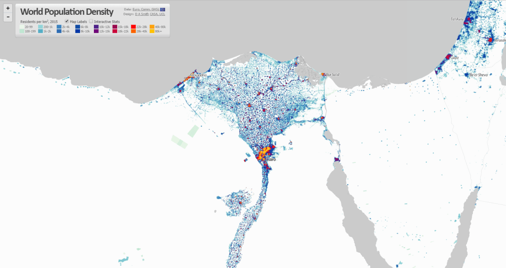
The intense settlement of Cairo and the Nile Delta is in complete contrast to the arid and empty Sahara.
Huge rural populations surround the delta lands of West Bengal and Bangladesh, focused around the megacities of Kolkata and Dhaka.
There is a massive concentration of population along the coast in South India. This reflects rich agriculture and prospering cities, but like many urban regions is vulnerable to sea level changes.
The comprehensive nature of the GHSL data means it can be analysed and applied in many ways, including as a time series as data is available for 1975, 1990, 2000 and 2015. So far I have only visualised 2015, but have calculated statistics for all the years (turn the interactive statistics on at the top left of the website- I’ll post more about these statistics later). Change over time animations would definitely be an interesting approach to explore in the future. Also see some nice work by Alasdair Rae who has produced some excellent 3D visualisations using GHSL.


Great job
Hi, the luminocity worldpopden map no longer works. Is there any way to fix this?
Apologies, we have had various issues with the server. The website is working again now!