
Every so often you come across a dataset that really amazes you in its richness and ability to change perspectives on understanding the world. One such dataset has been produced by academics at Stanford and Oslo tracing the global supply chain of CO2 emissions.
Traditionally emissions are attributed to countries depending on where fuels are burned- the point of production. This approach puts big industrial polluters like China at the top of the emissions pile. Yet globalisation means that we are linked into an increasingly complex web of trade that challenges a production-based understanding of emissions. A quarter of fossil fuel CO2 emissions can be considered as being embedded in manufactured goods that are consumed away from the point of production.
To address this issue Davis, Peters & Caldeira have created a database charting the global supply chain of CO2 emissions from extraction to production and finally to consumption. The database covers coal, oil, gas and secondary fuels traded by 58 industrial sectors in 112 countries for the year 2004. Even better, the entire database is available online.
Maps of the major carbon transfers included in the paper highlight firstly the massive flows from the energy rich Middle East and Russia, and secondly how production emissions from industrial countries such as China are ultimately driven by consumption in the affluent core of USA, Europe and Japan.

Being a mapping type, I feel that the flow maps in the paper miss out much of the amazing detail in the dataset, such as extraction to consumption flows within countries (half of all emissions). So I decided to put my visualisation skills to the test…
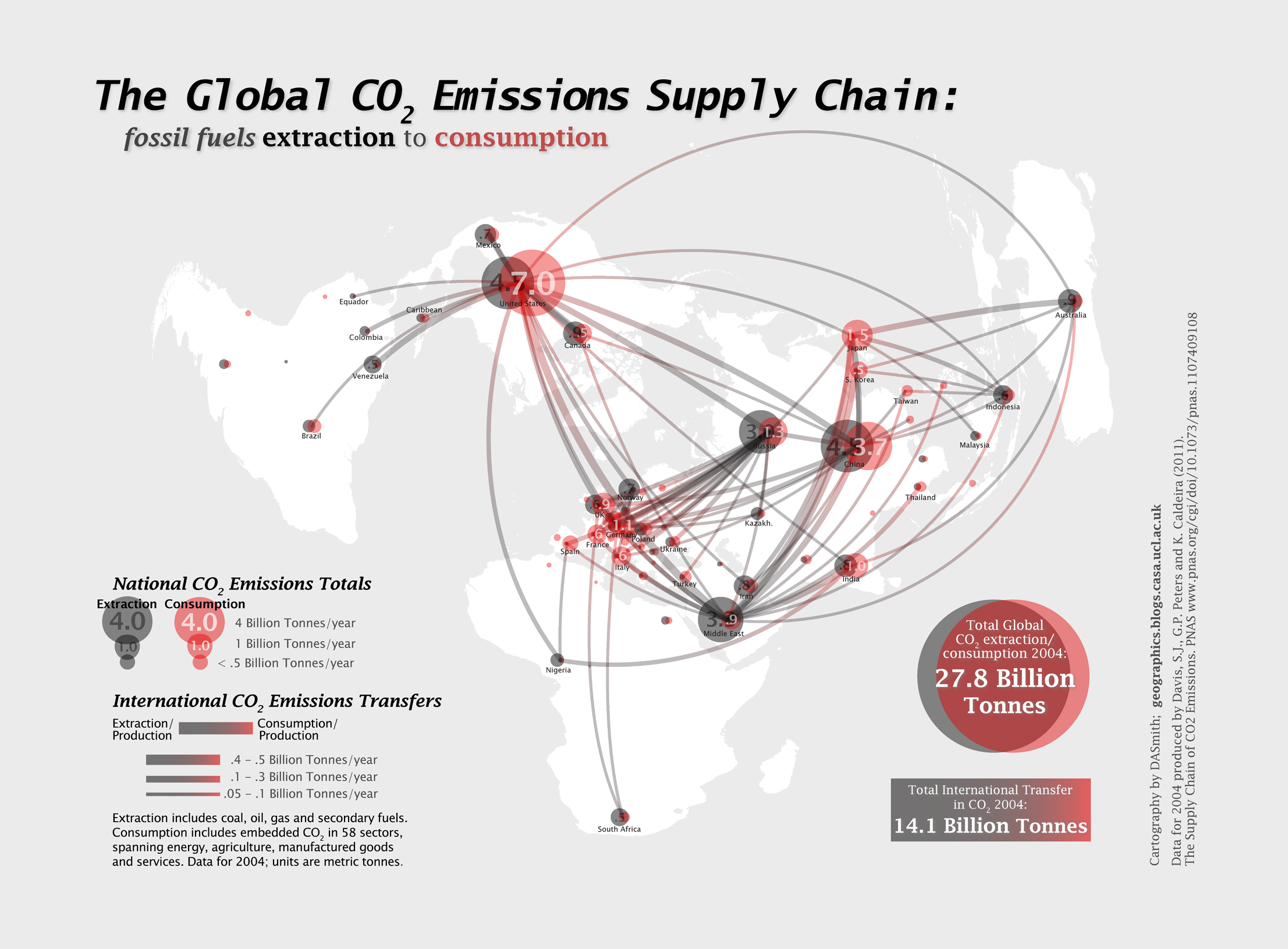
First up I produced a proportional bubble map of extraction and production, giving a good sense of the relative scale between countries. Economies with high levels of both extraction and consumption (e.g. USA and China) exploit their own energy resources and have large emission flows within their national boundaries. Other large consuming nations that lack energy resources (e.g. the EU, Japan and South Korea) must import them.

Next I mapped the transfers of CO2 embedded in trade flows, using the same black-red colour scheme to indicate flow direction. While the visualisation is not as straightforward as the simpler flow map above, it gives a strong sense of the amazing complexity in global trade relationships and highlights clear patterns and structures.
Black lines emanate from the major energy exporters of the Middle East and Russia. Indeed the degree to which all of Europe is dependent on Russian energy is highly alarming. Major industrial countries act as intermediaries, both importing and exporting emissions. For instance China and Japan import energy and materials from the Middle East, Indonesia and Australia, then export manufactured products to the USA and Europe. The USA is top predator in the emissions food chain, spectacularly drawing in goods and resources from every corner of the globe and racking up over 25% of global emissions by consumption.
The data is for 2004, so some current trends like the strong growth of South America, continued growth of China and the strengthening relationships between China and Africa are not fully captured. Hopefully an update will come in the not too distant future.
On the cartography side, I went for the Azimuthal Equidistant projection to emphasise the close North America-Europe-Asia links. This projection is recognisable as the basis of the United Nations logo. Here however it is global capitalism and environmental exploitation drawing the world together like some kind of tightening noose. After another empty environmental conference at Rio+20, burning billions of tonnes of fossil fuels is set to remain a defining characteristic of our age.
