World City Living and Working Densities: Poles Apart?

One of the most recognisable visualisation techniques used by LSE Cities in the Urban Age publications is the 3D density map- an intuitive and engaging way to represent built form, and enable comparison of very different city environments across the globe. I’ve been producing 3D density maps in my own research for around five years now, and so it was a nice challenge to produce the 3D density maps for this year’s Urban Age conference, the Electric City in London. In this post I focus on the contrasting densities in three leading world cities- London, New York and Hong Kong- with the added twist that both residential and employment densities are mapped for comparison.

Higher urban densities can facilitate more sustainable travel patterns, improve service delivery efficiency, reduce building energy use and promote urban vitality. These advantages depend of course on good urban planning to minimise congestion and pollution problems. High density mixed-use development is central to the compact city planning movement, and remains a foundation of sustainable planning policy today. Here we map the number of residents in each square kilometre of a 100 by 100 kilometre region for London, New York and Hong Kong. Lower urban densities apply to suburban-like neighbourhoods, while high densities generally represent medium or high rise buildings clustered on a tight urban grid.

The city that stands out in the mapping is Hong Kong, with its extremely high residential densities exceeding 110,000 people per km2. Here planners have responded to scarce land availability with very tall (over 30 storeys) high-density development. Scarce land has also influenced the development of New York City, where Manhattan densities peak at 59,000 people per km2. London in comparison is much lower density. The heritage of suburban housing and generous greenspace has created a residential culture at half the density of New York and a quarter the density of Hong Kong. Despite current intensification in London, residential densities remain a world away from other global cities.

Where people live is not however the only perspective needed to understand urban density. We can also examine employment densities for an important point of comparison (both residential and employment maps are at the same scale). Taller spikes in the employment maps represent higher numbers of jobs concentrated in business centres. London, New York and Hong Kong feature very intensive central employment clusters. The highest peak of over 150,000 jobs per km2 is in Midtown Manhattan. London is surprisingly close behind at over 140,000 jobs per km2, concentrated in the City of London and the West End. Hong Kong peaks at 120,000 jobs per km2 in Central (note the Hong Kong survey data is less comprehensive and may underestimate peak densities). These intense spikes represent very strong agglomeration economies, where financial and business services and creative industries cluster together to access labour markets, share fast-changing information and engage in face-to-face interaction with clients, customers and partners. Despite living in an age of instant telecommunication, proximity is still critical for many world city business activities.

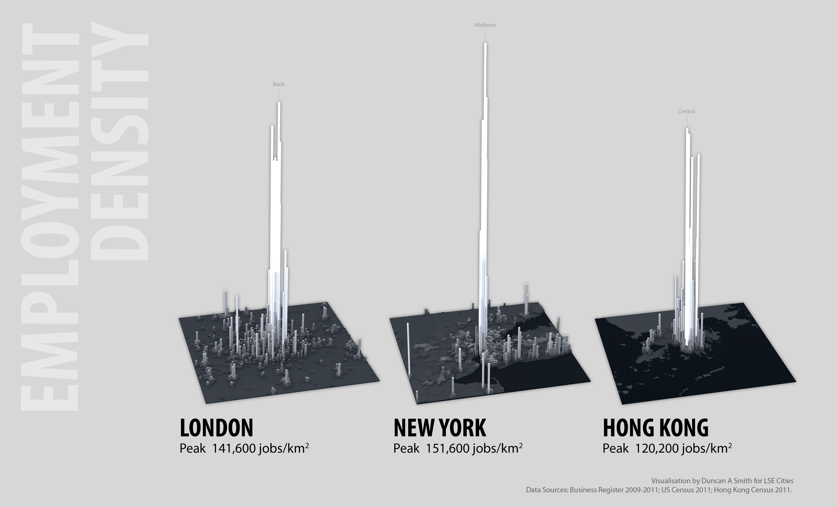
The extreme employment density peaks are indicative of economic success in these world cities. Demand for office space is so stong that developers get sufficient returns to build high and businesses use their space more intensively. Central employment clustering also means these cities are dominated by public transport rather than car travel (particularly Hong Kong). On the other hand the divergence of living and working densities can signify a lack of integration between living and working locations. London is very polarised between its low density living and high density working environments. This contributes to the long distance and long duration commuting travel for many Londoners (recent surveys find an average one-way commute times for Londoners of 38 minutes). New York has a better integration of living and working locations (average commutes are around 31 minutes). Hong Kong appears to have the closest integration of living and working spaces, though unfortunately commuting time survey data is not available to test this.

The analysis here supports the medium-rise inner-city residential intensification that the London Plan prescribes to improve the balance of urban functions, and increase accessibility for residents and businesses. The gap in residential densities between London and many world cities is so large that modest intensification can be achieved while keeping London’s distinct character, providing development is on the much remaining brownfield land rather than London’s treasured greenspaces.

Another interesting thought is whether the highly concentrated office clusters we see in London and New York will continue to be the way most businesses operate in the future. Greg Lindsay gave a good talk last week on how businesses are changing the way they use work space towards more shared and flexible environments that will likely be less space demanding.

To see more detailed analysis of sustainability trends in many more world cities from the Urban Age conference see the Electric City conference newspaper.

Carbonchart: Why are Global CO2 Emissions Soaring?

As the costs of recent droughts spiral from USA to Australia, West Africa to India, we’re getting a taste of what a significantly warmer climate would be like. Critically as the scientific evidence mounts up that climate change is occurring, global carbon dioxide emissions are soaring. Why is this?

I’ve designed a new website Carbon Chart visualising current data to answer this question.

There’s no single ideal metric to determine the contribution of different countries towards global warming, and a range of different perspectives need to be considered, as well as related issues of economic development and poverty reduction. The design of Carbon Chart is intended to allow the comparison of several perspectives.

So where are the maps? I’ve gone for a graph approach to focus on change over time. See Kiln’s excellent Carbon Map website for a cartogram-based approach to understanding global warming.

Current emissions data do not make happy reading. CO2 output is increasing in the developed world in consumption terms, and is rocketing in the developing world, especially China. We’re replicating our carbon intensive economic model on an incredible scale.

Maybe the climate models are wrong, or maybe an international climate agreement with substance is just around the corner. But right now it’s difficult to see how the more extreme scenarios of 4°C+ warming are going to be avoided.


Visualising Flows 2: the Global CO2 Emissions Supply Chain

GlobalCarbonFlows_web

Every so often you come across a dataset that really amazes you in its richness and ability to change perspectives on understanding the world. One such dataset has been produced by academics at Stanford and Oslo tracing the global supply chain of CO2 emissions.

Traditionally emissions are attributed to countries depending on where fuels are burned- the point of production. This approach puts big industrial polluters like China at the top of the emissions pile. Yet globalisation means that we are linked into an increasingly complex web of trade that challenges a production-based understanding of emissions. A quarter of fossil fuel CO2 emissions can be considered as being embedded in manufactured goods that are consumed away from the point of production.

To address this issue Davis, Peters & Caldeira have created a database charting the global supply chain of CO2 emissions from extraction to production and finally to consumption. The database covers coal, oil, gas and secondary fuels traded by 58 industrial sectors in 112 countries for the year 2004. Even better, the entire database is available online.

Maps of the major carbon transfers included in the paper highlight firstly the massive flows from the energy rich Middle East and Russia, and secondly how production emissions from industrial countries such as China are ultimately driven by consumption in the affluent core of USA, Europe and Japan.

Davisetal_FlowMap

Being a mapping type, I feel that the flow maps in the paper miss out much of the amazing detail in the dataset, such as extraction to consumption flows within countries (half of all emissions). So I decided to put my visualisation skills to the test…

First up I produced a proportional bubble map of extraction and production, giving a good sense of the relative scale between countries. Economies with high levels of both extraction and consumption (e.g. USA and China) exploit their own energy resources and have large emission flows within their national boundaries. Other large consuming nations that lack energy resources (e.g. the EU,  Japan and South Korea) must import them.

GlobalCarbonBubble_web

Next I mapped the transfers of CO2 embedded in trade flows, using the same black-red colour scheme to indicate flow direction. While the visualisation is not as straightforward as the simpler flow map above, it gives a strong sense of the amazing complexity in global trade relationships and highlights clear patterns and structures.

GlobalCarbonFlows_web

Black lines emanate from the major energy exporters of the Middle East and Russia. Indeed the degree to which all of Europe is dependent on Russian energy is highly alarming. Major industrial countries act as intermediaries, both importing and exporting emissions. For instance China and Japan import energy and materials from the Middle East, Indonesia and Australia, then export manufactured products to the USA and Europe. The USA is top predator in the emissions food chain, spectacularly drawing in goods and resources from every corner of the globe and racking up over 25% of global emissions by consumption.

The data is for 2004, so some current trends like the strong growth of South America, continued growth of China and the strengthening relationships between China and Africa are not fully captured. Hopefully an update will come in the not too distant future.

On the cartography side, I went for the Azimuthal Equidistant projection to emphasise the close North America-Europe-Asia links. This projection is recognisable as the basis of the United Nations logo. Here however it is global capitalism and environmental exploitation drawing the world together like some kind of tightening noose. After another empty environmental conference at Rio+20, burning billions of tonnes of fossil fuels is set to remain a defining characteristic of our age.

Visualising Flows: Great Britain Journey-to-Work

There have been some wonderful flow maps appearing online recently, such as Paul Butler’s global facebook friend’s map, and maps of global trade and flight patterns. Inspired by these, I’ve been mapping travel patterns in Great Britain using a similar “night-lights” visual style.

The above maps use data from the UK census connecting where people live to where they work, showing how transport flows form complex urban networks and extensive metropolitan regions. The data is at ward level, allowing a good level of detail:

EW_commuter_flows

Taking this visualisation further, a key issue for policy makers is how people travel, with private cars having greater energy, pollution and congestion impacts than alternatives. The final map below groups work trips into car, public transport and walking-cycling travel using an RGB colour scheme, creating a galactic effect (click for larger):

The aim of the visualisation is to put travel patterns in the context of the diverse urban scale and geography of Great Britain, and reveal the degree of regional variation.

The map really highlights how different London is in terms of its extensive regional public transport network, with the other major English conurbations like the West Midlands, Manchester and West Yorkshire being highly car dominant in comparison. The variation in public transport levels could be argued to relate to London’s massive size, yet the Scottish cities of Glasgow and Edinburgh perform well in public transport terms, despite being smaller than England’s northern cities.

Active travel modes of walking and cycling are generally minimal. The cities that do relatively well are the “cathedral cities” like Cambridge and York, with a few surprises like Hull.

The maps were created in ArcGIS using the XY to Line tool, then exported to Illustrator. A key aspect of such flow visualisations is that the thousands of overlapping flows add together to form denser links using a cumulative transparency effect. This is much easier to achieve using a vector graphics program such as Illustrator. Would be nice in a future post to add Northern Ireland and the Republic, and will get a data update with the 2011 census next year.

Applied Urban Modelling 2012

CASA researchers were out in force at the AUM 2012 meeting in Cambridge last week, organised by the urban modelling group at the Martin Centre. It was an enjoyable meeting, with a good range of participants from both academia and built-environment practitioners. I’ll discuss some highlights from my own GIS and visualisation perspective.

It was great to see Paul Waddell present UrbanSim, which is a well established and popular open source platform for land use transport modelling based on microsimulation. Current improvements include adding 3D visualisation capabilities and pedestrian accessibility. Paul also had a demo of an impressive new urban design tool using a procedural architecture approach similar to CityEngine. Colleagues at CASA Camilo Vargas and Melanie Bosredon are developing an UrbanSim model of London, so we will be returning to this software in future posts.

Andres Sevtsuk from City Form Lab MIT presented on modelling retail locations from a street network Space Syntax type approach. His team have developed an Urban Network Analysis tool for performing measures like Betweeness and Closeness within ArcGIS. This tool is also open source and it’s great to see so much interesting software going down this free to access route.

My favourite presentation was from past and present CASA researchers Kiril Stanilov and Paolo Mascucci. Kiril has painstakingly been putting together an incredibly detailed vector dataset of the growth of London’s road network from the 1700’s to the present day. The time-lapse sequence of the network growing looked spectacular, highlighting the path dependence from historical forms and the different sequences of growth in London’s history. There’s fantastic potential in this dataset for improving modelling and understanding of how cities grow and develop. A flavour of the data can be seen in the below poster image:

London 3D Augmented Reality Map

CASA hosted a very successful Smart Cities event last Friday, including presentations from Carlo Ratti, Mike Batty and Andy Hudson-Smith. The event premiered an interactive exhibition we have been working on, based on the theme of mixing physical and digital worlds. Some fantastic and fun exhibits have been developed by colleagues including George MacKerron, Steven GrayOllie O’Brien, Fabian Neuhaus, James Cheshire, Richard MiltonMartin de Jode, Ralph BarthelJon Reades, Hannah Fry, Toby DaviesPete Ferguson and Martin Austwick, who no doubt will be blogging about them all soon. Thanks to everyone who attended and contributed to a great day.

For my own exhibit I had a try at developing an augmented reality app to explore 3D urban data. The idea was to use iPads as the window into a 3D urban map of London, allowing the user to navigate around the virtual model to see different perspectives and focus on interesting parts of the data. Do we respond differently to data with a seemingly physical presence? Well this is one way to find out…

The app was developed in Unity using the Vuforia AR extension, and I was impressed with how accessible augmented reality technology has become using such tools. Firstly GIS data on urban form in London and air pollution was exported from ArcMap into Unity, and an interface to the data was developed. The core app without the AR capabilities can be viewed here (Unity web player required).

Next I followed the Vuforia iOS tutorials to add AR functionality. This approach uses a tracking image to position and scale the 3D model to the user’s viewpoint. Nice features of Vuforia include the ability to select your own tracking image, and that it can handle some occlusion of the image when the user moves to a particular part of the model, although a part of the tracking image must be in view of the camera at all times otherwise the model disappears from the user’s view. A large A0 poster was used as the tracking image, giving users greater flexibility in navigating the data.

The resulting app is very intuitive and delivered the desired ‘wow’ factor with many of the attendees at the conference. The AR aspect certainly encouraged users to explore the data, and identify patterns at different scales.

Adding more interactivity, animation and sorting out some issues with the target image (multiple smaller images would have worked better than one very large image) would all be nice for version 2. I’ll do a more detailed tutorial on the workflow developed later on if this is of interest.

Sketching the City in Motion

Whilst social scientists approach cities from rational and technical perspectives, it’s often interesting to get some inspiration from the creative arts world. Linking with artists is an emerging trend at CASA, with collaboration with Edinburgh College of Art through the TalesofThings project, the use of common visualisation tools such as Processing, and recent events like James’s presentation at the Mapping London Life event.

A shared challenge for artists and scientists is exploring the dynamics of cities, from the buzz of daily street life to the slower demolition and creation of the built-environment. An artist I admire for capturing these flows through static images is Lucinda Rogers, whose works have recently gone online on a new website. Her illustrations of street life in New York and London use line thickness and blurred colour to give the impression of forms in motion- from pedestrians and cars on the street to cranes dancing around St Pauls.

Rogers tends to choose Inner City subjects just at the edge of the centre, where gentrification processes are in tension with the historic fabric and traditional industries- locations such as Shoreditch and mid-town Manhattan. In this sense New York and London have much in common.

Another interesting London illustration book recently released in London Unfurled. Matteo Pericoli has done a series of books of super-long panoramas, published concertina style in one very long folded sheet. For London he follows the Thames from Hammersmith to Greenwich, with the north bank on one side of the page and the south bank on the other. This works well as the Thames is a key way  to ‘learn’ the form of London, from historic panoramas to the present day. If a 20 metre long panorama is too big for your coffee table, London Unfurled also comes in ipad version.

London Urban Form 3D Map

The structure of large cities such as London is complex and endlessly fascinating. Effective visualisation can reveal the many patterns in urban structures for research and planning tasks, and the visualisation challenge is to manage the multi-dimensional and dynamic nature of urban complexity. Here we explore the geography of land-use and density across Greater London using 3D cartography at a 500 metre grid scale (HD version here):

London is highly centralised, with recent patterns of intensification in the City of London, Canary Wharf and Inner London more generally cementing this pattern. Meanwhile much of Outer London struggles to attract higher value commercial uses. We will explore the agglomeration, property market, and planning policy processes that underlie these trends in future posts.

Many of land use patterns visible in London resemble the ‘classic’ urban location theory models: there is an extreme Alonso-type density gradient; retail uses retain a central-place hierarchy; and there are distinct radial corridors. Additionally further theories on the economics of mix-of-uses (e.g. Jacobs) and the lumpy mega-scale of real-estate investment are clearly key parts of London’s make-up.

The London Urban Form movie was created in ArcGlobe, which has some nice features like the ability to change the background mapping and animation timeline features. The advantages of doing the movie within GIS is the ability to easily combine spatial data at a variety of scales. Some of the more advanced animation effects that I would like to use such as geometry transitions (to show growth and decline) and controlling lighting are however not possible in GIS. A previous visualisation of this data in 3DS Max by Andy-Hudson Smith shows how these effects can be achieved.