Mapping Intra-metropolitan Journey-to-work Sustainability


As cities expand with multiple centres spread over massive regional hinterlands, the need to better understand the geographical variation across and within cities has become more pressing. This need applies strongly to issues of travel sustainability, where urban centres differ greatly in the accessibility they facilitate for private, public and active transport.

Spatial indicators are a useful tool to summarise complicated intrametropolitan patterns, as illustrated in my new working paper mapping CO2 emissions from journey-to-work travel across the London Region. The results of this indicator show a massive range of travel emissions by workplace of up to 300%, with particular problems for airports and the specialised employment region of the Western Sector, as can be seen in the map above.

This paper was co-authored with Joan Serras at CASA, who helped with the development of the road and public transport network analysis to model realistic routing behaviour from origin and destination flows from the 2001 census. One interesting aspect to this was the inclusion of GPS data to model average road speeds in London as illustrated below:

Full paper abstract:

“This paper develops a methodology for estimating network distances and CO2 emissions for UK census ward-level journey-to-work interactions. Improvements are made on existing empirical measures by providing comprehensive intra-metropolitan analysis; increasing network routing accuracy with UK public transport timetable and GPS-based average road speed data; allowing multimodal travel; and developing metrics suitable for travel sustainability analysis. The output unit of CO2 emissions has been selected to enable the integration of mode-choice and travel distance data, and to aid compatibility with integrated assessment applications. 

The methodology is applied to the case study of the London Region for the year 2001. A very high degree of intra-metropolitan variation is identified in the results. Employment sub-centres diverge in their per-capita CO2 emissions by up to 300%, with specific problems of carbon intensive commuting to major airports and the specialised employment region of the Western Sector. These findings indicate that subcentre travel variation may be intrinsic to polycentric urban structures. The paper discusses means to improve the methodology, in relation to issues of coefficient disaggregation and modelling more complicated multi-modal trips.”

Sponsored Space

Cities have always been the great spaces of commerce, trade and advertising; and recent decades have seen the corporate realm expand with the privatisation of services such as transport and utilities. Arguably corporate ownership is currently taking a new aspect with the explicit branding of urban places. English football clubs now play at the Emirates, Etihad and Sports Division Arena, rather than at Highbury, City of Manchester and St James’s Park stadiums. Skyscrapers in Canary Wharf project gigantic banking logos across East London. Westfield super-malls have branded entire new urban districts of streets and squares.

This process is not new- corporations have been building places to express their brands for a long time. Disneyland is perhaps the most famous example, and arguably the original UK new towns like Cadbury’s Bournville shared some of the same ideals. Many useful projects would simply not happen without corporate sponsorship, such as the popular (but loss-making)  Barclays Cycle Hire scheme in London, soon to be mimicked with Citi-Bike in New York.

The question however is whether this process represents a ‘slippery slope’ towards a comprehensive corporate branding of urban space. There has been much recent debate in London over the mayor’s decision to develop a cable car project across the Thames at the O2 Arena (another corporate venue). The project is sponsored by Emirates airlines and their name will be attached to two public transport stations, including appearing on London’s classic public transport map for a period of ten years.

The impact is fairly minor, though it does mean London is now in the dubious company of Dubai and Las Vegas in allowing sponsorship of subway stations. It did get me thinking, what would happen if London let rip and allowed the full sponsorship of the public transport network? My guess at the resulting network for London of businesses naming districts where they locate is below.

Obviously this map is satirical and would never actually be allowed to happen. I would argue though that this map does in its own way represent a real geography of corporations and capital flows in London. Is this map a more functionally honest representation of contemporary London than traditional images?


London 3D Augmented Reality Map

CASA hosted a very successful Smart Cities event last Friday, including presentations from Carlo Ratti, Mike Batty and Andy Hudson-Smith. The event premiered an interactive exhibition we have been working on, based on the theme of mixing physical and digital worlds. Some fantastic and fun exhibits have been developed by colleagues including George MacKerron, Steven GrayOllie O’Brien, Fabian Neuhaus, James Cheshire, Richard MiltonMartin de Jode, Ralph BarthelJon Reades, Hannah Fry, Toby DaviesPete Ferguson and Martin Austwick, who no doubt will be blogging about them all soon. Thanks to everyone who attended and contributed to a great day.

For my own exhibit I had a try at developing an augmented reality app to explore 3D urban data. The idea was to use iPads as the window into a 3D urban map of London, allowing the user to navigate around the virtual model to see different perspectives and focus on interesting parts of the data. Do we respond differently to data with a seemingly physical presence? Well this is one way to find out…

The app was developed in Unity using the Vuforia AR extension, and I was impressed with how accessible augmented reality technology has become using such tools. Firstly GIS data on urban form in London and air pollution was exported from ArcMap into Unity, and an interface to the data was developed. The core app without the AR capabilities can be viewed here (Unity web player required).

Next I followed the Vuforia iOS tutorials to add AR functionality. This approach uses a tracking image to position and scale the 3D model to the user’s viewpoint. Nice features of Vuforia include the ability to select your own tracking image, and that it can handle some occlusion of the image when the user moves to a particular part of the model, although a part of the tracking image must be in view of the camera at all times otherwise the model disappears from the user’s view. A large A0 poster was used as the tracking image, giving users greater flexibility in navigating the data.

The resulting app is very intuitive and delivered the desired ‘wow’ factor with many of the attendees at the conference. The AR aspect certainly encouraged users to explore the data, and identify patterns at different scales.

Adding more interactivity, animation and sorting out some issues with the target image (multiple smaller images would have worked better than one very large image) would all be nice for version 2. I’ll do a more detailed tutorial on the workflow developed later on if this is of interest.

The Evolving Business Geography of Greater London

I presented at the CASA Seminar Series yesterday on the topic of business centre specialisation in Greater London. The discussion drew on previous research into knowledge economy agglomeration and urban property markets.

The analysis showed how the diversity and restricted growth of West London underpins the current extremely high rents, whilst the greatly densified City of London faces oversupply with lower demand for financial services after the economic crises. The recent revival of centres in the City Fringe is based on creative industries and IT/new media, and it’s hoped similar recipes will work for future business centres at Kings Cross and Stratford.


The slides can be viewed here:

Sketching the City in Motion

Whilst social scientists approach cities from rational and technical perspectives, it’s often interesting to get some inspiration from the creative arts world. Linking with artists is an emerging trend at CASA, with collaboration with Edinburgh College of Art through the TalesofThings project, the use of common visualisation tools such as Processing, and recent events like James’s presentation at the Mapping London Life event.

A shared challenge for artists and scientists is exploring the dynamics of cities, from the buzz of daily street life to the slower demolition and creation of the built-environment. An artist I admire for capturing these flows through static images is Lucinda Rogers, whose works have recently gone online on a new website. Her illustrations of street life in New York and London use line thickness and blurred colour to give the impression of forms in motion- from pedestrians and cars on the street to cranes dancing around St Pauls.

Rogers tends to choose Inner City subjects just at the edge of the centre, where gentrification processes are in tension with the historic fabric and traditional industries- locations such as Shoreditch and mid-town Manhattan. In this sense New York and London have much in common.

Another interesting London illustration book recently released in London Unfurled. Matteo Pericoli has done a series of books of super-long panoramas, published concertina style in one very long folded sheet. For London he follows the Thames from Hammersmith to Greenwich, with the north bank on one side of the page and the south bank on the other. This works well as the Thames is a key way  to ‘learn’ the form of London, from historic panoramas to the present day. If a 20 metre long panorama is too big for your coffee table, London Unfurled also comes in ipad version.

London Urban Form 3D Map

The structure of large cities such as London is complex and endlessly fascinating. Effective visualisation can reveal the many patterns in urban structures for research and planning tasks, and the visualisation challenge is to manage the multi-dimensional and dynamic nature of urban complexity. Here we explore the geography of land-use and density across Greater London using 3D cartography at a 500 metre grid scale (HD version here):

London is highly centralised, with recent patterns of intensification in the City of London, Canary Wharf and Inner London more generally cementing this pattern. Meanwhile much of Outer London struggles to attract higher value commercial uses. We will explore the agglomeration, property market, and planning policy processes that underlie these trends in future posts.

Many of land use patterns visible in London resemble the ‘classic’ urban location theory models: there is an extreme Alonso-type density gradient; retail uses retain a central-place hierarchy; and there are distinct radial corridors. Additionally further theories on the economics of mix-of-uses (e.g. Jacobs) and the lumpy mega-scale of real-estate investment are clearly key parts of London’s make-up.

The London Urban Form movie was created in ArcGlobe, which has some nice features like the ability to change the background mapping and animation timeline features. The advantages of doing the movie within GIS is the ability to easily combine spatial data at a variety of scales. Some of the more advanced animation effects that I would like to use such as geometry transitions (to show growth and decline) and controlling lighting are however not possible in GIS. A previous visualisation of this data in 3DS Max by Andy-Hudson Smith shows how these effects can be achieved.


Shaping London by Terry Farrell

I have recently been enjoying Terry Farrell’s book “Shaping London: the patterns and forms that make the metropolis”. Farrell is one of the UK’s best known and respected urban planners, and his passion for place-making and urban culture shine through in this accessible discussion of the development of the capital.

Rather than an analysis of planning politics and economics, Farrell considers the historic features that underlie London’s structure and continue their influence to the present day- the Thames, village centres, estates and major transport infrastructure. He convincingly shows through text and illustration that contemporary planning tensions between connectivity and place-making are age-old London challenges, from the bridging the Thames 2000 years ago to present day issues over airports and motorways.

Of particular interest to me was the discussion of rail development. London is currently dominated by rail-land development schemes (Kings Cross, Stratford, Waterloo, Paddington…) with difficulties in integrating these sites into the wider urban realm. The history of the railways underlies the many issues of connectivity and isolation that create severance in areas of Inner London from rail and industrial infrastructure.


So overall a very enjoyable book. And as a bonus it includes some great images from CASA’s very own Andy Hudson-Smith.

Cycling City Tensions

With a few notable exceptions such as Cambridge, cycling in UK cities is minimal compared to continental European examples, and boosting cycling is a massive opportunity for improving travel sustainability and health in Britain. The potential is greatest in London, with its high density mixed-use form, relatively flat topography and benign climate that favour cycling; in addition to congested and expensive car and public transport networks that leave many looking for alternatives.

Planning policy at the Greater London Authority level recognises this potential and has become increasingly pro-cycling, with recent investments in the ‘Cycling Superhighways’ scheme– longer distance radial cycle routes that (almost) join up; the bike hire scheme; and modest improvements at many junctions and in cycle parking facilities. These measures have helped to increase the level of cycling in London substantially in the last decade (although beginning from a very low starting point):

So can this trend be accelerated to make London a real cycling metropolis, a larger scale version of Copenhagen or Amsterdam? I believe it’s possible, but I discuss one of the biggest obstacles here- safety and space. (Other obstacles include terrible integration with public transport, bike theft, image…).

On the 4th October a student from Korea was crushed to death by an HGV vehicle near Kings Cross, becoming the 13th fatality in London this year. Overall cycling fatalities and injuries declined in the early 2000’s, in line with pedestrian and car accidents in general, but have increased in recent years as cycling trips have increased. There were 467 serious injuries in 2010, up 8% on the previous year. Cycling in London is a hectic experience of dodging traffic and aggressive driving, with very minimal segregated lanes and many dangerous junctions to avoid.

Currently a high profile debate is occurring over one such accident blackspot, Blackfriars Bridge, where two cycling fatalities have occurred in recent years. The London Cycling Campaign argues that the TfL junction redesign fails to address cycle safety, and staged a mass demonstration on the 12th October of 2,500 cyclists, and are promoting an alternative junction design. Additional campaigns include the issue of HGV’s, which are responsible for half of all cycle fatalities.


Ultimately a serious increase in cycling use requires a serious improvement in safety, and this means the creation of many more segregated cycling routes and the redesign of many key junctions. These measures will translate into reductions in vehicle flow in London, and TfL seem largely unwilling to make this compromise when it comes to major roads. A significant culture change accepting cycling as a key part of London’s transport would have to occur to achieve a genuine cycling city.


High Rise Hangover

Swept up in the wave of the mid-2000’s property boom, planning authorities signed-off a series of new high rise developments in London- bigger and bolder than any in the city’s history. It is only now that the cumulative effects of these decisions are emerging on the London skyline. Faced with the bleak picture of our current economic climate, these buildings could be seen as the height of speculative folly- rampant capitalism gone awry in the kind of short-term money grabbing that led to the current economic crisis. Or maybe, to take a more optimistic view, are these instead symbols of confidence in London’s ability to ride-out the storm?

London is overall a low density city compared to say New York or Tokyo, or even Paris. The UK’s first experiments with high-rises began post-WWII, with cheap Corbusier tower imitations built to solve massive housing shortages. These towers were often aesthetically dull, difficult to live in (even dangerous), and conflicted with traditional street networks. Even those few high rise projects of good quality (like the Barbican) divided opinion with their aggressive style. Hence the traditional dislike of high-rise building in Britain.

This attitude began to change with the commercial success of Canary Wharf in the late 1990’s, and the popularity of 30 St Mary Axe by Foster & Partners, nicknamed the Gherkin. High-rise developers now actively promote skyscraper nicknames to make their multi-million investments seem more friendly and part of the city’s furniture.

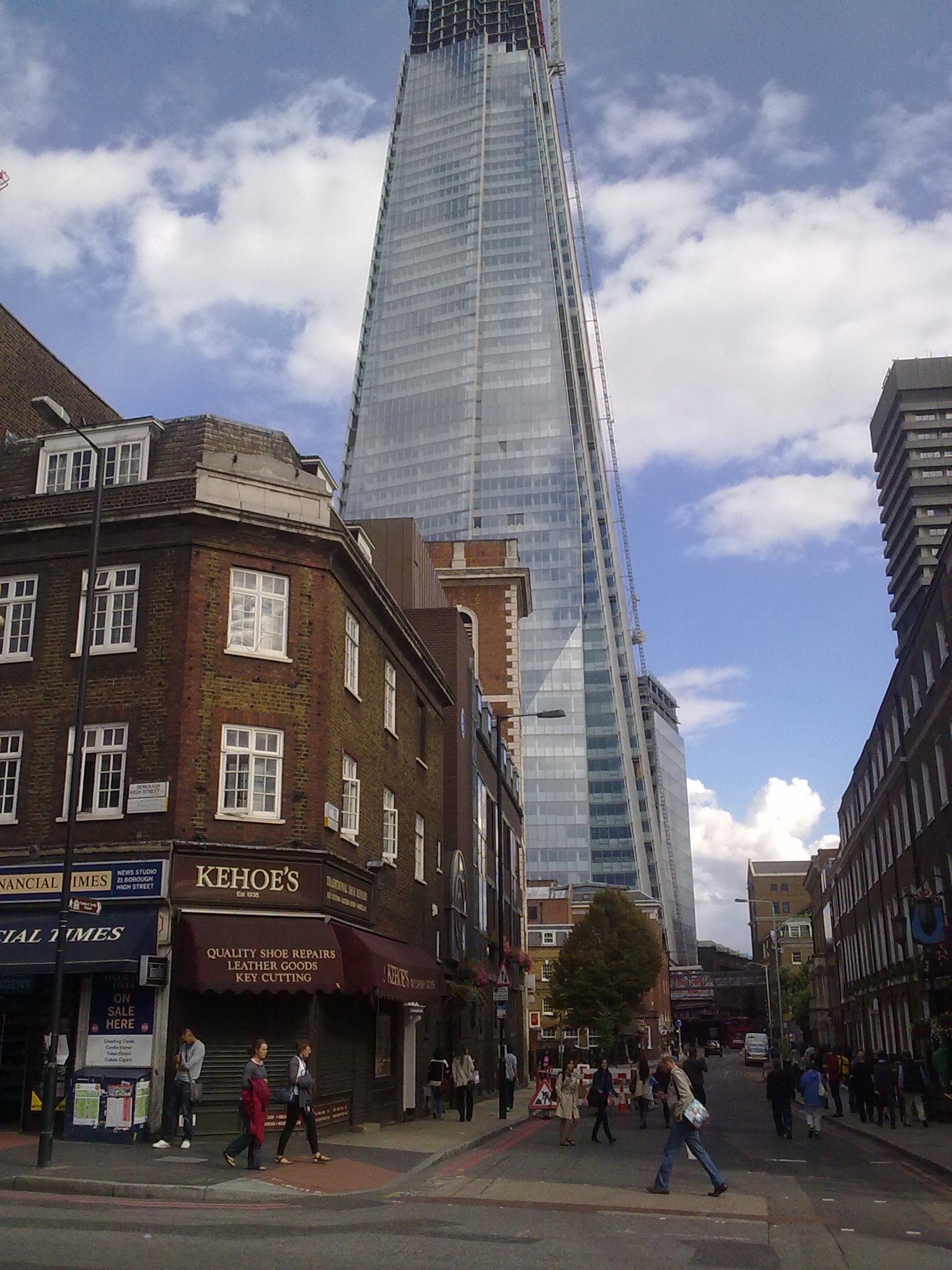
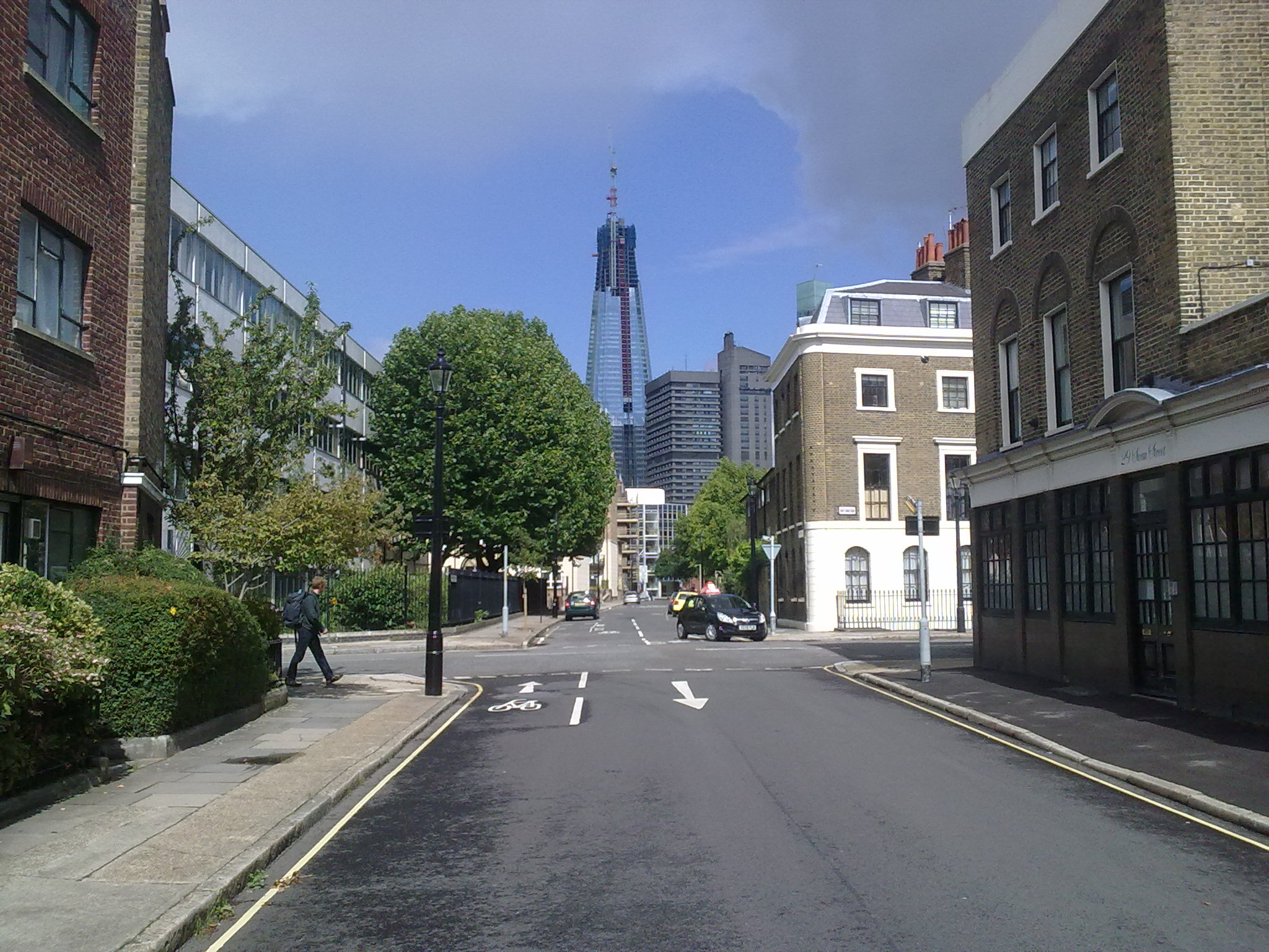
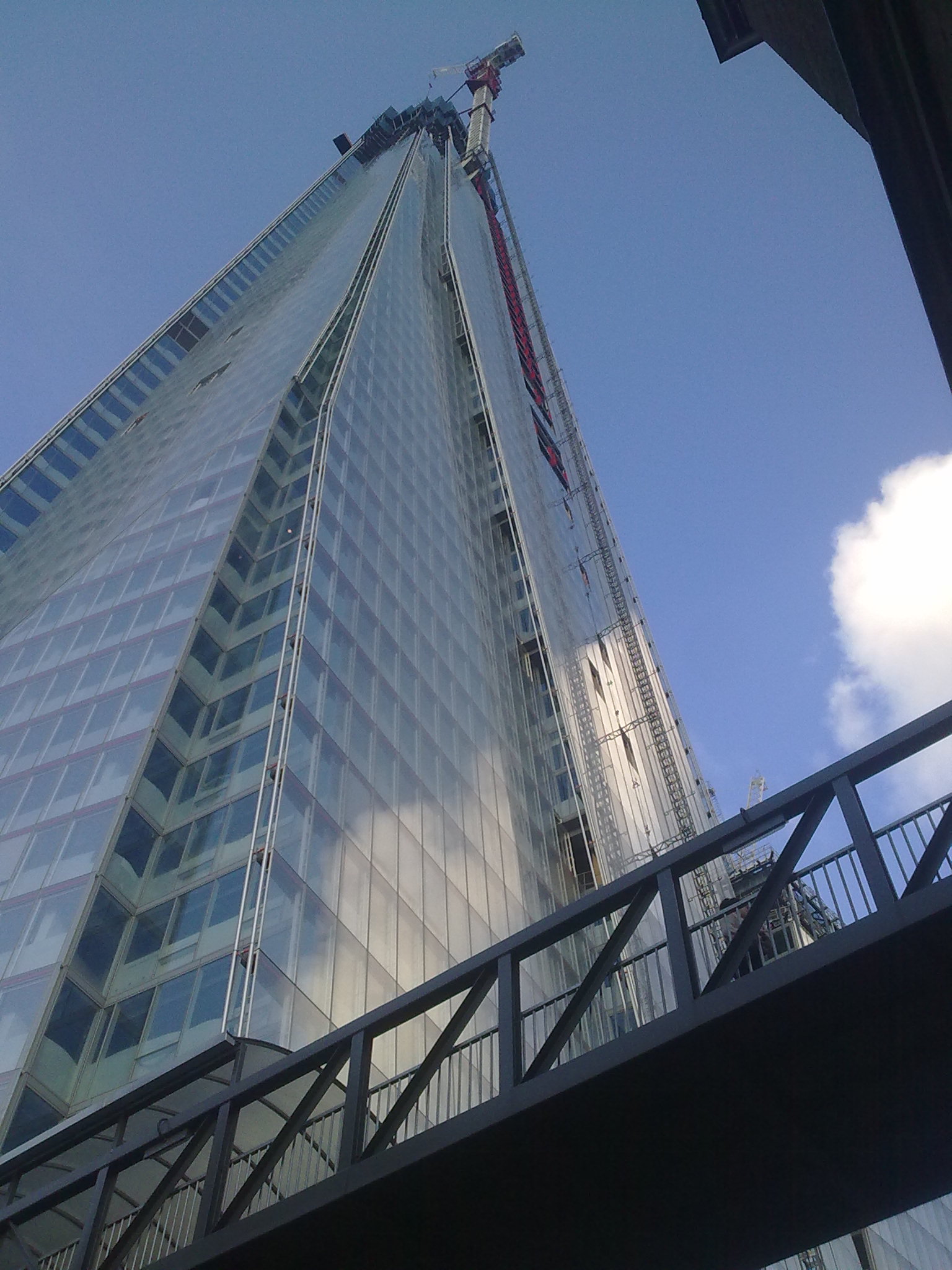
By far the tallest of the current crop of London skyscrapers is London Bridge Tower, or the ‘Shard’, which is now nearing completion. At a height of over 300 metres it’s not tall by international standards, but for London it’s a giant, 120 metres taller than the Gherkin. It sits outside of the main high-rise City cluster on the Southbank and, like Canary Wharf tower before it, could form the centre-piece of a new cluster. It’s certainly awe-inspiring, creating a Manhattan-like vertiginous feeling when you get up close. The tapered spire-like form limits the visual impact of the massive structure, and it sits not unattractively amongst the jumble of buildings south of the river.

Yet despite the Shard being an engineering marvel, you have to question whether this is an appropriate direction for the future of London. In scale terms it dwarfs anything on the London skyline, sitting incongruously with historic sights such as Tower Bridge and St Paul’s Cathedral. Despite architect Renzo Piano’s claims that he was inspired by London’s historic spires and ship masts, the structure appears sleekly anonymous and corporate, transferable to any world city, Dubai-on-Thames. There’s more than a hint of Bladerunner about the design, like we’ve decided sci-fi dystopia is the way-to-go for London. Perhaps this is a honest expression the social inequalities we’ve created, argues Jonathan Jones.

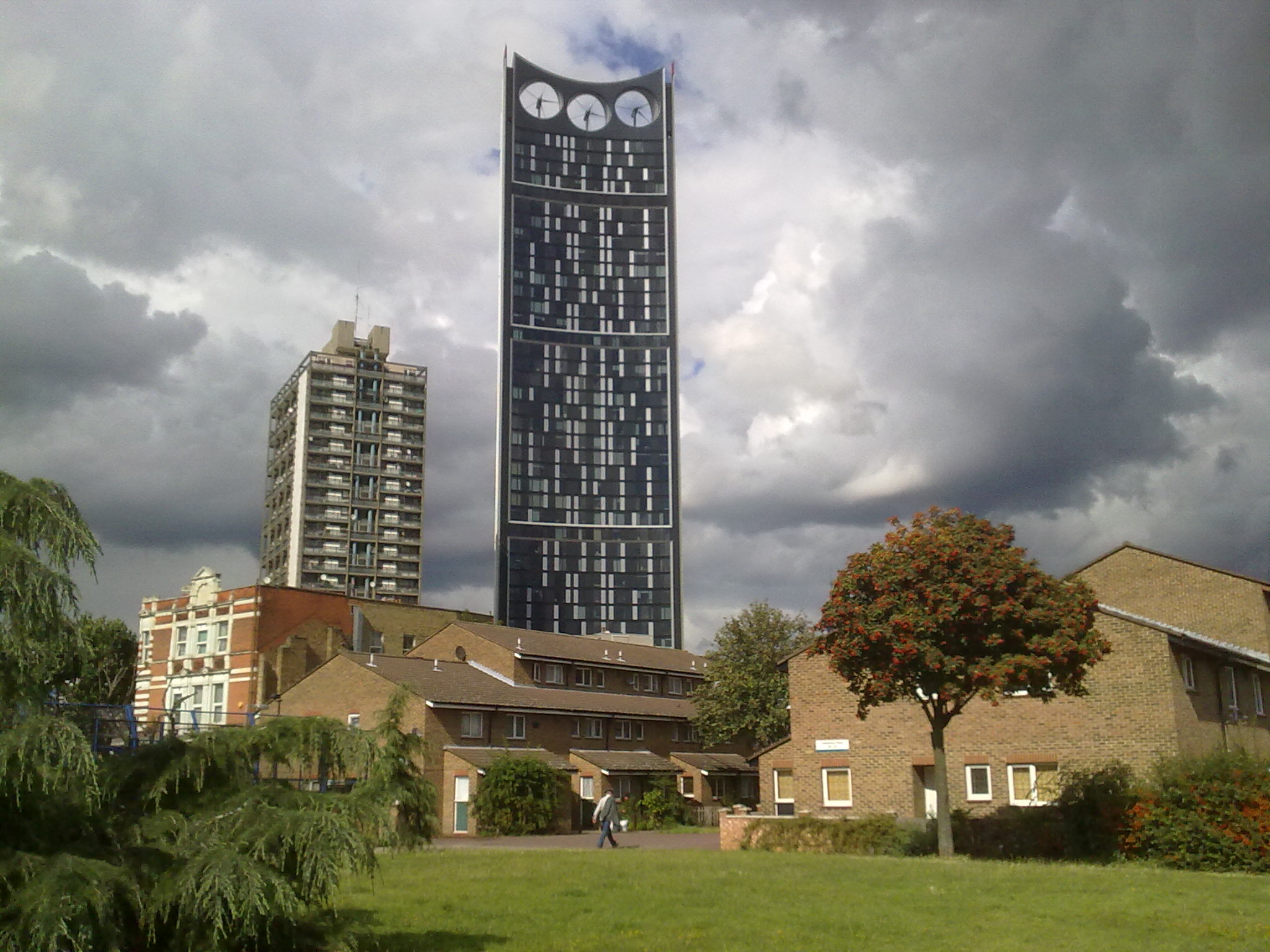
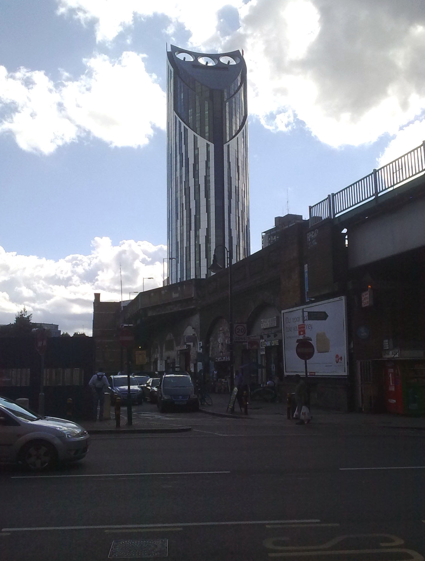
Time will tell how the public judge the Shard (or whatever alternative moniker catches on- the Spike? the Prick?). Soberingly it’s probably the best of the current breed of new skyscrapers in London. Continuing the theme of sci-fi kitsch, the worst new building in the UK, as voted in the 2010 carbuncle cup, is the Strata Tower at Elephant and Castle.

The Strata has an aggressive plastic-looking form, topped with three wind turbines. These turbines will reportedly supply 8% of the building’s electricity needs- a poor return for such a visually intrusive feature. High density development can bring sustainability benefits, but the embedded energy from the construction of thousands of tonnes of steel, concrete and glass nullifies the green credentials of any skyscraper, and the Strata tower’s turbines are surely the worst kind of greenwashing. Developers have dubbed Strata Tower the ‘Razor’, though I find the alternative moniker of ‘Sauron’s Tower’ better captures the building’s design and symbolism. Tolkien fans will note however that Sauron had a good deal more style than the Strata, and preferred geothermal power.

The real tragedy of Strata it that it’s supposed to be the catalyst for the regeneration of Elephant and Castle, a deprived district, notoriously badly designed with oppressive road intersections and 1960’s mass housing. Plans for major regeneration have been in place for many years, but there is currently little evidence on the ground. At present the debate is focussing on tranforming the traffic interchange, with TfL blocking more radical plans due to reduced vehicle flow impacts.

Not to be outdone by these Inner London imitators, the money-machine of the City has it’s own ambitious plans to win London’s race to the top/bottom. This includes a rather elegant fountain-pen shaped tower dubbed the Pinnacle, similar in height to the Shard, and also what I believe will go down as the biggest mistake in the current generation of London skyscrapers- 20 Fenchurch Street Tower. This ‘unique’ design gets bigger as it rises, thus providing larger floor-plates to maximise rents, and creating what will likely be a highly overbearing form at street level. Worst of all is the view from the Thames, where the building presents a bulging outline and inward looking face, in a remarkable resemblance to a sore thumb. In profile it looks like a hoodie. The Sore Thumb is now back under construction and is coming Londoners’ way in 2014.

Can we learn anything then from London’s new skyscraper bestiary? Our age of iconic architectural bling seems to have entered a new phase of attention-grabbing arrogance, with playful techno-futuristic aesthetics used as a marketing tool for investors and to soften the edges of raw soulless capitalism. For every interesting design there are several ungainly mistakes, and planners don’t seem to know the difference. Or alternatively authorities have decided that development trumps aesthetic or environmental concerns (worryingly this mode of thinking is the basis for proposed reforms to the planning system- more in a later post). The eccentric architectural laboratory of London continues with the modernist relics of the 2oth century now paired with our own 21st century futuristic fad, except this time the buildings are three times taller.  If we imposed a blanket-ban on all structures higher than 100 metres then coming generations would probably thank us.

London Riots- the Unemployment Link

2011 is fast becoming one of the most tumultuous years in recent memory, with revolutions and economic storms abroad paired with scandal and political tensions at home. Now to cap it off, the spectre of major urban violence has reared its ugly head in London and across England for the first time in three decades.

Whilst freedom fighters in the Arab world are using social networking to overthrow dictators, a section of London’s youth have been coordinating the overthrow of their local JD Sports and Curry’s via Blackberry Messenger. All this a year before the 2012 Olympics, which London secured based on its promotion of equality and diversity.

As is common, such events appear predictable with hindsight. The pattern of urban violence sparked by a controversial death of a police suspect is shared with recent riot events in Paris and in Athens.  Unrest is more common during economic downturns, as explored in a topical discussion paper by Ponticelli and Voth. London is, like all world cities, increasingly polarised between affluent classes of knowledge economy workers and households struggling to make ends meet on low paid work or benefits.

The Prime Minister has been making sweeping claims about the “Broken Society”, gangs and family breakdown. I want to look at a simpler relationship here- the geography of unemployment in London and where the riots occurred. The rioters were overwhelmingly male, between the ages of 18-25 and jobless (according to the Guardian data blog). It has been said repeatedly the rioters lack a “stake in society”, and presumably being isolated from work and education is a major factor in breaking links between individuals and their wider communities.

The map below shows the proportion of 16-65 year olds claiming unemployment benefit in 2011. The total has increased from 150,000 to 225,000 in the last four years. Locations of disturbances according to data from the Guardian are shown with purple dots. There are strong unemployment concentrations in a number of town centres that suffered disturbances, including Tottenham, Enfield, Hackney and Brixton. On the other hand some locations where trouble occurred, such as Ealing and Camden, are not highlighted. It would be useful to map the residential location of those arrested rather than the riot location, as people can of course commit crime outside of their neighbourhood, but this data is not currently available in a comprehensive form.

We can also look at changes in unemployment rates, as shown below between 2005 and 2011. Again Haringey and Enfield have suffered badly, along with further concentration in Croydon, Newham and Brent.


Finally we look at youth unemployment, with total unemployment under the age of 25 shown below. This was not available as a percentage and is instead shown as a raw count for wards. Again Tottenham and Enfield appear, and further clusters are highlighted in Peckham, Woolwich, Brixton and Brent.

Clearly the causes of the riots and looting in London are multiple and complex, and there is no magic key for preventing such horrific events happening again. But I do believe unemployment is a significant underlying factor, and one which the current recession is inevitably exacerbating. Similar levels of high urban unemployment are also evident in the disturbance hit cities of Birmingham, Manchester, Liverpool and Belfast (see the BBC for a useful national map). In the London context, there is large scale regeneration and local job opportunities occurring in Tower Hamlets and Newham, and it looks like similar efforts need to be stepped up in other deprived areas of London. The London government, the GLA, are aware of these problems and have been boosting apprenticeship schemes and supporting local town centres. Unfortunately recent patterns of employment change and development have left much of Outer London behind, with growth mainly in Central London, the west and the Wider South East. This will be discussed further in future posts.

PhD Thesis: Polycentricity and Sustainable Urban Form in London

Greater London office and retail floor space 3D density map

After four-and-half years of exploring, analysing, procrastinating, and writing, writing, writing, it’s finally done. Here’s the abstract:

“This research thesis is an empirical investigation of how changing patterns of employment geography are affecting the transportation sustainability of the London region. Contemporary world cities are characterised by high levels of economic specialisation between intra-urban centres, an expanding regional scope, and market-led processes of development. These issues have been given relatively little attention in sustainable travel research, yet are increasingly defining urban structures, and need to be much better understood if improvements to urban transport sustainability are to be achieved.

London has been argued to be the core of a polycentric urban region, and currently there is mixed evidence on the various sustainability and efficiency merits of more decentralised urban forms. The focus of this research is to develop analytical tools to investigate the links between urban economic geography and transportation sustainability; and apply these tools to the case study of the London region. An innovative methodology for the detailed spatial analysis of urban form, employment geography and transport sustainability is developed for this research, with a series of new application of GIS and spatial data to urban studies.”

PDF version here. If you are keen/crazy enough to want to print this monster then you have my eternal respect and can try the double sided PDF version here.

Many thanks to my supervisors Mike Batty and Andy Hudson-Smith for making this research possible, along with friends past and present at CASA who contribute to a great research centre.

I’ll be highlighting findings and developing the ideas from the research- particularly the themes of urban sustainability, the built-environment, transport, economic change, and urban GIS- here on this blog over the coming weeks. This will include some of the interesting visualisations created, such as the London urban density 3D map below.

Greater London office and retail floor space 3D density map