London’s High Rise Debate

Last week New London Architecture, centre for built-environment debate and communication, launched a new exhibition on London high rises and high buildings policy. As well as including many spectacular models of present and future buildings, the exhibition presents results from NLA research into London’s current generation of high building proposals.  The most eye-catching finding is that there are over 230 towers of 20 storeys or more proposed or under construction in London, potentially resulting in a dramatic change in London’s urban environment. A high profile campaign has been launched by the Guardian and Architects’ Journal calling for for more discussion and a ‘Skyline Commission’ to assess the impacts of these many developments. The NLA exhibition itself takes a more neutral tone in the debate, and highlights are summarised below.

NLA_Exhibition_Leadenhall
NLA “London’s Growing Up” Exhibition, with Leadenhall Building Model

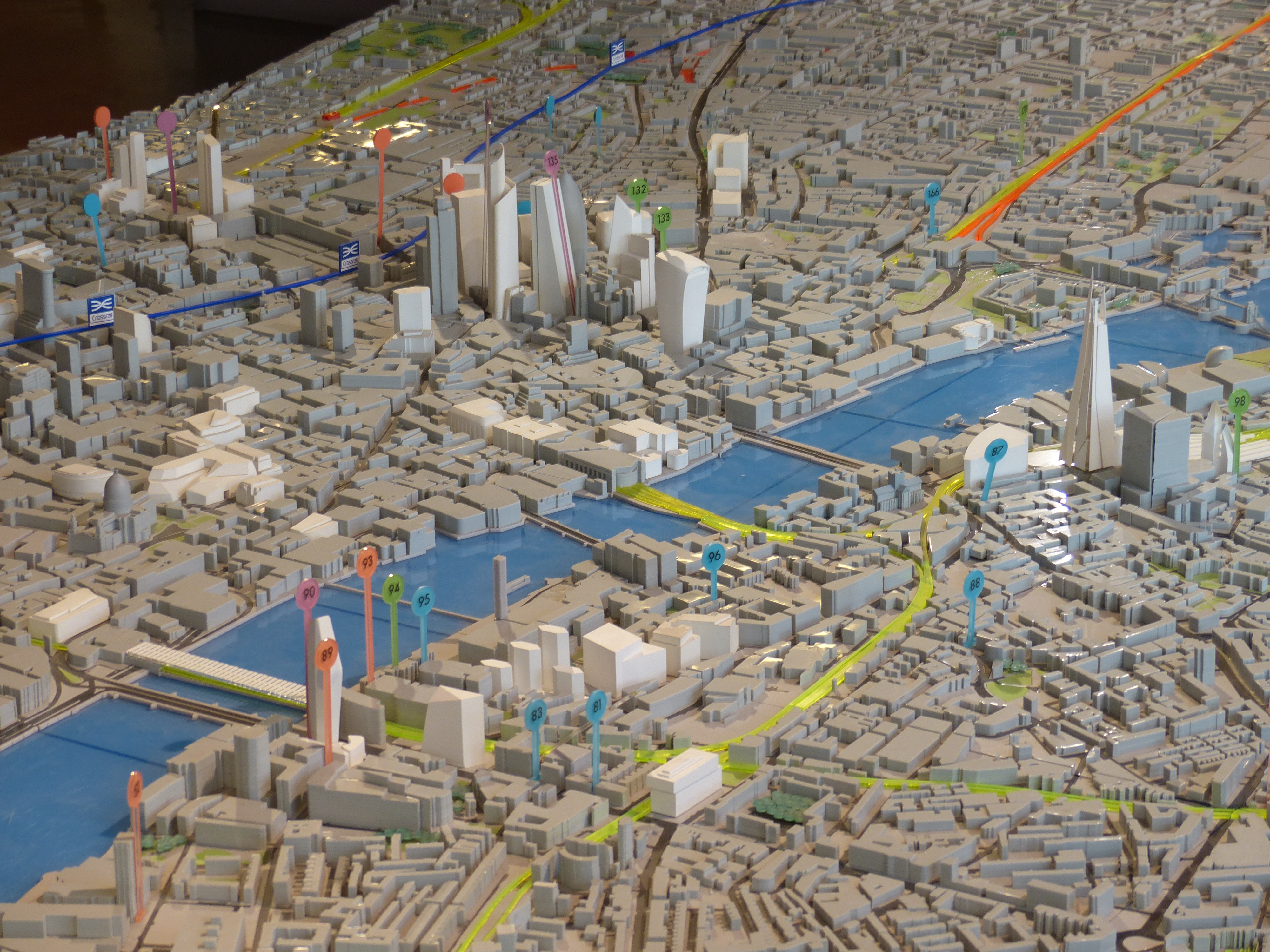
It’s clear from the NLA map below that the majority of proposals are strongly clustered spatially, with many adjacent to existing high rise districts of Canary Wharf and in the City around Bishopsgate and Liverpool Street. There are however many new clusters set to be created, principally Vauxhall-Nine Elms; Waterloo; Blackfriars Bridge; City Road (Islington); Aldgate; Stratford and North Greenwich. Demand for high rises is a result of acute pressures for more housing, and the prioritising of development at public transport nodes, such as Canary Wharf, Vauxhall and Blackfriars. In heritage terms a number of these clusters are controversial, particularly those along the South Bank that affect London’s river views, and those proposals in the vicinity of the world heritage sites of Westminster and the Tower of London.

SkyscraperLocationMap
NLA Insight Study map of current high building proposals

The main critique from campaigners is that there is a lack of vision from planners regarding high buildings policy, and that current developments are being driven by schemes for luxury residential flats along the river that maximise developer profits. The map above lends support to this view, particularly along the South Bank and at Vauxhall. There are already many medium rise luxury flat developments along the Thames of often limited design quality, and its debatable whether the current batch of taller developments will be any better. Policy restrictions in London are strongly geared towards protecting views of St Pauls Cathedral, effectively preventing new schemes in West Central London. Protection elsewhere is more limited and dependent on borough level interpretations of policy. Westminster has prioritised conservation and prevented new high rises (except at the Paddington Station development) while neighbouring boroughs of Lambeth and Southwark are more inclined to accept proposals, and use the much needed revenue for further housing development.

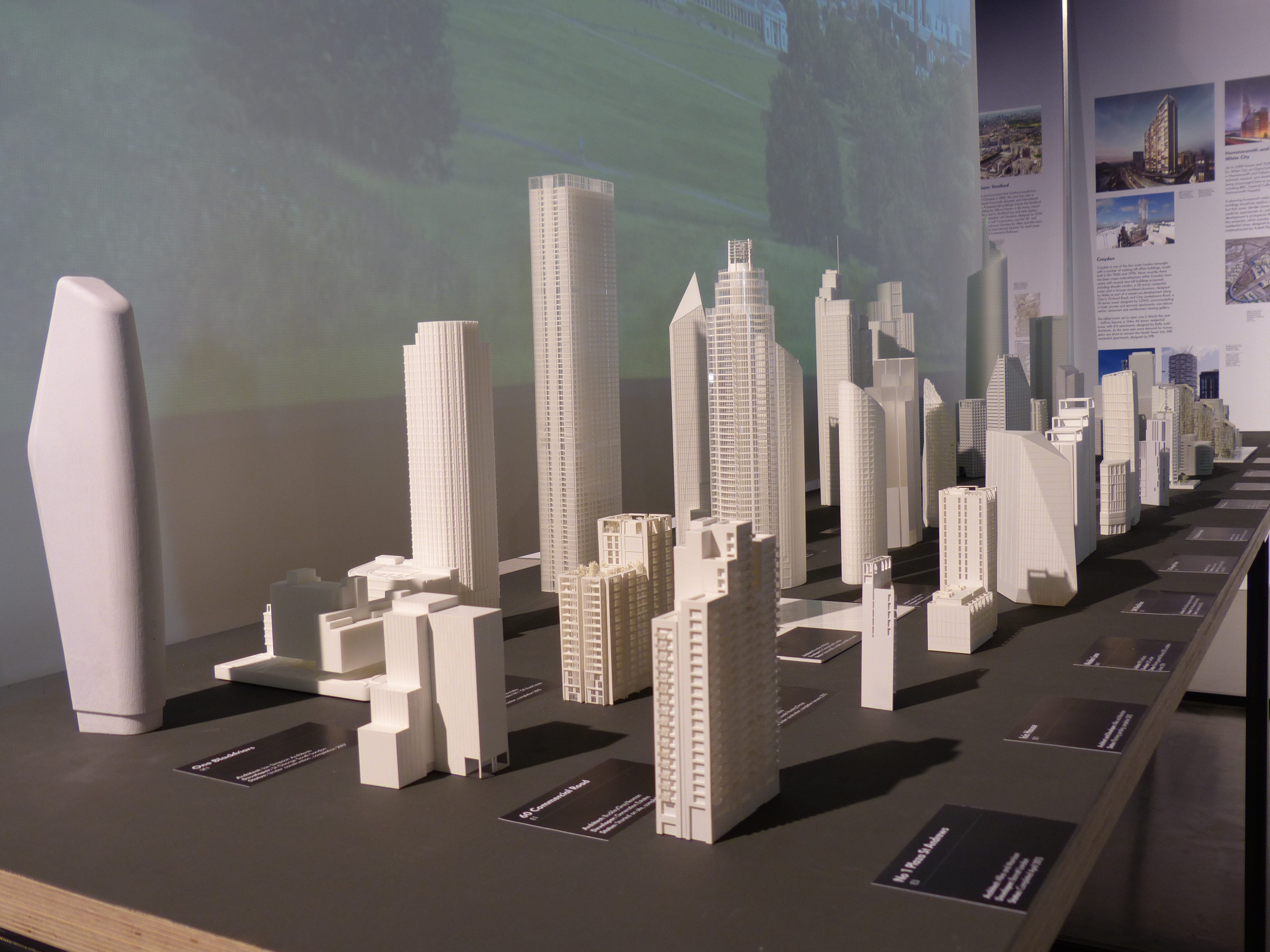
As well as covering the current planning debate, the exhibition includes many beautiful architectural models of existing and future high building proposals. There are some really unique designs, such as the fountain pen-shaped ‘Pinnacle’ that is back under development in the main City of London cluster.

Overall the exhibition is well worth a visit, and whether you are a fan or a critic of high buildings in London, there is clearly a need for greater awareness and discussion of current changes and what they will mean for the urban environment. There is also a need for more public access to open models and visualisations of how new buildings will appear and change London’s physical structure. Andy Hudson-Smith (@digitalurban) argued for this a few years back in CASA’s Virtual London project, and it appears that trends are currently moving in this direction.

SkyscraperMinatures

LargeModel_CityCentre


Rio de Janeiro: a City in Transformation

The 2013 Urban Age conference took place in Rio de Janeiro on the 24th-25th October. The LSE Cities research team have spent recent months learning about Rio and the fascinating changes this city is undergoing. It’s a city right in the eye of the storm of current debates in urban studies, relating to poverty, urban regeneration, mega-events and informal housing. I summarise some of the conference research highlights in this post. For a more comprehensive picture you can download the conference newspaper here.

Photograph by Tuca Viera for LSE Cities
Rio is defined by it’s mountainous topography. Here we look east with Zona Central on the left overlooking Guanabara Bay, and wealthy Zona Sul on the Atlantic Ocean to the right. Photograph by Tuca Viera for LSE Cities.

Economic Boom and Poverty Reduction
Rio conjures up very contrasting images to the outsider. On the one hand there is the wonderful exuberant city of Copacabana beach, samba music and carnival. These inspiring images are juxtaposed with the ongoing challenges Rio faces in terms of poverty, gang violence and drugs, captured in popular culture through films like City of God. Much more recently, Brazil has been hitting the headlines because of widespread protests across the country, with citizens demanding better quality public services and the tackling of government corruption.

Brazil has in fact made admirable progress in social development in recent decades. Social welfare reforms, such as the Bolsa Familia pragramme introduced by former president Lula in 2003, have seen one of the world’s most dramatic reductions in poverty, with significant improvement in cities like Rio. Education rates have greatly increased, and the high number homicides that plagued Rio in the 1990’s has fallen significantly.

RioSocialGraphs

These social improvements have been aided both by progressive leadership, and by a booming economy. The State of Rio has received a huge financial injection from the extensive oil and gas fields discovered off the coast. It makes for an incongruous sight walking along Copacabana beach to see the far horizon dotted with oil platforms. Revenues from this windfall have boosted investment into the city, although supporters of the current protests would argue that it should be more fairly distributed.

RioEconomicGraphs

Rio and the Favelas
Rio has grown rapidly into a city of 6.4 million people and 12 million in the wider metropolitan region. It is both defined and constrained by its spectacular coastal topography of steep slopes, forests and lagoons. Much of the expansion in population in the 20th century was housed informally, and 20% of Rio’s population still live in the favelas. These were built on the less accessible steep forest slopes, leading to the common distinction between the ‘morro’ and ‘asphalto’, the informal and the formal city. This is often a fine-grained division, as favelas are spread across the entire city, visible from the richest to the poorest areas.

RIO_landuse_v2_simplified

Rather than demolish the favalas, Rio has worked to upgrade them with sanitation and electricity. Yet many remain isolated from public services and employment. The favelas have also been at the centre of drugs trade, controlled by gangs and armed militias. A high profile ‘pacification’ programme has been implemented over the last five years by the Rio government to reclaim these territories for the city. While this programme generally has public support, it involves serious use of force, with the army moving into favelas and disarming local gangs. After this initial disarming process, a network of police stations is set up and further efforts are made to made to reintegrate communities into the wider city, socially and economically.

As seen in the above map, there is a distinct geography to the pacification programme, with favelas in the city centre and around the Olympic venues given priority. Rio will host both the World Cup in 2014 and Olympic Games in 2016, and these megaevents have greatly accelerated the pacification process. It remains to be seen whether pacification will eventually reach the entire city, or if peripheral favelas will remain beyond the control of city authorities.

Complexo do Alemao is one of Rio's largest favelas. After pacification, there have been investments in new housing, and a new cable car transport system. UPP police stations are located at the cable car stops. Photograph by Tuca Viera for LSE Cities
Complexo do Alemao is one of Rio’s largest favelas. After the initial pacification phase, there have been investments in new housing, and a cable car transport system to aid accessibility. UPP police stations are located adjacent to cable car stops. Photograph by Tuca Viera for LSE Cities

Urban Integration and Mobility
Rio’s topography and sharp social contrasts make for a largely fragmented city. Wealthy residents are concentrated in Zona Sul, the coastal area to the south that includes Copacabana and Ipanema. The magnificent beaches in Zona Sul are a central attraction for wealthier residents and tourists, and this area is expanding westwards along the coast to Barra da Tijuca, defined by high rises and gated communities that resemble Miami. The rest of the city is much poorer. Residents in the periphery and isolated favelas can take hours to access services and work locations. This is exacerbated by Rio’s very limited public transport system, and the underdevelopment of the old city centre and port area.

Concious of this fragmentation and the need for better connectivity, Rio’s authorities have begun a massive investment in public transport infrastructure. The centre-piece is a city-wide bus rapid transit system, with 160km of lines covering the entire width of the city area. The challenging topography of Rio requires serious infrastructure investment in tunnels and bridges to construct this new network.

Rio_BRT_Geo

As can be seen in the above maps, the BRT routes have several aims. One is to make Barra da Tijuca a new transport hub, with the three lines converging near the location of the new Olympic Park. Another is to provide much better connections for the previously isolated western suburbs of Rio. And finally the TransCarioca line will improve links to the city centre. Arguably this latter point of better connectivity to the city centre should be a higher priority if Rio is to successfully revive its inner city. Olympic developments and real-estate interests are playing a significant role in this major public transport investment.

Find Out More
See the Urban Age Conference website for full details of the research and essays by local and international experts on urban transformation. Videos of conference presentations and discussions will also be going online soon. There’s also a good summary of the discussion on the Rio Real Blog.

An Urban Renaissance Achieved? Mapping a Decade of Densification in UK Cities

It’s been 14 years since the landmark Urban Task Force report, which set the agenda for inner-city densification and brownfield regeneration in the UK. Furthermore we’ve seen significant economic and demographic change in the last decade that’s greatly impacted urban areas. We can now use the 2011 census data, mapped here on the LuminoCity GB site, to investigate how these policies and socio-economic trends have transformed British cities in terms of population density change.

The stand-out result is that there’s a striking similarity across a wide range of cities, with overall growth achieved through high levels of inner-city densification (shown in lighter blue to cyan colours) in combination with a mix of slowly growing and moderately declining suburbs (dark purple to magenta colours).

ChangeLegend


ManchesterPopDenChan01
BirminghamPopDenChan01
LeedsPopDenChan01
SheffieldPopDenChan01

We can see this pattern in the growing urban regions of Manchester, Birmingham, Leeds and Sheffield above. Manchester has the fastest population growth after London, with 8.1% growth in the city-region, and a massive 28% growth in the core local authority. Average densities in Manchester have gone up by 28% (+35 residents per hectare), but it’s not a uniform growth. There are new development sites at a very high 300 or 400 residents per hectare, contrasting with low density surrounds and the extensive remaining brownfield sites. There is a patchy nature to the current urban fabric of Manchester, indicating that much further development could still take place.

The West Midlands Conurbation is the third fastest growing city-region at 7.3%, with a higher 10% growth in the core city authority Birmingham. Density increases are more modest here (+13 residents per hectare) but the same general pattern remains. Similar patterns of high density inner-city growth are also clear in Leeds (5% growth) and Sheffield (8% growth).

The trend applies to medium size cities also. Those cities with the highest growth rates like Leicester (+18%), Nottingham (+14%), Cardiff (+13%) and Bristol (+12.5%) show fewer signs of suburban depopulation-

Nottingham Leicester
Cardiff Bristol

Scottish cities have a stronger tradition of high density inner-city living. With compact cores already in place, Edinburgh (+6.5%) and Aberdeen (+5%) have been expanding the inner city into Leith and Old Aberdeen-

Edinburgh Aberdeen

Meanwhile the UK’s former industrial powerhouses of Glasgow, Liverpool and Newcastle display a more problematic variation on this pattern. City centre intensification is still much in evidence, with core city authority populations growing at 8% in Newcastle, 6% in Liverpool and 4% in Glasgow. But this growth is in combination with outright decline in some surrounding towns and suburban areas, particularly around Glasgow. These patterns are linked to major programmes to overhaul poor inner-city housing stock, but are also inevitably linked to weaker economic growth in Glasgow and Liverpool. The picture is better in Tyne & Wear, where there are more positive employment signs (8% growth in workforce jobs 2001-2011).

Newcastle
LiverpoolGlasgow

What is driving this urban dynamic?

In addition to planning policy shifts, a series of economic and demographic changes are contributing to the pattern of central growth and struggling suburbs, as commentators have variously been observing in the UK and US (e.g. gentrification researchers, Erenhalt, Kochan). Demographic aspects include more students, immigrants, singles and childless couples. Economic aspects include city-centre friendly service and knowledge economy jobs, as well as increased costs of petrol. For these trends to occur over a wide range of demographically and economically diverse cities in the UK and beyond, clearly there are multiple factors pulling urban populations and growth in similar directions.

London Extremes


We’ve avoided the gigantic outlier of London so far. It’s a city apart in many ways- much larger (8.1 million in the GLA area) and faster growing (+14% 2001-2011). It’s also massively higher density, with average residents per hectare 50% higher (nearly 200 residents per hectare) than the next most dense city-region in GB. The biggest changes have been in Inner East London. Tower Hamlets (where Canary Wharf has boomed) is 1st on every indicator- highest population change (+28.8%), highest employment change (+50%!!), highest population density (324 residents / hectare). The pressures for growth in London are so high that there is little surburban decline in population terms (although employment has been declining significantly in Outer London).

London1

Yet the high rate of densification in London has come nowhere near meeting housing demand. London is the midst of a massive housing shortage and crisis, with some of the world’s highest property prices. The debate is currently raging about what needs to be done to accelerate construction, with advocates of transforming more land to community ownership (e.g. Planners Network UK), relaxing planning regulations such as the green belt (e.g. LSE SERC), and implementing an array of measures simultaneously (e.g. Shelter Report). We can see London’s challenges in the maps, such as the failure thus far of the flagship housing expansion programme, the Thames Gateway, to deliver. Some high profile development sites like Stratford and Kings Cross have only recently opened for residents and so do not show in the 2011 data.

London2
The Thames Gateway- aside from Woolwich, little housing has been delivered.

Another more surprising result is the fall in the population of Inner West London, particularly Kensington and Chelsea. While this finding does need some context- K&C is still the forth most densely populated local authority in the country- it’s still an amazing trend given the extreme population pressures in London. It is in line with arguments that the most expensive properties in London have become investments for international capital rather than homes for living. Such trends push prices up, cut supply and bring questionable benefits to the city. Addressing this issue would require tax changes, and macro economic factors like the value of the pound and yields on alternative investments are also clearly influential.

London3
Inner London- expansion in the East and decline in Kensington & Chelsea

Summary- an Ongoing Renaissance and Suburban Challenges

Well to state the obvious GB cities are, with only a few exceptions, growing significantly. That’s not to be sniffed at given the history of widespread urban decline throughout the second half of the 20th century. And secondly the pattern of growth in density terms is clear- densifying inner cities, and fairly static or declining suburbs. The scale of London and the severe housing crisis has it’s own unique dynamics, while Glasgow and Liverpool are still dealing with significant population loss in many areas of the city region. But on the whole, the pattern is surprisingly consistent across cities in Great Britain.

Clearly this review prompts a series of further questions analysing the economic, demographic, gentrification, deprivation and property market processes inherent in this urban change, and what future city centres and suburbs will be like. Hopefully this mapping exercise should is a useful context for the ongoing research.

Launching LuminoCity GB: Urban Form and Dynamics Explorer

Our cities have been changing dramatically in recent years, with the intensification of urban centres, redevelopment of old industrial spaces, new demographic trends, and the pressures of a volatile global economy. The aim of the LuminoCity website, which launches in beta today, is to visualise urban form and dynamics to better understand how these trends are transforming cities in Great Britain. Explore the site for yourself here- luminocitymap.org.

LuminoCity_PopDensity03
London Population Density by Built-up Area 2011
LC_GlasgowJobDen01
Glasgow Jobs Density by Built-up Area 2010
LC_ManchesterPopChan02
Manchester Population Density Change 2001-2011

The visual style developed for LuminoCity combines urban activity data with built-form. Density values are calculated by dividing fine-scale (LSOA) employment and population data by built-up area, and then mapping the results to the same building footprint data (Ordnance Survey VectorMap). The result is a novel city perspective on common demographic indicators like population and employment density, with links between density and the texture of the built-environment clearly highlighted. So for example in the London map above, we can see the patchwork pattern of recent high density developments in Docklands (along the river to the east), and high density clustering around major rail stations like Paddington.

There are three layers included in the beta version of LuminoCity-

Each layer provides a complementary angle on urban form, with Employment Density showing business agglomeration patterns, and Population Density Change highlighting where intensification is occurring and where population losses are found. Examples of these three layers for major cities are shown above. The Population Density Change is particularly interesting in light of clear patterns of city centre growth and static or declining suburbs in many British cities, such as Manchester above. There is also in London a distinct pattern of population loss in the western inner-city, likely due to international capital speculation leaving under-occupied housing (see image below). These trends will be discussed in a further post later this week.

London Population Density Change 2001-2011

Multi-Scale Interactive Statistics

As well as browsing the map you can also click on particular locations to get a set of core statistics and rankings of that area for the current map layer. The statistics are at three spatial levels- City Region, Local Authority and LSOA. This feature shows how typical a particular area is compared to the wider city-region and  the country as a whole. It also helps to communicate the variation in density measurements according to scale.

Location Statistics for Manchester, one of Britain's fastest growing cities
Location Statistics for Manchester, one of Britain’s fastest growing cities

Site Credits

The data used for the LuminoCity site is Crown Copyright Office for National Statistics, National Records of Scotland and Ordnance Survey. Cartography and site design by Duncan A Smith. The map layers were produced using the excellent TileMill software by MapBox.

The site concept was partly inspired by Ollie O’Brien’s ‘New Booth’ Map of Deprivation for Great Britain.

Datasets Used

The population data comes from the UK 2001 and 2011 Census, published by Office for National Statistics and National Records of Scotland. The employment data is derived from the Business Register and Employment Survey 2009-2011, also published by Office for National Statistics. The building footprint and urban area data is from the Ordnance Survey Vector District and Meridian products. These datasets have been published by the OS as Open Data, which is a fantastic recent development enabling sites like this to happen.

Spatial Analysis Method Details and Errors

All socio-economic mapping contains a degree of error, and the building footprint density approach used here introduces some issues. The Lower Super Output Area zone geography at which the population and employment data is published is fine scale but is not at the individual block level. Each LSOA zone represents groups of adjacent city blocks. The density results are therefore an average of the adjacent blocks in each zone. The results are affected by a particular version of the Modifiable Areal Unit Problem, and represent the density of fine-scale city neighbourhoods rather than of particular buildings. You can view the specific geography of the LSOA zones by turning on the ‘Admin Boundary’ layer on the LuminoCity site to see how blocks are aggregated.

Additionally the analysis does not consider building use (there are several technical and copyright challenges with this) and so population and employment density measures include all buildings rather than distinguishing residential and commercial property densities.

Finally, the ONS has not yet published census 2001 and 2011 population counts at the same LSOA geography, and a proportional spatial join method by building area was used to convert the 2001 LSOA  census data to 2011 LSOAs for the Population Density Change layer.

Feedback and Comments

If you like the site or have any feedback or comments then you can tweet me @citygeographics, or email duncan2001@gmail.com. The site is in beta at the moment, and I plan to add more layers and interactivity in future releases. I’ll be blogging here in more detail about what the visualisations reveal about the changing geography of British cities over the coming weeks.

ESRI Urban Observatory- the right model for city crowdsourcing?

This month ESRI made an interesting move into the field of global city data with the launch of Urban Observatory (TM). The site has some great interactive visualisation ideas with simultaneous mapping of three interchangeable cities, linked navigation and indicator selection. It provides an intuitive interface to explore the diverse forms of world cities-

UrbanObservatory

Furthermore this ambitious project is intended to be an extensible platform. Jack Dangermond (billionaire founder of ESRI) and Richard Saul Wurman (founder of TED with a long-standing interest in city cartography) discuss in the introductory video how they want many more cities to join in, to crowdsource city data from around the world, using the ArcGIS online platform.

So is this project going to be the answer for all our global urban and smart city data needs? Well I think despite the great interface, as a city crowdsourcing model ESRI’s urban observatory is not going to work. But it’s interesting to explore why, particularly in relation to the bigger questions of whether the open city data revolution is going to be truly global and inspire a new era of urban analysis and comparative urban research.

ESRI’s site states that “information about urbanization does not exist in comparative form”. In reality comparative urban analysis is a growing trend across many sectors, from international organisations like OECD, EU and UN (including the original UN Habitat Urban Observatory); to environmental organisations like ICLEI and C40; to economically focussed organisations like the World Bank and Brookings; to global remote sensing providers like the USGS; to major commercial data producers in transport and telecoms; to the many urban academic research centres around the world (including the two London based centres I’ve worked for, CASA and LSE Cities).

Global cities data example- GaWC Network at Loughborough
CASA- deprivation in UK cities example.
Brookings MetroMonitor- comparison of US cities' economic performance
Brookings MetroMonitor- comparison of US cities’ economic performance


LSE Cities- over a decade exploring comparative urbanism

There’s a rich and growing field of data providers and analysis techniques to draw on for comparative urban analysis. Indeed the ability to gather and analyse urban data is absolutely central to the whole Smart City agenda. But there are clearly many challenges. What do cities gain by opening up their data? Who then owns the data and controls how it is presented? Who selects what data is included and excluded?

I believe the natural platform for civic data (and subsequently for the international comparison of urban data) will be an open platform with wiki features to encourage civic engagement. This provides the answers to the above questions- citizens gain from better access to data and institutional transparency; citizens own the data and have a say in what is included and how it’s presented. This is the model for current successful open data sites like the London Datastore, where anyone can access the data, and Londoners can request new datasets (backed by freedom of information legislation). Unfortunately the governance situation is of course much more complicated for the international comparison of cities, and this has limited progress.

As the world’s leading provider of GIS software, ESRI are in a strong position to integrate global datasets, and have clear commercial interests in amassing urban data for their clients. But it’s much harder to answer questions about who owns and controls data in their urban observatory project. Arguably this will limit the number of cities volunteering to take part, and limits the project’s ability to respond to the diverse demands of global cities and their citizens.

A further huge challenge in comparative urbanism is in developing the right analytical techniques and indicators to answer key urban questions. This will inevitably require more sophisticated analysis tools than a set of thematic maps, and needs to draw on the many research strands developing the most relevant analytical tools.

Overall there will be some exciting competition in the coming months and years in the expanding market of international urban data integration and visualisation, with different models from commercial, government and academic contexts. ESRI’s urban observatory is an innovative project, and should stimulate further advances.

Animating Global Innovation Diffusion- Public Transport

UndergroundWorldMap

We know that knowledge networks and intensive competition within cities boosts innovation. There are also further scales to this dynamic. The networks and competition between cities at regional and global scales promotes the adoption of new ideas- as cities buy, borrow and adapt ideas from their competitors. It’s this latter global dynamic that we’re exploring in this post, investigating the spread of new ideas in a sector that’s intrinsically urban in nature- public transport. After widespread decline in the second half of the 20th century, transit has recently undergone an impressive renaissance linked to the dramatic growth of urban populations, high density forms and sustainability policies.

The spread of new ideas between cities is clustered in space and in time, as cities are strongly influenced by nearby competitors, as well as economic investment cycles. Therefore a natural way to visualise these spatial and temporal patterns is through animated cartography. This is the technique used here with the help of Processing and the MapThing library by Jon Reades (allows GIS data to be imported into Processing).

So first up we’re going to head back in time to the invention and dispersion of the underground/subway metro (data from metrobits.org; best viewed HD fullscreen)-

London celebrated 150 years of the Underground this year, and it was three decades after 1863 before other cities in Europe and North America had their own high-frequency high-capacity city centre networks. This delay can be linked to varied levels of industrialisation between countries, as well as the time taken to improve the metro concept with electrical power (the original Underground amazingly used steam locomotives). It’s interesting that the youthful American metropolises of Chicago and Boston were quicker off the mark to build metro systems than many European capitals.

Buenos Aires in 1913 and Tokyo in 1927 (now the world’s largest metro) were early exceptions to the European and North American monopoly on metro systems. Yet it took until the 1980’s onwards with the rise of Newly Industrialised Countries like Brazil, Russia, India, Mexico and Turkey for metro systems to become truly global. China is now in a league of its own with gigantic metros in Shanghai, Guangzhou, Beijing and Hong Kong.

Underground metros may seem like the best answer to cities’ transit demands, but they are highly expensive and disruptive to build, and are pricey to maintain also. These difficulties underlie another key innovation in the global rise of public transport- bus rapid transit. The use of segregated roads, specially designed stations and articulated buses enables BRT to have similar capacity and speed advantages of subways at a much lower cost. We can see from the animation that BRT begins as a Brazilian innovation (data from brtdata.org)-

Initially BRT adoption is highly clustered in Brazil’s major cities, with a few early adopters including Santiago de Chile, Quito, Pittsburgh and Essen in Germany. Then in the late 1990’s the dynamic changes with a burst of new systems in Central America, Canada, Australia, and mainly second-tier cities in Europe. Taipei has spearheaded the adoption of BRT into China, with many new large systems emerging. Sizeable BRTs also recently opened in Istanbul, Tehran and interestingly in Lagos where hopefully further investment in African cities will follow.

In our highly connected globalised world, new city innovations are likely to spread more quickly, and that seems to be the case with BRT. Indeed this acceleration effect is even more marked in the last innovation we’re going to investigate- the bike sharing phenomenon. Now bike share schemes are of course small investments compared to city-wide metro systems, yet they are still an interesting recent advance with similar global dispersion dynamics (data from Bike Sharing World Map and O’Brien Bike Share Map)-

The original pioneer of bike sharing is not as clean cut as the BRT and Underground examples as there have been several generations of innovation (see pdf article). In 1995 Copenhagen successfully created a reasonably sized (1,000 bikes) coin operated system with specially designed bicycles that tried to reduce theft. A small number of cities in Germany and France followed suit. The next generation began in Lyon in 2005 with a larger (4,000 bikes) system using smart card technology that greatly reduced theft. Subsequently bike sharing has exploded globally across Europe, North America, China and South Korea.

Paris has by far the largest system in Europe with 20,000 bikes. But even Paris’s Vélib’ is small compared to two huge Chinese systems in Wuhan (90,000 bikes) and Hangzhou (70,000 bikes). China’s strong cycling tradition has recently been in decline with rising car ownership, and hopefully the Bike Share boom will reverse this trend.

So to conclude, we are experiencing an age of truly global transit adoption with innovations spreading more rapidly through global city networks. While innovation has traditionally arisen in Western European and North American contexts, by far the greatest urban growth is in Newly Industrialised Countries, increasing demand for innovations like BRT. The rapid rise of bike share systems shows that relatively modest innovations can have a global impact when the innovation is popular and effectively implemented.


————————————————————————————

Notes-

The ridership and scheme size data relates to current passenger levels rather than the size of the system at the time of construction. Would be great to do this visualisation with time-series ridership data, but this is not to my knowledge currently available.

The definition of metro and BRT systems used here comes from the database providers, and there is some ambiguity, e.g. in defining when a regional urban rail system can be classed as a metro (see metrobits.org).


World City Living and Working Densities: Poles Apart?

One of the most recognisable visualisation techniques used by LSE Cities in the Urban Age publications is the 3D density map- an intuitive and engaging way to represent built form, and enable comparison of very different city environments across the globe. I’ve been producing 3D density maps in my own research for around five years now, and so it was a nice challenge to produce the 3D density maps for this year’s Urban Age conference, the Electric City in London. In this post I focus on the contrasting densities in three leading world cities- London, New York and Hong Kong- with the added twist that both residential and employment densities are mapped for comparison.

Higher urban densities can facilitate more sustainable travel patterns, improve service delivery efficiency, reduce building energy use and promote urban vitality. These advantages depend of course on good urban planning to minimise congestion and pollution problems. High density mixed-use development is central to the compact city planning movement, and remains a foundation of sustainable planning policy today. Here we map the number of residents in each square kilometre of a 100 by 100 kilometre region for London, New York and Hong Kong. Lower urban densities apply to suburban-like neighbourhoods, while high densities generally represent medium or high rise buildings clustered on a tight urban grid.

The city that stands out in the mapping is Hong Kong, with its extremely high residential densities exceeding 110,000 people per km2. Here planners have responded to scarce land availability with very tall (over 30 storeys) high-density development. Scarce land has also influenced the development of New York City, where Manhattan densities peak at 59,000 people per km2. London in comparison is much lower density. The heritage of suburban housing and generous greenspace has created a residential culture at half the density of New York and a quarter the density of Hong Kong. Despite current intensification in London, residential densities remain a world away from other global cities.

Where people live is not however the only perspective needed to understand urban density. We can also examine employment densities for an important point of comparison (both residential and employment maps are at the same scale). Taller spikes in the employment maps represent higher numbers of jobs concentrated in business centres. London, New York and Hong Kong feature very intensive central employment clusters. The highest peak of over 150,000 jobs per km2 is in Midtown Manhattan. London is surprisingly close behind at over 140,000 jobs per km2, concentrated in the City of London and the West End. Hong Kong peaks at 120,000 jobs per km2 in Central (note the Hong Kong survey data is less comprehensive and may underestimate peak densities). These intense spikes represent very strong agglomeration economies, where financial and business services and creative industries cluster together to access labour markets, share fast-changing information and engage in face-to-face interaction with clients, customers and partners. Despite living in an age of instant telecommunication, proximity is still critical for many world city business activities.

The extreme employment density peaks are indicative of economic success in these world cities. Demand for office space is so stong that developers get sufficient returns to build high and businesses use their space more intensively. Central employment clustering also means these cities are dominated by public transport rather than car travel (particularly Hong Kong). On the other hand the divergence of living and working densities can signify a lack of integration between living and working locations. London is very polarised between its low density living and high density working environments. This contributes to the long distance and long duration commuting travel for many Londoners (recent surveys find an average one-way commute times for Londoners of 38 minutes). New York has a better integration of living and working locations (average commutes are around 31 minutes). Hong Kong appears to have the closest integration of living and working spaces, though unfortunately commuting time survey data is not available to test this.

The analysis here supports the medium-rise inner-city residential intensification that the London Plan prescribes to improve the balance of urban functions, and increase accessibility for residents and businesses. The gap in residential densities between London and many world cities is so large that modest intensification can be achieved while keeping London’s distinct character, providing development is on the much remaining brownfield land rather than London’s treasured greenspaces.

Another interesting thought is whether the highly concentrated office clusters we see in London and New York will continue to be the way most businesses operate in the future. Greg Lindsay gave a good talk last week on how businesses are changing the way they use work space towards more shared and flexible environments that will likely be less space demanding.

To see more detailed analysis of sustainability trends in many more world cities from the Urban Age conference see the Electric City conference newspaper.

Sparks of Inspiration at the Electric City Conference

UAECC_7Dec_103
Michael Kimmelman, Bjarke Ingels, Ricky Burdett and Alejandro Zaera-Polo debate urban design

You know you’ve attended a good conference when the discussion leaves your head buzzing with new ideas and possibilities, and the debate continues long after the event closes. This was certainly the case at the Urban Age Electric City conference last week, where politicians, academics, designers and technologists met to share, discuss and argue urban policy and the future of cities.

Ostensibly the conference theme was smart cities and urban technology, and there were several tech business speakers extolling the virtues of electric cars, smart grids and so on. There was however widespread cynicism of techno-fixes on many fronts. Adam Greenfield used the very definitions of the smart city provided by corporate promoters to show the vacuous techno-utopian branding of what is often simply an extension of the real-estate industry. Richard Sennett articulated the ambiguous and complex nature of traditional street-based urban form, and by extension how archetypal smart-city examples from Masdar and Songdu failed to create similar spaces of social interaction that support innovation.

Yet it must be said that the urban technology debate is itself far more diverse than the strawman examples of Masdar and Songdu. Certainly the Shoreditch digital economy cluster that surrounds the conference venue illustrates thriving tech businesses in a traditional urban setting. Many of the counterexamples to smart-city utopia presented during the conference themselves involved aspects of technology, particularly in relation to communication and participation.

Urban equity, or lack of, was a key theme for many speakers. Enrique Peñalosa, former mayor of Bogotá, passionately argued for tackling social inequality as a central element of improving urban sustainability- an argument he has helped translate into reality through reforming Bogotá’s public transport networks. The politics of inequality also underlie the social movements and protests that have rocked the world, from Occupy to the Arab Spring and the London riots. In these cases social networking technology presents a highly dynamic and unpredictable force that city governments, both rich and poor, are struggling to engage with.

On the design front, the talk that best integrated the conference themes was from Alejandro Zaera-Polo, who sought to articulate the evolution of architectural style and practice in response to digital communication. Citing modular and self-build architecture examples, he described a new aesthetic of incompleteness, and used slum developments as the model of how complex functional urban form emerges from simple building blocks. He also pointed to crowdsourcing as an increasingly key funding mechanism for development in the austerity age, requiring a new entrepreneurialism from architects to generate public support and money for ambitious projects. This spirit of architectural daring and entrepreneurialism was certainly on show from Bjarke Ingels, whose mad and wonderful “hedonistic sustainability” examples were a joy to see.

Alejandro Zaera-Polo- "architects must create belief"
Alejandro Zaera-Polo- “architects must create belief”

Yet as much the designers inspired, presentations tackling the global environment highlighted the gaping chasm between urban sustainability aspirations and reality. “Cities dream of Barcelona and build Los Angeles” was Greg Clark’s quick-fire summary of Joan Clos’s conclusions from the UN Human Settlements Programme. “The compact city plus global lives do not equal sustainability” correctly argued Maartin Hajer.

Intellectual heavyweight Anthony Giddens grappled with the grave implications of the 4+ degrees warming path we are set on for this century, and the high-risk high-opportunity civilisation we have created. When asked somewhat glibly by the chair whether he was an “optimist or a pessimist” he replied quite rightly that the question was irrelevant and that climate change requires scientific realism, a perspective that is currently beyond much of the public. It’s certainly appeared beyond the UK politicians on show, who enthusiastically banged the drum for sustainable London while conveniently forgetting that much of the globe’s fossil fuel industry in headquartered in London and funded by City banks.

Anthony Giddens tackles the implications of global climate change

There were also some rays of hope for a deeper understanding of urban sustainability. The former mayor of Stockholm, Carl Cederschiöld, described how sustainability progress had been achieved in his city, pointing to the vital role of both strong national support and public understanding as well as city government. Dimitri Zenghelis put forward the economic growth case for an urban green transformation. Mark Swilling presented a methodology of understanding urban sustainability through social and resource flows- exactly the kind of approach needed for considering sustainability in an age of global connectivity. Maartin Hajer described the need for forging “coalitions of the willing” in tackling global sustainability where international governance has been so ineffective.

And that’s what the Urban Age conference surely is in the end, one big coalition of the willing… or willing to discuss and debate at any rate. Thanks to all those who took part and contributed to a very engaging event. If you missed it, conference video highlights will be appearing on the website over the coming days, and you can read essays by many of these speakers in the conference newspaper.

Urban Age Electric City Conference

ElectricCity

I recently began a new job at LSE Cities and have been working for the last month on materials for the Electric City conference in London, taking place on the 6th and 7th December this week. The conference will be exploring smart cities and disruptive urban tech from a sociological slant, and includes talks from famous urbanists such as Ed Glaeser, Saskia Sassen and Deyan Sudjic. You can get a flavour of the debate from Richard Sennett’s provocative article on “Stupefying Smart Cities”.

The whole event will be live streamed on the conference website.

My role, alongside the LSE Cities Research Team, has been in producing comparative urban visualisations and analysis around the theme of sustainable urbanism. These visuals and articles are now online in the conference newspaper.

Copenhagen and Hong Kong: Mapping Global Leaders in Green Transport

Cities that achieve social and economic success without high car use generally have three things in common: high densities, good urban design, and successful planning frameworks that integrate land-use with public transport, walking and cycling networks. I’ve been working on an LSE Cities project that investigated two leading global cities in green transport- Copenhagen and Hong Kong- to better understand how their leading positions were reached. You can read the final Going Green report here.

The project required visualising the level of integration between public transport and urban density in these cities. We developed a technique where the rail network is shown as a transect through a 3D population density surface. This shows how the density of jobs and residents in these cities is clustered around major public transport nodes.

CopenhagenMap_small

Copenhagen has a classic radial pattern, based on the famous ‘Finger Plan‘ developed over 60 years ago, where linear urban features are separated by thin green wedges. This is quite distinct to the UK greenbelt approach. Current expansion is focussed to the south of the city centre along the Orestad corridor served by the more recently developed metro links. This area sites the airport and transport links to Sweden, continuing the cross-border integration between Copenhagen and Malmö.

Hong Kong makes a very interesting comparison. It is on average 8 times(!) higher density than Copenhagen, and peak densities are around four times higher at nearly 150,000 jobs & residents per square kilometre. This is due firstly to the natural boundaries and country park designations that prevent suburban development, and secondly to the unique ‘Rail plus Property’ planning model run by the government and MTR, where extremely high development densities are pursued at rail station sites, and land value gains captured to fund public transport. The result is a polycentric pattern of jagged nodal development.

HongKongMap_small

Another way to consider this relationship is to measure typical distances to rail & metro stations for these cities. As can be seen below, Copenhagen and Hong Kong compare favourably to other leading global cities like London and New York.

It would be interesting to pursue this analysis further for London. You can see that London scores relatively lower for the population within 500 metres of stations. Intensification policies at public transport nodes are a recent policy change for London. Accessibility figures are likely to change over time with several major intensification projects under way at rail stations in Inner London.

(Above figure based on metropolitan regions. Defined as Outer Met Area for London and 100 km by 100 km square centred on Manhattan for NYC).

Carbonchart: Why are Global CO2 Emissions Soaring?

As the costs of recent droughts spiral from USA to Australia, West Africa to India, we’re getting a taste of what a significantly warmer climate would be like. Critically as the scientific evidence mounts up that climate change is occurring, global carbon dioxide emissions are soaring. Why is this?

I’ve designed a new website Carbon Chart visualising current data to answer this question.

There’s no single ideal metric to determine the contribution of different countries towards global warming, and a range of different perspectives need to be considered, as well as related issues of economic development and poverty reduction. The design of Carbon Chart is intended to allow the comparison of several perspectives.

So where are the maps? I’ve gone for a graph approach to focus on change over time. See Kiln’s excellent Carbon Map website for a cartogram-based approach to understanding global warming.

Current emissions data do not make happy reading. CO2 output is increasing in the developed world in consumption terms, and is rocketing in the developing world, especially China. We’re replicating our carbon intensive economic model on an incredible scale.

Maybe the climate models are wrong, or maybe an international climate agreement with substance is just around the corner. But right now it’s difficult to see how the more extreme scenarios of 4°C+ warming are going to be avoided.


Automobile 2.0: Electrification, Sharing and Self-Drive

Autonomous car concept by Mike and Maaike.


Despite the litany of sins levelled at the automobile- it’s woeful energy efficiency, harmful pollution, congestion, road casualties, damage to public space, contribution to obesity- we are still wedded to the car. In the UK the car accounts for over three quarters of trip miles. The flexibility, security and door-to-door convenience of automobile travel remains a winning combination, particularly when we spent most of the 20th century developing car-based cities with limited alternatives.

Current planning practice restricts car travel to improve sustainability and urban quality of life. Short of an outright ban however, the car is here to stay in some form or other.

For the automobile to be in any way sustainable we need to radically challenge current systems of car design, driving and ownership to effectively create a new mode of transport. This post considers whether such a revolution is possible in light of exciting recent innovations.

Electrification
We now for the first time have competitive alternatives to the internal combustion engine car on the market with electric and hybrid models from the world’s biggest manufacturers. These technologies dramatically reduce or remove tail-pipe emissions. Surely then the eco-car has now arrived and city transport has been saved?

Nissan Leaf plugport


Well… as electric cars (and vans/taxis/buses) become more widespread urban air quality should improve dramatically, as should vehicle mileages. But as we generate the majority of electricity using fossil fuels (and will continue to do so for the next 20 years+), CO2 emissions from electric cars remain significant.

Furthermore several other car design issues are not solved by electrification, such as energy used in manufacture, road congestion, safety and damage to public space. There’s a danger that electric cars become merely a green-wash cover for business as usual, rather than as a step towards bigger change.

Sharing
Most cars are driven for a relatively short period each day, and are parked the rest of the time occupying land (around 10% in cities). On-street parking eats up large amounts of valuable public space from pedestrians, public transport and cyclists. It’s a wasteful situation, both for the efficiency of cities and for the environment due to the vast amounts of materials and energy used to manufacture our largely idle cars.

One increasingly popular solution in cities is car-sharing, with the largest company Zipcar now up to 700,000 members. Car-sharing is a convenient and affordable option for many city residents who want regular car access without the hassles of ownership. The popularity of smartphones provides an easy way to manage car-share booking. Comparable sharing trends are also evident for ride-sharing and for urban cycling.

Is sharing the answer then to the sustainable city travel? It’s definitely an important trend. Sharing allows a much better pricing model for driving, paying by the mile and charging more at peak times, thus encouraging more efficient behaviour.

Car-sharing coverage is limited however to denser urban areas, and it is not yet clear to what extent car-sharing can significantly reduce the total number of vehicles and car parking space in cities.

Self-Drive
The last trend is at a much earlier stage than electrification and car-sharing, yet it could have the most far-reaching consequences. Sat-nav and parking-assist technologies were early steps towards greater automation in cars. Now Google as well as several manufactures have working prototypes of autonomous or self-driving vehicles.

Amazing yes, but what’s the point? In its current form, the application of this technology is not immediately clear, beyond providing a luxury car gizmo that lets you read the paper while your car drives you to work. But future developments will likely involve cars built around self-drive from the ground-up.

Potentially you could have a city taxi fleet of fully autonomous electric cars, requested by smartphone, operating 24 hours a day, moving to areas of high demand, charging batteries when not in use. Whilst bad news for taxi-drivers, such a system could be highly efficient and provide a quick and flexible complement to mass transit networks.

A related concept has already been developed in a rail-pod form operating at Heathrow airport. Dubbed Personal Rapid Transit, it is intended to combine the advantages of both private and public transport. Obviously the challenges of converting such a system to operate autonomously in the ‘wild’ of the urban environment are many, yet are increasingly being tackled.

If such a system could safely and legally operate, the implications would be massive. Imagine freight and courier services operating automatically at night to minimise disruption; your car picking up your shopping on its own, or taking a nap and waking up at your destination.

Reality Check
It’s easy to get carried away with the wonders of new technology. Transport challenges require political and economic solutions as much as technological brilliance. Indeed relying on car manufacturers alone to green transport is as unlikely as “Beyond Petroleum” BP and Shell delivering the renewable energy revolution. Yet there is some incredible innovation currently emerging, and the next couple of decades are certain to be very interesting times for urban transport.


A Tale of Tech City: the future of Inner East London’s Digital Economy

Earlier this month Demos published a fascinating report on the hot topic of London’s “Tech City” cluster, which has been promoted by the government as a key growth pole for the UK. The report authors Max Nathan, Emma Vandore and Rob Whitehead, put the Inner East London cluster in the context of similar phenomena in New York and Berlin; and get their hands dirty with some in-depth data analysis and face-to-face interviews of entrepreneurs. Policy recommendations are then made for the best way forward.

There have been some cool efforts at mapping the Silicon Roundabout Shoreditch/Old Street cluster from Wired UK, and from Tech City Map using social networking connections. A more traditional robust approach was taken in this report of using the various business survey datasets to measure firms and their activities. The scale of the cluster (defined more widely to include Clerkenwell, Shoreditch and Hoxton) was found to be larger than previously thought, at around 3,200 digital economy firms and 48,000 jobs, with these industries becoming increasingly important for the London economy.

I got involved with the project doing some density mapping of the core industries that make up the cluster: ICT firms and creative industry firms. The key message that comes from such mapping is that the cluster is embedded in a digital-creative corridor stretching from the West-End and Soho through Clerkenwell and on to Shoreditch.

From a spatial perspective, the cluster is about the Jane Jacobs type urban diversity fusion of IT and creative industries, very similar to Silicon Alley in NYC. High profile success stories like LastFM (music, digital broadcasting and social networking crossover) and Unruly Media (advertising, social network and analytics crossover) are prime examples of this integration. This tech-creative fusion clearly distinguishes the Inner London cluster from the IT software/hardware concentrations you get in Silicon Valley, or in the “Western Wedge” around Heathrow.

A high profile policy objective from the UK government has been to link the Inner East London cluster to future opportunities at the Olympic Park. The Demos report convincingly argues that the focus should rather be on the current cluster, enhancing funding opportunities, skills and growing new businesses. Moving to the Olympic Park is problematic in terms of it lacking the history, creativity and ‘vibe’ of the current cluster. The absence of creative and IT firms around Stratford is apparent in the above maps. Opportunities in the Olympic Park are more likely to suit larger established IT and engineering firms attracted to new high-spec offices.

That’s not to say the Olympic Park can’t have a role however. The firm interviews in the Demos report identified the lack of skilled workers being a big issue, at all levels including graduates:

There just aren’t enough computer scientists in the uk. And we need computer scientists, we don’t need – what do they call it – ICT trained people. We need real computer scientists who do software engineering and programming. No education coupled with visa restrictions is not a particularly good combination.

So apart from lifting the current counter-productive visa restrictions in the UK, there’s a clear role for universities in training more computer scientists with the right skills to succeed in these growing industries. This is what London universities are now in the process of doing at the Olympic Park, with new campuses planned and initiatives such as the UCL-Imperial smart cities institute in the pipeline. Your very own CASA is already involved in training graduates with smart cities skills. Smart Cities industries can themselves be viewed as a built environment-engineering-ICT fusion, likely complimentary to creative industry clusters.


Visualising Flows 2: the Global CO2 Emissions Supply Chain

GlobalCarbonFlows_web

Every so often you come across a dataset that really amazes you in its richness and ability to change perspectives on understanding the world. One such dataset has been produced by academics at Stanford and Oslo tracing the global supply chain of CO2 emissions.

Traditionally emissions are attributed to countries depending on where fuels are burned- the point of production. This approach puts big industrial polluters like China at the top of the emissions pile. Yet globalisation means that we are linked into an increasingly complex web of trade that challenges a production-based understanding of emissions. A quarter of fossil fuel CO2 emissions can be considered as being embedded in manufactured goods that are consumed away from the point of production.

To address this issue Davis, Peters & Caldeira have created a database charting the global supply chain of CO2 emissions from extraction to production and finally to consumption. The database covers coal, oil, gas and secondary fuels traded by 58 industrial sectors in 112 countries for the year 2004. Even better, the entire database is available online.

Maps of the major carbon transfers included in the paper highlight firstly the massive flows from the energy rich Middle East and Russia, and secondly how production emissions from industrial countries such as China are ultimately driven by consumption in the affluent core of USA, Europe and Japan.

Davisetal_FlowMap

Being a mapping type, I feel that the flow maps in the paper miss out much of the amazing detail in the dataset, such as extraction to consumption flows within countries (half of all emissions). So I decided to put my visualisation skills to the test…

First up I produced a proportional bubble map of extraction and production, giving a good sense of the relative scale between countries. Economies with high levels of both extraction and consumption (e.g. USA and China) exploit their own energy resources and have large emission flows within their national boundaries. Other large consuming nations that lack energy resources (e.g. the EU,  Japan and South Korea) must import them.

GlobalCarbonBubble_web

Next I mapped the transfers of CO2 embedded in trade flows, using the same black-red colour scheme to indicate flow direction. While the visualisation is not as straightforward as the simpler flow map above, it gives a strong sense of the amazing complexity in global trade relationships and highlights clear patterns and structures.

GlobalCarbonFlows_web

Black lines emanate from the major energy exporters of the Middle East and Russia. Indeed the degree to which all of Europe is dependent on Russian energy is highly alarming. Major industrial countries act as intermediaries, both importing and exporting emissions. For instance China and Japan import energy and materials from the Middle East, Indonesia and Australia, then export manufactured products to the USA and Europe. The USA is top predator in the emissions food chain, spectacularly drawing in goods and resources from every corner of the globe and racking up over 25% of global emissions by consumption.

The data is for 2004, so some current trends like the strong growth of South America, continued growth of China and the strengthening relationships between China and Africa are not fully captured. Hopefully an update will come in the not too distant future.

On the cartography side, I went for the Azimuthal Equidistant projection to emphasise the close North America-Europe-Asia links. This projection is recognisable as the basis of the United Nations logo. Here however it is global capitalism and environmental exploitation drawing the world together like some kind of tightening noose. After another empty environmental conference at Rio+20, burning billions of tonnes of fossil fuels is set to remain a defining characteristic of our age.

Visualising Flows: Great Britain Journey-to-Work

There have been some wonderful flow maps appearing online recently, such as Paul Butler’s global facebook friend’s map, and maps of global trade and flight patterns. Inspired by these, I’ve been mapping travel patterns in Great Britain using a similar “night-lights” visual style.

The above maps use data from the UK census connecting where people live to where they work, showing how transport flows form complex urban networks and extensive metropolitan regions. The data is at ward level, allowing a good level of detail:

EW_commuter_flows

Taking this visualisation further, a key issue for policy makers is how people travel, with private cars having greater energy, pollution and congestion impacts than alternatives. The final map below groups work trips into car, public transport and walking-cycling travel using an RGB colour scheme, creating a galactic effect (click for larger):

The aim of the visualisation is to put travel patterns in the context of the diverse urban scale and geography of Great Britain, and reveal the degree of regional variation.

The map really highlights how different London is in terms of its extensive regional public transport network, with the other major English conurbations like the West Midlands, Manchester and West Yorkshire being highly car dominant in comparison. The variation in public transport levels could be argued to relate to London’s massive size, yet the Scottish cities of Glasgow and Edinburgh perform well in public transport terms, despite being smaller than England’s northern cities.

Active travel modes of walking and cycling are generally minimal. The cities that do relatively well are the “cathedral cities” like Cambridge and York, with a few surprises like Hull.

The maps were created in ArcGIS using the XY to Line tool, then exported to Illustrator. A key aspect of such flow visualisations is that the thousands of overlapping flows add together to form denser links using a cumulative transparency effect. This is much easier to achieve using a vector graphics program such as Illustrator. Would be nice in a future post to add Northern Ireland and the Republic, and will get a data update with the 2011 census next year.

BBC London Calling Season


To mark the Olympic year a series of programs on London is being broadcast by the BBC, exploring the dynamic and diverse nature of the capital and its historic roots. There have already been some great documentaries on, with interesting use of maps, archive materials and personal testimonies charting the changing city and built-environment.

Last night saw the start of The Secret History of Our Streets, telling London’s history in microcosm by picking one street to follow in each episode through good times and bad. The first episode told the rather tragic tale of Deptford High Street, which moved from a relatively thriving working class centre in the early 20th century to one of London’s poorest areas in the present.

A shop trader John Price (below) who has lived in Deptford all his life engagingly recounts the close community life of his youth with his extended family all living on the same street. This is brought to an end with the drawn out demolition of the Victorian terraced housing to be replaced by modern estates. The existing community is separated as families move out to suburban new towns.

Modernist planning is unashamedly painted as the bad guy in this narrative. “Tell ’em the truth, tell ’em how they fucked everything up” mutters a passerby in one scene. The father of British Planning, Patrick Abercrombie, appears as a monocled toff in the archive footage, as he expresses his disgust at London’s old housing. This critical view of planning intervention is clearly simplistic, as there were of course very severe housing problems in London.

Yet the filmmakers back up their perspective by uncovering the council’s environmental health archives, showing that John Price’s street was healthy and in a decent state of repair- not the slum that it was labelled. To add salt to this wound, such traditional housing is now in great demand in Deptford and Greenwich, with terraces on nearby streets selling for well over half a million pounds, in stark contrast to the drab and inflexible modernist housing that replaced it and cannot be gentrified. The forthcoming episodes in this series will likely tell more rosy tales of changing London, but Deptford’s history was hard hitting stuff and very well told.

Continuing on the traditional market theme, the BBC has also been exploring London’s remaining wholesale markets in The London Markets. These have moved out of the city centre for cheaper rents and road transport links, with Billingsgate fish market moving to Docklands and Covent Garden fruit and veg going to Vauxhall. Smithfield meat market is still hanging on near the City, but surely not for long. The arcane night-time world of the butchers appears as a weird anachronism surrounded by late night financiers and clubbers in Farringdon.

Lastly on a lighter note, A Picture of London explored artists interpretations of the city across time. As well as picture postcard views from Canaletto and Monet, some of London’s most dramatic moments are depicted such as the burning of the Houses of Parliament by Turner. My personal favourite however was this gem from the archives of a witty and prescient silent movie from the 1920’s of a time traveller guessing what London might be like in the future. Perhaps the oldest urban sci-fi film? Take a look:

Applied Urban Modelling 2012

CASA researchers were out in force at the AUM 2012 meeting in Cambridge last week, organised by the urban modelling group at the Martin Centre. It was an enjoyable meeting, with a good range of participants from both academia and built-environment practitioners. I’ll discuss some highlights from my own GIS and visualisation perspective.

It was great to see Paul Waddell present UrbanSim, which is a well established and popular open source platform for land use transport modelling based on microsimulation. Current improvements include adding 3D visualisation capabilities and pedestrian accessibility. Paul also had a demo of an impressive new urban design tool using a procedural architecture approach similar to CityEngine. Colleagues at CASA Camilo Vargas and Melanie Bosredon are developing an UrbanSim model of London, so we will be returning to this software in future posts.

Andres Sevtsuk from City Form Lab MIT presented on modelling retail locations from a street network Space Syntax type approach. His team have developed an Urban Network Analysis tool for performing measures like Betweeness and Closeness within ArcGIS. This tool is also open source and it’s great to see so much interesting software going down this free to access route.

My favourite presentation was from past and present CASA researchers Kiril Stanilov and Paolo Mascucci. Kiril has painstakingly been putting together an incredibly detailed vector dataset of the growth of London’s road network from the 1700’s to the present day. The time-lapse sequence of the network growing looked spectacular, highlighting the path dependence from historical forms and the different sequences of growth in London’s history. There’s fantastic potential in this dataset for improving modelling and understanding of how cities grow and develop. A flavour of the data can be seen in the below poster image: