ESRI Urban Observatory- the right model for city crowdsourcing?

This month ESRI made an interesting move into the field of global city data with the launch of Urban Observatory (TM). The site has some great interactive visualisation ideas with simultaneous mapping of three interchangeable cities, linked navigation and indicator selection. It provides an intuitive interface to explore the diverse forms of world cities-

UrbanObservatory

Furthermore this ambitious project is intended to be an extensible platform. Jack Dangermond (billionaire founder of ESRI) and Richard Saul Wurman (founder of TED with a long-standing interest in city cartography) discuss in the introductory video how they want many more cities to join in, to crowdsource city data from around the world, using the ArcGIS online platform.

So is this project going to be the answer for all our global urban and smart city data needs? Well I think despite the great interface, as a city crowdsourcing model ESRI’s urban observatory is not going to work. But it’s interesting to explore why, particularly in relation to the bigger questions of whether the open city data revolution is going to be truly global and inspire a new era of urban analysis and comparative urban research.

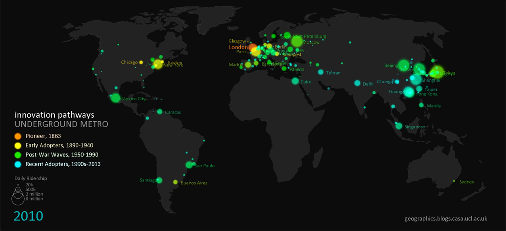
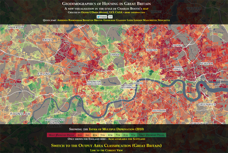
ESRI’s site states that “information about urbanization does not exist in comparative form”. In reality comparative urban analysis is a growing trend across many sectors, from international organisations like OECD, EU and UN (including the original UN Habitat Urban Observatory); to environmental organisations like ICLEI and C40; to economically focussed organisations like the World Bank and Brookings; to global remote sensing providers like the USGS; to major commercial data producers in transport and telecoms; to the many urban academic research centres around the world (including the two London based centres I’ve worked for, CASA and LSE Cities).

Global cities data example- GaWC Network at Loughborough
CASA- deprivation in UK cities example.
Brookings MetroMonitor- comparison of US cities' economic performance
Brookings MetroMonitor- comparison of US cities’ economic performance


LSE Cities- over a decade exploring comparative urbanism

There’s a rich and growing field of data providers and analysis techniques to draw on for comparative urban analysis. Indeed the ability to gather and analyse urban data is absolutely central to the whole Smart City agenda. But there are clearly many challenges. What do cities gain by opening up their data? Who then owns the data and controls how it is presented? Who selects what data is included and excluded?

I believe the natural platform for civic data (and subsequently for the international comparison of urban data) will be an open platform with wiki features to encourage civic engagement. This provides the answers to the above questions- citizens gain from better access to data and institutional transparency; citizens own the data and have a say in what is included and how it’s presented. This is the model for current successful open data sites like the London Datastore, where anyone can access the data, and Londoners can request new datasets (backed by freedom of information legislation). Unfortunately the governance situation is of course much more complicated for the international comparison of cities, and this has limited progress.

As the world’s leading provider of GIS software, ESRI are in a strong position to integrate global datasets, and have clear commercial interests in amassing urban data for their clients. But it’s much harder to answer questions about who owns and controls data in their urban observatory project. Arguably this will limit the number of cities volunteering to take part, and limits the project’s ability to respond to the diverse demands of global cities and their citizens.

A further huge challenge in comparative urbanism is in developing the right analytical techniques and indicators to answer key urban questions. This will inevitably require more sophisticated analysis tools than a set of thematic maps, and needs to draw on the many research strands developing the most relevant analytical tools.

Overall there will be some exciting competition in the coming months and years in the expanding market of international urban data integration and visualisation, with different models from commercial, government and academic contexts. ESRI’s urban observatory is an innovative project, and should stimulate further advances.

Animating Global Innovation Diffusion- Public Transport

UndergroundWorldMap

We know that knowledge networks and intensive competition within cities boosts innovation. There are also further scales to this dynamic. The networks and competition between cities at regional and global scales promotes the adoption of new ideas- as cities buy, borrow and adapt ideas from their competitors. It’s this latter global dynamic that we’re exploring in this post, investigating the spread of new ideas in a sector that’s intrinsically urban in nature- public transport. After widespread decline in the second half of the 20th century, transit has recently undergone an impressive renaissance linked to the dramatic growth of urban populations, high density forms and sustainability policies.

The spread of new ideas between cities is clustered in space and in time, as cities are strongly influenced by nearby competitors, as well as economic investment cycles. Therefore a natural way to visualise these spatial and temporal patterns is through animated cartography. This is the technique used here with the help of Processing and the MapThing library by Jon Reades (allows GIS data to be imported into Processing).

So first up we’re going to head back in time to the invention and dispersion of the underground/subway metro (data from metrobits.org; best viewed HD fullscreen)-

London celebrated 150 years of the Underground this year, and it was three decades after 1863 before other cities in Europe and North America had their own high-frequency high-capacity city centre networks. This delay can be linked to varied levels of industrialisation between countries, as well as the time taken to improve the metro concept with electrical power (the original Underground amazingly used steam locomotives). It’s interesting that the youthful American metropolises of Chicago and Boston were quicker off the mark to build metro systems than many European capitals.

Buenos Aires in 1913 and Tokyo in 1927 (now the world’s largest metro) were early exceptions to the European and North American monopoly on metro systems. Yet it took until the 1980’s onwards with the rise of Newly Industrialised Countries like Brazil, Russia, India, Mexico and Turkey for metro systems to become truly global. China is now in a league of its own with gigantic metros in Shanghai, Guangzhou, Beijing and Hong Kong.

Underground metros may seem like the best answer to cities’ transit demands, but they are highly expensive and disruptive to build, and are pricey to maintain also. These difficulties underlie another key innovation in the global rise of public transport- bus rapid transit. The use of segregated roads, specially designed stations and articulated buses enables BRT to have similar capacity and speed advantages of subways at a much lower cost. We can see from the animation that BRT begins as a Brazilian innovation (data from brtdata.org)-

Initially BRT adoption is highly clustered in Brazil’s major cities, with a few early adopters including Santiago de Chile, Quito, Pittsburgh and Essen in Germany. Then in the late 1990’s the dynamic changes with a burst of new systems in Central America, Canada, Australia, and mainly second-tier cities in Europe. Taipei has spearheaded the adoption of BRT into China, with many new large systems emerging. Sizeable BRTs also recently opened in Istanbul, Tehran and interestingly in Lagos where hopefully further investment in African cities will follow.

In our highly connected globalised world, new city innovations are likely to spread more quickly, and that seems to be the case with BRT. Indeed this acceleration effect is even more marked in the last innovation we’re going to investigate- the bike sharing phenomenon. Now bike share schemes are of course small investments compared to city-wide metro systems, yet they are still an interesting recent advance with similar global dispersion dynamics (data from Bike Sharing World Map and O’Brien Bike Share Map)-

The original pioneer of bike sharing is not as clean cut as the BRT and Underground examples as there have been several generations of innovation (see pdf article). In 1995 Copenhagen successfully created a reasonably sized (1,000 bikes) coin operated system with specially designed bicycles that tried to reduce theft. A small number of cities in Germany and France followed suit. The next generation began in Lyon in 2005 with a larger (4,000 bikes) system using smart card technology that greatly reduced theft. Subsequently bike sharing has exploded globally across Europe, North America, China and South Korea.

Paris has by far the largest system in Europe with 20,000 bikes. But even Paris’s Vélib’ is small compared to two huge Chinese systems in Wuhan (90,000 bikes) and Hangzhou (70,000 bikes). China’s strong cycling tradition has recently been in decline with rising car ownership, and hopefully the Bike Share boom will reverse this trend.

So to conclude, we are experiencing an age of truly global transit adoption with innovations spreading more rapidly through global city networks. While innovation has traditionally arisen in Western European and North American contexts, by far the greatest urban growth is in Newly Industrialised Countries, increasing demand for innovations like BRT. The rapid rise of bike share systems shows that relatively modest innovations can have a global impact when the innovation is popular and effectively implemented.


————————————————————————————

Notes-

The ridership and scheme size data relates to current passenger levels rather than the size of the system at the time of construction. Would be great to do this visualisation with time-series ridership data, but this is not to my knowledge currently available.

The definition of metro and BRT systems used here comes from the database providers, and there is some ambiguity, e.g. in defining when a regional urban rail system can be classed as a metro (see metrobits.org).