Tracking Gentrification in London and Manchester Using the 2021 Census Occupational Class Data

The Office for National Statistics have started to publish the more detailed tables from the new 2021 census. Of particular interest for my research are the variables related to gentrification. In this post I look at the occupational class data (Standard Occupational Class) to identify areas of London and Manchester with the biggest social changes.

The Changing Geography of London
Given that gentrification has been transforming Inner London for over half a century, some researchers had speculated these processes will start to slow with fewer and fewer working class districts left in Inner London that have not already been transformed. The 2021 census data shows however that gentrification has continued at pace between 2011-2021, with substantial changes in the geography of occupational classes, particularly in East and South-East London.

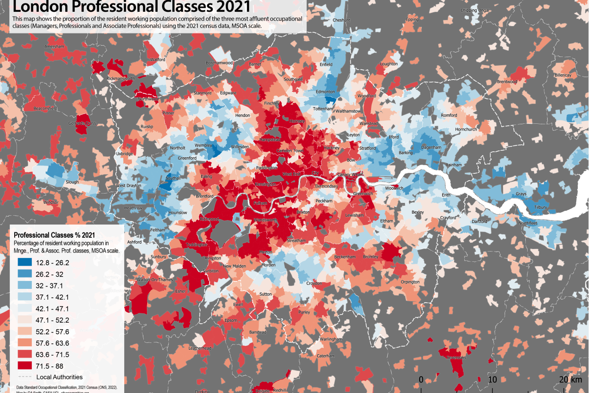
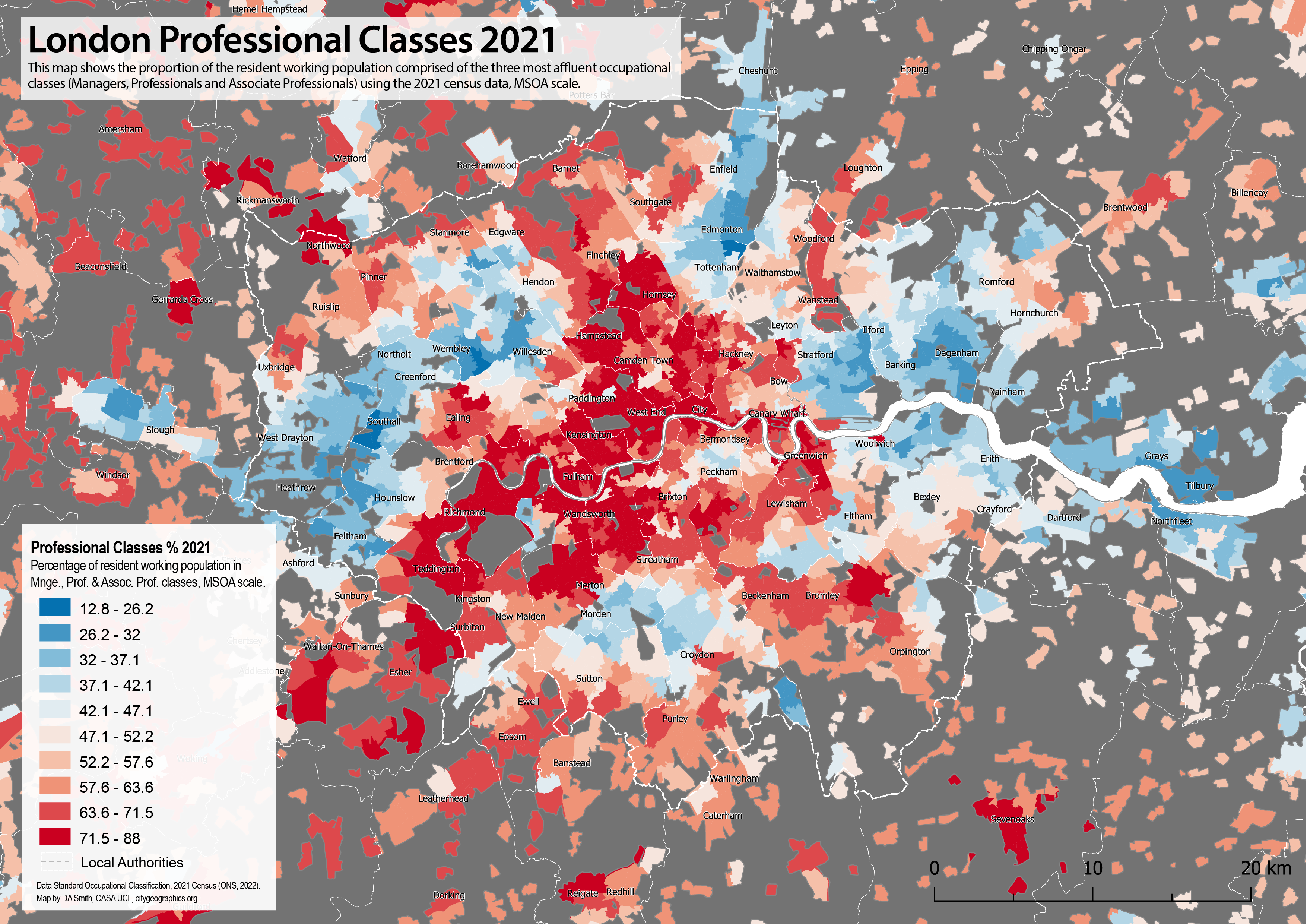
The map below shows the proportion of residents in the three most affluent occupational classes: Managers, Professionals and Associate Professionals in 2021. This is a useful overall indicator of gentrification (though note there are differences between these classes, and deprived populations can also be present in gentrifying areas). The map shows the long established structure of affluent Londoners clustered in Inner and West London, with radial corridors extending South West and North West through historic wealthy areas such as Richmond and Hampstead. The most dramatic changes with the 2021 data are in East London, and South East London, in areas such as Stratford, Walthamstow, Deptford and Greenwich, fitting with widely discussed social trends of these areas in the last ten years. The changes in East London are so substantial that we can identify new radial corridors of relative affluence forming in North East and South East London, mirroring the radial sectors in West London and forming a big red ‘X’ shape on the map. The traditional divisions between East and West are eroding over time with gentrification processes and the substantial transport and planning interventions in East London in recent decades. On the other hand, many of these areas in East and South East London still include high levels of deprivation alongside these gentrification processes, leading to a complex picture.

Below the 2011 and 2021 data are shown side by side with a slider. Gentrification is almost always a spatially clustered process, with newly gentrifying neighbourhoods forming next to existing affluent areas. You can see this very clearly in the maps below as the red areas follow a pattern of organic growth as they expand and strengthen from historic clusters-

We can also map change directly, as shown below. This highlights just how concentrated gentrification is in East and South East London. Some major development sites are picked out, such as the Olympic Park at Stratford, and the developments at North Greenwich. New build gentrification is clearly playing a significant role. But many of the changes are spread across districts such as Walthamstow, Leyton, Bow, Peckham and Deptford, and these changes will be through turnover in the historic housing stock alongside new build housing.

An important difference in 2021 compared the 1990s and early 2000s appears to be more social change in Outer London, at the urban fringe and extending into the more rural Home Counties. This is particularly noticeable in South East London (Bromley, Orpington, Bexley), as well as other parts of Outer London (Barnet, Ruislip, Romford, Coulsdon). This will likely be linked to the extreme unaffordability of Inner London, but the 2021 census may also be picking up some of the demand for larger houses with gardens in 2020 and early 2021 following the pandemic.

On the topic of whether gentrification processes are displacing lower income populations in London, it is not possible to answer with this data. A useful overall perspective comes from looking at the profile of all occupational classes for Greater London in 2011 and 2021. We can clearly observe in the graph below a very large increase in the Professional class, and a big increase in the Management class (Associate Professional is static- this is on average the youngest class, and is probably a sign that this group has been more affected by the price/rent increases). The remaining classes do not however show a decline, they are largely static (except for Administrative, on average the oldest class). This implies that the overall process of increased professionalisation in the last decade has been more about new populations moving to London rather than lower income classes being further displaced, but this conclusion is speculative and migration data would be needed to investigate this. Note also that the professionalisation pattern is clearly visible in the occupational class profile of England and Wales, showing that the growth in knowledge jobs is affecting the entire economy, not just big cities like London.

The Wider Picture Across England
The scale and economic dynamism of London typically makes the capital an outlier compared to other UK cities in terms of processes of urban change. However, devolved governments in city regions such as Greater Manchester and the West Midlands have brought substantial new investment and developments in their cities over the last decade, and we would anticipate some similar processes of social change to be happening. If we look at percentage point change in professional classes for England and Wales (the same measure as the change map above, but this time at local authority scale), we can see the top ranked local authorities are mainly in East and South East London. A crucial difference however is the prominence of Greater Manchester boroughs, including Trafford and Salford. This indicates that major social change is occurring in Manchester. Additionally the West Midlands is also picked up within the top 25 local authorities. Note the national average change in Professional classes is +5.4 percentage points between 2011-2021, so the change towards professional and service jobs is occurring across the economy as a whole.

Local Authorities Ranked by Percentage Point Change in Profess. Classes 2011-2021-

RankLocal AuthorityRegionProf. % 2011Prof. % 2021Percentage Point
Change 11-21
1Waltham ForestLondon (East)39.250.511.3
2Trafford Grt. Manchester48.158.410.3
3Newham London (East)32.041.59.5
4Salford Grt. Manchester36.145.59.4
5Dartford London (OMA)37.346.69.3
6Bromley London (SE)50.659.89.1
7Bexley London (SE)36.745.89.1
8Greenwich London (SE)44.253.18.9
9Lewisham London (SE)48.857.48.5
10S. Cambridgeshire East of England52.360.88.5
11Stockport Grt. Manchester44.352.68.4
12Havering London (East)36.945.38.3
13Warwick West Midlands51.960.18.2
14North Tyneside Tyne & Wear38.346.38.0
15Southwark London (Inner)53.861.88.0
16Broxbourne London (OMA)35.243.28.0
17Epsom and Ewell London (OMA)51.459.27.9
18Sutton London (SW)43.951.77.8
19Hackney London (Inner)56.564.27.8
20Mid Sussex South East48.055.77.7
21Tonbrg. & Malling South East44.151.77.7
22Exeter South West39.246.87.6
23Bromsgrove West Midlands48.255.77.5
24Solihull West Midlands45.452.97.4
25N. Hertfordshire London (OMA)49.657.07.4
26Sevenoaks London (OMA)48.155.47.3
27Epping Forest London (OMA)45.853.17.3
28Bristol, City of West of England44.952.17.2
29Ribble Valley North West45.252.47.2
30Cambridge East of England57.965.17.2

Occupational Class Change in Greater Manchester
It is clear from the table above that alongside London, there are considerable changes in the occupational class geography of Greater Manchester ongoing. The borough of Trafford ranks second in the above table, while Salford is at four and Stockport at eleven. Repeating the mapping exercise below, we can see that occupational class changes are widespread across Greater Manchester, particularly to the west and south of the city centre. In economic terms this is a positive sign that Manchester’s knowledge economy is growing and attracting skilled workers, an important trend given generally low productivity for many UK cities beyond London. On the flip side however, Manchester residents will be less impressed if house prices and levels of inequality start to resemble the extreme situation in the capital.

We can repeat the change map again for Greater Manchester. Some big development sites appear to be picked up in Salford, Ancoats and Sale (the prominent development site of Salford Quays appears to have already gentrified before the 2011 census). But the growth in more affluent occupational classes is not confined to these development sites, it is occurring across most of Greater Manchester and, similar to London, includes many suburban areas. It is only really in Bolton, Rochdale and Oldham where there are few signs of change identifiable.

Summary
The occupational class data from the 2021 census shows that evolution towards knowledge economy and service jobs continues at pace, with Professional and Management classes showing by far the highest growth levels across England and Wales. London has continued to experience significant gentrification levels, with the spatial focus in the last decade concentrated in East and South East London. London centres such as Walthamstow, Stratford, Deptford and Lewisham have changed dramatically, so much so that we can see two new radial corridors of more affluent populations forming in North East and South East London, mirroring the long established structure of West London.

Gentrification is by no means confined to London, and indeed Greater Manchester has several of fastest gentrifying local authorities in England and Wales, particularly the boroughs of Salford and Trafford. This is largely reinforcing the structure of wealthier populations being concentrated to the south and west of Greater Manchester, and in the city centre.

This analysis has looked only at the new occupational class data, which does provide some interesting insights. To look into these issues more deeply however we would need to add analysis on housing markets, tenure, deprivation, age and migration data.

A Compact City for the Wealthy? Continuing Inner London Gentrification and Impacts on Accessibility Inequalities

We have a new paper out in the Journal of Transport Geography- “A compact city for the wealthy? Employment accessibility inequalities between occupational classes in the London metropolitan region 2011“. The paper explores how the increasingly affluent nature of Inner London has improved sustainable travel opportunities for more affluent professional and management classes, while less affluent groups have increasingly been priced out to lower accessibility Outer London locations.

The Continuing Gentrification of Inner London
The gentrification of Inner London was first recorded by Ruth Glass back in the 1960s, with middle class residents moving into largely working class neighbourhoods as London’s economy began its long evolution from manufacturing towards service jobs. This process has continued for decades, ultimately transforming most of Inner London. In the 21st century, some researchers have argued that gentrification has stalled (perhaps because there are few neighbourhoods left to gentrify) or has entered a different phase (e.g. processes such as super-gentrification and new-build gentrification as discussed by Davidson and Lees).

This research uses the Standard Occupational Class data as the basis of measuring social class. This classification was found to correspond to differences in income, as well as to a distinct residential geography. In particular, the three most affluent groups (Management, Professional and Associate Professional) cluster together, resulting in the social geography we can see in the map below using the 2011 Census data. There is a clear clustering of professional classes in Inner-West London, with two prominent radial corridors extending northwards through Camden, Islington and Hampstead; and south-westwards through Kensington, Wandsworth and Richmond. Concentrations of non-professional groups are mainly in Outer London to the east, north-east and west, with only smaller pockets remaining in Inner London. This analysis largely matches the description of Inner London now being dominated by professional classes, with lower income groups increasingly in Outer London (with some exceptions remaining in Inner East and South-East London).

Professional Classes (Manag., Prof. & Assoc. Prof.) Residential Percentage 2011. Data: Census 2011 (Office for National Statistics, 2016).

As well as mapping the 2011 geography of occupational class, we looked at more recent changes to see if gentrification is continuing or has slowed, using the ONS Annual Population Survey. Analysing changes between 2006 and 2016, we found had substantial gentrification had continued in Inner London, as shown in the table below. The Management, Professional and Associate Professional groups all grew as a proportion of the Inner London population, while all other occupational classes fell proportionally (green cells are above the average for the metro region, and orange cells are below the average). Interestingly, the biggest growth was in the Management and Professional classes, rather than the younger Associate Professional class, arguably more in line with super-gentrification processes. In contrast, there are proportional increases in several lower income classes in Outer London.

Sub-Regional Occupational Class Percentage Point Change by Residence 2006–2016 (final 2016 sub-regional percentages in brackets)

We can also explore these changes at the more detailed level of local authorities, and show that even more dramatic changes are occurring at the local level. In the chart below, each Local Authority is shown as a trajectory connecting its position in 2006 to its position in 2016 in relation to the percentage of professional classes and the total working population. Generally, Inner Greater London Authority (GLA) boroughs experience high working population growth combined with large increases in the proportion of professional classes. Boroughs with a long history of gentrification, such as Camden and Islington, are higher up in the chart reaching 70% professional classes, while more recent gentrifiers, such as Lewisham and Southwark, are rapidly gentrifying from a lower base. Outer GLA boroughs also show substantial population growth but with lower levels of change in professional classes, and decline in some cases. The exceptions are mainly in South and South-West London, with Croydon, Sutton and Richmond all gentrifying. Outer Metropolitan Area (OMA) local authorities have a mixed picture, with some increases in professional occupational classes with minimal working population growth; while some lower income towns such as Luton and Harlow are not gentrifying.

Local Authority Trajectories for Combined Percentage of Professional Occupational Classes and Total Working Population for 2006 and 2016. Data Source: Annual Population Survey 2005–2017.

What Impacts Does Inner London Gentrification have on Accessibility to Jobs?
We would expect that the dominance of more affluent classes in Inner London translates into accessibility advantages for these classes, as Inner London has substantially better accessibility opportunities by public transport, walking and cycling. We were particularly interested in accessibility by more affordable travel modes in this research. Bus travel is in general considerably cheaper than other public transport options in London. This is reflected in higher rates of more affordable bus and walking trips by lower income classes in the 2011 Census data. We can see in the table below that the three lowest income classes (6, 7 & 9) have around three times higher rates of bus travel and two times higher rates of walking than the most affluent three classes (1, 2 & 3)-

We used network analysis to analyse accessibility differences (see working paper on accessibility model). The analysis was carried out using the 2011 census data. The box plot below shows the cumulative accessibility to jobs for 60 minutes travel by Car, Public Transport (all modes) and Bus Only for the occupational classes. We can see differences between classes, particularly for public transport and bus trips, though there is also much variation within each class.

GLA 60mins Cumulative Accessibility to Employment by SOC Groups: Absolute Results

The accessibility differences between occupational classes can be more clearly seen by plotting differences between how the average accessibility for each group varies from the average accessibility for the entire working population, as shown below. Note in this chart the accessibility differences are normalised by travel mode, so the differences between travel modes in the chart above are normalised in the chart below. We can see clear consistent accessibility advantages for the top three occupational classes, particularly for more affordable slower modes- walking and cycling. The remaining occupational classes have below average accessibility to jobs, particularly for the more car oriented Skilled Trades and Process groups.

Greater London Authority 60mins Cumulative Accessibility to Employment by SOC Groups: Relative Differences in Occupational Class Mode Means and Mode Means for Total Population

The results for bus and walking modes is a particular accessibility challenge. Accessibility by these more affordable modes is generally low in absolute terms outside of Inner London. For the bus mode, less than half the number of jobs are reachable at typical commute times compared to the full public transport network. Given that lower income groups are the most frequent bus and walking commuters, and that these classes are increasingly being priced out of Inner London, these limitations are a significant accessibility challenge going forward.

What Policies Can Planner follow to Mitigate this?
In terms of transport policy, this research supports efforts to improve the affordability and connectivity of public transport for lower income populations. This is indeed a priority of the current London Mayor Sadiq Khan, who has committed to freezing public transport fares, and has reformed ticketing to allow multiple bus journeys on a single fare. These measures help offset travel costs for lower income residents in Outer London.

The main policy conclusion is the importance of housing policy in influencing accessibility outcomes in the study area. Low and moderate income groups are being priced out of public transport accessible areas. Without a step-change in the delivery of genuinely affordable housing in accessible locations, the increasing dominance of Inner London by professional classes will continue, resulting in greater accessibility inequalities, and likely increased travel costs for lower income classes.

Note on Covid-19 and Travel Inequalities
This research was completed in 2019, before the recent COVID-19 pandemic. The pandemic has in the short term shut down public transport networks, and greatly disadvantaged millions of city residents around the world. Longer term it is possible that the pandemic will reduce the attraction of inner city areas such as Inner London, due to perceived risk of future pandemics as well as the acceleration of telecommuting and home-working trends. The overall effect could be to slow gentrification processes, although this is difficult to predict. The alternative view is that  London will recover and adapt as it has done following many crises in the past. East Asian metropolises offer a good model of how to built resilience following their response to the earlier SARS and MERS outbreaks.

The wider economic impacts are clearly also important. Certainly we are in line for a very large recession, hitting important sectors such as tourism and hospitality. More specifically in London, the recession may hit development viability for affordable housing, and is a real headache for public transport operators. Transport for London was in financial trouble before the crisis, and is currently dependent on government bailouts to keep running. This will likely curtail the ability of the Mayor to maintain lower public transport fares, and so impact the kind of transport accessibility inequalities this paper discusses.


BBC London Calling Season


To mark the Olympic year a series of programs on London is being broadcast by the BBC, exploring the dynamic and diverse nature of the capital and its historic roots. There have already been some great documentaries on, with interesting use of maps, archive materials and personal testimonies charting the changing city and built-environment.

Last night saw the start of The Secret History of Our Streets, telling London’s history in microcosm by picking one street to follow in each episode through good times and bad. The first episode told the rather tragic tale of Deptford High Street, which moved from a relatively thriving working class centre in the early 20th century to one of London’s poorest areas in the present.

A shop trader John Price (below) who has lived in Deptford all his life engagingly recounts the close community life of his youth with his extended family all living on the same street. This is brought to an end with the drawn out demolition of the Victorian terraced housing to be replaced by modern estates. The existing community is separated as families move out to suburban new towns.

Modernist planning is unashamedly painted as the bad guy in this narrative. “Tell ’em the truth, tell ’em how they fucked everything up” mutters a passerby in one scene. The father of British Planning, Patrick Abercrombie, appears as a monocled toff in the archive footage, as he expresses his disgust at London’s old housing. This critical view of planning intervention is clearly simplistic, as there were of course very severe housing problems in London.

Yet the filmmakers back up their perspective by uncovering the council’s environmental health archives, showing that John Price’s street was healthy and in a decent state of repair- not the slum that it was labelled. To add salt to this wound, such traditional housing is now in great demand in Deptford and Greenwich, with terraces on nearby streets selling for well over half a million pounds, in stark contrast to the drab and inflexible modernist housing that replaced it and cannot be gentrified. The forthcoming episodes in this series will likely tell more rosy tales of changing London, but Deptford’s history was hard hitting stuff and very well told.

Continuing on the traditional market theme, the BBC has also been exploring London’s remaining wholesale markets in The London Markets. These have moved out of the city centre for cheaper rents and road transport links, with Billingsgate fish market moving to Docklands and Covent Garden fruit and veg going to Vauxhall. Smithfield meat market is still hanging on near the City, but surely not for long. The arcane night-time world of the butchers appears as a weird anachronism surrounded by late night financiers and clubbers in Farringdon.

Lastly on a lighter note, A Picture of London explored artists interpretations of the city across time. As well as picture postcard views from Canaletto and Monet, some of London’s most dramatic moments are depicted such as the burning of the Houses of Parliament by Turner. My personal favourite however was this gem from the archives of a witty and prescient silent movie from the 1920’s of a time traveller guessing what London might be like in the future. Perhaps the oldest urban sci-fi film? Take a look:

Sketching the City in Motion

Whilst social scientists approach cities from rational and technical perspectives, it’s often interesting to get some inspiration from the creative arts world. Linking with artists is an emerging trend at CASA, with collaboration with Edinburgh College of Art through the TalesofThings project, the use of common visualisation tools such as Processing, and recent events like James’s presentation at the Mapping London Life event.

A shared challenge for artists and scientists is exploring the dynamics of cities, from the buzz of daily street life to the slower demolition and creation of the built-environment. An artist I admire for capturing these flows through static images is Lucinda Rogers, whose works have recently gone online on a new website. Her illustrations of street life in New York and London use line thickness and blurred colour to give the impression of forms in motion- from pedestrians and cars on the street to cranes dancing around St Pauls.

Rogers tends to choose Inner City subjects just at the edge of the centre, where gentrification processes are in tension with the historic fabric and traditional industries- locations such as Shoreditch and mid-town Manhattan. In this sense New York and London have much in common.

Another interesting London illustration book recently released in London Unfurled. Matteo Pericoli has done a series of books of super-long panoramas, published concertina style in one very long folded sheet. For London he follows the Thames from Hammersmith to Greenwich, with the north bank on one side of the page and the south bank on the other. This works well as the Thames is a key way  to ‘learn’ the form of London, from historic panoramas to the present day. If a 20 metre long panorama is too big for your coffee table, London Unfurled also comes in ipad version.